
Search results for "Insulation helps" in Home Design Ideas
 TKS Design Group
Free ebook, Creating the Ideal Kitchen. DOWNLOAD NOW
The Klimala’s and their three kids are no strangers to moving, this being their fifth house in the same town over the 20-year period they have lived there. “It must be the 7-year itch, because every seven years, we seem to find ourselves antsy for a new project or a new environment. I think part of it is being a designer, I see my own taste evolve and I want my environment to reflect that. Having easy access to wonderful tradesmen and a knowledge of the process makes it that much easier”.
This time, Klimala’s fell in love with a somewhat unlikely candidate. The 1950’s ranch turned cape cod was a bit of a mutt, but it’s location 5 minutes from their design studio and backing up to the high school where their kids can roll out of bed and walk to school, coupled with the charm of its location on a private road and lush landscaping made it an appealing choice for them.
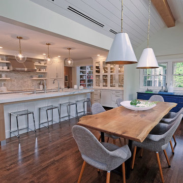
“The bones of the house were really charming. It was typical 1,500 square foot ranch that at some point someone added a second floor to. Its sloped roofline and dormered bedrooms gave it some charm.” With the help of architect Maureen McHugh, Klimala’s gutted and reworked the layout to make the house work for them. An open concept kitchen and dining room allows for more frequent casual family dinners and dinner parties that linger. A dingy 3-season room off the back of the original house was insulated, given a vaulted ceiling with skylights and now opens up to the kitchen. This room now houses an 8’ raw edge white oak dining table and functions as an informal dining room. “One of the challenges with these mid-century homes is the 8’ ceilings. I had to have at least one room that had a higher ceiling so that’s how we did it” states Klimala.
The kitchen features a 10’ island which houses a 5’0” Galley Sink. The Galley features two faucets, and double tiered rail system to which accessories such as cutting boards and stainless steel bowls can be added for ease of cooking. Across from the large sink is an induction cooktop. “My two teen daughters and I enjoy cooking, and the Galley and induction cooktop make it so easy.” A wall of tall cabinets features a full size refrigerator, freezer, double oven and built in coffeemaker. The area on the opposite end of the kitchen features a pantry with mirrored glass doors and a beverage center below.
The rest of the first floor features an entry way, a living room with views to the front yard’s lush landscaping, a family room where the family hangs out to watch TV, a back entry from the garage with a laundry room and mudroom area, one of the home’s four bedrooms and a full bath. There is a double sided fireplace between the family room and living room. The home features pops of color from the living room’s peach grass cloth to purple painted wall in the family room. “I’m definitely a traditionalist at heart but because of the home’s Midcentury roots, I wanted to incorporate some of those elements into the furniture, lighting and accessories which also ended up being really fun. We are not formal people so I wanted a house that my kids would enjoy, have their friends over and feel comfortable.”
The second floor houses the master bedroom suite, two of the kids’ bedrooms and a back room nicknamed “the library” because it has turned into a quiet get away area where the girls can study or take a break from the rest of the family. The area was originally unfinished attic, and because the home was short on closet space, this Jack and Jill area off the girls’ bedrooms houses two large walk-in closets and a small sitting area with a makeup vanity. “The girls really wanted to keep the exposed brick of the fireplace that runs up the through the space, so that’s what we did, and I think they feel like they are in their own little loft space in the city when they are up there” says Klimala.
Designed by: Susan Klimala, CKD, CBD
Photography by: Carlos Vergara
For more information on kitchen and bath design ideas go to: www.kitchenstudio-ge.com
 Thyme & Place Design LLC
When my client had to move from her company office to work at home, she set up in the dining room. Despite her best efforts, this was not the long-term solution she was looking for. My client realized she needed a dedicated space not on the main floor of the home. On one hand, having your office space right next to the kitchen is handy. On the other hand, it made separating work and home life was not that easy.
The house was a ranch. In essence, the basement would run entire length of the home. As we came down the steps, we entered a time capsule. The house was built in the 1950’s. The walls were covered with original knotty pine paneling. There was a wood burning fireplace and considering this was a basement, high ceilings. In addition, there was everything her family could not store at their own homes. As we wound though the space, I though “wow this has potential”, Eventually, after walking through the laundry room we came to a small nicely lit room. This would be the office.
My client looked at me and asked what I thought. Undoubtedly, I said, this can be a great workspace, but do you really want to walk through this basement and laundry to get here? Without reservation, my client said where do we start?
Once the design was in place, we started the renovation. The knotty pine paneling had to go. Specifically, to add some insulation and control the dampness and humidity. The laundry room wall was relocated to create a hallway to the office.
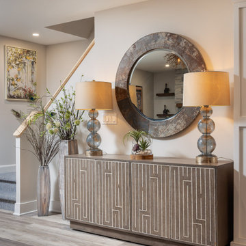
At the far end of the room, we designated a workout zone. Weights, mats, exercise bike and television are at the ready for morning or afternoon workouts. The space can be concealed by a folding screen for party time. Doors to an old closet under the stairs were relocated to the workout area for hidden storage. Now we had nice wall for a beautiful console and mirror for storage and serving during parties.
In order to add architectural details, we covered the old ugly support columns with simple recessed millwork panels. This detail created a visual division between the bar area and the seating area in front of the fireplace. The old red brick on the fireplace surround was replaced with stack stone. A mantle was made from reclaimed wood. Additional reclaimed wood floating shelves left and right of the fireplace provides decorative display while maintaining a rustic element balancing the copper end table and leather swivel rocker.
We found an amazing rug which tied all of the colors together further defining the gathering space. Russet and burnt orange became the accent color unifying each space. With a bit of whimsy, a rather unusual light fixture which looks like roots from a tree growing through the ceiling is a conversation piece.
The office space is quite and removed from the main part of the basement. There is a desk large enough for multiple screens, a small bookcase holding office supplies and a comfortable chair for conference calls. Because working from home requires many online meetings, we added a shiplap wall painted in Hale Navy to contrast with the orange fabric on the chair. We finished the décor with a painting from my client’s father. This is the background online visitors will see.
The last and best part of the renovation is the beautiful bar. My client is an avid collector of wine. She already had the EuroCave refrigerator, so I incorporated it into the design. The cabinets are painted Temptation Grey from Benjamin Moore. The counter tops are my favorite hard working quartzite Brown Fantasy. The backsplash is a combination of rustic wood and old tin ceiling like porcelain tiles. Together with the textures of the reclaimed wood and hide poofs balanced against the smooth finish of the cabinets, we created a comfortable luxury for relaxing.
There is ample storage for bottles, cans, glasses, and anything else you can think of for a great party. In addition to the wine storage, we incorporated a beverage refrigerator, an ice maker, and a sink. Floating shelves with integrated lighting illuminate the back bar. The raised height of the front bar provides the perfect wine tasting and paring spot. I especially love the pendant lights which look like wine glasses.
Finally, I selected carpet for the stairs and office. It is perfect for noise reduction. Meanwhile for the overall flooring, I specifically selected a high-performance vinyl plank floor. We often use this product as it is perfect to install on a concrete floor. It is soft to walk on, easy to clean and does not reduce the overall height of the space.
 Clopay
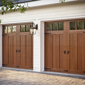
Wood Garage Door Look-Alike. Designed for homeowners who love the look of wood but not the upkeep, Clopay's Canyon Ridge Collection faux wood carriage house garage doors offer the best of both worlds: the realism, design flexibility and beauty of wood along with the benefits of a low-maintenance, energy-efficient, insulated steel garage door. Unlike real wood, the door is moisture resistant, so it won’t rot, split, shrink, separate, or crack. The cladding is molded from real wood boards to duplicate the natural texture and grain patterns to give each door one-of-a-kind character. The surface can be painted or stained. Doors shown: Clopay Canyon Ridege Collection Limited Edition Series, Design 13 with Mahogany cladding and overlays, factory-stained in a Dark finish.
Find the right local pro for your project
 Kathleen Jennison
An Arts & Crafts Bungalow is one of my favorite styles of homes. We have quite a few of them in our Stockton Mid-Town area. And when C&L called us to help them remodel their 1923 American Bungalow, I was beyond thrilled.
As per usual, when we get a new inquiry, we quickly Google the project location while we are talking to you on the phone. My excitement escalated when I saw the Google Earth Image of the sweet Sage Green bungalow in Mid-Town Stockton. "Yes, we would be interested in working with you," I said trying to keep my cool.
But what made it even better was meeting C&L and touring their home, because they are the nicest young couple, eager to make their home period perfect. Unfortunately, it had been slightly molested by some bad house-flippers, and we needed to bring the bathroom back to it "roots."
We knew we had to banish the hideous brown tile and cheap vanity quickly. But C&L complained about the condensation problems and the constant fight with mold. This immediately told me that improper remodeling had occurred and we needed to remedy that right away.
The Before: Frustrations with a Botched Remodel
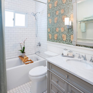
The bathroom needed to be brought back to period appropriate design with all the functionality of a modern bathroom. We thought of things like marble countertop, white mosaic floor tiles, white subway tile, board and batten molding, and of course a fabulous wallpaper.
This small (and only) bathroom on a tight budget required a little bit of design sleuthing to figure out how we could get the proper look and feel. Our goal was to determine where to splurge and where to economize and how to complete the remodel as quickly as possible because C&L would have to move out while construction was going on.
The Process: Hard Work to Remedy Design and Function
During our initial design study, (which included 2 hours in the owners’ home), we noticed framed images of William Morris Arts and Crafts textile patterns and knew this would be our design inspiration. We presented C&L with three options and they quickly selected the Pimpernel Design Concept.
We had originally selected the Black and Olive colors with a black vanity, mirror, and black and white floor tile. C&L liked it but weren’t quite sure about the black, We went back to the drawing board and decided the William & Co Pimpernel Wallpaper in Bayleaf and Manilla color with a softer gray painted vanity and mirror and white floor tile was more to their liking.
After the Design Concept was approved, we went to work securing the building permit, procuring all the elements, and scheduling our trusted tradesmen to perform the work.
We did uncover some shoddy work by the flippers such as live electrical wires hidden behind the wall, plumbing venting cut-off and buried in the walls (hence the constant dampness), the tub barely balancing on two fence boards across the floor joist, and no insulation on the exterior wall.
All of the previous blunders were fixed and the bathroom put back to its previous glory. We could feel the house thanking us for making it pretty again.
The After Reveal: Cohesive Design Decisions
We selected a simple white subway tile for the tub/shower. This is always classic and in keeping with the style of the house.
We selected a pre-fab vanity and mirror, but they look rich with the quartz countertop. There is much more storage in this small vanity than you would think.
The Transformation: A Period Perfect Refresh
We began the remodel just as the pandemic reared and stay-in-place orders went into effect. As C&L were already moved out and living with relatives, we got the go-ahead from city officials to get the work done (after all, how can you shelter in place without a bathroom?).
All our tradesmen were scheduled to work so that only one crew was on the job site at a time. We stayed on the original schedule with only a one week delay.
The end result is the sweetest little bathroom I've ever seen (and I can't wait to start work on C&L's kitchen next).
Thank you for joining me in this project transformation. I hope this inspired you to think about being creative with your design projects, determining what works best in keeping with the architecture of your space, and carefully assessing how you can have the best life in your home.
 Dovetail Construction
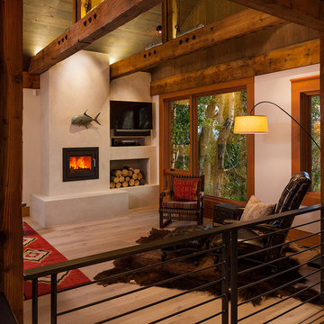
Large mountain style open concept light wood floor living room photo with white walls, a plaster fireplace and a wall-mounted tv
 LMB Interiors
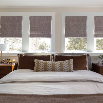
Warm guest bedroom with layered bedding, wood nightstands, and tailored window shades.
Arts and crafts bedroom photo in San Francisco
Arts and crafts bedroom photo in San Francisco
 KohlMark Architects and Builders
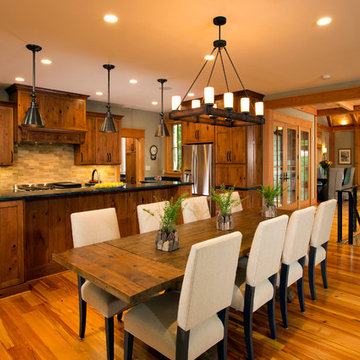
The design of this home was driven by the owners’ desire for a three-bedroom waterfront home that showcased the spectacular views and park-like setting. As nature lovers, they wanted their home to be organic, minimize any environmental impact on the sensitive site and embrace nature.
This unique home is sited on a high ridge with a 45° slope to the water on the right and a deep ravine on the left. The five-acre site is completely wooded and tree preservation was a major emphasis. Very few trees were removed and special care was taken to protect the trees and environment throughout the project. To further minimize disturbance, grades were not changed and the home was designed to take full advantage of the site’s natural topography. Oak from the home site was re-purposed for the mantle, powder room counter and select furniture.
The visually powerful twin pavilions were born from the need for level ground and parking on an otherwise challenging site. Fill dirt excavated from the main home provided the foundation. All structures are anchored with a natural stone base and exterior materials include timber framing, fir ceilings, shingle siding, a partial metal roof and corten steel walls. Stone, wood, metal and glass transition the exterior to the interior and large wood windows flood the home with light and showcase the setting. Interior finishes include reclaimed heart pine floors, Douglas fir trim, dry-stacked stone, rustic cherry cabinets and soapstone counters.
Exterior spaces include a timber-framed porch, stone patio with fire pit and commanding views of the Occoquan reservoir. A second porch overlooks the ravine and a breezeway connects the garage to the home.
Numerous energy-saving features have been incorporated, including LED lighting, on-demand gas water heating and special insulation. Smart technology helps manage and control the entire house.
Greg Hadley Photography

Sponsored
Columbus, OH

Hope Restoration & General Contracting
Columbus Design-Build, Kitchen & Bath Remodeling, Historic Renovations
 CM Ragusa Builders
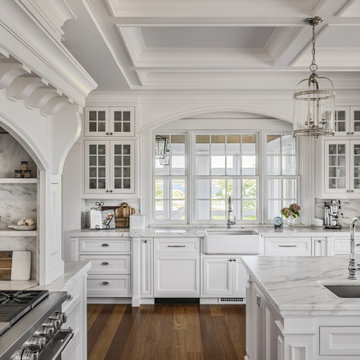
A timeless and traditional kitchen. White cabinetry paired with calacatta marble countertops makes this space feel elevated.
 Anura Design | architects+engineers
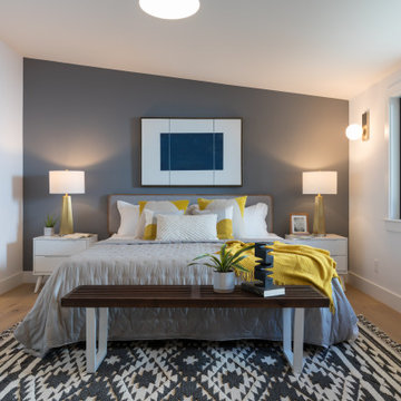
Example of a trendy medium tone wood floor, brown floor and vaulted ceiling bedroom design in San Francisco with gray walls

 Clopay
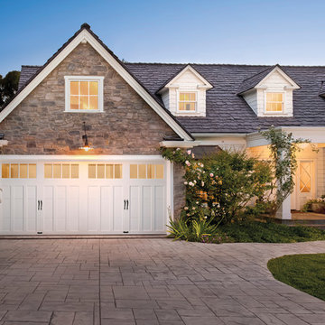
Clopay Coachman Collection carriage house style overhead garage door, Design 13 with REC4 windows, painted white.
Inspiration for a mid-sized timeless attached two-car garage remodel in Cincinnati
Inspiration for a mid-sized timeless attached two-car garage remodel in Cincinnati

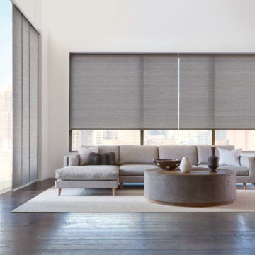
 Window Spaces
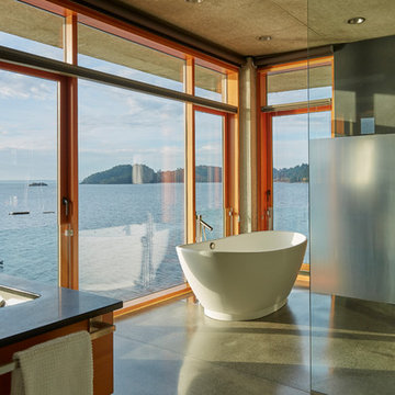
Hunter Douglas Skyline® Gliding Window Panels & Designer Roller Shades provide a contemporary look and style!
Large trendy formal and open concept dark wood floor and brown floor living room photo in San Diego with white walls, no fireplace and no tv
Large trendy formal and open concept dark wood floor and brown floor living room photo in San Diego with white walls, no fireplace and no tv

Sponsored
Delaware, OH

Buckeye Basements, Inc.
Central Ohio's Basement Finishing ExpertsBest Of Houzz '13-'21
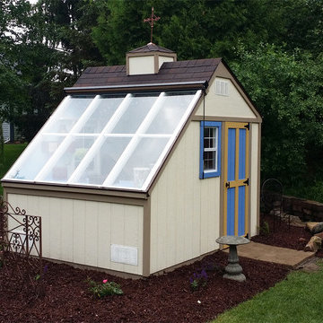
 Backyard Buildings
The Aurora can be labeled as a greenhouse shed combo. It includes four large aluminum windows with tempered glass for safety. On top of that, it features 509 cubic feet of storage space for gardening tools and equipment or plants. With the many windows, light is aplenty. However, there is even the option to add solar shades so you can control the amount of sunlight coming in. In addition, you can add a power ventilation fan to remove excess heat and bring in cool air inside. If you looking to grow plants and vegetables all year around and store stuff, the Aurora greenhouse shed combo is just what you're looking for. It's a customer favorite.
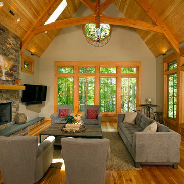 KohlMark Architects and Builders
The design of this home was driven by the owners’ desire for a three-bedroom waterfront home that showcased the spectacular views and park-like setting. As nature lovers, they wanted their home to be organic, minimize any environmental impact on the sensitive site and embrace nature.
This unique home is sited on a high ridge with a 45° slope to the water on the right and a deep ravine on the left. The five-acre site is completely wooded and tree preservation was a major emphasis. Very few trees were removed and special care was taken to protect the trees and environment throughout the project. To further minimize disturbance, grades were not changed and the home was designed to take full advantage of the site’s natural topography. Oak from the home site was re-purposed for the mantle, powder room counter and select furniture.
The visually powerful twin pavilions were born from the need for level ground and parking on an otherwise challenging site. Fill dirt excavated from the main home provided the foundation. All structures are anchored with a natural stone base and exterior materials include timber framing, fir ceilings, shingle siding, a partial metal roof and corten steel walls. Stone, wood, metal and glass transition the exterior to the interior and large wood windows flood the home with light and showcase the setting. Interior finishes include reclaimed heart pine floors, Douglas fir trim, dry-stacked stone, rustic cherry cabinets and soapstone counters.
Exterior spaces include a timber-framed porch, stone patio with fire pit and commanding views of the Occoquan reservoir. A second porch overlooks the ravine and a breezeway connects the garage to the home.
Numerous energy-saving features have been incorporated, including LED lighting, on-demand gas water heating and special insulation. Smart technology helps manage and control the entire house.
Greg Hadley Photography
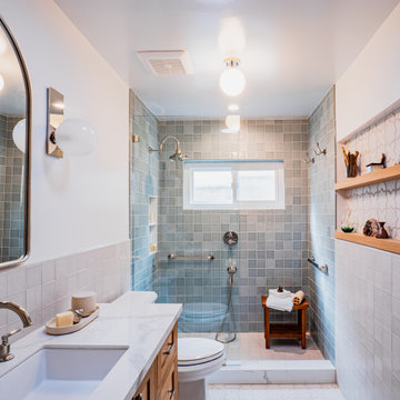
 5blox Inc.
Taking this outdated and loud space and transforming it in to a serene retreat with pull-out cabinets and a refreshing palette. Dive into this beach-style bathroom transformation where calm meets chic!
The corner shower has made way for a spacious design, and those dated green vanities? Swapped for a timelessly elegant vanity, custom cabinetry, and a square tile that raps around this stunning refresh for our wonderful client.
Photo by Christian Morales

Sponsored
Columbus, OH
Hope Restoration & General Contracting
Columbus Design-Build, Kitchen & Bath Remodeling, Historic Renovations
 Johnson County Siding & Window Co., Inc.
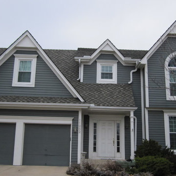
Inspiration for a timeless gray vinyl exterior home remodel in Kansas City
 Naikoon Contracting Ltd
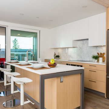
One Raven is a truely unique project that pushes the boundaries of urban density without losing heritage roots. Located in the heart of North Vancouver‘s up and coming moodyville neighbourhood, One Raven will be a beacon on E 3rd. With one of the last remaining heritage buildings on the front of the lot, the project consists of a NetZero high-performance infill duplex, each complete with its suite. This will add 4 new livable units in an infill laneway format with the heritage home complementing the site. The project is built to Level 5 of the BC Energy Step Code meaning it is already at the energy targets for all buildings in 2032, 13 years early! This spectacular and unique project was designed by the talented architect Tina Hubert at Design Studio 8.
The passive house inspired townhouses and suites will be accessed via an internal courtyard bi-secting the lot in an east-west orientation parallel to the street. A circulation corridor oriented north-south will be accessed from the sidewalk at the existing stone retaining wall and concrete stair.
The site design creates private open spaces yet also fosters connection to the semi-private realm of the inner courtyard. Each townhouse will have access to ground level patios, gardens, balconies and roof decks.
The exterior walls are “super” insulated walls that are 12” or more thick with a focus on air-tight detailing. High performance triple pane windows are oriented southward to maximize solar gain in winter and rely on shading devices in the summer. All other windows are located to promote natural ventilation and to reduce energy losses. The highly air-tight building (0.93 ACH) utilizes heat recovery ventilation system to exhaust air and bring in fresh air. The building is designed to be compact with a reduced surface area.
Maximizing on-site infiltration and rainwater collection will help manage storm water runoff. Ground-oriented landscape lighting and low planting along pathways and lot lines encourage visibility and overlook.
The architecture of the building is uniquely modern and clearly establishes it‘s identity, through horizontal and vertical rectilinear forms, asymmetrical window placement, slim profile detailing, standing seam metal cladding, heritage coloured siding, and architectural panelized guardrails.
 Naikoon Contracting Ltd
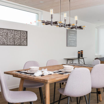
One Raven is a truely unique project that pushes the boundaries of urban density without losing heritage roots. Located in the heart of North Vancouver‘s up and coming moodyville neighbourhood, One Raven will be a beacon on E 3rd. With one of the last remaining heritage buildings on the front of the lot, the project consists of a NetZero high-performance infill duplex, each complete with its suite. This will add 4 new livable units in an infill laneway format with the heritage home complementing the site. The project is built to Level 5 of the BC Energy Step Code meaning it is already at the energy targets for all buildings in 2032, 13 years early! This spectacular and unique project was designed by the talented architect Tina Hubert at Design Studio 8.
The passive house inspired townhouses and suites will be accessed via an internal courtyard bi-secting the lot in an east-west orientation parallel to the street. A circulation corridor oriented north-south will be accessed from the sidewalk at the existing stone retaining wall and concrete stair.
The site design creates private open spaces yet also fosters connection to the semi-private realm of the inner courtyard. Each townhouse will have access to ground level patios, gardens, balconies and roof decks.
The exterior walls are “super” insulated walls that are 12” or more thick with a focus on air-tight detailing. High performance triple pane windows are oriented southward to maximize solar gain in winter and rely on shading devices in the summer. All other windows are located to promote natural ventilation and to reduce energy losses. The highly air-tight building (0.93 ACH) utilizes heat recovery ventilation system to exhaust air and bring in fresh air. The building is designed to be compact with a reduced surface area.
Maximizing on-site infiltration and rainwater collection will help manage storm water runoff. Ground-oriented landscape lighting and low planting along pathways and lot lines encourage visibility and overlook.
The architecture of the building is uniquely modern and clearly establishes it‘s identity, through horizontal and vertical rectilinear forms, asymmetrical window placement, slim profile detailing, standing seam metal cladding, heritage coloured siding, and architectural panelized guardrails.
31