
Search results for "Interface">interface" in Home Design Ideas
 OakWood Designers & Builders
The renovation of the project included a main floor renovation which included a brand-new kitchen and a sunroom addition. This renovation revised the space in the kitchen area by removing a load-bearing wall and relocating the mechanical and electrical systems inside. This freed up space and allowed for a more open design in the kitchen area.
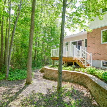
The client had several requests for this project, including large windows to allow maximum natural light. This idea was further added upon by adding sun tunnels in the roof for even more light. The sunroom also features a custom deck on the back of the house with aluminum handrails. The addition to the house was to have its own air conditioning system with custom ceiling tray detailing with crown moulding. This also served to hide the attic hatch with millwork finish. Besides, the sunroom space was designed as both a living room and extra dining space. During the pandemic, it also served as an office and home work hub for their children.
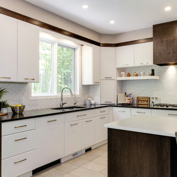
What makes this project appealing is the enhanced natural light being brought into the spaces through large windows and sun tunnels. Other enhancements include a large-scale hexagonal mosaic in marble-looking material to add texture to the wall, as well as the use of accent panels to extend custom hood cabinets to the ceiling. Next, the island in the kitchen can seat 4 comfortably enhancing the usefulness of the space. The colours chosen for the kitchen include off white slab doors and deep rich wood accents and island. The hardware is brushed nickel as well as the light fixture, all to match the plumbing fixtures. Around the walls in the sunroom is custom wainscotting using millwork and casing.
Special work was done on the ceiling, by concealing the beams with bulkheads and then angling them to match the existing bulkheads in the kitchen and original dining room. Besides, a custom appliance garage corner cabinet sits on the countertop which offers convenience and efficiency. The size of the island was maximized to get the most storage space out of it, including a pull-out spice rack and a space for a wine fridge. The unique transition between tile and hardwood was done out of necessity, as the sitting stools had to sit on only one medium. Plus, it is a unique way to transition from two different flooring materials!
The unique challenges of this project include the wood to tile interface. This was required for the sitting stools to rest on only one medium. This design feature turned out to be an attractive solution to the design problem. This solution was also used at the patio door entrance. The plumbing in this project was challenging since it connected to an existing reverse osmosis system. There was a large beam in the kitchen ceiling which interfered with lighting placement. Additionally, picking a complimentary wood colour which would go with the existing flooring was challenging. The overall design of the addition took extra time to make the space well-used as the lot itself was an irregular shape.
 OakWood Designers & Builders
The renovation of the project included a main floor renovation which included a brand-new kitchen and a sunroom addition. This renovation revised the space in the kitchen area by removing a load-bearing wall and relocating the mechanical and electrical systems inside. This freed up space and allowed for a more open design in the kitchen area.
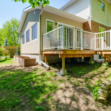
The client had several requests for this project, including large windows to allow maximum natural light. This idea was further added upon by adding sun tunnels in the roof for even more light. The sunroom also features a custom deck on the back of the house with aluminum handrails. The addition to the house was to have its own air conditioning system with custom ceiling tray detailing with crown moulding. This also served to hide the attic hatch with millwork finish. Besides, the sunroom space was designed as both a living room and extra dining space. During the pandemic, it also served as an office and home work hub for their children.
What makes this project appealing is the enhanced natural light being brought into the spaces through large windows and sun tunnels. Other enhancements include a large-scale hexagonal mosaic in marble-looking material to add texture to the wall, as well as the use of accent panels to extend custom hood cabinets to the ceiling. Next, the island in the kitchen can seat 4 comfortably enhancing the usefulness of the space. The colours chosen for the kitchen include off white slab doors and deep rich wood accents and island. The hardware is brushed nickel as well as the light fixture, all to match the plumbing fixtures. Around the walls in the sunroom is custom wainscotting using millwork and casing.
Special work was done on the ceiling, by concealing the beams with bulkheads and then angling them to match the existing bulkheads in the kitchen and original dining room. Besides, a custom appliance garage corner cabinet sits on the countertop which offers convenience and efficiency. The size of the island was maximized to get the most storage space out of it, including a pull-out spice rack and a space for a wine fridge. The unique transition between tile and hardwood was done out of necessity, as the sitting stools had to sit on only one medium. Plus, it is a unique way to transition from two different flooring materials!
The unique challenges of this project include the wood to tile interface. This was required for the sitting stools to rest on only one medium. This design feature turned out to be an attractive solution to the design problem. This solution was also used at the patio door entrance. The plumbing in this project was challenging since it connected to an existing reverse osmosis system. There was a large beam in the kitchen ceiling which interfered with lighting placement. Additionally, picking a complimentary wood colour which would go with the existing flooring was challenging. The overall design of the addition took extra time to make the space well-used as the lot itself was an irregular shape.
 OakWood Designers & Builders
The renovation of the project included a main floor renovation which included a brand-new kitchen and a sunroom addition. This renovation revised the space in the kitchen area by removing a load-bearing wall and relocating the mechanical and electrical systems inside. This freed up space and allowed for a more open design in the kitchen area.
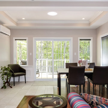
The client had several requests for this project, including large windows to allow maximum natural light. This idea was further added upon by adding sun tunnels in the roof for even more light. The sunroom also features a custom deck on the back of the house with aluminum handrails. The addition to the house was to have its own air conditioning system with custom ceiling tray detailing with crown moulding. This also served to hide the attic hatch with millwork finish. Besides, the sunroom space was designed as both a living room and extra dining space. During the pandemic, it also served as an office and home work hub for their children.
What makes this project appealing is the enhanced natural light being brought into the spaces through large windows and sun tunnels. Other enhancements include a large-scale hexagonal mosaic in marble-looking material to add texture to the wall, as well as the use of accent panels to extend custom hood cabinets to the ceiling. Next, the island in the kitchen can seat 4 comfortably enhancing the usefulness of the space. The colours chosen for the kitchen include off white slab doors and deep rich wood accents and island. The hardware is brushed nickel as well as the light fixture, all to match the plumbing fixtures. Around the walls in the sunroom is custom wainscotting using millwork and casing.
Special work was done on the ceiling, by concealing the beams with bulkheads and then angling them to match the existing bulkheads in the kitchen and original dining room. Besides, a custom appliance garage corner cabinet sits on the countertop which offers convenience and efficiency. The size of the island was maximized to get the most storage space out of it, including a pull-out spice rack and a space for a wine fridge. The unique transition between tile and hardwood was done out of necessity, as the sitting stools had to sit on only one medium. Plus, it is a unique way to transition from two different flooring materials!
The unique challenges of this project include the wood to tile interface. This was required for the sitting stools to rest on only one medium. This design feature turned out to be an attractive solution to the design problem. This solution was also used at the patio door entrance. The plumbing in this project was challenging since it connected to an existing reverse osmosis system. There was a large beam in the kitchen ceiling which interfered with lighting placement. Additionally, picking a complimentary wood colour which would go with the existing flooring was challenging. The overall design of the addition took extra time to make the space well-used as the lot itself was an irregular shape.
Find the right local pro for your project

 AlliKristé Custom Cabinetry and Kitchen Design
Beautiful, relaxing bathrooms....
Example of a mid-sized trendy 3/4 porcelain tile and beige floor alcove shower design in Tampa with shaker cabinets, dark wood cabinets, blue walls, a vessel sink, solid surface countertops and a hinged shower door
Example of a mid-sized trendy 3/4 porcelain tile and beige floor alcove shower design in Tampa with shaker cabinets, dark wood cabinets, blue walls, a vessel sink, solid surface countertops and a hinged shower door

 Natural Stone Institute
Tucker Design Awards celebrate the innovation and vision that designers bring to their projects through the specification and use of natural stone materials. For members of the Natural Stone Institute, acknowledgment as a contributor to a Tucker Design Awards winning project is a genuine tribute to their traditional values, physicality of work, and dedication to precise specifications required in the realization of such accomplished architectural design.
Landscape Architect
Design Workshop, Aspen, CO
Landscape Contractor/
Installer
Landscape Workshop, Carbondale, CO
Stone Installer
JD Masonry, Arvada, CO
Stone Suppliers
Coldspring, Cold Spring, MN
Gallegos Corporation, Vail, CO
Through a collective dialogue between landscape, architecture and interior design, a new vision reimagines the disturbed site into a livable landscape, emblematic of our American West. The residence – an ensemble of structures designed in a modern ranch vernacular – is effortlessly unified through layered, interconnected outdoor gathering spaces and regional materials that elaborates upon the experience of moving between structures, heightening and renewing one’s sense of place. Upon entering the courtyard, one is immediately aware of seamless and unfolding relationships between architecture and landscape through a sophisticated, regional palette of natural stone, water, and plants. Set upon architectural focal points, two perpendicular sandstone paths descend into the space and converge upon a monolithic, hand-carved granite fountain. The design of the fountain is purposefully quiet, both in its detailing and operation. The feature includes a recessed interior, allowing water to become still before it reaches the surface, with lightly cleft sides, allowing the water to delicately bounce as it descends into the geometric lower granite basin. The landscape architect’s selection of various stone material extends the tones of the home’s granite walls and contextual surroundings into the garden, but also be detailed in a manner that balances rural and modern qualities. The majority of the paving is constructed of rectilinear gray sandstone with a natural finish and snapped edges, laid in a staggered running bond organization. Throughout the garden, thoughtful attention was also given to the configuration and layout of terraces, pathways, and steps. In doing so, this ensured that the edges of the terrace and its interface to other elements were designed so that no “leftover” stone paver pieces would be found. Within the central courtyard, split-faced stone stairs descend into a rectilinear plinth of lawn, punctuated by a carved granite fire pit. Leveraging the property’s existing topographic relief, a shallow infinity-edge dipping pool abstracts the transparent and cavity-like pools found throughout the Rocky Mountains. The design purposefully achieves the illusion of a larger water feature with the distant pond and offers a refreshing recreational element. Containing the infinity edge, a designed granite escarpment emerges from the meadow, juxtaposing the geometric water feature and providing informal seating ledges. The site’s prior use required the landscape architect to incorporate a highly technical and complex sub-surface structural system. The initial geotechnical report identified the building envelopes rested on 12 feet of man-placed fill. Assuming a 1 percent settlement, the team faced concerns that the terraces would settle up to 12 inches. In response, a grid of structural micro-piles provides the necessary foundation for the construction of terraces immediately outside of the architecture, under the water features and site walls. The solution enabled the crisp detailing and design resolution of the architectural structures to seamlessly connect with the horizontal stone terraces.
 OakWood Designers & Builders
The renovation of the project included a main floor renovation which included a brand-new kitchen and a sunroom addition. This renovation revised the space in the kitchen area by removing a load-bearing wall and relocating the mechanical and electrical systems inside. This freed up space and allowed for a more open design in the kitchen area.
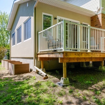
The client had several requests for this project, including large windows to allow maximum natural light. This idea was further added upon by adding sun tunnels in the roof for even more light. The sunroom also features a custom deck on the back of the house with aluminum handrails. The addition to the house was to have its own air conditioning system with custom ceiling tray detailing with crown moulding. This also served to hide the attic hatch with millwork finish. Besides, the sunroom space was designed as both a living room and extra dining space. During the pandemic, it also served as an office and home work hub for their children.
What makes this project appealing is the enhanced natural light being brought into the spaces through large windows and sun tunnels. Other enhancements include a large-scale hexagonal mosaic in marble-looking material to add texture to the wall, as well as the use of accent panels to extend custom hood cabinets to the ceiling. Next, the island in the kitchen can seat 4 comfortably enhancing the usefulness of the space. The colours chosen for the kitchen include off white slab doors and deep rich wood accents and island. The hardware is brushed nickel as well as the light fixture, all to match the plumbing fixtures. Around the walls in the sunroom is custom wainscotting using millwork and casing.
Special work was done on the ceiling, by concealing the beams with bulkheads and then angling them to match the existing bulkheads in the kitchen and original dining room. Besides, a custom appliance garage corner cabinet sits on the countertop which offers convenience and efficiency. The size of the island was maximized to get the most storage space out of it, including a pull-out spice rack and a space for a wine fridge. The unique transition between tile and hardwood was done out of necessity, as the sitting stools had to sit on only one medium. Plus, it is a unique way to transition from two different flooring materials!
The unique challenges of this project include the wood to tile interface. This was required for the sitting stools to rest on only one medium. This design feature turned out to be an attractive solution to the design problem. This solution was also used at the patio door entrance. The plumbing in this project was challenging since it connected to an existing reverse osmosis system. There was a large beam in the kitchen ceiling which interfered with lighting placement. Additionally, picking a complimentary wood colour which would go with the existing flooring was challenging. The overall design of the addition took extra time to make the space well-used as the lot itself was an irregular shape.
 OakWood Designers & Builders
The renovation of the project included a main floor renovation which included a brand-new kitchen and a sunroom addition. This renovation revised the space in the kitchen area by removing a load-bearing wall and relocating the mechanical and electrical systems inside. This freed up space and allowed for a more open design in the kitchen area.
The client had several requests for this project, including large windows to allow maximum natural light. This idea was further added upon by adding sun tunnels in the roof for even more light. The sunroom also features a custom deck on the back of the house with aluminum handrails. The addition to the house was to have its own air conditioning system with custom ceiling tray detailing with crown moulding. This also served to hide the attic hatch with millwork finish. Besides, the sunroom space was designed as both a living room and extra dining space. During the pandemic, it also served as an office and home work hub for their children.
What makes this project appealing is the enhanced natural light being brought into the spaces through large windows and sun tunnels. Other enhancements include a large-scale hexagonal mosaic in marble-looking material to add texture to the wall, as well as the use of accent panels to extend custom hood cabinets to the ceiling. Next, the island in the kitchen can seat 4 comfortably enhancing the usefulness of the space. The colours chosen for the kitchen include off white slab doors and deep rich wood accents and island. The hardware is brushed nickel as well as the light fixture, all to match the plumbing fixtures. Around the walls in the sunroom is custom wainscotting using millwork and casing.
Special work was done on the ceiling, by concealing the beams with bulkheads and then angling them to match the existing bulkheads in the kitchen and original dining room. Besides, a custom appliance garage corner cabinet sits on the countertop which offers convenience and efficiency. The size of the island was maximized to get the most storage space out of it, including a pull-out spice rack and a space for a wine fridge. The unique transition between tile and hardwood was done out of necessity, as the sitting stools had to sit on only one medium. Plus, it is a unique way to transition from two different flooring materials!
The unique challenges of this project include the wood to tile interface. This was required for the sitting stools to rest on only one medium. This design feature turned out to be an attractive solution to the design problem. This solution was also used at the patio door entrance. The plumbing in this project was challenging since it connected to an existing reverse osmosis system. There was a large beam in the kitchen ceiling which interfered with lighting placement. Additionally, picking a complimentary wood colour which would go with the existing flooring was challenging. The overall design of the addition took extra time to make the space well-used as the lot itself was an irregular shape.
 Natural Stone Institute
Tucker Design Awards celebrate the innovation and vision that designers bring to their projects through the specification and use of natural stone materials. For members of the Natural Stone Institute, acknowledgment as a contributor to a Tucker Design Awards winning project is a genuine tribute to their traditional values, physicality of work, and dedication to precise specifications required in the realization of such accomplished architectural design.
Landscape Architect
Design Workshop, Aspen, CO
Landscape Contractor/
Installer
Landscape Workshop, Carbondale, CO
Stone Installer
JD Masonry, Arvada, CO
Stone Suppliers
Coldspring, Cold Spring, MN
Gallegos Corporation, Vail, CO
Through a collective dialogue between landscape, architecture and interior design, a new vision reimagines the disturbed site into a livable landscape, emblematic of our American West. The residence – an ensemble of structures designed in a modern ranch vernacular – is effortlessly unified through layered, interconnected outdoor gathering spaces and regional materials that elaborates upon the experience of moving between structures, heightening and renewing one’s sense of place. Upon entering the courtyard, one is immediately aware of seamless and unfolding relationships between architecture and landscape through a sophisticated, regional palette of natural stone, water, and plants. Set upon architectural focal points, two perpendicular sandstone paths descend into the space and converge upon a monolithic, hand-carved granite fountain. The design of the fountain is purposefully quiet, both in its detailing and operation. The feature includes a recessed interior, allowing water to become still before it reaches the surface, with lightly cleft sides, allowing the water to delicately bounce as it descends into the geometric lower granite basin. The landscape architect’s selection of various stone material extends the tones of the home’s granite walls and contextual surroundings into the garden, but also be detailed in a manner that balances rural and modern qualities. The majority of the paving is constructed of rectilinear gray sandstone with a natural finish and snapped edges, laid in a staggered running bond organization. Throughout the garden, thoughtful attention was also given to the configuration and layout of terraces, pathways, and steps. In doing so, this ensured that the edges of the terrace and its interface to other elements were designed so that no “leftover” stone paver pieces would be found. Within the central courtyard, split-faced stone stairs descend into a rectilinear plinth of lawn, punctuated by a carved granite fire pit. Leveraging the property’s existing topographic relief, a shallow infinity-edge dipping pool abstracts the transparent and cavity-like pools found throughout the Rocky Mountains. The design purposefully achieves the illusion of a larger water feature with the distant pond and offers a refreshing recreational element. Containing the infinity edge, a designed granite escarpment emerges from the meadow, juxtaposing the geometric water feature and providing informal seating ledges. The site’s prior use required the landscape architect to incorporate a highly technical and complex sub-surface structural system. The initial geotechnical report identified the building envelopes rested on 12 feet of man-placed fill. Assuming a 1 percent settlement, the team faced concerns that the terraces would settle up to 12 inches. In response, a grid of structural micro-piles provides the necessary foundation for the construction of terraces immediately outside of the architecture, under the water features and site walls. The solution enabled the crisp detailing and design resolution of the architectural structures to seamlessly connect with the horizontal stone terraces.
 Natural Stone Institute
Tucker Design Awards celebrate the innovation and vision that designers bring to their projects through the specification and use of natural stone materials. For members of the Natural Stone Institute, acknowledgment as a contributor to a Tucker Design Awards winning project is a genuine tribute to their traditional values, physicality of work, and dedication to precise specifications required in the realization of such accomplished architectural design.
Landscape Architect
Design Workshop, Aspen, CO
Landscape Contractor/
Installer
Landscape Workshop, Carbondale, CO
Stone Installer
JD Masonry, Arvada, CO
Stone Suppliers
Coldspring, Cold Spring, MN
Gallegos Corporation, Vail, CO
Through a collective dialogue between landscape, architecture and interior design, a new vision reimagines the disturbed site into a livable landscape, emblematic of our American West. The residence – an ensemble of structures designed in a modern ranch vernacular – is effortlessly unified through layered, interconnected outdoor gathering spaces and regional materials that elaborates upon the experience of moving between structures, heightening and renewing one’s sense of place. Upon entering the courtyard, one is immediately aware of seamless and unfolding relationships between architecture and landscape through a sophisticated, regional palette of natural stone, water, and plants. Set upon architectural focal points, two perpendicular sandstone paths descend into the space and converge upon a monolithic, hand-carved granite fountain. The design of the fountain is purposefully quiet, both in its detailing and operation. The feature includes a recessed interior, allowing water to become still before it reaches the surface, with lightly cleft sides, allowing the water to delicately bounce as it descends into the geometric lower granite basin. The landscape architect’s selection of various stone material extends the tones of the home’s granite walls and contextual surroundings into the garden, but also be detailed in a manner that balances rural and modern qualities. The majority of the paving is constructed of rectilinear gray sandstone with a natural finish and snapped edges, laid in a staggered running bond organization. Throughout the garden, thoughtful attention was also given to the configuration and layout of terraces, pathways, and steps. In doing so, this ensured that the edges of the terrace and its interface to other elements were designed so that no “leftover” stone paver pieces would be found. Within the central courtyard, split-faced stone stairs descend into a rectilinear plinth of lawn, punctuated by a carved granite fire pit. Leveraging the property’s existing topographic relief, a shallow infinity-edge dipping pool abstracts the transparent and cavity-like pools found throughout the Rocky Mountains. The design purposefully achieves the illusion of a larger water feature with the distant pond and offers a refreshing recreational element. Containing the infinity edge, a designed granite escarpment emerges from the meadow, juxtaposing the geometric water feature and providing informal seating ledges. The site’s prior use required the landscape architect to incorporate a highly technical and complex sub-surface structural system. The initial geotechnical report identified the building envelopes rested on 12 feet of man-placed fill. Assuming a 1 percent settlement, the team faced concerns that the terraces would settle up to 12 inches. In response, a grid of structural micro-piles provides the necessary foundation for the construction of terraces immediately outside of the architecture, under the water features and site walls. The solution enabled the crisp detailing and design resolution of the architectural structures to seamlessly connect with the horizontal stone terraces.

 RENESA ARCHITECTURE DESIGN INTERIORS
The PentHaus, Gurgaon.
(High-End Luxury Interiors- Residential Category)
2013-14
Built Up Area-
12,000 sq feet approx
Design Team:
RENESA ARCHITECTURE DESIGN INTERIORS,New Delhi
• Sanjay Arora - Founder| Principal Architect
• Sanchit Arora - Studio Head Architect
• Vandana Arora - Interior Designer| Decor Head
• Virender Singh- Studio Technical Head| Architectural Assistant
Photographer-
• Vibhor Yadav - RENESA's Official Photographer.
Social Media Connect:-
RENESA ARCHITECTURE DESIGN INTERIORS STUDIO, New Delhi
www.renesa.in
Contact: +91-9953542461
Tel : 011 455 11 211
Tel : 011 457 00 411
Email: renesa91@gmail.com | sanchit.renesa@gmail.com
Facebook: https://www.facebook.com/renesa.architecture
Instagram: https://www.instagram.com/renesa.architects/
Consultants | Contractors:
• Site Contractor - Mr. Umesh Mehta (Star Construction)
• Mechanical Consultants - TN Engg & Consultants.
• Electrial Consultants - Electro Consultants
"The PentHaus,Gurgaon" - Design Profile.
The Conceptual Design Development-
RENESA ARCHITECTURE DESIGN INTERIORS have recently completed an interiors project for a penthouse(The PentHaus) in Gurgaon.
The basic design requirement as per the client was to divide the floor plates in the penthouse on the basis of public and private relationship.(With the public interaction and services on the lower level with the private interface on the upper level).
The design philosophy as dictated and understood was on the lines of contrast in colors with the play of art and decorative pieces highlighting the depth in the detailing of the accessorization of the whole scale model.
The client's interest in art and design pieces worked in favor for RENESA DESIGN STUDIO as it was a value-addition to the whole interior decor design process.
Credits need to be given to the client for the right selection of art pieces in terms of the color pallet blending into the design philosophy set by RENESA STUDIO.
A mix of contemporary modern with classical essence here and there provides a smooth transition of amalgamation of different design philosophies in a given space model.
The play of solid volumes with double height spaces gives the apartment a very expansive and grand look at the entrance.
Thus a line of communication is created between the public and private zones via the massive chandelier mass structure in the middle of the entrance foyer.
RENESA ARCHITECTURE STUDIO carefully studied and analyzed the given area and the clients requirement for the look and feel for the space (internal decor) and planned the space accordingly. The positioning and placement of art pieces, furniture and furnishings once decided by RENESA was left to the client to decide and they did proper justification to the space with some amazing decor choice to value add to the existing space design by the architects. It is also great to have clients with good design taste as it is always a value addition to the architect's vision.
Each and every space has been demarcated with its own essence of design so that they stand out and give a new experience to the visitor while passing through.
Also, the toilets have been carefully crafted according to the ambience of the space. Different specialized Italian stones for each different toilets gives a new experience for the viewers.
Perhaps the contrasting color pallets of the activity zones change so massively that the eye catching experiential pathway is induced at the lower level of the apartment.
The kitchen area has been expansively designed to give a very airy feeling to the household activities. Huge windows with amazing views provide a perfect setup for a good-to-cook ambiance at any time of the day.
The deck area for the Penthouse has been carefully crafted in terms of keeping the pallet on the green side with a tinge of hardscaping with the lit backdrop of the penthouse adding character to this external space.
Hence, all in all the character of a bling-y yet subtle design space is created at this apartment with more importance given to the transparency of the space transitions with the careful play of the color shade card in the backdrop.


 Leicht Westchester-Greenwich
Example of a minimalist u-shaped concrete floor home design design in New York with an integrated sink, flat-panel cabinets, dark wood cabinets, quartzite countertops, stainless steel appliances and an island

 kimberly peck architect
This brownstone, located in Harlem, consists of five stories which had been duplexed to create a two story rental unit and a 3 story home for the owners. The owner hired us to do a modern renovation of their home and rear garden. The garden was under utilized, barely visible from the interior and could only be accessed via a small steel stair at the rear of the second floor. We enlarged the owner’s home to include the rear third of the floor below which had walk out access to the garden. The additional square footage became a new family room connected to the living room and kitchen on the floor above via a double height space and a new sculptural stair. The rear facade was completely restructured to allow us to install a wall to wall two story window and door system within the new double height space creating a connection not only between the two floors but with the outside. The garden itself was terraced into two levels, the bottom level of which is directly accessed from the new family room space, the upper level accessed via a few stone clad steps. The upper level of the garden features a playful interplay of stone pavers with wood decking adjacent to a large seating area and a new planting bed. Wet bar cabinetry at the family room level is mirrored by an outside cabinetry/grill configuration as another way to visually tie inside to out. The second floor features the dining room, kitchen and living room in a large open space. Wall to wall builtins from the front to the rear transition from storage to dining display to kitchen; ending at an open shelf display with a fireplace feature in the base. The third floor serves as the children’s floor with two bedrooms and two ensuite baths. The fourth floor is a master suite with a large bedroom and a large bathroom bridged by a walnut clad hall that conceals a closet system and features a built in desk. The master bath consists of a tiled partition wall dividing the space to create a large walkthrough shower for two on one side and showcasing a free standing tub on the other. The house is full of custom modern details such as the recessed, lit handrail at the house’s main stair, floor to ceiling glass partitions separating the halls from the stairs and a whimsical builtin bench in the entry.
 Green Gorge Construction
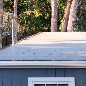
Due to its deteriorating condition, the asphalt roll roofing on this ADU required replacement before the Fall rains. Asphalt roll roofing generally lasts only 5-10 years, leading to ongoing maintenance challenges. The original 1×10 sheathing showed significant sagging in several spots, resulting in standing water not suitable for asphalt. Additionally, there was a complete absence of ventilation after improper installation of R-21 fiberglass insulation, leaving no air gap between the sheathing and insulation. A noticeable hump along the center of the roof indicated that the load-bearing wall had been supporting that section since construction, contributing to light sagging between the walls.
The old roof was completely removed down to the joists, revealing a solid base for the new installation. The central hump was eliminated by shaving the high point along that line. 2×6 beams were ripped in half then nailed on top of the existing joists, creating a 1.5″ gap for insulation and providing strong attachment points for the OSB sheathing, which was secured with screws to prevent any potential issues with nail heads popping through over the roof’s expected lifespan of over 50 years. The EPDM membrane was then adhered using glue and contact cement along the edges of each sheet, with the ends folded over the roof edges and secured with termination bars. Drip edge flashing was added and taped to ensure a water-tight seal, and EPDM-safe caulking was applied over the seams for additional protection. Finally, all exposed wood was primed and painted.
The new roof features a 60mil commercial-grade EPDM rubber membrane, offering a lifespan exceeding 50 years, in stark contrast to the 5-10 year lifespan of asphalt roll roofing.
Using two sheets of EPDM for installation streamlined the process, resulting in one single seam across the entire roof, compared to the asphalt roll’s dimensions of 3 feet wide by 33 feet long, which created 8 vertical seams and 9 horizontal seams—significantly increasing the risk of leakage and failure. Wrapping the rubber over the edge of the roof effectively addressed concerns about water infiltration at the edges, an issue prevalent with the asphalt and drip edge interface.
Another benefit to removing the splitting 1×10 decking and replacing it with OSB sheathing is the increase in structural integrity, moisture resistance, longevity and consistency.
The project successfully transformed the ADU’s roof from a maintenance-prone asphalt roll system to a highly durable 60mil EPDM rubber membrane. By addressing critical structural issues, including sagging sheathing and inadequate ventilation, the team ensured that the new roof not only offers superior water resistance and longevity but also meets higher performance standards for insulation and durability. The replacement process eliminated common weak points, such as numerous seams and poor edge sealing, which were vulnerabilities in the old roofing system. The result is a streamlined, secure installation that provides peace of mind and long-term value, with a lifespan extending well beyond the original roof.

 Kitchen & Bath Gallery
This kitchen features Fieldstone Custom Cabinetry in the Stratford door style with a clean white finish. There are stacked cabinets that reach the tray ceiling with clear glass fronts ion the upper level. The backsplash features the 3x6 ceramic subway tile in Grigio from Cancos' Whisper line. Kohler fixtures were used, including the Whitehaven apron front sink and the Artifacts kitchen & prep faucets. A filtered hot-cold water dispenser from Insinkerator was also chosed to complement the faucets. Hardware, including cup pulls, is from Top Knobs' Somerset Weston line in Antique Pewter. The Sub-Zero, Wolf, and Basko appliances were paneled and installed with the flush-inset approach, to keep a streamlined look with the cabinets. A rectangular island includes a prep sink and double-ogee edge treatment on Silestone's Cygnus color. The decorative wood hood from Stanici delivers a focal point with beautiful curved lines, found also above & below the refrigerator and the shape of the cup pulls. An appliance garage was also included to keep the counters clutter-free.
Photography By: Kyle J Caldwell

 Ginkgo Leaf Studio
Runnels in the concrete function to drain water out of the patio area but also add a subtle inlay detail. Here the runnel is filled with both beach pebbles and dry-laid bluestone.
Renn Kuhnen Photography
 Klopf Architecture
Malibu Glass Box House by Klopf Architecture
Following the devastating Woolsey Fire of 2018, the site in Malibu offered a unique opportunity to rebuild not just a home, but a new architectural composition that highlighted the property’s potential while navigating strict fire-rebuild codes in the area. Designed by Klopf Architecture, this project embraced a set of limitations and translated them into an architectural asset.
The city’s fire-rebuild process required the new structure to remain close to the original footprint, size and bulk, a constraint that ultimately clarified the architectural direction. Perched near the front of a long, narrow lot, the new home frames and overlooks a private, park-like rear expanse, an uncommon luxury especially in this part of Malibu .
Without a fixed program, the design process allowed for a different kind of creative focus allowing Klopf Architecture the opportunity to explore how a modernist home could best respond to this site. The team approached the project not with a list of requirements, but with a question: How might a modernist live here? What spatial qualities would inspire calm, connection, and a sense of wonder in this setting? The process became less about problem-solving and more about architectural storytelling—letting the site, the light, and the principles of modern design guide the form and flow of the home.
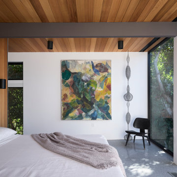
The response emerged in the form of a glass-box pavilion, an open, Mid-Century Modern inspired living, dining, and kitchen space that floats at the edge of the property’s natural descent. Connected to the more enclosed, private areas of the home by a glass-walled hallway, the living pavilion becomes a distinct centerpiece of the design. It opens on all four sides to the landscape with decks and patios on the flanks, an internal garden and water feature to the north, and a dramatic unguarded view of the expansive backyard and ocean horizon to the south.
Because of the mandated footprint, careful planning was required to ensure every space could still engage with light, landscape, or both. Strategic voids in the form of atriums and courtyards allow daylight to filter deep into the home’s core, while offering moments of surprise and retreat. These design gestures allow natural light to filter deep into the interior, creating a sense of brightness and openness throughout the day. At the same time, they expand the perceptual boundaries between inside and out, making the home feel more expansive while anchoring its connection to the surrounding landscape.
The siting of the house is what gives it its unique character. Rather than receding into the backyard like the neighboring homes, the house holds a slight prominence. From the central living pavilion, stepping down into the landscape feels more like entering a secluded park where a separate existing accessory structure, trail, and recreational areas await. The home’s modest street presence gives way to this unfolding drama of space, view, and nature.
Fire-resilient materials and assemblies are integrated seamlessly throughout including triple-pane glazing, under-slab and roof insulation, and locally sourced fire-rated cladding ensure the house not only meets Calfornia’s rigorous wildland-urban interface (WUI) standards, but feels effortlessly aligned with them. While technical decisions like fire-hardening and mechanical systems presented some construction challenges, particularly around the cantilevered glass box, the team found a functional compromise that preserved the integrity of the design.
Inside, a restrained palette and exposed post and beam design celebrate the ethos of mid-century modernism. A central circulation spine extends from the entry to the rear glass wall, offering a continuous visual link from street to ocean. Spaces such as the library and office, though more intimate in scale, are never cut off from nature as each opens to its own unique courtyard or garden view.
Though born out of a strict regulatory framework and developed without a specific client, the rebuild design unfolded with remarkable clarity. Grounded in site logic, refined by limitations and an emphasis on timeless spatial relationships – light, proportion, and a strong connection to nature, the resulting design feels both effortless and uplifting. The home lives lightly on the land, opens generously to its surroundings, and strikes a careful balance between privacy, openness, and calm. For Klopf Architecture, it stands as a compelling case study in how site, code, and circumstantial constraints can inspire enduring, modernist architecture. With years of experience reimagining mid-century modern design for how people live today, the firm took the project’s limitations as an opportunity. The result is a home shaped by open, flowing spaces, strong indoor-outdoor connections, and a calm, clear sense of structure. It’s a good reminder that even with strict constraints, there’s still room for architecture to breathe—and for modernism to keep moving forward.
Klopf Architecture project team: Geoff Campen, John Klopf, AIA, and Sherry Tan
Structural Engineer: ZFA
Contractor: Maison D’Artiste
Photography: ©2025 Mariko Reed
Year Completed: 2023

 Thyme & Place Design LLC
This small kitchen packs a powerful punch. By replacing an oversized sliding glass door with a 24" cantilever which created additional floor space. We tucked a large Reid Shaw farm sink with a wall mounted faucet into this recess. A 7' peninsula was added for storage, work counter and informal dining. A large oversized window floods the kitchen with light. The color of the Eucalyptus painted and glazed cabinets is reflected in both the Najerine stone counter tops and the glass mosaic backsplash tile from Oceanside Glass Tile, "Devotion" series. All dishware is stored in drawers and the large to the counter cabinet houses glassware, mugs and serving platters. Tray storage is located above the refrigerator. Bottles and large spices are located to the left of the range in a pull out cabinet. Pots and pans are located in large drawers to the left of the dishwasher. Pantry storage was created in a large closet to the left of the peninsula for oversized items as well as the microwave. Additional pantry storage for food is located to the right of the refrigerator in an alcove. Cooking ventilation is provided by a pull out hood so as not to distract from the lines of the kitchen.
 Klopf Architecture
Malibu Glass Box House by Klopf Architecture
Following the devastating Woolsey Fire of 2018, the site in Malibu offered a unique opportunity to rebuild not just a home, but a new architectural composition that highlighted the property’s potential while navigating strict fire-rebuild codes in the area. Designed by Klopf Architecture, this project embraced a set of limitations and translated them into an architectural asset.
The city’s fire-rebuild process required the new structure to remain close to the original footprint, size and bulk, a constraint that ultimately clarified the architectural direction. Perched near the front of a long, narrow lot, the new home frames and overlooks a private, park-like rear expanse, an uncommon luxury especially in this part of Malibu .
Without a fixed program, the design process allowed for a different kind of creative focus allowing Klopf Architecture the opportunity to explore how a modernist home could best respond to this site. The team approached the project not with a list of requirements, but with a question: How might a modernist live here? What spatial qualities would inspire calm, connection, and a sense of wonder in this setting? The process became less about problem-solving and more about architectural storytelling—letting the site, the light, and the principles of modern design guide the form and flow of the home.
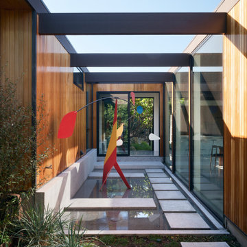
The response emerged in the form of a glass-box pavilion, an open, Mid-Century Modern inspired living, dining, and kitchen space that floats at the edge of the property’s natural descent. Connected to the more enclosed, private areas of the home by a glass-walled hallway, the living pavilion becomes a distinct centerpiece of the design. It opens on all four sides to the landscape with decks and patios on the flanks, an internal garden and water feature to the north, and a dramatic unguarded view of the expansive backyard and ocean horizon to the south.
Because of the mandated footprint, careful planning was required to ensure every space could still engage with light, landscape, or both. Strategic voids in the form of atriums and courtyards allow daylight to filter deep into the home’s core, while offering moments of surprise and retreat. These design gestures allow natural light to filter deep into the interior, creating a sense of brightness and openness throughout the day. At the same time, they expand the perceptual boundaries between inside and out, making the home feel more expansive while anchoring its connection to the surrounding landscape.
The siting of the house is what gives it its unique character. Rather than receding into the backyard like the neighboring homes, the house holds a slight prominence. From the central living pavilion, stepping down into the landscape feels more like entering a secluded park where a separate existing accessory structure, trail, and recreational areas await. The home’s modest street presence gives way to this unfolding drama of space, view, and nature.
Fire-resilient materials and assemblies are integrated seamlessly throughout including triple-pane glazing, under-slab and roof insulation, and locally sourced fire-rated cladding ensure the house not only meets Calfornia’s rigorous wildland-urban interface (WUI) standards, but feels effortlessly aligned with them. While technical decisions like fire-hardening and mechanical systems presented some construction challenges, particularly around the cantilevered glass box, the team found a functional compromise that preserved the integrity of the design.
Inside, a restrained palette and exposed post and beam design celebrate the ethos of mid-century modernism. A central circulation spine extends from the entry to the rear glass wall, offering a continuous visual link from street to ocean. Spaces such as the library and office, though more intimate in scale, are never cut off from nature as each opens to its own unique courtyard or garden view.
Though born out of a strict regulatory framework and developed without a specific client, the rebuild design unfolded with remarkable clarity. Grounded in site logic, refined by limitations and an emphasis on timeless spatial relationships – light, proportion, and a strong connection to nature, the resulting design feels both effortless and uplifting. The home lives lightly on the land, opens generously to its surroundings, and strikes a careful balance between privacy, openness, and calm. For Klopf Architecture, it stands as a compelling case study in how site, code, and circumstantial constraints can inspire enduring, modernist architecture. With years of experience reimagining mid-century modern design for how people live today, the firm took the project’s limitations as an opportunity. The result is a home shaped by open, flowing spaces, strong indoor-outdoor connections, and a calm, clear sense of structure. It’s a good reminder that even with strict constraints, there’s still room for architecture to breathe—and for modernism to keep moving forward.
Klopf Architecture project team: Geoff Campen, John Klopf, AIA, and Sherry Tan
Structural Engineer: ZFA
Contractor: Maison D’Artiste
Photography: ©2025 Mariko Reed
Year Completed: 2023

 Jack Calderone
This bedroom and full bathroom are part of an adventuresome project my wife and I embarked upon to create a complete apartment in the basement of our townhouse. We designed a floor plan that creatively and efficiently used all of the 385-square-foot-space, without sacrificing beauty, comfort or function – and all without breaking the bank! To maximize our budget, we did the work ourselves and added everything from thrift store finds to DIY wall art to bring it all together.
A partial double closet bar adds a little extra space while still leaving room for longer hanging clothes.
62