
Search results for "Interior renovation" in Home Design Ideas

 Imery Group
Sunroom - mid-sized traditional ceramic tile and multicolored floor sunroom idea in Atlanta with a wood stove and a skylight

 ZeroEnergy Design
This renovated brick rowhome in Boston’s South End offers a modern aesthetic within a historic structure, creative use of space, exceptional thermal comfort, a reduced carbon footprint, and a passive stream of income.
DESIGN PRIORITIES. The goals for the project were clear - design the primary unit to accommodate the family’s modern lifestyle, rework the layout to create a desirable rental unit, improve thermal comfort and introduce a modern aesthetic. We designed the street-level entry as a shared entrance for both the primary and rental unit. The family uses it as their everyday entrance - we planned for bike storage and an open mudroom with bench and shoe storage to facilitate the change from shoes to slippers or bare feet as they enter their home. On the main level, we expanded the kitchen into the dining room to create an eat-in space with generous counter space and storage, as well as a comfortable connection to the living space. The second floor serves as master suite for the couple - a bedroom with a walk-in-closet and ensuite bathroom, and an adjacent study, with refinished original pumpkin pine floors. The upper floor, aside from a guest bedroom, is the child's domain with interconnected spaces for sleeping, work and play. In the play space, which can be separated from the work space with new translucent sliding doors, we incorporated recreational features inspired by adventurous and competitive television shows, at their son’s request.
MODERN MEETS TRADITIONAL. We left the historic front facade of the building largely unchanged - the security bars were removed from the windows and the single pane windows were replaced with higher performing historic replicas. We designed the interior and rear facade with a vision of warm modernism, weaving in the notable period features. Each element was either restored or reinterpreted to blend with the modern aesthetic. The detailed ceiling in the living space, for example, has a new matte monochromatic finish, and the wood stairs are covered in a dark grey floor paint, whereas the mahogany doors were simply refinished. New wide plank wood flooring with a neutral finish, floor-to-ceiling casework, and bold splashes of color in wall paint and tile, and oversized high-performance windows (on the rear facade) round out the modern aesthetic.
RENTAL INCOME. The existing rowhome was zoned for a 2-family dwelling but included an undesirable, single-floor studio apartment at the garden level with low ceiling heights and questionable emergency egress. In order to increase the quality and quantity of space in the rental unit, we reimagined it as a two-floor, 1 or 2 bedroom, 2 bathroom apartment with a modern aesthetic, increased ceiling height on the lowest level and provided an in-unit washer/dryer. The apartment was listed with Jackie O'Connor Real Estate and rented immediately, providing the owners with a source of passive income.
ENCLOSURE WITH BENEFITS. The homeowners sought a minimal carbon footprint, enabled by their urban location and lifestyle decisions, paired with the benefits of a high-performance home. The extent of the renovation allowed us to implement a deep energy retrofit (DER) to address air tightness, insulation, and high-performance windows. The historic front facade is insulated from the interior, while the rear facade is insulated on the exterior. Together with these building enclosure improvements, we designed an HVAC system comprised of continuous fresh air ventilation, and an efficient, all-electric heating and cooling system to decouple the house from natural gas. This strategy provides optimal thermal comfort and indoor air quality, improved acoustic isolation from street noise and neighbors, as well as a further reduced carbon footprint. We also took measures to prepare the roof for future solar panels, for when the South End neighborhood’s aging electrical infrastructure is upgraded to allow them.
URBAN LIVING. The desirable neighborhood location allows the both the homeowners and tenant to walk, bike, and use public transportation to access the city, while each charging their respective plug-in electric cars behind the building to travel greater distances.
OVERALL. The understated rowhouse is now ready for another century of urban living, offering the owners comfort and convenience as they live life as an expression of their values.
Photography: Eric Roth Photo

 Anchor Builders
Builder: Anchor Builders / Building design by Fluidesign Studio and Anchor Builders. Interior finishes by Fluidesign Studio. Plans drafted by Fluidesign Studio and Orfield Drafting / Photos: Seth Benn Photography
Find the right local pro for your project

 Studio Dearborn
This expansive Victorian had tremendous historic charm but hadn’t seen a kitchen renovation since the 1950s. The homeowners wanted to take advantage of their views of the backyard and raised the roof and pushed the kitchen into the back of the house, where expansive windows could allow southern light into the kitchen all day. A warm historic gray/beige was chosen for the cabinetry, which was contrasted with character oak cabinetry on the appliance wall and bar in a modern chevron detail. Kitchen Design: Sarah Robertson, Studio Dearborn Architect: Ned Stoll, Interior finishes Tami Wassong Interiors

 User
Photographer: David Duncan Livingston
Example of an island style formal and enclosed living room design in San Francisco
Example of an island style formal and enclosed living room design in San Francisco

 Hungerford Interior Design
Laundry closet in a Shaughnessy townhouse renovation in Vancouver by Hungerford Interior Design, with stacked washer and dryer, dog-print wallpaper and light wood cabinetry.

 KraftMaster Renovations
Custom double vanity with perfect pull-out storage for hair products and organization!
Photos by Chris Veith
Large elegant master white tile and mosaic tile marble floor and white floor bathroom photo in New York with beaded inset cabinets, an undermount tub, an undermount sink, quartzite countertops, a hinged shower door and white countertops
Large elegant master white tile and mosaic tile marble floor and white floor bathroom photo in New York with beaded inset cabinets, an undermount tub, an undermount sink, quartzite countertops, a hinged shower door and white countertops
Sponsored
Columbus, OH

Hope Restoration & General Contracting
Columbus Design-Build, Kitchen & Bath Remodeling, Historic Renovations

 Guimar Urbina Interiors, Corp.
Argo Studio, Inc.
Emilio Collavino
Bedroom - large transitional master dark wood floor bedroom idea in Miami with gray walls and no fireplace
Bedroom - large transitional master dark wood floor bedroom idea in Miami with gray walls and no fireplace

 Cheryl Ketner Interiors
Interiors by Cheryl Ketner Interiors.
Renovation by Kerry Ketner Services.
Photography by Par Bengtsson.
Foyer - mid-sized transitional dark wood floor foyer idea in Dallas with beige walls
Foyer - mid-sized transitional dark wood floor foyer idea in Dallas with beige walls

 Beverley Broun Interiors
Designer: Beverley Broun Interiors; Photographer: John Cole
Elegant white tile and stone tile alcove shower photo in DC Metro with a console sink, blue walls and an undermount tub
Elegant white tile and stone tile alcove shower photo in DC Metro with a console sink, blue walls and an undermount tub

 mitchell holladay architects
To increase storage at a small laundry room, the adjacent linen closet was split to provide an alcove for a rolling laundry basket. Blind sliding door hardware keeps the hallway minimal and clean.
photography by adam rouse
 ZeroEnergy Design
Modern family loft renovation. A young couple starting a family in the city purchased this two story loft in Boston's South End. Built in the 1990's, the loft was ready for updates. ZED transformed the space, creating a fresh new look and greatly increasing its functionality to accommodate an expanding family within an urban setting. Improvement were made to the aesthetics, scale, and functionality for the growing family to enjoy.
Photos by Eric Roth.
Construction by Ralph S. Osmond Company.
Green architecture by ZeroEnergy Design.

 Kandrac & Kole Interior Designs, Inc.
This was a full gut an renovation. The existing kitchen had very dated cabinets and didn't function well for the clients. A previous desk area was turned into hidden cabinetry to house the microwave and larger appliances and to keep the countertops clutter free. The original pendants were about 4" wide and were inappropriate for the large island. They were replaced with larger, brighter and more sophisticated pendants. The use of panel ready appliances with large matte black hardware made gave this a clean and sophisticated look. Mosaic tile was installed from the countertop to the ceiling and wall sconces were installed over the kitchen window. A different tile was used in the bar area which has a beverage refrigerator and an ice machine and floating shelves. The cabinetry in this area also includes a pullout drawer for dog food.
Sponsored
Plain City, OH

The Creative Kitchen Company
Columbus Area Kitchen Remodeling and Refacing Professional

 threshold interiors
Location: Spring Lake, NJ, US
Our design goal for this renovation and addition was to present a modern interpretation of Colonial Plantation Style. This home features dark wood floors, wood paneling and a light soothing color scheme. The Dining Room features classic silk De Gournay Wallpaper which further fuses the indoor and outdoor seamlessness of the home. The amazing tile installations permeate the decor with color, texture and pattern. The shaker-style kitchen is refreshed by using black cabinetry, a custom stainless hood and La Cornue Range. We enjoyed adding vintage finds throughout - a farm table for the Kitchen, Bergere chairs in the Entry, and a Victorian Flower mirror in the Powder Room. threshold interiors ensures that your beach retreat is elegant, transitional and most importantly comfortable and relaxing!
Photographed by: Michael Partenio

 Lauren Levant
Inspiration for a large modern master gray tile and cement tile gray floor and concrete floor double shower remodel with medium tone wood cabinets, a one-piece toilet, gray walls, a vessel sink, a hinged shower door, black countertops and concrete countertops
 FineLine Kitchens, Inc.
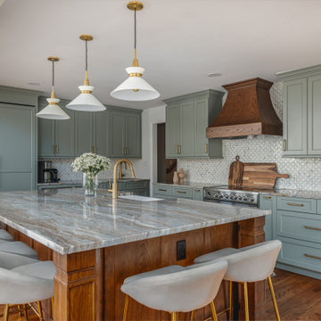
Hi everyone, I'm Sarah and Ogun we are here with fine line kitchens. So we are a couple working together. I do the interior design and remodeling of the space material selection meeting with the clients. And I handled operations outside, you know meaning all the construction work that is taking place the inside. The houses that we work in. I handle all the aspects of the construction, so today's project is very special. We're in Vienna and the client had a very big family. It's a family of seven that lives here. So we had a few aspects that we needed to keep in mind while designing this one. Having everybody be able to sit on the island. So we wanted plenty of seating all the way around. We didn't want anybody standing or anything like that. So what we did is we maximize the space. The center island is the biggest part of the kitchen. We use a natural stone to kind of give it a beautiful texture versus quartz. It's kind of standard white or kind of fabricated, so I wanted something very natural. We did this because I took my inspiration from the outside, so the inspiration if you look at the view right in front of me is there are so many greens there's a lot of brass accents and I wanted to bring this. Into this kitchen while designing it for my clients. She is very warm very. She wanted a very homey, comfy kind of look for the kitchen. So that's what we did today. As you can see, the cabinets are sage green, very light, so I still think it's a neutral, but it's a lighter color that again brings the outside in and we combine that with the oak right behind me so it's a slightly warm oak. It's not very dark. It's not very light. It's a medium brown and the same color went on the island. To kind of tie these two in and the backsplash, my favorite part is where you can see a little bit of design. It is, in my opinion still classic, but includes a pattern so the outside part is as we said in the beginning, is handled by my husband. I'd like him to speak a little bit about that. Thanks, Sarah, I want to talk to you guys a little bit about the construction part of this project. Originally this kitchen was located mostly in this area. They had their stove there sing. It was more of a peninsula layout in Sarah's and the customer vision they wanted. They wanted to get rid of the peninsula and they want to be able to have a huge island that can at least sit seven people because they're familiar with seven. So we wanted to make sure that we can achieve this design and bring it to life so that they can be happy with this layout. Some of the challenges we had, the house, the home being, you know, old home. There were a lot of you know the older electrical and plumbing that had to be replaced. We had to relocate the stove from here to this area. Over here we had put a nice foot fan that we had to relocate all the ductwork and the plumbing. Was being on the peninsula area. We had to relocate it to the center islands. So we achieved all this and kind of like bring it to bring in this kitchen up to date it looks beautiful. That's true, so yes, the old layout did not function for my clients because everything was kind of gathered on one side of the kitchen. So there was like a peninsula right there. So the end of this island kind of continued straight. And that was just the L shape. Kind of where everything was and there used to be another big table here, so they were using only kind of half of the space. So like I said at the beginning, our vision was to kind of feed everybody at the island, create some symmetry. 'cause I love that. So as you can see behind me, this is kind of the focal point symmetrical. Everything is kind of even we wanted to also panel the fridge here so it mimics the pantry and another size. So when you're looking at it, it is bringing again that symmetry back again. I hope you enjoyed this kitchen and this video and I'll see you soon. So how do you think this project turned out? It's nice. I like the color. I think it turned out nice. It's kind of like a little bit different color than what we always do. So I realize. Are you giving me a little bit of credit here that I did something different? Are you proud? I'm so proud of you. Other than that I like it. That they have kind of like a two sink. So if this was our kitchen, if we ever like you can have your own. I can have mine if we ever get into a fight then this can be like my own kitchen. Why are we gonna bring in a fight right now? So I'm cooking anyway. You're grilling most of the time, So what are you even talking about? My kitchen? That's my kitchen. You can just take the small sink. That's fine. It's always good to have your own space right there, so anyways. Thank you guys for watching. We hope to see you soon and if you have any questions please click the link below. It'll lead you to our website, house, YouTube and all of the social media is so nice to have you guys. We'll see you soon. Thanks bye bye-bye.

 Melissa Hill Home Design
When our clients moved into their already built home they decided to live in it for a while before making any changes. Once they were settled they decided to hire us as their interior designers to renovate and redesign various spaces of their home. As they selected the spaces to be renovated they expressed a strong need for storage and customization. They allowed us to design every detail as well as oversee the entire construction process directing our team of skilled craftsmen. The home is a traditional home so it was important for us to retain some of the traditional elements while incorporating our clients style preferences.
Custom designed by Hartley and Hill Design
All materials and furnishings in this space are available through Hartley and Hill Design. www.hartleyandhilldesign.com
888-639-0639
Neil Landino Photography

 threshold interiors
This cute cottage, one block from the beach, had not been updated in over 20 years. The homeowners finally decided that it was time to renovate after scrapping the idea of tearing the home down and starting over. Amazingly, they were able to give this house a fresh start with our input. We completed a full kitchen renovation and addition and updated 4 of their bathrooms. We added all new light fixtures, furniture, wallpaper, flooring, window treatments and tile. The mix of metals and wood brings a fresh vibe to the home. We loved working on this project and are so happy with the outcome!
Photographed by: James Salomon
 Studio Dearborn
INTERNATIONAL AWARD WINNER. 2018 NKBA Design Competition Best Overall Kitchen. 2018 TIDA International USA Kitchen of the Year. 2018 Best Traditional Kitchen - Westchester Home Magazine design awards. The designer's own kitchen was gutted and renovated in 2017, with a focus on classic materials and thoughtful storage. The 1920s craftsman home has been in the family since 1940, and every effort was made to keep finishes and details true to the original construction. For sources, please see the website at www.studiodearborn.com. Photography, Adam Kane Macchia

 Haus Interior Design
Before renovating, this bright and airy family kitchen was small, cramped and dark. The dining room was being used for spillover storage, and there was hardly room for two cooks in the kitchen. By knocking out the wall separating the two rooms, we created a large kitchen space with plenty of storage, space for cooking and baking, and a gathering table for kids and family friends. The dark navy blue cabinets set apart the area for baking, with a deep, bright counter for cooling racks, a tiled niche for the mixer, and pantries dedicated to baking supplies. The space next to the beverage center was used to create a beautiful eat-in dining area with an over-sized pendant and provided a stunning focal point visible from the front entry. Touches of brass and iron are sprinkled throughout and tie the entire room together.
Photography by Stacy Zarin
13