
Search results for "Involve continued" in Home Design Ideas
 Generations Custom Homes
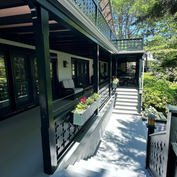
This project involved a complete, top-to-bottom renovation of a classic home originally built in 1920. We took this century-old structure and transformed it into a modern, energy-efficient, and beautifully finished home.
The house was stripped to its bones, allowing us to address the core structure. A critical part of the project was adding comprehensive insulation to the entire building, which previously had none. We installed a full set of new, high-performance windows and doors to further enhance the home's efficiency. A major upgrade included the integration of a high-tech ducted heating and cooling system, bringing state-of-the-art climate control to the entire house.
The exterior was given a complete facelift with brand-new siding, all new exterior trim, and a professional paint job, restoring its timeless curb appeal. The attention to detail continued inside with new trim throughout and a full interior repainting, resulting in a fresh, clean, and move-in-ready space that honors the home's historic character while providing all the comforts of modern living.
 TRUE TO FORM DESIGN
truetoformdesign.com presents another masterful feat in design, craftsmanship and client fulfillment!
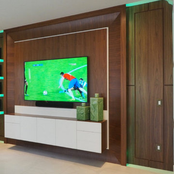
This is a Walnut and Painted exterior TV DISPLAY w/a Walnut interior. The initial concept was to visually keep it simple with the floating cabinets and solid back panels. The actual details and execution in fabricating this piece was quite involved. The cabinet doors & drawers are beveled with the top and bottom of the continual outer shell creating a crisp color transition. The perimeter of the book-matched TV panel has a series of frames utilizing the direction of the grain to reinforce the concave shapes while using a painted boarder to define them. The outer most frame allows us to scribe the unit to the ceiling and create a spacial effect on the sides further enhanced with the RGB LED lighting behind washing color over the extreme end panels. The floating shelves off to one side add the asymmetry needed to allow a reserved amount of display and dynamics.
 Karla Trincanello, CID, Interior Decisions, Inc.
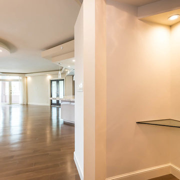
Project involved total demo of a condo in Boca and redesigning the space to an open look for entertaining. Wood laminate flooring adds warmth and durability without fear of warping. Ceiling customized with stepping outlines the spaces and provides for lighting where concrete ceilings would not allow lighting. Woven custom shades and sheer panels create a light air look to the space with views out to the intercoastal. Kitchen is all white, counter top for island is Calacutta white, back splash is white glass installed as three horizontal continuous rows. All doors are customized in espresso wood finish and opague glass centers. Master Bedroom wall is expanded by sliding wood and Lumicor panels of reeds to create a beautiful back drop to the bed. Design by Karla Trincanello.
Photo by Jason Juliano
Find the right local pro for your project
 Angie Finton Designs LLC
This master bathroom is located on the basement slab level of their home, offering a sidewalk and patio for accessibility so creating a space that will be functional, as well as accessible in considering the future was necessary.
Must have's: Ease of cleaning, accessibility, walk in bathroom, jetted tub, led partial moon mirror design, moody- contemporary feel.
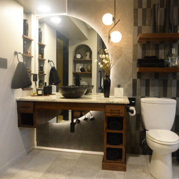
We created a walk in shower with large format tile for less grout along the full back wall with a subway tile feature to break up space between the vanity and the shower. This same subway theme, mixed from 3 tiles, was matched on the opposing tub wall with a mirrored niche and large format tile for continuity, and flow. The door was changed to a barndoor with a recessed mirror, this allows both function and provides a wide opening. The client can access the bathroom through either the hall or their master bathroom with a zero threshold entry into the bathroom and into the shower. The rounded niche mimics the rounded mirror. Custom dark stained and black wood set off this moody modern bathroom down to the exposed vanity bottle trap and plumb lines, with varying dimmers and lighting to set off this moody vibe. The homeowners were involved every step of the way, down to the custom quartzite countertop. Layout, space planning, design, rendering and plumbing provided by Angie Finton Designs. The amazing and wonderful styling decorations were completed by the homeowner.
 Cabinets 4U, Inc.
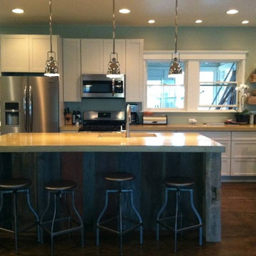
Rustic + Modern. That is the vision this homeowner had for her new kitchen. After purchasing this house, one of the big changes was removing a wall, and opening up the space. This gave us the space for a huge island, and a dramatic focal point.
The design concept was driven by the client’s vision, and involved prominent use of reclaimed barn wood. From the beginning, 2 major uses of the barn wood were planned – wrapping the island, and construction of a sliding “barn” door.
With these focal points in mind, the cabinetry was kept clean and simple. A shaker door style was chosen in maple, painted with a soft gray-toned white. Poured concrete countertops continue the neutral background, allowing the barn wood to keep center stage.
The mix: rustic + modern. The rustic details include the sliding door hardware, period stools, and the reclaimed-lumber open shelves with the primitive dishware display. These details are seamlessly melded with modern elements, including the contemporary light fixtures and faucet. Other modern touches include the brushed-stainless accessories.
This kitchen design includes an impressive 8’ island, with generous prep and seating areas. The main wall offers over 19’ of cabinetry, and features an immense amount of storage. Across the room, 2 custom pantry cabinets expand the storage options.
All in all, a timeless and unique kitchen that we were proud to be a part of!
 LAUP
LAUPItalain description:
Riqualificazione ambientale-paesaggistica del lago Fontana
Primo premio Ex Aequo | Paysage City’Scape Award
Menzione speciale | Premio Triennale Fare Paesaggio
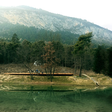
L’intervento prevede la creazione di un itinerario in dialogo costante con la topografia del territorio che si adatta alla sua naturale configurazione, in modo tale da minimizzare l’impatto ambientale e percettivo. Il frequente alternarsi delle quote di calpestio del terreno ha offerto l’occasione di ottenere una pavimentazione piana continua e di una piccola terrazza panoramica che si colloca circa a metà del percorso.
. . .
English description:
Environmental and landscape renovation of lake Fontana
First prize Ex Aequo | Paysage City’Scape Award
Special mention | Premio Triennale Fare Paesaggio
The intervention involves the creation of an itinerary in constant dialogue with the topography of the area, that adapts to its natural configuration in such a way as to minimize the environmental and perceptive impact. The frequent alternation of the levels of the ground offered the opportunity to obtain a continuous flat pavement and a small panoramic terrace which is located approximately halfway along the route.
 Drury Design
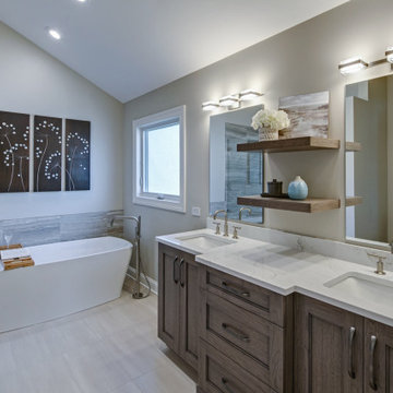
This update involved keeping the existing floorplan while using new materials to bring the space up to date.
Design objectives
-Modernize the space
-Use eye-catching tile
-Vanity with more storage
-Brighter finish on plumbing fixtures
Design challenges:
-Get more storage/functionality out of the same vanity space
-Tile selection – finding the right combination for the large the space
-Material selection – getting that wow-factor effect without being able to move walls or plumbing. This refresh was all about choosing materials with impact.
-Bringing in more light in a space somewhat defined by an existing vaulted ceiling.
Design solutions:
-Removed the old built-in tub look and replaced it with a sleek freestanding tub
-Continued the same tile from the shower walls behind the freestanding tub for a beautiful look on the back wall when you walk into the space
-Created a vanity with undermount sinks, all at one level to gain more countertop space
-Added floating shelves by the vanity – this added more options for decor and easy access to everyday items
-Large-format tile = less visible grout
 My Kitchen And Bath
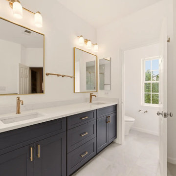
A complete primary bathroom remodel in Springfield, Virginia, designed around three priorities our clients came in with: a real walk-in shower, a freestanding tub by the windows, and a proper double vanity with storage that actually worked.
The original layout had everything in the wrong place. The tub sat against an interior wall away from the natural light. A small stall shower took up real estate across the room. The vanity was squeezed into whatever space was left over. Three windows on the back wall were doing nothing for the room because the layout was fighting them. Our solution involved knocking down the dividing wall between the old shower and vanity area, relocating plumbing for both the tub and the new vanities, and placing the freestanding tub directly under the bay of windows so morning light became part of the experience.
Design Approach
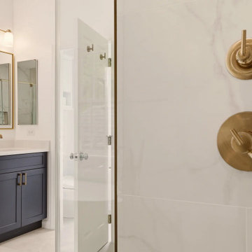
We anchored the room around contrast: deep navy cabinetry against soft white walls, warm brushed gold against cool marble tile, sharp Shaker lines against the curved silhouette of the freestanding tub. Navy was the design decision the rest of the room was built around — the clients knew they wanted color but didn't want anything that would feel dated in five years. Navy reads bold without being loud, pairs with virtually any metal finish, and has staying power that trendier choices don't.
We used Fabuwood Galaxy Indigo for the vanities — all-plywood construction with solid wood doors and drawer fronts, soft close throughout. Shaker-style flat panels keep the navy from feeling heavy. The brushed gold (Jeffrey Alexander 635-96SBZ in satin bronze) shows up across hardware, faucets, lighting, the tub filler, and the shower trim, creating a quiet continuity throughout the room.
The Shower
Removing the wall between the old shower and old vanity area created room for a proper walk-in. We tiled the entire shower floor to ceiling in Decovita Calacatta Suave 24x48" porcelain — large format installed in a 50% offset horizontal pattern, with cement board and redgard underneath. The marble-look porcelain gives the visual depth of natural marble without the maintenance.
A built-in shower bench, custom-built into the corner, is wrapped in the same wall tile on the front with a quartz top matching the vanity counter. The shower niche is detailed with MSI Arabescato Carrara 2" honed hex mosaic at the back, the same tile used on the shower floor. All tile edges are finished with Schluter in satin bronze to match the room's metal finishes. The shower door is custom frameless 3/8" tempered glass with a satin bronze pull — no metal frame interrupting the sight line.
The Vanities and Countertops
The new double vanity gives both clients their own space for morning routines. Counter tops are MSI Calacatta Miraggio Cielo quartz with pencil edging and a 4" backsplash — a soft white with subtle gray veining that reads like real Calacatta marble without the porosity issues. Two undermount square porcelain sinks finish the surface cleanly.
The Tub
A 60" freestanding soaker tub sits under the bay of three windows. The floor-mounted tub filler is satin bronze with a handheld sprayer. We relocated the drain and supply lines to make the centered placement work. The tub is the room's quietest feature and its strongest — clients tell us they use this bathroom differently than they used the old one.
Flooring
MSI Sande Ivory 12x24" matte porcelain runs throughout the bathroom floor in a 50% offset pattern parallel to the vanity wall. Cement board underneath, 4" white wood baseboard, Whisper Grey grout that handles daily use without showing wear.
Paint and Lighting
Walls are Benjamin Moore Chantilly Lace 2121-70 in satin — a true crisp white that doesn't lean cool or warm. The ceiling uses Benjamin Moore Aura Bath and Spa White, which is formulated to resist mildew in high-humidity spaces. Lighting is layered: three new 6" LED recessed lights on a dimmer, two satin bronze vanity sconces above the mirrors, and the existing three windows providing the daytime ambient light.
Project Specs
Location: Springfield, Virginia
Project type: Full primary bathroom remodel
Project duration: Approximately 5 weeks
Style: Modern, Transitional
Color palette: Navy, white, brushed gold, marble
Materials
Cabinetry: Fabuwood Galaxy Indigo, Shaker-style flat panel maple, all-plywood construction
Cabinet hardware: Jeffrey Alexander 635-96SBZ Satin Bronze pulls
Vanity counter and bench top: MSI Calacatta Miraggio Cielo Quartz, pencil edge with 4" backsplash
Sinks: Undermount white porcelain BR-202 square (x2)
Wall tile: Decovita Calacatta Suave 24x48" porcelain
Floor tile: MSI Sande Ivory 12x24" matte porcelain
Shower floor + niche back: MSI Arabescato Carrara 2" honed hex mosaic marble
Edge trim: Schluter satin bronze
Shower door: Custom frameless 3/8" tempered glass
Tub: 60" freestanding acrylic soaker (Ferguson)
Tub filler: Floor-mounted satin bronze (Ferguson)
Vanity faucets, mirrors, sconces, toilet: Satin bronze coordinated finishes (Ferguson)
Wall paint: Benjamin Moore Chantilly Lace 2121-70 Satin
Ceiling paint: Benjamin Moore Aura Bath and Spa White
Grout: Whisper Grey (floor), Standard White (walls and shower)
Designed and built by My Kitchen and Bath out of our Alexandria showroom at 5710 General Washington Drive. We've been designing and building kitchens, bathrooms, and full home renovations across Northern Virginia and the DMV since 1994.
 My Kitchen And Bath
A complete primary bathroom remodel in Springfield, Virginia, designed around three priorities our clients came in with: a real walk-in shower, a freestanding tub by the windows, and a proper double vanity with storage that actually worked.
The original layout had everything in the wrong place. The tub sat against an interior wall away from the natural light. A small stall shower took up real estate across the room. The vanity was squeezed into whatever space was left over. Three windows on the back wall were doing nothing for the room because the layout was fighting them. Our solution involved knocking down the dividing wall between the old shower and vanity area, relocating plumbing for both the tub and the new vanities, and placing the freestanding tub directly under the bay of windows so morning light became part of the experience.
Design Approach
We anchored the room around contrast: deep navy cabinetry against soft white walls, warm brushed gold against cool marble tile, sharp Shaker lines against the curved silhouette of the freestanding tub. Navy was the design decision the rest of the room was built around — the clients knew they wanted color but didn't want anything that would feel dated in five years. Navy reads bold without being loud, pairs with virtually any metal finish, and has staying power that trendier choices don't.
We used Fabuwood Galaxy Indigo for the vanities — all-plywood construction with solid wood doors and drawer fronts, soft close throughout. Shaker-style flat panels keep the navy from feeling heavy. The brushed gold (Jeffrey Alexander 635-96SBZ in satin bronze) shows up across hardware, faucets, lighting, the tub filler, and the shower trim, creating a quiet continuity throughout the room.
The Shower
Removing the wall between the old shower and old vanity area created room for a proper walk-in. We tiled the entire shower floor to ceiling in Decovita Calacatta Suave 24x48" porcelain — large format installed in a 50% offset horizontal pattern, with cement board and redgard underneath. The marble-look porcelain gives the visual depth of natural marble without the maintenance.
A built-in shower bench, custom-built into the corner, is wrapped in the same wall tile on the front with a quartz top matching the vanity counter. The shower niche is detailed with MSI Arabescato Carrara 2" honed hex mosaic at the back, the same tile used on the shower floor. All tile edges are finished with Schluter in satin bronze to match the room's metal finishes. The shower door is custom frameless 3/8" tempered glass with a satin bronze pull — no metal frame interrupting the sight line.
The Vanities and Countertops
The new double vanity gives both clients their own space for morning routines. Counter tops are MSI Calacatta Miraggio Cielo quartz with pencil edging and a 4" backsplash — a soft white with subtle gray veining that reads like real Calacatta marble without the porosity issues. Two undermount square porcelain sinks finish the surface cleanly.
The Tub
A 60" freestanding soaker tub sits under the bay of three windows. The floor-mounted tub filler is satin bronze with a handheld sprayer. We relocated the drain and supply lines to make the centered placement work. The tub is the room's quietest feature and its strongest — clients tell us they use this bathroom differently than they used the old one.
Flooring
MSI Sande Ivory 12x24" matte porcelain runs throughout the bathroom floor in a 50% offset pattern parallel to the vanity wall. Cement board underneath, 4" white wood baseboard, Whisper Grey grout that handles daily use without showing wear.
Paint and Lighting
Walls are Benjamin Moore Chantilly Lace 2121-70 in satin — a true crisp white that doesn't lean cool or warm. The ceiling uses Benjamin Moore Aura Bath and Spa White, which is formulated to resist mildew in high-humidity spaces. Lighting is layered: three new 6" LED recessed lights on a dimmer, two satin bronze vanity sconces above the mirrors, and the existing three windows providing the daytime ambient light.
Project Specs
Location: Springfield, Virginia
Project type: Full primary bathroom remodel
Project duration: Approximately 5 weeks
Style: Modern, Transitional
Color palette: Navy, white, brushed gold, marble
Materials
Cabinetry: Fabuwood Galaxy Indigo, Shaker-style flat panel maple, all-plywood construction
Cabinet hardware: Jeffrey Alexander 635-96SBZ Satin Bronze pulls
Vanity counter and bench top: MSI Calacatta Miraggio Cielo Quartz, pencil edge with 4" backsplash
Sinks: Undermount white porcelain BR-202 square (x2)
Wall tile: Decovita Calacatta Suave 24x48" porcelain
Floor tile: MSI Sande Ivory 12x24" matte porcelain
Shower floor + niche back: MSI Arabescato Carrara 2" honed hex mosaic marble
Edge trim: Schluter satin bronze
Shower door: Custom frameless 3/8" tempered glass
Tub: 60" freestanding acrylic soaker (Ferguson)
Tub filler: Floor-mounted satin bronze (Ferguson)
Vanity faucets, mirrors, sconces, toilet: Satin bronze coordinated finishes (Ferguson)
Wall paint: Benjamin Moore Chantilly Lace 2121-70 Satin
Ceiling paint: Benjamin Moore Aura Bath and Spa White
Grout: Whisper Grey (floor), Standard White (walls and shower)
Designed and built by My Kitchen and Bath out of our Alexandria showroom at 5710 General Washington Drive. We've been designing and building kitchens, bathrooms, and full home renovations across Northern Virginia and the DMV since 1994.
 KCBR Design | Remodel
Designed for repeat clients, this Overland Park remodel focused on improving function, flow, and everyday livability across multiple spaces.
In the kitchen, the layout was refined to create a more open and efficient environment. An enlarged island now serves as a central hub for cooking, gathering, and daily use, while ceiling-height cabinetry maximizes storage and creates a clean, built-in aesthetic. New hardwood flooring ties the space together, adding warmth and continuity.
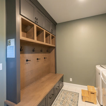
A key transformation involved reconfiguring the layout to better support storage needs. By relocating the laundry room door, a dedicated pantry was introduced, significantly improving organization and accessibility. The adjacent laundry room was also updated, along with the addition of custom cubbies to streamline daily routines.
For a bold contrast, the powder bath was reimagined as a moody, speakeasy-inspired space, bringing depth, character, and a memorable design moment to the home.
The result is a cohesive, thoughtfully redesigned interior that enhances how the family lives day to day, balancing function, storage, and distinctive style.
 Vineuve Construction Inc.
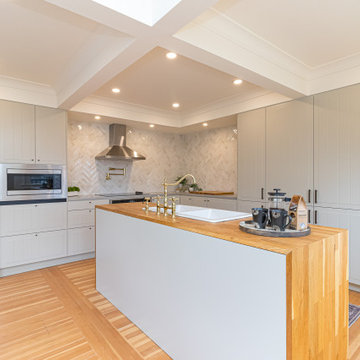
This stunning fully Vineuve designed and renovated kitchen showcases a complete transformation with a subtle grey cabinetry with clean lines, a prominent central island featuring a maple butcher block waterfall countertop, and an elegant marble herringbone backsplash that adds sophisticated texture to the space. The renovation involved strategically filling in a doorway to create a continuous wall, which now features a seamlessly integrated hidden cabinet door fridge that blends perfectly with the surrounding cabinetry for a clean, uninterrupted look. The open-concept layout flows effortlessly into adjacent living areas, enhanced by recessed lighting in a coffered ceiling and oak hardwood flooring that extends throughout the space, creating a bright, modern, and highly functional culinary environment.
 Michael Nash Design, Build & Homes
2010 NARI CAPITAL COTY GRAND AWARD WINNER
A young couple with toddlers purchased this home and decided to do extensive renovations before they moved in. The existing galley kitchen and dining room were too small and separated by a load bearing wall. The sunken family room floor was less than ideal for small children to have to climb up and down.
The first step in the renovation involved eliminating the load bearing walls and replacing them with a new steel beam capable of handling the load. By doing so, Michael Nash Design, Build & Homes was able to combine the galley kitchen and dining room into one large family kitchen with an eating area.
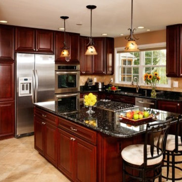
The focal point of the new space is a large multi-purpose island with a cooktop. Cherry stained cabinetry with a dark granite countertop provides plenty of storage and workspace, as well as bar seating. The same materials are used around the perimeter of the kitchen.
One wall features upper and lower cabinets which surround a stainless steel refrigerator and double wall ovens. A large pantry is included on this wall. The second wall houses the main kitchen sink and built-in dishwasher. A large window sits above the sink area allowing the parents to watch over children playing in the backyard. A butler area features a utility sink and an under-the-counter beverage refrigerator that is easy for the kids to access.
The family room floor was raised to be level with the rest of the first floor and Brazilian cherry wood floors provide continuity and richness throughout the space. Archways were built for style and pleasant viewing from each room.
The end result of the project is that this kitchen is the heart of the home. The living and dining area is now large enough for family gatherings and entertaining.
 Mindy Khan
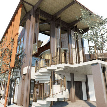
Let's face it: times are changing. We're living in an era where technology advances at a fast pace and its developments have a significant impact on the surroundings. The need for environmental solutions has become more urgent with each passing day.
While we live and adapt to our immediate environment, it doesn't mean that we have to settle with what's present, especially when our surrounding conditions are becoming detrimental to our wellbeing. This is the reason Singapore architects are looking into eco-friendly approaches when designing residential spaces.
Singapore architects are becoming more proactive in integrating eco-friendly principles in their residential projects. Below are some of the standout reasons why:
1. You get to practice energy efficiency.
In typical homes, electricity is powered by non-renewable sources. The continuous use of non-renewable energy increases carbon footprint and worsens air pollution, both of which negatively affect the environment.
However, there are alternative sources of energy that can be included in your home's architectural design. These include solar panels and wind turbines that produce electricity that can keep the house powered. These methods do not produce toxic compounds or carbon emissions; they are also renewable and do not incur recurring expenses.
2. Eco-friendly architecture brings you closer to a more "natural environment."
The emergence of urban landscapes has deprived today's generation of the opportunity to be one with nature. Individuals these days have to travel to the countryside to enjoy nature's beauty and all the amazing benefits it has to offer.
Fortunately, eco-friendly architecture provides a route where you can better appreciate many of the benefits nature offers. As a homeowner, you must enjoy a calm, clean, and fresh indoor environment.
Eco-friendly approaches to homes aim to provide this kind of atmosphere through the use of local materials, renewable energy sources, and incorporating nature's elements (such as sunlight and air ventilation) on the structural design.
3. You save money for maintenance and upkeep.
Eco-friendly architecture is known for its low maintenance costs. At first glance, you may find it expensive to build a "green home." However, since it makes use of renewable energy sources and local resources for upkeep, operational costs become much cheaper compared to living in a conventional home.
Also, green homes promote material efficiency. Apart from using local resources, eco-friendly construction involves building processes that generate as little waste as possible.
Recycled and reusable materials are preferred in building the home, while the architectural design follows construction techniques that use less energy, water, and raw materials.
4. You enjoy better health.
Living in a green home offers a lot of health benefits. For instance, eco-friendly architecture supports the use of natural materials and it discourages having plastic by-products in the building process.
At the same time, eco-friendly architectural designs look into utilising vertical space to boost freedom of movement and air circulation. These spatial strategies allow you to breathe better even while indoors and move around the house without feeling cramped.
Lastly, utilising vertical space offers more natural light to enter the home. Natural light is essential not just because it illuminates the house during the day, it also regulates the circadian rhythm, which dictates our body's waking and sleeping hours.
In a nutshell
Eco-friendly homes can help you save money and time, not to mention improve your health dramatically. Moreover, it can also help reduce your environmental footprint significantly. From improving air quality to helping regulate the effects of climate change, eco-friendly homes allow you to live a more sustainable lifestyle.
 Shenton Architects LLP
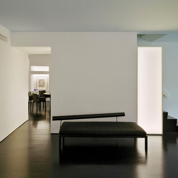
This three bedroom duplex apartment is uniquely located at the corner of Gramercy Park. The project involved the renovation of one apartment and expansion into the unit above. The one bedroom apartment upstairs was converted into a Master Suite, while the original Master Bedroom was absorbed into the living room, creating a larger entertainment space to accommodate a piano and a custom bar with a cantilevered counter.
A new staircase connecting the existing apartment with the Master Suite is tucked away to maximize open social area. The dark wood floors were continued through the stair to suggest that this had always been part of the original design.
Upstairs, the new Master Bedroom faces south overlooking the park with integrated millwork on either side of the fireplace. A built-in bed floats off the floor and adjacent wall. Her closet used space flanking the fireplace for built-in shoe storage, providing a functional yet colorful display when lit. Cove lighting, stretched fabric and frosted glass were employed to provide a warm glow for the spaces when not illuminated by the abundant daylight on both levels.
Project by Richard Meier & Partners, Architects LLP
 My Kitchen And Bath
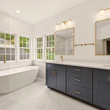
A complete primary bathroom remodel in Springfield, Virginia, designed around three priorities our clients came in with: a real walk-in shower, a freestanding tub by the windows, and a proper double vanity with storage that actually worked.
The original layout had everything in the wrong place. The tub sat against an interior wall away from the natural light. A small stall shower took up real estate across the room. The vanity was squeezed into whatever space was left over. Three windows on the back wall were doing nothing for the room because the layout was fighting them. Our solution involved knocking down the dividing wall between the old shower and vanity area, relocating plumbing for both the tub and the new vanities, and placing the freestanding tub directly under the bay of windows so morning light became part of the experience.
Design Approach
We anchored the room around contrast: deep navy cabinetry against soft white walls, warm brushed gold against cool marble tile, sharp Shaker lines against the curved silhouette of the freestanding tub. Navy was the design decision the rest of the room was built around — the clients knew they wanted color but didn't want anything that would feel dated in five years. Navy reads bold without being loud, pairs with virtually any metal finish, and has staying power that trendier choices don't.
We used Fabuwood Galaxy Indigo for the vanities — all-plywood construction with solid wood doors and drawer fronts, soft close throughout. Shaker-style flat panels keep the navy from feeling heavy. The brushed gold (Jeffrey Alexander 635-96SBZ in satin bronze) shows up across hardware, faucets, lighting, the tub filler, and the shower trim, creating a quiet continuity throughout the room.
The Shower
Removing the wall between the old shower and old vanity area created room for a proper walk-in. We tiled the entire shower floor to ceiling in Decovita Calacatta Suave 24x48" porcelain — large format installed in a 50% offset horizontal pattern, with cement board and redgard underneath. The marble-look porcelain gives the visual depth of natural marble without the maintenance.
A built-in shower bench, custom-built into the corner, is wrapped in the same wall tile on the front with a quartz top matching the vanity counter. The shower niche is detailed with MSI Arabescato Carrara 2" honed hex mosaic at the back, the same tile used on the shower floor. All tile edges are finished with Schluter in satin bronze to match the room's metal finishes. The shower door is custom frameless 3/8" tempered glass with a satin bronze pull — no metal frame interrupting the sight line.
The Vanities and Countertops
The new double vanity gives both clients their own space for morning routines. Counter tops are MSI Calacatta Miraggio Cielo quartz with pencil edging and a 4" backsplash — a soft white with subtle gray veining that reads like real Calacatta marble without the porosity issues. Two undermount square porcelain sinks finish the surface cleanly.
The Tub
A 60" freestanding soaker tub sits under the bay of three windows. The floor-mounted tub filler is satin bronze with a handheld sprayer. We relocated the drain and supply lines to make the centered placement work. The tub is the room's quietest feature and its strongest — clients tell us they use this bathroom differently than they used the old one.
Flooring
MSI Sande Ivory 12x24" matte porcelain runs throughout the bathroom floor in a 50% offset pattern parallel to the vanity wall. Cement board underneath, 4" white wood baseboard, Whisper Grey grout that handles daily use without showing wear.
Paint and Lighting
Walls are Benjamin Moore Chantilly Lace 2121-70 in satin — a true crisp white that doesn't lean cool or warm. The ceiling uses Benjamin Moore Aura Bath and Spa White, which is formulated to resist mildew in high-humidity spaces. Lighting is layered: three new 6" LED recessed lights on a dimmer, two satin bronze vanity sconces above the mirrors, and the existing three windows providing the daytime ambient light.
Project Specs
Location: Springfield, Virginia
Project type: Full primary bathroom remodel
Project duration: Approximately 5 weeks
Style: Modern, Transitional
Color palette: Navy, white, brushed gold, marble
Materials
Cabinetry: Fabuwood Galaxy Indigo, Shaker-style flat panel maple, all-plywood construction
Cabinet hardware: Jeffrey Alexander 635-96SBZ Satin Bronze pulls
Vanity counter and bench top: MSI Calacatta Miraggio Cielo Quartz, pencil edge with 4" backsplash
Sinks: Undermount white porcelain BR-202 square (x2)
Wall tile: Decovita Calacatta Suave 24x48" porcelain
Floor tile: MSI Sande Ivory 12x24" matte porcelain
Shower floor + niche back: MSI Arabescato Carrara 2" honed hex mosaic marble
Edge trim: Schluter satin bronze
Shower door: Custom frameless 3/8" tempered glass
Tub: 60" freestanding acrylic soaker (Ferguson)
Tub filler: Floor-mounted satin bronze (Ferguson)
Vanity faucets, mirrors, sconces, toilet: Satin bronze coordinated finishes (Ferguson)
Wall paint: Benjamin Moore Chantilly Lace 2121-70 Satin
Ceiling paint: Benjamin Moore Aura Bath and Spa White
Grout: Whisper Grey (floor), Standard White (walls and shower)
Designed and built by My Kitchen and Bath out of our Alexandria showroom at 5710 General Washington Drive. We've been designing and building kitchens, bathrooms, and full home renovations across Northern Virginia and the DMV since 1994.
 Michael Nash Design, Build & Homes
2010 NARI CAPITAL COTY GRAND AWARD WINNER
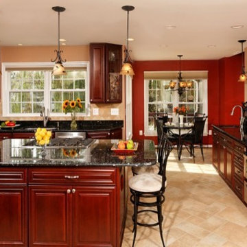
A young couple with toddlers purchased this home and decided to do extensive renovations before they moved in. The existing galley kitchen and dining room were too small and separated by a load bearing wall. The sunken family room floor was less than ideal for small children to have to climb up and down.
The first step in the renovation involved eliminating the load bearing walls and replacing them with a new steel beam capable of handling the load. By doing so, Michael Nash Design, Build & Homes was able to combine the galley kitchen and dining room into one large family kitchen with an eating area.
The focal point of the new space is a large multi-purpose island with a cooktop. Cherry stained cabinetry with a dark granite countertop provides plenty of storage and workspace, as well as bar seating. The same materials are used around the perimeter of the kitchen.
One wall features upper and lower cabinets which surround a stainless steel refrigerator and double wall ovens. A large pantry is included on this wall. The second wall houses the main kitchen sink and built-in dishwasher. A large window sits above the sink area allowing the parents to watch over children playing in the backyard. A butler area features a utility sink and an under-the-counter beverage refrigerator that is easy for the kids to access.
The family room floor was raised to be level with the rest of the first floor and Brazilian cherry wood floors provide continuity and richness throughout the space. Archways were built for style and pleasant viewing from each room.
The end result of the project is that this kitchen is the heart of the home. The living and dining area is now large enough for family gatherings and entertaining.
 Kustom Home Design
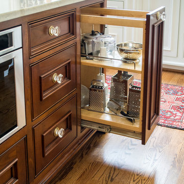
This renovation involved expanding the kitchen space into an adjacent office area, creating a side entry, new kitchen layout that worked well for two cooks, professional grade appliances, oversized island with seating on two sides, eat-in area, sitting area and furniture look cabinets with both stained and painted finishes. We enlarged an existing window by creating a boxed bay at the relocated sink and designed a continuous quartzite counter which serves as planting ledge for herbs and flowers. Some of the appliances were integrated into the cabinetry with panels, while others were designed as impact pieces. Custom designed cabinets include a large mantel style chimney hood with vent insert, furniture grade hutch with leaded glass doors, contrasting stained island with seating on two sides, bar with wine refrigerator and deep drawers, and a galley style butler's pantry which provides secondary prep space and ample storage.
Details such as shaped cabinet feet, upper glass front cabinets, pull-out trash drawer, spice columns and hidden drawers and storage make this newly designed kitchen space feel luxurious and function perfectly. Traditional materials and forms meld seamlessly with industrial accents and modern amenities. Mixed metals are used in a balanced and dynamic way with warm gold tone cabinet hardware, stainless steel and chrome all working in harmony. Antique furnishings blend with the newly designed cabinets and modern lighting.
Photos by: Kimberly Kerl
 Building Designers Association of Australia
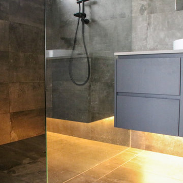
Making a real impression by designing & building with exceptional people is exactly the effect JL Design & the client as owner-builder have achieved with “Scarborough House” in Scarborough, NSW. The brief required the dwelling to take maximum advantage of stunning views over the ocean & nearby escarpment cliffs. The residence was also to be a contemporary modernist four bedroom family dwelling, maximising built external living & pool areas. The client was extensively involved with the overall design, & carried out material selection, interior detailing and selection of fixtures and fittings. This collective method guaranteed a result where the client as the builder, through continued personal investment throughout the design and construction achieved a stunning result. The concrete, steelwork, windows, timber & various forms of cladding, joinery and concealed lighting are all custom made hand crafted elements. The design called for minimal tolerances, requiring a high level of skill and cooperation between trades. “Scarborough House” features BlueScope Colorbond monument matt ribbed wall cladding with rendered & ‘rendered look’ areas in off-white. A vertical feature hardwood timber screen to the side of the entry softens the ‘industrial’ feel, giving a modernist external appearance. Carefully calculated overhangs allow a passive solar solution to heating & cooling, with efficient reverse-cycle air conditioning required only during weather extremes. Internally, timber floors to the upper living areas give a feel of comfort & warmth. The warm, substantial character of the dwelling is carefully composed by means of the clarity of the detailing, a palette of tactical natural materials and the careful manipulation of light.
![Barclay-Hollywood [B]](https://st.hzcdn.com/fimgs/5b81168504c5b189_5271-w360-h360-b0-p0--.jpg)
 Deluxe Stair & Railing Ltd
They say a picture is worth a thousand words, but that is completely understated in this project for an award winning builder. Deluxe was faced with the challenge of a continuous staircase from basement up to second floor, surrounded mostly with windows which limited our abilities to leverage weight distribution. As you can tell, our mission for this client was accomplished, and done so beautifully.
This is as custom as custom is going to get. The treads were made of 100% solid 2-1/4" Red Oak materials and the stringers were made of two laminated solid Red Oak boards to achieve a final 3-1/2" thickness. Many people would think that with those thicknesses it would involve veneer but we stand by our quality of work and delivered exactly what the client wanted.
*railings were completed by others
*featured images are property of Deluxe Stair & Railing Ltd
 Eldorado Stone
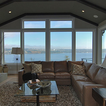
The interior of this home blurs the line between modern and traditional, forging a relaxed living environment. The arched, copper porch, which features Eldorado Stone’s modern LedgeCut33, creates an inviting presentation with its continuous linear pattern displayed throughout this residence. Additionally, Eldorado Stone’s Sage LegdeCut33 adds a modern element with its lines while its cool color palette blends into the surrounding elements, which allows the home to reveal itself progressively.
\Builder: Zetterberg Custom Homes & Remodels
Website: www.zetterberg.com
Phone: (253) 770-1730
Facebook: Zetterberg Custom Homes and Remodeling
22