
Search results for "Involve continued" in Home Design Ideas
 KCBR Design | Remodel
Designed for repeat clients, this Overland Park remodel focused on improving function, flow, and everyday livability across multiple spaces.
In the kitchen, the layout was refined to create a more open and efficient environment. An enlarged island now serves as a central hub for cooking, gathering, and daily use, while ceiling-height cabinetry maximizes storage and creates a clean, built-in aesthetic. New hardwood flooring ties the space together, adding warmth and continuity.
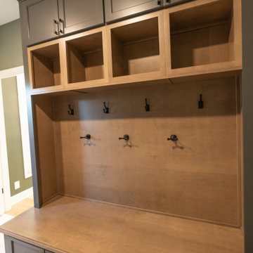
A key transformation involved reconfiguring the layout to better support storage needs. By relocating the laundry room door, a dedicated pantry was introduced, significantly improving organization and accessibility. The adjacent laundry room was also updated, along with the addition of custom cubbies to streamline daily routines.
For a bold contrast, the powder bath was reimagined as a moody, speakeasy-inspired space, bringing depth, character, and a memorable design moment to the home.
The result is a cohesive, thoughtfully redesigned interior that enhances how the family lives day to day, balancing function, storage, and distinctive style.
 Ober Woodworking
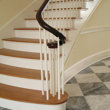
This is a shaped handrail which serpentines around an elliptical landing and down and elliptical stairway. My head still spins when I recall the math involved getting this just right. The long runs were shaped with machines and routers, but the turnout at the bottom was all done by hand and a keen eye. To further complicate the process, the finish on it is a multi-stepped process which needed to be done in place after all the joinery was completed and faired. We did all that on temporary spindles and then enlisted the help of all the carpenters on site to lift it up in one piece and set it back down on over 150 spindles. The contractor on this project was Birdseye Building Company of Richmond, Vermont.
 Angie Finton Designs LLC
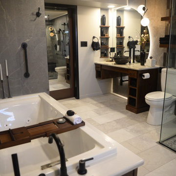
This master bathroom is located on the basement slab level of their home, offering a sidewalk and patio for accessibility so creating a space that will be functional, as well as accessible in considering the future was necessary.
Must have's: Ease of cleaning, accessibility, walk in bathroom, jetted tub, led partial moon mirror design, moody- contemporary feel.
We created a walk in shower with large format tile for less grout along the full back wall with a subway tile feature to break up space between the vanity and the shower. This same subway theme, mixed from 3 tiles, was matched on the opposing tub wall with a mirrored niche and large format tile for continuity, and flow. The door was changed to a barndoor with a recessed mirror, this allows both function and provides a wide opening. The client can access the bathroom through either the hall or their master bathroom with a zero threshold entry into the bathroom and into the shower. The rounded niche mimics the rounded mirror. Custom dark stained and black wood set off this moody modern bathroom down to the exposed vanity bottle trap and plumb lines, with varying dimmers and lighting to set off this moody vibe. The homeowners were involved every step of the way, down to the custom quartzite countertop. Layout, space planning, design, rendering and plumbing provided by Angie Finton Designs. The amazing and wonderful styling decorations were completed by the homeowner.
Find the right local pro for your project
 Drury Design
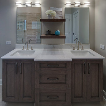
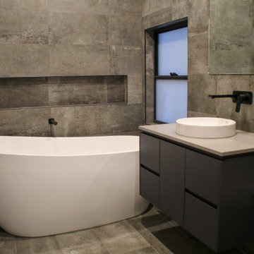
This update involved keeping the existing floorplan while using new materials to bring the space up to date.
Design objectives
-Modernize the space
-Use eye-catching tile
-Vanity with more storage
-Brighter finish on plumbing fixtures
Design challenges:
-Get more storage/functionality out of the same vanity space
-Tile selection – finding the right combination for the large the space
-Material selection – getting that wow-factor effect without being able to move walls or plumbing. This refresh was all about choosing materials with impact.
-Bringing in more light in a space somewhat defined by an existing vaulted ceiling.
Design solutions:
-Removed the old built-in tub look and replaced it with a sleek freestanding tub
-Continued the same tile from the shower walls behind the freestanding tub for a beautiful look on the back wall when you walk into the space
-Created a vanity with undermount sinks, all at one level to gain more countertop space
-Added floating shelves by the vanity – this added more options for decor and easy access to everyday items
-Large-format tile = less visible grout
 Marula Landscape & Design
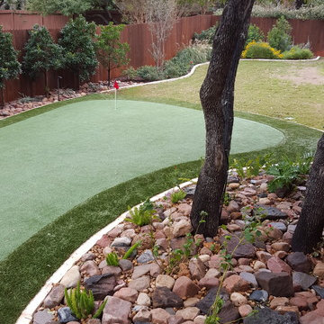
This backyard began with no aesthetic appeal, and also came with drainage issues. Their son has a passion for golf, so they wanted to incorporate that into their newly landscaped yard.
Our team worked on the re-level of the yard to resolve the issue with flooding during major rains, and are continually working on updating overall drainage systems, through interlocked natural stones and underground drainage gutters and piping.
Our next step will involve updating the natural grass in the back portion of the yard.
 Building Designers Association of Australia
Making a real impression by designing & building with exceptional people is exactly the effect JL Design & the client as owner-builder have achieved with “Scarborough House” in Scarborough, NSW. The brief required the dwelling to take maximum advantage of stunning views over the ocean & nearby escarpment cliffs. The residence was also to be a contemporary modernist four bedroom family dwelling, maximising built external living & pool areas. The client was extensively involved with the overall design, & carried out material selection, interior detailing and selection of fixtures and fittings. This collective method guaranteed a result where the client as the builder, through continued personal investment throughout the design and construction achieved a stunning result. The concrete, steelwork, windows, timber & various forms of cladding, joinery and concealed lighting are all custom made hand crafted elements. The design called for minimal tolerances, requiring a high level of skill and cooperation between trades. “Scarborough House” features BlueScope Colorbond monument matt ribbed wall cladding with rendered & ‘rendered look’ areas in off-white. A vertical feature hardwood timber screen to the side of the entry softens the ‘industrial’ feel, giving a modernist external appearance. Carefully calculated overhangs allow a passive solar solution to heating & cooling, with efficient reverse-cycle air conditioning required only during weather extremes. Internally, timber floors to the upper living areas give a feel of comfort & warmth. The warm, substantial character of the dwelling is carefully composed by means of the clarity of the detailing, a palette of tactical natural materials and the careful manipulation of light.
 Rooftopia, LLC
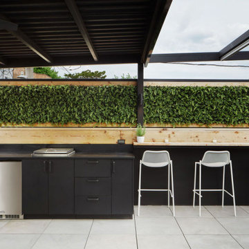
Rooftopia continues to enjoy working with this client on multiple projects, starting with this lovely first collaboration. The clients goals were to use mostly black finishes with a pink statement dining chair! We developed the space with some existing project challenges so our first tasks involved modifications to the existing pergola and flooring tiles. We integrated a retractable fabric shade canopy and several up/down light fixtures into the new space. We designed, built and installed privacy screens made of faux greenery to block out unsightly views toward the alley. We added cedar screens for privacy and to act as a backdrop for an outdoor TV. We also customized and installed a lovely outdoor cabinet system with drawers and a built-in outdoor refrigerator. Their coffee table doubles as an ice bin to top off the overall party vibe!
 Constantine Design Group, Inc.
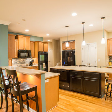
This is a Sunroom Addition. It involved removing the Kitchen's existing exterior wall and adding a new Sunroom Addition, open and connected with the existing Kitchen. A new high counter was added for barstools adjacent the kitchen sink area as well as a new large island accommodating the "kids" while mom prepares dinner. The addition incorporates lots of glass windows, a continuous bench seat (with storage beneath) along an outside wall as well as a table for eight and a special "beverage center" for entertaining. Matching hardwood flooring lets one space smoothly "flow" into the next. All this is carefully designed while maintaining an uninterrupted Kitchen "work triangle" that allows the cook to remain a part of the "event".
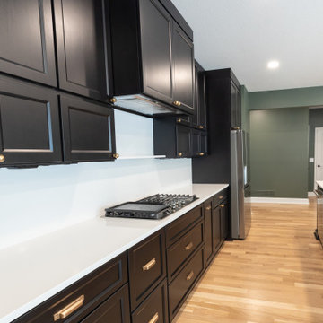 KCBR Design | Remodel
Designed for repeat clients, this Overland Park remodel focused on improving function, flow, and everyday livability across multiple spaces.
In the kitchen, the layout was refined to create a more open and efficient environment. An enlarged island now serves as a central hub for cooking, gathering, and daily use, while ceiling-height cabinetry maximizes storage and creates a clean, built-in aesthetic. New hardwood flooring ties the space together, adding warmth and continuity.
A key transformation involved reconfiguring the layout to better support storage needs. By relocating the laundry room door, a dedicated pantry was introduced, significantly improving organization and accessibility. The adjacent laundry room was also updated, along with the addition of custom cubbies to streamline daily routines.
For a bold contrast, the powder bath was reimagined as a moody, speakeasy-inspired space, bringing depth, character, and a memorable design moment to the home.
The result is a cohesive, thoughtfully redesigned interior that enhances how the family lives day to day, balancing function, storage, and distinctive style.
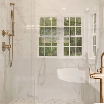
 My Kitchen And Bath
A complete primary bathroom remodel in Springfield, Virginia, designed around three priorities our clients came in with: a real walk-in shower, a freestanding tub by the windows, and a proper double vanity with storage that actually worked.
The original layout had everything in the wrong place. The tub sat against an interior wall away from the natural light. A small stall shower took up real estate across the room. The vanity was squeezed into whatever space was left over. Three windows on the back wall were doing nothing for the room because the layout was fighting them. Our solution involved knocking down the dividing wall between the old shower and vanity area, relocating plumbing for both the tub and the new vanities, and placing the freestanding tub directly under the bay of windows so morning light became part of the experience.
Design Approach
We anchored the room around contrast: deep navy cabinetry against soft white walls, warm brushed gold against cool marble tile, sharp Shaker lines against the curved silhouette of the freestanding tub. Navy was the design decision the rest of the room was built around — the clients knew they wanted color but didn't want anything that would feel dated in five years. Navy reads bold without being loud, pairs with virtually any metal finish, and has staying power that trendier choices don't.
We used Fabuwood Galaxy Indigo for the vanities — all-plywood construction with solid wood doors and drawer fronts, soft close throughout. Shaker-style flat panels keep the navy from feeling heavy. The brushed gold (Jeffrey Alexander 635-96SBZ in satin bronze) shows up across hardware, faucets, lighting, the tub filler, and the shower trim, creating a quiet continuity throughout the room.
The Shower
Removing the wall between the old shower and old vanity area created room for a proper walk-in. We tiled the entire shower floor to ceiling in Decovita Calacatta Suave 24x48" porcelain — large format installed in a 50% offset horizontal pattern, with cement board and redgard underneath. The marble-look porcelain gives the visual depth of natural marble without the maintenance.
A built-in shower bench, custom-built into the corner, is wrapped in the same wall tile on the front with a quartz top matching the vanity counter. The shower niche is detailed with MSI Arabescato Carrara 2" honed hex mosaic at the back, the same tile used on the shower floor. All tile edges are finished with Schluter in satin bronze to match the room's metal finishes. The shower door is custom frameless 3/8" tempered glass with a satin bronze pull — no metal frame interrupting the sight line.
The Vanities and Countertops
The new double vanity gives both clients their own space for morning routines. Counter tops are MSI Calacatta Miraggio Cielo quartz with pencil edging and a 4" backsplash — a soft white with subtle gray veining that reads like real Calacatta marble without the porosity issues. Two undermount square porcelain sinks finish the surface cleanly.
The Tub
A 60" freestanding soaker tub sits under the bay of three windows. The floor-mounted tub filler is satin bronze with a handheld sprayer. We relocated the drain and supply lines to make the centered placement work. The tub is the room's quietest feature and its strongest — clients tell us they use this bathroom differently than they used the old one.
Flooring
MSI Sande Ivory 12x24" matte porcelain runs throughout the bathroom floor in a 50% offset pattern parallel to the vanity wall. Cement board underneath, 4" white wood baseboard, Whisper Grey grout that handles daily use without showing wear.
Paint and Lighting
Walls are Benjamin Moore Chantilly Lace 2121-70 in satin — a true crisp white that doesn't lean cool or warm. The ceiling uses Benjamin Moore Aura Bath and Spa White, which is formulated to resist mildew in high-humidity spaces. Lighting is layered: three new 6" LED recessed lights on a dimmer, two satin bronze vanity sconces above the mirrors, and the existing three windows providing the daytime ambient light.
Project Specs
Location: Springfield, Virginia
Project type: Full primary bathroom remodel
Project duration: Approximately 5 weeks
Style: Modern, Transitional
Color palette: Navy, white, brushed gold, marble
Materials
Cabinetry: Fabuwood Galaxy Indigo, Shaker-style flat panel maple, all-plywood construction
Cabinet hardware: Jeffrey Alexander 635-96SBZ Satin Bronze pulls
Vanity counter and bench top: MSI Calacatta Miraggio Cielo Quartz, pencil edge with 4" backsplash
Sinks: Undermount white porcelain BR-202 square (x2)
Wall tile: Decovita Calacatta Suave 24x48" porcelain
Floor tile: MSI Sande Ivory 12x24" matte porcelain
Shower floor + niche back: MSI Arabescato Carrara 2" honed hex mosaic marble
Edge trim: Schluter satin bronze
Shower door: Custom frameless 3/8" tempered glass
Tub: 60" freestanding acrylic soaker (Ferguson)
Tub filler: Floor-mounted satin bronze (Ferguson)
Vanity faucets, mirrors, sconces, toilet: Satin bronze coordinated finishes (Ferguson)
Wall paint: Benjamin Moore Chantilly Lace 2121-70 Satin
Ceiling paint: Benjamin Moore Aura Bath and Spa White
Grout: Whisper Grey (floor), Standard White (walls and shower)
Designed and built by My Kitchen and Bath out of our Alexandria showroom at 5710 General Washington Drive. We've been designing and building kitchens, bathrooms, and full home renovations across Northern Virginia and the DMV since 1994.
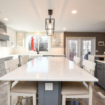
 Reico Kitchen & Bath
Jennifer Hazen from Reico Kitchen and Bath in Charlottesville, VA, collaborated with Nick Greenwood of Prevail Construction to create a transitional kitchen design featuring Merillat Masterpiece cabinetry.
The kitchen’s perimeter cabinets feature the Montresano door style in a Moonshine finish, while the beverage bar and wall cabinets are in a Lagoon finish. The countertop is MSI Q Calacatta Miraggio Cielo.
The kitchen also features a Whirlpool beverage refrigerator and an 18” full height quartz backsplash in the same color as the countertop for clean, continuous look and feel.
The client, delighted with the project outcome, shared their experience. “Our project involved a complete demolition of four areas—our Kitchen, Bathroom, Pantry, and Laundry Room. These were all combined into one open space Kitchen area. Jennifer has excellent taste and skillfully recommended elements that seamlessly came together to create a functional, aesthetically pleasing kitchen. The level of detail that she put into the plan amazed me and it ensured that all of the contractors knew exactly what to do.”
“We are extremely happy with the outcome of the kitchen. The open space is very functional and makes using our kitchen a joy. Thank you Reico and Jennifer for such a positive experience!”
Jennifer shared insights into the labor of love behind the design, stating, “The most challenging part was concealing a full-size stackable washer/dryer within a run that included a double oven, a 36" refrigerator, and an unmovable wall due to water pipes. We bumped everything out to 36" to create a functional face-frame for laundry, double oven, and a 9" pantry.”
During the planning stage, Jennifer expressed her excitement about the homeowners embracing unique design elements. "I was thrilled as the homeowners selecting design elements such as the full-height splash behind the range and the waterfall leg at the espresso bar bookcase."
Photo courtesy of Tim Snyder.
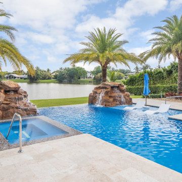
 Van Kirk & Sons Pools and Spas
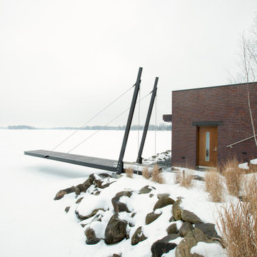
This amazing vanishing edge overlooks a beautiful lake and the spa is handicapped accessible! the beautiful
symmetric waterfalls on each side accentuates the rustic look of the architecture of the house! The tile that was
selected is quite unique as it displays a huge variety of different shades of browns and blues to match those
waterfalls!
 Vetter Architects
A tea pot, being a vessel, is defined by the space it contains, it is not the tea pot that is important, but the space.
Crispin Sartwell
Located on a lake outside of Milwaukee, the Vessel House is the culmination of an intense 5 year collaboration with our client and multiple local craftsmen focused on the creation of a modern analogue to the Usonian Home.
As with most residential work, this home is a direct reflection of it’s owner, a highly educated art collector with a passion for music, fine furniture, and architecture. His interest in authenticity drove the material selections such as masonry, copper, and white oak, as well as the need for traditional methods of construction.
The initial diagram of the house involved a collection of embedded walls that emerge from the site and create spaces between them, which are covered with a series of floating rooves. The windows provide natural light on three sides of the house as a band of clerestories, transforming to a floor to ceiling ribbon of glass on the lakeside.
The Vessel House functions as a gallery for the owner’s art, motorcycles, Tiffany lamps, and vintage musical instruments – offering spaces to exhibit, store, and listen. These gallery nodes overlap with the typical house program of kitchen, dining, living, and bedroom, creating dynamic zones of transition and rooms that serve dual purposes allowing guests to relax in a museum setting.
Through it’s materiality, connection to nature, and open planning, the Vessel House continues many of the Usonian principles Wright advocated for.
Overview
Oconomowoc, WI
Completion Date
August 2015
Services
Architecture, Interior Design, Landscape Architecture
 Cabinets 4U, Inc.
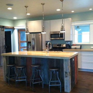
Rustic + Modern. That is the vision this homeowner had for her new kitchen. After purchasing this house, one of the big changes was removing a wall, and opening up the space. This gave us the space for a huge island, and a dramatic focal point.
The design concept was driven by the client’s vision, and involved prominent use of reclaimed barn wood. From the beginning, 2 major uses of the barn wood were planned – wrapping the island, and construction of a sliding “barn” door.
With these focal points in mind, the cabinetry was kept clean and simple. A shaker door style was chosen in maple, painted with a soft gray-toned white. Poured concrete countertops continue the neutral background, allowing the barn wood to keep center stage.
The mix: rustic + modern. The rustic details include the sliding door hardware, period stools, and the reclaimed-lumber open shelves with the primitive dishware display. These details are seamlessly melded with modern elements, including the contemporary light fixtures and faucet. Other modern touches include the brushed-stainless accessories.
This kitchen design includes an impressive 8’ island, with generous prep and seating areas. The main wall offers over 19’ of cabinetry, and features an immense amount of storage. Across the room, 2 custom pantry cabinets expand the storage options.
All in all, a timeless and unique kitchen that we were proud to be a part of!
![Barclay-Hollywood [B]](https://st.hzcdn.com/fimgs/03a19e3c04bd9717_5568-w360-h360-b0-p0--.jpg)
 Deluxe Stair & Railing Ltd
They say a picture is worth a thousand words, but that is completely understated in this project for an award winning builder. Deluxe was faced with the challenge of a continuous staircase from basement up to second floor, surrounded mostly with windows which limited our abilities to leverage weight distribution. As you can tell, our mission for this client was accomplished, and done so beautifully.
This is as custom as custom is going to get. The treads were made of 100% solid 2-1/4" Red Oak materials and the stringers were made of two laminated solid Red Oak boards to achieve a final 3-1/2" thickness. Many people would think that with those thicknesses it would involve veneer but we stand by our quality of work and delivered exactly what the client wanted.
*railings were completed by others
*featured images are property of Deluxe Stair & Railing Ltd
 Bilotta Kitchen & Home
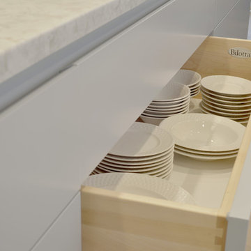
Kitchens with fabulous water views require a design that is central to the view. In this case, Bilotta designer, Randy O’Kane, working with Rachel Laxer of Rachel Laxer Interiors, Robert Keller of Keller Eaton Architects, and the homeowner, quickly established that the focal point would be the outside, thus there are really no wall cabinets. The cooktop and main sink are situated on the island so that they face the water with wall ovens and refrigerator/freezer behind. The lines of the Bilotta Collection cabinetry are sleek and there is little to no hardware; drawers have a channel system in place of hardware. A tall pantry area hugs the wall and disappears with only glass pulls giving it away. The natural quartzite countertops have the undulating feel of moving water. The bar area is tucked away with the same clean lined cabinetry, but with an added touch of antique mercury mirrors to help reflect the lovely views. Soft seating by way of a custom banquette and sectional makes this kitchen not just a place to eat, but a relaxing area to watch the boats go by. Contemporary painted casing trims an extra-large pocket door into a formal dining room beautifully detailed by Rachel Laxer and continues the soft color scheme with added pops of color. This is definitely a great space to entertain in or just enjoy! Additional people involved include Staci Ruiz of Staci Ruiz Lighting Consultant and Bobby Noonan of Noonan Construction. Appliances are a mix of Miele, Sub-Zero and Gaggenau; sinks are Franke and faucets by Dornbracht. Bilotta Designer Randy O’Kane with Rachel Laxer for Rachel Laxer Interiors and Robert Keller of Keller Eaton Architects. Photo Credit: Peter Krupenye

 Rooftopia, LLC
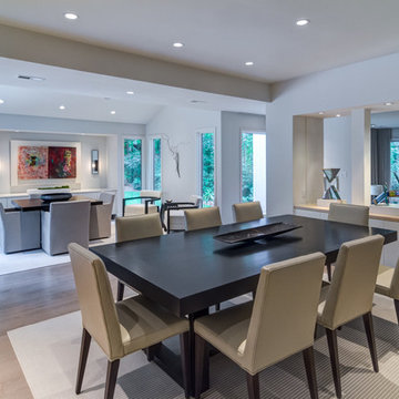
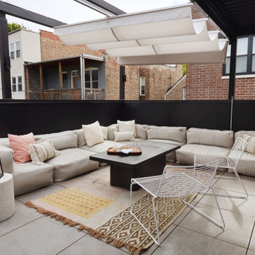
Rooftopia continues to enjoy working with this client on multiple projects, starting with this lovely first collaboration. The clients goals were to use mostly black finishes with a pink statement dining chair! We developed the space with some existing project challenges so our first tasks involved modifications to the existing pergola and flooring tiles. We integrated a retractable fabric shade canopy and several up/down light fixtures into the new space. We designed, built and installed privacy screens made of faux greenery to block out unsightly views toward the alley. We added cedar screens for privacy and to act as a backdrop for an outdoor TV. We also customized and installed a lovely outdoor cabinet system with drawers and a built-in outdoor refrigerator. Their coffee table doubles as an ice bin to top off the overall party vibe!
 KCBR Design | Remodel
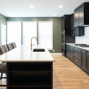
Designed for repeat clients, this Overland Park remodel focused on improving function, flow, and everyday livability across multiple spaces.
In the kitchen, the layout was refined to create a more open and efficient environment. An enlarged island now serves as a central hub for cooking, gathering, and daily use, while ceiling-height cabinetry maximizes storage and creates a clean, built-in aesthetic. New hardwood flooring ties the space together, adding warmth and continuity.
A key transformation involved reconfiguring the layout to better support storage needs. By relocating the laundry room door, a dedicated pantry was introduced, significantly improving organization and accessibility. The adjacent laundry room was also updated, along with the addition of custom cubbies to streamline daily routines.
For a bold contrast, the powder bath was reimagined as a moody, speakeasy-inspired space, bringing depth, character, and a memorable design moment to the home.
The result is a cohesive, thoughtfully redesigned interior that enhances how the family lives day to day, balancing function, storage, and distinctive style.
 Michael Nash Design, Build & Homes
2010 NARI CAPITAL COTY GRAND AWARD WINNER
A young couple with toddlers purchased this home and decided to do extensive renovations before they moved in. The existing galley kitchen and dining room were too small and separated by a load bearing wall. The sunken family room floor was less than ideal for small children to have to climb up and down.
The first step in the renovation involved eliminating the load bearing walls and replacing them with a new steel beam capable of handling the load. By doing so, Michael Nash Design, Build & Homes was able to combine the galley kitchen and dining room into one large family kitchen with an eating area.
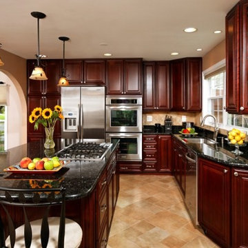
The focal point of the new space is a large multi-purpose island with a cooktop. Cherry stained cabinetry with a dark granite countertop provides plenty of storage and workspace, as well as bar seating. The same materials are used around the perimeter of the kitchen.
One wall features upper and lower cabinets which surround a stainless steel refrigerator and double wall ovens. A large pantry is included on this wall. The second wall houses the main kitchen sink and built-in dishwasher. A large window sits above the sink area allowing the parents to watch over children playing in the backyard. A butler area features a utility sink and an under-the-counter beverage refrigerator that is easy for the kids to access.
The family room floor was raised to be level with the rest of the first floor and Brazilian cherry wood floors provide continuity and richness throughout the space. Archways were built for style and pleasant viewing from each room.
The end result of the project is that this kitchen is the heart of the home. The living and dining area is now large enough for family gatherings and entertaining.
24