
Search results for "Involved removing" in Home Design Ideas

 TVL Creative Ltd.
This remodel took an extremely dark & dated kitchen and transformed it into a bright and airy happy place for our client. The existing conditions created a dark, hall-like kitchen that greatly lacked in function and did little to optimize storage. Realizing the potential of this truly massive space, we created a design that utilizes every inch of the kitchen and creates functional cooking and prep space as well as pantry storage and work nooks. Our first order of business was to demo out the blocky corner that separated the kitchen from the living room. This involved removing an existing fireplace, re-structuring a wall, and having an entirely new furnace installed in the basement to eliminate a duct running right through the corner we hoped to eliminate. After opening up the space, we focused on highlighting and brightening the room. New NuCore flooring was installed to give the kitchen a fresh look while offering optimal function and cleanability. Two-toned cabinets in a honey maple and painted silk were used to create a warm and comfortable balance throughout the space. New quartz countertops in MSI's canvas were installed, and butcher block was installed on the two desk areas to offer a warm visual relief and casual work surface. The color palette for the kitchen is reminiscent of a cozy apothecary; we utilized fresh greens with Sherwin Williams paint on the walls and Treviso Gray Sage glazed subway tiles on the backsplash. Over the sink, we designed a playful highlight with counter-to-ceiling mini brick mosaic in a dark crackle green. We introduced additional lighting throughout including new recessed lights, over-sink light, and under-cabinet lights. New appliances were introduced to the space as well, and we complimented the stainless steel of these fixtures to the transitional nickel hardware on the cabinets. This space now feels open and inviting, and is visible from the second you enter the front door! We are so proud of this result and so happy that our clients can enjoy this gorgeous kitchen for years to come.

 Cape Associates, Inc.
This 1,200 square-foot Provincetown condominium lives large, both functionally and aesthetically, thanks to its recent renovation. The waterfront home, overlooking Cape Cod Bay, is part of an historic grouping of three individual buildings on Commercial Street that have been combined into condominiums.
Begun in November 2014 and completed just in time for summer in May 2016, b Architecture Studios and Cape Associates Builders worked with a budget of $366,000 to transform this prosaic dwelling into a stunning light-flooded space—designed to maximize both the living space and the mesmerizing views of the bay.
“The space was totally reconfigured,” said project manager Jon Ziperman. “It was a total gut job requiring leveling of floors, straightening of walls, removing a chimney and fireplace that ran up to the above neighbors’ unit.” The renovation also required a complete rewiring and plumbing system that involved wires and pipes that were integrated into the surrounding units. From wall to wall and floor to ceiling, there was nothing that could be salvaged from the original space.
One of the most prominent changes was moving the stairway from its original placement, where it originally broke up the living and dining space and blocked views to the bay beyond. The stairway now sits on the opposite side of the condominium. With the stairs tucked to the left side of the living area, the sightline now extends from the entry straight through the living and dining areas to the water. The new design allowed for storage space beneath the stairs, which lead to an airy sleeping loft, and room for a desk niche. A light well, where the former sleeping area was, and new windows bring abundant natural light to the central living area.
Innovative features in the entry room include a Murphy bed and sliding glass door separating it from the living area, so that the space can double as a guest room.
“The Murphy bed fit in nicely, allowing for a flush wall at the entry/guest room and a desk niche in the adjacent room,” Brown said. “Convincing the client to create the wrap-around chair rail, lined up with the divided lights of the sliding glass door, makes a purposeful connection in a small space.”
Neolith countertops in the open kitchen and details like the flush minimal baseboard contribute to the sleek, modern aesthetic, now complemented by the owner’s contemporary furnishings. This complete renovation has rendered this compact home worthy of its beautiful setting.
 Cape Associates, Inc.
This 1,200 square-foot Provincetown condominium lives large, both functionally and aesthetically, thanks to its recent renovation. The waterfront home, overlooking Cape Cod Bay, is part of an historic grouping of three individual buildings on Commercial Street that have been combined into condominiums.
Begun in November 2014 and completed just in time for summer in May 2016, b Architecture Studios and Cape Associates Builders worked with a budget of $366,000 to transform this prosaic dwelling into a stunning light-flooded space—designed to maximize both the living space and the mesmerizing views of the bay.
“The space was totally reconfigured,” said project manager Jon Ziperman. “It was a total gut job requiring leveling of floors, straightening of walls, removing a chimney and fireplace that ran up to the above neighbors’ unit.” The renovation also required a complete rewiring and plumbing system that involved wires and pipes that were integrated into the surrounding units. From wall to wall and floor to ceiling, there was nothing that could be salvaged from the original space.
One of the most prominent changes was moving the stairway from its original placement, where it originally broke up the living and dining space and blocked views to the bay beyond. The stairway now sits on the opposite side of the condominium. With the stairs tucked to the left side of the living area, the sightline now extends from the entry straight through the living and dining areas to the water. The new design allowed for storage space beneath the stairs, which lead to an airy sleeping loft, and room for a desk niche. A light well, where the former sleeping area was, and new windows bring abundant natural light to the central living area.
Innovative features in the entry room include a Murphy bed and sliding glass door separating it from the living area, so that the space can double as a guest room.
“The Murphy bed fit in nicely, allowing for a flush wall at the entry/guest room and a desk niche in the adjacent room,” Brown said. “Convincing the client to create the wrap-around chair rail, lined up with the divided lights of the sliding glass door, makes a purposeful connection in a small space.”
Neolith countertops in the open kitchen and details like the flush minimal baseboard contribute to the sleek, modern aesthetic, now complemented by the owner’s contemporary furnishings. This complete renovation has rendered this compact home worthy of its beautiful setting.
Find the right local pro for your project
 G. Christianson Construction, Inc.
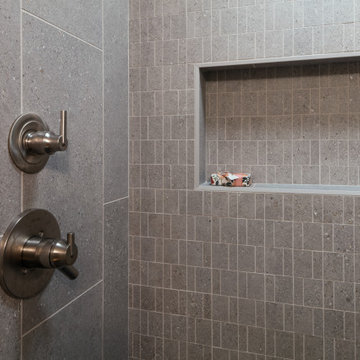
This compact modern bathroom remodel features intentionally placed colors, patterns, materials, and finishes to perfectly execute the homeowner’s style. In addition to a distaste for the bathroom’s existing brown color scheme, there was an extremely large and deep soaking tub with a shower combo that had been installed by a previous owner which made accessibility extremely difficult for these new homeowners to use the shower. The homeowners expressed a love for modern, contemporary, and sleek design styles with strong preferences for grey and slate tones and a dislike of brown tones and ornate patterns. In addition, Interior Designer Elizabeth noticed that they would get excited when discussing whimsical features. The final bathroom design involved replacing the bath vanity, toilet, flooring, and removing the obtrusive tub to create an easy-access tile shower with a sliding shower glass barn door. The existing unique bathroom layout was a narrow room open to the Primary Bedroom with no door and contained all fixtures on the interior wall facing away from the Primary Bedroom entrance. We utilized a floating vanity to give the illusion of a wider bathroom and the open space below the cabinet makes it easier to round the corner to enter the bathroom without running into the cabinet. To create a bathroom design that expressed the homeowner’s style of modern, grey, and whimsy, Interior Designer Elizabeth proposed a grey mosaic tile that formed a whimsical pattern via the grout lines, and maintained the desired modern feel by having this mosaic tile installed over the entirety of the back wall with large format tiles of the same color/collection installed on the side walls. The cool tones of the grey tile shower and charcoal tile floor are balanced with the warmth of a natural rift white oak vanity and recessed medicine cabinet mirror to create this luxurious modern bathroom.
 TVL Creative Ltd.
This remodel took an extremely dark & dated kitchen and transformed it into a bright and airy happy place for our client. The existing conditions created a dark, hall-like kitchen that greatly lacked in function and did little to optimize storage. Realizing the potential of this truly massive space, we created a design that utilizes every inch of the kitchen and creates functional cooking and prep space as well as pantry storage and work nooks. Our first order of business was to demo out the blocky corner that separated the kitchen from the living room. This involved removing an existing fireplace, re-structuring a wall, and having an entirely new furnace installed in the basement to eliminate a duct running right through the corner we hoped to eliminate. After opening up the space, we focused on highlighting and brightening the room. New NuCore flooring was installed to give the kitchen a fresh look while offering optimal function and cleanability. Two-toned cabinets in a honey maple and painted silk were used to create a warm and comfortable balance throughout the space. New quartz countertops in MSI's canvas were installed, and butcher block was installed on the two desk areas to offer a warm visual relief and casual work surface. The color palette for the kitchen is reminiscent of a cozy apothecary; we utilized fresh greens with Sherwin Williams paint on the walls and Treviso Gray Sage glazed subway tiles on the backsplash. Over the sink, we designed a playful highlight with counter-to-ceiling mini brick mosaic in a dark crackle green. We introduced additional lighting throughout including new recessed lights, over-sink light, and under-cabinet lights. New appliances were introduced to the space as well, and we complimented the stainless steel of these fixtures to the transitional nickel hardware on the cabinets. This space now feels open and inviting, and is visible from the second you enter the front door! We are so proud of this result and so happy that our clients can enjoy this gorgeous kitchen for years to come.

 Cantoni Atlanta
The fact that this home is in a development called Providence now seems perfectly fitting. Chris, the owner, was merely considering the possibility of downsizing from a formal residence outside Atlanta when he happened on the small complex of luxury brownstones under construction in nearby Roswell. “I wandered into The Providence by chance and loved what I saw. The developer, his wife, and the agent were there and discussing how Cantoni was going to finish out one of the units, and so we all started talking,” Chris explains “They asked if I wanted to meet with the designer from Cantoni, and suggested I could customize the home as I saw fit, and that did it for me. I was sold.”
Cantoni was originally approached by Mike and Joy Walsh, of Lehigh Homes, to create a contemporary model home to be featured on the Roswell Woman’s Club home tour. “Since Chris bought the brownstone right after we agreed to do the design work,” Lorna Hunter recalls, “we brought him in on the meetings with the architects to help finalize the layout.” From selecting tile and counter tops, to designing the kitchen and baths, to the furniture, art and even linens—Cantoni was involved with every phase of the project. “This home really represents the complete range of design and staging services we offer at Cantoni,” says Lorna. “Rooms were reconfigured to allow for changes Chris found appealing, and every tile and doorknob was thoughtfully chosen to complete the overall look.”
Chris found an easy rapport with Lorna. “I have always been drawn to contemporary décor,” he explains, “ so Lorna and I hit it off immediately.” Among the custom design ideas the two conceived for the 2,600 sq. ft. 3/3 brownstone: creating a “wing wall” (open on both sides) to form a sitting area adjacent to the guest room
downstairs, removing the elevator to enhance a sense of openness while leaving the 3-story shaft as a unique focal point, and choosing to expand the height of windows on the third level to maximize the flow of natural light.
The Providence is ideally located near quaint shops, great restaurants, jogging trails and a scenic river—not to mention it’s just four miles from Chris’ office. The project represents the breadth and depth of Cantoni’s in-house creative resources, and proves again that GREAT DESIGN IS A WAY OF LIFE.
 TVL Creative Ltd.
This remodel took an extremely dark & dated kitchen and transformed it into a bright and airy happy place for our client. The existing conditions created a dark, hall-like kitchen that greatly lacked in function and did little to optimize storage. Realizing the potential of this truly massive space, we created a design that utilizes every inch of the kitchen and creates functional cooking and prep space as well as pantry storage and work nooks. Our first order of business was to demo out the blocky corner that separated the kitchen from the living room. This involved removing an existing fireplace, re-structuring a wall, and having an entirely new furnace installed in the basement to eliminate a duct running right through the corner we hoped to eliminate. After opening up the space, we focused on highlighting and brightening the room. New NuCore flooring was installed to give the kitchen a fresh look while offering optimal function and cleanability. Two-toned cabinets in a honey maple and painted silk were used to create a warm and comfortable balance throughout the space. New quartz countertops in MSI's canvas were installed, and butcher block was installed on the two desk areas to offer a warm visual relief and casual work surface. The color palette for the kitchen is reminiscent of a cozy apothecary; we utilized fresh greens with Sherwin Williams paint on the walls and Treviso Gray Sage glazed subway tiles on the backsplash. Over the sink, we designed a playful highlight with counter-to-ceiling mini brick mosaic in a dark crackle green. We introduced additional lighting throughout including new recessed lights, over-sink light, and under-cabinet lights. New appliances were introduced to the space as well, and we complimented the stainless steel of these fixtures to the transitional nickel hardware on the cabinets. This space now feels open and inviting, and is visible from the second you enter the front door! We are so proud of this result and so happy that our clients can enjoy this gorgeous kitchen for years to come.

 Cantoni Atlanta
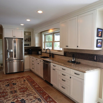
The fact that this home is in a development called Providence now seems perfectly fitting. Chris, the owner, was merely considering the possibility of downsizing from a formal residence outside Atlanta when he happened on the small complex of luxury brownstones under construction in nearby Roswell. “I wandered into The Providence by chance and loved what I saw. The developer, his wife, and the agent were there and discussing how Cantoni was going to finish out one of the units, and so we all started talking,” Chris explains “They asked if I wanted to meet with the designer from Cantoni, and suggested I could customize the home as I saw fit, and that did it for me. I was sold.”
Cantoni was originally approached by Mike and Joy Walsh, of Lehigh Homes, to create a contemporary model home to be featured on the Roswell Woman’s Club home tour. “Since Chris bought the brownstone right after we agreed to do the design work,” Lorna Hunter recalls, “we brought him in on the meetings with the architects to help finalize the layout.” From selecting tile and counter tops, to designing the kitchen and baths, to the furniture, art and even linens—Cantoni was involved with every phase of the project. “This home really represents the complete range of design and staging services we offer at Cantoni,” says Lorna. “Rooms were reconfigured to allow for changes Chris found appealing, and every tile and doorknob was thoughtfully chosen to complete the overall look.”
Chris found an easy rapport with Lorna. “I have always been drawn to contemporary décor,” he explains, “ so Lorna and I hit it off immediately.” Among the custom design ideas the two conceived for the 2,600 sq. ft. 3/3 brownstone: creating a “wing wall” (open on both sides) to form a sitting area adjacent to the guest room
downstairs, removing the elevator to enhance a sense of openness while leaving the 3-story shaft as a unique focal point, and choosing to expand the height of windows on the third level to maximize the flow of natural light.
The Providence is ideally located near quaint shops, great restaurants, jogging trails and a scenic river—not to mention it’s just four miles from Chris’ office. The project represents the breadth and depth of Cantoni’s in-house creative resources, and proves again that GREAT DESIGN IS A WAY OF LIFE.
 TVL Creative Ltd.
This remodel took an extremely dark & dated kitchen and transformed it into a bright and airy happy place for our client. The existing conditions created a dark, hall-like kitchen that greatly lacked in function and did little to optimize storage. Realizing the potential of this truly massive space, we created a design that utilizes every inch of the kitchen and creates functional cooking and prep space as well as pantry storage and work nooks. Our first order of business was to demo out the blocky corner that separated the kitchen from the living room. This involved removing an existing fireplace, re-structuring a wall, and having an entirely new furnace installed in the basement to eliminate a duct running right through the corner we hoped to eliminate. After opening up the space, we focused on highlighting and brightening the room. New NuCore flooring was installed to give the kitchen a fresh look while offering optimal function and cleanability. Two-toned cabinets in a honey maple and painted silk were used to create a warm and comfortable balance throughout the space. New quartz countertops in MSI's canvas were installed, and butcher block was installed on the two desk areas to offer a warm visual relief and casual work surface. The color palette for the kitchen is reminiscent of a cozy apothecary; we utilized fresh greens with Sherwin Williams paint on the walls and Treviso Gray Sage glazed subway tiles on the backsplash. Over the sink, we designed a playful highlight with counter-to-ceiling mini brick mosaic in a dark crackle green. We introduced additional lighting throughout including new recessed lights, over-sink light, and under-cabinet lights. New appliances were introduced to the space as well, and we complimented the stainless steel of these fixtures to the transitional nickel hardware on the cabinets. This space now feels open and inviting, and is visible from the second you enter the front door! We are so proud of this result and so happy that our clients can enjoy this gorgeous kitchen for years to come.
 Cantoni Atlanta
The fact that this home is in a development called Providence now seems perfectly fitting. Chris, the owner, was merely considering the possibility of downsizing from a formal residence outside Atlanta when he happened on the small complex of luxury brownstones under construction in nearby Roswell. “I wandered into The Providence by chance and loved what I saw. The developer, his wife, and the agent were there and discussing how Cantoni was going to finish out one of the units, and so we all started talking,” Chris explains “They asked if I wanted to meet with the designer from Cantoni, and suggested I could customize the home as I saw fit, and that did it for me. I was sold.”
Cantoni was originally approached by Mike and Joy Walsh, of Lehigh Homes, to create a contemporary model home to be featured on the Roswell Woman’s Club home tour. “Since Chris bought the brownstone right after we agreed to do the design work,” Lorna Hunter recalls, “we brought him in on the meetings with the architects to help finalize the layout.” From selecting tile and counter tops, to designing the kitchen and baths, to the furniture, art and even linens—Cantoni was involved with every phase of the project. “This home really represents the complete range of design and staging services we offer at Cantoni,” says Lorna. “Rooms were reconfigured to allow for changes Chris found appealing, and every tile and doorknob was thoughtfully chosen to complete the overall look.”
Chris found an easy rapport with Lorna. “I have always been drawn to contemporary décor,” he explains, “ so Lorna and I hit it off immediately.” Among the custom design ideas the two conceived for the 2,600 sq. ft. 3/3 brownstone: creating a “wing wall” (open on both sides) to form a sitting area adjacent to the guest room
downstairs, removing the elevator to enhance a sense of openness while leaving the 3-story shaft as a unique focal point, and choosing to expand the height of windows on the third level to maximize the flow of natural light.
The Providence is ideally located near quaint shops, great restaurants, jogging trails and a scenic river—not to mention it’s just four miles from Chris’ office. The project represents the breadth and depth of Cantoni’s in-house creative resources, and proves again that GREAT DESIGN IS A WAY OF LIFE.
 Cantoni Atlanta
The fact that this home is in a development called Providence now seems perfectly fitting. Chris, the owner, was merely considering the possibility of downsizing from a formal residence outside Atlanta when he happened on the small complex of luxury brownstones under construction in nearby Roswell. “I wandered into The Providence by chance and loved what I saw. The developer, his wife, and the agent were there and discussing how Cantoni was going to finish out one of the units, and so we all started talking,” Chris explains “They asked if I wanted to meet with the designer from Cantoni, and suggested I could customize the home as I saw fit, and that did it for me. I was sold.”
Cantoni was originally approached by Mike and Joy Walsh, of Lehigh Homes, to create a contemporary model home to be featured on the Roswell Woman’s Club home tour. “Since Chris bought the brownstone right after we agreed to do the design work,” Lorna Hunter recalls, “we brought him in on the meetings with the architects to help finalize the layout.” From selecting tile and counter tops, to designing the kitchen and baths, to the furniture, art and even linens—Cantoni was involved with every phase of the project. “This home really represents the complete range of design and staging services we offer at Cantoni,” says Lorna. “Rooms were reconfigured to allow for changes Chris found appealing, and every tile and doorknob was thoughtfully chosen to complete the overall look.”
Chris found an easy rapport with Lorna. “I have always been drawn to contemporary décor,” he explains, “ so Lorna and I hit it off immediately.” Among the custom design ideas the two conceived for the 2,600 sq. ft. 3/3 brownstone: creating a “wing wall” (open on both sides) to form a sitting area adjacent to the guest room
downstairs, removing the elevator to enhance a sense of openness while leaving the 3-story shaft as a unique focal point, and choosing to expand the height of windows on the third level to maximize the flow of natural light.
The Providence is ideally located near quaint shops, great restaurants, jogging trails and a scenic river—not to mention it’s just four miles from Chris’ office. The project represents the breadth and depth of Cantoni’s in-house creative resources, and proves again that GREAT DESIGN IS A WAY OF LIFE.
 G. Christianson Construction, Inc.
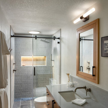
This compact modern bathroom remodel features intentionally placed colors, patterns, materials, and finishes to perfectly execute the homeowner’s style. In addition to a distaste for the bathroom’s existing brown color scheme, there was an extremely large and deep soaking tub with a shower combo that had been installed by a previous owner which made accessibility extremely difficult for these new homeowners to use the shower. The homeowners expressed a love for modern, contemporary, and sleek design styles with strong preferences for grey and slate tones and a dislike of brown tones and ornate patterns. In addition, Interior Designer Elizabeth noticed that they would get excited when discussing whimsical features. The final bathroom design involved replacing the bath vanity, toilet, flooring, and removing the obtrusive tub to create an easy-access tile shower with a sliding shower glass barn door. The existing unique bathroom layout was a narrow room open to the Primary Bedroom with no door and contained all fixtures on the interior wall facing away from the Primary Bedroom entrance. We utilized a floating vanity to give the illusion of a wider bathroom and the open space below the cabinet makes it easier to round the corner to enter the bathroom without running into the cabinet. To create a bathroom design that expressed the homeowner’s style of modern, grey, and whimsy, Interior Designer Elizabeth proposed a grey mosaic tile that formed a whimsical pattern via the grout lines, and maintained the desired modern feel by having this mosaic tile installed over the entirety of the back wall with large format tiles of the same color/collection installed on the side walls. The cool tones of the grey tile shower and charcoal tile floor are balanced with the warmth of a natural rift white oak vanity and recessed medicine cabinet mirror to create this luxurious modern bathroom.
 Cape Associates, Inc.
This 1,200 square-foot Provincetown condominium lives large, both functionally and aesthetically, thanks to its recent renovation. The waterfront home, overlooking Cape Cod Bay, is part of an historic grouping of three individual buildings on Commercial Street that have been combined into condominiums.
Begun in November 2014 and completed just in time for summer in May 2016, b Architecture Studios and Cape Associates Builders worked with a budget of $366,000 to transform this prosaic dwelling into a stunning light-flooded space—designed to maximize both the living space and the mesmerizing views of the bay.
“The space was totally reconfigured,” said project manager Jon Ziperman. “It was a total gut job requiring leveling of floors, straightening of walls, removing a chimney and fireplace that ran up to the above neighbors’ unit.” The renovation also required a complete rewiring and plumbing system that involved wires and pipes that were integrated into the surrounding units. From wall to wall and floor to ceiling, there was nothing that could be salvaged from the original space.
One of the most prominent changes was moving the stairway from its original placement, where it originally broke up the living and dining space and blocked views to the bay beyond. The stairway now sits on the opposite side of the condominium. With the stairs tucked to the left side of the living area, the sightline now extends from the entry straight through the living and dining areas to the water. The new design allowed for storage space beneath the stairs, which lead to an airy sleeping loft, and room for a desk niche. A light well, where the former sleeping area was, and new windows bring abundant natural light to the central living area.
Innovative features in the entry room include a Murphy bed and sliding glass door separating it from the living area, so that the space can double as a guest room.
“The Murphy bed fit in nicely, allowing for a flush wall at the entry/guest room and a desk niche in the adjacent room,” Brown said. “Convincing the client to create the wrap-around chair rail, lined up with the divided lights of the sliding glass door, makes a purposeful connection in a small space.”
Neolith countertops in the open kitchen and details like the flush minimal baseboard contribute to the sleek, modern aesthetic, now complemented by the owner’s contemporary furnishings. This complete renovation has rendered this compact home worthy of its beautiful setting.
 Cape Associates, Inc.
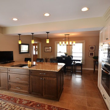
This 1,200 square-foot Provincetown condominium lives large, both functionally and aesthetically, thanks to its recent renovation. The waterfront home, overlooking Cape Cod Bay, is part of an historic grouping of three individual buildings on Commercial Street that have been combined into condominiums.
Begun in November 2014 and completed just in time for summer in May 2016, b Architecture Studios and Cape Associates Builders worked with a budget of $366,000 to transform this prosaic dwelling into a stunning light-flooded space—designed to maximize both the living space and the mesmerizing views of the bay.
“The space was totally reconfigured,” said project manager Jon Ziperman. “It was a total gut job requiring leveling of floors, straightening of walls, removing a chimney and fireplace that ran up to the above neighbors’ unit.” The renovation also required a complete rewiring and plumbing system that involved wires and pipes that were integrated into the surrounding units. From wall to wall and floor to ceiling, there was nothing that could be salvaged from the original space.
One of the most prominent changes was moving the stairway from its original placement, where it originally broke up the living and dining space and blocked views to the bay beyond. The stairway now sits on the opposite side of the condominium. With the stairs tucked to the left side of the living area, the sightline now extends from the entry straight through the living and dining areas to the water. The new design allowed for storage space beneath the stairs, which lead to an airy sleeping loft, and room for a desk niche. A light well, where the former sleeping area was, and new windows bring abundant natural light to the central living area.
Innovative features in the entry room include a Murphy bed and sliding glass door separating it from the living area, so that the space can double as a guest room.
“The Murphy bed fit in nicely, allowing for a flush wall at the entry/guest room and a desk niche in the adjacent room,” Brown said. “Convincing the client to create the wrap-around chair rail, lined up with the divided lights of the sliding glass door, makes a purposeful connection in a small space.”
Neolith countertops in the open kitchen and details like the flush minimal baseboard contribute to the sleek, modern aesthetic, now complemented by the owner’s contemporary furnishings. This complete renovation has rendered this compact home worthy of its beautiful setting.
 TVL Creative Ltd.
This remodel took an extremely dark & dated kitchen and transformed it into a bright and airy happy place for our client. The existing conditions created a dark, hall-like kitchen that greatly lacked in function and did little to optimize storage. Realizing the potential of this truly massive space, we created a design that utilizes every inch of the kitchen and creates functional cooking and prep space as well as pantry storage and work nooks. Our first order of business was to demo out the blocky corner that separated the kitchen from the living room. This involved removing an existing fireplace, re-structuring a wall, and having an entirely new furnace installed in the basement to eliminate a duct running right through the corner we hoped to eliminate. After opening up the space, we focused on highlighting and brightening the room. New NuCore flooring was installed to give the kitchen a fresh look while offering optimal function and cleanability. Two-toned cabinets in a honey maple and painted silk were used to create a warm and comfortable balance throughout the space. New quartz countertops in MSI's canvas were installed, and butcher block was installed on the two desk areas to offer a warm visual relief and casual work surface. The color palette for the kitchen is reminiscent of a cozy apothecary; we utilized fresh greens with Sherwin Williams paint on the walls and Treviso Gray Sage glazed subway tiles on the backsplash. Over the sink, we designed a playful highlight with counter-to-ceiling mini brick mosaic in a dark crackle green. We introduced additional lighting throughout including new recessed lights, over-sink light, and under-cabinet lights. New appliances were introduced to the space as well, and we complimented the stainless steel of these fixtures to the transitional nickel hardware on the cabinets. This space now feels open and inviting, and is visible from the second you enter the front door! We are so proud of this result and so happy that our clients can enjoy this gorgeous kitchen for years to come.
 G. Christianson Construction, Inc.
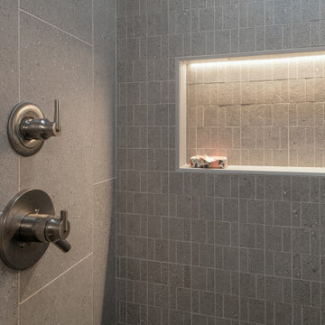
This compact modern bathroom remodel features intentionally placed colors, patterns, materials, and finishes to perfectly execute the homeowner’s style. In addition to a distaste for the bathroom’s existing brown color scheme, there was an extremely large and deep soaking tub with a shower combo that had been installed by a previous owner which made accessibility extremely difficult for these new homeowners to use the shower. The homeowners expressed a love for modern, contemporary, and sleek design styles with strong preferences for grey and slate tones and a dislike of brown tones and ornate patterns. In addition, Interior Designer Elizabeth noticed that they would get excited when discussing whimsical features. The final bathroom design involved replacing the bath vanity, toilet, flooring, and removing the obtrusive tub to create an easy-access tile shower with a sliding shower glass barn door. The existing unique bathroom layout was a narrow room open to the Primary Bedroom with no door and contained all fixtures on the interior wall facing away from the Primary Bedroom entrance. We utilized a floating vanity to give the illusion of a wider bathroom and the open space below the cabinet makes it easier to round the corner to enter the bathroom without running into the cabinet. To create a bathroom design that expressed the homeowner’s style of modern, grey, and whimsy, Interior Designer Elizabeth proposed a grey mosaic tile that formed a whimsical pattern via the grout lines, and maintained the desired modern feel by having this mosaic tile installed over the entirety of the back wall with large format tiles of the same color/collection installed on the side walls. The cool tones of the grey tile shower and charcoal tile floor are balanced with the warmth of a natural rift white oak vanity and recessed medicine cabinet mirror to create this luxurious modern bathroom.
 Cantoni Atlanta
The fact that this home is in a development called Providence now seems perfectly fitting. Chris, the owner, was merely considering the possibility of downsizing from a formal residence outside Atlanta when he happened on the small complex of luxury brownstones under construction in nearby Roswell. “I wandered into The Providence by chance and loved what I saw. The developer, his wife, and the agent were there and discussing how Cantoni was going to finish out one of the units, and so we all started talking,” Chris explains “They asked if I wanted to meet with the designer from Cantoni, and suggested I could customize the home as I saw fit, and that did it for me. I was sold.”
Cantoni was originally approached by Mike and Joy Walsh, of Lehigh Homes, to create a contemporary model home to be featured on the Roswell Woman’s Club home tour. “Since Chris bought the brownstone right after we agreed to do the design work,” Lorna Hunter recalls, “we brought him in on the meetings with the architects to help finalize the layout.” From selecting tile and counter tops, to designing the kitchen and baths, to the furniture, art and even linens—Cantoni was involved with every phase of the project. “This home really represents the complete range of design and staging services we offer at Cantoni,” says Lorna. “Rooms were reconfigured to allow for changes Chris found appealing, and every tile and doorknob was thoughtfully chosen to complete the overall look.”
Chris found an easy rapport with Lorna. “I have always been drawn to contemporary décor,” he explains, “ so Lorna and I hit it off immediately.” Among the custom design ideas the two conceived for the 2,600 sq. ft. 3/3 brownstone: creating a “wing wall” (open on both sides) to form a sitting area adjacent to the guest room
downstairs, removing the elevator to enhance a sense of openness while leaving the 3-story shaft as a unique focal point, and choosing to expand the height of windows on the third level to maximize the flow of natural light.
The Providence is ideally located near quaint shops, great restaurants, jogging trails and a scenic river—not to mention it’s just four miles from Chris’ office. The project represents the breadth and depth of Cantoni’s in-house creative resources, and proves again that GREAT DESIGN IS A WAY OF LIFE.
 G. Christianson Construction, Inc.
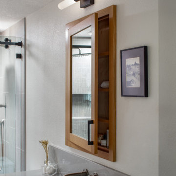
This compact modern bathroom remodel features intentionally placed colors, patterns, materials, and finishes to perfectly execute the homeowner’s style. In addition to a distaste for the bathroom’s existing brown color scheme, there was an extremely large and deep soaking tub with a shower combo that had been installed by a previous owner which made accessibility extremely difficult for these new homeowners to use the shower. The homeowners expressed a love for modern, contemporary, and sleek design styles with strong preferences for grey and slate tones and a dislike of brown tones and ornate patterns. In addition, Interior Designer Elizabeth noticed that they would get excited when discussing whimsical features. The final bathroom design involved replacing the bath vanity, toilet, flooring, and removing the obtrusive tub to create an easy-access tile shower with a sliding shower glass barn door. The existing unique bathroom layout was a narrow room open to the Primary Bedroom with no door and contained all fixtures on the interior wall facing away from the Primary Bedroom entrance. We utilized a floating vanity to give the illusion of a wider bathroom and the open space below the cabinet makes it easier to round the corner to enter the bathroom without running into the cabinet. To create a bathroom design that expressed the homeowner’s style of modern, grey, and whimsy, Interior Designer Elizabeth proposed a grey mosaic tile that formed a whimsical pattern via the grout lines, and maintained the desired modern feel by having this mosaic tile installed over the entirety of the back wall with large format tiles of the same color/collection installed on the side walls. The cool tones of the grey tile shower and charcoal tile floor are balanced with the warmth of a natural rift white oak vanity and recessed medicine cabinet mirror to create this luxurious modern bathroom.

 Decra-Scape, Inc.
The City of Farmington is comprised of numerous historic structures that make up the Farmington Historic District. This Historic District surrounds the project site and played a huge role in the design and construction of the streetscape. While the plans look fascinating on paper, bringing the project to life became a challenge on its own – upon the initial layout of the site, we found that none of the existing buildings were square, so additional cutting would be required for the bricks abutting these structures and the curbs along the road.
Another challenge faced during this project was after the demolition and removal of the existing concrete sidewalk. The demolition had caused damage to the face of the historic buildings, and required careful repairs. These unexpected repairs consisted of turning brick on end to cover blemishes, mortaring bricks on the buildings back into position, and re-cutting concrete sills.
Throughout the project, the stacked diamond pattern involving two different color bricks proved to be a challenge as well. One brick laid out of position could alter the aesthetics of the project and would not be accepted. When working with clay bricks, the dimension tolerances are somewhat loose, which make it difficult to keep clean site-lines due to the carrying sized bricks. Furthermore, the different colored bricks used for this project were created by different manufactures, which amplified the dimension tolerance issue.
Coordination with the project took careful planning and communication. The bricks specified were coming from two different states, one being California. With materials being shipped from across the continent, and tight deadline, managing logistics was key to insuring the success of this project. Further, all of the storefronts remained open during the course of the project, as did the road. This created tight working quarters, and required coordination with shop owners, and careful attention to pedestrians as they walked through the worksite to shop in the stores. For each storefront, the team had to strike the leveling layer up to the entrance, lay the brick pavers, and get past the door in a timely manner as not to interrupt the normal business operations. The tight deadline and unfavorable weather conditions caused the team to work 21 consecutive days to finish on schedule.
Upon completion of the project, the new streetscape complimented the historic feel of the city and looked as if it was meant-to-be. The architect was happy with our workmanship, and pleased with the results.
 TVL Creative Ltd.
This remodel took an extremely dark & dated kitchen and transformed it into a bright and airy happy place for our client. The existing conditions created a dark, hall-like kitchen that greatly lacked in function and did little to optimize storage. Realizing the potential of this truly massive space, we created a design that utilizes every inch of the kitchen and creates functional cooking and prep space as well as pantry storage and work nooks. Our first order of business was to demo out the blocky corner that separated the kitchen from the living room. This involved removing an existing fireplace, re-structuring a wall, and having an entirely new furnace installed in the basement to eliminate a duct running right through the corner we hoped to eliminate. After opening up the space, we focused on highlighting and brightening the room. New NuCore flooring was installed to give the kitchen a fresh look while offering optimal function and cleanability. Two-toned cabinets in a honey maple and painted silk were used to create a warm and comfortable balance throughout the space. New quartz countertops in MSI's canvas were installed, and butcher block was installed on the two desk areas to offer a warm visual relief and casual work surface. The color palette for the kitchen is reminiscent of a cozy apothecary; we utilized fresh greens with Sherwin Williams paint on the walls and Treviso Gray Sage glazed subway tiles on the backsplash. Over the sink, we designed a playful highlight with counter-to-ceiling mini brick mosaic in a dark crackle green. We introduced additional lighting throughout including new recessed lights, over-sink light, and under-cabinet lights. New appliances were introduced to the space as well, and we complimented the stainless steel of these fixtures to the transitional nickel hardware on the cabinets. This space now feels open and inviting, and is visible from the second you enter the front door! We are so proud of this result and so happy that our clients can enjoy this gorgeous kitchen for years to come.
87