
Search results for "Involved removing" in Home Design Ideas

 Thompson Remodeling
One of the focal points of the new kitchen design is the new, octagonal island made of slate stained cabinets with a Milan grey quartz countertop. For contrast, the wall cabinets have a chestnut stain with a terra brown quartz countertop.
Our clients did not want to use recessed lighting in their kitchen, so we designed a custom track system and combined it with pendant lighting in other areas. For more formal family meals, we built a custom banquette that the children can also use for doing homework. The homeowner’s favorite part of the kitchen is the floor to ceiling cabinetry that offers loads of storage space.
The children in the family are very active and involved in many activities, but this home was not built to handle their comings and goings and all the “stuff” that goes with it. We removed a closet and used the extra space to create a fantastic mudroom with custom lockers, each with its on bottom drawer on rollers, personal bench, hooks and phone charging station! We also used this area to bring in some of the homeowner’s favorite bright colors.
We remodeled the laundry space to make it more functional for the family. Updates include open shelves to store laundry baskets, a new sink, cabinets with an oregano stain, and a countertop at just the right height for the parents.
The master bath received a luxurious update to create a relaxing space for mom and dad. A large tile shower replaces the old alcove bathtub and a new double vanity features java stained cabinets and quartz countertops.
 Thompson Remodeling
One of the focal points of the new kitchen design is the new, octagonal island made of slate stained cabinets with a Milan grey quartz countertop. For contrast, the wall cabinets have a chestnut stain with a terra brown quartz countertop.
Our clients did not want to use recessed lighting in their kitchen, so we designed a custom track system and combined it with pendant lighting in other areas. For more formal family meals, we built a custom banquette that the children can also use for doing homework. The homeowner’s favorite part of the kitchen is the floor to ceiling cabinetry that offers loads of storage space.
The children in the family are very active and involved in many activities, but this home was not built to handle their comings and goings and all the “stuff” that goes with it. We removed a closet and used the extra space to create a fantastic mudroom with custom lockers, each with its on bottom drawer on rollers, personal bench, hooks and phone charging station! We also used this area to bring in some of the homeowner’s favorite bright colors.
We remodeled the laundry space to make it more functional for the family. Updates include open shelves to store laundry baskets, a new sink, cabinets with an oregano stain, and a countertop at just the right height for the parents.
The master bath received a luxurious update to create a relaxing space for mom and dad. A large tile shower replaces the old alcove bathtub and a new double vanity features java stained cabinets and quartz countertops.

 Kitchen Design Concepts
We introduce to you one of our newer services we are providing here at Kitchen Design Concepts: spaces that just need a little reviving! As of recent, we are taking on projects that are in need of minimal updating, as in, spaces that don’t need a full-on remodel. Yes, you heard right! If your space has good bones, you like the layout of your kitchen, and you just need a few cosmetic changes, then today’s feature is for you! Recently, we updated a space where we did just this! The kitchen was in need of a little love, some fresh paint, and new finishes. And if we’re being honest here, the result looks almost as if the kitchen had a full-on remodel! To learn more about this space and how we did our magic, continue reading below:
The Before and After
First, see what an impact new finishes can make! The “before” image shows a kitchen with outdated finishes such as the tile countertops, backsplash, and cabinetry finish. The “after” image, is a kitchen that looks almost as if its brand new, the image speaks for itself!
Cabinetry
With the wooden cabinetry in this kitchen already having great bones, all we needed to do was our refinishing process that involved removing door and drawer fronts, sanding, priming, and painting. The main color of the cabinetry is white (Sherwin Williams Pure White 7005) and as an accent, we applied a deep navy blue that really pops in this space (Sherwin Willaims Naval 6244). As a special design element, we incorporated a natural wooden band across the hood which is subtle but adds an element of surprise.
Countertops
The original countertops in this space were a 12×12 tile with cracks and discolored grout from all the wear and tear. To replace the countertops, we installed a clean and crisp quartz that is not only durable but easy to maintain (no grout here!). The 3cm countertops are a Cambria quartz in a grey-tone color (Carrick).
Backsplash
Keeping things simple, yet classic, we installed a 3×6 subway tile from Interceramic. The crisp white pairs well with all the other finishes of the space and really brighten the space up! To spice things up, we paired the white tile with a contrasting grout color (Cape Grey) that matches the countertop. This is a simple method to add interest to your white backsplash!
Fixtures and Fittings
For the fixtures and fittings of the kitchen, we wanted pieces that made a statement. That’s why we selected this industrial style faucet from Brizo! The faucet is a Brizo LITZE™ PULL-DOWN FAUCET WITH ARC SPOUT AND INDUSTRIAL HANDLE (63044LF-BLGL). The matte black paired with the luxe gold elements really make a statement! To match the gold elements of the faucet, we installed cabinetry hardware from Topknobs in the same gold finish. The hardware is a Channing pull TK743HB. Lastly, the large single bowl sink (who doesn’t want a large sink?!) is a great functional touch to the kitchen. The sink is a Blanco Precision 16″ R10 super single with 16″ Drainer in stainless steel (516216).
Find the right local pro for your project

 White Crane Construction
Cohesively updating and modernizing this home built in the 1990s were the goal in this remodel. Several elements throughout the house like the traditional golden oak original stair railing in the main entry were too colonial for the homeowner as their taste was trending more modern. The golden oak used on trim, fireplace mantle, and baseboards trapped this home in a time warp. The original Kitchen had cabinetry with a traditional door style, painted cabinets, and laminate countertops which also caused it to look dated. The clients expressed a desire to integrate more modern elements into their home in a cost effective way without having to rip everything down to the studs. Our design/build team proposed and executed many elegant cost effective design solutions that involved changing paint, cabinetry, finishes, and fixtures to achieve the desired modern feeling throughout the home.
The Kitchen was completely remodeled. The traditional cabinetry was replaced by new frameless Décor cabinets with slab doors and drawers in a beautiful exotic walnut veneer with horizontal graining and soft closing hardware. To enhance the existing structure functionally the built in desk space in the Kitchen was removed and replaced by pantry cabinetry creating improved storage and flow in the new kitchen. The new large Cherry island, also by Décor, was finished in a dark charcoal stain and topped with a solid surface Cambria quartz countertop in Kingston which features a modern mix of black, white and olive tones. For the perimeter countertops Cambria Oakhampton was selected for its complimentary sleek dark chocolate color. Innovative use of materials was demonstrated by cutting linear strips of a pre-sheeted horizontal grey glass mosaic tile, staggering it, and running it vertically instead of horizontally on the backsplash. White Kitchen appliances were traded out for a more contemporary stainless steel.
Photography: Jill Greer

 Cantoni Atlanta
The fact that this home is in a development called Providence now seems perfectly fitting. Chris, the owner, was merely considering the possibility of downsizing from a formal residence outside Atlanta when he happened on the small complex of luxury brownstones under construction in nearby Roswell. “I wandered into The Providence by chance and loved what I saw. The developer, his wife, and the agent were there and discussing how Cantoni was going to finish out one of the units, and so we all started talking,” Chris explains “They asked if I wanted to meet with the designer from Cantoni, and suggested I could customize the home as I saw fit, and that did it for me. I was sold.”
Cantoni was originally approached by Mike and Joy Walsh, of Lehigh Homes, to create a contemporary model home to be featured on the Roswell Woman’s Club home tour. “Since Chris bought the brownstone right after we agreed to do the design work,” Lorna Hunter recalls, “we brought him in on the meetings with the architects to help finalize the layout.” From selecting tile and counter tops, to designing the kitchen and baths, to the furniture, art and even linens—Cantoni was involved with every phase of the project. “This home really represents the complete range of design and staging services we offer at Cantoni,” says Lorna. “Rooms were reconfigured to allow for changes Chris found appealing, and every tile and doorknob was thoughtfully chosen to complete the overall look.”
Chris found an easy rapport with Lorna. “I have always been drawn to contemporary décor,” he explains, “ so Lorna and I hit it off immediately.” Among the custom design ideas the two conceived for the 2,600 sq. ft. 3/3 brownstone: creating a “wing wall” (open on both sides) to form a sitting area adjacent to the guest room
downstairs, removing the elevator to enhance a sense of openness while leaving the 3-story shaft as a unique focal point, and choosing to expand the height of windows on the third level to maximize the flow of natural light.
The Providence is ideally located near quaint shops, great restaurants, jogging trails and a scenic river—not to mention it’s just four miles from Chris’ office. The project represents the breadth and depth of Cantoni’s in-house creative resources, and proves again that GREAT DESIGN IS A WAY OF LIFE.

 TVL Creative Ltd.
This remodel took an extremely dark & dated kitchen and transformed it into a bright and airy happy place for our client. The existing conditions created a dark, hall-like kitchen that greatly lacked in function and did little to optimize storage. Realizing the potential of this truly massive space, we created a design that utilizes every inch of the kitchen and creates functional cooking and prep space as well as pantry storage and work nooks. Our first order of business was to demo out the blocky corner that separated the kitchen from the living room. This involved removing an existing fireplace, re-structuring a wall, and having an entirely new furnace installed in the basement to eliminate a duct running right through the corner we hoped to eliminate. After opening up the space, we focused on highlighting and brightening the room. New NuCore flooring was installed to give the kitchen a fresh look while offering optimal function and cleanability. Two-toned cabinets in a honey maple and painted silk were used to create a warm and comfortable balance throughout the space. New quartz countertops in MSI's canvas were installed, and butcher block was installed on the two desk areas to offer a warm visual relief and casual work surface. The color palette for the kitchen is reminiscent of a cozy apothecary; we utilized fresh greens with Sherwin Williams paint on the walls and Treviso Gray Sage glazed subway tiles on the backsplash. Over the sink, we designed a playful highlight with counter-to-ceiling mini brick mosaic in a dark crackle green. We introduced additional lighting throughout including new recessed lights, over-sink light, and under-cabinet lights. New appliances were introduced to the space as well, and we complimented the stainless steel of these fixtures to the transitional nickel hardware on the cabinets. This space now feels open and inviting, and is visible from the second you enter the front door! We are so proud of this result and so happy that our clients can enjoy this gorgeous kitchen for years to come.
 Tile Doctor Ltd
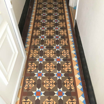
This client owned a property in Haringey, North London, which had a classic Victorian tiled floor laid in the hallway. Unfortunately, the floor was in a bad state, the tiles were dull and dirty and there was a missing section by the bottom of the stairs that had been back filled with cement. Fortunately for him however his neighbour decided to remove their front path which was made with matching tiles and so he was able acquire replacements from him. He then contacted us to see if we could use those tiles to fill in the missing ones and revive the whole floor with a clean and seal at the same time.
Before quoting for the restoration work, I paid a visit to the property to survey the floor. I can give quotes from photographs, but much prefer to visit and conduct a test clean, and in this case, I was able to check the spare tiles he had acquired. From that I emailed a quote which the client was happy with, so we arranged a date to return and do the work.
This was a large job, so I teamed up with Jackson Davis the Central London Tile Doctor and whilst Jackson started on cleaning the floor, I took the reclaimed tiles outside and carefully grinded off the excess cement and adhesive from them and cleaned them by hand. We managed to do this by about 3pm. Jackson and I work on a lot of jobs together so it made sense to work as a bubble from the beginning of Covid so we could continue to work together, with two of us on the job it also means we can get the job done quicker.
Cleaning the floor involved applying a 200-grit diamond burnishing pad to the tile lubricated with a strong dilution of Tile Doctor Remove and Go, the slurry was then rinsed off the floor with more water and then extracted with an industrial vacuum. The process was repeated on stubborn areas until we were satisfied the tiles were really clean.
We then moved onto carefully removing the cement from the floor at the bottom of the stairs and cleaning up the base. Once done the newly renovated replacement tiles were laid in place using a rapid setting adhesive which meant they could be grouted later that day before heading home. The floor was then left overnight to dry off.
We then returned the following day and took some moisture readings with the damp meter. The readings were within the expected range, so we were good to go ahead and apply the sealer. If the floor is not dry the seal will not cure properly, and this can lead to a patchy finish.
Three coats of Tile Doctor Colour Grow were applied to seal the tiles. This is a colour intensifying impregnating sealer that works from with and will gives the Victorian tiles durable protection, ideal for a high traffic area such as the hallway. In addition, Colour Grow is a fully breathable sealer so it will allow for moisture to rise through the tile and evaporate, this is critical for floors of this age that will not have the benefit of a damp proof membrane installed under the floor.
The hallway is now looking transformed by the work we did, we certainly thought so, but more importantly our client was very happy with the result and now has the floor he hoped for.
Andrew Newstead
North London Tile Doctor

 Tile Doctor Ltd
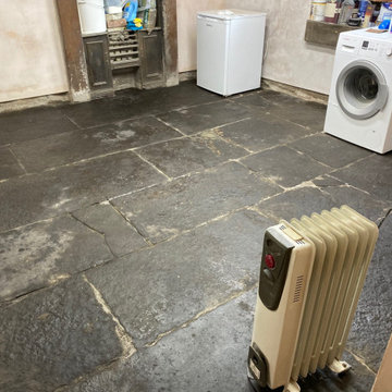
I was contacted by a client in Kendal to see if I could help with their Black Flagstone basement floor. As you can see from the photographs it was in a bit of a state and the stone looked mostly White rather than Black.
I carried out a site visit, to survey the floor and work out the best approach to restore its appearance. After testing a few different products and techniques I worked out an effective restoration plan and discussed this with the owner. Happy with my plan and costing’s we agreed a date to start the work. Being in the basement of the property had its challenges but it would mean we could work socially distanced from the owner.
To restore the floors appearance, I started with a set of coarse wire (60 and 120 grit) brushes lubricated with Tile Doctor Remove and Go which is a strong coatings remover. I had considered using milling pads on the tiles to reveal a new surface underneath but that does involve the use of an expensive set of coarse pads and given it was a basement the owners didn’t feel the extra expense would be justified.
The wire grits work well on rough stone floors when attached to a weighted buffing machine and we add some Tile Doctor Remove and Go to the mix. Once clean the floor was rinsed with water and the slurry extracted using an industrial wet vacuum. After cleaning the floor, it looked transformed, some pointing was required so we carried this out after the main clean.
The stone was left to dry out for a few days before returning to apply a sealer. For this floor I felt Tile Doctor X-Tra seal would be the best product and applied two coats. I chose X-Tra seal for this job as it ticks a lot of boxes, it’s a breathable oil-based resin sealer which being breathable will allow moisture to rise through the floor. Old floors like this don’t have a damp proof membrane so it is important to choose a sealer that can allow the floor to breath and not let damp build up under the floor where it can reach out to the walls and cause rising damp.
I also chose X-Tra Seal as it has a great ability to bring out the colour of the darker stone due to its high oil content, the oil will deter salts from forming if efflorescence is an issue. This is a unique property of this sealer as we never know if efflorescent salts are going to form or not so having this in place as a sealer is a great plus for a Tile Doctor, it is new to the market and is already proving popular on floors like this and for protecting external stone.
If the tiles are smooth Tile Doctor X-Tra Seal adds a bit of a sheen to the appearance of the stone however this stone was very rough, so we didn’t manage a shine, but the customer was happy with the matt finish and the slightly honed effect.
The floor looked great and much more appealing making the space more attractive and likely to be used. For aftercare I recommended Tile Doctor Neutral Tile Cleaner which will clean the floor without impacting the sealer which can be a problem with many of the stronger products you find in supermarkets.
Heidi Taylor
South Cumbria Tile Doctor
 White Crane Construction
Cohesively updating and modernizing this home built in the 1990s were the goal in this remodel. Several elements throughout the house like the traditional golden oak original stair railing in the main entry were too colonial for the homeowner as their taste was trending more modern. The golden oak used on trim, fireplace mantle, and baseboards trapped this home in a time warp. The original Kitchen had cabinetry with a traditional door style, painted cabinets, and laminate countertops which also caused it to look dated. The clients expressed a desire to integrate more modern elements into their home in a cost effective way without having to rip everything down to the studs. Our design/build team proposed and executed many elegant cost effective design solutions that involved changing paint, cabinetry, finishes, and fixtures to achieve the desired modern feeling throughout the home.
The Kitchen was completely remodeled. The traditional cabinetry was replaced by new frameless Décor cabinets with slab doors and drawers in a beautiful exotic walnut veneer with horizontal graining and soft closing hardware. To enhance the existing structure functionally the built in desk space in the Kitchen was removed and replaced by pantry cabinetry creating improved storage and flow in the new kitchen. The new large Cherry island, also by Décor, was finished in a dark charcoal stain and topped with a solid surface Cambria quartz countertop in Kingston which features a modern mix of black, white and olive tones. For the perimeter countertops Cambria Oakhampton was selected for its complimentary sleek dark chocolate color. Innovative use of materials was demonstrated by cutting linear strips of a pre-sheeted horizontal grey glass mosaic tile, staggering it, and running it vertically instead of horizontally on the backsplash. White Kitchen appliances were traded out for a more contemporary stainless steel.
The small original fireplace with oak mantle and brass trim seemed out of scale on the immense 2 story Living Room wall it inhabited. Superior craftsmanship was demonstrated by removing the original fireplace surround and replacing with a new larger fireplace surround which was tiled with a 6” x 20” warm taupe stone in a running bond patterned tile installed in a minimal horizontal stack bond pattern. The brass trim on the original firebox was updated with heat resistant high temperature paint in a bronze color. Slabs of Indiana Limestone were installed at the hearth and atop the firebox to create interest and texture. New Décor charcoal stained cabinets for media storage and large floating shelves were integrated into the new fireplace surround design creating an interesting asymmetrical scale appropriate hearth and TV area for the room. New modern satin nickel ceiling fan, bronze wall sconces, and grey textured carpeting were selected for the Living Room to compliment the new tile and woodwork of the fireplace surround.
Photography: Jill Greer
Photography: Jill Greer

 Benson Homes LLC
This remodeling story is a wonderful example of how removing and shifting walls can have an amazing impact on the functionality and visual appeal of an entire level of a home. When our clients reached out to us, they were looking to create an open concept Kitchen that would allow for easy entertaining. The couple had recently purchased this townhome so his mother could be closer to the family.
The existing floorplan offered first floor living, but the Kitchen was tucked in the back and was separated from the rest of the living space by a full wall with a small pass through into the Dining Room. Our design involved removing the dividing wall between the Dining Room and Kitchen as well as the fake columns and beam that separated the Dining Room and Living Room. The entire space was opened up to allow for easy flow and view throughout the first floor living space. The wall shared by the Kitchen and large Master Bedroom was shifted back just enough to provide a full wall of additional cabinetry including a much-needed large double Pantry cabinet. Now that we had opened up the Kitchen area we could focus on the cabinetry layout and selections.
The existing wood toned cabinets were replaced with white cabinets and crown molding to match the rest of the home. The larger, open space allowed for more cabinetry and the addition of an island with new undermount sink, dishwasher and convenient trash pullout along with seating for the grandchildren. A new range hood was installed and vented to the exterior of the house to replace the old recirculating hood. We were able to repurpose the some of the existing cabinets for use above the washer and dryer in the adjoining Laundry Room and swapped out the existing swinging door for a pocket door to free up traffic flow when doing Laundry and working in the Kitchen. The slate-look ceramic tile was replaced with a pre-engineered hardwood floor that creates a sense of warmth while easy to clean. The new Cambria countertop compliments the slate-look tile found in the Dining Room and Living Room and a natural field tile backsplash offsets the cabinets beautifully.
The single fluorescent ceiling light was outdated and did not provide adequate lighting for the new Kitchen. The new lighting plan was carefully thought out to provide general illumination through well placed recessed lighting; task lighting through pendant lighting over the island and under cabinet lighting; and aesthetic fluidity with an eye-catching chandelier for the Dining Room table. Special details include a touch faucet, under counter microwave and glass front cabinetry for displaying dishes.
By removing and shifting walls, we improved the entire flow of the first floor visually as well as functionally and created a beautiful, light-filled space for cooking and entertaining. Grandma can easily prepare meals in her new Kitchen and still chat with her guests and grandchildren who love to sit at the island as well as in the adjoining Dining Room and Living Room.
The Benson Homes team really enjoyed creating this space for this family and we hope they will enjoy spending time with friends and family for years to come.
 Tile Doctor Ltd
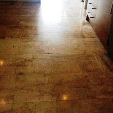
This customer from the historic city of Cardiff was keen to see what Tile Doctor could do to put some life back into their treasured Limestone kitchen floor that was laid in 2008. My first observations were mainly centred on the horrific condition of the surface which although adequately sealed initially the floor had not received any subsequent maintenance and its condition had deteriorated over time. The light shining in from the patio doors highlighted all the imperfections in the floor caused by surface wear and tear commonly seen in high traffic areas such as a kitchen.
Upon closer inspection, there were further problems: the floor was stained and scuffed, and in most places the sealer had worn off completely allowing the dirt to become ingrained into the pores of the Limestone. Additionally the grout was recessed but was now flush with the tile surface due to dirt build-up. There were also areas contaminated with grease and kitchen cooking oil.
The Limestone floor tiles were 20mm thick French Limestone, and had been laid very well so there was no requirement to do any tile or grout repairs however to get this floor back to its original condition the surface would need to be reconditioned using the Tile Doctor four stage burnishing system.
I started by giving the floor a wash with a medium dilution of Tile Doctor Pro-Clean, focusing mainly on the grout lines in order to remove the muck that had built-up there. I used a special stiff grout brush for this activity; it’s quite narrow and ideal for grout scrubbing.
This worked well, but the significant build-up of dirt along some of the grout lines meant more work was required. I tackled this problem with a hand scraper assisted with steam. At the end of this process, the whole floor was then rinsed down with water to remove any soil and the resulting slurry was then extracted using a wet vacuum.
The next step was to start the burnishing process, which basically involves applying four diamond encrusted floor pads in sequence over the floor. Each pad is a different grade, starting with the most abrasive coarse pad and moving through to the finer grades using a little water to lubricate and rinsing away any slurry between each pad.
I eventually finished with the extra fine pad which builds up shine and lustre on the tile; it had taken two days to clean the grout and burnish the Limestone but the floor was much improved and so after a final rinse down I left the floor to dry off overnight with the aid of the underfloor heating.
During this time, I also addressed the stained Limestone in the area of the kitchen where the dustbin was situated. This had been a major upset for the customer and I’m happy to report I managed to deal with it. However, it was quite an involved process, so I’ll write about this in a separate post.
On the third day I came back to seal the floor, checking first that it had dried sufficiently with a damp meter. Fortunately, the underfloor heating had done a great job of drying the stone and I was able to seal the floor using three coats of Tile Doctor Colour Grow sealant. This sealant not only provides a durable seal but also penetrates deep into the pores of the stone protecting it from within and enhancing the natural colours of the Limestone in the process.
After the final layer of sealant, I worked over the floor again with the extra fine burnishing pad both to add shine again following sealing, and to ensure that no smear marks were visible as the lighting conditions were unforgiving and highlighted any imperfections.
The customer was delighted with the results: so much so, in fact, that they booked me in to restore their Victorian hallway floor as well but that’s a story for another time!
Julian Iancono
SE Wales Tile Doctor

 Jarrett Design
Entertaining friends and family doesn't work well when rooms are small and closed off. So when our clients decided to remodel, they knew they wanted to open up the space to accommodate large gatherings. Also important were ample storage and quality appliances that would hold up to the demands of cooking creative meals several nights a week.
As is sometimes the case with remodeling, solving one problem can create another. Opening up the space involved removing a wall, which sacrificed critical square footage for cabinetry and appliances. We knew the wall needed to come down so we were challenged with making sure every available cabinet space in the kitchen was being utilized as thoughtfully and creatively as possible. A tall pantry was added next to the refrigerator to allow for storage of pots and pans, as well as food, while another pantry in the adjacent dining room housed all dishes and silverware. A small bar area was created in an unused section in the back of the home to store coffee and tea accessories and drinkware. Finally, a small island in the center of the kitchen offered the ideal location for the microwave and most-used pots and pans.
With the expanded space, smart use of storage options and top-notch appliances, our clients are enjoying working in their new kitchen and have already hosted a ravioli-making class!
Matt Villano Photography
 HOME REMODELING INC.
A kitchen remodel is a project that involves changing the layout, fixtures, and finishes of your kitchen. It can be a small project, such as painting the cabinets and replacing the hardware, or a major project, such as tearing down walls and installing new appliances.
Here are some of the things that you might do during a kitchen remodel:
Change the layout of the kitchen. This could involve moving walls, relocating plumbing and electrical fixtures, and adding or removing cabinets.
Install new cabinets and countertops. Cabinets and countertops are the two most important elements of a kitchen, so choosing the right ones is important. There are many different styles and materials to choose from, so you can find something that fits your taste and budget.
Kitchen remodel countertops
Install new appliances. If your appliances are old or outdated, you may want to replace them with new ones. There are many different appliances to choose from, so you can find ones that meet your needs and budget.
Kitchen remodel appliances
Install new flooring. The flooring in your kitchen should be durable and easy to clean. There are many different flooring types, such as tile, hardwood, and laminate.
Kitchen remodel flooring
Install new lighting. Good lighting is essential in a kitchen. You can add task lighting under cabinets and over the sink and ambient lighting in the ceiling.
Kitchen remodel lighting
Add a backsplash. A backsplash is a decorative tile or panel behind the stove and sink. It can add a touch of personality to your kitchen.
Kitchen remodel backsplash
A kitchen remodel can be a big investment, but it can also be a very rewarding experience. If you are thinking about remodeling your kitchen, it is important to do your research and plan your project carefully.
Here are some additional tips for kitchen remodels:
Set a budget and stick to it. Knowing how much you can afford to spend on your remodel before you start is important. Once you have a budget, get quotes from several contractors to ensure you get the best price.
Get permits. Some kitchen remodels require permits. Be sure to check with your local building department to see if you need any permits before you start your project.
Be patient. Kitchen remodels can take several weeks or even months to complete. Be patient, and don't try to rush the process.
I hope this gives you a general idea of what a kitchen remodel is all about. If you have any specific questions, please feel free to ask.
 Jarrett Design
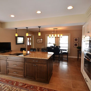
Entertaining friends and family doesn't work well when rooms are small and closed off. So when our clients decided to remodel, they knew they wanted to open up the space to accommodate large gatherings. Also important were ample storage and quality appliances that would hold up to the demands of cooking creative meals several nights a week.
As is sometimes the case with remodeling, solving one problem can create another. Opening up the space involved removing a wall, which sacrificed critical square footage for cabinetry and appliances. We knew the wall needed to come down so we were challenged with making sure every available cabinet space in the kitchen was being utilized as thoughtfully and creatively as possible. A tall pantry was added next to the refrigerator to allow for storage of pots and pans, as well as food, while another pantry in the adjacent dining room housed all dishes and silverware. A small bar area was created in an unused section in the back of the home to store coffee and tea accessories and drinkware. Finally, a small island in the center of the kitchen offered the ideal location for the microwave and most-used pots and pans.
With the expanded space, smart use of storage options and top-notch appliances, our clients are enjoying working in their new kitchen and have already hosted a ravioli-making class!
Matt Villano Photography

 Independent Home Walk In Tubs New Jersey
Our installation experts at Independent Home just completed a walk in tub installation for our customer Edward of Haddonfield. Find out why he decided to go with Independent Home along with how the installation was completed.
Edward began shopping around for walk in tubs about a month ago. He was looking for a tub that was not only safe but could help with his arthritis. He received quotes from a few different companies but in the end decided on Independent Home. We were chosen because our salesmen were not pushy and were patient with answering all of Edward’s questions. A pre-installation meeting was then scheduled.
The pre-installation meeting involved our installation experts and, of course, Edward. The meeting consisted of discussing what tub would be best for Edward’s needs, where the best location would be, and what type of finish should be added. Edward and our experts decided to go with our celebrity walk in tub with hydrotherapy model.
The celebrity was the best choice for Edward because it had all of the requirements he was looking for. It met his safety requirements with a non-slip floor, an ADA compliant seat, and a low threshold for an easy entrance and exit. The tub’s hydrotherapy features will be able to reduce Edward’s arthritis pain. All he has to do is turn on the jets and relax. The way that the jets move will increase his circulation which will help his muscles and joints rehabilitate.
The entire installation process only took a couple of days to complete. This consisted of removing Edward’s old tub and foundation, bringing in the new tub, leveling the legs, connecting the water, and testing for leaks. The last step of the installation was building the finish with a simple tile wall surround that Edward had requested.
Edward loves his new tub. The hydrotherapy features have decreased his arthritis pain, allowing him to get out more.
 White Crane Construction
Cohesively updating and modernizing this home built in the 1990s were the goal in this remodel. Several elements throughout the house like the traditional golden oak original stair railing in the main entry were too colonial for the homeowner as their taste was trending more modern. The golden oak used on trim, fireplace mantle, and baseboards trapped this home in a time warp. The original Kitchen had cabinetry with a traditional door style, painted cabinets, and laminate countertops which also caused it to look dated. The clients expressed a desire to integrate more modern elements into their home in a cost effective way without having to rip everything down to the studs. Our design/build team proposed and executed many elegant cost effective design solutions that involved changing paint, cabinetry, finishes, and fixtures to achieve the desired modern feeling throughout the home.
The Kitchen was completely remodeled. The traditional cabinetry was replaced by new frameless Décor cabinets with slab doors and drawers in a beautiful exotic walnut veneer with horizontal graining and soft closing hardware. To enhance the existing structure functionally the built in desk space in the Kitchen was removed and replaced by pantry cabinetry creating improved storage and flow in the new kitchen. The new large Cherry island, also by Décor, was finished in a dark charcoal stain and topped with a solid surface Cambria quartz countertop in Kingston which features a modern mix of black, white and olive tones. For the perimeter countertops Cambria Oakhampton was selected for its complimentary sleek dark chocolate color. Innovative use of materials was demonstrated by cutting linear strips of a pre-sheeted horizontal grey glass mosaic tile, staggering it, and running it vertically instead of horizontally on the backsplash. White Kitchen appliances were traded out for a more contemporary stainless steel.
The small original fireplace with oak mantle and brass trim seemed out of scale on the immense 2 story Living Room wall it inhabited. Superior craftsmanship was demonstrated by removing the original fireplace surround and replacing with a new larger fireplace surround which was tiled with a 6” x 20” warm taupe stone in a running bond patterned tile installed in a minimal horizontal stack bond pattern. The brass trim on the original firebox was updated with heat resistant high temperature paint in a bronze color. Slabs of Indiana Limestone were installed at the hearth and atop the firebox to create interest and texture. New Décor charcoal stained cabinets for media storage and large floating shelves were integrated into the new fireplace surround design creating an interesting asymmetrical scale appropriate hearth and TV area for the room. New modern satin nickel ceiling fan, bronze wall sconces, and grey textured carpeting were selected for the Living Room to compliment the new tile and woodwork of the fireplace surround.
Photography: Jill Greer
 TVL Creative Ltd.
This remodel took an extremely dark & dated kitchen and transformed it into a bright and airy happy place for our client. The existing conditions created a dark, hall-like kitchen that greatly lacked in function and did little to optimize storage. Realizing the potential of this truly massive space, we created a design that utilizes every inch of the kitchen and creates functional cooking and prep space as well as pantry storage and work nooks. Our first order of business was to demo out the blocky corner that separated the kitchen from the living room. This involved removing an existing fireplace, re-structuring a wall, and having an entirely new furnace installed in the basement to eliminate a duct running right through the corner we hoped to eliminate. After opening up the space, we focused on highlighting and brightening the room. New NuCore flooring was installed to give the kitchen a fresh look while offering optimal function and cleanability. Two-toned cabinets in a honey maple and painted silk were used to create a warm and comfortable balance throughout the space. New quartz countertops in MSI's canvas were installed, and butcher block was installed on the two desk areas to offer a warm visual relief and casual work surface. The color palette for the kitchen is reminiscent of a cozy apothecary; we utilized fresh greens with Sherwin Williams paint on the walls and Treviso Gray Sage glazed subway tiles on the backsplash. Over the sink, we designed a playful highlight with counter-to-ceiling mini brick mosaic in a dark crackle green. We introduced additional lighting throughout including new recessed lights, over-sink light, and under-cabinet lights. New appliances were introduced to the space as well, and we complimented the stainless steel of these fixtures to the transitional nickel hardware on the cabinets. This space now feels open and inviting, and is visible from the second you enter the front door! We are so proud of this result and so happy that our clients can enjoy this gorgeous kitchen for years to come.
 Benson Homes LLC
This remodeling story is a wonderful example of how removing and shifting walls can have an amazing impact on the functionality and visual appeal of an entire level of a home. When our clients reached out to us, they were looking to create an open concept Kitchen that would allow for easy entertaining. The couple had recently purchased this townhome so his mother could be closer to the family.
The existing floorplan offered first floor living, but the Kitchen was tucked in the back and was separated from the rest of the living space by a full wall with a small pass through into the Dining Room. Our design involved removing the dividing wall between the Dining Room and Kitchen as well as the fake columns and beam that separated the Dining Room and Living Room. The entire space was opened up to allow for easy flow and view throughout the first floor living space. The wall shared by the Kitchen and large Master Bedroom was shifted back just enough to provide a full wall of additional cabinetry including a much-needed large double Pantry cabinet. Now that we had opened up the Kitchen area we could focus on the cabinetry layout and selections.
The existing wood toned cabinets were replaced with white cabinets and crown molding to match the rest of the home. The larger, open space allowed for more cabinetry and the addition of an island with new undermount sink, dishwasher and convenient trash pullout along with seating for the grandchildren. A new range hood was installed and vented to the exterior of the house to replace the old recirculating hood. We were able to repurpose the some of the existing cabinets for use above the washer and dryer in the adjoining Laundry Room and swapped out the existing swinging door for a pocket door to free up traffic flow when doing Laundry and working in the Kitchen. The slate-look ceramic tile was replaced with a pre-engineered hardwood floor that creates a sense of warmth while easy to clean. The new Cambria countertop compliments the slate-look tile found in the Dining Room and Living Room and a natural field tile backsplash offsets the cabinets beautifully.
The single fluorescent ceiling light was outdated and did not provide adequate lighting for the new Kitchen. The new lighting plan was carefully thought out to provide general illumination through well placed recessed lighting; task lighting through pendant lighting over the island and under cabinet lighting; and aesthetic fluidity with an eye-catching chandelier for the Dining Room table. Special details include a touch faucet, under counter microwave and glass front cabinetry for displaying dishes.
By removing and shifting walls, we improved the entire flow of the first floor visually as well as functionally and created a beautiful, light-filled space for cooking and entertaining. Grandma can easily prepare meals in her new Kitchen and still chat with her guests and grandchildren who love to sit at the island as well as in the adjoining Dining Room and Living Room.
The Benson Homes team really enjoyed creating this space for this family and we hope they will enjoy spending time with friends and family for years to come.
 Benson Homes LLC
This remodeling story is a wonderful example of how removing and shifting walls can have an amazing impact on the functionality and visual appeal of an entire level of a home. When our clients reached out to us, they were looking to create an open concept Kitchen that would allow for easy entertaining. The couple had recently purchased this townhome so his mother could be closer to the family.
The existing floorplan offered first floor living, but the Kitchen was tucked in the back and was separated from the rest of the living space by a full wall with a small pass through into the Dining Room. Our design involved removing the dividing wall between the Dining Room and Kitchen as well as the fake columns and beam that separated the Dining Room and Living Room. The entire space was opened up to allow for easy flow and view throughout the first floor living space. The wall shared by the Kitchen and large Master Bedroom was shifted back just enough to provide a full wall of additional cabinetry including a much-needed large double Pantry cabinet. Now that we had opened up the Kitchen area we could focus on the cabinetry layout and selections.
The existing wood toned cabinets were replaced with white cabinets and crown molding to match the rest of the home. The larger, open space allowed for more cabinetry and the addition of an island with new undermount sink, dishwasher and convenient trash pullout along with seating for the grandchildren. A new range hood was installed and vented to the exterior of the house to replace the old recirculating hood. We were able to repurpose the some of the existing cabinets for use above the washer and dryer in the adjoining Laundry Room and swapped out the existing swinging door for a pocket door to free up traffic flow when doing Laundry and working in the Kitchen. The slate-look ceramic tile was replaced with a pre-engineered hardwood floor that creates a sense of warmth while easy to clean. The new Cambria countertop compliments the slate-look tile found in the Dining Room and Living Room and a natural field tile backsplash offsets the cabinets beautifully.
The single fluorescent ceiling light was outdated and did not provide adequate lighting for the new Kitchen. The new lighting plan was carefully thought out to provide general illumination through well placed recessed lighting; task lighting through pendant lighting over the island and under cabinet lighting; and aesthetic fluidity with an eye-catching chandelier for the Dining Room table. Special details include a touch faucet, under counter microwave and glass front cabinetry for displaying dishes.
By removing and shifting walls, we improved the entire flow of the first floor visually as well as functionally and created a beautiful, light-filled space for cooking and entertaining. Grandma can easily prepare meals in her new Kitchen and still chat with her guests and grandchildren who love to sit at the island as well as in the adjoining Dining Room and Living Room.
The Benson Homes team really enjoyed creating this space for this family and we hope they will enjoy spending time with friends and family for years to come.
 Benson Homes LLC
This remodeling story is a wonderful example of how removing and shifting walls can have an amazing impact on the functionality and visual appeal of an entire level of a home. When our clients reached out to us, they were looking to create an open concept Kitchen that would allow for easy entertaining. The couple had recently purchased this townhome so his mother could be closer to the family.
The existing floorplan offered first floor living, but the Kitchen was tucked in the back and was separated from the rest of the living space by a full wall with a small pass through into the Dining Room. Our design involved removing the dividing wall between the Dining Room and Kitchen as well as the fake columns and beam that separated the Dining Room and Living Room. The entire space was opened up to allow for easy flow and view throughout the first floor living space. The wall shared by the Kitchen and large Master Bedroom was shifted back just enough to provide a full wall of additional cabinetry including a much-needed large double Pantry cabinet. Now that we had opened up the Kitchen area we could focus on the cabinetry layout and selections.
The existing wood toned cabinets were replaced with white cabinets and crown molding to match the rest of the home. The larger, open space allowed for more cabinetry and the addition of an island with new undermount sink, dishwasher and convenient trash pullout along with seating for the grandchildren. A new range hood was installed and vented to the exterior of the house to replace the old recirculating hood. We were able to repurpose the some of the existing cabinets for use above the washer and dryer in the adjoining Laundry Room and swapped out the existing swinging door for a pocket door to free up traffic flow when doing Laundry and working in the Kitchen. The slate-look ceramic tile was replaced with a pre-engineered hardwood floor that creates a sense of warmth while easy to clean. The new Cambria countertop compliments the slate-look tile found in the Dining Room and Living Room and a natural field tile backsplash offsets the cabinets beautifully.
The single fluorescent ceiling light was outdated and did not provide adequate lighting for the new Kitchen. The new lighting plan was carefully thought out to provide general illumination through well placed recessed lighting; task lighting through pendant lighting over the island and under cabinet lighting; and aesthetic fluidity with an eye-catching chandelier for the Dining Room table. Special details include a touch faucet, under counter microwave and glass front cabinetry for displaying dishes.
By removing and shifting walls, we improved the entire flow of the first floor visually as well as functionally and created a beautiful, light-filled space for cooking and entertaining. Grandma can easily prepare meals in her new Kitchen and still chat with her guests and grandchildren who love to sit at the island as well as in the adjoining Dining Room and Living Room.
The Benson Homes team really enjoyed creating this space for this family and we hope they will enjoy spending time with friends and family for years to come.
83