
Search results for "Involved removing" in Home Design Ideas
 Ashton Renovations
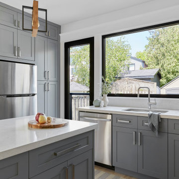
At Muriel Ave. in Toronto, we undertook a comprehensive renovation project that focused primarily on the main floor, with additional updates to the flooring on the second floor. The main floor was transformed by removing walls to create a more open and spacious concept. This allowed for better flow and usability, enhancing the overall aesthetic and functional appeal of the home.
A significant part of the renovation involved enlarging the window opening above the kitchen counter and installing a new side door. Both features were fitted with specialized European black trim windows, adding a sleek, modern touch to the space. In the living area, we installed a beautiful, modern gas fireplace that serves as a focal point, providing both warmth and ambiance.
The staircase received a notable upgrade with new maple treads and a striking black aluminum railing complemented by glass panels, blending safety with contemporary design. One of the most distinctive features of this renovation is the full glass wall by the stairs, which extends to cover the opening to the basement. This not only adds a sense of openness but also allows natural light to permeate through multiple levels of the home.
The kitchen was redesigned into an L-shaped layout with an island, optimizing both functionality and aesthetics. The inclusion of a brick backsplash above the stove offers a rustic yet stylish contrast to the modern kitchen fixtures. The client also chose to retain the existing powder room off to the side of the kitchen, preserving a convenient and practical feature.
On the second floor, we replaced the flooring, ensuring a cohesive and modern look throughout the house. The final product of this renovation is truly stunning, showcasing an eclectic blend of new and old design elements. This project at Muriel Ave., located near the bustling intersection of Pape and Danforth, highlights our expertise and frequent work in this vibrant area. Our team is proud to deliver high-quality, customized renovations that enhance both the functionality and beauty of our clients’ homes.

 Benson Homes LLC
This remodeling story is a wonderful example of how removing and shifting walls can have an amazing impact on the functionality and visual appeal of an entire level of a home. When our clients reached out to us, they were looking to create an open concept Kitchen that would allow for easy entertaining. The couple had recently purchased this townhome so his mother could be closer to the family.
The existing floorplan offered first floor living, but the Kitchen was tucked in the back and was separated from the rest of the living space by a full wall with a small pass through into the Dining Room. Our design involved removing the dividing wall between the Dining Room and Kitchen as well as the fake columns and beam that separated the Dining Room and Living Room. The entire space was opened up to allow for easy flow and view throughout the first floor living space. The wall shared by the Kitchen and large Master Bedroom was shifted back just enough to provide a full wall of additional cabinetry including a much-needed large double Pantry cabinet. Now that we had opened up the Kitchen area we could focus on the cabinetry layout and selections.
The existing wood toned cabinets were replaced with white cabinets and crown molding to match the rest of the home. The larger, open space allowed for more cabinetry and the addition of an island with new undermount sink, dishwasher and convenient trash pullout along with seating for the grandchildren. A new range hood was installed and vented to the exterior of the house to replace the old recirculating hood. We were able to repurpose the some of the existing cabinets for use above the washer and dryer in the adjoining Laundry Room and swapped out the existing swinging door for a pocket door to free up traffic flow when doing Laundry and working in the Kitchen. The slate-look ceramic tile was replaced with a pre-engineered hardwood floor that creates a sense of warmth while easy to clean. The new Cambria countertop compliments the slate-look tile found in the Dining Room and Living Room and a natural field tile backsplash offsets the cabinets beautifully.
The single fluorescent ceiling light was outdated and did not provide adequate lighting for the new Kitchen. The new lighting plan was carefully thought out to provide general illumination through well placed recessed lighting; task lighting through pendant lighting over the island and under cabinet lighting; and aesthetic fluidity with an eye-catching chandelier for the Dining Room table. Special details include a touch faucet, under counter microwave and glass front cabinetry for displaying dishes.
By removing and shifting walls, we improved the entire flow of the first floor visually as well as functionally and created a beautiful, light-filled space for cooking and entertaining. Grandma can easily prepare meals in her new Kitchen and still chat with her guests and grandchildren who love to sit at the island as well as in the adjoining Dining Room and Living Room.
The Benson Homes team really enjoyed creating this space for this family and we hope they will enjoy spending time with friends and family for years to come.
 Benson Homes LLC
This remodeling story is a wonderful example of how removing and shifting walls can have an amazing impact on the functionality and visual appeal of an entire level of a home. When our clients reached out to us, they were looking to create an open concept Kitchen that would allow for easy entertaining. The couple had recently purchased this townhome so his mother could be closer to the family.
The existing floorplan offered first floor living, but the Kitchen was tucked in the back and was separated from the rest of the living space by a full wall with a small pass through into the Dining Room. Our design involved removing the dividing wall between the Dining Room and Kitchen as well as the fake columns and beam that separated the Dining Room and Living Room. The entire space was opened up to allow for easy flow and view throughout the first floor living space. The wall shared by the Kitchen and large Master Bedroom was shifted back just enough to provide a full wall of additional cabinetry including a much-needed large double Pantry cabinet. Now that we had opened up the Kitchen area we could focus on the cabinetry layout and selections.
The existing wood toned cabinets were replaced with white cabinets and crown molding to match the rest of the home. The larger, open space allowed for more cabinetry and the addition of an island with new undermount sink, dishwasher and convenient trash pullout along with seating for the grandchildren. A new range hood was installed and vented to the exterior of the house to replace the old recirculating hood. We were able to repurpose the some of the existing cabinets for use above the washer and dryer in the adjoining Laundry Room and swapped out the existing swinging door for a pocket door to free up traffic flow when doing Laundry and working in the Kitchen. The slate-look ceramic tile was replaced with a pre-engineered hardwood floor that creates a sense of warmth while easy to clean. The new Cambria countertop compliments the slate-look tile found in the Dining Room and Living Room and a natural field tile backsplash offsets the cabinets beautifully.
The single fluorescent ceiling light was outdated and did not provide adequate lighting for the new Kitchen. The new lighting plan was carefully thought out to provide general illumination through well placed recessed lighting; task lighting through pendant lighting over the island and under cabinet lighting; and aesthetic fluidity with an eye-catching chandelier for the Dining Room table. Special details include a touch faucet, under counter microwave and glass front cabinetry for displaying dishes.
By removing and shifting walls, we improved the entire flow of the first floor visually as well as functionally and created a beautiful, light-filled space for cooking and entertaining. Grandma can easily prepare meals in her new Kitchen and still chat with her guests and grandchildren who love to sit at the island as well as in the adjoining Dining Room and Living Room.
The Benson Homes team really enjoyed creating this space for this family and we hope they will enjoy spending time with friends and family for years to come.
Find the right local pro for your project
 Benson Homes LLC
This remodeling story is a wonderful example of how removing and shifting walls can have an amazing impact on the functionality and visual appeal of an entire level of a home. When our clients reached out to us, they were looking to create an open concept Kitchen that would allow for easy entertaining. The couple had recently purchased this townhome so his mother could be closer to the family.
The existing floorplan offered first floor living, but the Kitchen was tucked in the back and was separated from the rest of the living space by a full wall with a small pass through into the Dining Room. Our design involved removing the dividing wall between the Dining Room and Kitchen as well as the fake columns and beam that separated the Dining Room and Living Room. The entire space was opened up to allow for easy flow and view throughout the first floor living space. The wall shared by the Kitchen and large Master Bedroom was shifted back just enough to provide a full wall of additional cabinetry including a much-needed large double Pantry cabinet. Now that we had opened up the Kitchen area we could focus on the cabinetry layout and selections.
The existing wood toned cabinets were replaced with white cabinets and crown molding to match the rest of the home. The larger, open space allowed for more cabinetry and the addition of an island with new undermount sink, dishwasher and convenient trash pullout along with seating for the grandchildren. A new range hood was installed and vented to the exterior of the house to replace the old recirculating hood. We were able to repurpose the some of the existing cabinets for use above the washer and dryer in the adjoining Laundry Room and swapped out the existing swinging door for a pocket door to free up traffic flow when doing Laundry and working in the Kitchen. The slate-look ceramic tile was replaced with a pre-engineered hardwood floor that creates a sense of warmth while easy to clean. The new Cambria countertop compliments the slate-look tile found in the Dining Room and Living Room and a natural field tile backsplash offsets the cabinets beautifully.
The single fluorescent ceiling light was outdated and did not provide adequate lighting for the new Kitchen. The new lighting plan was carefully thought out to provide general illumination through well placed recessed lighting; task lighting through pendant lighting over the island and under cabinet lighting; and aesthetic fluidity with an eye-catching chandelier for the Dining Room table. Special details include a touch faucet, under counter microwave and glass front cabinetry for displaying dishes.
By removing and shifting walls, we improved the entire flow of the first floor visually as well as functionally and created a beautiful, light-filled space for cooking and entertaining. Grandma can easily prepare meals in her new Kitchen and still chat with her guests and grandchildren who love to sit at the island as well as in the adjoining Dining Room and Living Room.
The Benson Homes team really enjoyed creating this space for this family and we hope they will enjoy spending time with friends and family for years to come.

 Kitchen Design Concepts
We introduce to you one of our newer services we are providing here at Kitchen Design Concepts: spaces that just need a little reviving! As of recent, we are taking on projects that are in need of minimal updating, as in, spaces that don’t need a full-on remodel. Yes, you heard right! If your space has good bones, you like the layout of your kitchen, and you just need a few cosmetic changes, then today’s feature is for you! Recently, we updated a space where we did just this! The kitchen was in need of a little love, some fresh paint, and new finishes. And if we’re being honest here, the result looks almost as if the kitchen had a full-on remodel! To learn more about this space and how we did our magic, continue reading below:
The Before and After
First, see what an impact new finishes can make! The “before” image shows a kitchen with outdated finishes such as the tile countertops, backsplash, and cabinetry finish. The “after” image, is a kitchen that looks almost as if its brand new, the image speaks for itself!
Cabinetry
With the wooden cabinetry in this kitchen already having great bones, all we needed to do was our refinishing process that involved removing door and drawer fronts, sanding, priming, and painting. The main color of the cabinetry is white (Sherwin Williams Pure White 7005) and as an accent, we applied a deep navy blue that really pops in this space (Sherwin Willaims Naval 6244). As a special design element, we incorporated a natural wooden band across the hood which is subtle but adds an element of surprise.
Countertops
The original countertops in this space were a 12×12 tile with cracks and discolored grout from all the wear and tear. To replace the countertops, we installed a clean and crisp quartz that is not only durable but easy to maintain (no grout here!). The 3cm countertops are a Cambria quartz in a grey-tone color (Carrick).
Backsplash
Keeping things simple, yet classic, we installed a 3×6 subway tile from Interceramic. The crisp white pairs well with all the other finishes of the space and really brighten the space up! To spice things up, we paired the white tile with a contrasting grout color (Cape Grey) that matches the countertop. This is a simple method to add interest to your white backsplash!
Fixtures and Fittings
For the fixtures and fittings of the kitchen, we wanted pieces that made a statement. That’s why we selected this industrial style faucet from Brizo! The faucet is a Brizo LITZE™ PULL-DOWN FAUCET WITH ARC SPOUT AND INDUSTRIAL HANDLE (63044LF-BLGL). The matte black paired with the luxe gold elements really make a statement! To match the gold elements of the faucet, we installed cabinetry hardware from Topknobs in the same gold finish. The hardware is a Channing pull TK743HB. Lastly, the large single bowl sink (who doesn’t want a large sink?!) is a great functional touch to the kitchen. The sink is a Blanco Precision 16″ R10 super single with 16″ Drainer in stainless steel (516216).
 Benson Homes LLC
This remodeling story is a wonderful example of how removing and shifting walls can have an amazing impact on the functionality and visual appeal of an entire level of a home. When our clients reached out to us, they were looking to create an open concept Kitchen that would allow for easy entertaining. The couple had recently purchased this townhome so his mother could be closer to the family.
The existing floorplan offered first floor living, but the Kitchen was tucked in the back and was separated from the rest of the living space by a full wall with a small pass through into the Dining Room. Our design involved removing the dividing wall between the Dining Room and Kitchen as well as the fake columns and beam that separated the Dining Room and Living Room. The entire space was opened up to allow for easy flow and view throughout the first floor living space. The wall shared by the Kitchen and large Master Bedroom was shifted back just enough to provide a full wall of additional cabinetry including a much-needed large double Pantry cabinet. Now that we had opened up the Kitchen area we could focus on the cabinetry layout and selections.
The existing wood toned cabinets were replaced with white cabinets and crown molding to match the rest of the home. The larger, open space allowed for more cabinetry and the addition of an island with new undermount sink, dishwasher and convenient trash pullout along with seating for the grandchildren. A new range hood was installed and vented to the exterior of the house to replace the old recirculating hood. We were able to repurpose the some of the existing cabinets for use above the washer and dryer in the adjoining Laundry Room and swapped out the existing swinging door for a pocket door to free up traffic flow when doing Laundry and working in the Kitchen. The slate-look ceramic tile was replaced with a pre-engineered hardwood floor that creates a sense of warmth while easy to clean. The new Cambria countertop compliments the slate-look tile found in the Dining Room and Living Room and a natural field tile backsplash offsets the cabinets beautifully.
The single fluorescent ceiling light was outdated and did not provide adequate lighting for the new Kitchen. The new lighting plan was carefully thought out to provide general illumination through well placed recessed lighting; task lighting through pendant lighting over the island and under cabinet lighting; and aesthetic fluidity with an eye-catching chandelier for the Dining Room table. Special details include a touch faucet, under counter microwave and glass front cabinetry for displaying dishes.
By removing and shifting walls, we improved the entire flow of the first floor visually as well as functionally and created a beautiful, light-filled space for cooking and entertaining. Grandma can easily prepare meals in her new Kitchen and still chat with her guests and grandchildren who love to sit at the island as well as in the adjoining Dining Room and Living Room.
The Benson Homes team really enjoyed creating this space for this family and we hope they will enjoy spending time with friends and family for years to come.
 Tile Doctor Ltd
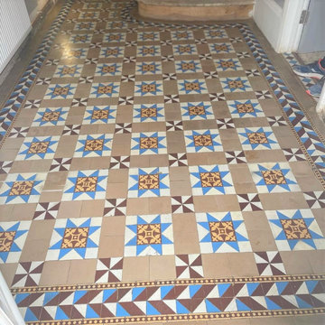
These pictures of a Victorian Tiled Hallway are from a property in Canterbury that was once a nursing home and was now being renovated to become a children’s home. The building was being gutted and extended at the same time and when the carpet was pulled up in the hallway, they were surprised to find a relatively intact Victorian tiled floor underneath.
Whilst they thought it bizarre that anyone would want to cover up such an attractive floor the carpet had protected it over the years. They realized it would make a marvellous feature at the entrance to the property, but professional restoration would be needed to do it justice. After a bit of research, they came across Tile Doctor and got in touch.
Canterbury comes under my North Kent designation, so I went to visit the property and survey the floor and quote for doing the restoration. There were a few missing and loose tiles that would need replacing and refixing also there was a lot of ingrained dirt so a deep clean and application of a new sealer would be required. I gave them a price for the work which they readily accepted, and we arranged a suitable time to carry out the work. Subject to the building schedule I had calculated the floor would take three days to restore.
On the first day I set about replacing and re-fixing the missing, broken, and loose tiles. This is delicate work as you need to extract the old tile without disturbing its neighbours and then clean up the area ready for its replacement. Being a Tile Doctor I keep a selection of stock tiles for repairs, some are reclaimed, and some are replica. Also, there are several companies still making Victorian style tiles so I can usually source what I need.
After the individual missing and broken tiles had been replaced and the adhesive had set, it was then a matter of renovating the floor as a whole. The tiles were covered in a thick layer of carpet adhesive which needed a combination of specialist tools and products to remove. First, a liberal layer of Tile Doctor Remove and Go was applied and left to dwell for thirty minutes. Next, Tile Doctor Pro-Clean was added and scrubbed in with a black pad.
This process softened the adhesive sufficiently in readiness for the next stage which involves using a set of diamond burnishing pads on a weighted buffing machine. Several applications were needed, each time with a successively finer grade of diamond pad and rinsing off the slurry in between. The tiles were first milled using a very coarse 50-grit pad, followed by 100, 200 and finally burnished with a 400-grit burnishing pads. This removed all the adhesive and dirt in the tiles, which was cleaned up using the wet vacuum.
Old Victorian floors like this do not have a damp proof membrane installed under the floor, and with a lot of water being used in the cleaning process I was concerned White efflorescence salts could appear later as the floor dried. To counter this, I gave the floor an acid wash using Tile Doctor Acid Gel to counter and dissolve the salts, it also gives the tiles another clean and will remove any old grout smears further improving the appearance of the tiles. Once done the floor was left to dry overnight.
On my return I tested the floor was dry by taking several moisture readings around the floor with a damp meter. Applying sealer to a damp floor is never advised and can lead to clouding and an unwanted finish.
Happy that the tiles were dry, a single coat of Tile Doctor Colour Grow sealer was applied. This is an impregnating sealer with a colour enhancing component to ‘lift’ the stronger colours of the floor. Colour Grow however does leave a matt appearance and as the client had asked for a shiny finish it was topped up with five coats of Tile Doctor Seal and Go. This is a compatible topical sealer which added a mid to high sheen.
By the end of the third day the Victorian floor looked brand new, and I received the following feedback from the client. Its rare to receive feedback from commercial customers so they were clearly overwhelmed with the transformation.
Did not think this glued covered bad old floor could look sooooo good Fabulous Fantastic job Looks Amazing Thank you
For aftercare I recommend the use of Tile Doctor Neutral Cleaner which isn’t as harsh as many of the products you find in supermarket. Stronger products can actually strip off the sealer over time leaving it vulnerable to dirt and detracting from its appearance.
Graham Davis
North Kent Tile Doctor

 Benson Homes LLC
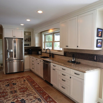
This remodeling story is a wonderful example of how removing and shifting walls can have an amazing impact on the functionality and visual appeal of an entire level of a home. When our clients reached out to us, they were looking to create an open concept Kitchen that would allow for easy entertaining. The couple had recently purchased this townhome so his mother could be closer to the family.
The existing floorplan offered first floor living, but the Kitchen was tucked in the back and was separated from the rest of the living space by a full wall with a small pass through into the Dining Room. Our design involved removing the dividing wall between the Dining Room and Kitchen as well as the fake columns and beam that separated the Dining Room and Living Room. The entire space was opened up to allow for easy flow and view throughout the first floor living space. The wall shared by the Kitchen and large Master Bedroom was shifted back just enough to provide a full wall of additional cabinetry including a much-needed large double Pantry cabinet. Now that we had opened up the Kitchen area we could focus on the cabinetry layout and selections.
The existing wood toned cabinets were replaced with white cabinets and crown molding to match the rest of the home. The larger, open space allowed for more cabinetry and the addition of an island with new undermount sink, dishwasher and convenient trash pullout along with seating for the grandchildren. A new range hood was installed and vented to the exterior of the house to replace the old recirculating hood. We were able to repurpose the some of the existing cabinets for use above the washer and dryer in the adjoining Laundry Room and swapped out the existing swinging door for a pocket door to free up traffic flow when doing Laundry and working in the Kitchen. The slate-look ceramic tile was replaced with a pre-engineered hardwood floor that creates a sense of warmth while easy to clean. The new Cambria countertop compliments the slate-look tile found in the Dining Room and Living Room and a natural field tile backsplash offsets the cabinets beautifully.
The single fluorescent ceiling light was outdated and did not provide adequate lighting for the new Kitchen. The new lighting plan was carefully thought out to provide general illumination through well placed recessed lighting; task lighting through pendant lighting over the island and under cabinet lighting; and aesthetic fluidity with an eye-catching chandelier for the Dining Room table. Special details include a touch faucet, under counter microwave and glass front cabinetry for displaying dishes.
By removing and shifting walls, we improved the entire flow of the first floor visually as well as functionally and created a beautiful, light-filled space for cooking and entertaining. Grandma can easily prepare meals in her new Kitchen and still chat with her guests and grandchildren who love to sit at the island as well as in the adjoining Dining Room and Living Room.
The Benson Homes team really enjoyed creating this space for this family and we hope they will enjoy spending time with friends and family for years to come.

 White Crane Construction
Cohesively updating and modernizing this home built in the 1990s were the goal in this remodel. Several elements throughout the house like the traditional golden oak original stair railing in the main entry were too colonial for the homeowner as their taste was trending more modern. The golden oak used on trim, fireplace mantle, and baseboards trapped this home in a time warp. The original Kitchen had cabinetry with a traditional door style, painted cabinets, and laminate countertops which also caused it to look dated. The clients expressed a desire to integrate more modern elements into their home in a cost effective way without having to rip everything down to the studs. Our design/build team proposed and executed many elegant cost effective design solutions that involved changing paint, cabinetry, finishes, and fixtures to achieve the desired modern feeling throughout the home.
The Kitchen was completely remodeled. The traditional cabinetry was replaced by new frameless Décor cabinets with slab doors and drawers in a beautiful exotic walnut veneer with horizontal graining and soft closing hardware. To enhance the existing structure functionally the built in desk space in the Kitchen was removed and replaced by pantry cabinetry creating improved storage and flow in the new kitchen. The new large Cherry island, also by Décor, was finished in a dark charcoal stain and topped with a solid surface Cambria quartz countertop in Kingston which features a modern mix of black, white and olive tones. For the perimeter countertops Cambria Oakhampton was selected for its complimentary sleek dark chocolate color. Innovative use of materials was demonstrated by cutting linear strips of a pre-sheeted horizontal grey glass mosaic tile, staggering it, and running it vertically instead of horizontally on the backsplash. White Kitchen appliances were traded out for a more contemporary stainless steel.
Photography: Jill Greer
 Tile Doctor Ltd
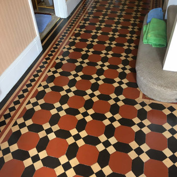
This Victorian floor in Twickenham, Middlesex was in good physical condition for its age but needed a good deep clean. Our customer had informed us that they had never cleaned or sealed the floor in the sixteen years that they had lived there so it was well overdue.
I went over to survey the floor and completed a test clean on a small section of tiling to see which products/techniques would work best. I like to do this as it demonstrates to the client what can be done, and it allows me to come up with an accurate price for doing the work.
As you can see from the pictures, there was quite a difference in the test patch compared to the rest of the floor. Years of foot traffic from the street had taken its’ toll and the floor was very dirty. Luckily, the floor was in very good condition and had not worn too badly.
Once they had seen the test patch, they were confident that it would be worth go ahead with my quote. It would ensure that the period feature was retained for many years to come. The colours on the floor were quite faded so it would be nice to get it restored.
I started the cleaning process by first taping up the surrounding skirting boards and doors to ensure they were protected from potential splashing. Cleaning involved spraying the Victorian tiles with a strong dilution of Tile Doctor Pro-Clean which is a dedicated Tile and Grout cleaning product. This was left to soak in for about ten minutes and then scrubbed in using a black pad fitted to a heavy-duty rotary scrubber.
This gives the floor a good mechanical scrub and works wonders releasing the ground-in dirt and soil from the tiles. The strong dilution of Pro-Clean will also remove any remaining sealers from the tile, however after sixteen years I doubted there would much trace of sealer left. Once done the floor was rinsed with water and all the soils removed with a wet vacuum.
Following the initial clean the colours were already much stronger. Next step however was to improve on that by giving the floor an acid rinse using Tile Doctor Grout Clean-Up. This removes mineral deposits and generally brightens up the appearance of the tile. After another round of scrubbing the floor was rinsed with our high-pressure washer and then vacuumed, extracting all of the dirty water and dirt away in one go. The floor was looking a lot better and was left to dry overnight.
After allowing the floor to dry overnight, we returned the next day to seal the floor. First, checking the floor was dry using the damp meter. Floors of this age can take a little longer to dry as there is no damp-proof membrane so it’s always worth checking as applying a sealer to damp tiles is not a good idea.
Once I was satisfied it was dry eight coats of Tile Doctor Seal and Go sheen finish sealer were applied. This takes a while to do as each coat needs to dry before applying the next. The sealer will protect the Victorian tiles for dirt and stains, it also enhanced the colours in the tile and will make it easier to keep the floor clean going forward.
My client was very pleased with the floor and mentioned that they should have called me in sooner! For aftercare cleaning I recommended Tile Doctor Neutral Clean which is an effective cleaner with a neutral pH, its designed for cleaning tiles without degrading the sealer.
Jonathan Oldham
South Middlesex Tile Doctor
 Benson Homes LLC
This remodeling story is a wonderful example of how removing and shifting walls can have an amazing impact on the functionality and visual appeal of an entire level of a home. When our clients reached out to us, they were looking to create an open concept Kitchen that would allow for easy entertaining. The couple had recently purchased this townhome so his mother could be closer to the family.
The existing floorplan offered first floor living, but the Kitchen was tucked in the back and was separated from the rest of the living space by a full wall with a small pass through into the Dining Room. Our design involved removing the dividing wall between the Dining Room and Kitchen as well as the fake columns and beam that separated the Dining Room and Living Room. The entire space was opened up to allow for easy flow and view throughout the first floor living space. The wall shared by the Kitchen and large Master Bedroom was shifted back just enough to provide a full wall of additional cabinetry including a much-needed large double Pantry cabinet. Now that we had opened up the Kitchen area we could focus on the cabinetry layout and selections.
The existing wood toned cabinets were replaced with white cabinets and crown molding to match the rest of the home. The larger, open space allowed for more cabinetry and the addition of an island with new undermount sink, dishwasher and convenient trash pullout along with seating for the grandchildren. A new range hood was installed and vented to the exterior of the house to replace the old recirculating hood. We were able to repurpose the some of the existing cabinets for use above the washer and dryer in the adjoining Laundry Room and swapped out the existing swinging door for a pocket door to free up traffic flow when doing Laundry and working in the Kitchen. The slate-look ceramic tile was replaced with a pre-engineered hardwood floor that creates a sense of warmth while easy to clean. The new Cambria countertop compliments the slate-look tile found in the Dining Room and Living Room and a natural field tile backsplash offsets the cabinets beautifully.
The single fluorescent ceiling light was outdated and did not provide adequate lighting for the new Kitchen. The new lighting plan was carefully thought out to provide general illumination through well placed recessed lighting; task lighting through pendant lighting over the island and under cabinet lighting; and aesthetic fluidity with an eye-catching chandelier for the Dining Room table. Special details include a touch faucet, under counter microwave and glass front cabinetry for displaying dishes.
By removing and shifting walls, we improved the entire flow of the first floor visually as well as functionally and created a beautiful, light-filled space for cooking and entertaining. Grandma can easily prepare meals in her new Kitchen and still chat with her guests and grandchildren who love to sit at the island as well as in the adjoining Dining Room and Living Room.
The Benson Homes team really enjoyed creating this space for this family and we hope they will enjoy spending time with friends and family for years to come.
 Murphy Bros. Design | Build | Remodel
The list was long. Very long. And the level of remodeling they needed was a too demanding for these very capable empty nester DIYers to handle on their own. That’s not surprising since they wanted to remodel their kitchen, living room, entryway, and add a garage/office/bedroom addition off the side of their home.
“I think what was really driving this remodel was the shared desire to liberate this home from its 60’s style (dark paneling) and confined layout,” recalls Murphy Bros. designer Courtney Cartee. “They needed more space everywhere, from the kitchen to the adjoining entryway and living room. In short they really needed a whole new look and layout.”
So we suggested a three-part solution. A completely new kitchen, which required the removal of a giant stone fireplace, that was causing all kinds of space issues in both living room, entry and kitchen.
The second part of the design involved an addition to the side of the property, which added another garage stall and an office/bedroom above. “I can remember going in front of the city hall officials to get approval for the variance to add on the garage addition,” remembers Cartee. “They were very impressed with how our design integrated the addition with the existing exterior of the home. They remarked that so many remodels in their city now are just tear downs instead of taking the time and imagination to work with what’s already there.”
The third aspect of the design had to do with the entry and upgrading the exterior of the home. The entry is now wider and the whole house was painted to achieve much better curb appeal, which can have a big impact on first impressions for resale and simple pride.
“Before they had just enough room for barely two people in their kitchen. I mean it was really tight. Once we got that fireplace out, that opened up everything. Now they can have the whole family in that space and still be able to move around and entertain,” says Cartee.
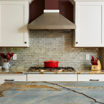
Island & perimeter countertop: Azure Quartzite slab from Brazil.
Backsplash: Dockside Gale Stria porcelain and glass wall tile
 Tile Doctor Ltd
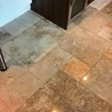
The photographs below are of a Polished limestone floor that had been installed in the Kitchen of a house in Cheltenham approximately eight years prior. The polish and sealer had worn off over that time allowing dirt to become ingrained into the pores of the stone making it difficult to clean.
This is a common problem with all types of porous stone and tile which need to be sealed to maintain their appearance. Sealers do wear down over time with use however and need to be maintained, this is why Tile Doctor have created a maintenance program whereby we pop by every 12 months to give the floor a light clean and top-up the sealer, it only takes a few hours, but it keeps your sealer in good condition.
Cheltenham by the way is a lovely town situated on the edge of the Cotswolds which is an area of Outstanding Natural Beauty. It has a racecourse and is well known for the mineral springs which were discovered here in 1716.
My first job was to protect the wooden kitchen units from any splashes by covering them some cotton sheets. Next, I set about restoring the Limestone’s appearance using a set of Burnishing Pads which is a form of polishing which involves the sequential application of four diamond encrusted pads of different grit levels.
The first pad applied is a Coarse 400 grit pad which is applied to the floor with a buffing machine and lubricated with water. This process grinds away the top layer of dirt and staining from the stone, along with any old sealer, the floor is then rinsed to remove the soil that is generated. I then move through the system, applying the Medium and then Fine pads using less and less water as you go but rinsing in-between and extracting the water with a wet-vac machine.
Once I was happy with the stone I scrubbed the grout lines to remove any soiling that the pads had failed to pick up. The floor was then given a final rinse and the wet vacuum used to extract as much moisture as possible. The floor was then left to dry out completely overnight.
The next day I gave the floor a polish with the Very Fine 3,000 grit diamond burnishing pad, this is applied using a technique we call a “spray burnish” due to the fact that very little water is used during its application.
The next step was to seal the stone using for which I used Tile Doctor Colour Grow which is an impregnating sealer that protects the stone from within by occupying its pores. Colour Grow also has the added benefit of intensifying the natural colours in the stone. The floor was then left to dry for an hour before I gave it one final dry polish using the Very Fine burnishing pad.
My customer was very happy with the final result and made the comment that they thought the floor looked brand new.
Malcolm Crowther
Gloucester Tile Doctor

 Cantoni Atlanta
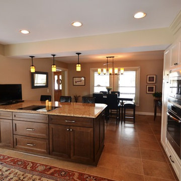
The fact that this home is in a development called Providence now seems perfectly fitting. Chris, the owner, was merely considering the possibility of downsizing from a formal residence outside Atlanta when he happened on the small complex of luxury brownstones under construction in nearby Roswell. “I wandered into The Providence by chance and loved what I saw. The developer, his wife, and the agent were there and discussing how Cantoni was going to finish out one of the units, and so we all started talking,” Chris explains “They asked if I wanted to meet with the designer from Cantoni, and suggested I could customize the home as I saw fit, and that did it for me. I was sold.”
Cantoni was originally approached by Mike and Joy Walsh, of Lehigh Homes, to create a contemporary model home to be featured on the Roswell Woman’s Club home tour. “Since Chris bought the brownstone right after we agreed to do the design work,” Lorna Hunter recalls, “we brought him in on the meetings with the architects to help finalize the layout.” From selecting tile and counter tops, to designing the kitchen and baths, to the furniture, art and even linens—Cantoni was involved with every phase of the project. “This home really represents the complete range of design and staging services we offer at Cantoni,” says Lorna. “Rooms were reconfigured to allow for changes Chris found appealing, and every tile and doorknob was thoughtfully chosen to complete the overall look.”
Chris found an easy rapport with Lorna. “I have always been drawn to contemporary décor,” he explains, “ so Lorna and I hit it off immediately.” Among the custom design ideas the two conceived for the 2,600 sq. ft. 3/3 brownstone: creating a “wing wall” (open on both sides) to form a sitting area adjacent to the guest room
downstairs, removing the elevator to enhance a sense of openness while leaving the 3-story shaft as a unique focal point, and choosing to expand the height of windows on the third level to maximize the flow of natural light.
The Providence is ideally located near quaint shops, great restaurants, jogging trails and a scenic river—not to mention it’s just four miles from Chris’ office. The project represents the breadth and depth of Cantoni’s in-house creative resources, and proves again that GREAT DESIGN IS A WAY OF LIFE.

 Torres Home Remodeling
We are a kitchen and bath remodel contractor in Los Angeles with a rich and long tradition of multi-cultural craftsmanship. Our kitchen remodel in Los Angeles is meant to suit your needs as our bathroom remodeling service in San Jose focuses on style and functionality.
Kitchen, Bathroom Remodel Contractors in Los Angeles, CA - https://www.torreshomeremodeling.com/
 Cantoni Atlanta
The fact that this home is in a development called Providence now seems perfectly fitting. Chris, the owner, was merely considering the possibility of downsizing from a formal residence outside Atlanta when he happened on the small complex of luxury brownstones under construction in nearby Roswell. “I wandered into The Providence by chance and loved what I saw. The developer, his wife, and the agent were there and discussing how Cantoni was going to finish out one of the units, and so we all started talking,” Chris explains “They asked if I wanted to meet with the designer from Cantoni, and suggested I could customize the home as I saw fit, and that did it for me. I was sold.”
Cantoni was originally approached by Mike and Joy Walsh, of Lehigh Homes, to create a contemporary model home to be featured on the Roswell Woman’s Club home tour. “Since Chris bought the brownstone right after we agreed to do the design work,” Lorna Hunter recalls, “we brought him in on the meetings with the architects to help finalize the layout.” From selecting tile and counter tops, to designing the kitchen and baths, to the furniture, art and even linens—Cantoni was involved with every phase of the project. “This home really represents the complete range of design and staging services we offer at Cantoni,” says Lorna. “Rooms were reconfigured to allow for changes Chris found appealing, and every tile and doorknob was thoughtfully chosen to complete the overall look.”
Chris found an easy rapport with Lorna. “I have always been drawn to contemporary décor,” he explains, “ so Lorna and I hit it off immediately.” Among the custom design ideas the two conceived for the 2,600 sq. ft. 3/3 brownstone: creating a “wing wall” (open on both sides) to form a sitting area adjacent to the guest room
downstairs, removing the elevator to enhance a sense of openness while leaving the 3-story shaft as a unique focal point, and choosing to expand the height of windows on the third level to maximize the flow of natural light.
The Providence is ideally located near quaint shops, great restaurants, jogging trails and a scenic river—not to mention it’s just four miles from Chris’ office. The project represents the breadth and depth of Cantoni’s in-house creative resources, and proves again that GREAT DESIGN IS A WAY OF LIFE.
 Tile Doctor Ltd
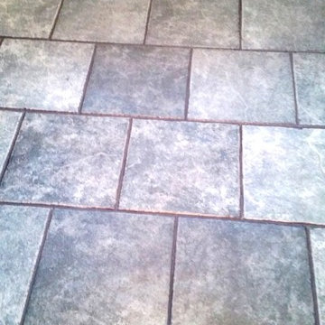
Here’s a quick grout cleaning and re-colouring job I completed in the town of Canvey Island, Essex. Canvey Island lies on the south east coast, and lies just above sea level which in my job is always worth noting as the area can be prone to flooding. This wasn’t the problem here though, simply put, my client was unhappy with the colour of their grout, and wanted it re-coloured to a darker shade to match the grey Ceramic floor tiles.
Cleaning the grout before re-colouring is essential because, as many readers are probably well aware, grouts are porous and therefore can very easily absorb dirt and grease. Most often this will result in grout discolouration if not dealt with promptly.
So, as mentioned above the first step in the re-colouring process involved cleaning the grout lines. For this Tile Doctor has a special Pre-Treat Cleaner which is sprayed on and scrubbed into the grout to both remove any existing dirt and also to prepare the grout joints for a superior bond with the Grout Colourant. Once complete the grout lines looked clean and refreshed.
To clean the ceramic I diluted one part Tile Doctor Pro-Clean to three parts water, and used it to wash down the Ceramic tiles, leaving a consistent level of cleanliness across the entire floor. I then rinsed the floor with water which was then extracted using a wet vacuum and waited for 3 hours for the floor to dry.
Once dry, I began the process of applying the Charcoal Grey (as chosen by the client) Grout Colourant to the grout lines. As well as changing the colour the colourant also forms a barrier over the grout sealing it in and protecting it from future staining for years to come.
Then, once dry, the floor was given another quick clean using a light spray of water and a white buffing pad, resulting in an aesthetically pleasing sheen finish. My client was very happy with the outcome and now has the floor they wanted.
Nick Murphy
South Essex Tile Doctor
 Cantoni Atlanta
The fact that this home is in a development called Providence now seems perfectly fitting. Chris, the owner, was merely considering the possibility of downsizing from a formal residence outside Atlanta when he happened on the small complex of luxury brownstones under construction in nearby Roswell. “I wandered into The Providence by chance and loved what I saw. The developer, his wife, and the agent were there and discussing how Cantoni was going to finish out one of the units, and so we all started talking,” Chris explains “They asked if I wanted to meet with the designer from Cantoni, and suggested I could customize the home as I saw fit, and that did it for me. I was sold.”
Cantoni was originally approached by Mike and Joy Walsh, of Lehigh Homes, to create a contemporary model home to be featured on the Roswell Woman’s Club home tour. “Since Chris bought the brownstone right after we agreed to do the design work,” Lorna Hunter recalls, “we brought him in on the meetings with the architects to help finalize the layout.” From selecting tile and counter tops, to designing the kitchen and baths, to the furniture, art and even linens—Cantoni was involved with every phase of the project. “This home really represents the complete range of design and staging services we offer at Cantoni,” says Lorna. “Rooms were reconfigured to allow for changes Chris found appealing, and every tile and doorknob was thoughtfully chosen to complete the overall look.”
Chris found an easy rapport with Lorna. “I have always been drawn to contemporary décor,” he explains, “ so Lorna and I hit it off immediately.” Among the custom design ideas the two conceived for the 2,600 sq. ft. 3/3 brownstone: creating a “wing wall” (open on both sides) to form a sitting area adjacent to the guest room
downstairs, removing the elevator to enhance a sense of openness while leaving the 3-story shaft as a unique focal point, and choosing to expand the height of windows on the third level to maximize the flow of natural light.
The Providence is ideally located near quaint shops, great restaurants, jogging trails and a scenic river—not to mention it’s just four miles from Chris’ office. The project represents the breadth and depth of Cantoni’s in-house creative resources, and proves again that GREAT DESIGN IS A WAY OF LIFE.

 Cape Associates, Inc.
This 1,200 square-foot Provincetown condominium lives large, both functionally and aesthetically, thanks to its recent renovation. The waterfront home, overlooking Cape Cod Bay, is part of an historic grouping of three individual buildings on Commercial Street that have been combined into condominiums.
Begun in November 2014 and completed just in time for summer in May 2016, b Architecture Studios and Cape Associates Builders worked with a budget of $366,000 to transform this prosaic dwelling into a stunning light-flooded space—designed to maximize both the living space and the mesmerizing views of the bay.
“The space was totally reconfigured,” said project manager Jon Ziperman. “It was a total gut job requiring leveling of floors, straightening of walls, removing a chimney and fireplace that ran up to the above neighbors’ unit.” The renovation also required a complete rewiring and plumbing system that involved wires and pipes that were integrated into the surrounding units. From wall to wall and floor to ceiling, there was nothing that could be salvaged from the original space.
One of the most prominent changes was moving the stairway from its original placement, where it originally broke up the living and dining space and blocked views to the bay beyond. The stairway now sits on the opposite side of the condominium. With the stairs tucked to the left side of the living area, the sightline now extends from the entry straight through the living and dining areas to the water. The new design allowed for storage space beneath the stairs, which lead to an airy sleeping loft, and room for a desk niche. A light well, where the former sleeping area was, and new windows bring abundant natural light to the central living area.
Innovative features in the entry room include a Murphy bed and sliding glass door separating it from the living area, so that the space can double as a guest room.
“The Murphy bed fit in nicely, allowing for a flush wall at the entry/guest room and a desk niche in the adjacent room,” Brown said. “Convincing the client to create the wrap-around chair rail, lined up with the divided lights of the sliding glass door, makes a purposeful connection in a small space.”
Neolith countertops in the open kitchen and details like the flush minimal baseboard contribute to the sleek, modern aesthetic, now complemented by the owner’s contemporary furnishings. This complete renovation has rendered this compact home worthy of its beautiful setting.
 Design Studio West
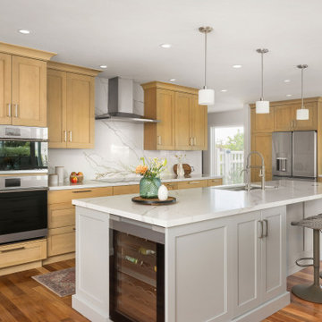
A new island layout encourages gathering with room for four. In addition to an outlet on one side of the island, a pop-up outlet at the other end allows for the utilization of small kitchen appliances and casual usage of laptops and personal devices.
85