
Search results for "Involves balancing" in Home Design Ideas
 Sosna Inc
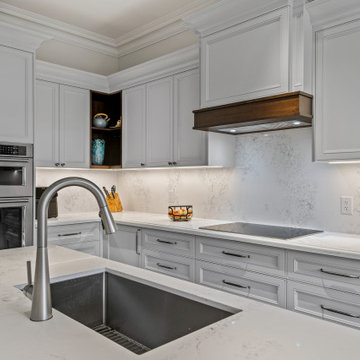
This North York home renovation was designed to perfectly suit a vibrant professional couple, their two active teenagers, and their pets, combining beauty and functionality to match their busy lifestyle. The home needed a functional overhaul, particularly in the kitchen, powder room, master ensuite, and underutilized basement. The clients, eager for an upgrade but short on time, entrusted the project to a team that prioritized communication, thoughtful design, and a seamless process.
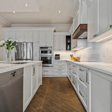
The kitchen was completely reimagined with custom cabinetry, maximizing storage and accessibility. A redesigned island now allows access from all sides, improving flow for cooking and family gatherings. New countertops, contemporary flooring, and a balanced mix of crisp tiles and warm wall tones created a cohesive, inviting atmosphere. The master ensuite was transformed into a luxurious retreat with elegant stone-style tiles, an expanded glass-enclosed shower, and a striking tiled feature wall framing the bathtub, delivering both beauty and improved functionality.
To refresh the powder room and entryway on a budget, professional grout cleaning gave existing tiles a new life. Modern lighting and bright wallpaper added charm and energy, welcoming guests into the home. The basement, tailored for the teens and pets, became a cozy entertainment space, separated by subtle partitions for added privacy and comfort.
One notable challenge involved seamlessly transitioning between wood-look porcelain tiles in the kitchen and the existing hardwood floors—a task achieved through careful planning and execution, ensuring a flawless blend. A highlight of the project came when the client saw the near-final result and expressed amazement at the transformation, calling it a “WOW factor.”
The result is a home that perfectly balances style and practicality. The streamlined kitchen, spa-like ensuite, refreshed powder room, and tailored basement now enhance daily life and encourage quality time as a family. This project stands as a testament to thoughtful design and expert craftsmanship, creating a space that reflects the family’s energy and personality while supporting their needs for years to come.
 Sosna Inc
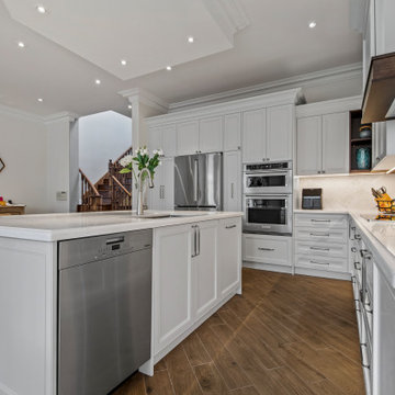
This North York home renovation was designed to perfectly suit a vibrant professional couple, their two active teenagers, and their pets, combining beauty and functionality to match their busy lifestyle. The home needed a functional overhaul, particularly in the kitchen, powder room, master ensuite, and underutilized basement. The clients, eager for an upgrade but short on time, entrusted the project to a team that prioritized communication, thoughtful design, and a seamless process.
The kitchen was completely reimagined with custom cabinetry, maximizing storage and accessibility. A redesigned island now allows access from all sides, improving flow for cooking and family gatherings. New countertops, contemporary flooring, and a balanced mix of crisp tiles and warm wall tones created a cohesive, inviting atmosphere. The master ensuite was transformed into a luxurious retreat with elegant stone-style tiles, an expanded glass-enclosed shower, and a striking tiled feature wall framing the bathtub, delivering both beauty and improved functionality.
To refresh the powder room and entryway on a budget, professional grout cleaning gave existing tiles a new life. Modern lighting and bright wallpaper added charm and energy, welcoming guests into the home. The basement, tailored for the teens and pets, became a cozy entertainment space, separated by subtle partitions for added privacy and comfort.
One notable challenge involved seamlessly transitioning between wood-look porcelain tiles in the kitchen and the existing hardwood floors—a task achieved through careful planning and execution, ensuring a flawless blend. A highlight of the project came when the client saw the near-final result and expressed amazement at the transformation, calling it a “WOW factor.”
The result is a home that perfectly balances style and practicality. The streamlined kitchen, spa-like ensuite, refreshed powder room, and tailored basement now enhance daily life and encourage quality time as a family. This project stands as a testament to thoughtful design and expert craftsmanship, creating a space that reflects the family’s energy and personality while supporting their needs for years to come.
 Sosna Inc
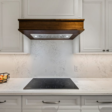
This North York home renovation was designed to perfectly suit a vibrant professional couple, their two active teenagers, and their pets, combining beauty and functionality to match their busy lifestyle. The home needed a functional overhaul, particularly in the kitchen, powder room, master ensuite, and underutilized basement. The clients, eager for an upgrade but short on time, entrusted the project to a team that prioritized communication, thoughtful design, and a seamless process.
The kitchen was completely reimagined with custom cabinetry, maximizing storage and accessibility. A redesigned island now allows access from all sides, improving flow for cooking and family gatherings. New countertops, contemporary flooring, and a balanced mix of crisp tiles and warm wall tones created a cohesive, inviting atmosphere. The master ensuite was transformed into a luxurious retreat with elegant stone-style tiles, an expanded glass-enclosed shower, and a striking tiled feature wall framing the bathtub, delivering both beauty and improved functionality.
To refresh the powder room and entryway on a budget, professional grout cleaning gave existing tiles a new life. Modern lighting and bright wallpaper added charm and energy, welcoming guests into the home. The basement, tailored for the teens and pets, became a cozy entertainment space, separated by subtle partitions for added privacy and comfort.
One notable challenge involved seamlessly transitioning between wood-look porcelain tiles in the kitchen and the existing hardwood floors—a task achieved through careful planning and execution, ensuring a flawless blend. A highlight of the project came when the client saw the near-final result and expressed amazement at the transformation, calling it a “WOW factor.”
The result is a home that perfectly balances style and practicality. The streamlined kitchen, spa-like ensuite, refreshed powder room, and tailored basement now enhance daily life and encourage quality time as a family. This project stands as a testament to thoughtful design and expert craftsmanship, creating a space that reflects the family’s energy and personality while supporting their needs for years to come.
Find the right local pro for your project
 Dream Coast Builders
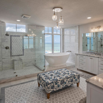
A large, luxurious bathroom with a freestanding bathtub, double vanity, and a patterned ottoman in the center, featuring white cabinetry, tile floors, and large windows that provide natural light.
 Sosna Inc
This North York home renovation was designed to perfectly suit a vibrant professional couple, their two active teenagers, and their pets, combining beauty and functionality to match their busy lifestyle. The home needed a functional overhaul, particularly in the kitchen, powder room, master ensuite, and underutilized basement. The clients, eager for an upgrade but short on time, entrusted the project to a team that prioritized communication, thoughtful design, and a seamless process.
The kitchen was completely reimagined with custom cabinetry, maximizing storage and accessibility. A redesigned island now allows access from all sides, improving flow for cooking and family gatherings. New countertops, contemporary flooring, and a balanced mix of crisp tiles and warm wall tones created a cohesive, inviting atmosphere. The master ensuite was transformed into a luxurious retreat with elegant stone-style tiles, an expanded glass-enclosed shower, and a striking tiled feature wall framing the bathtub, delivering both beauty and improved functionality.
To refresh the powder room and entryway on a budget, professional grout cleaning gave existing tiles a new life. Modern lighting and bright wallpaper added charm and energy, welcoming guests into the home. The basement, tailored for the teens and pets, became a cozy entertainment space, separated by subtle partitions for added privacy and comfort.
One notable challenge involved seamlessly transitioning between wood-look porcelain tiles in the kitchen and the existing hardwood floors—a task achieved through careful planning and execution, ensuring a flawless blend. A highlight of the project came when the client saw the near-final result and expressed amazement at the transformation, calling it a “WOW factor.”
The result is a home that perfectly balances style and practicality. The streamlined kitchen, spa-like ensuite, refreshed powder room, and tailored basement now enhance daily life and encourage quality time as a family. This project stands as a testament to thoughtful design and expert craftsmanship, creating a space that reflects the family’s energy and personality while supporting their needs for years to come.
 Sosna Inc
This North York home renovation was designed to perfectly suit a vibrant professional couple, their two active teenagers, and their pets, combining beauty and functionality to match their busy lifestyle. The home needed a functional overhaul, particularly in the kitchen, powder room, master ensuite, and underutilized basement. The clients, eager for an upgrade but short on time, entrusted the project to a team that prioritized communication, thoughtful design, and a seamless process.
The kitchen was completely reimagined with custom cabinetry, maximizing storage and accessibility. A redesigned island now allows access from all sides, improving flow for cooking and family gatherings. New countertops, contemporary flooring, and a balanced mix of crisp tiles and warm wall tones created a cohesive, inviting atmosphere. The master ensuite was transformed into a luxurious retreat with elegant stone-style tiles, an expanded glass-enclosed shower, and a striking tiled feature wall framing the bathtub, delivering both beauty and improved functionality.
To refresh the powder room and entryway on a budget, professional grout cleaning gave existing tiles a new life. Modern lighting and bright wallpaper added charm and energy, welcoming guests into the home. The basement, tailored for the teens and pets, became a cozy entertainment space, separated by subtle partitions for added privacy and comfort.
One notable challenge involved seamlessly transitioning between wood-look porcelain tiles in the kitchen and the existing hardwood floors—a task achieved through careful planning and execution, ensuring a flawless blend. A highlight of the project came when the client saw the near-final result and expressed amazement at the transformation, calling it a “WOW factor.”
The result is a home that perfectly balances style and practicality. The streamlined kitchen, spa-like ensuite, refreshed powder room, and tailored basement now enhance daily life and encourage quality time as a family. This project stands as a testament to thoughtful design and expert craftsmanship, creating a space that reflects the family’s energy and personality while supporting their needs for years to come.
 Cantoni Irvine
When Irvine designer, Richard Bustos’ client decided to remodel his Orange County 4,900 square foot home into a contemporary space, he immediately thought of Cantoni. His main concern though was based on the assumption that our luxurious modern furnishings came with an equally luxurious price tag. It was only after a visit to our Irvine store, where the client and Richard connected that the client realized our extensive collection of furniture and accessories was well within his reach.
“Richard was very thorough and straight forward as far as pricing,” says the client. "I became very intrigued that he was able to offer high quality products that I was looking for within my budget.”
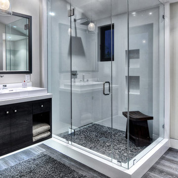
The next phases of the project involved looking over floor plans and discussing the client’s vision as far as design. The goal was to create a comfortable, yet stylish and modern layout for the client, his wife, and their three kids. In addition to creating a cozy and contemporary space, the client wanted his home to exude a tranquil atmosphere. Drawing most of his inspiration from Houzz, (the leading online platform for home remodeling and design) the client incorporated a Zen-like ambiance through the distressed greyish brown flooring, organic bamboo wall art, and with Richard’s help, earthy wall coverings, found in both the master bedroom and bathroom.
Over the span of approximately two years, Richard helped his client accomplish his vision by selecting pieces of modern furniture that possessed the right colors, earthy tones, and textures so as to complement the home’s pre-existing features.
The first room the duo tackled was the great room, and later continued furnishing the kitchen and master bedroom. Living up to its billing, the great room not only opened up to a breathtaking view of the Newport coast, it also was one great space. Richard decided that the best option to maximize the space would be to break the room into two separate yet distinct areas for living and dining.
While exploring our online collections, the client discovered the Jasper Shag rug in a bold and vibrant green. The grassy green rug paired with the sleek Italian made Montecarlo glass dining table added just the right amount of color and texture to compliment the natural beauty of the bamboo sculpture. The client happily adds, “I’m always receiving complements on the green rug!”
Once the duo had completed the dining area, they worked on furnishing the living area, and later added pieces like the classic Renoir bed to the master bedroom and Crescent Console to the kitchen, which adds both balance and sophistication. The living room, also known as the family room was the central area where Richard’s client and his family would spend quality time. As a fellow family man, Richard understood that that meant creating an inviting space with comfortable and durable pieces of furniture that still possessed a modern flare. The client loved the look and design of the Mercer sectional. With Cantoni’s ability to customize furniture, Richard was able to special order the sectional in a fabric that was both durable and aesthetically pleasing.
Selecting the color scheme for the living room was also greatly influenced by the client’s pre-existing artwork as well as unique distressed floors. Richard recommended adding dark pieces of furniture as seen in the Mercer sectional along with the Viera area rug. He explains, “The darker colors and contrast of the rug’s material worked really well with the distressed wood floor.” Furthermore, the comfortable American Leather Recliner, which was customized in red leather not only maximized the space, but also tied in the client’s picturesque artwork beautifully. The client adds gratefully, “Richard was extremely helpful with color; He was great at seeing if I was taking it too far or not enough.”
It is apparent that Richard and his client made a great team. With the client’s passion for great design and Richard’s design expertise, together they transformed the home into a modern sanctuary. Working with this particular client was a very rewarding experience for Richard. He adds, “My client and his family were so easy and fun to work with. Their enthusiasm, focus, and involvement are what helped me bring their ideas to life. I think we created a unique environment that their entire family can enjoy for many years to come.”
https://www.cantoni.com/project/a-contemporary-sanctuary
Sponsored
Sunbury, OH

J.Holderby - Renovations
Franklin County's Leading General Contractors - 2X Best of Houzz!
 Sweetlake Interior Design LLC
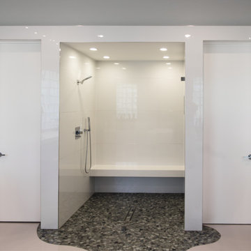
This amazing bathroom was renovated to have a modern flare. The tile is a shiny gray porcelain that has a rectified edge so it could be butted up tight and the grout lines minimal. My client had previously chosen this tile throughout her home. The Graff Luna freestanding tub filler is mounted on a floating glass mosaic tiled wall. We relocated the tub. Instead of saw cutting into the slab floor we built a platform to hide the plumbing that the tub rests on. The floating vanity cabinets are made of laminate beautifully displaying the quartz countertop with a straight 3" mitered edge. The sides of the countertops drop to the floor on each side of the cabinet, known as a waterfall edge. My client and I designed a cut in wave on the tiled floor leading into the shiny white shower with a floating white quartz bench seat. We built in custom planters made from the quartz countertop material that balance out each side of the floating tub wall in the center of the bathroom. I must say, throughout this design process my client was involved the entire time. She played an integral role in selecting the amazing fixtures seen in this master bathroom remodel. She needed help with the layout so she reached out to us. As you can see in the results we collaborated well together. It was pleasure to work with a client who has such exquisite taste.
 KCBR Design | Remodel
Designed for repeat clients, this Overland Park remodel focused on improving function, flow, and everyday livability across multiple spaces.
In the kitchen, the layout was refined to create a more open and efficient environment. An enlarged island now serves as a central hub for cooking, gathering, and daily use, while ceiling-height cabinetry maximizes storage and creates a clean, built-in aesthetic. New hardwood flooring ties the space together, adding warmth and continuity.
A key transformation involved reconfiguring the layout to better support storage needs. By relocating the laundry room door, a dedicated pantry was introduced, significantly improving organization and accessibility. The adjacent laundry room was also updated, along with the addition of custom cubbies to streamline daily routines.
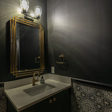
For a bold contrast, the powder bath was reimagined as a moody, speakeasy-inspired space, bringing depth, character, and a memorable design moment to the home.
The result is a cohesive, thoughtfully redesigned interior that enhances how the family lives day to day, balancing function, storage, and distinctive style.
 JPL Creative Design Solutions
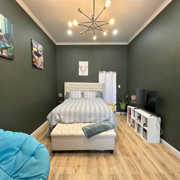
The goal of this project was to transform the room into a serene and sophisticated space that serves as both a sanctuary for rest and a functional area for daily use. At the core of this design is the philosophy of blending modern functionality with an organic connection to nature through color, texture, and spatial harmony.
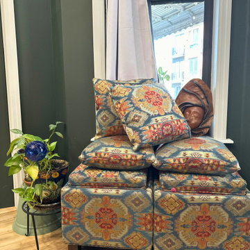
The deep green walls are central to this design, creating a cocoon-like atmosphere while grounding the space. Inspired by nature, the color promotes relaxation and adds a rich contrast to the lighter elements in the room. This contrast enhances the room's natural lighting and brings depth to the design. The process involved pairing this bold backdrop with natural wood tones and textured fabrics to elevate the space, while still maintaining a modern aesthetic.
This newly designed primary bedroom evokes feelings of peace and luxury. The deep, moody greens make the room feel cozy and inviting, while the light wood floors and white accents provide a sense of brightness and balance. It’s a space where one can truly relax, escape the demands of everyday life, and enjoy quiet moments of reflection or rejuvenation.
 JPL Creative Design Solutions
The goal of this project was to transform the room into a serene and sophisticated space that serves as both a sanctuary for rest and a functional area for daily use. At the core of this design is the philosophy of blending modern functionality with an organic connection to nature through color, texture, and spatial harmony.
The deep green walls are central to this design, creating a cocoon-like atmosphere while grounding the space. Inspired by nature, the color promotes relaxation and adds a rich contrast to the lighter elements in the room. This contrast enhances the room's natural lighting and brings depth to the design. The process involved pairing this bold backdrop with natural wood tones and textured fabrics to elevate the space, while still maintaining a modern aesthetic.
This newly designed primary bedroom evokes feelings of peace and luxury. The deep, moody greens make the room feel cozy and inviting, while the light wood floors and white accents provide a sense of brightness and balance. It’s a space where one can truly relax, escape the demands of everyday life, and enjoy quiet moments of reflection or rejuvenation.
 KCBR Design | Remodel
Designed for repeat clients, this Overland Park remodel focused on improving function, flow, and everyday livability across multiple spaces.
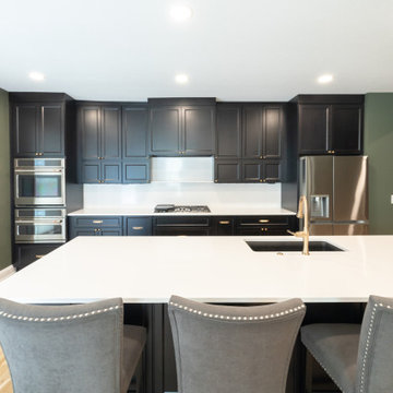
In the kitchen, the layout was refined to create a more open and efficient environment. An enlarged island now serves as a central hub for cooking, gathering, and daily use, while ceiling-height cabinetry maximizes storage and creates a clean, built-in aesthetic. New hardwood flooring ties the space together, adding warmth and continuity.
A key transformation involved reconfiguring the layout to better support storage needs. By relocating the laundry room door, a dedicated pantry was introduced, significantly improving organization and accessibility. The adjacent laundry room was also updated, along with the addition of custom cubbies to streamline daily routines.
For a bold contrast, the powder bath was reimagined as a moody, speakeasy-inspired space, bringing depth, character, and a memorable design moment to the home.
The result is a cohesive, thoughtfully redesigned interior that enhances how the family lives day to day, balancing function, storage, and distinctive style.
 KCBR Design | Remodel
Designed for repeat clients, this Overland Park remodel focused on improving function, flow, and everyday livability across multiple spaces.
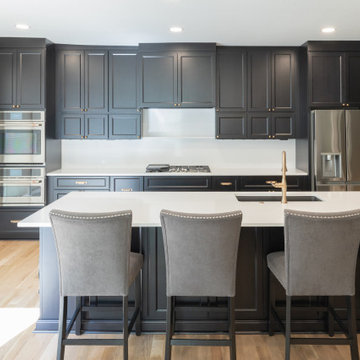
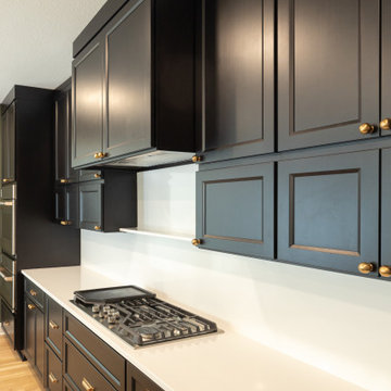
In the kitchen, the layout was refined to create a more open and efficient environment. An enlarged island now serves as a central hub for cooking, gathering, and daily use, while ceiling-height cabinetry maximizes storage and creates a clean, built-in aesthetic. New hardwood flooring ties the space together, adding warmth and continuity.
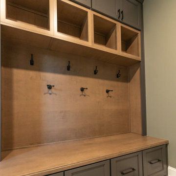
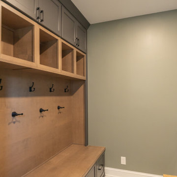
A key transformation involved reconfiguring the layout to better support storage needs. By relocating the laundry room door, a dedicated pantry was introduced, significantly improving organization and accessibility. The adjacent laundry room was also updated, along with the addition of custom cubbies to streamline daily routines.
For a bold contrast, the powder bath was reimagined as a moody, speakeasy-inspired space, bringing depth, character, and a memorable design moment to the home.
The result is a cohesive, thoughtfully redesigned interior that enhances how the family lives day to day, balancing function, storage, and distinctive style.
Sponsored
Sunbury, OH
J.Holderby - Renovations
Franklin County's Leading General Contractors - 2X Best of Houzz!
 KCBR Design | Remodel
Designed for repeat clients, this Overland Park remodel focused on improving function, flow, and everyday livability across multiple spaces.
In the kitchen, the layout was refined to create a more open and efficient environment. An enlarged island now serves as a central hub for cooking, gathering, and daily use, while ceiling-height cabinetry maximizes storage and creates a clean, built-in aesthetic. New hardwood flooring ties the space together, adding warmth and continuity.
A key transformation involved reconfiguring the layout to better support storage needs. By relocating the laundry room door, a dedicated pantry was introduced, significantly improving organization and accessibility. The adjacent laundry room was also updated, along with the addition of custom cubbies to streamline daily routines.
For a bold contrast, the powder bath was reimagined as a moody, speakeasy-inspired space, bringing depth, character, and a memorable design moment to the home.
The result is a cohesive, thoughtfully redesigned interior that enhances how the family lives day to day, balancing function, storage, and distinctive style.
 KCBR Design | Remodel
Designed for repeat clients, this Overland Park remodel focused on improving function, flow, and everyday livability across multiple spaces.
In the kitchen, the layout was refined to create a more open and efficient environment. An enlarged island now serves as a central hub for cooking, gathering, and daily use, while ceiling-height cabinetry maximizes storage and creates a clean, built-in aesthetic. New hardwood flooring ties the space together, adding warmth and continuity.
A key transformation involved reconfiguring the layout to better support storage needs. By relocating the laundry room door, a dedicated pantry was introduced, significantly improving organization and accessibility. The adjacent laundry room was also updated, along with the addition of custom cubbies to streamline daily routines.
For a bold contrast, the powder bath was reimagined as a moody, speakeasy-inspired space, bringing depth, character, and a memorable design moment to the home.
The result is a cohesive, thoughtfully redesigned interior that enhances how the family lives day to day, balancing function, storage, and distinctive style.
 KCBR Design | Remodel
Designed for repeat clients, this Overland Park remodel focused on improving function, flow, and everyday livability across multiple spaces.
In the kitchen, the layout was refined to create a more open and efficient environment. An enlarged island now serves as a central hub for cooking, gathering, and daily use, while ceiling-height cabinetry maximizes storage and creates a clean, built-in aesthetic. New hardwood flooring ties the space together, adding warmth and continuity.
A key transformation involved reconfiguring the layout to better support storage needs. By relocating the laundry room door, a dedicated pantry was introduced, significantly improving organization and accessibility. The adjacent laundry room was also updated, along with the addition of custom cubbies to streamline daily routines.
For a bold contrast, the powder bath was reimagined as a moody, speakeasy-inspired space, bringing depth, character, and a memorable design moment to the home.
The result is a cohesive, thoughtfully redesigned interior that enhances how the family lives day to day, balancing function, storage, and distinctive style.
 KCBR Design | Remodel
Designed for repeat clients, this Overland Park remodel focused on improving function, flow, and everyday livability across multiple spaces.
In the kitchen, the layout was refined to create a more open and efficient environment. An enlarged island now serves as a central hub for cooking, gathering, and daily use, while ceiling-height cabinetry maximizes storage and creates a clean, built-in aesthetic. New hardwood flooring ties the space together, adding warmth and continuity.
A key transformation involved reconfiguring the layout to better support storage needs. By relocating the laundry room door, a dedicated pantry was introduced, significantly improving organization and accessibility. The adjacent laundry room was also updated, along with the addition of custom cubbies to streamline daily routines.
For a bold contrast, the powder bath was reimagined as a moody, speakeasy-inspired space, bringing depth, character, and a memorable design moment to the home.
The result is a cohesive, thoughtfully redesigned interior that enhances how the family lives day to day, balancing function, storage, and distinctive style.


 KCBR Design | Remodel
Designed for repeat clients, this Overland Park remodel focused on improving function, flow, and everyday livability across multiple spaces.
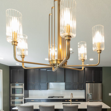
In the kitchen, the layout was refined to create a more open and efficient environment. An enlarged island now serves as a central hub for cooking, gathering, and daily use, while ceiling-height cabinetry maximizes storage and creates a clean, built-in aesthetic. New hardwood flooring ties the space together, adding warmth and continuity.
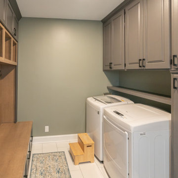
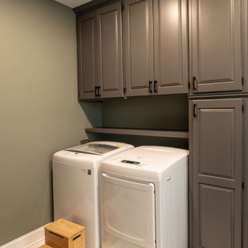
A key transformation involved reconfiguring the layout to better support storage needs. By relocating the laundry room door, a dedicated pantry was introduced, significantly improving organization and accessibility. The adjacent laundry room was also updated, along with the addition of custom cubbies to streamline daily routines.
For a bold contrast, the powder bath was reimagined as a moody, speakeasy-inspired space, bringing depth, character, and a memorable design moment to the home.
The result is a cohesive, thoughtfully redesigned interior that enhances how the family lives day to day, balancing function, storage, and distinctive style.
 KCBR Design | Remodel
Designed for repeat clients, this Overland Park remodel focused on improving function, flow, and everyday livability across multiple spaces.
In the kitchen, the layout was refined to create a more open and efficient environment. An enlarged island now serves as a central hub for cooking, gathering, and daily use, while ceiling-height cabinetry maximizes storage and creates a clean, built-in aesthetic. New hardwood flooring ties the space together, adding warmth and continuity.
A key transformation involved reconfiguring the layout to better support storage needs. By relocating the laundry room door, a dedicated pantry was introduced, significantly improving organization and accessibility. The adjacent laundry room was also updated, along with the addition of custom cubbies to streamline daily routines.
For a bold contrast, the powder bath was reimagined as a moody, speakeasy-inspired space, bringing depth, character, and a memorable design moment to the home.
The result is a cohesive, thoughtfully redesigned interior that enhances how the family lives day to day, balancing function, storage, and distinctive style.
 KCBR Design | Remodel
Designed for repeat clients, this Overland Park remodel focused on improving function, flow, and everyday livability across multiple spaces.
In the kitchen, the layout was refined to create a more open and efficient environment. An enlarged island now serves as a central hub for cooking, gathering, and daily use, while ceiling-height cabinetry maximizes storage and creates a clean, built-in aesthetic. New hardwood flooring ties the space together, adding warmth and continuity.
A key transformation involved reconfiguring the layout to better support storage needs. By relocating the laundry room door, a dedicated pantry was introduced, significantly improving organization and accessibility. The adjacent laundry room was also updated, along with the addition of custom cubbies to streamline daily routines.
For a bold contrast, the powder bath was reimagined as a moody, speakeasy-inspired space, bringing depth, character, and a memorable design moment to the home.
The result is a cohesive, thoughtfully redesigned interior that enhances how the family lives day to day, balancing function, storage, and distinctive style.
15