
Search results for "Isolation" in Home Design Ideas
 Casa De RJ Construction LLC
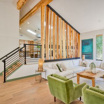
Complete revision turning this mid-century modern classic into a Scandinavian treehouse perched on the hillside amongst the trees. This full gut 2,800 remodel was extensive and require a tremendous amount of planing, coordination and detail. It also was an amazing test of ability doing heavy structural and concrete work on a 45 degree hillside which included 5 underpinnings at 16' deep and 11 isolated footings at 10' deep.
 Cello Technologies
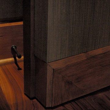
We designed double seals on the theater door (as well as on the hidden door into the snack bar/kitchen) to isolate the room, as well as provide an acoustic surface within the room.
 Urban Kitchens
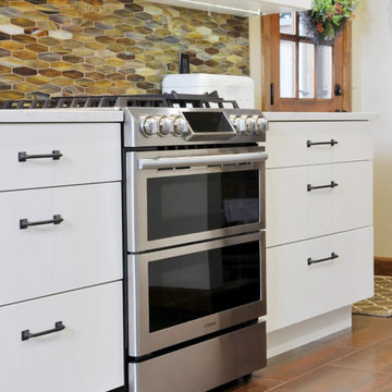
Open to the living area! This kitchen was isolated from the living area with traditional cabinets and Old World finishes. Built in 1979, this kitchen looks fabulous with bright cabinets and new tile floors! Urban Kitchens installed Showplace Cabinetry with Concord doors finished and painted with Soft Cream.
Find the right local pro for your project

 Park Landscaping Ltd.
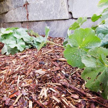
A expansive backyard with modern touch ups. Everything seen in the pictures are built or installed by Park Landscaping Ltd. From the brown slate outdoor walkway that supports the dark wood deck to the ocean pearl slate stairs that lead to the outdoor stone fireplace. Creativity with stealthy and modern elements to ensure that the surrounding area is complemented, not isolated.
 Urban Kitchens
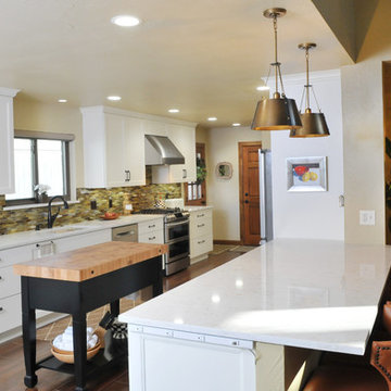
Open to the living area! This kitchen was isolated from the living area with traditional cabinets and Old World finishes. Built in 1979, this kitchen looks fabulous with bright cabinets and new tile floors! Urban Kitchens installed Showplace Cabinetry with Concord doors finished and painted with Soft Cream.
 Huggins Wood Floor Specialist
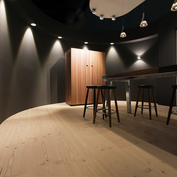
Douglas Fir plank in 3-layer construction with a small bevel on long side and approx. 5 mm top layer, with approx. 5 mm backing in the same wood and a conifer middle layer.
Tongue and groove on all sides for easy installation.
Typical are few bony, well-embedded knots up to 60 mm diameter and pronounced formation of the annual rings. Isolated knotholes, splints and cracks are possible and are closed with appropriate wood putty.
 DZINE
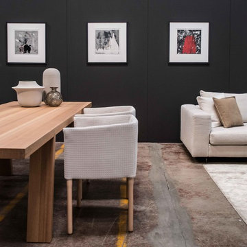
DZINEBaxter | Liquid side tables by Draga e Aurel
Bosa | Oops vase by Roberto e Ludovica Palomba & Isole vase by Sam Baron
Paola Lenti | Elsie chairs by Francesco Rota
Porro | Minimo table by Piero Lissoni
Venini | Monofiori Balloton vase by Venini
Zanotta | Scott sofa by Ludovica + Roberto Palomba
DZINE Gallery | An Expression of Time; The Space Between; Virguna Night; & Behind the Flow of Time by Ellen Markoff
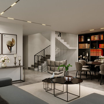
 Ferriss - Architectural Renderings
Top 10 house planning mistakes
Mistake # 1: placing wet areas away from communications.
Architects always foresee in advance the placement of wet areas in the immediate vicinity of communications, so you should not move the kitchen or bathrooms to more distant distances.
Mistake # 2: arrangement of living rooms and kitchens in rooms without natural light.
A person needs natural light when he is reading, studying or preparing food. Therefore, you should not plan living spaces, including the kitchen, in rooms without windows. Premises without natural light are mainly dressing rooms, storage rooms and bathrooms.
Mistake # 3: exit the bathroom to the living room or dining room.
Doors to bathrooms and utility rooms cannot open into public areas - living room or dining room. With such a planning decision, you will inconvenience guests and households, because no one will be able to enter or leave the premises unnoticed.
Mistake # 4: having one entrance to the house.
Plan 2-3 entrances to your home with each one serving a specific role. For example, through the front door you will meet guests, the entrance from the courtyard facade - to exit to the site in order to go around the house. The third entrance should lead from the street to the boiler room. Technicians enter through it and the equipment is replaced.
Mistake # 5: neglecting entrance hallways.
Do not plan grand halls and lounges when entering a house. Be sure to organize hallways with dressing rooms or spacious wardrobes.
Mistake # 6: placing a guest bathroom far from the entrance.
The concept of "guest bathroom" speaks for itself. To get into it, your friends do not need to go through all the rooms on the ground floor. Therefore, do not place it far from the front door.
Mistake # 7: Insufficient number of bathrooms on the floor.
One bathroom is not enough for a floor, especially if it is a bedroom. For the convenience of households and guests, each bedroom should be equipped with a separate bathroom.
Mistake #8: lack of an economic block.
In houses of any number of stores on the first or basement floor, a pantry with a sink should be provided for storing cleaning equipment, for storing vegetables or solid fuel. In this case, the exit from the storeroom to the floor must be isolated from the living rooms.
Mistake # 9: arrangement of walk-through living rooms.
Do not make the living room a walk-through, even if you plan to equip an office or living room in it. You and your guests will feel uncomfortable because the multiple doors leading to other rooms make the room look like a reception.
Mistake # 10: the wrong size of the corridors.
The width of the passage corridors should be at least 120 cm. First of all, the rule should be observed for the safety of residents and according to the rules of fire safety measures. An important role is played by ensuring sufficient ventilation of the premises: if the corridor is narrow and long, then there will be either a constant draft or stale air.
Also, in a narrow aisle, it will be extremely difficult to bring in and take out large-sized furniture or equipment. And the doors that open into the corridor should not block the passage, as a traumatic situation may arise.
If you have any polls that are not covered by this topic - write to us, we will be happy to advise you.
https://www.ferriss.co/
 Master Remodelers Inc.
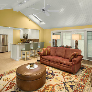
The 360 sq. ft. family room addition—which replaced a screened porch—also features a large window to the woods, vaulted ceiling, plus sliding doors to a new patio. It’s part of an open floor plan connecting the kitchen, living, dining and family rooms; a double pocket door can isolate the living room to control sound. The flooring is wood-look porcelain tile; LED track lights on the ceiling. An interior designer created a warm and harmonious interior decor.
GENERAL CONTRACTOR: Regis McQuaide, Master Remodelers… architectural designer: Junko Higashibeppu... Interior designer: Rachel Pavilack, Pavilack Design… Photography: George Mendell
 CITYDESKSTUDIO, Inc.
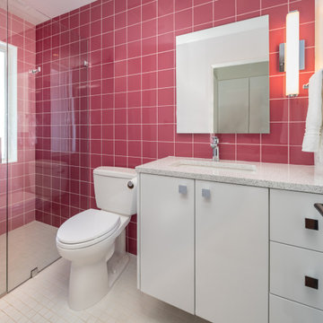
So often our task as residential architects is not to create something out of nothing. Instead, it is to help evolve, or bring forward something that is already there; to see with new eyes the best of what exists and to clarify and expand it, so that the house supports and celebrates how the client lives, and hopes to live, in the home.
So was the case with our House of Blues. The house was already wonderful. There was plenty of space, good views, a functioning floor plan, and the home was in overall good condition. The best features however, were embedded in the time it was built – mid 1960’s. The views were good, but too small. The kitchen location worked well, but is was closed off, cramped, and lacking counter space. The dining room was elegant, but too large and isolated. The graceful central hallway remained the homes most unique feature, but it was dark and the entry to the rooms on either side were accessed via small doorways. The bathrooms were large enough, and in the right locations, but they were tired and dated, and there was no mudroom.
We created something out of something. Beautiful shades of blue permeated the owner’s things and became a central theme in new elements. Daylight was expanded and brought deeper into the space. Doorways were widened and walls removed. The central hallway was fully opened at the end with two-story glass to improve on an already good idea. The kitchen was wholly new and expanded by borrowing space from the dining room. A mudroom was carved out of the garage. All the bathrooms were remodeled with fresh materials and new features. The gracious concrete stoop was reclad in stone and the front door was changed out for a splash of color. Light now permeates all the rooms and spaces flow together without losing their identity or function. The owners no longer feel blue in their House of Blues!
Location: St Paul, MN
Project Team:
Ben Awes, AIA, Principal- in -Charge
Nate Dodge
 Drury Design
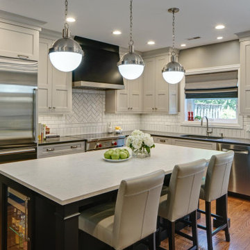
The existing kitchen was closed off, which necessitated several space-related compromises that affected many aspects of daily life.
Design Objectives:
• Open the tiny kitchen to living space
• Maintain the dining area
• Create a family room/TV space
• Increase kitchen storage and work surface
• Improve lighting
• Upgrade appliances to ‘chef grade’
Biggest Design Challenge:
• Our main challenge was to add a family room/TV area while maintaining a dining space. Prior to the remodel, the homeowners were using a TV room on their third floor, which was less than ideal.
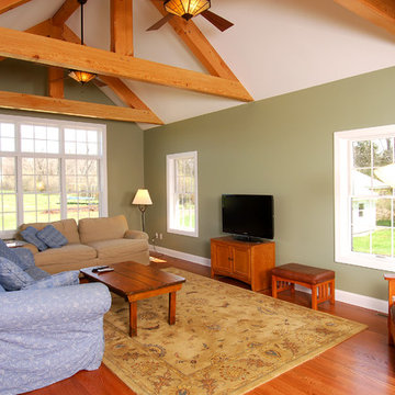
Taking down the kitchen wall and opening up the area to the adjacent living space made a big difference. The repurposed former dining room works well as a TV space. The former breakfast nook was updated with a new table that allows for casual dining on a daily basis, but is expandable for parties and holidays. Kitchen storage was expanded with island and ceiling-height cabinetry. Kitchen island seating and the open floor plan have definitely changed the quality of day-to-day life – the cook no longer feels isolated and now enjoys preparing meals while spending time with friends.
 Kitchens Direct, Inc
Prior to being renovated, the existing rooms of this home were compartmentalized into claustrophobic sections, barely serving their individual functions in relative isolation. With a belief that utility need not exist independent of comfort, we looked to open up and expand the kitchen space into an existing porch. We feel this answered the client's call for a combined kitchen and living space while improving on all functional elements of the design. Throughout the project we would keep our focus on the goal of bringing the home into the modern age, without sacrificing the client's desire for a comfortable, family friendly feel.
Photographed by: Skylim Photography
 ITECTDESIGN LLC.
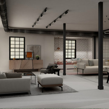
This basement project is a masterclass in modern industrial design, utilizing an open-concept layout to seamlessly integrate high-end hospitality with functional family living. The design maintains a cohesive aesthetic through a monochromatic palette of black, white, and grey, warmed by extensive wood textures and strategic lighting.
Social & Entertaining Hub
The heart of the basement is designed for hosting, featuring a seamless flow between indoor and outdoor entertaining.
Open Kitchen & Wine Storage: A sleek kitchen features a massive waterfall marble island that doubles as a buffet for guests. Behind it, custom black cabinetry and open wood shelving provide a sophisticated backdrop. A floor-to-ceiling glass-enclosed wine cabinet acts as a functional piece of art, showcasing a curated collection.
Lounge Area: Positioned to overlook the backyard, the lounge features low-profile modular sectional sofas in neutral tones. The space is anchored by a large grey area rug and a minimalist glass coffee table, creating a comfortable yet refined conversation zone.
Indoor-Outdoor Transition: The layout is oriented toward a large door that leads directly to the backyard and outdoor grill, making it the perfect "hub" for summer gatherings.
Home Office: Tucked into a quiet corner, the office uses the same vertical wood slatting found throughout the basement to create a sense of privacy without the need for heavy walls.
Home Gym: An industrial-inspired gym is located within the open plan, identified by exposed black support columns and overhead ductwork. This allows the client to exercise in a space that feels connected to the rest of the home rather than isolated.
Integrated Play Area
A dedicated small play area for the child is cleverly integrated into a large window alcove. It features:
Architectural Nook: A built-in storage bench with mauve cushions and a playful black-and-white triangle feature wall that extends to the ceiling.
 romero + obeji interior design
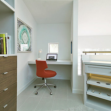
Cozy loft writing desk updated with paint and tile. Tie dye water color art, red soft wool task chair and porcelain lamp
Family room library - small eclectic carpeted and gray floor family room library idea in Orange County with white walls
Family room library - small eclectic carpeted and gray floor family room library idea in Orange County with white walls
 AOME Architects
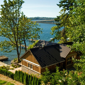
Perched at the base of the steep bluff that ensures isolation, access is via a new tram for the main property eighty feet above.
Example of a small classic gray one-story mixed siding exterior home design in Seattle with a metal roof
Example of a small classic gray one-story mixed siding exterior home design in Seattle with a metal roof
 Melancon Ortega Designs
architect: Patrick Melancon
interior designer: Monica Melancon
photo credit: Adrianna Benjamin
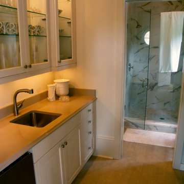
Inspiration for a laundry room remodel in New Orleans
Inspiration for a laundry room remodel in New Orleans
 NILES
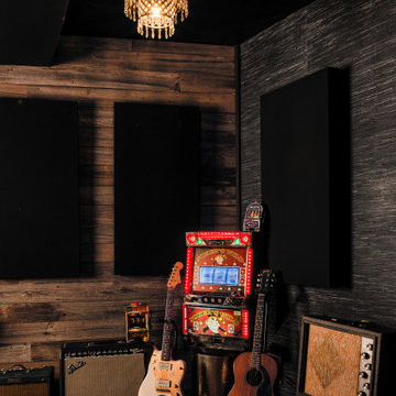
NILESThis 1,400 sq. ft. studio, built in 2018 for Grammy Award–winning drummer, multi-instrumentalist, and producer Adam Box, was one of the earliest full-scale NILES design–build projects. After years of session and touring work, Adam had a clear vision for his own creative home—a space that combined comfort, vibe, and technical precision. Our team partnered closely with him through every phase of the design and build process to bring that vision to life.
The studio features a full Control Room, a spacious Live Room, two amp isolation booths, and a large dedicated ISO booth engineered specifically for dry drum capture. Each room is fully wired for a complete live-tracking environment, enabling an entire band to plug in and record seamlessly. The Live Room is sonically open and collaborative, while the Control Room is fine-tuned for long stretches of creative focus and accurate monitoring.
Aesthetic direction played a major role in this project. Natural stonework, warm wood details, and a comfortable, lived-in feel create a distinctive character throughout the space. Adam added many of his own finishing touches, giving the studio an unmistakable personal identity that reflects his style and musical approach.
The result is a studio that delivers both atmosphere and performance—an inspiring hub for writing, tracking, mixing, and producing at the highest level.
 Bilotta Kitchen & Home
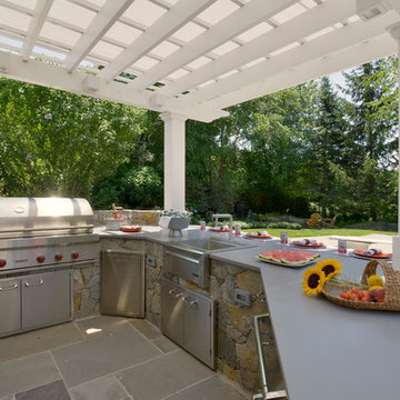
This client needed a place to entertain by the pool. They had already done their “inside” kitchen with Bilotta and so returned to design their outdoor space. All summer they spend a lot of time in their backyard entertaining guests, day and night. But before they had their fully designed outdoor space, whoever was in charge of grilling would feel isolated from everyone else. They needed one cohesive space to prep, mingle, eat and drink, alongside their pool. They did not skimp on a thing – they wanted all the bells and whistles: a big Wolf grill, plenty of weather resistant countertop space for dining (Lapitec - Grigio Cemento, by Eastern Stone), an awning (Durasol Pinnacle II by Gregory Sahagain & Sons, Inc.) that would also keep bright light out of the family room, lights, and an indoor space where they could escape the bugs if needed and even watch TV. The client was thrilled with the outcome - their complete vision for an ideal outdoor entertaining space came to life. Cabinetry is Lynx Professional Storage Line. Refrigerator drawers and sink by Lynx. Faucet is stainless by MGS Nerhas. Bilotta Designer: Randy O’Kane with Clark Neuringer Architects, posthumously. Photo Credit: Peter Krupenye
 Jay-Quinones Contracting Inc.
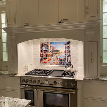
This was a complete kitchen renovation. The remodel included removing skylights and installing a two story bump up adding no square footage to the room but creating a dramatic visual even for the most discriminating designer. When you enter this kitchen your eyes wander trying to absorb the immense planning and detail that went into the renovation but ultimately you find yourself positioned under the large Theresa Maria chandelier gazing into the sky. The kitchen was designed around the 48 inch Thermador stove. The 2 story inset cabinet creation around the stove flows up into the addition creating a visual masterpiece that is only rivaled by original pieces of art works created by the likes of Van Gogh, Picasso and Rembrandt. The sink was relocated from the exterior wall and into the island so that the stove wall would be isolated and not connected any other cabinets. The 36-inch-wide refrigerator and 36-inch-wide freezer were designed and installed next to a microwave cabinet that makes heating up items as convenient as 1,2,3. The outside cabinet wall section is perfect for entertaining with the 42 inch base cabinets. The massive two-tiered island of 124 inches long is perfect for everyday family living. A farmer’s sink adds the perfect touch to this traditional design. Renovating a kitchen without ceiling detail is one of the most overlooked parts of the renovation. The amount of money spent on the renovation depends on the budget of course but I highly recommend including ceiling detail as much as one considers the tile backsplash.
56