
Search results for "Issue locations" in Home Design Ideas
 Irene Designs
Home Remodeling Project Overview
This extensive home remodeling project transformed a dated and inefficient layout into a functional, open, and aesthetically cohesive living space. The original layout had several challenges:
• A kitchen with limited storage, no cabinets on the window side, a sink facing the wall, and a range crammed into the corner. The pantry closet was too deep and impractical.
• A living room that couldn’t accommodate furniture without interfering with traffic flow.
• A front foyer with wasted space.
• A claustrophobic hallway toilet room without a sink, located near the laundry room.
The Remodeling Concept
The scope of this project extended well beyond the kitchen. We proposed several layout options to address issues in all adjacent spaces, ultimately implementing a plan that:
• Removed two walls and moved doorways.
• Replaced the kitchen window.
• Converted the hallway toilet room into a storage space.
• Installed pocket doors to separate the laundry hallway from the living room.
Kitchen Transformation
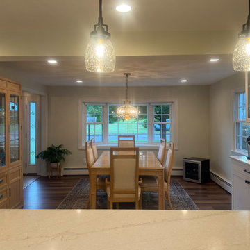
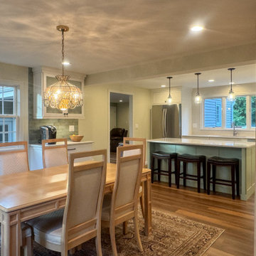
• Open Concept: By removing the wall between the kitchen and dining room, the two spaces became a seamless open area.
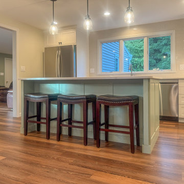
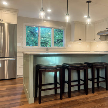
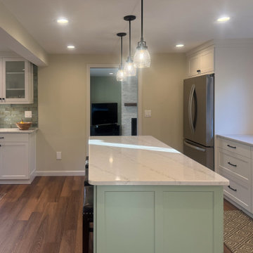
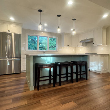
• New Layout: Cabinets were relocated to the window side for more storage and natural light. A central island with storage and seating was added, and a coffee bar was installed in the dining room.
• Updated Pantry: The deep pantry closet was converted into a pullout pantry with a cabinet front for better accessibility.
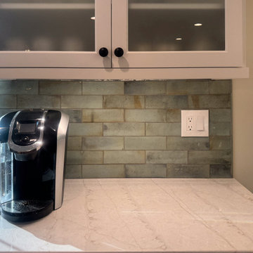
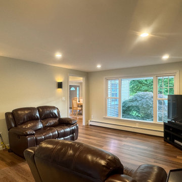
• Design Details: Off-white kitchen cabinets pair beautifully with a light green island. Warm white quartz counters and an artisan tile backsplash complete the look.
Dining Room
• Expanded Space: Most of the wall separating the dining room and foyer was removed, creating a more spacious area while still accommodating all furniture thanks to careful measurements.
Living Room Improvements
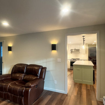
• Optimized Layout: Moving doorways and installing pocket doors allowed for better furniture placement, including a sofa that doesn’t interfere with traffic flow.
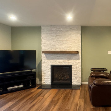
• Fireplace Upgrade: The brick fireplace was updated with a three-dimensional staggered stone veneer in a color matching the kitchen cabinets, creating a cohesive look. A TV was installed above the fireplace at a comfortable viewing angle.
Additional Updates
• New Flooring: All remodeled rooms now feature updated flooring.
• Ceilings: Popcorn ceilings were replaced with smooth, flat finishes, complemented by recessed lighting.
• Walls: Fresh paint throughout the space, with an accent wall in the living room matching the light green of the kitchen island.
• Lighting: Stylish sconces were added for a touch of elegance.
The Result
The homeowners are thrilled with the transformation, marveling at how their once cramped and inefficient home now feels spacious, functional, and beautifully cohesive. They can’t believe their house could ever look like this!
 Irene Designs
Home Remodeling Project Overview
This extensive home remodeling project transformed a dated and inefficient layout into a functional, open, and aesthetically cohesive living space. The original layout had several challenges:
• A kitchen with limited storage, no cabinets on the window side, a sink facing the wall, and a range crammed into the corner. The pantry closet was too deep and impractical.
• A living room that couldn’t accommodate furniture without interfering with traffic flow.
• A front foyer with wasted space.
• A claustrophobic hallway toilet room without a sink, located near the laundry room.
The Remodeling Concept
The scope of this project extended well beyond the kitchen. We proposed several layout options to address issues in all adjacent spaces, ultimately implementing a plan that:
• Removed two walls and moved doorways.
• Replaced the kitchen window.
• Converted the hallway toilet room into a storage space.
• Installed pocket doors to separate the laundry hallway from the living room.
Kitchen Transformation
• Open Concept: By removing the wall between the kitchen and dining room, the two spaces became a seamless open area.
• New Layout: Cabinets were relocated to the window side for more storage and natural light. A central island with storage and seating was added, and a coffee bar was installed in the dining room.
• Updated Pantry: The deep pantry closet was converted into a pullout pantry with a cabinet front for better accessibility.
• Design Details: Off-white kitchen cabinets pair beautifully with a light green island. Warm white quartz counters and an artisan tile backsplash complete the look.
Dining Room
• Expanded Space: Most of the wall separating the dining room and foyer was removed, creating a more spacious area while still accommodating all furniture thanks to careful measurements.
Living Room Improvements
• Optimized Layout: Moving doorways and installing pocket doors allowed for better furniture placement, including a sofa that doesn’t interfere with traffic flow.
• Fireplace Upgrade: The brick fireplace was updated with a three-dimensional staggered stone veneer in a color matching the kitchen cabinets, creating a cohesive look. A TV was installed above the fireplace at a comfortable viewing angle.
Additional Updates
• New Flooring: All remodeled rooms now feature updated flooring.
• Ceilings: Popcorn ceilings were replaced with smooth, flat finishes, complemented by recessed lighting.
• Walls: Fresh paint throughout the space, with an accent wall in the living room matching the light green of the kitchen island.
• Lighting: Stylish sconces were added for a touch of elegance.
The Result
The homeowners are thrilled with the transformation, marveling at how their once cramped and inefficient home now feels spacious, functional, and beautifully cohesive. They can’t believe their house could ever look like this!
 Irene Designs
Home Remodeling Project Overview
This extensive home remodeling project transformed a dated and inefficient layout into a functional, open, and aesthetically cohesive living space. The original layout had several challenges:
• A kitchen with limited storage, no cabinets on the window side, a sink facing the wall, and a range crammed into the corner. The pantry closet was too deep and impractical.
• A living room that couldn’t accommodate furniture without interfering with traffic flow.
• A front foyer with wasted space.
• A claustrophobic hallway toilet room without a sink, located near the laundry room.
The Remodeling Concept
The scope of this project extended well beyond the kitchen. We proposed several layout options to address issues in all adjacent spaces, ultimately implementing a plan that:
• Removed two walls and moved doorways.
• Replaced the kitchen window.
• Converted the hallway toilet room into a storage space.
• Installed pocket doors to separate the laundry hallway from the living room.
Kitchen Transformation
• Open Concept: By removing the wall between the kitchen and dining room, the two spaces became a seamless open area.
• New Layout: Cabinets were relocated to the window side for more storage and natural light. A central island with storage and seating was added, and a coffee bar was installed in the dining room.
• Updated Pantry: The deep pantry closet was converted into a pullout pantry with a cabinet front for better accessibility.
• Design Details: Off-white kitchen cabinets pair beautifully with a light green island. Warm white quartz counters and an artisan tile backsplash complete the look.
Dining Room
• Expanded Space: Most of the wall separating the dining room and foyer was removed, creating a more spacious area while still accommodating all furniture thanks to careful measurements.
Living Room Improvements
• Optimized Layout: Moving doorways and installing pocket doors allowed for better furniture placement, including a sofa that doesn’t interfere with traffic flow.
• Fireplace Upgrade: The brick fireplace was updated with a three-dimensional staggered stone veneer in a color matching the kitchen cabinets, creating a cohesive look. A TV was installed above the fireplace at a comfortable viewing angle.
Additional Updates
• New Flooring: All remodeled rooms now feature updated flooring.
• Ceilings: Popcorn ceilings were replaced with smooth, flat finishes, complemented by recessed lighting.
• Walls: Fresh paint throughout the space, with an accent wall in the living room matching the light green of the kitchen island.
• Lighting: Stylish sconces were added for a touch of elegance.
The Result
The homeowners are thrilled with the transformation, marveling at how their once cramped and inefficient home now feels spacious, functional, and beautifully cohesive. They can’t believe their house could ever look like this!
Find the right local pro for your project
 Irene Designs
Home Remodeling Project Overview
This extensive home remodeling project transformed a dated and inefficient layout into a functional, open, and aesthetically cohesive living space. The original layout had several challenges:
• A kitchen with limited storage, no cabinets on the window side, a sink facing the wall, and a range crammed into the corner. The pantry closet was too deep and impractical.
• A living room that couldn’t accommodate furniture without interfering with traffic flow.
• A front foyer with wasted space.
• A claustrophobic hallway toilet room without a sink, located near the laundry room.
The Remodeling Concept
The scope of this project extended well beyond the kitchen. We proposed several layout options to address issues in all adjacent spaces, ultimately implementing a plan that:
• Removed two walls and moved doorways.
• Replaced the kitchen window.
• Converted the hallway toilet room into a storage space.
• Installed pocket doors to separate the laundry hallway from the living room.
Kitchen Transformation
• Open Concept: By removing the wall between the kitchen and dining room, the two spaces became a seamless open area.
• New Layout: Cabinets were relocated to the window side for more storage and natural light. A central island with storage and seating was added, and a coffee bar was installed in the dining room.
• Updated Pantry: The deep pantry closet was converted into a pullout pantry with a cabinet front for better accessibility.
• Design Details: Off-white kitchen cabinets pair beautifully with a light green island. Warm white quartz counters and an artisan tile backsplash complete the look.
Dining Room
• Expanded Space: Most of the wall separating the dining room and foyer was removed, creating a more spacious area while still accommodating all furniture thanks to careful measurements.
Living Room Improvements
• Optimized Layout: Moving doorways and installing pocket doors allowed for better furniture placement, including a sofa that doesn’t interfere with traffic flow.
• Fireplace Upgrade: The brick fireplace was updated with a three-dimensional staggered stone veneer in a color matching the kitchen cabinets, creating a cohesive look. A TV was installed above the fireplace at a comfortable viewing angle.
Additional Updates
• New Flooring: All remodeled rooms now feature updated flooring.
• Ceilings: Popcorn ceilings were replaced with smooth, flat finishes, complemented by recessed lighting.
• Walls: Fresh paint throughout the space, with an accent wall in the living room matching the light green of the kitchen island.
• Lighting: Stylish sconces were added for a touch of elegance.
The Result
The homeowners are thrilled with the transformation, marveling at how their once cramped and inefficient home now feels spacious, functional, and beautifully cohesive. They can’t believe their house could ever look like this!
 Irene Designs
Home Remodeling Project Overview
This extensive home remodeling project transformed a dated and inefficient layout into a functional, open, and aesthetically cohesive living space. The original layout had several challenges:
• A kitchen with limited storage, no cabinets on the window side, a sink facing the wall, and a range crammed into the corner. The pantry closet was too deep and impractical.
• A living room that couldn’t accommodate furniture without interfering with traffic flow.
• A front foyer with wasted space.
• A claustrophobic hallway toilet room without a sink, located near the laundry room.
The Remodeling Concept
The scope of this project extended well beyond the kitchen. We proposed several layout options to address issues in all adjacent spaces, ultimately implementing a plan that:
• Removed two walls and moved doorways.
• Replaced the kitchen window.
• Converted the hallway toilet room into a storage space.
• Installed pocket doors to separate the laundry hallway from the living room.
Kitchen Transformation
• Open Concept: By removing the wall between the kitchen and dining room, the two spaces became a seamless open area.
• New Layout: Cabinets were relocated to the window side for more storage and natural light. A central island with storage and seating was added, and a coffee bar was installed in the dining room.
• Updated Pantry: The deep pantry closet was converted into a pullout pantry with a cabinet front for better accessibility.
• Design Details: Off-white kitchen cabinets pair beautifully with a light green island. Warm white quartz counters and an artisan tile backsplash complete the look.
Dining Room
• Expanded Space: Most of the wall separating the dining room and foyer was removed, creating a more spacious area while still accommodating all furniture thanks to careful measurements.
Living Room Improvements
• Optimized Layout: Moving doorways and installing pocket doors allowed for better furniture placement, including a sofa that doesn’t interfere with traffic flow.
• Fireplace Upgrade: The brick fireplace was updated with a three-dimensional staggered stone veneer in a color matching the kitchen cabinets, creating a cohesive look. A TV was installed above the fireplace at a comfortable viewing angle.
Additional Updates
• New Flooring: All remodeled rooms now feature updated flooring.
• Ceilings: Popcorn ceilings were replaced with smooth, flat finishes, complemented by recessed lighting.
• Walls: Fresh paint throughout the space, with an accent wall in the living room matching the light green of the kitchen island.
• Lighting: Stylish sconces were added for a touch of elegance.
The Result
The homeowners are thrilled with the transformation, marveling at how their once cramped and inefficient home now feels spacious, functional, and beautifully cohesive. They can’t believe their house could ever look like this!
 Irene Designs
Home Remodeling Project Overview
This extensive home remodeling project transformed a dated and inefficient layout into a functional, open, and aesthetically cohesive living space. The original layout had several challenges:
• A kitchen with limited storage, no cabinets on the window side, a sink facing the wall, and a range crammed into the corner. The pantry closet was too deep and impractical.
• A living room that couldn’t accommodate furniture without interfering with traffic flow.
• A front foyer with wasted space.
• A claustrophobic hallway toilet room without a sink, located near the laundry room.
The Remodeling Concept
The scope of this project extended well beyond the kitchen. We proposed several layout options to address issues in all adjacent spaces, ultimately implementing a plan that:
• Removed two walls and moved doorways.
• Replaced the kitchen window.
• Converted the hallway toilet room into a storage space.
• Installed pocket doors to separate the laundry hallway from the living room.
Kitchen Transformation
• Open Concept: By removing the wall between the kitchen and dining room, the two spaces became a seamless open area.
• New Layout: Cabinets were relocated to the window side for more storage and natural light. A central island with storage and seating was added, and a coffee bar was installed in the dining room.
• Updated Pantry: The deep pantry closet was converted into a pullout pantry with a cabinet front for better accessibility.
• Design Details: Off-white kitchen cabinets pair beautifully with a light green island. Warm white quartz counters and an artisan tile backsplash complete the look.
Dining Room
• Expanded Space: Most of the wall separating the dining room and foyer was removed, creating a more spacious area while still accommodating all furniture thanks to careful measurements.
Living Room Improvements
• Optimized Layout: Moving doorways and installing pocket doors allowed for better furniture placement, including a sofa that doesn’t interfere with traffic flow.
• Fireplace Upgrade: The brick fireplace was updated with a three-dimensional staggered stone veneer in a color matching the kitchen cabinets, creating a cohesive look. A TV was installed above the fireplace at a comfortable viewing angle.
Additional Updates
• New Flooring: All remodeled rooms now feature updated flooring.
• Ceilings: Popcorn ceilings were replaced with smooth, flat finishes, complemented by recessed lighting.
• Walls: Fresh paint throughout the space, with an accent wall in the living room matching the light green of the kitchen island.
• Lighting: Stylish sconces were added for a touch of elegance.
The Result
The homeowners are thrilled with the transformation, marveling at how their once cramped and inefficient home now feels spacious, functional, and beautifully cohesive. They can’t believe their house could ever look like this!
 Irene Designs
Home Remodeling Project Overview
This extensive home remodeling project transformed a dated and inefficient layout into a functional, open, and aesthetically cohesive living space. The original layout had several challenges:
• A kitchen with limited storage, no cabinets on the window side, a sink facing the wall, and a range crammed into the corner. The pantry closet was too deep and impractical.
• A living room that couldn’t accommodate furniture without interfering with traffic flow.
• A front foyer with wasted space.
• A claustrophobic hallway toilet room without a sink, located near the laundry room.
The Remodeling Concept
The scope of this project extended well beyond the kitchen. We proposed several layout options to address issues in all adjacent spaces, ultimately implementing a plan that:
• Removed two walls and moved doorways.
• Replaced the kitchen window.
• Converted the hallway toilet room into a storage space.
• Installed pocket doors to separate the laundry hallway from the living room.
Kitchen Transformation
• Open Concept: By removing the wall between the kitchen and dining room, the two spaces became a seamless open area.
• New Layout: Cabinets were relocated to the window side for more storage and natural light. A central island with storage and seating was added, and a coffee bar was installed in the dining room.
• Updated Pantry: The deep pantry closet was converted into a pullout pantry with a cabinet front for better accessibility.
• Design Details: Off-white kitchen cabinets pair beautifully with a light green island. Warm white quartz counters and an artisan tile backsplash complete the look.
Dining Room
• Expanded Space: Most of the wall separating the dining room and foyer was removed, creating a more spacious area while still accommodating all furniture thanks to careful measurements.
Living Room Improvements
• Optimized Layout: Moving doorways and installing pocket doors allowed for better furniture placement, including a sofa that doesn’t interfere with traffic flow.
• Fireplace Upgrade: The brick fireplace was updated with a three-dimensional staggered stone veneer in a color matching the kitchen cabinets, creating a cohesive look. A TV was installed above the fireplace at a comfortable viewing angle.
Additional Updates
• New Flooring: All remodeled rooms now feature updated flooring.
• Ceilings: Popcorn ceilings were replaced with smooth, flat finishes, complemented by recessed lighting.
• Walls: Fresh paint throughout the space, with an accent wall in the living room matching the light green of the kitchen island.
• Lighting: Stylish sconces were added for a touch of elegance.
The Result
The homeowners are thrilled with the transformation, marveling at how their once cramped and inefficient home now feels spacious, functional, and beautifully cohesive. They can’t believe their house could ever look like this!
Sponsored
Columbus, OH
Free consultation for landscape design!

Peabody Landscape Group
Franklin County's Reliable Landscape Design & Contracting
 Irene Designs
Home Remodeling Project Overview
This extensive home remodeling project transformed a dated and inefficient layout into a functional, open, and aesthetically cohesive living space. The original layout had several challenges:
• A kitchen with limited storage, no cabinets on the window side, a sink facing the wall, and a range crammed into the corner. The pantry closet was too deep and impractical.
• A living room that couldn’t accommodate furniture without interfering with traffic flow.
• A front foyer with wasted space.
• A claustrophobic hallway toilet room without a sink, located near the laundry room.
The Remodeling Concept
The scope of this project extended well beyond the kitchen. We proposed several layout options to address issues in all adjacent spaces, ultimately implementing a plan that:
• Removed two walls and moved doorways.
• Replaced the kitchen window.
• Converted the hallway toilet room into a storage space.
• Installed pocket doors to separate the laundry hallway from the living room.
Kitchen Transformation
• Open Concept: By removing the wall between the kitchen and dining room, the two spaces became a seamless open area.
• New Layout: Cabinets were relocated to the window side for more storage and natural light. A central island with storage and seating was added, and a coffee bar was installed in the dining room.
• Updated Pantry: The deep pantry closet was converted into a pullout pantry with a cabinet front for better accessibility.
• Design Details: Off-white kitchen cabinets pair beautifully with a light green island. Warm white quartz counters and an artisan tile backsplash complete the look.
Dining Room
• Expanded Space: Most of the wall separating the dining room and foyer was removed, creating a more spacious area while still accommodating all furniture thanks to careful measurements.
Living Room Improvements
• Optimized Layout: Moving doorways and installing pocket doors allowed for better furniture placement, including a sofa that doesn’t interfere with traffic flow.
• Fireplace Upgrade: The brick fireplace was updated with a three-dimensional staggered stone veneer in a color matching the kitchen cabinets, creating a cohesive look. A TV was installed above the fireplace at a comfortable viewing angle.
Additional Updates
• New Flooring: All remodeled rooms now feature updated flooring.
• Ceilings: Popcorn ceilings were replaced with smooth, flat finishes, complemented by recessed lighting.
• Walls: Fresh paint throughout the space, with an accent wall in the living room matching the light green of the kitchen island.
• Lighting: Stylish sconces were added for a touch of elegance.
The Result
The homeowners are thrilled with the transformation, marveling at how their once cramped and inefficient home now feels spacious, functional, and beautifully cohesive. They can’t believe their house could ever look like this!
 Irene Designs
Home Remodeling Project Overview
This extensive home remodeling project transformed a dated and inefficient layout into a functional, open, and aesthetically cohesive living space. The original layout had several challenges:
• A kitchen with limited storage, no cabinets on the window side, a sink facing the wall, and a range crammed into the corner. The pantry closet was too deep and impractical.
• A living room that couldn’t accommodate furniture without interfering with traffic flow.
• A front foyer with wasted space.
• A claustrophobic hallway toilet room without a sink, located near the laundry room.
The Remodeling Concept
The scope of this project extended well beyond the kitchen. We proposed several layout options to address issues in all adjacent spaces, ultimately implementing a plan that:
• Removed two walls and moved doorways.
• Replaced the kitchen window.
• Converted the hallway toilet room into a storage space.
• Installed pocket doors to separate the laundry hallway from the living room.
Kitchen Transformation
• Open Concept: By removing the wall between the kitchen and dining room, the two spaces became a seamless open area.
• New Layout: Cabinets were relocated to the window side for more storage and natural light. A central island with storage and seating was added, and a coffee bar was installed in the dining room.
• Updated Pantry: The deep pantry closet was converted into a pullout pantry with a cabinet front for better accessibility.
• Design Details: Off-white kitchen cabinets pair beautifully with a light green island. Warm white quartz counters and an artisan tile backsplash complete the look.
Dining Room
• Expanded Space: Most of the wall separating the dining room and foyer was removed, creating a more spacious area while still accommodating all furniture thanks to careful measurements.
Living Room Improvements
• Optimized Layout: Moving doorways and installing pocket doors allowed for better furniture placement, including a sofa that doesn’t interfere with traffic flow.
• Fireplace Upgrade: The brick fireplace was updated with a three-dimensional staggered stone veneer in a color matching the kitchen cabinets, creating a cohesive look. A TV was installed above the fireplace at a comfortable viewing angle.
Additional Updates
• New Flooring: All remodeled rooms now feature updated flooring.
• Ceilings: Popcorn ceilings were replaced with smooth, flat finishes, complemented by recessed lighting.
• Walls: Fresh paint throughout the space, with an accent wall in the living room matching the light green of the kitchen island.
• Lighting: Stylish sconces were added for a touch of elegance.
The Result
The homeowners are thrilled with the transformation, marveling at how their once cramped and inefficient home now feels spacious, functional, and beautifully cohesive. They can’t believe their house could ever look like this!
 Irene Designs
Home Remodeling Project Overview
This extensive home remodeling project transformed a dated and inefficient layout into a functional, open, and aesthetically cohesive living space. The original layout had several challenges:
• A kitchen with limited storage, no cabinets on the window side, a sink facing the wall, and a range crammed into the corner. The pantry closet was too deep and impractical.
• A living room that couldn’t accommodate furniture without interfering with traffic flow.
• A front foyer with wasted space.
• A claustrophobic hallway toilet room without a sink, located near the laundry room.
The Remodeling Concept
The scope of this project extended well beyond the kitchen. We proposed several layout options to address issues in all adjacent spaces, ultimately implementing a plan that:
• Removed two walls and moved doorways.
• Replaced the kitchen window.
• Converted the hallway toilet room into a storage space.
• Installed pocket doors to separate the laundry hallway from the living room.
Kitchen Transformation
• Open Concept: By removing the wall between the kitchen and dining room, the two spaces became a seamless open area.
• New Layout: Cabinets were relocated to the window side for more storage and natural light. A central island with storage and seating was added, and a coffee bar was installed in the dining room.
• Updated Pantry: The deep pantry closet was converted into a pullout pantry with a cabinet front for better accessibility.
• Design Details: Off-white kitchen cabinets pair beautifully with a light green island. Warm white quartz counters and an artisan tile backsplash complete the look.
Dining Room
• Expanded Space: Most of the wall separating the dining room and foyer was removed, creating a more spacious area while still accommodating all furniture thanks to careful measurements.
Living Room Improvements
• Optimized Layout: Moving doorways and installing pocket doors allowed for better furniture placement, including a sofa that doesn’t interfere with traffic flow.
• Fireplace Upgrade: The brick fireplace was updated with a three-dimensional staggered stone veneer in a color matching the kitchen cabinets, creating a cohesive look. A TV was installed above the fireplace at a comfortable viewing angle.
Additional Updates
• New Flooring: All remodeled rooms now feature updated flooring.
• Ceilings: Popcorn ceilings were replaced with smooth, flat finishes, complemented by recessed lighting.
• Walls: Fresh paint throughout the space, with an accent wall in the living room matching the light green of the kitchen island.
• Lighting: Stylish sconces were added for a touch of elegance.
The Result
The homeowners are thrilled with the transformation, marveling at how their once cramped and inefficient home now feels spacious, functional, and beautifully cohesive. They can’t believe their house could ever look like this!

 Edgewater Design Group
As written in Northern Home & Cottage by Elizabeth Edwards
For years, Jeff and Ellen Miller spent their vacations sailing in Northern Michigan—so they had plenty of time to check out which small harbor town they might like to retire to someday. When that time arrived several years ago, they looked at properties up and down the coast and along inland lakes. When they discovered a sweet piece on the outskirts of Boyne City that included waterfront and a buildable lot, with a garage on it, across the street, they knew they’d found home. The couple figured they could find plans for their dream lake cottage online. After all, they weren’t looking to build anything grandiose. Just a small-to-medium sized contemporary Craftsman. But after an unfruitful online search they gave up, frustrated. Every plan they found had the back of the house facing the water—they needed a blueprint for a home that fronted on the water. The Millers first met the woman, Stephanie Baldwin, Owner & President of Edgewater Design Group, who solved that issue and a number of others on the 2015
Northern Home & Cottage Petoskey Area Home Tour. Baldwin’s home that year was a smart, 2000-square cottage on Crooked Lake with simple lines and a Craftsman sensibility. That home proved to the couple that Edgewater Design Group is as proficient at small homes as the larger ones they are often known for. Edgewater Design Group did indeed come up with the perfect plan for the Millers. At 2400 square feet, the simple Craftsman with its 3 bedrooms, vaulted ceiling in the great room and upstairs deck is everything the Millers wanted—including the fact that construction stayed within their budget. An extra courtesy of working with the talented design team is a screened in porch facing the lake (“She told us, of course you have to have a screened in porch,” Ellen says. “And we love it!’) Edgewater’s other touches are more subtle. The Millers wanted to keep the garage, but the home needed to be sited on a small knoll some feet away in order to capture the views of Lake Charlevoix across the street. The solution is a covered walkway and steps that are so artful they enhance the home. Another favor Baldwin did for them was to connect them with Legacy Construction, a firm known for its craftsmanship and attention to detail. The Miller home, outfitted with touches including custom molding, cherry cabinetry, a stunning custom range hood, built in shelving and custom vanities. A warm hickory floor and lovely earth-toned Craftsman-style color palette pull it all together, while a fireplace mantel hewn from a tree taken on the property rounds out this gracious lake cottage.

 William Hoffman Architect
What simply started out as the purchase of a 30” Wolf gas stove to replace the old, turned into a complete kitchen renovation. The original intent was to replace the existing stove with the new. The new Wolf came other issues one being installing an adequate exhaust system to meet the needs of the stove. One thing led to the next and with that a new kitchen. The renovation included removing all existing fixtures, cabinetry and lighting. The existing tile floor remained the same but with some added area that was previously under existing base cabinets.
The goal of the project, once the decision was made to do a complete renovation, was to update the kitchen creating an eclectic aesthetic with all new fixtures of the best quality that could be afforded. Listed below are the changes that were made. All fixtures remained in their existing locations other than removing small piece of wall that allowed an extended length of the new bakers table to extend 24” into the existing dining and living room space to pull the spaces together and provide a small eating bar with adjoining bar stools. One stool was a custom design and fabrication (Marlin Stool)
Fixtures
1. Existing gas stove replaced with new 30” gas Wolf stove.
2. Existing Refrigerator replace with new 36” stainless steel Jen-Air refrigerator with bottom freezer.
3. Existing Dishwasher replace with new Jen-Air stainless steel interior and exterior dishwasher.
4. Existing base cabinets replaced with a combination of open and closed tables and cabinets. Two stainless steel commercial kitchen tables with an open bases and shelving. One with a stainless steel top the other a bakers table with a wood butcher block top. The cabinets were Kraft Made traditional wood base cabinets with a Kaffe finish and Fireslate counter surface. These cabinets were customized with stainless steel perforated door inserts and Mockett stainless steel drawer and door pulls.
5. Surface counter and table material included wood butcher block, stainless steel and Fireslate.
6. Overhead shelving included open commercial kitchen stainless steel shelves and open Appleply wood shelves with Rakks aluminum shelf brackets.
7. Existing lighting was replaced with Zumtobel track lighting with Ushio lamps, Lutron dimmers and an up lighted coffered ceiling (see Superman).
8. Existing kitchen sink was replaced with a large single compartment sink from Kindred with an In-Sinkerator Evolution garbage disposal. Filter water tap was added that connects to an Everprue water filter system.
9. Walls were tiled with Bottle Green 4 1/4” x 4 1/4” Daltile to staying consistent with existing original house tile.
10. The ceiling was reworked as required with a plaster finish
11. Marine grade caulk was used as required.
12. A soffit with up lighting was added to the periphery of kitchen facing the adjoining living and dining rooms.
13. Silver Masonite peg board storage wall adjacent to refrigerator.
Credits:
• Little Pete the Parakeet.....for being there
• Catalina Aguirre.....pots
• Many Friends....pots
• David D’Imperio.....Sputnik lamp
• Jose Maria Concha Sali.....painting
• Ron Meyers.....Plates on wall
• Bill Sanders.....Bunny screen painting
• William Hoffman....Beverly lamp
• William Hoffman.....marlin stool
• William Hoffman.....Gulfstream side chair
• William Hoffman.....Gulfstream dining table
• William Hoffman.....5 from 1 plywood chair
Bill Sanders Photography

 Milgard Windows & Doors
The Kiguchi family moved into their Austin, Texas home in 1994. Built in the 1980’s as part of a neighborhood development, they happily raised their family here but longed for something more contemporary. Once they became empty nesters, they decided it was time for a major remodel. After spending many years visiting Austin AIA Home Tours that highlight contemporary residential architecture, they had a lot of ideas and in 2013 were ready to interview architects and get their renovation underway.
The project turned into a major remodel due to an unstable foundation. Architects Ben Arbib and Ed Hughey, of Arbib Hughey Design were hired to solve the structural issue and look for inspiration in the bones of the house, which sat on top of a hillside and was surrounded by great views.
Unfortunately, with the old floor plan, the beautiful views were hidden by small windows that were poorly placed. In order to bring more natural light into the house the window sizes and configurations had to be addressed, all while keeping in mind the homeowners desire for a modern look and feel.
To achieve a more contemporary and sophisticated front of house, a new entry was designed that included removing a two-story bay window and porch. The entrance of the home also became more integrated with the landscape creating a template for new foliage to be planted. Older exterior materials were updated to incorporate a more muted palette of colors with a metal roof, dark grey siding in the back and white stucco in the front. Deep eaves were added over many of the new large windows for clean lines and sun protection.
“Inside it was about opening up the floor plan, expanding the views throughout the house, and updating the material palette to get a modern look that was also warm and inviting,” said Ben from Arbib Hughey Design. “Prior to the remodel, the house had the typical separation of rooms. We removed the walls between them and changed all of the windows to Milgard Thermally Improved Aluminum to connect the inside with the outside. No matter where you are you get nice views and natural light.”
The architects wanted to create some drama, which they accomplished with the window placement and opening up the interior floor plan to an open concept approach. Cabinetry was used to help delineate intimate spaces. To add warmth to an all-white living room, white-washed oak wood floors were installed and pine planks were used around the fireplace. The large windows served as artwork bringing the color of nature into the space.
An octagon shaped, elevated dining room, (named “the turret”), had a big impact on the design of the house. They architects rounded the corners and added larger window openings overlooking a new sunken garden. The great room was also softened by rounding out the corners and that circular theme continued throughout the house, being picked up in skylight wells and kitchen cabinetry. A staircase leading to a catwalk was added and the result was a two-story window wall that flooded the home with natural light.
When asked why Milgard® Thermally Improved Aluminum windows were selected, the architectural team listed many reasons:
1) Aesthetics: “We liked the slim profiles and narrow sightlines. The window frames never get in the way of the view and that was important to us. They also have a very contemporary look that went well with our design.”
2) Options: “We liked that we could get large sliding doors that matched the windows, giving us a very cohesive look and feel throughout the project.”
3) Cost Effective: “Milgard windows are affordable. You get a good product at a good price.”
4) Custom Sizes: “Milgard windows are customizable, which allowed us to get the right window for each location.”
Ready to take on your own traditional to modern home remodeling project? Arbib Hughey Design advises, “Work with a good architect. That means picking a team that is creative, communicative, listens well and is responsive. We think it’s important for an architect to listen to their clients and give them something they want, not something the architect thinks they should have. At the same time you want an architect who is willing and able to think outside the box and offer up design options that you may not have considered. Design is about a lot of back and forth, trying out ideas, getting feedback and trying again.”
The home was completely transformed into a unique, contemporary house perfectly integrated with its site. Internally the home has a natural flow for the occupants and externally it is integrated with the surroundings taking advantage of great natural light. As a side note, it was highly praised as part of the Austin AIA homes tour.



 J Design Group - Interior Designers Miami - Modern
AVENTURA MAGAZINE selected our client’s luxury 5000 Sf ocean front apartment in Miami Beach, to publish it in their issue and they Said:
Story by Linda Marx, Photography by Daniel Newcomb
Light & Bright
New York snowbirds redesigned their Miami Beach apartment to take advantage of the tropical lifestyle.
WHEN INTERIOR DESIGNER JENNIFER CORREDOR was asked to recreate a four-bedroom, six-bath condominium at The Bath Club in Miami Beach, she seized the opportunity to open the rooms and better utilize the vast ocean views.
In five months last year, the designer transformed a dark and closed 5,000-square-foot unit located on a high floor into a series of sweeping waterfront spaces and updated the well located apartment into a light and airy retreat for a sports-loving family of five.
“They come down from New York every other weekend and wanted to make their waterfront home a series of grand open spaces,” says Corrredor, of the J. Design Group in Coral Gables, a firm specializing in modern and contemporary interiors. “Since many of the rooms face the ocean, it made sense to open and lighten up the home, taking advantage of the awesome views of the sea and the bay.”
The designer used 40 x 40 all white tile throughout the apartment as a clean base. This way, her sophisticated use of color would stand out and bring the outdoors in.
The close-knit family members—two parents and three boys in college—like to do things together. But there were situations to overcome in the process of modernizing and opening the space. When Jennifer Corredor was briefed on their desires, nothing seemed too daunting. The confident designer was ready to delve in. For example, she fixed an area at the front door
that was curved. “The wood was concave so I straightened it out,” she explains of a request from the clients. “It was an obstacle that I overcame as part of what I do in a redesign. I don’t consider it a difficult challenge. Improving what I see is part of the process.”
She also tackled the kitchen with gusto by demolishing a wall. The kitchen had formerly been enclosed, which was a waste of space and poor use of available waterfront ambience. To create a grand space linking the kitchen to the living room and dining room area, something had to go. Once the wall was yesterday’s news, she relocated the refrigerator and freezer (two separate appliances) to the other side of the room. This change was a natural functionality in the new open space. “By tearing out the wall, the family has a better view of the kitchen from the living and dining rooms,” says Corredor, who also made it easier to walk in and out of one area and into the other. “The views of the larger public space and the surrounding water are breathtaking.
Opening it up changed everything.”
They clients can now see the kitchen from the living and dining areas, and at the same time, dwell in an airy and open space instead of feeling stuck in a dark enclosed series of rooms. In fact, the high-top bar stools that Corredor selected for the kitchen can be twirled around to use for watching TV in the living room.
In keeping with the theme of moving seamlessly from one room to the other, Corredor designed a subtle wall of glass in the living room along with lots of comfortable seating. This way, all family members feel at ease while relaxing, talking, or watching sporting events on the large flat screen television. “For this room, I wanted more open space, light and a supreme airy feeling,” she says. “With the glass design making a statement, it quickly became the star of the show.”…….
….. To add texture and depth, Corredor custom created wood doors here, and in other areas of the home. They provide a nice contrast to the open Florida tropical feel. “I added character to the openness by using exotic cherry wood,” she says. “I repeated this throughout the home and it works well.”
Known for capturing the client’s vision while adding her own innovative twists, Corredor lightened the family room, giving it a contemporary and modern edge with colorful art and matching throw pillows on the sofas. She added a large beige leather ottoman as the center coffee table in the room. This round piece was punctuated with a bold-toned flowering plant atop. It effortlessly matches the pillows and colors of the contemporary canvas.
Miami,
Miami Interior Designers,
Miami Interior Designer,
Interior Designers Miami,
Interior Designer Miami,
Modern Interior Designers,
Modern Interior Designer,
Modern interior decorators,
Modern interior decorator,
Contemporary Interior Designers,
Contemporary Interior Designer,
Interior design decorators,
Interior design decorator,
Interior Decoration and Design,
Black Interior Designers,
Black Interior Designer,
Interior designer,
Interior designers,
Interior design decorators,
Interior design decorator,
Home interior designers,
Home interior designer,
Interior design companies,
Interior decorators,
Interior decorator,
Decorators,
Decorator,
Miami Decorators,
Miami Decorator,
Decorators Miami,
Decorator Miami,
Interior Design Firm,
Interior Design Firms,
Interior Designer Firm,
Interior Designer Firms,
Interior design,
Interior designs,
Home decorators,
Interior decorating Miami,
Best Interior Designers,
Interior design decorator,
 Milgard Windows & Doors
The Kiguchi family moved into their Austin, Texas home in 1994. Built in the 1980’s as part of a neighborhood development, they happily raised their family here but longed for something more contemporary. Once they became empty nesters, they decided it was time for a major remodel. After spending many years visiting Austin AIA Home Tours that highlight contemporary residential architecture, they had a lot of ideas and in 2013 were ready to interview architects and get their renovation underway.
The project turned into a major remodel due to an unstable foundation. Architects Ben Arbib and Ed Hughey, of Arbib Hughey Design were hired to solve the structural issue and look for inspiration in the bones of the house, which sat on top of a hillside and was surrounded by great views.
Unfortunately, with the old floor plan, the beautiful views were hidden by small windows that were poorly placed. In order to bring more natural light into the house the window sizes and configurations had to be addressed, all while keeping in mind the homeowners desire for a modern look and feel.
To achieve a more contemporary and sophisticated front of house, a new entry was designed that included removing a two-story bay window and porch. The entrance of the home also became more integrated with the landscape creating a template for new foliage to be planted. Older exterior materials were updated to incorporate a more muted palette of colors with a metal roof, dark grey siding in the back and white stucco in the front. Deep eaves were added over many of the new large windows for clean lines and sun protection.
“Inside it was about opening up the floor plan, expanding the views throughout the house, and updating the material palette to get a modern look that was also warm and inviting,” said Ben from Arbib Hughey Design. “Prior to the remodel, the house had the typical separation of rooms. We removed the walls between them and changed all of the windows to Milgard Thermally Improved Aluminum to connect the inside with the outside. No matter where you are you get nice views and natural light.”
The architects wanted to create some drama, which they accomplished with the window placement and opening up the interior floor plan to an open concept approach. Cabinetry was used to help delineate intimate spaces. To add warmth to an all-white living room, white-washed oak wood floors were installed and pine planks were used around the fireplace. The large windows served as artwork bringing the color of nature into the space.
An octagon shaped, elevated dining room, (named “the turret”), had a big impact on the design of the house. They architects rounded the corners and added larger window openings overlooking a new sunken garden. The great room was also softened by rounding out the corners and that circular theme continued throughout the house, being picked up in skylight wells and kitchen cabinetry. A staircase leading to a catwalk was added and the result was a two-story window wall that flooded the home with natural light.
When asked why Milgard® Thermally Improved Aluminum windows were selected, the architectural team listed many reasons:
1) Aesthetics: “We liked the slim profiles and narrow sightlines. The window frames never get in the way of the view and that was important to us. They also have a very contemporary look that went well with our design.”
2) Options: “We liked that we could get large sliding doors that matched the windows, giving us a very cohesive look and feel throughout the project.”
3) Cost Effective: “Milgard windows are affordable. You get a good product at a good price.”
4) Custom Sizes: “Milgard windows are customizable, which allowed us to get the right window for each location.”
Ready to take on your own traditional to modern home remodeling project? Arbib Hughey Design advises, “Work with a good architect. That means picking a team that is creative, communicative, listens well and is responsive. We think it’s important for an architect to listen to their clients and give them something they want, not something the architect thinks they should have. At the same time you want an architect who is willing and able to think outside the box and offer up design options that you may not have considered. Design is about a lot of back and forth, trying out ideas, getting feedback and trying again.”
The home was completely transformed into a unique, contemporary house perfectly integrated with its site. Internally the home has a natural flow for the occupants and externally it is integrated with the surroundings taking advantage of great natural light. As a side note, it was highly praised as part of the Austin AIA homes tour.
 Tile Doctor Ltd
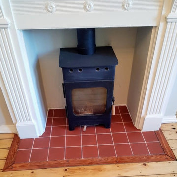
We received an inquiry from a client in Lindow End near Wilmslow Golf Club in the Cheshire stockbroker belt. They were restoring their home and were unhappy with the state of the Quarry tiled hearth under their log burning stove. We arranged a site visit to survey the tile and grout and provide a quote for restoring the appearance. The village is situated in what’s known as the ‘Cheshire Golden Triangle’ which is one of the most sought-after places to live in the UK after London. As a result, we often find ourselves in this area working on some very nice properties, so it wasn’t long before we were able to call in and survey the tiles.
As you can see from the pictures the hearth was quite dirty and the grouting had discoloured from years of use of the wood burner. The work here was a minor part of their restoration which had included significant building work. We agreed a price to carry out the work, which should only take a day and were able to return the following week.
Our first job was to cover the newly sanded and sealed wooden floors with dust sheets, so we didn’t mark them as we came in the front door to the lounge. We always try and make as little mess as possible and we are always as careful as possible.
We then sprayed Tile Doctor Pro-Clean on the fire hearth tiles. This is a multi-purpose tile and grout cleaner which would make light work of the dirty tiles. The product was left to soak into the Quarry tile and grout for about twenty minutes before being scrubbed in. The hearth was a small area, so this was done by hand and then washed down with clean water.
The dirty residue was removed using a wet vacuum then the tiles where wiped down with a clean micro fibre cloth. We then dried off the tiles using a little encouragement with a heat gun to speed up the drying process. Speed drying the tile and grout in this manor would allow us to complete the work in one visit.
Once the tiles and grout lines were dry it was clear that years of dirt and soiling had stained the grout, so although no much cleaner it was clear more work would be needed to give the grout a fresh and consistent appearance.
To address this issue with the grout we selected to apply a Sandstone Tile Doctor Grout Colourant. This is applied with a small brush and brushed it into the grout lines. It is quite a precise job but any colourant that goes onto the tiles is removed with a baby wipe before it dries. This process really transformed the look of the grout, the colourant also forms a barrier over the grout which will protect it going forward and make it easier to clean.
The Quarry tiles were then given a coat of Tile Doctor Colour Grow which is an impregnating colour enhancing sealer. This brings out the best in the quarry tiles and adds protection against future staining which will be needed given its location.
The client was very happy with the finish, in fact the hearth looked like it had been newly tiled, the impact of the recoloured grout was that striking. Sometimes the smallest jobs can be the most rewarding.
Andrew Robb
East Cheshire Tile Doctor

 Advance Design Studio, Ltd.
After six years of living in their Huntley IL home, Chris and Meghan were tired of their dark, dingy, outdated kitchen and it was finally time for a long-anticipated change. “The kitchen is the place where we live, it’s where we do everything,” Meghan said. “It was important that it be a space where we wanted to be.” Meghan loves cooking and enjoys including their girls in healthy meal prepping, this led them to want a brighter, more enjoyable kitchen with increased functionality and improved storage.
For Chris especially, the laundry room was an entirely dysfunctional eyesore. “We had a washer and a dryer, but it was all kind-of cobbled together!” Chris said. “There were always laundry piles everywhere, we weren’t really sure what we wanted to do in there, but it was time for us to make a change.” The mess of the space was stressful every time they walked in the door from the garage each day. Kids’ backpacks and shoes piled up haphazardly in the makeshift boot-bench closet left the family feeling disorganized and stressed. They needed space for folding clothes and locker cubbies to help keep the family organized.
Having known Christine and Todd in the Huntley community for years, Chris and Meghan were familiar with their work. “We already trusted them personally and having seen their projects for years we knew they did top notch work. After we reviewed the initial round of designs, we knew that hiring them was definitely the right choice,” Meghan and Chris said. Although Chris had done a lot of work in their home himself, the kitchen and laundry room renovation was such a large undertaking that he didn’t want to steal time away from his family to spend what would surely be many long weekends doing the job himself. “That would not have been a wise choice for us,” Chris laughed.
“Our designer, Michelle was very, very, easy to work with; anything we wanted to see or weren’t sure about, she went above and beyond to make this easy for us. She was easy to get hold of and always quick to respond,” the couple said. Michelle pulled ideas that mirrored the couple’s taste and style and was adept at directing the couple to limited choices that didn’t overwhelm them and kept the process moving. “I have a hard time making decisions. Michelle made the decision-making process so easy. I loved how she listened to what I liked and then presented three great options for me to choose from,” Meghan said.
The main objectives for the kitchen were better storage solutions, they wanted the space to reflect their lifestyle and taste, and they wanted it to last for years with low maintenance. One of the first steps in creating a more functional kitchen was relocating the refrigerator, creating an improved workflow for the busy family.
“We didn’t know that we could even move the refrigerator to a new location where it is now, that was something that we never would have thought of,” Chris said. “The new refrigerator location makes the kitchen feel so much bigger. We didn’t add any space, but our whole kitchen with the new design just seems like it’s so much larger than before!” Meghan said.
The perimeter mist colored cabinets helped warm and brighten the entire room, while the graphite colored cabinets on the island added contrast. Using this fresh, clean color palette satisfied the couple’s desire for a bright space that was the exact opposite of what they had before. Organization accessories were also added to the cabinets such as a spice drawer tray and roll outs to create hidden convenience.
“I absolutely love the hidden spices – it makes cooking so much more enjoyable!” Chris said. “And all the pull outs, and the double trash bin, who would think you could get so excited about organization!” the couple said in unison.
One thing they hated in their original kitchen was how dark the space felt. Added lighting on the ceiling with the new light fixtures combined with the lighter cabinetry colors throughout solved this problem. “Our new kitchen has this warm, almost cozy feeling that our old kitchen never had, it’s just a space that I love spending my time in now,” Meghan said. The light airy feeling was accentuated with the use of floating white shelves on either side of the decorative range hood. “We have so much cabinetry space, the new design is amazing we actually have more storage space than we will ever need,” Meghan said.
The island was extended to create more work surface and added space for stool seating. “The new island changes how we live. Now the kids can be in the kitchen with us, doing homework, eating breakfast, and the three of us have special dinners there when Chris is working late,” Meghan said.
The Carrara Marmi Quartz countertops were chosen because they are, not only beautiful, but are made from hard-working material that doesn’t require maintenance. The white subway tile backsplash that wraps to the ceiling behind the focal point cooktop range/hood compliments the crisp white countertops perfectly, while brushed brass hardware and light fixtures keep the design fresh and new.
The couple had a few fears at the beginning of the project, as most homeowners do. Their biggest fear was being out of their kitchen and laundry room for an extended time. The crew made it very easy for the family to work in a limited space keeping the washer and dryer hooked up the majority of the time, and also getting appliances working with minimal downtime.
“They above and beyond accommodated us to get us through the process,” Meghan said. “They did a great job making sure we were as comfortable as possible throughout the process,” Chris added.
“Our project manager DJ did a great job. He was very good at updating us on schedule changes, getting guys in as quickly as possible. Everyone that stepped in the house was nice and did great work,” said Chris. They thought Advance’s carpenter was phenomenal and were impressed when he took a conceptual idea from a photograph and worked with designer Michelle to create a one of a kind range/hood that has become the topic of conversation with friends and family who visit the new kitchen. “He was in our house literally every day for several weeks. He was easy to work with and good at what he did,” Meghan and Chris said.
The focal point of the kitchen; a hand-crafted, custom-built ventilation hood was clad with handpicked reclaimed barnwood. Advance Design’s carpenter built the framework and the cladding to create a one-of-a-kind design element that the couple loves.
“I think it was especially fun for him to create something unique from scratch, showcasing his talent in this area,” Meghan said. “I love that my kitchen is not like everyone else’s. I got to pick out the wood on my hood and watch it being built and was able to choose what pieces of wood went where on it. It’s totally unique.”
Red Oak flooring was toothed-in throughout the kitchen and the rest of the first floor anywhere changes were made. Then the whole floor was refinished to tone down the orange undertones in the existing floor stain, ultimately changing the color complexion of the entire first floor. The result is a completely new feeling to the entire home.
Renovating the laundry room was extremely important to Meghan and Chris, but they had trouble visualizing what the possibilities were for the seemingly small space. Michelle produced beautiful 3D illustrations that helped them envision the space in a whole new way.
“I must have told Michelle 100 times that I am a visual person, seeing the designs in 3D made it so easy to make decisions and see what we could really do with our space,” Meghan said.
A dividing wall and doorway were removed between the existing laundry room and hallway formerly containing a coat closet, providing space to design specialized graphite colored cabinetry matching the kitchen island to house custom storage cubbies for each family member. Adding the tall utility cabinetry in the new laundry area helped solve the storage issue, tucking away cleaning supplies, household items, and even the cat got its own cubby.
“I love how everything is now hidden in its own space. I can’t tell you how much I hated coming home and seeing everything sitting around on counters,” Chris said.
Electrical outlets were planned for the inside of utility cabinets, so devices could charge in hidden locations. Stacking the washer and dryer allowed for wider countertop space to provide a folding area and a special space for clothes to hang. “The way I do laundry has been completely transformed! I can actually fold clothes and hang them now right out of the washer and dryer,” Meghan said.
“The end result in the kitchen and the laundry/mud room was an updated light and bright space, with a smarter work flow that better meets the needs of this family,” Michelle said.
“I would totally recommend Advance Design,” Meghan said. “Sometimes I sit and just look at my kitchen and laundry room and think ‘Wow, I can’t believe I get to live here!’ It’s an understatement to say we love our new space.”

 TKS Design Group
Download our free ebook, Creating the Ideal Kitchen. DOWNLOAD NOW
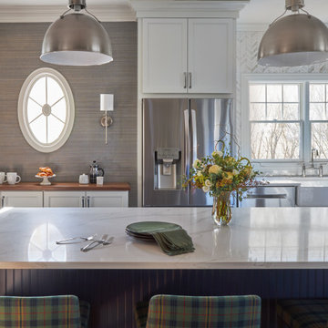
Like many families with older children, this local Glen Ellyn couple wanted to expand the size of their kitchen while also creating a more open, airy feel for their main level. The home had plenty of space that included a formal living room, formal dining room, family room with eat-in area and kitchen with butler’s pantry. What it didn’t have, was an effortless flow between the areas used daily for cooking, eating and gathering.
Additionally, the kitchen had become outdated, feeling dark and dismal, despite the abundance of natural light. Our clients wanted a bright, cheerful interior that would inspire the family to congregate in this part of the house. No easy feat with teenagers.
An open floor plan design solved the issues with functionality and circulation, removing the walls that restricted flow and opening up the entry to the dining room. We also eliminated the rarely used butler’s pantry allowing us to expand the kitchen and add a large island for food prep and gathering. To create a sense of symmetry and consistency in the space, a clerestory window was added below the header and framed to match the existing adjacent entry from the living room.
Inspired by the owner’s Scottish ancestry, the island cabinetry boasts a beautiful blue hue, paired with stools upholstered in a sprightly plaid. The built-in buffet area provides additional storage, topped with a beautiful wooden top stained to coordinate with the stunning tones of the flooring.
The owner’s opted for stainless steel appliances, inspiring the selection of brushed silver light fixtures and polished chrome hardware. Marble-look quartz offered a durable, lightly colored surface to reflect sunlight and enhance the cheer factor. According to this happy family, this uplifting space is now everyone’s favorite place to gather.
Designed by: Susan Klimala, CKBD
Photography by: Michael Kaskel
For more design inspiration go to: www.kitchenstudio-ge.com

 River Valley Landscapes
The property is one of the original farm houses located on the main street of a small town. It has been in the family for many years and our client just inherited the property. They were trying to have balance of preserving the old while realizing modern day living has its benefits too. The house had a large addition added using mostly old style materials, but designed with function and modern day luxuries. Our goal was to carry that theme to the outside.
Our first problem we had to address was how to transition between the first floor elevation changes. The lower room was the husband’s office. He stated in the future he may have clients over and it would be nice to have an area to sit outside. The wife’s main concern was to renew the four corner garden. She also felt it was very important to be able to see it from the kitchen area. Finally there was an old wishing well stuck right outside the kitchen. They both felt it would be neat to be able to incorporate this in some how. They wanted a patio area with a built in grill to accommodate there family and friends. They also wanted to keep a large play area for the kids.
We were able to pull this off successfully. We addressed the first issue by having a small lower level flagstone area. This area is large enough for 1 to 2 people to sit comfortably. It also provides a transition from his office to the larger patio area. We installed a simple small gravel sitting area opposite of the main patio. This provides our client a secluded place to relax or do business. Mrs.... told me she is amazed how much her and her husband enjoys this area. It is so peaceful looking at the small creek over a glass of wine.
We built a natural limestone retaining wall to create the patio terrace. The stone was chosen to extend the houses architectural elements into the landscape. Irregular broken flagstone was used to give it a more casual feel. We installed three Serviceberries into the patio terrace to replace some trees that were taken down during the remodeling. She was very concern that they would block the view of the four corner garden. We new they were crucial to nestle in the terrace, so we placed them for a couple days for her to decide. Fortunately she agreed they not only kept the view open, but helped frame the garden.
The four corner garden was designed to be viewed from afar and experienced up close. We wanted the space to have some formal structure while keeping with the casual farm house feel. Another natural limestone retaining wall was created. This leveled the garden terrace and helped associate it with the rest of the property. The four corner garden is nestled into the existing woods edge. This provides three distinct experiences to entering the garden; a more formal from the driveway, an open feel from the lower lawn, and a more natural / casual experience from the wooded area. The Plymouth brown gravel was used for the center of the garden. This helped highlight the stone post that was found during construction. The gravel also brings the sense of sound into the garden space. Lamb’s ear was chosen as a fun way to get kids interest in horticulture.
The balance of using the new to create the old feel is what makes this project a success. The property has already hosted a local historical society event and won an award for its preservation efforts. When Mrs.... can’t find her husband, she knows he is either reading the newspaper by the grill or resting in the hammock along the wood’s path.
 J Design Group - Interior Designers Miami - Modern
AVENTURA MAGAZINE selected our client’s luxury 5000 Sf ocean front apartment in Miami Beach, to publish it in their issue and they Said:
Story by Linda Marx, Photography by Daniel Newcomb
Light & Bright
New York snowbirds redesigned their Miami Beach apartment to take advantage of the tropical lifestyle.
WHEN INTERIOR DESIGNER JENNIFER CORREDOR was asked to recreate a four-bedroom, six-bath condominium at The Bath Club in Miami Beach, she seized the opportunity to open the rooms and better utilize the vast ocean views.
In five months last year, the designer transformed a dark and closed 5,000-square-foot unit located on a high floor into a series of sweeping waterfront spaces and updated the well located apartment into a light and airy retreat for a sports-loving family of five.
“They come down from New York every other weekend and wanted to make their waterfront home a series of grand open spaces,” says Corrredor, of the J. Design Group in Coral Gables, a firm specializing in modern and contemporary interiors. “Since many of the rooms face the ocean, it made sense to open and lighten up the home, taking advantage of the awesome views of the sea and the bay.”
The designer used 40 x 40 all white tile throughout the apartment as a clean base. This way, her sophisticated use of color would stand out and bring the outdoors in.
The close-knit family members—two parents and three boys in college—like to do things together. But there were situations to overcome in the process of modernizing and opening the space. When Corredor was briefed on their desires, nothing seemed too daunting. The confident designer was ready to delve in. For example, she fixed an area at the front door
that was curved. “The wood was concave so I straightened it out,” she explains of a request from the clients. “It was an obstacle that I overcame as part of what I do in a redesign. I don’t consider it a difficult challenge. Improving what I see is part of the process.”
She also tackled the kitchen with gusto by demolishing a wall. The kitchen had formerly been enclosed, which was a waste of space and poor use of available waterfront ambience. To create a grand space linking the kitchen to the living room and dining room area, something had to go. Once the wall was yesterday’s news, she relocated the refrigerator and freezer (two separate appliances) to the other side of the room. This change was a natural functionality in the new open space. “By tearing out the wall, the family has a better view of the kitchen from the living and dining rooms,” says Corredor, who also made it easier to walk in and out of one area and into the other. “The views of the larger public space and the surrounding water are breathtaking.
Opening it up changed everything.”
They clients can now see the kitchen from the living and dining areas, and at the same time, dwell in an airy and open space instead of feeling stuck in a dark enclosed series of rooms. In fact, the high-top bar stools that Corredor selected for the kitchen can be twirled around to use for watching TV in the living room.
In keeping with the theme of moving seamlessly from one room to the other, Corredor designed a subtle wall of glass in the living room along with lots of comfortable seating. This way, all family members feel at ease while relaxing, talking, or watching sporting events on the large flat screen television. “For this room, I wanted more open space, light and a supreme airy feeling,” she says. “With the glass design making a statement, it quickly became the star of the show.”…….
….. To add texture and depth, Corredor custom created wood doors here, and in other areas of the home. They provide a nice contrast to the open Florida tropical feel. “I added character to the openness by using exotic cherry wood,” she says. “I repeated this throughout the home and it works well.”
Known for capturing the client’s vision while adding her own innovative twists, Corredor lightened the family room, giving it a contemporary and modern edge with colorful art and matching throw pillows on the sofas. She added a large beige leather ottoman as the center coffee table in the room. This round piece was punctuated with a bold-toned flowering plant atop. It effortlessly matches the pillows and colors of the contemporary canvas.
Miami,
Miami Interior Designers,
Miami Interior Designer,
Interior Designers Miami,
Interior Designer Miami,
Modern Interior Designers,
Modern Interior Designer,
Modern interior decorators,
Modern interior decorator,
Contemporary Interior Designers,
Contemporary Interior Designer,
Interior design decorators,
Interior design decorator,
Interior Decoration and Design,
Black Interior Designers,
Black Interior Designer,
Interior designer,
Interior designers,
Interior design decorators,
Interior design decorator,
Home interior designers,
Home interior designer,
Interior design companies,
Interior decorators,
Interior decorator,
Decorators,
Decorator,
Miami Decorators,
Miami Decorator,
Decorators Miami,
Decorator Miami,
Interior Design Firm,
Interior Design Firms,
Interior Designer Firm,
Interior Designer Firms,
Interior design,
Interior designs,
Home decorators,
Miami Beach
Interior decorating Miami,
Best Interior Designers,
Interior design decorator,
60