
Search results for "John decided" in Home Design Ideas
 Jemm Interiors
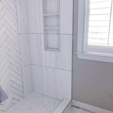
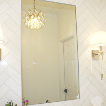
My client wanted to update her old builder grade basic powder room/bath. It was the only bath on the main floor, so it was important that we made this space memorable. The white custom vanity was created, with matching nine piece draw fronts, and beautiful classy polish nickel hardware, for a timeless look. We wanted this piece to look like a piece of furniture, and we topped it with a beautiful white marble top, that had subtle colors ranging from grays to warm golds. On the floor we went with a dolomite marble tile, that is like a geometric daisy. We also used the same dolomite marble behind the vanity wall. This time I decided to a herringbone pattern, as it was just the right amount of elegance needed, to leave that lasting impression. The same herringbone tile, was also repeated in the shower area, this time as a waterfall feature, along with a larger dolomite tile. The shower niche, was kept clean and simple, but we did use the same marble from the vanity top, for the niche shelves. The beautiful wall sconces, in polish nickel and acrylic, elevated the space, and was not your typical vanity light. All in all, I played with varying tones of white, that kept this space elegant.
Project completed by Reka Jemmott, Jemm Interiors desgn firm, which serves Sandy Springs, Alpharetta, Johns Creek, Buckhead, Cumming, Roswell, Brookhaven and Atlanta areas.
For more about Jemm Interiors, see here: https://jemminteriors.com/
https://www.houzz.com/hznb/projects/powder-room-pj-vj~6753789

 Metro Tile Inc
Alcove shower - small contemporary 3/4 gray tile, white tile and matchstick tile porcelain tile and beige floor alcove shower idea in New York with a one-piece toilet
 Jemm Interiors
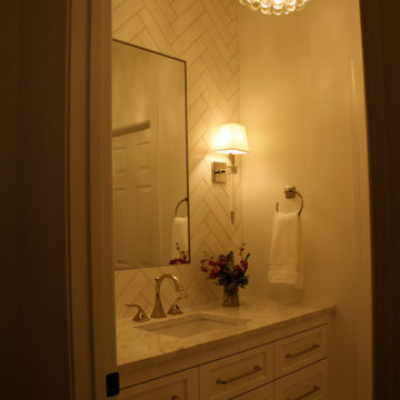
My client wanted to update her old builder grade basic powder room/bath. It was the only bath on the main floor, so it was important that we made this space memorable. The white custom vanity was created, with matching nine piece draw fronts, and beautiful classy polish nickel hardware, for a timeless look. We wanted this piece to look like a piece of furniture, and we topped it with a beautiful white marble top, that had subtle colors ranging from grays to warm golds. On the floor we went with a dolomite marble tile, that is like a geometric daisy. We also used the same dolomite marble behind the vanity wall. This time I decided to a herringbone pattern, as it was just the right amount of elegance needed, to leave that lasting impression. The same herringbone tile, was also repeated in the shower area, this time as a waterfall feature, along with a larger dolomite tile. The shower niche, was kept clean and simple, but we did use the same marble from the vanity top, for the niche shelves. The beautiful wall sconces, in polish nickel and acrylic, elevated the space, and was not your typical vanity light. All in all, I played with varying tones of white, that kept this space elegant.
Project completed by Reka Jemmott, Jemm Interiors desgn firm, which serves Sandy Springs, Alpharetta, Johns Creek, Buckhead, Cumming, Roswell, Brookhaven and Atlanta areas.
For more about Jemm Interiors, see here: https://jemminteriors.com/
https://www.houzz.com/hznb/projects/powder-room-pj-vj~6753789
Find the right local pro for your project
 Jemm Interiors
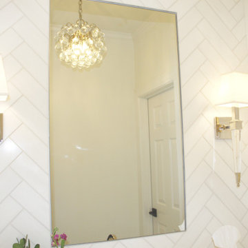
My client wanted to update her old builder grade basic powder room/bath. It was the only bath on the main floor, so it was important that we made this space memorable. The white custom vanity was created, with matching nine piece draw fronts, and beautiful classy polish nickel hardware, for a timeless look. We wanted this piece to look like a piece of furniture, and we topped it with a beautiful white marble top, that had subtle colors ranging from grays to warm golds. On the floor we went with a dolomite marble tile, that is like a geometric daisy. We also used the same dolomite marble behind the vanity wall. This time I decided to a herringbone pattern, as it was just the right amount of elegance needed, to leave that lasting impression. The same herringbone tile, was also repeated in the shower area, this time as a waterfall feature, along with a larger dolomite tile. The shower niche, was kept clean and simple, but we did use the same marble from the vanity top, for the niche shelves. The beautiful wall sconces, in polish nickel and acrylic, elevated the space, and was not your typical vanity light. All in all, I played with varying tones of white, that kept this space elegant.
Project completed by Reka Jemmott, Jemm Interiors desgn firm, which serves Sandy Springs, Alpharetta, Johns Creek, Buckhead, Cumming, Roswell, Brookhaven and Atlanta areas.
For more about Jemm Interiors, see here: https://jemminteriors.com/
https://www.houzz.com/hznb/projects/powder-room-pj-vj~6753789
 Jemm Interiors
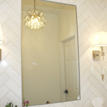
My client wanted to update her old builder grade basic powder room/bath. It was the only bath on the main floor, so it was important that we made this space memorable. The white custom vanity was created, with matching nine piece draw fronts, and beautiful classy polish nickel hardware, for a timeless look. We wanted this piece to look like a piece of furniture, and we topped it with a beautiful white marble top, that had subtle colors ranging from grays to warm golds. On the floor we went with a dolomite marble tile, that is like a geometric daisy. We also used the same dolomite marble behind the vanity wall. This time I decided to a herringbone pattern, as it was just the right amount of elegance needed, to leave that lasting impression. The same herringbone tile, was also repeated in the shower area, this time as a waterfall feature, along with a larger dolomite tile. The shower niche, was kept clean and simple, but we did use the same marble from the vanity top, for the niche shelves. The beautiful wall sconces, in polish nickel and acrylic, elevated the space, and was not your typical vanity light. All in all, I played with varying tones of white, that kept this space elegant.
Project completed by Reka Jemmott, Jemm Interiors desgn firm, which serves Sandy Springs, Alpharetta, Johns Creek, Buckhead, Cumming, Roswell, Brookhaven and Atlanta areas.
For more about Jemm Interiors, see here: https://jemminteriors.com/
https://www.houzz.com/hznb/projects/powder-room-pj-vj~6753789
 Jemm Interiors
My client wanted to update her old builder grade basic powder room/bath. It was the only bath on the main floor, so it was important that we made this space memorable. The white custom vanity was created, with matching nine piece draw fronts, and beautiful classy polish nickel hardware, for a timeless look. We wanted this piece to look like a piece of furniture, and we topped it with a beautiful white marble top, that had subtle colors ranging from grays to warm golds. On the floor we went with a dolomite marble tile, that is like a geometric daisy. We also used the same dolomite marble behind the vanity wall. This time I decided to a herringbone pattern, as it was just the right amount of elegance needed, to leave that lasting impression. The same herringbone tile, was also repeated in the shower area, this time as a waterfall feature, along with a larger dolomite tile. The shower niche, was kept clean and simple, but we did use the same marble from the vanity top, for the niche shelves. The beautiful wall sconces, in polish nickel and acrylic, elevated the space, and was not your typical vanity light. All in all, I played with varying tones of white, that kept this space elegant.
Project completed by Reka Jemmott, Jemm Interiors desgn firm, which serves Sandy Springs, Alpharetta, Johns Creek, Buckhead, Cumming, Roswell, Brookhaven and Atlanta areas.
For more about Jemm Interiors, see here: https://jemminteriors.com/
https://www.houzz.com/hznb/projects/powder-room-pj-vj~6753789

 TKS Design Group
Free ebook, Creating the Ideal Kitchen. DOWNLOAD NOW
Our clients came in after thinking a long time about what to do with their kitchen – new cabinets or paint them, white kitchen or wood, custom or is semi-custom? All good questions to ask! They were committed to making this home for a while, they decided to do a full remodel. The kitchen was not living up to its potential both visually and functionally. The dark cabinets and countertop made the room feel dull. And the major drawback, a large corner pantry that was eating into the room, make it appear smaller than it was.
We started by ditching the corner pantry. It created a perfectly centered spot for the new professional range and made room for a much larger island that now houses a beverage center, microwave drawer, seating for three and tons of storage. The multi-generational family does a ton of cooking, so this kitchen gets used! We spent lots of time fine tuning the storage devices and planning where critical items would be stored. This included the new pantry area across from the refrigerator that houses small appliances and food staples.
Designed by: Susan Klimala, CKBD
Photography by: LOMA Studios
For more information on kitchen and bath design ideas go to: www.kitchenstudio-ge.com
Sponsored
Columbus, OH

Hope Restoration & General Contracting
Columbus Design-Build, Kitchen & Bath Remodeling, Historic Renovations

 John Case Adams, Architect
This was part of a major interior and exterior renovation of a 1920's Tudor house in Dobbs Ferry, NY. A previous renovation in the 70's had stripped away most of the original exterior wood details and had added plain modern widows with no casings or detail at all, culminating in a hideous 8'x8' plastic bubble skylight on the roof. So we embarked on a process of adding detail back into the house and we decided early on to pitch the style more in a Craftsman direction. We replaced all the windows and doors with pre-finished wood Norwood windows and doors, with simulated divided lites and enlarged head casings and sills. We re-wired and re-stucco'd the exterior, covering the previous sprayed on stucco with a new hand troweled smooth finish. We added a small gabled addition to the Kitchen wing which matched exactly a gable at the other side of the house and we redid all the flashing, gutters and leaders in copper.
In the interior we renovated the ground floor including the Kitchen that you see. in the photos. The stone chimney was a happy find...previously covered in stucco which we had removed. We found a local mill in CT to custom cut the random width wide plank white oak floor boards which we installed with antique square face nails. The floor tiles in the Kitchen are actually salvaged 19th century Chicago building bricks, which were sliced to tile thickness and installed in a basketweave pattern.
The fact we are most proud of with this project, is that all of this work was done within a 3 months construction schedule. We managed the construction together with our client, a filmmaker who was a wizard at running crews, and it all came together beautifully.....on a schedule we haven't seen before or since.

 Olamar Interiors
These Northern Virginia residents have owned this vacation home for about ten years. With retirement imminent, they decided to give the entire home an over-haul. With it’s great bones and amazing location, this seemed like a very sound investment for their future. Paola McDonald from Olamar Interiors had been working with the clients for the past three years, helping them to renovate their Sterling, VA condominium and their Moorefield, WV weekend home. It seemed fitting that they would also hire her to help them renovate this home as well.
For this project we took the home down to the studs and practically rebuilt it. The renovation includes an addition to the basement level and main floor to create a new fitness room, additional guest bedroom and larger kitchen and dining area. It also included a renovation of the facade of the home. The exterior of the home was completely re-sided and painted, and we added the tall windows at the stairs. The lower entry deck was expanded and an upper deck was added just off the kitchen in order for the homeowner to keep his grill away from the strong ocean winds. A new deck was also added off of the master bedroom. New stainless steel railings were added to all the decks. We opened the homes stairwells, adding custom glass railings and new lighting to create a much more open feel and allow for natural light to flood the entire main living area. The original, tiny kitchen was expanded substantially, adding a large custom eat in bar, wine storage area and plenty of storage. We utilized Decora’s Marquis Cabinetry in an espresso finish to give the kitchen a very clean, contemporary feel. Carrara marble countertops paired with a grey quartz, single slap marble backsplash, and stainless appliances create a clean look. In the new dining area, a simple Modloft dining table was paired with a Regina Andrew bubbles chandelier and Jessica Charles dining chairs for a sophisticated feel accentuated perfectly by beachy colors and textures that tie in the beautiful views of the Ocean. A custom chandelier from John Pomp is the highlight of the family room, particularly at night when it is reminiscent to fireflies in the sky. A new custom designed, custom made sectional, cozy newly added Spark Modern Fires gas fireplace, custom rug by Julie Dasher and Lee Industries chairs create a cozy place to lounge and watch television after a long day at the beach. Guests feel like they are in a luxurious boutique hotel complete with spectacular views, comfortable Ann Gish linens and beautiful and unique lighting fixtures. All three full baths and the powder room received complete facelifts with new glass, marble and ceramic tiles, Decora cabinetry, new lighting fixtures, quartz countertops and unique features that make unique statements in each one. Phillip Jeffries mica wallpaper are used in the entryway and family room fireplace walls to add a sandy texture to each space. Phillip Jeffries grasscloth was added to the master bedroom accent wall to create a delicate feature. New flooring throughout includes gorgeous dark stained hardwood floors, ceramic tile and Karastan carpeting in the bedrooms. The crisp white and grey walls are accentuated throughout the home by beach inspired turquoises, navies and lime greens. Perfectly appointed furnishings, artwork, accessories and custom made window treatments complete the look and feel of this gorgeous vacation home.
Photography by Tinius Photography

 ODS Architecture
Atherton has many large substantial homes - our clients purchased an existing home on a one acre flag-shaped lot and asked us to design a new dream home for them. The result is a new 7,000 square foot four-building complex consisting of the main house, six-car garage with two car lifts, pool house with a full one bedroom residence inside, and a separate home office /work out gym studio building. A fifty-foot swimming pool was also created with fully landscaped yards.
Given the rectangular shape of the lot, it was decided to angle the house to incoming visitors slightly so as to more dramatically present itself. The house became a classic u-shaped home but Feng Shui design principals were employed directing the placement of the pool house to better contain the energy flow on the site. The main house entry door is then aligned with a special Japanese red maple at the end of a long visual axis at the rear of the site. These angles and alignments set up everything else about the house design and layout, and views from various rooms allow you to see into virtually every space tracking movements of others in the home.
The residence is simply divided into two wings of public use, kitchen and family room, and the other wing of bedrooms, connected by the living and dining great room. Function drove the exterior form of windows and solid walls with a line of clerestory windows which bring light into the middle of the large home. Extensive sun shadow studies with 3D tree modeling led to the unorthodox placement of the pool to the north of the home, but tree shadow tracking showed this to be the sunniest area during the entire year.
Sustainable measures included a full 7.1kW solar photovoltaic array technically making the house off the grid, and arranged so that no panels are visible from the property. A large 16,000 gallon rainwater catchment system consisting of tanks buried below grade was installed. The home is California GreenPoint rated and also features sealed roof soffits and a sealed crawlspace without the usual venting. A whole house computer automation system with server room was installed as well. Heating and cooling utilize hot water radiant heated concrete and wood floors supplemented by heat pump generated heating and cooling.
A compound of buildings created to form balanced relationships between each other, this home is about circulation, light and a balance of form and function.
Photo by John Sutton Photography.

 InnovationLand
Houston Interior Designer Lisha Maxey took this Museum District condo from the dated, mirrored walls of the 1980s to Mid Century Modern with a gallery look featuring the client's art collection.
"The place was covered with glued-down, floor-to-ceiling mirrors," says Lisha Maxey, senior designer for Homescapes of Houston and principal at LGH Design Services in Houston. "When we took them off the walls, the walls came apart. We ended up taking them down to the studs."
The makeover took six months to complete, primarily because of strict condo association rules that only gave the Houston interior designers very limited access to the elevator - through which all materials and team members had to go.
"Monday through Friday, we could only be noisy from 10 a.m. to 2 p.m., and if we had to do something extra loud, like sawing or drilling, we had to schedule it with the management and they had to communicate that to the condo owners. So it was just a lot of coordination. But a lot of Inner City Loopers live in these kinds of buildings, so we're used to handling that kind of thing."
The client, a child psychiatrist in her 60s, recently moved to Houston from northeast Texas to be with friends. After being widowed three years ago, she decided it was time to let go of the traditionally styled estate that wasn't really her style anyway. An avid diver who has traveled around the world to pursue her passion, she has amassed a large collection of art from her travels. Downsizing to 1,600 feet and wanting to go more contemporary, she wanted the display - and the look - more streamlined.
"She wanted clean lines and muted colors, with the main focus being her artwork," says Maxey. "So we made the space a palette for that."
Enter the white, gallery-grade paint she chose for the walls: "It's halfway between satin and flat," explains Maxey. "It's not glossy and it's not chalky - just very smooth and clean."
Adding to the gallery theme is the satin nickel track lighting with lamps aimed to highlight pieces of art. "This lighting has no wires," notes Maxey. "It's powered by a positive and negative conduit."
The new flooring throughout is a blended-grey porcelain tile that looks like wood planks. "It's gorgeous, natural-looking and combines all the beauty of wood with the durability of tile," says Maxey. "We used it throughout the condo to unify the space."
After Maxey started looking at the client's bright, vibrant, colorful artwork, she felt the palette couldn't stay as muted anymore. Hence the Mid Century Modern orange leather sofas from West Elm and bright green chairs from Joybird, plus the throw pillows in different textures, patterns and shades of gold, orange and green.
The concave lines of the Danish-inspired chairs, she notes, help them look beautiful from all the way around - a key to designing spaces for loft living.
"The table in the living room is very interesting," notes Maxey. "It was handmade for the client in 1974 and has a signature on it from the artist. She was adamant about including the piece, which has all these hand-painted black-and-white art tiles on the top. I took one look at it and said 'It's not really going to go.'"
However, after cutting 6 inches off the bottom and making it look a little distressed, the table ended up being the perfect complement to the sofas.
The dining room table - from Design Within Reach - is a solid piece of mahogany, the chair upholstery a mix of grey velvet and leather and the legs a shiny brass. "The side chairs are leather and the end ones are velvet," says Maxey. "It's a nice textural mix that lends depth and texture."
The galley kitchen, meanwhile, has been lightened and brightened, with white quartz countertops and backsplashes mimicking the look of Carrara marble, stainless steel appliances and a velvet green bench seat for a punch of color. The cabinets are painted a cool grey color called "Silverplate."
The two bathrooms have been updated with contemporary white vanities and vessel sinks and the master bath now features a walk-in shower tiled in Dolomite white marble (the floor is Bianco Carrara marble mosaic, done in a herringbone pattern.
In the master bedroom, Homescapes of Houston knocked down a wall between two smaller closets with swing doors to make one large walk-in closet with pocket doors. The closet in the guest bedroom also came out 13 more inches.
The client's artwork throughout personalizes the space and tells the story of a life. There's a huge bowl of shells from the client's diving adventures, framed art from her child psychiatry patients and a 16th century wood carving from a monastery that's been in her family forever.
"Her collection is quite impressive," says Maxey. "There's even a framed piece of autographed songs written by John Lennon." (You can see this black-framed piece of art on the wall in the photo above of two green chairs).
"We're extremely happy with how the project turned out, and so is the client," says Maxey. "No expense was spared for her. It was a labor of love and we were excited to do it."
 KitchenLab Interiors
’ first, entirely new construction project in collaboration with GTH architects who designed the residence. KLI was responsible for all interior finishes, fixtures, furnishings, and design including the stairs, casework, interior doors, moldings and millwork. KLI also worked with the client on selecting the roof, exterior stucco and paint colors, stone, windows, and doors. The homeowners had purchased the existing home on a lakefront lot of the Valley Lo community in Glenview, thinking that it would be a gut renovation, but when they discovered a host of issues including mold, they decided to tear it down and start from scratch. The minute you look out the living room windows, you feel as though you're on a lakeside vacation in Wisconsin or Michigan. We wanted to help the homeowners achieve this feeling throughout the house - merging the causal vibe of a vacation home with the elegance desired for a primary residence. This project is unique and personal in many ways - Rebekah and the homeowner, Lorie, had grown up together in a small suburb of Columbus, Ohio. Lorie had been Rebekah's babysitter and was like an older sister growing up. They were both heavily influenced by the style of the late 70's and early 80's boho/hippy meets disco and 80's glam, and both credit their moms for an early interest in anything related to art, design, and style. One of the biggest challenges of doing a new construction project is that it takes so much longer to plan and execute and by the time tile and lighting is installed, you might be bored by the selections of feel like you've seen them everywhere already. “I really tried to pull myself, our team and the client away from the echo-chamber of Pinterest and Instagram. We fell in love with counter stools 3 years ago that I couldn't bring myself to pull the trigger on, thank god, because then they started showing up literally everywhere", Rebekah recalls. Lots of one of a kind vintage rugs and furnishings make the home feel less brand-spanking new. The best projects come from a team slightly outside their comfort zone. One of the funniest things Lorie says to Rebekah, "I gave you everything you wanted", which is pretty hilarious coming from a client to a designer.

 FunCycled
Hi Friends!
I’m sooooooooo excited to share our first ever kitchen makeover with you!! Do you like Fixer Upper? If so, you’ll probably enjoy this kitchen makeover. It started back in June with the Interior Design phase. Ann hired me to be the interior designer for her dining room and entry way. The week we finished the entry way, she stopped by our store and said, “what room would you like to design next?”. I felt weird about telling her a room needed a makeover but she promised not to have hurt feelings! So I jumped at the idea of redoing her kitchen! She has a small kitchen but I knew we could breathe new life into it and make it a fun place to have friends over. Ann had other people give her quotes to redo the kitchen but they wanted to rip walls down and make it a major renovation project. Ann didn’t go for it and loved that I wanted to keep the original shape and size, but give it new life again.
To share the pictures of the kitchen after the remodel wouldn’t be the same without showing the before pictures.
Let’s start with the fridge wall, shall we? I didn’t like the placement of the fridge or that the island was all wood. You’ll see in the next few pictures that there is very little kitchen cabinet space so I wanted to make the island look like the rest of the cabinets and add exposed shelving above it. I sent Ann three different design ideas for the kitchen but my favorite design was one that included all retro style appliances from Big Chill. With such a small room, a retro design could incorporate fun appliances. I was elated to find out that she wanted to go with the retro appliances plan!!!
We also added white shiplap to the bottom half of the wall to add even more texture to the space.
I wanted to make the fridge the focal point of the room so I moved it to the middle, then put the island on the left and built exposed shelving to go above it. We also added LED lights under each shelf to brighten up that corner.
Let’s move on to the wall with the stove. The stove needed to be replaced, but I felt like this space also needed more storage. Here it is before:
Storage was tricky because behind the butcher block was a heater that couldn’t be covered. We decided to build a cabinet that looked like a counter but with metal on the bottom to let the heat out but still give her work space and built a custom cabinet to also provide more storage.
Scroll back up and take a look at the door to the left of the stove. The rest of Ann’s house has beautiful mahogany doors and I wanted these to match so we stripped off all the paint, sanded them down and stained them to match. I love the timeless look that gives this kitchen. Refinishing the doors was probably Johns least favorite part of this renovation. Now check out the difference!
Moving on to the sink section. The dark color of the cabinets made this space feel small.The doors and drawers were really basic so John added decorative trim to make it seem more modern and high end. Here’s a close up on those:
John also build the counter top from scratch using solid maple. That was probably the hardest part of the remodel. Not the install, but the build itself. It was definitely worth it though!
We went with a GE retro dishwasher because we wanted white. The hardware is all from Restoration Hardware. What would a kitchen makeover be without a farmhouse sink anyway??
The rug added another deign element that made the kitchen fun and fresh. The tile is from Lowes and we went with a dark gray grout. Since the windows look out to her back yard, I wanted to skip on curtains and leave it open and sunshiney.
Ann already had this antique coffee grinder and I definitely wanted to incorporate it into the kitchen design. Isn’t it awesome?!?
Sponsored
Columbus, OH
Hope Restoration & General Contracting
Columbus Design-Build, Kitchen & Bath Remodeling, Historic Renovations

 Scott Simpson Design + Build
The original homeowner’s plan was to do an extensive renovation to the existing structure. Scott Simpson and Tom Kenny, owners of Scott Simpson Builders, collaborated with the homeowners and the architect, John Holbert, and decided to do new construction to utilize as many green technologies and building practices as possible. As the project progressed, more and more elements were employed to make this home a unique, environmentally sensitive structure.
GREENER BUILDING
Green technologies used in construction include:
--8,000 kw of photovoltaic cells.
--Installation of a net meter system by which excess energy can be sold back to the electric company.
--Solar panels to heat home’s floors through a radiant system and to heat the home’s water.
--Low VOC water-based urethane used to seal concrete basement floor and low VOC finishes throughout.
--Roof was made from Galvalume-an aluminum that reflects solar energy off the roof and reduces the need for air conditioning.
--The installation of an 8,000 gallon tank under the driveway to harvest rain water and re use it to water drought resistant trees and grasses. This is the FIRST rain water harvest system to be installed in the Village of Wilmette.
--Green roof located over garage.
--Benches used are Gabians, traditionally used for erosion control. The bricks used in the benches were recycled from the original brick home on the site.
--A rain garden was installed in the backyard as part of the storm water management system.
Innovative and creative solutions include:
--Creating mantles from trees that had to be removed from the property prior to construction.
--Stone for the fireplaces was made from Chilton Stone from Sussex, Wisconsin.
--1,500 s.f. of Villeroy & Boch tile through out house sourced and reused from a local convent that was converted into condominiums.
--Exterior siding from recycled pickle barrels.
--Recycled barn wood used throughout for closet doors and cabinetry.
--Grade school gymnasium floor recycled and used for children’s basement playroom.
--Decorative beams, hardwood flooring originated from timbers from the Thomas Edison factory in New London, Wisconsin.
--Shelving in the living room was built by Amish cabinetmakers, Lambright Woodworking, using reclaimed walnut.

 SEN Creative
Photo: Lauren Edith Anderson © 2016 Houzz
Photo of a traditional landscaping in San Francisco.
Photo of a traditional landscaping in San Francisco.

 GS Construction
Example of a small classic 3/4 white tile and stone tile mosaic tile floor alcove shower design in Chicago with an undermount sink, recessed-panel cabinets, black cabinets, quartzite countertops, a two-piece toilet and gray walls

Sponsored
Columbus, OH

Snider & Metcalf Interior Design, LTD
Leading Interior Designers in Columbus, Ohio & Ponte Vedra, Florida

 Complete Flooring
Chris Golden
Inspiration for a transitional carpeted living room remodel in Phoenix with beige walls, a standard fireplace and a tile fireplace
Inspiration for a transitional carpeted living room remodel in Phoenix with beige walls, a standard fireplace and a tile fireplace

 Trilogy Construction Company
Great glass scallop tile detail. This tile is bordered by slabs of white marble.
Bathroom - modern bathroom idea in Miami
Bathroom - modern bathroom idea in Miami

 Ariel Muller Designs
The solid walnut staircase rises up from the elegant,
herringbone patterned hardwood floors and pairs beautifully with the figured walnut back-paneled wall. The custom railing serves as an exclamation point to the rich design.
18