
Search results for "Kitchen sitting area ideas" in Home Design Ideas
 Advance Design Studio, Ltd.
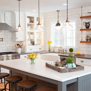
When this suburban family decided to renovate their kitchen, they knew that they wanted a little more space. Advance Design worked together with the homeowner to design a kitchen that would work for a large family who loved to gather regularly and always ended up in the kitchen! So the project began with extending out an exterior wall to accommodate a larger island and more moving-around space between the island and the perimeter cabinetry.
Style was important to the cook, who began collecting accessories and photos of the look she loved for months prior to the project design. She was drawn to the brightness of whites and grays, and the design accentuated this color palette brilliantly with the incorporation of a warm shade of brown woods that originated from a dining room table that was a family favorite. Classic gray and white cabinetry from Dura Supreme hits the mark creating a perfect balance between bright and subdued. Hints of gray appear in the bead board detail peeking just behind glass doors, and in the application of the handsome floating wood shelves between cabinets. White subway tile is made extra interesting with the application of dark gray grout lines causing it to be a subtle but noticeable detail worthy of attention.
Suede quartz Silestone graces the countertops with a soft matte hint of color that contrasts nicely with the presence of white painted cabinetry finished smartly with the brightness of a milky white farm sink. Old melds nicely with new, as antique bronze accents are sprinkled throughout hardware and fixtures, and work together unassumingly with the sleekness of stainless steel appliances.
The grace and timelessness of this sparkling new kitchen maintains the charm and character of a space that has seen generations past. And now this family will enjoy this new space for many more generations to come in the future with the help of the team at Advance Design Studio.
Photographer: Joe Nowak
Dura Supreme Cabinetry
 ZeroEnergy Design
This LEED Platinum certified house reflects the homeowner's desire for an exceptionally healthy and comfortable living environment, within a traditional neighborhood.
INFILL SITE. The family, who moved from another area of Wellesley, sought out this property to be within walking distance of the high school and downtown area. An existing structure on the tight lot was removed to make way for the new home. 84% of the construction waste, from both the previous structure and the new home, was diverted from a landfill. ZED designed to preserve the existing mature trees on the perimeter of the property to minimize site impacts, and to maintain the character of the neighborhood as well as privacy on the site.
EXTERIOR EXPRESSION. The street facade of the home relates to the local New England vernacular. The rear uses contemporary language, a nod to the family’s Californian roots, to incorporate a roof deck, solar panels, outdoor living space, and the backyard swimming pool. ZED’s careful planning avoided to the need to face the garage doors towards the street, a common syndrome of a narrow lot.
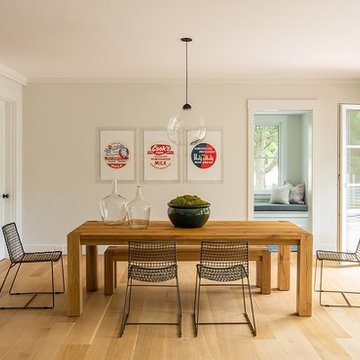
THOUGHTFUL SPACE. Homes with dual entries can often result in duplicate and unused spaces. In this home, the everyday and formal entry areas are one and the same; the front and garage doors share the entry program of coat closets, mudroom storage with bench for removing your shoes, and a laundry room with generous closets for the children's sporting equipment. The entry area leads directly to the living space, encompassing the kitchen, dining and sitting area areas in an L-shaped open plan arrangement. The kitchen is placed at the south-west corner of the space to allow for a strong connection to the dining, sitting and outdoor living spaces. A fire pit on the deck satisfies the family’s desire for an open flame while a sealed gas fireplace is used indoors - ZED’s preference after omitting gas burning appliances completely from an airtight home. A small study, with a window seat, is conveniently located just off of the living space. A first floor guest bedroom includes an accessible bathroom for aging visitors and can be used as a master suite to accommodate aging in place.
HEALTHY LIVING. The client requested a home that was easy to clean and would provide a respite from seasonal allergies and common contaminants that are found in many indoor spaces. ZED selected easy to clean solid surface flooring throughout, provided ample space for cleaning supplies on each floor, and designed a mechanical system with ventilation that provides a constant supply of fresh outdoor air. ZED selected durable materials, finishes, cabinetry, and casework with low or no volatile organic compounds (VOCs) and no added urea formaldehyde.
YEAR-ROUND COMFORT. The home is super insulated and air-tight, paired with high performance triple-paned windows, to ensure it is draft-free throughout the winter (even when in front of the large windows and doors). ZED designed a right-sized heating and cooling system to pair with the thermally improved building enclosure to ensure year-round comfort. The glazing on the home maximizes passive solar gains, and facilitates cross ventilation and daylighting.
ENERGY EFFICIENT. As one of the most energy efficient houses built to date in Wellesley, the home highlights a practical solution for Massachusetts. First, the building enclosure reduces the largest energy requirement for typical houses (heating). Super-insulation, exceptional air sealing, a thermally broken wall assembly, triple pane windows, and passive solar gain combine for a sizable heating load reduction. Second, within the house only efficient systems consume energy. These include an air source heat pump for heating & cooling, a heat pump hot water heater, LED lighting, energy recovery ventilation, and high efficiency appliances. Lastly, photovoltaics provide renewable energy help offset energy consumption. The result is an 89% reduction in energy use compared to a similar brand new home built to code requirements.
RESILIENT. The home will fare well in extreme weather events. During a winter power outage, heat loss will be very slow due to the super-insulated and airtight envelope– taking multiple days to drop to 60 degrees even with no heat source. An engineered drainage system, paired with careful the detailing of the foundation, will help to keep the finished basement dry. A generator will provide full operation of the all-electric house during a power outage.
OVERALL. The home is a reflection of the family goals and an expression of their values, beautifully enabling health, comfort, safety, resilience, and utility, all while respecting the planet.
ZED - Architect & Mechanical Designer
Bevilacqua Builders Inc - Contractor
Creative Land & Water Engineering - Civil Engineering
Barbara Peterson Landscape - Landscape Design
Nest & Company - Interior Furnishings
Eric Roth Photography - Photography
 Glickman Design Build
Photo Credit: © John Cole Photography
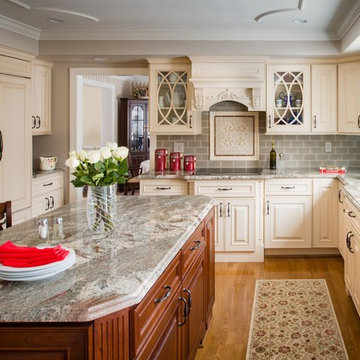
Inspiration for a timeless u-shaped medium tone wood floor kitchen remodel in DC Metro with an island, an undermount sink, raised-panel cabinets, beige cabinets, gray backsplash, subway tile backsplash and paneled appliances
Inspiration for a timeless u-shaped medium tone wood floor kitchen remodel in DC Metro with an island, an undermount sink, raised-panel cabinets, beige cabinets, gray backsplash, subway tile backsplash and paneled appliances
Find the right local pro for your project
 ARCHIA HOMES
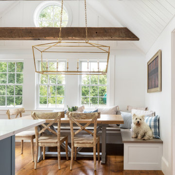
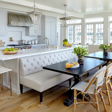
Reclaimed beams and vaulted ceilings with finish carpentry details including v-groove and board and batten add character to this dining area, while the wide plank pine flooring hints at the house's historic origin. Mimi sits at her favorite seat on the custom-made banquette, where she has a better view of whats cooking in the kitchen!
 DEANE Inc | Distinctive Design & Cabinetry
The new floor plan design made more effective use of the space, accommodating multiple renovation needs into the kitchen. The new layout created an open galley kitchen with a 13 1/2′ Island with seating at each end, a cool-grey custom banquette with 2 tables.
 Advance Design Studio, Ltd.
After six years of living in their Huntley IL home, Chris and Meghan were tired of their dark, dingy, outdated kitchen and it was finally time for a long-anticipated change. “The kitchen is the place where we live, it’s where we do everything,” Meghan said. “It was important that it be a space where we wanted to be.” Meghan loves cooking and enjoys including their girls in healthy meal prepping, this led them to want a brighter, more enjoyable kitchen with increased functionality and improved storage.
For Chris especially, the laundry room was an entirely dysfunctional eyesore. “We had a washer and a dryer, but it was all kind-of cobbled together!” Chris said. “There were always laundry piles everywhere, we weren’t really sure what we wanted to do in there, but it was time for us to make a change.” The mess of the space was stressful every time they walked in the door from the garage each day. Kids’ backpacks and shoes piled up haphazardly in the makeshift boot-bench closet left the family feeling disorganized and stressed. They needed space for folding clothes and locker cubbies to help keep the family organized.
Having known Christine and Todd in the Huntley community for years, Chris and Meghan were familiar with their work. “We already trusted them personally and having seen their projects for years we knew they did top notch work. After we reviewed the initial round of designs, we knew that hiring them was definitely the right choice,” Meghan and Chris said. Although Chris had done a lot of work in their home himself, the kitchen and laundry room renovation was such a large undertaking that he didn’t want to steal time away from his family to spend what would surely be many long weekends doing the job himself. “That would not have been a wise choice for us,” Chris laughed.
“Our designer, Michelle was very, very, easy to work with; anything we wanted to see or weren’t sure about, she went above and beyond to make this easy for us. She was easy to get hold of and always quick to respond,” the couple said. Michelle pulled ideas that mirrored the couple’s taste and style and was adept at directing the couple to limited choices that didn’t overwhelm them and kept the process moving. “I have a hard time making decisions. Michelle made the decision-making process so easy. I loved how she listened to what I liked and then presented three great options for me to choose from,” Meghan said.
The main objectives for the kitchen were better storage solutions, they wanted the space to reflect their lifestyle and taste, and they wanted it to last for years with low maintenance. One of the first steps in creating a more functional kitchen was relocating the refrigerator, creating an improved workflow for the busy family.
“We didn’t know that we could even move the refrigerator to a new location where it is now, that was something that we never would have thought of,” Chris said. “The new refrigerator location makes the kitchen feel so much bigger. We didn’t add any space, but our whole kitchen with the new design just seems like it’s so much larger than before!” Meghan said.
The perimeter mist colored cabinets helped warm and brighten the entire room, while the graphite colored cabinets on the island added contrast. Using this fresh, clean color palette satisfied the couple’s desire for a bright space that was the exact opposite of what they had before. Organization accessories were also added to the cabinets such as a spice drawer tray and roll outs to create hidden convenience.
“I absolutely love the hidden spices – it makes cooking so much more enjoyable!” Chris said. “And all the pull outs, and the double trash bin, who would think you could get so excited about organization!” the couple said in unison.
One thing they hated in their original kitchen was how dark the space felt. Added lighting on the ceiling with the new light fixtures combined with the lighter cabinetry colors throughout solved this problem. “Our new kitchen has this warm, almost cozy feeling that our old kitchen never had, it’s just a space that I love spending my time in now,” Meghan said. The light airy feeling was accentuated with the use of floating white shelves on either side of the decorative range hood. “We have so much cabinetry space, the new design is amazing we actually have more storage space than we will ever need,” Meghan said.
The island was extended to create more work surface and added space for stool seating. “The new island changes how we live. Now the kids can be in the kitchen with us, doing homework, eating breakfast, and the three of us have special dinners there when Chris is working late,” Meghan said.
The Carrara Marmi Quartz countertops were chosen because they are, not only beautiful, but are made from hard-working material that doesn’t require maintenance. The white subway tile backsplash that wraps to the ceiling behind the focal point cooktop range/hood compliments the crisp white countertops perfectly, while brushed brass hardware and light fixtures keep the design fresh and new.
The couple had a few fears at the beginning of the project, as most homeowners do. Their biggest fear was being out of their kitchen and laundry room for an extended time. The crew made it very easy for the family to work in a limited space keeping the washer and dryer hooked up the majority of the time, and also getting appliances working with minimal downtime.
“They above and beyond accommodated us to get us through the process,” Meghan said. “They did a great job making sure we were as comfortable as possible throughout the process,” Chris added.
“Our project manager DJ did a great job. He was very good at updating us on schedule changes, getting guys in as quickly as possible. Everyone that stepped in the house was nice and did great work,” said Chris. They thought Advance’s carpenter was phenomenal and were impressed when he took a conceptual idea from a photograph and worked with designer Michelle to create a one of a kind range/hood that has become the topic of conversation with friends and family who visit the new kitchen. “He was in our house literally every day for several weeks. He was easy to work with and good at what he did,” Meghan and Chris said.
The focal point of the kitchen; a hand-crafted, custom-built ventilation hood was clad with handpicked reclaimed barnwood. Advance Design’s carpenter built the framework and the cladding to create a one-of-a-kind design element that the couple loves.
“I think it was especially fun for him to create something unique from scratch, showcasing his talent in this area,” Meghan said. “I love that my kitchen is not like everyone else’s. I got to pick out the wood on my hood and watch it being built and was able to choose what pieces of wood went where on it. It’s totally unique.”
Red Oak flooring was toothed-in throughout the kitchen and the rest of the first floor anywhere changes were made. Then the whole floor was refinished to tone down the orange undertones in the existing floor stain, ultimately changing the color complexion of the entire first floor. The result is a completely new feeling to the entire home.
Renovating the laundry room was extremely important to Meghan and Chris, but they had trouble visualizing what the possibilities were for the seemingly small space. Michelle produced beautiful 3D illustrations that helped them envision the space in a whole new way.
“I must have told Michelle 100 times that I am a visual person, seeing the designs in 3D made it so easy to make decisions and see what we could really do with our space,” Meghan said.
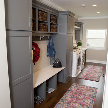
A dividing wall and doorway were removed between the existing laundry room and hallway formerly containing a coat closet, providing space to design specialized graphite colored cabinetry matching the kitchen island to house custom storage cubbies for each family member. Adding the tall utility cabinetry in the new laundry area helped solve the storage issue, tucking away cleaning supplies, household items, and even the cat got its own cubby.
“I love how everything is now hidden in its own space. I can’t tell you how much I hated coming home and seeing everything sitting around on counters,” Chris said.
Electrical outlets were planned for the inside of utility cabinets, so devices could charge in hidden locations. Stacking the washer and dryer allowed for wider countertop space to provide a folding area and a special space for clothes to hang. “The way I do laundry has been completely transformed! I can actually fold clothes and hang them now right out of the washer and dryer,” Meghan said.
“The end result in the kitchen and the laundry/mud room was an updated light and bright space, with a smarter work flow that better meets the needs of this family,” Michelle said.
“I would totally recommend Advance Design,” Meghan said. “Sometimes I sit and just look at my kitchen and laundry room and think ‘Wow, I can’t believe I get to live here!’ It’s an understatement to say we love our new space.”
 Haven Design and Construction
Matthew Niemann Photography
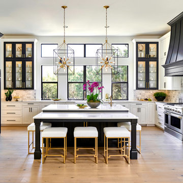
Example of a transitional u-shaped light wood floor and beige floor kitchen design in Austin with a farmhouse sink, raised-panel cabinets, gray backsplash, paneled appliances, an island, white countertops, quartz countertops, white cabinets and stone tile backsplash
Example of a transitional u-shaped light wood floor and beige floor kitchen design in Austin with a farmhouse sink, raised-panel cabinets, gray backsplash, paneled appliances, an island, white countertops, quartz countertops, white cabinets and stone tile backsplash

Sponsored
Sunbury, OH

J.Holderby - Renovations
Franklin County's Leading General Contractors - 2X Best of Houzz!
 Rudloff Custom Builders
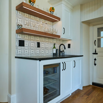
This beverage area has a wet bar within its absolute black polished granite counter, tops white shaker cabinets. The backsplash is tin. The open shelves are made from reclaimed wood and feature subtle and modern lighting. The black iron hardware matches the hardware on the adjacent Dutch door.
After tearing down this home's existing addition, we set out to create a new addition with a modern farmhouse feel that still blended seamlessly with the original house. The addition includes a kitchen great room, laundry room and sitting room. Outside, we perfectly aligned the cupola on top of the roof, with the upper story windows and those with the lower windows, giving the addition a clean and crisp look. Using granite from Chester County, mica schist stone and hardy plank siding on the exterior walls helped the addition to blend in seamlessly with the original house. Inside, we customized each new space by paying close attention to the little details. Reclaimed wood for the mantle and shelving, sleek and subtle lighting under the reclaimed shelves, unique wall and floor tile, recessed outlets in the island, walnut trim on the hood, paneled appliances, and repeating materials in a symmetrical way work together to give the interior a sophisticated yet comfortable feel.
Rudloff Custom Builders has won Best of Houzz for Customer Service in 2014, 2015 2016, 2017 and 2019. We also were voted Best of Design in 2016, 2017, 2018, 2019 which only 2% of professionals receive. Rudloff Custom Builders has been featured on Houzz in their Kitchen of the Week, What to Know About Using Reclaimed Wood in the Kitchen as well as included in their Bathroom WorkBook article. We are a full service, certified remodeling company that covers all of the Philadelphia suburban area. This business, like most others, developed from a friendship of young entrepreneurs who wanted to make a difference in their clients’ lives, one household at a time. This relationship between partners is much more than a friendship. Edward and Stephen Rudloff are brothers who have renovated and built custom homes together paying close attention to detail. They are carpenters by trade and understand concept and execution. Rudloff Custom Builders will provide services for you with the highest level of professionalism, quality, detail, punctuality and craftsmanship, every step of the way along our journey together.
Specializing in residential construction allows us to connect with our clients early in the design phase to ensure that every detail is captured as you imagined. One stop shopping is essentially what you will receive with Rudloff Custom Builders from design of your project to the construction of your dreams, executed by on-site project managers and skilled craftsmen. Our concept: envision our client’s ideas and make them a reality. Our mission: CREATING LIFETIME RELATIONSHIPS BUILT ON TRUST AND INTEGRITY.
Photo Credit: Linda McManus Images
 Metropolis Drafting and Construction Inc
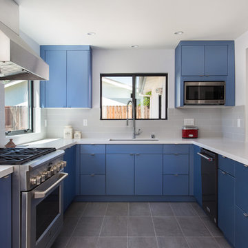
A small enclosed kitchen is very common in many homes such as the home that we remodeled here.
Opening a wall to allow natural light to penetrate the space is a must. When budget is important the solution can be as you see in this project - the wall was opened and removed but a structural post remained and it was incorporated in the design.
The blue modern flat paneled cabinets was a perfect choice to contras the very familiar gray scale color scheme but it’s still compliments it since blue is in the correct cold color spectrum.
Notice the great black windows and the fantastic awning window facing the pool. The awning window is great to be able to serve the exterior sitting area near the pool.
Opening the wall also allowed us to compliment the kitchen with a nice bar/island sitting area without having an actual island in the space.
The best part of this kitchen is the large built-in pantry wall with a tall wine fridge and a lovely coffee area that we built in the sitting area made the kitchen expend into the breakfast nook and doubled the area that is now considered to be the kitchen.
 TKS Design Group
Free ebook, Creating the Ideal Kitchen. DOWNLOAD NOW
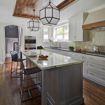
This young family of four came in right after closing on their house and with a new baby on the way. Our goal was to complete the project prior to baby’s arrival so this project went on the expedite track. The beautiful 1920’s era brick home sits on a hill in a very picturesque neighborhood, so we were eager to give it the kitchen it deserves. The clients’ dream kitchen included pro-style appliances, a large island with seating for five and a kitchen that feels appropriate to the home’s era but that also is fresh and modern. They explicitly stated they did not want a “cookie cutter” design, so we took that to heart.
The key challenge was to fit in all of the items on their wish given the room’s constraints. We eliminated an existing breakfast area and bay window and incorporated that area into the kitchen. The bay window was bricked in, and to compensate for the loss of seating, we widened the opening between the kitchen and formal dining room for more of an open concept plan.
The ceiling in the original kitchen is about a foot lower than the rest of the house, and once it was determined that it was to hide pipes and other mechanicals, we reframed a large tray over the island and left the rest of the ceiling as is. Clad in walnut planks, the tray provides an interesting feature and ties in with the custom walnut and plaster hood.
The space feels modern yet appropriate to its Tudor roots. The room boasts large family friendly appliances, including a beverage center and cooktop/double oven combination. Soft white inset cabinets paired with a slate gray island provide a gentle backdrop to the multi-toned island top, a color echoed in the backsplash tile. The handmade subway tile has a textured pattern at the cooktop, and large pendant lights add more than a bit of drama to the room.
Designed by: Susan Klimala, CKD, CBD
Photography by: Mike Kaskel
For more information on kitchen and bath design ideas go to: www.kitchenstudio-ge.com
 TKS Design Group
Free ebook, Creating the Ideal Kitchen. DOWNLOAD NOW
The Klimala’s and their three kids are no strangers to moving, this being their fifth house in the same town over the 20-year period they have lived there. “It must be the 7-year itch, because every seven years, we seem to find ourselves antsy for a new project or a new environment. I think part of it is being a designer, I see my own taste evolve and I want my environment to reflect that. Having easy access to wonderful tradesmen and a knowledge of the process makes it that much easier”.
This time, Klimala’s fell in love with a somewhat unlikely candidate. The 1950’s ranch turned cape cod was a bit of a mutt, but it’s location 5 minutes from their design studio and backing up to the high school where their kids can roll out of bed and walk to school, coupled with the charm of its location on a private road and lush landscaping made it an appealing choice for them.
“The bones of the house were really charming. It was typical 1,500 square foot ranch that at some point someone added a second floor to. Its sloped roofline and dormered bedrooms gave it some charm.” With the help of architect Maureen McHugh, Klimala’s gutted and reworked the layout to make the house work for them. An open concept kitchen and dining room allows for more frequent casual family dinners and dinner parties that linger. A dingy 3-season room off the back of the original house was insulated, given a vaulted ceiling with skylights and now opens up to the kitchen. This room now houses an 8’ raw edge white oak dining table and functions as an informal dining room. “One of the challenges with these mid-century homes is the 8’ ceilings. I had to have at least one room that had a higher ceiling so that’s how we did it” states Klimala.
The kitchen features a 10’ island which houses a 5’0” Galley Sink. The Galley features two faucets, and double tiered rail system to which accessories such as cutting boards and stainless steel bowls can be added for ease of cooking. Across from the large sink is an induction cooktop. “My two teen daughters and I enjoy cooking, and the Galley and induction cooktop make it so easy.” A wall of tall cabinets features a full size refrigerator, freezer, double oven and built in coffeemaker. The area on the opposite end of the kitchen features a pantry with mirrored glass doors and a beverage center below.
The rest of the first floor features an entry way, a living room with views to the front yard’s lush landscaping, a family room where the family hangs out to watch TV, a back entry from the garage with a laundry room and mudroom area, one of the home’s four bedrooms and a full bath. There is a double sided fireplace between the family room and living room. The home features pops of color from the living room’s peach grass cloth to purple painted wall in the family room. “I’m definitely a traditionalist at heart but because of the home’s Midcentury roots, I wanted to incorporate some of those elements into the furniture, lighting and accessories which also ended up being really fun. We are not formal people so I wanted a house that my kids would enjoy, have their friends over and feel comfortable.”
The second floor houses the master bedroom suite, two of the kids’ bedrooms and a back room nicknamed “the library” because it has turned into a quiet get away area where the girls can study or take a break from the rest of the family. The area was originally unfinished attic, and because the home was short on closet space, this Jack and Jill area off the girls’ bedrooms houses two large walk-in closets and a small sitting area with a makeup vanity. “The girls really wanted to keep the exposed brick of the fireplace that runs up the through the space, so that’s what we did, and I think they feel like they are in their own little loft space in the city when they are up there” says Klimala.
Designed by: Susan Klimala, CKD, CBD
Photography by: Carlos Vergara
For more information on kitchen and bath design ideas go to: www.kitchenstudio-ge.com
 Zieba Builders, Inc.
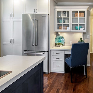
Our clients loved the location of their duplex home with its peak-a-boo ocean view, but their existing kitchen was not suited for their growing family. They wanted a kitchen with a coastal vibe, plenty of storage space, and an eat-in area.
We started by bringing the far wall into the kitchen space to accommodate a large panty and communication center for the family. Doing this allowed us to move the refrigerator out of the main traffic area and doubled the amount of storage space. Several new windows were added to bring in natural light. A half wall was moved to allow more countertop area and open up sight lines. The previously awkwardly shaped island was slimmed down to create better flow.
There were a few venting challenges to overcome; gas lines and plumbing had to be re-routed without disturbing the unit below. To open up sight lines, soffits were eliminated which allowed the extension of cabinets to the ceiling. To stay within the homeowner’s budget, we match existing scraped flooring by lacing in and repairing patches.
The old dining area was too small for table, so we designed and built a custom banquette to maximize the space and take advantage of the outdoor views. The overall space works for family meals as well as entertaining.
A light summer palette was used to reflect the shades of the sand, sea and sky. Even though the new kitchen is actually smaller than the original space, its now far more functional and open.
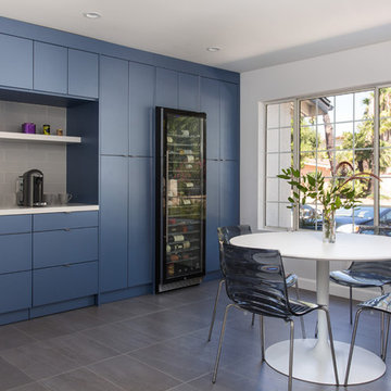 Metropolis Drafting and Construction Inc
A small enclosed kitchen is very common in many homes such as the home that we remodeled here.
Opening a wall to allow natural light to penetrate the space is a must. When budget is important the solution can be as you see in this project - the wall was opened and removed but a structural post remained and it was incorporated in the design.
The blue modern flat paneled cabinets was a perfect choice to contras the very familiar gray scale color scheme but it’s still compliments it since blue is in the correct cold color spectrum.
Notice the great black windows and the fantastic awning window facing the pool. The awning window is great to be able to serve the exterior sitting area near the pool.
Opening the wall also allowed us to compliment the kitchen with a nice bar/island sitting area without having an actual island in the space.
The best part of this kitchen is the large built-in pantry wall with a tall wine fridge and a lovely coffee area that we built in the sitting area made the kitchen expend into the breakfast nook and doubled the area that is now considered to be the kitchen.

 Ulrich Inc
Ulrich Designer: Julia Kleyman
Photography by Peter Rymwid
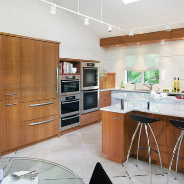
The design challenge in this kitchen was to combine sleek materials to make the space look modern – in fitting with the overall character of the home – and also to achieve a warm and inviting living space. Some special touches for the homeowners include the peninsula counter top that was dropped down to a more comfortable height for mixing and dough rolling. Above the peninsula a bean-shaped frosted glass snack counter sits on metal posts, creating an eating/snacking area. White porcelain tile with two chrome liners running around the perimeter create a clean backdrop for the focal point of the kitchen, a clear glass hood by Miele. A blue acrylic cabinetry finish gives the space a dash of color, while the cherry finish on the appliances side of the kitchen and on the sitting side of the peninsula makes the kitchen warm and inviting.
 ZeroEnergy Design
ZeroEnergy Design (ZED) created this modern home for a progressive family in the desirable community of Lexington.
Thoughtful Land Connection. The residence is carefully sited on the infill lot so as to create privacy from the road and neighbors, while cultivating a side yard that captures the southern sun. The terraced grade rises to meet the house, allowing for it to maintain a structured connection with the ground while also sitting above the high water table. The elevated outdoor living space maintains a strong connection with the indoor living space, while the stepped edge ties it back to the true ground plane. Siting and outdoor connections were completed by ZED in collaboration with landscape designer Soren Deniord Design Studio.
Exterior Finishes and Solar. The exterior finish materials include a palette of shiplapped wood siding, through-colored fiber cement panels and stucco. A rooftop parapet hides the solar panels above, while a gutter and site drainage system directs rainwater into an irrigation cistern and dry wells that recharge the groundwater.
Cooking, Dining, Living. Inside, the kitchen, fabricated by Henrybuilt, is located between the indoor and outdoor dining areas. The expansive south-facing sliding door opens to seamlessly connect the spaces, using a retractable awning to provide shade during the summer while still admitting the warming winter sun. The indoor living space continues from the dining areas across to the sunken living area, with a view that returns again to the outside through the corner wall of glass.
Accessible Guest Suite. The design of the first level guest suite provides for both aging in place and guests who regularly visit for extended stays. The patio off the north side of the house affords guests their own private outdoor space, and privacy from the neighbor. Similarly, the second level master suite opens to an outdoor private roof deck.
Light and Access. The wide open interior stair with a glass panel rail leads from the top level down to the well insulated basement. The design of the basement, used as an away/play space, addresses the need for both natural light and easy access. In addition to the open stairwell, light is admitted to the north side of the area with a high performance, Passive House (PHI) certified skylight, covering a six by sixteen foot area. On the south side, a unique roof hatch set flush with the deck opens to reveal a glass door at the base of the stairwell which provides additional light and access from the deck above down to the play space.
Energy. Energy consumption is reduced by the high performance building envelope, high efficiency mechanical systems, and then offset with renewable energy. All windows and doors are made of high performance triple paned glass with thermally broken aluminum frames. The exterior wall assembly employs dense pack cellulose in the stud cavity, a continuous air barrier, and four inches exterior rigid foam insulation. The 10kW rooftop solar electric system provides clean energy production. The final air leakage testing yielded 0.6 ACH 50 - an extremely air tight house, a testament to the well-designed details, progress testing and quality construction. When compared to a new house built to code requirements, this home consumes only 19% of the energy.
Architecture & Energy Consulting: ZeroEnergy Design
Landscape Design: Soren Deniord Design
Paintings: Bernd Haussmann Studio
Photos: Eric Roth Photography
 River Valley Landscapes
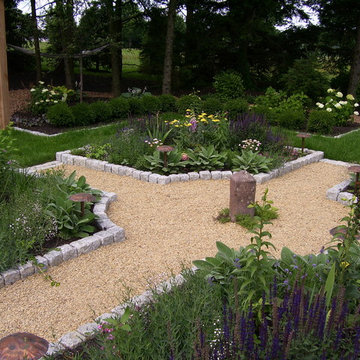
The property is one of the original farm houses located on the main street of a small town. It has been in the family for many years and our client just inherited the property. They were trying to have balance of preserving the old while realizing modern day living has its benefits too. The house had a large addition added using mostly old style materials, but designed with function and modern day luxuries. Our goal was to carry that theme to the outside.
Our first problem we had to address was how to transition between the first floor elevation changes. The lower room was the husband’s office. He stated in the future he may have clients over and it would be nice to have an area to sit outside. The wife’s main concern was to renew the four corner garden. She also felt it was very important to be able to see it from the kitchen area. Finally there was an old wishing well stuck right outside the kitchen. They both felt it would be neat to be able to incorporate this in some how. They wanted a patio area with a built in grill to accommodate there family and friends. They also wanted to keep a large play area for the kids.
We were able to pull this off successfully. We addressed the first issue by having a small lower level flagstone area. This area is large enough for 1 to 2 people to sit comfortably. It also provides a transition from his office to the larger patio area. We installed a simple small gravel sitting area opposite of the main patio. This provides our client a secluded place to relax or do business. Mrs.... told me she is amazed how much her and her husband enjoys this area. It is so peaceful looking at the small creek over a glass of wine.
We built a natural limestone retaining wall to create the patio terrace. The stone was chosen to extend the houses architectural elements into the landscape. Irregular broken flagstone was used to give it a more casual feel. We installed three Serviceberries into the patio terrace to replace some trees that were taken down during the remodeling. She was very concern that they would block the view of the four corner garden. We new they were crucial to nestle in the terrace, so we placed them for a couple days for her to decide. Fortunately she agreed they not only kept the view open, but helped frame the garden.
The four corner garden was designed to be viewed from afar and experienced up close. We wanted the space to have some formal structure while keeping with the casual farm house feel. Another natural limestone retaining wall was created. This leveled the garden terrace and helped associate it with the rest of the property. The four corner garden is nestled into the existing woods edge. This provides three distinct experiences to entering the garden; a more formal from the driveway, an open feel from the lower lawn, and a more natural / casual experience from the wooded area. The Plymouth brown gravel was used for the center of the garden. This helped highlight the stone post that was found during construction. The gravel also brings the sense of sound into the garden space. Lamb’s ear was chosen as a fun way to get kids interest in horticulture.
The balance of using the new to create the old feel is what makes this project a success. The property has already hosted a local historical society event and won an award for its preservation efforts. When Mrs.... can’t find her husband, she knows he is either reading the newspaper by the grill or resting in the hammock along the wood’s path.
 Corinthian Fine Homes
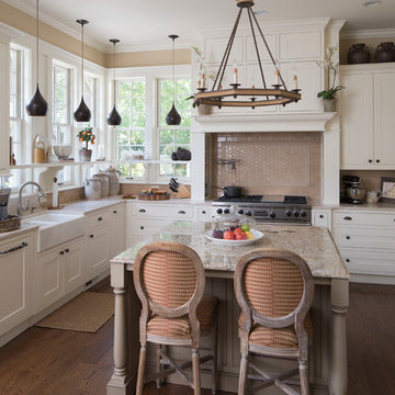
These homeowners relocated to Indianapolis and wanted a traditional home in the Meridian Hills area that offered family living space off the kitchen. “It’s what we were used to, but we had trouble finding exactly what we were looking for.” They spent a lot of time thinking about the possibilities of a remodel. They had space both within and outside the house that were under-utilized and decided to embark on a significant renovation project.
We endeavored to completely rework the current floor plan in hopes of addressing all their needs and wants. Plans included relocating the kitchen, moving the exterior walls by a couple of feet, raising the ceiling, and moving the office. The results of these changes were dramatic. Additionally the family now enjoys a larger and updated entrance with storage and closets that is perfect for their two active daughters and two often muddy labs, a beautiful kitchen with improved functionality that is filled with tons of natural light, as well as a cozy hearth room, ideal for relaxing together as a family. The once neglected screened porch is now a unique and inviting office with workspace for everyone.
Once these improvements were made the view to the back of the house was now apparent, the couple decided to enhance their outdoor living space as well. We added a new patio, a custom pergola, water feature and a fire pit. “Now it’s a private spot to relax and connect with the outdoors. It really highlights the style of the house and we love it,” says the homeowner.

Sponsored
Columbus, OH

Hope Restoration & General Contracting
Columbus Design-Build, Kitchen & Bath Remodeling, Historic Renovations
 Haus Interior Design
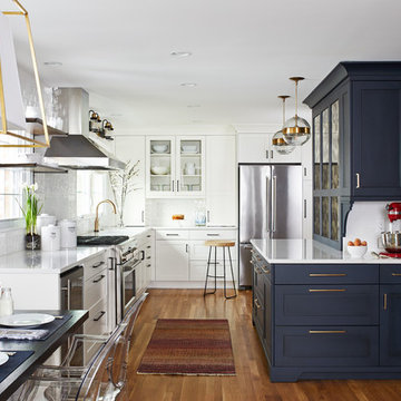
Before renovating, this bright and airy family kitchen was small, cramped and dark. The dining room was being used for spillover storage, and there was hardly room for two cooks in the kitchen. By knocking out the wall separating the two rooms, we created a large kitchen space with plenty of storage, space for cooking and baking, and a gathering table for kids and family friends. The dark navy blue cabinets set apart the area for baking, with a deep, bright counter for cooling racks, a tiled niche for the mixer, and pantries dedicated to baking supplies. The space next to the beverage center was used to create a beautiful eat-in dining area with an over-sized pendant and provided a stunning focal point visible from the front entry. Touches of brass and iron are sprinkled throughout and tie the entire room together.
Photography by Stacy Zarin
 TKS Design Group
Free ebook, Creating the Ideal Kitchen. DOWNLOAD NOW
Our clients had been in their home since the early 1980’s and decided it was time for some updates. We took on the kitchen, two bathrooms and a powder room.
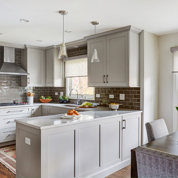
The layout in the kitchen was functional for them, so we kept that pretty much as is. Our client wanted a contemporary-leaning transitional look — nice clean lines with a gray and white palette. Light gray cabinets with a slightly darker gray subway tile keep the northern exposure light and airy. They also purchased some new furniture for their breakfast room and adjoining family room, so the whole space looks completely styled and new. The light fixtures are staggered and give a nice rhythm to the otherwise serene feel.
The homeowners were not 100% sold on the flooring choice for little powder room off the kitchen when I first showed it, but now they think it is one of the most interesting features of the design. I always try to “push” my clients a little bit because that’s when things can get really fun and this is what you are paying for after all, ideas that you may not come up with on your own.
We also worked on the two upstairs bathrooms. We started first on the hall bath which was basically just in need of a face lift. The floor is porcelain tile made to look like carrera marble. The vanity is white Shaker doors fitted with a white quartz top. We re-glazed the cast iron tub.
The master bath was a tub to shower conversion. We used a wood look porcelain plank on the main floor along with a Kohler Tailored vanity. The custom shower has a barn door shower door, and vinyl wallpaper in the sink area gives a rich textured look to the space. Overall, it’s a pretty sophisticated look for its smaller fooprint.
Designed by: Susan Klimala, CKD, CBD
Photography by: Michael Alan Kaskel
For more information on kitchen and bath design ideas go to: www.kitchenstudio-ge.com
 Dalia Kitchen Design
Boston Home Magazine
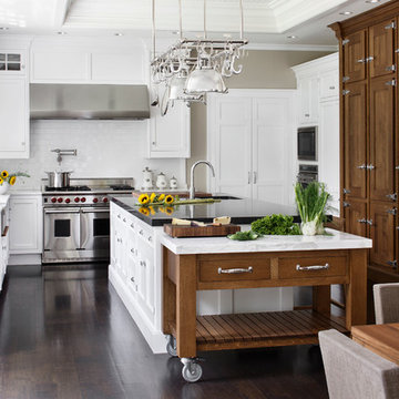
Inspiration for a large timeless u-shaped dark wood floor eat-in kitchen remodel in Boston with a farmhouse sink, shaker cabinets, white cabinets, marble countertops, white backsplash, subway tile backsplash and stainless steel appliances
Inspiration for a large timeless u-shaped dark wood floor eat-in kitchen remodel in Boston with a farmhouse sink, shaker cabinets, white cabinets, marble countertops, white backsplash, subway tile backsplash and stainless steel appliances
8