
Search results for "Kitchen sitting area ideas" in Home Design Ideas
 Advance Design Studio, Ltd.
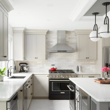
After six years of living in their Huntley IL home, Chris and Meghan were tired of their dark, dingy, outdated kitchen and it was finally time for a long-anticipated change. “The kitchen is the place where we live, it’s where we do everything,” Meghan said. “It was important that it be a space where we wanted to be.” Meghan loves cooking and enjoys including their girls in healthy meal prepping, this led them to want a brighter, more enjoyable kitchen with increased functionality and improved storage.
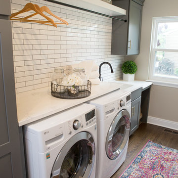
For Chris especially, the laundry room was an entirely dysfunctional eyesore. “We had a washer and a dryer, but it was all kind-of cobbled together!” Chris said. “There were always laundry piles everywhere, we weren’t really sure what we wanted to do in there, but it was time for us to make a change.” The mess of the space was stressful every time they walked in the door from the garage each day. Kids’ backpacks and shoes piled up haphazardly in the makeshift boot-bench closet left the family feeling disorganized and stressed. They needed space for folding clothes and locker cubbies to help keep the family organized.
Having known Christine and Todd in the Huntley community for years, Chris and Meghan were familiar with their work. “We already trusted them personally and having seen their projects for years we knew they did top notch work. After we reviewed the initial round of designs, we knew that hiring them was definitely the right choice,” Meghan and Chris said. Although Chris had done a lot of work in their home himself, the kitchen and laundry room renovation was such a large undertaking that he didn’t want to steal time away from his family to spend what would surely be many long weekends doing the job himself. “That would not have been a wise choice for us,” Chris laughed.
“Our designer, Michelle was very, very, easy to work with; anything we wanted to see or weren’t sure about, she went above and beyond to make this easy for us. She was easy to get hold of and always quick to respond,” the couple said. Michelle pulled ideas that mirrored the couple’s taste and style and was adept at directing the couple to limited choices that didn’t overwhelm them and kept the process moving. “I have a hard time making decisions. Michelle made the decision-making process so easy. I loved how she listened to what I liked and then presented three great options for me to choose from,” Meghan said.
The main objectives for the kitchen were better storage solutions, they wanted the space to reflect their lifestyle and taste, and they wanted it to last for years with low maintenance. One of the first steps in creating a more functional kitchen was relocating the refrigerator, creating an improved workflow for the busy family.
“We didn’t know that we could even move the refrigerator to a new location where it is now, that was something that we never would have thought of,” Chris said. “The new refrigerator location makes the kitchen feel so much bigger. We didn’t add any space, but our whole kitchen with the new design just seems like it’s so much larger than before!” Meghan said.
The perimeter mist colored cabinets helped warm and brighten the entire room, while the graphite colored cabinets on the island added contrast. Using this fresh, clean color palette satisfied the couple’s desire for a bright space that was the exact opposite of what they had before. Organization accessories were also added to the cabinets such as a spice drawer tray and roll outs to create hidden convenience.
“I absolutely love the hidden spices – it makes cooking so much more enjoyable!” Chris said. “And all the pull outs, and the double trash bin, who would think you could get so excited about organization!” the couple said in unison.
One thing they hated in their original kitchen was how dark the space felt. Added lighting on the ceiling with the new light fixtures combined with the lighter cabinetry colors throughout solved this problem. “Our new kitchen has this warm, almost cozy feeling that our old kitchen never had, it’s just a space that I love spending my time in now,” Meghan said. The light airy feeling was accentuated with the use of floating white shelves on either side of the decorative range hood. “We have so much cabinetry space, the new design is amazing we actually have more storage space than we will ever need,” Meghan said.
The island was extended to create more work surface and added space for stool seating. “The new island changes how we live. Now the kids can be in the kitchen with us, doing homework, eating breakfast, and the three of us have special dinners there when Chris is working late,” Meghan said.
The Carrara Marmi Quartz countertops were chosen because they are, not only beautiful, but are made from hard-working material that doesn’t require maintenance. The white subway tile backsplash that wraps to the ceiling behind the focal point cooktop range/hood compliments the crisp white countertops perfectly, while brushed brass hardware and light fixtures keep the design fresh and new.
The couple had a few fears at the beginning of the project, as most homeowners do. Their biggest fear was being out of their kitchen and laundry room for an extended time. The crew made it very easy for the family to work in a limited space keeping the washer and dryer hooked up the majority of the time, and also getting appliances working with minimal downtime.
“They above and beyond accommodated us to get us through the process,” Meghan said. “They did a great job making sure we were as comfortable as possible throughout the process,” Chris added.
“Our project manager DJ did a great job. He was very good at updating us on schedule changes, getting guys in as quickly as possible. Everyone that stepped in the house was nice and did great work,” said Chris. They thought Advance’s carpenter was phenomenal and were impressed when he took a conceptual idea from a photograph and worked with designer Michelle to create a one of a kind range/hood that has become the topic of conversation with friends and family who visit the new kitchen. “He was in our house literally every day for several weeks. He was easy to work with and good at what he did,” Meghan and Chris said.
The focal point of the kitchen; a hand-crafted, custom-built ventilation hood was clad with handpicked reclaimed barnwood. Advance Design’s carpenter built the framework and the cladding to create a one-of-a-kind design element that the couple loves.
“I think it was especially fun for him to create something unique from scratch, showcasing his talent in this area,” Meghan said. “I love that my kitchen is not like everyone else’s. I got to pick out the wood on my hood and watch it being built and was able to choose what pieces of wood went where on it. It’s totally unique.”
Red Oak flooring was toothed-in throughout the kitchen and the rest of the first floor anywhere changes were made. Then the whole floor was refinished to tone down the orange undertones in the existing floor stain, ultimately changing the color complexion of the entire first floor. The result is a completely new feeling to the entire home.
Renovating the laundry room was extremely important to Meghan and Chris, but they had trouble visualizing what the possibilities were for the seemingly small space. Michelle produced beautiful 3D illustrations that helped them envision the space in a whole new way.
“I must have told Michelle 100 times that I am a visual person, seeing the designs in 3D made it so easy to make decisions and see what we could really do with our space,” Meghan said.
A dividing wall and doorway were removed between the existing laundry room and hallway formerly containing a coat closet, providing space to design specialized graphite colored cabinetry matching the kitchen island to house custom storage cubbies for each family member. Adding the tall utility cabinetry in the new laundry area helped solve the storage issue, tucking away cleaning supplies, household items, and even the cat got its own cubby.
“I love how everything is now hidden in its own space. I can’t tell you how much I hated coming home and seeing everything sitting around on counters,” Chris said.
Electrical outlets were planned for the inside of utility cabinets, so devices could charge in hidden locations. Stacking the washer and dryer allowed for wider countertop space to provide a folding area and a special space for clothes to hang. “The way I do laundry has been completely transformed! I can actually fold clothes and hang them now right out of the washer and dryer,” Meghan said.
“The end result in the kitchen and the laundry/mud room was an updated light and bright space, with a smarter work flow that better meets the needs of this family,” Michelle said.
“I would totally recommend Advance Design,” Meghan said. “Sometimes I sit and just look at my kitchen and laundry room and think ‘Wow, I can’t believe I get to live here!’ It’s an understatement to say we love our new space.”

 ZeroEnergy Design
This LEED Platinum certified house reflects the homeowner's desire for an exceptionally healthy and comfortable living environment, within a traditional neighborhood.
INFILL SITE. The family, who moved from another area of Wellesley, sought out this property to be within walking distance of the high school and downtown area. An existing structure on the tight lot was removed to make way for the new home. 84% of the construction waste, from both the previous structure and the new home, was diverted from a landfill. ZED designed to preserve the existing mature trees on the perimeter of the property to minimize site impacts, and to maintain the character of the neighborhood as well as privacy on the site.
EXTERIOR EXPRESSION. The street facade of the home relates to the local New England vernacular. The rear uses contemporary language, a nod to the family’s Californian roots, to incorporate a roof deck, solar panels, outdoor living space, and the backyard swimming pool. ZED’s careful planning avoided to the need to face the garage doors towards the street, a common syndrome of a narrow lot.
THOUGHTFUL SPACE. Homes with dual entries can often result in duplicate and unused spaces. In this home, the everyday and formal entry areas are one and the same; the front and garage doors share the entry program of coat closets, mudroom storage with bench for removing your shoes, and a laundry room with generous closets for the children's sporting equipment. The entry area leads directly to the living space, encompassing the kitchen, dining and sitting area areas in an L-shaped open plan arrangement. The kitchen is placed at the south-west corner of the space to allow for a strong connection to the dining, sitting and outdoor living spaces. A fire pit on the deck satisfies the family’s desire for an open flame while a sealed gas fireplace is used indoors - ZED’s preference after omitting gas burning appliances completely from an airtight home. A small study, with a window seat, is conveniently located just off of the living space. A first floor guest bedroom includes an accessible bathroom for aging visitors and can be used as a master suite to accommodate aging in place.
HEALTHY LIVING. The client requested a home that was easy to clean and would provide a respite from seasonal allergies and common contaminants that are found in many indoor spaces. ZED selected easy to clean solid surface flooring throughout, provided ample space for cleaning supplies on each floor, and designed a mechanical system with ventilation that provides a constant supply of fresh outdoor air. ZED selected durable materials, finishes, cabinetry, and casework with low or no volatile organic compounds (VOCs) and no added urea formaldehyde.
YEAR-ROUND COMFORT. The home is super insulated and air-tight, paired with high performance triple-paned windows, to ensure it is draft-free throughout the winter (even when in front of the large windows and doors). ZED designed a right-sized heating and cooling system to pair with the thermally improved building enclosure to ensure year-round comfort. The glazing on the home maximizes passive solar gains, and facilitates cross ventilation and daylighting.
ENERGY EFFICIENT. As one of the most energy efficient houses built to date in Wellesley, the home highlights a practical solution for Massachusetts. First, the building enclosure reduces the largest energy requirement for typical houses (heating). Super-insulation, exceptional air sealing, a thermally broken wall assembly, triple pane windows, and passive solar gain combine for a sizable heating load reduction. Second, within the house only efficient systems consume energy. These include an air source heat pump for heating & cooling, a heat pump hot water heater, LED lighting, energy recovery ventilation, and high efficiency appliances. Lastly, photovoltaics provide renewable energy help offset energy consumption. The result is an 89% reduction in energy use compared to a similar brand new home built to code requirements.
RESILIENT. The home will fare well in extreme weather events. During a winter power outage, heat loss will be very slow due to the super-insulated and airtight envelope– taking multiple days to drop to 60 degrees even with no heat source. An engineered drainage system, paired with careful the detailing of the foundation, will help to keep the finished basement dry. A generator will provide full operation of the all-electric house during a power outage.
OVERALL. The home is a reflection of the family goals and an expression of their values, beautifully enabling health, comfort, safety, resilience, and utility, all while respecting the planet.
ZED - Architect & Mechanical Designer
Bevilacqua Builders Inc - Contractor
Creative Land & Water Engineering - Civil Engineering
Barbara Peterson Landscape - Landscape Design
Nest & Company - Interior Furnishings
Eric Roth Photography - Photography
 Rudloff Custom Builders
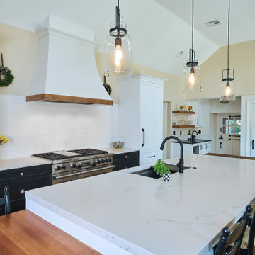
This sun-filled farmhouse kitchen is the focal point of this home’s new addition. The kitchen is white with wood elements, giving it a contemporary feel. From the recessed outlets in the island, to the columns adorning the island, to the hood with walnut trim, to the paneled refrigerator that matches the cabinetry, every detail was customized for the homeowners. The kitchen is anchored by a large island with seating for seven and tons of storage. The island is bookended by additional components topped by walnut butcher block counters. One end serves as a table and the other end is an extra area for food prep and storage. There is also a cutting board integrated into the sink. The white quartz on the island and main kitchen counters and white subway tile backsplash give the kitchen a modern, sleek look. The walnut trim around the hood is a special touch that ties directly into the walnut butcher block counters.
After tearing down this home's existing addition, we set out to create a new addition with a modern farmhouse feel that still blended seamlessly with the original house. The addition includes a kitchen great room, laundry room and sitting room. Outside, we perfectly aligned the cupola on top of the roof, with the upper story windows and those with the lower windows, giving the addition a clean and crisp look. Using granite from Chester County, mica schist stone and hardy plank siding on the exterior walls helped the addition to blend in seamlessly with the original house. Inside, we customized each new space by paying close attention to the little details. Reclaimed wood for the mantle and shelving, sleek and subtle lighting under the reclaimed shelves, unique wall and floor tile, recessed outlets in the island, walnut trim on the hood, paneled appliances, and repeating materials in a symmetrical way work together to give the interior a sophisticated yet comfortable feel.
Rudloff Custom Builders has won Best of Houzz for Customer Service in 2014, 2015 2016, 2017 and 2019. We also were voted Best of Design in 2016, 2017, 2018, 2019 which only 2% of professionals receive. Rudloff Custom Builders has been featured on Houzz in their Kitchen of the Week, What to Know About Using Reclaimed Wood in the Kitchen as well as included in their Bathroom WorkBook article. We are a full service, certified remodeling company that covers all of the Philadelphia suburban area. This business, like most others, developed from a friendship of young entrepreneurs who wanted to make a difference in their clients’ lives, one household at a time. This relationship between partners is much more than a friendship. Edward and Stephen Rudloff are brothers who have renovated and built custom homes together paying close attention to detail. They are carpenters by trade and understand concept and execution. Rudloff Custom Builders will provide services for you with the highest level of professionalism, quality, detail, punctuality and craftsmanship, every step of the way along our journey together.
Specializing in residential construction allows us to connect with our clients early in the design phase to ensure that every detail is captured as you imagined. One stop shopping is essentially what you will receive with Rudloff Custom Builders from design of your project to the construction of your dreams, executed by on-site project managers and skilled craftsmen. Our concept: envision our client’s ideas and make them a reality. Our mission: CREATING LIFETIME RELATIONSHIPS BUILT ON TRUST AND INTEGRITY.
Photo Credit: Linda McManus Images
Find the right local pro for your project
 Corinthian Fine Homes
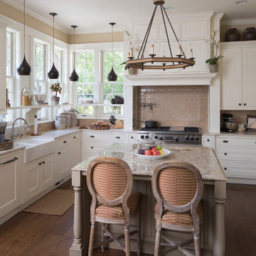
These homeowners relocated to Indianapolis and wanted a traditional home in the Meridian Hills area that offered family living space off the kitchen. “It’s what we were used to, but we had trouble finding exactly what we were looking for.” They spent a lot of time thinking about the possibilities of a remodel. They had space both within and outside the house that were under-utilized and decided to embark on a significant renovation project.
We endeavored to completely rework the current floor plan in hopes of addressing all their needs and wants. Plans included relocating the kitchen, moving the exterior walls by a couple of feet, raising the ceiling, and moving the office. The results of these changes were dramatic. Additionally the family now enjoys a larger and updated entrance with storage and closets that is perfect for their two active daughters and two often muddy labs, a beautiful kitchen with improved functionality that is filled with tons of natural light, as well as a cozy hearth room, ideal for relaxing together as a family. The once neglected screened porch is now a unique and inviting office with workspace for everyone.
Once these improvements were made the view to the back of the house was now apparent, the couple decided to enhance their outdoor living space as well. We added a new patio, a custom pergola, water feature and a fire pit. “Now it’s a private spot to relax and connect with the outdoors. It really highlights the style of the house and we love it,” says the homeowner.
 Robson Homes
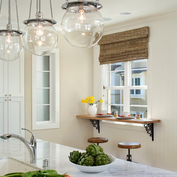
Example of a classic kitchen design in San Francisco with an undermount sink and an island
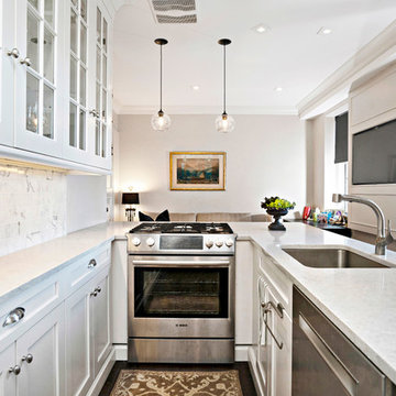
 JMT Fine Living
Pre war kitchen completely gutted. Small space efficiently designed to maximize kitchen counter and storage space while including sitting area and work space. Counter stools and wine fridge hidden at far end of island
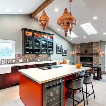
 Ayelet Designs
Boaz Meiri Photography
Eat-in kitchen - transitional eat-in kitchen idea in San Francisco with a farmhouse sink, shaker cabinets, dark wood cabinets, solid surface countertops, mosaic tile backsplash and an island
Eat-in kitchen - transitional eat-in kitchen idea in San Francisco with a farmhouse sink, shaker cabinets, dark wood cabinets, solid surface countertops, mosaic tile backsplash and an island

Sponsored
Columbus, OH
Free consultation for landscape design!

Peabody Landscape Group
Franklin County's Reliable Landscape Design & Contracting
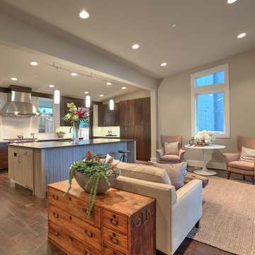
 JayMarc Homes
The extra space outside of the Kitchen was created into a Sitting Area. It can also be used as a Nook.
Inspiration for a large transitional open concept medium tone wood floor living room remodel in Seattle with gray walls
Inspiration for a large transitional open concept medium tone wood floor living room remodel in Seattle with gray walls
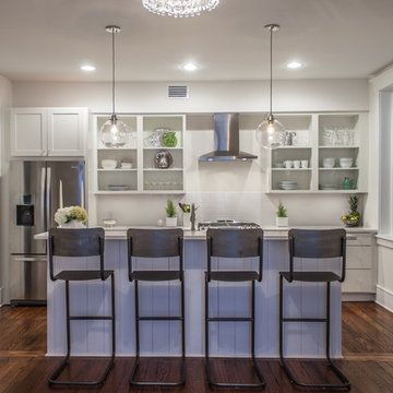
 Ellsworth Design Build
The kitchen area was originally two spaces. The area in the foreground was a butlers pantry/ breakfast room that had been converted to a laundry room. The Kitchen was the area by the window, roughly 8' x 8' and completely cut off from the rest of the house. The island sits on what had been the dividing line between the kitchen and the dining room. We discovered some salvageable hardwood flooring under the linoleum, we brought in salvaged hardwood to match. All the floors were then stained English Chestnut. All the woodwork was removed for construction, then carefully re installed and stripped once the work was complete. The kitchen has a mix of 6" recessed cans, under cabinet lighting, and island pendants. The soffit over the cabinets conceals the HVAC ducting as well as the hood ducting.

 Metropolis Drafting and Construction Inc
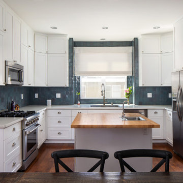
Updating a recently built town home in culver city for a wonderful family was a very enjoyable project for us.
a classic shaker kitchen with double row of upper cabinets due to the extra high ceiling. butcher block island with a sink as a work area. The centerpiece of it all is the amazing handmade Moroccan zellige tiles that were used as the backsplash.
going all the way to the ceiling around the window area and finished off in the corners with a black matt Schluter corner system.
 DESIGN 4 CORNERS
Jim Pelar of Linova Photography
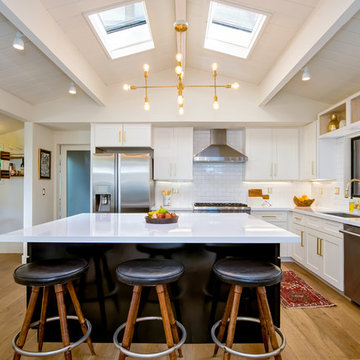
Eat-in kitchen - large transitional light wood floor eat-in kitchen idea in San Diego with an undermount sink, shaker cabinets, white cabinets, white backsplash, subway tile backsplash, stainless steel appliances and an island
Eat-in kitchen - large transitional light wood floor eat-in kitchen idea in San Diego with an undermount sink, shaker cabinets, white cabinets, white backsplash, subway tile backsplash, stainless steel appliances and an island
 Corinthian Fine Homes
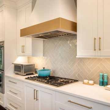
This young family began working with us after struggling with their previous contractor. They were over budget and not achieving what they really needed with the addition they were proposing. Rather than extend the existing footprint of their house as had been suggested, we proposed completely changing the orientation of their separate kitchen, living room, dining room, and sunroom and opening it all up to an open floor plan. By changing the configuration of doors and windows to better suit the new layout and sight lines, we were able to improve the views of their beautiful backyard and increase the natural light allowed into the spaces. We raised the floor in the sunroom to allow for a level cohesive floor throughout the areas. Their extended kitchen now has a nice sitting area within the kitchen to allow for conversation with friends and family during meal prep and entertaining. The sitting area opens to a full dining room with built in buffet and hutch that functions as a serving station. Conscious thought was given that all “permanent” selections such as cabinetry and countertops were designed to suit the masses, with a splash of this homeowner’s individual style in the double herringbone soft gray tile of the backsplash, the mitred edge of the island countertop, and the mixture of metals in the plumbing and lighting fixtures. Careful consideration was given to the function of each cabinet and organization and storage was maximized. This family is now able to entertain their extended family with seating for 18 and not only enjoy entertaining in a space that feels open and inviting, but also enjoy sitting down as a family for the simple pleasure of supper together.

 Fiorito Interior Design
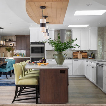
This gorgeous, nature-inspired Great Room—comprised of the kitchen, dining area, and sitting room—was reimagined for some wonderful repeat clients, beginning with a small, treasured piece of art.
Their large 1950s ranch house nestled into a gentle hill surrounded by orchards of fragrant orange, lemon, and cherry trees initially featured a too-small kitchen adjacent to a warren of small spaces with low ceilings serving as a dining and sitting area. They dreamed of a more spacious, light-filled layout.
A complete redesign of the home not only resolved spatial constraints but also embraced the beauty of the home’s natural surroundings. By removing walls and creating an open-plan layout, we enhanced the flow and connectivity between the kitchen, dining, and sitting areas, seamlessly integrating the outdoors with the indoors.
The relocated kitchen now faces the backyard, to facilitate outdoor entertaining and features a large island, serving as a welcoming focal point for both cooking and socializing. I designed a distinctive ceiling feature above the island, crafted from planks of the adjacent vaulted ceiling, mirroring the shape of the island below. This feature adds architectural interest and visually connects the flat kitchen plane with the vaulted plank ceiling of the sitting area, creating a harmonious sense of continuity and warmth.
A beautiful, prized painting of a bird on a branch created the direction for the color and texture palette. An intriguing yellow-green-tan background in the art guided my choices for the backsplash tile (an iridescent version mimics light glinting on water) and countertops. The kitchen's soothing color palette features various shades of natural green, while the dining area introduces feather-blue tones through chair upholstery and rug. Just steps away, the inviting sitting area features a rebuilt fireplace clad in cut, polished Haisa marble tiles in a vertical pattern. The soft, generous seating creates a comfortable spot for movie nights or cozying up by the fire on a cold winter evening. The elegant, simple silhouettes of the furniture enhance the serene and calming atmosphere of the space.
After photos: Bernardo Grijalva and Fiorito Interior Design
Cabinetry: custom by Schmitz Woodwork
Countertops: Primordia and Calcatta Maximus by Caesarstone
Backsplash: Elements in Miami Sand Pearl by Lunada Bay
Island pendants: Simple Sanders by Shades of Light
Stools: Essex by Lazar in Brisa fabric by Ultrafabrics
Dining table: Emerson Wave by Saloom
Dining chairs: Essex by Lazar
Dining lighting: Triad chandelier by Kichler
Dining rug: Soho Smoke by Jaunty Inc.
Sitting area sofa and ottoman: Corvo by Lazar
Sitting area swivel chair: Noah by Lazar
Sitting area rug: Soho Stone by Jaunty Inc.
Motorized shades: Hunter Douglas
Entry console: Reed by Uttermost
Entry light: Re by Visual Comfort
Fireplace: Haisa cut and polished marble by Icontile
Wall paint: Mascarpone by Benjamin Moore
 Ulrich Inc
Ulrich Designer: Julia Kleyman
Photography by Peter Rymwid
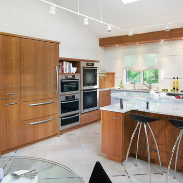
The design challenge in this kitchen was to combine sleek materials to make the space look modern – in fitting with the overall character of the home – and also to achieve a warm and inviting living space. Some special touches for the homeowners include the peninsula counter top that was dropped down to a more comfortable height for mixing and dough rolling. Above the peninsula a bean-shaped frosted glass snack counter sits on metal posts, creating an eating/snacking area. White porcelain tile with two chrome liners running around the perimeter create a clean backdrop for the focal point of the kitchen, a clear glass hood by Miele. A blue acrylic cabinetry finish gives the space a dash of color, while the cherry finish on the appliances side of the kitchen and on the sitting side of the peninsula makes the kitchen warm and inviting.
 Corinthian Fine Homes
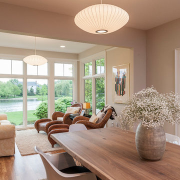
Our homeowner was desirous of an improved floorplan for her Kitchen/Living Room area, updating the kitchen and converting a 3-season room into a sunroom off the kitchen. With some modifications to existing cabinetry in the kitchen and new countertops, backsplash and plumbing fixtures she has an elegant renewal of the space.
Additionally, we created a circular floor plan by opening the wall that separated the living room from the kitchen allowing for much improved function of the space. We raised the floor in the 3-season room to bring the floor level with the kitchen and dining area creating a sitting area as an extension of the kitchen. New windows and French doors with transoms in the sitting area and living room, not only improved the aesthetic but also improved function and the ability to access the exterior patio of the home. With refinished hardwoods and paint throughout, and an updated staircase with stained treads and painted risers, this home is now beautiful and an entertainer’s dream.
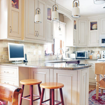
 Caves Kitchens
This peninsula is the perfect size for a couple sitting places and the design allows for more surface area when working and storage space underneath.
The three pendant lights above provide additional lighting and the sleek silver matches the cabinetry's hardware.
-Allison Caves, CKD
Caves Kitchens
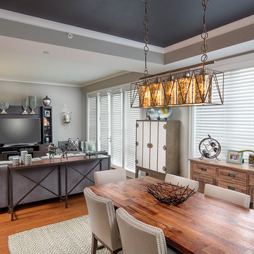

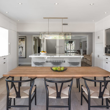
 Astro Design Inc.
The inspiration for this Glebe kitchen was the white washed interiors synonymous with Scandinavian design. Planning the spaces of the kitchen was something that was broken into 5 key areas; cooking station, cleaning area, coffee bar, place for casual family dining and lastly a nook to sit with a great book that was still integrated in the kitchen.
Kitchen designed & supplied by Astro Design Centre
Ottawa, Canada
Photographer: DoubleSpace Photography
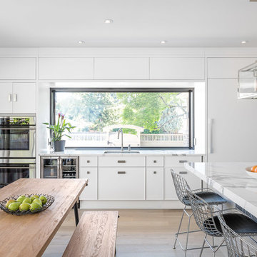 Astro Design Inc.
The inspiration for this Glebe kitchen was the white washed interiors synonymous with Scandinavian design. Planning the spaces of the kitchen was something that was broken into 5 key areas; cooking station, cleaning area, coffee bar, place for casual family dining and lastly a nook to sit with a great book that was still integrated in the kitchen.
Kitchen designed & supplied by Astro Design Centre
Ottawa, Canada
Photographer: DoubleSpace Photography
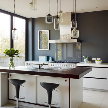
 Roundhouse
Roundhouse Urbo bespoke matt lacquer kitchen
Eat-in kitchen - large contemporary eat-in kitchen idea in London with an undermount sink, flat-panel cabinets, white cabinets and an island
Eat-in kitchen - large contemporary eat-in kitchen idea in London with an undermount sink, flat-panel cabinets, white cabinets and an island
9