
Search results for "Lacking" in Home Design Ideas
 Morimoto Photography
Glenn Morimoto - morimotophotography.com
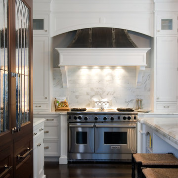
Large country u-shaped dark wood floor eat-in kitchen photo in Chicago with glass-front cabinets, white cabinets, marble countertops, white backsplash, stainless steel appliances and an island
Large country u-shaped dark wood floor eat-in kitchen photo in Chicago with glass-front cabinets, white cabinets, marble countertops, white backsplash, stainless steel appliances and an island
 Urbanology Designs
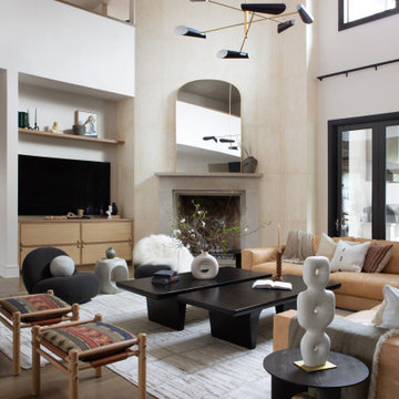
A captivating transformation in the coveted neighborhood of University Park, Dallas
The heart of this home lies in the kitchen, where we embarked on a design endeavor that would leave anyone speechless. By opening up the main kitchen wall, we created a magnificent window system that floods the space with natural light and offers a breathtaking view of the picturesque surroundings. Suspended from the ceiling, a steel-framed marble vent hood floats a few inches from the window, showcasing a mesmerizing Lilac Marble. The same marble is skillfully applied to the backsplash and island, featuring a bold combination of color and pattern that exudes elegance.
Adding to the kitchen's allure is the Italian range, which not only serves as a showstopper but offers robust culinary features for even the savviest of cooks. However, the true masterpiece of the kitchen lies in the honed reeded marble-faced island. Each marble strip was meticulously cut and crafted by artisans to achieve a half-rounded profile, resulting in an island that is nothing short of breathtaking. This intricate process took several months, but the end result speaks for itself.
To complement the grandeur of the kitchen, we designed a combination of stain-grade and paint-grade cabinets in a thin raised panel door style. This choice adds an elegant yet simple look to the overall design. Inside each cabinet and drawer, custom interiors were meticulously designed to provide maximum functionality and organization for the day-to-day cooking activities. A vintage Turkish runner dating back to the 1960s, evokes a sense of history and character.
The breakfast nook boasts a stunning, vivid, and colorful artwork created by one of Dallas' top artist, Kyle Steed, who is revered for his mastery of his craft. Some of our favorite art pieces from the inspiring Haylee Yale grace the coffee station and media console, adding the perfect moment to pause and loose yourself in the story of her art.
The project extends beyond the kitchen into the living room, where the family's changing needs and growing children demanded a new design approach. Accommodating their new lifestyle, we incorporated a large sectional for family bonding moments while watching TV. The living room now boasts bolder colors, striking artwork a coffered accent wall, and cayenne velvet curtains that create an inviting atmosphere. Completing the room is a custom 22' x 15' rug, adding warmth and comfort to the space. A hidden coat closet door integrated into the feature wall adds an element of surprise and functionality.
This project is not just about aesthetics; it's about pushing the boundaries of design and showcasing the possibilities. By curating an out-of-the-box approach, we bring texture and depth to the space, employing different materials and original applications. The layered design achieved through repeated use of the same material in various forms, shapes, and locations demonstrates that unexpected elements can create breathtaking results.
The reason behind this redesign and remodel was the homeowners' desire to have a kitchen that not only provided functionality but also served as a beautiful backdrop to their cherished family moments. The previous kitchen lacked the "wow" factor they desired, prompting them to seek our expertise in creating a space that would be a source of joy and inspiration.
Inspired by well-curated European vignettes, sculptural elements, clean lines, and a natural color scheme with pops of color, this design reflects an elegant organic modern style. Mixing metals, contrasting textures, and utilizing clean lines were key elements in achieving the desired aesthetic. The living room introduces bolder moments and a carefully chosen color scheme that adds character and personality.
The client's must-haves were clear: they wanted a show stopping centerpiece for their home, enhanced natural light in the kitchen, and a design that reflected their family's dynamic. With the transformation of the range wall into a wall of windows, we fulfilled their desire for abundant natural light and breathtaking views of the surrounding landscape.
Our favorite rooms and design elements are numerous, but the kitchen remains a standout feature. The painstaking process of hand-cutting and crafting each reeded panel in the island to match the marble's veining resulted in a labor of love that emanates warmth and hospitality to all who enter.
In conclusion, this tastefully lux project in University Park, Dallas is an extraordinary example of a full gut remodel that has surpassed all expectations. The meticulous attention to detail, the masterful use of materials, and the seamless blend of functionality and aesthetics create an unforgettable space. It serves as a testament to the power of design and the transformative impact it can have on a home and its inhabitants.
Project by Texas' Urbanology Designs. Their North Richland Hills-based interior design studio serves Dallas, Highland Park, University Park, Fort Worth, and upscale clients nationwide.
 Authenticity, LLC
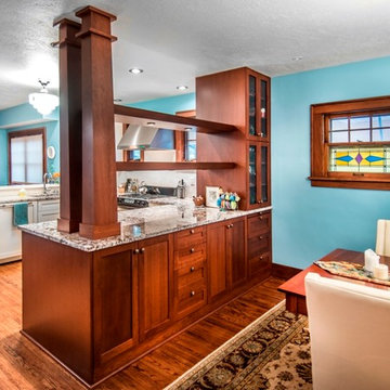
Architect: Michelle Penn, AIA This is remodel & addition project of an Arts & Crafts two-story home. It included the Kitchen & Dining remodel and an addition of an Office, Dining, Mudroom & 1/2 Bath. We double stacked the lower cabinets to create tons of storage that the original Kitchen lacked! Photo Credit: Jackson Studios
Find the right local pro for your project
 TKS Design Group
Download our free ebook, Creating the Ideal Kitchen. DOWNLOAD NOW
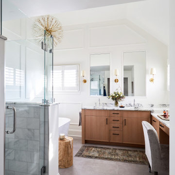
A tired primary bathroom, with varying ceiling heights and a beige-on-beige color scheme, was screaming for love. Squaring the room and adding natural materials erased the memory of the lack luster space and converted it to a bright and welcoming spa oasis. The home was a new build in 2005 and it looked like all the builder’s material choices remained. The client was clear on their design direction but were challenged by the differing ceiling heights and were looking to hire a design-build firm that could resolve that issue.
This local Glen Ellyn couple found us on Instagram (@kitchenstudioge, follow us ?). They loved our designs and felt like we fit their style. They requested a full primary bath renovation to include a large shower, soaking tub, double vanity with storage options, and heated floors. The wife also really wanted a separate make-up vanity. The biggest challenge presented to us was to architecturally marry the various ceiling heights and deliver a streamlined design.
The existing layout worked well for the couple, so we kept everything in place, except we enlarged the shower and replaced the built-in tub with a lovely free-standing model. We also added a sitting make-up vanity. We were able to eliminate the awkward ceiling lines by extending all the walls to the highest level. Then, to accommodate the sprinklers and HVAC, lowered the ceiling height over the entrance and shower area which then opens to the 2-story vanity and tub area. Very dramatic!
This high-end home deserved high-end fixtures. The homeowners also quickly realized they loved the look of natural marble and wanted to use as much of it as possible in their new bath. They chose a marble slab from the stone yard for the countertops and back splash, and we found complimentary marble tile for the shower. The homeowners also liked the idea of mixing metals in their new posh bathroom and loved the look of black, gold, and chrome.
Although our clients were very clear on their style, they were having a difficult time pulling it all together and envisioning the final product. As interior designers it is our job to translate and elevate our clients’ ideas into a deliverable design. We presented the homeowners with mood boards and 3D renderings of our modern, clean, white marble design. Since the color scheme was relatively neutral, at the homeowner’s request, we decided to add of interest with the patterns and shapes in the room.
We were first inspired by the shower floor tile with its circular/linear motif. We designed the cabinetry, floor and wall tiles, mirrors, cabinet pulls, and wainscoting to have a square or rectangular shape, and then to create interest we added perfectly placed circles to contrast with the rectangular shapes. The globe shaped chandelier against the square wall trim is a delightful yet subtle juxtaposition.
The clients were overjoyed with our interpretation of their vision and impressed with the level of detail we brought to the project. It’s one thing to know how you want a space to look, but it takes a special set of skills to create the design and see it thorough to implementation. Could hiring The Kitchen Studio be the first step to making your home dreams come to life?
 Kitchen Innovations
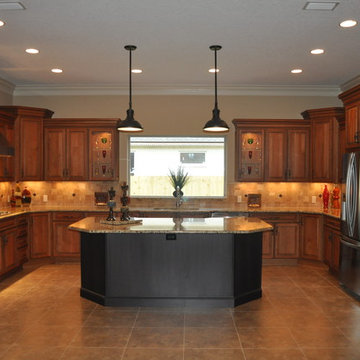
The builder allowed me creative freedom in this kitchen. The huge space and 10' ceilings allowed for staggering from 90" - 96" and extra depth in the corners and ends. I also added accent on the bases and island with angles to mimic the rest of the kitchen. The cabinets on the perimeter are cherry with a medium stain and black glaze. The island is cherry with a black stain. This house received an award in the 2014 Parade of Homes in Okaloosa County. www.southernparadisehomes.com
 Caroline Sharpnack
Photo: Caroline Sharpnack © 2017 Houzz
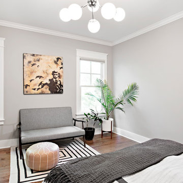
Example of a 1960s bedroom design in Nashville
Example of a 1960s bedroom design in Nashville
 Grand View Windows & Doors LLC
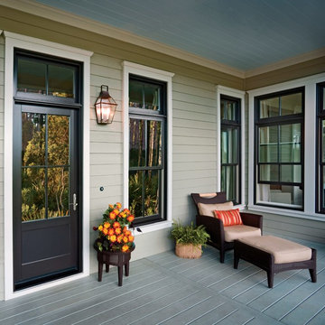
Mid-sized elegant front porch photo in Oklahoma City with decking and a roof extension
 Otogawa-Anschel Design-Build
With the pending arrival of a beautiful baby girl, the homeowners of this 1928 Minneapolis Tudor wanted a basement that was conducive to a young child, but would still allow a place for family to gather and the occasional house guest. The original basement was typical; cold, lacking natural light with tiny, uncomfortably confined rooms and that “unique” basement smell. The goal was to reverse all of the ill effects of a rarely unappreciated space while increasing the performance of the older home.
The frigid temperatures and wet, mildew odor was remedied by demolishing the entire slab floor and excavating to gain an extra six inches in ceiling height. It also allowed us to insulate to R-15, moisture proof under the new slab, install a drain tile and sump pump. Within the concrete slab is a hydronic, in-floor radiant heating system which further helps to add comfort to the space. Lastly, we also sprayed a closed-cell, expanding urethane foam on the inside of the foundation walls all the way to the first floor.
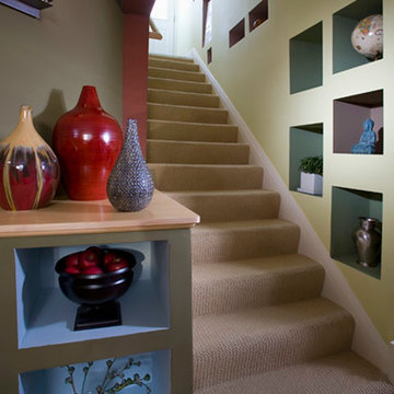
To help bring more light down to the basement, we started by opening up the staircase on both sides. A curved wall bends light into the lower level while a countertop and cubbies below provide storage space for odds and ends. On the opposite wall, creatively placed cubbies provide places for paintings, ceramics and plants. We also removed the tiny 18” x 34” window on the south wall and installed a full-sized, high-efficiency, triple pane Pella egress window. To let lots of natural light into the window, we expanded the size of the cedar-lined egress well and included a built-in planter at the base to help bring life into an otherwise empty cavity.
Small, unspecified spaces that became storage areas now have purpose. The areas are defined, yet open. Upon descending down the stairs, one is greeted by a large living room with curved walls, custom design media center, built-in daybed and bookshelves. Use of paint was important in the design. Naturally in older homes basements are going to have exposed beams, soffits and a whole gambit of nooks and crannies. Instead of disguising them, we played them up, which created a layer effect with the color. The color also adds a touch of playfulness which anyone, regardless of age, can enjoy.
We scavenged the client’s garage and discovered that the previous homeowner kept the old, full-view glass front entry door in the garage. We re-installed the original glass knob and attached the door to sliding barn door hardware which was attached to the main structural beam of the lower level. On the other side of the door was the homeowners’ combined office and small fitness area. The office floor is a blend of thin strips of different colored cork. A built-in storage cabinet sits across from a site-built desk which forms to the curve of the dividing wall. A small, square hole in the curved wall provides a view to see who is coming down the stairs. Opposite of the office area and directly at the base of the stairs is a place for the homeowner’s treadmill.
Hidden is the mechanical room, which is home to many green and energy efficient products. The washing machine is a low-water consumption unit while the dryer requires less energy to operate than most standard units. Both sit atop a checkerboard pattern of different colored VCT tiles. We also replaced the aging boiler, which only heated the first and second level, with a 95% efficient heat source for the entire house—including the basement.
Behind the curved wall, the bathroom is conveniently located. A large, custom built no-formaldehyde added vanity supports the slab of remnant granite countertop. A piece of eco-resin wall panel, embedded with organic material, contains water in the shower and blends beautifully with the updated colors. Tucked under the stairs, we installed a dual-flush, low-water consumption toilet.
Through creative space planning, we packed a lot of into a rather small space. As a result, we have three very happy homeowners who are enjoying their light, clean and safe lower level of their home—however, they’ve been hard pressed to think of it as a “basement”.
highlights
Moisture management system
Insulated slab
Hydronic in-floor heat
Formaldehyde free cabinetry
MN-made custom cabinets
Ultra-low VOC paints
Wool carpet
Dual-flush toilet
Cork floor
No recessed lights
Cedar egress window well with planter
Re-used door
Eco-resin
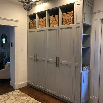
 Kate Fairweather Designs and Custom Cabinetry
Example of a transitional home design design in DC Metro
 Renovations Group Inc
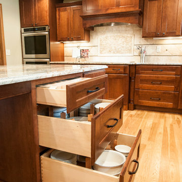
The clients in this charming ranch home had a wish for an updated kitchen that felt a part of the home by blending into the existing space.
Their existing eat-in kitchen, while spacious, lacked the character of the rest of the home. Rich woods and earth tones filled the cozy rooms leaving the outdated kitchen uninspired. Supple cherry tones of the new cabinetry and alluring cashmere hues in the one-o-a-kind granite countertops wrap you in warmth and invite you to take a seat at the grand island. Turned posts and arched trim details throughout draw your eyes around this timeless kitchen.
Zachary Seib Photography
 keter
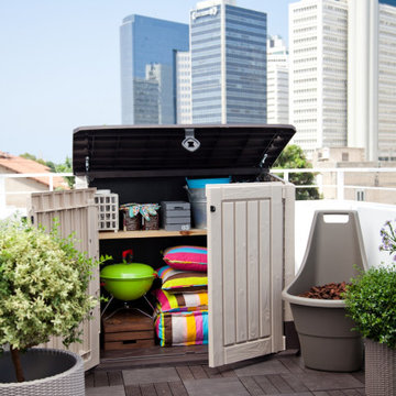
keterIf you need a little more outdoor storage space, check out the Keter Store-It-Out MIDI. This portable shed gives you a convenient place to keep your garden tools and supplies. It also works great as a pool storage shed for your floats, pool chemicals and other necessities. The Keter Store-It-Out MIDI comes in handy for a variety of both indoor and outdoor uses where you lack storage space. Because the Store-It-Out MIDI has a strong yet lightweight plastic construction, you can move it anywhere without sacrificing durability. This portable storage shed holds up to years of consistent use and gives you extra storage space exactly where you need it. Place the Store-It-Out MIDI in your garage for organizing tools and supplies, or keep it in the wash room for storing cleaning supplies and household tools.
 GMT Home Designs Inc.
The original kitchen was dark and lacked storage space. It was cut off from the rest of the house and needed an update. We removed the wall between the dining room and kitchen and bumped the kitchen out in the rear of the house. We created lots of storage, a new island with seating and added windows bringing in much needed natural light. The kitchen is now a hub of activity for the whole family.
 Simply Baths & Kitchens
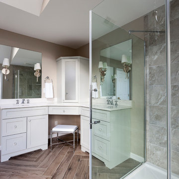
When designer Rachel Peterson of Simply Baths, Inc. first met this young, stylish couple at their house they had a small handful of items they knew they really wanted in their master bathroom: a freestanding tub, a chandelier, a larger shower and more counter space. But the truth was, the bath needed a major face-lift. The space was outdated and lacked personality. It certainly didn't reflect the homeowners and their elegant aesthetic. The combination of stone and wood tiles lends just enough of a rustic flair to bring a little bit of the outdoors in and while helping to balance some of the feminine elements in the room with simple masculine touches.
Featuring Dura Supreme Cabinetry.
 Kustom Home Design
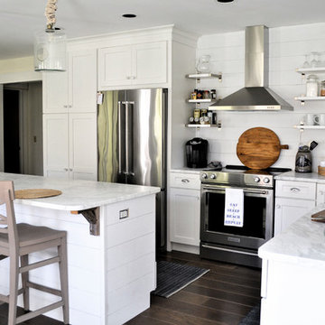
We transformed an outdated, lack luster beach house on Fripp Island into a coastal retreat complete with southern charm and bright personality. The main living space was opened up to allow for a charming kitchen with open shelving, white painted ship lap, a large inviting island and sleek stainless steel appliances. Nautical details are woven throughout adding to the charisma and simplistic beauty of this coastal home. New dark hardwood floors contrast with the soft white walls and cabinetry, while also coordinating with the dark window sashes and mullions. The new open plan allows an abundance of natural light to wash through the interior space with ease. Tropical vegetation form beautiful views and welcome visitors like an old friend to the grand front stairway. The play between dark and light continues on the exterior with crisp contrast balanced by soft hues and warm stains. What was once nothing more than a shelter, is now a retreat worthy of the paradise that envelops it.
 Baker Design Group
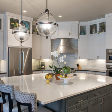
Pops of colored accessories bring some fun life above the cabinets to this newly revived sleek white kitchen.
Inspiration for a mid-sized transitional l-shaped dark wood floor and brown floor open concept kitchen remodel in Dallas with shaker cabinets, white cabinets, an island, white backsplash, matchstick tile backsplash, stainless steel appliances, an undermount sink and quartz countertops
Inspiration for a mid-sized transitional l-shaped dark wood floor and brown floor open concept kitchen remodel in Dallas with shaker cabinets, white cabinets, an island, white backsplash, matchstick tile backsplash, stainless steel appliances, an undermount sink and quartz countertops
 TVL Creative Ltd.
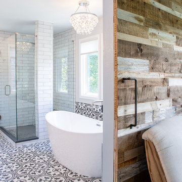
This project is an incredible transformation and the perfect example of successful style mixing! This client, and now a good friend of TVL (as they all become), is a wonderfully eclectic and adventurous one with immense interest in texture play, pops of color, and unique applications. Our scope in this home included a full kitchen renovation, main level powder room renovation, and a master bathroom overhaul. Taking just over a year to complete from the first design phases to final photos, this project was so insanely fun and packs an amazing amount of fun details and lively surprises. The original kitchen was large and fairly functional. However, the cabinetry was dated, the lighting was inefficient and frankly ugly, and the space was lacking personality in general. Our client desired maximized storage and a more personalized aesthetic. The existing cabinets were short and left the nice height of the space under-utilized. We integrated new gray shaker cabinets from Waypoint Living Spaces and ran them to the ceiling to really exaggerate the height of the space and to maximize usable storage as much as possible. The upper cabinets are glass and lit from within, offering display space or functional storage as the client needs. The central feature of this space is the large cobalt blue range from Viking as well as the custom made reclaimed wood range hood floating above. The backsplash along this entire wall is vertical slab of marble look quartz from Pental Surfaces. This matches the expanse of the same countertop that wraps the room. Flanking the range, we installed cobalt blue lantern penny tile from Merola Tile for a playful texture that adds visual interest and class to the entire room. We upgraded the lighting in the ceiling, under the cabinets, and within cabinets--we also installed accent sconces over each window on the sink wall to create cozy and functional illumination. The deep, textured front Whitehaven apron sink is a dramatic nod to the farmhouse aesthetic from KOHLER, and it's paired with the bold and industrial inspired Tournant faucet, also from Kohler. We finalized this space with other gorgeous appliances, a super sexy dining table and chair set from Room & Board, the Paxton dining light from Pottery Barn and a small bar area and pantry on the far end of the space. In the small powder room on the main level, we converted a drab builder-grade space into a super cute, rustic-inspired washroom. We utilized the Bonner vanity from Signature Hardware and paired this with the cute Ashfield faucet from Pfister. The most unique statements in this room include the water-drop light over the vanity from Shades Of Light, the copper-look porcelain floor tile from Pental Surfaces and the gorgeous Cashmere colored Tresham toilet from Kohler. Up in the master bathroom, elegance abounds. Using the same footprint, we upgraded everything in this space to reflect the client's desire for a more bright, patterned and pretty space. Starting at the entry, we installed a custom reclaimed plank barn door with bold large format hardware from Rustica Hardware. In the bathroom, the custom slate blue vanity from Tharp Cabinet Company is an eye catching statement piece. This is paired with gorgeous hardware from Amerock, vessel sinks from Kohler, and Purist faucets also from Kohler. We replaced the old built-in bathtub with a new freestanding soaker from Signature Hardware. The floor tile is a bold, graphic porcelain tile with a classic color scheme. The shower was upgraded with new tile and fixtures throughout: new clear glass, gorgeous distressed subway tile from the Castle line from TileBar, and a sophisticated shower panel from Vigo. We finalized the space with a small crystal chandelier and soft gray paint. This project is a stunning conversion and we are so thrilled that our client can enjoy these personalized spaces for years to come. Special thanks to the amazing Ian Burks of Burks Wurks Construction for bringing this to life!
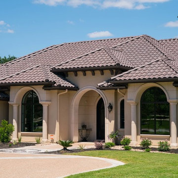
 Goodner Brothers Custom Homes
Large mediterranean beige two-story mixed siding house exterior idea in Austin with a hip roof and a tile roof
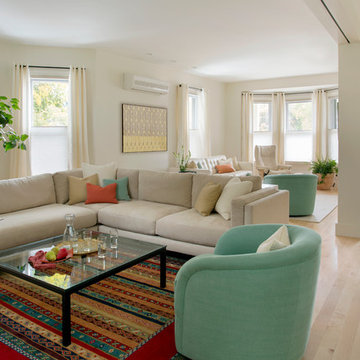
 Morse Constructions
Working within the existing footprint, Morse Constructions created flexible, open spaces by opening up a traditional 1890s floor plan.. A large beam replaced a center bearing wall to open up the space. Worn out oak flooring and the kitchen’s cork floor were replaced with maple throughout. The uniform flooring, combined with the lack of thresholds, creates a seamless look that makes the entire space feel larger.
Interior Design: Elza B. Design
Photography: Eric Roth
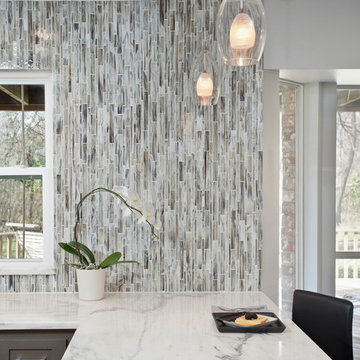
 Nicole Arnold Interiors
Clear globes were chosen for the light pendants and recessed lighting in the ceiling so that there was no visual interference with the wall tile.
The installation of the backsplash tile on this extremely large exposed wall had to overcome the wall’s significant lack of plumb which had to be corrected and made perfectly straight.
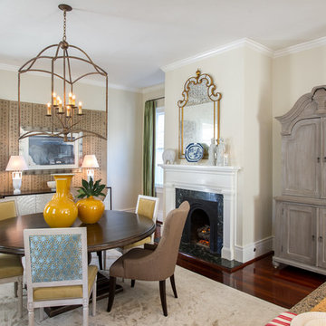
 Foley & Stinnette Interior Design
Rick McKee
Example of a mid-sized classic medium tone wood floor kitchen/dining room combo design in Other with a standard fireplace and beige walls
Example of a mid-sized classic medium tone wood floor kitchen/dining room combo design in Other with a standard fireplace and beige walls
116