
Search results for "Lacking" in Home Design Ideas


 Keating Moore Construction
Ron Rosenzweig
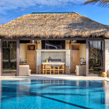
Inspiration for a mid-sized tropical backyard rectangular pool remodel in Miami
Inspiration for a mid-sized tropical backyard rectangular pool remodel in Miami
Find the right local pro for your project
 North Bay NARI
photo courtesy Paulette Bilgart, Bilgart Design
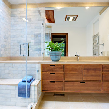
Trendy 3/4 blue tile bathroom photo in San Francisco with an integrated sink, flat-panel cabinets, medium tone wood cabinets and white walls
Trendy 3/4 blue tile bathroom photo in San Francisco with an integrated sink, flat-panel cabinets, medium tone wood cabinets and white walls
 Ellsworth Design Build
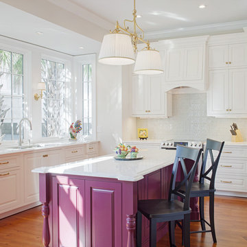
Traditional home in the heart of Savannah's Historic Landmark District that was built in 1999 had an 8' by 11' kitchen completely cut off from the rest of the house. We pushed out the back of the house three feet to create a bay to hold a sink, allowing us to completely open up the floorplan. The island color was based on the clients favorite shade of red (it also matches the front door). The rest of the palette is kept light and soft with a play of materials like the original pine floors, grass cloth wallpaper, Walker Zanger backsplash tile, and Viaterra Quartz 'marble' counters. The cabinets are all fully custom including an integrated dishwasher. It is a complete transformation from where we started!
Photos by Richard Leo Johnson of Atlantic Archives
 User
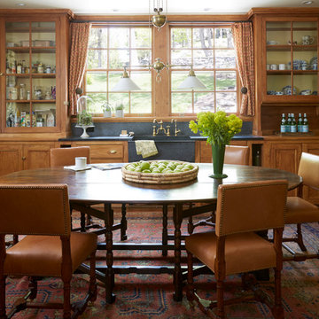
UserInspiration for a timeless eat-in kitchen remodel in New York with a farmhouse sink, glass-front cabinets and medium tone wood cabinets
 Leah Weinberg Design
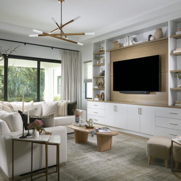
Beach style medium tone wood floor, brown floor and tray ceiling living room photo in New York with white walls and a wall-mounted tv
 House of Maevie
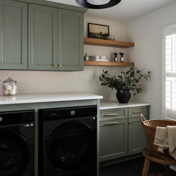
Raleigh remodel featuring a transitional kitchen, laundry room, and bathrooms. Custom cabinetry, timeless finishes, and thoughtful layouts create spaces that are both beautiful and functional. Designed by House of Maevie, each room blends modern comfort with classic style for lasting appeal.
 The Brooklyn Studio
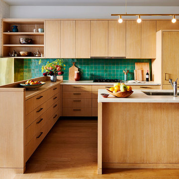
This residence was a complete gut renovation of a 4-story row house in Park Slope, and included a new rear extension and penthouse addition. The owners wished to create a warm, family home using a modern language that would act as a clean canvas to feature rich textiles and items from their world travels. As with most Brooklyn row houses, the existing house suffered from a lack of natural light and connection to exterior spaces, an issue that Principal Brendan Coburn is acutely aware of from his experience re-imagining historic structures in the New York area. The resulting architecture is designed around moments featuring natural light and views to the exterior, of both the private garden and the sky, throughout the house, and a stripped-down language of detailing and finishes allows for the concept of the modern-natural to shine.
Upon entering the home, the kitchen and dining space draw you in with views beyond through the large glazed opening at the rear of the house. An extension was built to allow for a large sunken living room that provides a family gathering space connected to the kitchen and dining room, but remains distinctly separate, with a strong visual connection to the rear garden. The open sculptural stair tower was designed to function like that of a traditional row house stair, but with a smaller footprint. By extending it up past the original roof level into the new penthouse, the stair becomes an atmospheric shaft for the spaces surrounding the core. All types of weather – sunshine, rain, lightning, can be sensed throughout the home through this unifying vertical environment. The stair space also strives to foster family communication, making open living spaces visible between floors. At the upper-most level, a free-form bench sits suspended over the stair, just by the new roof deck, which provides at-ease entertaining. Oak was used throughout the home as a unifying material element. As one travels upwards within the house, the oak finishes are bleached to further degrees as a nod to how light enters the home.
The owners worked with CWB to add their own personality to the project. The meter of a white oak and blackened steel stair screen was designed by the family to read “I love you” in Morse Code, and tile was selected throughout to reference places that hold special significance to the family. To support the owners’ comfort, the architectural design engages passive house technologies to reduce energy use, while increasing air quality within the home – a strategy which aims to respect the environment while providing a refuge from the harsh elements of urban living.
This project was published by Wendy Goodman as her Space of the Week, part of New York Magazine’s Design Hunting on The Cut.
Photography by Kevin Kunstadt

 Designs by BSB
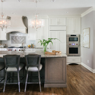
The clients believed the peninsula footprint was required due to the unique entry points from the hallway leading to the dining room and the foyer. The new island increases storage, counters and a more pleasant flow of traffic from all directions.
The biggest challenge was trying to make the structural beam that ran perpendicular to the space work in a new design; it was off center and difficult to balance the cabinetry and functional spaces to work with it. In the end it was decided to increase the budget and invest in moving the header in the ceiling to achieve the best design, esthetically and funcationlly.
Specific storage designed to meet the clients requests include:
- pocket doors at counter tops for everyday appliances
- deep drawers for pots, pans and Tupperware
- island includes designated zone for baking supplies
- tall and shallow pantry/food storage for easy access near island
- pull out spice near cooking
- tray dividers for assorted baking pans/sheets, cutting boards and numerous other serving trays
- cutlery and knife inserts and built in trash/recycle bins to keep things organized and convenient to use, out of sight
- custom design hutch to hold various, yet special dishes and silverware
Elements of design chosen to meet the clients wishes include:
- painted cabinetry to lighten up the room that lacks windows and give relief/contrast to the expansive wood floors
- monochromatic colors throughout give peaceful yet elegant atmosphere
o stained island provides interest and warmth with wood, but still unique in having a different stain than the wood floors – this is repeated in the tile mosaic backsplash behind the rangetop
- punch of fun color used on hutch for a unique, furniture feel
- carefully chosen detailed embellishments like the tile mosaic, valance toe boards, furniture base board around island, and island pendants are traditional details to not only the architecture of the home, but also the client’s furniture and décor.
- Paneled refrigerator minimizes the large appliance, help keeping an elegant feel
Superior cooking equipment includes a combi-steam oven, convection wall ovens paired with a built-in refrigerator with interior air filtration to better preserve fresh foods.
Photography by Gregg Willett
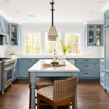
 Amy Troute Inspired Interior Design
ATIID collaborated with these homeowners to curate new furnishings throughout the home while their down-to-the studs, raise-the-roof renovation, designed by Chambers Design, was underway. Pattern and color were everything to the owners, and classic “Americana” colors with a modern twist appear in the formal dining room, great room with gorgeous new screen porch, and the primary bedroom. Custom bedding that marries not-so-traditional checks and florals invites guests into each sumptuously layered bed. Vintage and contemporary area rugs in wool and jute provide color and warmth, grounding each space. Bold wallpapers were introduced in the powder and guest bathrooms, and custom draperies layered with natural fiber roman shades ala Cindy’s Window Fashions inspire the palettes and draw the eye out to the natural beauty beyond. Luxury abounds in each bathroom with gleaming chrome fixtures and classic finishes. A magnetic shade of blue paint envelops the gourmet kitchen and a buttery yellow creates a happy basement laundry room. No detail was overlooked in this stately home - down to the mudroom’s delightful dutch door and hard-wearing brick floor.
Photography by Meagan Larsen Photography
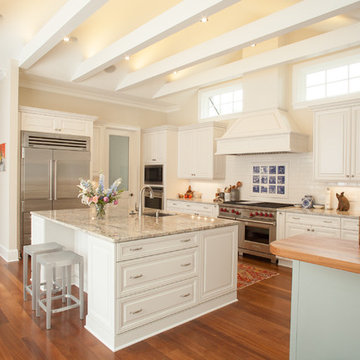
 Peridot Interiors Inc.
Harry Taylor - Photographer
Inspiration for a timeless u-shaped open concept kitchen remodel in Other with raised-panel cabinets, beige cabinets, beige backsplash and stainless steel appliances
Inspiration for a timeless u-shaped open concept kitchen remodel in Other with raised-panel cabinets, beige cabinets, beige backsplash and stainless steel appliances
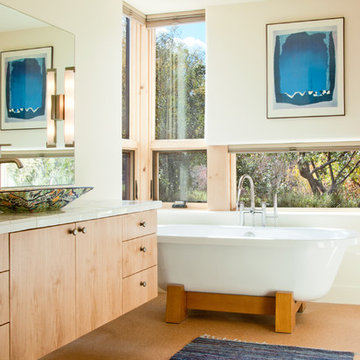
 BARRETT STUDIO architects
Maggie Flickinger
Example of a southwest freestanding bathtub design in Denver with a vessel sink and light wood cabinets
Example of a southwest freestanding bathtub design in Denver with a vessel sink and light wood cabinets
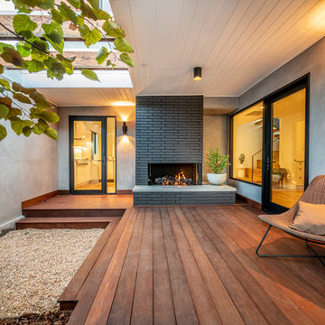
 AAHA Studio
Interior Entry Courtyard
Deck - mid-sized contemporary deck idea in Los Angeles with a roof extension
Deck - mid-sized contemporary deck idea in Los Angeles with a roof extension
 Dave Fox Design Build Remodelers
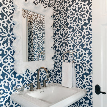
This remodel consisted of a whole house transformation. We took this 3 bedroom dated home and turned it into a 5 bedroom award winning showpiece, all without an addition. By reworking the awkward floor plan and lowering the living room floor to be level with the rest of the house we were able to create additional space within the existing footprint of the home. What was once the small lack-luster master suite, is now 2 kids bedrooms that share a jack and jill bath. The master suite was relocated to the first floor, and the kitchen that was located right at the front door, is now located in the back of the home with great access to the patio overlooking the golf course.
View more about this project and our company at our website: www.davefox.com
 Clark Design Build, LLC
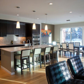
This home is located on a one acre parcel of land near the banks of the Milwaukee River in the older established subdivision of Sleepy Hollow Estates in Mequon, Wisconsin. The inspiration for this Glen Cove Residence was to bring the desired by many, contemporary and modern lifestyle of a down town loft and establish it in a neighborhood in the suburbs amongst traditional style homes.
Sleepy Hollow Estates like many older established neighborhoods throughout the North shore and Westside communities of Milwaukee had great local architects such as John Randall McDonald and Russell Barr Williamson, who built contemporary master pieces amongst very traditional style homes. This created diversity in the style of homes in these neighborhoods which for the people living in them and the people just passing by, an experience of harmony and cultural lifestyle.
Unfortunately today, many new neighborhood developments lack harmony and cultural lifestyle and don’t allow for homes such as this Glen Cove Residence to be built. And for that matter many of the homes built by John Randall McDonald and Russell Barr Williamson back in the 1950’s. When driving through these new developments, one would experience beautiful traditional style homes, but all the homes tend to look the same. There is no diversity in the styles of homes thus these neighborhoods lack the harmony and a cultural life style for the people who live there or what people are looking for when buying a home that reflects their lifestyle. This Glen Cove Residence is an example that a contemporary home which offers a modern lifestyle that many desires can be established amongst traditional homes while blending in with the neighborhood.
Don’t be fooled by the flat roof of this home, building technology has come a long way since Frank Lloyd Wright! The roof system on this home is more energy efficient than most roof systems builders are putting on traditional homes today and it doesn’t leak! This Glen Cove Residence was built using all traditional building materials that you would see in homes being built in new developments today. There is a misconception out there that modern homes are expensive to build. That is not true! This Glen Cove Residence was built for roughly $130 per square foot which is the same price one would pay for a similar builder’s model traditional style home with the same upgrades.
This Glen Cove Residence consists of three bedrooms and three and one half baths. All bedrooms are located on second floor with laundry, guest bath and a master suite. Located between the first and second floors off of the landing is an office/den space. The first floor is open concept with the kitchen, dining and living areas located at the rear of the home with expansive windows allowing a great connection to back yard area and outdoors. On the back of the home is a covered deck area allowing for outdoor entertaining without the worry of the elements. The first floor also offers a powder room, mudroom and walk-in pantry off the kitchen area. From the mudroom there is access to an attached four car tandem garage. From the first floor to the finished basement is an open stair allowing the basement area to feel as part of the house and not just a basement? The basement consists of a main living area, game area with wet bar, exercise room, kids play room with 14’ ceilings, full bathroom and mechanical room with storage closets throughout.
 TKS Design Group
Download our free ebook, Creating the Ideal Kitchen. DOWNLOAD NOW
As with most projects, it all started with the kitchen layout. The home owners came to us wanting to upgrade their kitchen and overall aesthetic in their suburban home, with a combination of fresh paint, updated finishes, and improved flow for more ease when doing everyday activities.
A monochromatic, earth-toned palette left the kitchen feeling uninspired. It lacked the brightness they wanted from their space. An eat-in table underutilized the available square footage. The butler’s pantry was out of the way and hard to access, and the dining room felt detached from the kitchen.
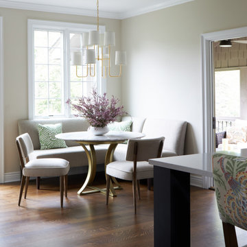
Lead Designer, Stephanie Cole, saw an improved layout for the spaces that were no longer working for this family. By eliminating an existing wall between the kitchen and dining room, and relocating the bar area to the dining room, we opened up the kitchen, providing all the space we needed to create a dreamy and functional layout. A new perimeter configuration promoted circulation while also making space for a large and functional island loaded with seating – a must for any family. Because an island that isn’t big enough for everyone (and a few more) is a recipe for disaster. The light white cabinetry is fresh and contrasts with the deeper tones in the wood flooring, creating a modern aesthetic that is elevated, yet approachable for everyday living.
With better flow as the overarching goal, we made some structural changes too. To remove a bottleneck in the entryway, we angled one of the dining room walls to create more natural separation between rooms and facilitate ease of movement throughout the large space.
At The Kitchen Studio, we believe a well-designed kitchen uses every square inch to the fullest. By starting from scratch, it was possible to rethink the entire kitchen layout and design the space according to how it is used, because the kitchen shouldn’t make it harder to feed the family. A new location for the existing range, flanked by a new column refrigerator and freezer on each side, worked to anchor the space. The very large and very spacious island (a dream island if we do say so ourselves) now houses the primary sink and provides ample space for food prep and family gathering.
The new kitchen table and coordinating banquette seating provide a cozy nook for quick breakfasts before school or work, and evening homework sessions. Elegant gold details catch the natural light, elevating the aesthetic.
The dining room was transformed into one of this client’s favorite spaces and we couldn’t agree more. We saw an opportunity to give the dining room a more distinguished identity by closing off the entrance from the foyer. The relocated wet bar enhances the sophisticated vibe of this gathering space, complete with beautiful antique mirror tiles and open shelving encased by moody built-in cabinets.
Updated furnishings add warmth. A rich walnut table is paired with custom chairs in a muted coral fabric. The large, transitional chandelier grounds the room, pairing beautifully with the gold finishes prevalent in the faucet and cabinet hardware. Linen-inspired wallpaper and cream-toned window treatments add to the glamorous feel of this entertainment space.
There is no way around it. The laundry room was cramped. The large washer and dryer blocked access to the sink and left little room for the space to serve its other essential function – as a mudroom. Because we reworked the kitchen layout to create more space overall, we could rethink the mudroom too – an essential for any busy family. The first step was moving the washer and dryer to an existing area on the second floor, where most of the family’s laundry lives (no one wants to carry laundry up and down the stairs if they don’t have to anyway). This is a more functional solution and opened up the space for all the mudroom necessities – including the existing kitchen refrigerator, loads of built-in cubbies, and a bench.
It’s hard to not fall in love with every detail of a new space, especially when it serves your day-to-day life. But that doesn’t mean the clients didn’t have their favorite features they use on the daily. This remodel was focused largely on function with a new kitchen layout. And it’s the functional features that have the biggest impact. The large island provides much needed workspace in the kitchen and is a spot where everyone gathers together – it grounds the space and the family. And the custom counter stools are the icing on the cake. The nearby mudroom has everything their previous space was lacking – ample storage, space for everyone’s essentials, and the beloved cement floor tiles that are both durable and artistic.
 The Brooklyn Studio
This residence was a complete gut renovation of a 4-story row house in Park Slope, and included a new rear extension and penthouse addition. The owners wished to create a warm, family home using a modern language that would act as a clean canvas to feature rich textiles and items from their world travels. As with most Brooklyn row houses, the existing house suffered from a lack of natural light and connection to exterior spaces, an issue that Principal Brendan Coburn is acutely aware of from his experience re-imagining historic structures in the New York area. The resulting architecture is designed around moments featuring natural light and views to the exterior, of both the private garden and the sky, throughout the house, and a stripped-down language of detailing and finishes allows for the concept of the modern-natural to shine.
Upon entering the home, the kitchen and dining space draw you in with views beyond through the large glazed opening at the rear of the house. An extension was built to allow for a large sunken living room that provides a family gathering space connected to the kitchen and dining room, but remains distinctly separate, with a strong visual connection to the rear garden. The open sculptural stair tower was designed to function like that of a traditional row house stair, but with a smaller footprint. By extending it up past the original roof level into the new penthouse, the stair becomes an atmospheric shaft for the spaces surrounding the core. All types of weather – sunshine, rain, lightning, can be sensed throughout the home through this unifying vertical environment. The stair space also strives to foster family communication, making open living spaces visible between floors. At the upper-most level, a free-form bench sits suspended over the stair, just by the new roof deck, which provides at-ease entertaining. Oak was used throughout the home as a unifying material element. As one travels upwards within the house, the oak finishes are bleached to further degrees as a nod to how light enters the home.
The owners worked with CWB to add their own personality to the project. The meter of a white oak and blackened steel stair screen was designed by the family to read “I love you” in Morse Code, and tile was selected throughout to reference places that hold special significance to the family. To support the owners’ comfort, the architectural design engages passive house technologies to reduce energy use, while increasing air quality within the home – a strategy which aims to respect the environment while providing a refuge from the harsh elements of urban living.
This project was published by Wendy Goodman as her Space of the Week, part of New York Magazine’s Design Hunting on The Cut.
Photography by Kevin Kunstadt
29