
Search results for "Lacking" in Home Design Ideas
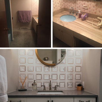
 TVL Creative Ltd.
This project was such an incredible design opportunity, and instilled inspiration and excitement at every turn! Our amazing clients came to us with the challenge of converting their beloved family home into a welcoming haven for all members of the family. At the time that we met our clients, they were struggling with the difficult personal decision of the fate of the home. Their father/father-in-law had passed away and their mother/mother-in-law had recently been admitted into a nursing facility and was fighting Alzheimer’s. Resistant to loss of the home now that both parents were out of it, our clients purchased the home to keep in in the family. Despite their permanent home currently being in New Jersey, these clients dedicated themselves to keeping and revitalizing the house. We were moved by the story and became immediately passionate about bringing this dream to life.
The home was built by the parents of our clients and was only ever owned by them, making this a truly special space to the family. Our goal was to revitalize the home and to bring new energy into every room without losing the special characteristics that were original to the home when it was built. In this way, we were able to develop a house that maintains its own unique personality while offering a space of welcoming neutrality for all members of the family to enjoy over time.
The renovation touched every part of the home: the exterior, foyer, kitchen, living room, sun room, garage, six bedrooms, three bathrooms, the laundry room, and everything in between. The focus was to develop a style that carried consistently from space to space, but allowed for unique expression in the small details in every room.
Starting at the entry, we renovated the front door and entry point to offer more presence and to bring more of the mid-century vibe to the home’s exterior. We integrated a new modern front door, cedar shingle accents, new exterior paint, and gorgeous contemporary house numbers that really allow the home to stand out. Just inside the entry, we renovated the foyer to create a playful entry point worthy of attention. Cement look tile adorns the foyer floor, and we’ve added new lighting and upgraded the entry coat storage.
Upon entering the home, one will immediately be captivated by the stunning kitchen just off the entry. We transformed this space in just about every way. While the footprint of the home ultimately remained almost identical, the aesthetics were completely turned on their head. We re-worked the kitchen to maximize storage and to create an informal dining area that is great for casual hosting or morning coffee.
We removed the entry to the garage that was once in the informal dining, and created a peninsula in its place that offers a unique division between the kitchen/informal dining and the formal dining and living areas. The simple light warm light gray cabinetry offers a bit of traditional elegance, along with the marble backsplash and quartz countertops. We extended the original wood flooring into the kitchen and stained all floors to match for a warmth that truly resonates through all spaces. We upgraded appliances, added lighting everywhere, and finished the space with some gorgeous mid century furniture pieces.
In the formal dining and living room, we really focused on maintaining the original marble fireplace as a focal point. We cleaned the marble, repaired the mortar, and refinished the original fireplace screen to give a new sleek look in black. We then integrated a new gas insert for modern heating and painted the upper portion in a rich navy blue; an accent that is carried through the home consistently as a nod to our client’s love of the color.
The former entry into the old covered porch is now an elegant glass door leading to a stunning finished sunroom. This room was completely upgraded as well. We wrapped the entire space in cozy white shiplap to keep a casual feel with brightness. We tiled the floor with large format concrete look tile, and painted the old brick fireplace a bright white. We installed a new gas burning unit, and integrated transitional style lighting to bring warmth and elegance into the space. The new black-frame windows are adorned with decorative shades that feature hand-sketched bird prints, and we’ve created a dedicated garden-ware “nook” for our client who loves to work in the yard. The far end of this space is completed with two oversized chaise loungers and overhead lights…the most perfect little reading nook!
Just off the dining room, we created an entirely new space to the home: a mudroom. The clients lacked this space and desperately needed a landing spot upon entering the home from the garage. We uniquely planned existing space in the garage to utilize for this purpose, and were able to create a small but functional entry point without losing the ability to park cars in the garage. This new space features cement-look tile, gorgeous deep brown cabinetry, and plenty of storage for all the small items one might need to store while moving in and out of the home.
The remainder of the upstairs level includes massive renovations to the guest hall bathroom and guest bedroom, upstairs master bed/bath suite, and a third bedroom that we converted into a home office for the client.
Some of the largest transformations were made in the basement, where unfinished space and lack of light were converted into gloriously lit, cozy, finished spaces. Our first task was to convert the massive basement living room into the new master bedroom for our clients. We removed existing built-ins, created an entirely new walk-in closet, painted the old brick fireplace, installed a new gas unit, added carpet, introduced new lighting, replaced windows, and upgraded every part of the aesthetic appearance. One of the most incredible features of this space is the custom double sliding barn door made by a Denver artisan. This space is truly a retreat for our clients!
We also completely transformed the laundry room, back storage room, basement master bathroom, and two bedrooms.
This home’s massive scope and ever-evolving challenges were thrilling and exciting to work with, and the result is absolutely amazing. At the end of the day, this home offers a look and feel that the clients love. Above all, though, the clients feel the spirit of their family home and have a welcoming environment for all members of the family to enjoy for years to come.
 Paver House
This Tampa Bay homeowner was looking into complete change his backyard. Most pools in Tampa are built with a connected spa. To increase his pool size, he ended up deciding for not to build spa, however, he still wanted an appealing focal point to his pool. To contrast with the beautiful green landscape around the backyard, our customer wanted to add color and movement to his outdoor area.
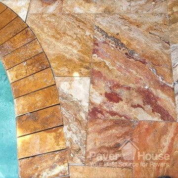
For the main pool deck area, our customer felt in love with the french pattern autumn blend tumbled travertine pavers. French Pattern Tumbled Autumn Blend Travertine Pavers contain a mixture of mostly red and gold, with some white, dark and light brown tones. Autumn Blend added the perfect amount of color and movement our customer wanted.
Travertine pavers offer a few unique color mixtures that make any outdoor space pops up from others.
A great accent color solution for the coping was the Desert Gold color on the 4×9 tumbled travertine copings. The beautifully blended Desert Gold may be bright and striking but does not lack for warmth and richness as well. To not compete with the strong colors of the pool deck, we advised our customer to add a lighter and more neutral pool tile: 2×2 autumn blend tumbled travertine tiles brought the perfect combination of contrast and harmony we were looking to achieve.
CREATIVITY ON YOUR POOL REMODEL WITH TRAVERTINE PAVER.
Pool remodel with travertine paver does not need to represent neutral colors only. Different than what most people believe, travertine pavers offer a few unique color mixtures that make any outdoor space pop up from others. Don’t be afraid of mixing different patterns, colors and textures to add more character to your outdoor space. Remember that, travertine pavers will display better their color when sealed, like the pictures from this pool remodel. If you are not sure if you would like your paver with the enhanced color, spray the sample with water first.
PREMIUM TRAVERTINE FRENCH PATTERN PAVERS
Pool remodel with travertine paver
POOL REMODEL WITH TRAVERTINE PAVERS
This Tampa Bay homeowner was looking into complete change his backyard. Most pools in Tampa are built with a connected spa. To increase his pool size, he ended up deciding for not to build spa, however, he still wanted an appealing focal point to his pool. To contrast with the beautiful green landscape around the backyard, our customer wanted to add color and movement to his outdoor area.
For the main pool deck area, our customer felt in love with the french pattern autumn blend tumbled travertine pavers. French Pattern Tumbled Autumn Blend Travertine Pavers contain a mixture of mostly red and gold, with some white, dark and light brown tones. Autumn Blend added the perfect amount of color and movement our customer wanted.
pool remodel with travertine paverpool remodel with travertine paverpool remodel with travertine paverpool remodel with travertine paverpool remodel with travertine paver
Previous
Next
Travertine pavers offer a few unique color mixtures that make any outdoor space pops up from others.
A great accent color solution for the coping was the Desert Gold color on the 4×9 tumbled travertine copings. The beautifully blended Desert Gold may be bright and striking but does not lack for warmth and richness as well. To not compete with the strong colors of the pool deck, we advised our customer to add a lighter and more neutral pool tile: 2×2 autumn blend tumbled travertine tiles brought the perfect combination of contrast and harmony we were looking to achieve.
CREATIVITY ON YOUR POOL REMODEL WITH TRAVERTINE PAVER.
Pool remodel with travertine paver does not need to represent neutral colors only. Different than what most people believe, travertine pavers offer a few unique color mixtures that make any outdoor space pop up from others. Don’t be afraid of mixing different patterns, colors and textures to add more character to your outdoor space. Remember that, travertine pavers will display better their color when sealed, like the pictures from this pool remodel. If you are not sure if you would like your paver with the enhanced color, spray the sample with water first.
PREMIUM TRAVERTINE FRENCH PATTERN PAVERS
On this pool remodel project, our customer preferred to use the French Pattern design, which is a good way to break up the monotony of the typical geometric or square appearance of large areas. Just like this outstanding pool deck remodel, patios and walkways will appear more fluid and mosaic by eliminating grout lines and the usual linear effect as well as the need for constant maintenance of the typical square or rectangular paver.
A French Pattern or a Versailles pattern is a paver pattern made up of four different sized tiles. Most French patterns are laid in stone, and nearly all are sold in “bundles” of tile that will cover 16 square feet.
Travertine pavers on your pool deck will reflect heat on hot days, remaining cool to the touch, unlike concrete surface options. Travertine does not discolor or become chalky after installation. The texture of travertine ensures that the stone remains slip resistant for wet feet, while its cool feel prevents burns. Another great advantage of travertine pavers is that there will be no visible grout lines; grout can be a source of both installation problems and added cost for future removal / replacement or up-keep.
 Living The Dream Interiors
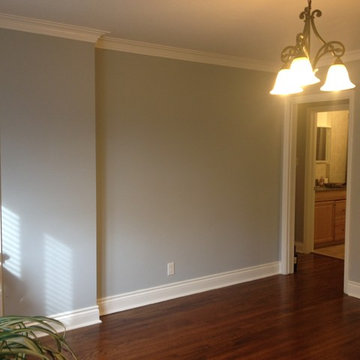
BEFORE - Clients living room lacked lighting, function and and style. All the furniture was removed and a fresh coat of paint from Benjamin Moore was added in this soft blue-grey hue. This particular wall is opposite the seating area and because the clients home lacked closet and storage space, we used this wall for shoe storage, coats, umbrellas and keys.
Find the right local pro for your project
 Drury Design
THE SETUP
Sam’s client had lived in her downtown townhome home for less than a year when she decided to remodel the spacious second level. This open area consisted of three sections: a TV and fireplace zone, a sparsely furnished dining area, and a dominant central kitchen. The kitchen featured a long back wall with three segmented sections and a massive island housing the cooktop. She found the kitchen’s functionality lacking and its presence overwhelming – it dominated the entire floor, regardless of where you stood.
Design objectives:
- Reconfigure key kitchen elements (sink, cooktop, oven) while minimizing the kitchen’s visual impact
- Optimize the kitchen’s back wall, eliminating existing dead space
- Create a purposeful, well-defined dining area
- Establish a distinct, comfortable living area
- Reuse existing appliances and flooring
- Maintain an overall modern design aesthetic
THE REMODEL
Design challenges to be solved:
- Redesign the island to reduce its overwhelming presence
- Create a comfortable, dedicated living room within the available space
- Establish a distinct, inviting dining area within spatial constraints
- Enhance kitchen functionality and style without dominating the entire floor
THE RENEWED SPACE
Design solutions:
- Sam created raised end caps for the island. This separated the kitchen from adjacent living and dining areas while focusing the kitchen’s functionality. The new sink location offers ample workspace, allowing the cook to interact with guests seated at the island. The redesigned island also provides additional storage.
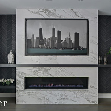
- For the living area, Sam opted for a functional-yet-minimalist approach. Large-format tile creates a natural stone look for the fireplace and TV wall. The recessed TV and extended fireplace shelf maintain a sleek profile. - Artistic wallpaper adds depth and texture, while the intentional lack of extensive shelving keeps the space open and distinct.
- Sam transformed the dining area’s blank wall into a feature, adding a unique dry bar with counter space, open shelves, cabinet storage and a beverage fridge. - - - Wallpaper behind and above the bar contributes to the area’s personality. A mirror adds depth while pendant lights add style and visual interest.
Relocating the cooktop to the back wall facilitates hidden ventilation, reducing visual clutter. Sam balanced transitional and modern elements for a contemporary yet comfortable feel. The digital control panel on the convection cooktop maintains a sleek look, while the wall oven is now at an easy-to-use height. ----- Mirrored base cabinet fronts and a paneled fridge prevent cabinetry monotony.
The redesign has delighted Sam’s client, achieving her main goal of creating a more inviting and visually appealing space. Each section now has its own visual personality and functionality while harmonizing within a monochromatic palette. The entire floor offers wow-factor pop upon first glance, with each area maintaining its distinct character while contributing to a cohesive, modern aesthetic.
 Amy Pearson Design
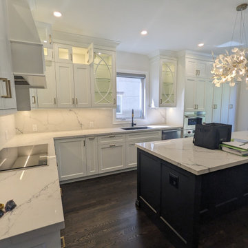
A classic Portland foursquare, lovingly owned by an active and lively family of four, had undergone some unfortunate previous renovations that were in desperate need of updating. A cramped kitchen layout, lacking countertop work space, non-functional appliance locations (the range was floating on it’s own!), cramped kitchen nook not large enough for eat-in space and therefor left underutilized, and a general lack of storage all needed to be addressed.
To increase functional space, we enclosed a small back porch and re-built the adjacent nook, folding in the square footage to create an expansive kitchen footprint. We relocated the back door and added a back deck while creating space for a mud bench for littles to tuck away their gear! The enlarged kitchen now boasts a extensive natural light thanks to the addition of several windows.
An easy work flow was created within the new kitchen layout featuring an in-island sink with range and hood flanked by matching windows. Custom cabinet accessories make storage a breeze and provide a space for all the necessities to be right at the homeowner’s fingertips. The eat-in kitchen space allows not only for lingering family chats, but homework and craft projects to be done while dinner simmers on the stove. This kitchen truly is the heart of this home!
All of the updates were completed with the home’s original foursquare architecture in mind. with a focus on classic architectural molding styles, traditional window details, and clean-lined classic fixtures. Youthfulness and modernity are infused into the space with the contemporary handmade tile backsplash, rich and timeless green cabinets, and artistic wallpaper with a whimsical floral print and subtle European nod. The custom range in cream and brass is a stunning showstopper and a testament that even the most functional of elements in a kitchen can still be beautiful! Which one is the star of the show? How do we pick just one?!
 Sosna Inc
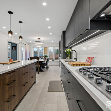
These delightful clients of Sosna, a family of middle-aged professionals, contacted us to renovate their Kitchen and Office Space in their home. The Kitchen was dated, and lacked sufficient storage, while the Office lacked adequate work space and storage.
Throughout the renovation process, ensuring top-quality workmanship and adhering to a strict deadline were paramount.
The Kitchen was transformed into a stunning, highly functional space ideal for hosting gatherings. The eyes are drawn to the unique lighting feature over the large island, and the gorgeous sliding door with black trim, providing natural light, and a perfect view into the backyard.
The Living Room was updated with functional shelving that kept everything in its place, and wires and cords tucked away.
In the office, we've maximized storage and functionality. Our design approach focused on timelessness, incorporating white and black cabinetry with touches of gold, creating an elegant and enduring style.
In the end, we completed the project on time and provided our clients with a functional space, that matched their personal style and met their needs.
If you’re ready to make your home feel like it’s been made just for you, contact us to get started! We’re the Renovator You Can Count On!
Sosna Inc
7250 Keele Street, Unit 372
Vaughan, ON L4K 1Z8
416-888-7366 (RENO)
Website: sosna.ca
Email: contact@sosna.ca
 Drury Design
THE SETUP
The original primary bathroom was characterized by a disjointed and segmented layout. The shower featured a bulky glass-block enclosure that overwhelmed the space visually. There was a considerable amount of open, unused space, and despite having a his and hers vanity, the arrangement lacked personal space for each user, as they shared the conjoined space between the sinks. The toilet was inconveniently located right by the door, with a half-wall partition meant to provide privacy but instead contributing to a cramped and unbalanced feel. Overall, the bathroom’s layout and design were fragmented, failing to make the most of the available space and lacking adequate storage solutions.
Design objectives:
- Reconfigure the layout to enhance functionality and flow.
- Create an elegant, upscale aesthetic that is light and bright.
- Incorporate specialized storage solutions for female hair care needs.
- Increase overall storage capacity.
- Develop a spa-like shower experience.
- Provide a significant wow factor to the space.
THE REMODEL
Design challenges to be solved:
- Repositioning the toilet to a more suitable location.
- Designing hair care storage solutions without cluttering the elegant space.
- Balancing an upscale, elegant design with a feminine touch in the color palette.
- Increasing the brightness of the room without adding windows.
- Completely replacing the existing shower to create a spa-like experience.
- Planning new storage solutions without adding bulkiness or clutter to the cabinetry.
THE RENEWED SPACE
Design solutions:
Toilet Relocation: Moved the toilet by the window, creating a better overall layout that also opened up two full walls for cabinetry and storage solutions.
Specialized Vanity Storage: The left side of the left vanity is the wife’s. Open shelves facing across the vanity can be used for decorative or daily needs items. Pull-out docking drawers with power outlets and metal basins handle hot hair appliances.
Bright and Elegant Color Scheme: White cabinets, countertops, floors, and shower walls keep the space bright. The just-off-white wall color with a hint of pink adds a feminine touch. Thin wainscoting with white trim offers traditional-leaning elegance.
Layered Lighting Strategy: Ceiling can lights, sconces, lighted mirrors, and toe-kick lighting were installed. Natural light-rated bulbs keep the space bright and natural-feeling.
Spa-Like Shower: An extra-large shower was created using the same floor tile materials for continuity. Equipped with a Kohler Anthem system with a shower head, hand-held, and four body sprays. His and Hers niches for separate body care product storage.
Enhanced Storage Solutions: Added a linen cabinet within the vanity area for efficient storage of towels and bathroom essentials.
This elegant bathroom feels incredibly spacious now. The color palette and lights keep the room bright and cheery. Gold fixtures, the herringbone pattern on the floor, and exquisite trim work add an elegant touch. With the husband and wife having their own vanity wall sections joined at the corner, each user truly has their own space within the space. The clients are very happy with the final result.
 Sosna Inc
Our clients approached us to renovate their home, as it was lacking function for their family’s changing needs. They were facing issues with insufficient storage, and underutilised areas.
The entry was cramped, which was especially noticeable when several people were coming in, or when carrying in groceries. The Shared Bathroom was too small, and lacked enough room for their teenage children to store their individual belongings. Additionally, since both clients work from home, a dedicated office space was essential.
On the Main Floor, we relocated the closet at the entry, making the entrance more spacious, and the Powder Room was given an update and new fixtures.
The wall between the Kitchen and Dining Room was removed, which opened up the Main Floor. Half of the space this created was used to create a much larger Kitchen with ample gathering space for our client’s large family. The new custom Kitchen boasts plenty of dark cabinetry with wood accents, and is complimented by a beautiful quartz countertop and matching black fixtures.
The other half of the newly created space was transformed into a quiet, functional home office. In the new office, a wall of built-in cabinetry offers useful storage for both work and hobby items, creating the perfect space for both work and crafting.
On the Second Floor, we expanded the Shared Bathroom by using space from the Guest Bedroom closet and the Second Floor Office. We replaced the bathtub shower combo with a spacious grand shower and added a large vanity and makeup area, giving each teenager their own dedicated personal storage space.
In the Master Ensuite, we altered the entryway location, allowing for a redesigned layout that includes a large vanity and double sink, enhancing both functionality and storage.
Our clients expressed their happiness with the renovation process with Sosna, specifically how clean the construction area was kept, and how respectful the Sosna team was of their home and neighbours. They were pleased that all deadlines were met, and the project was completed on time, and looked even better than they had dreamed.
Sosna Inc
416-888-7366 ext 1
email: contact@sosna.ca
website: sosna.ca
 Interiors by Natasha
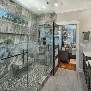
A poorly operating bathroom was creating a negative effect on how it was functioning for Tyrone and Veronica. This 120-square-foot bathroom in Atlanta, GA had problems which needed to be addressed. A leaking, moldy shower stall and a large unused jacuzzi tub were the impetus for this bathroom renovation. The lack of storage in the long narrow double vanity with oversized frameless mirror created yet another problem.
Our immediate attention focused on replacing the large double window above the jacuzzi tub with a long narrow 6-foot window. Because the jacuzzi tub was rarely used my clients wanted to remove it; instead, they wanted a 9-foot his and hers double shower. We decided to modify the vanity with a custom-built double vanity with an attached tall linen closet. The linen closet inside the bathroom was then turned it into a shoe closet. There is a lack of storage space in the owner’s suite closet, so we decided to convert the linen closet into a shoe closet.
 TVL Creative Ltd.
This project was such an incredible design opportunity, and instilled inspiration and excitement at every turn! Our amazing clients came to us with the challenge of converting their beloved family home into a welcoming haven for all members of the family. At the time that we met our clients, they were struggling with the difficult personal decision of the fate of the home. Their father/father-in-law had passed away and their mother/mother-in-law had recently been admitted into a nursing facility and was fighting Alzheimer’s. Resistant to loss of the home now that both parents were out of it, our clients purchased the home to keep in in the family. Despite their permanent home currently being in New Jersey, these clients dedicated themselves to keeping and revitalizing the house. We were moved by the story and became immediately passionate about bringing this dream to life.
The home was built by the parents of our clients and was only ever owned by them, making this a truly special space to the family. Our goal was to revitalize the home and to bring new energy into every room without losing the special characteristics that were original to the home when it was built. In this way, we were able to develop a house that maintains its own unique personality while offering a space of welcoming neutrality for all members of the family to enjoy over time.
The renovation touched every part of the home: the exterior, foyer, kitchen, living room, sun room, garage, six bedrooms, three bathrooms, the laundry room, and everything in between. The focus was to develop a style that carried consistently from space to space, but allowed for unique expression in the small details in every room.
Starting at the entry, we renovated the front door and entry point to offer more presence and to bring more of the mid-century vibe to the home’s exterior. We integrated a new modern front door, cedar shingle accents, new exterior paint, and gorgeous contemporary house numbers that really allow the home to stand out. Just inside the entry, we renovated the foyer to create a playful entry point worthy of attention. Cement look tile adorns the foyer floor, and we’ve added new lighting and upgraded the entry coat storage.
Upon entering the home, one will immediately be captivated by the stunning kitchen just off the entry. We transformed this space in just about every way. While the footprint of the home ultimately remained almost identical, the aesthetics were completely turned on their head. We re-worked the kitchen to maximize storage and to create an informal dining area that is great for casual hosting or morning coffee.
We removed the entry to the garage that was once in the informal dining, and created a peninsula in its place that offers a unique division between the kitchen/informal dining and the formal dining and living areas. The simple light warm light gray cabinetry offers a bit of traditional elegance, along with the marble backsplash and quartz countertops. We extended the original wood flooring into the kitchen and stained all floors to match for a warmth that truly resonates through all spaces. We upgraded appliances, added lighting everywhere, and finished the space with some gorgeous mid century furniture pieces.
In the formal dining and living room, we really focused on maintaining the original marble fireplace as a focal point. We cleaned the marble, repaired the mortar, and refinished the original fireplace screen to give a new sleek look in black. We then integrated a new gas insert for modern heating and painted the upper portion in a rich navy blue; an accent that is carried through the home consistently as a nod to our client’s love of the color.
The former entry into the old covered porch is now an elegant glass door leading to a stunning finished sunroom. This room was completely upgraded as well. We wrapped the entire space in cozy white shiplap to keep a casual feel with brightness. We tiled the floor with large format concrete look tile, and painted the old brick fireplace a bright white. We installed a new gas burning unit, and integrated transitional style lighting to bring warmth and elegance into the space. The new black-frame windows are adorned with decorative shades that feature hand-sketched bird prints, and we’ve created a dedicated garden-ware “nook” for our client who loves to work in the yard. The far end of this space is completed with two oversized chaise loungers and overhead lights…the most perfect little reading nook!
Just off the dining room, we created an entirely new space to the home: a mudroom. The clients lacked this space and desperately needed a landing spot upon entering the home from the garage. We uniquely planned existing space in the garage to utilize for this purpose, and were able to create a small but functional entry point without losing the ability to park cars in the garage. This new space features cement-look tile, gorgeous deep brown cabinetry, and plenty of storage for all the small items one might need to store while moving in and out of the home.
The remainder of the upstairs level includes massive renovations to the guest hall bathroom and guest bedroom, upstairs master bed/bath suite, and a third bedroom that we converted into a home office for the client.
Some of the largest transformations were made in the basement, where unfinished space and lack of light were converted into gloriously lit, cozy, finished spaces. Our first task was to convert the massive basement living room into the new master bedroom for our clients. We removed existing built-ins, created an entirely new walk-in closet, painted the old brick fireplace, installed a new gas unit, added carpet, introduced new lighting, replaced windows, and upgraded every part of the aesthetic appearance. One of the most incredible features of this space is the custom double sliding barn door made by a Denver artisan. This space is truly a retreat for our clients!
We also completely transformed the laundry room, back storage room, basement master bathroom, and two bedrooms.
This home’s massive scope and ever-evolving challenges were thrilling and exciting to work with, and the result is absolutely amazing. At the end of the day, this home offers a look and feel that the clients love. Above all, though, the clients feel the spirit of their family home and have a welcoming environment for all members of the family to enjoy for years to come.
 Sosna Inc
Our clients, a vibrant young family with two energetic kids and a playful dog, were feeling the constraints of their outdated, cramped house. The Main Floor was divided by walls, fragmenting the Kitchen, Dining Room, and living areas, making family time and entertaining a bit of a struggle.
The Kitchen was small and dim, lacking counter space and storage. The kids' study/play table was squeezed into a tight corner, emphasizing the lack of space. The dark hardwood floors were scratched and worn, and the foyer felt cramped and uninviting. The powder room was also
The idea of a major renovation brought both excitement and a bit of anxiety. The couple was unsure about design decisions and worried about the challenges of dealing with structural columns and beams.
Collaborating with Sosna designer Camila, the family embarked on a journey to transform their outdated house into a bright, functional home.
To open up the space, walls were removed, creating a seamless flow between the foyer, living room, dining room, and kitchen.
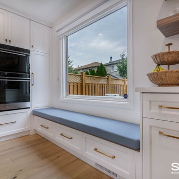
The kitchen was relocated and expanded to include generous counter space and a large island, providing the ideal spot for the kids to help prepare meals—a task they’ve come to enjoy since the renovation—or work on their homework. Additionally, the addition of a cozy window bench offers extra seating for hanging out with the family. It’s also the perfect place to curl up with a good book.
The once dark and gloomy powder room was completely refreshed with new fixtures, a white oak vanity, and beautiful floor tiles, which significantly brightened it up.
Additionally, the dark hardwood floors were replaced with a lighter, more modern option, brightening the entire main floor.
The renovation wasn't without its hiccups. A mix-up with the hardwood flooring led to a last-minute scramble for a replacement. But in the end, the family fell in love with the new flooring, proving that sometimes unexpected changes can lead to even better outcomes.
The renovation completely transformed the home. What was once a cramped and segmented main floor is now a bright, open space perfectly suited to the family's lifestyle. The new kitchen island became the heart of the home, providing a place for the kids to do homework while their parents cooked, fostering a sense of togetherness. The open layout also made hosting gatherings effortless.
Throughout the renovation, the kids and their dog brought a playful energy to the construction site, forming a special bond with the crew. Despite the challenges of living through a renovation, the family managed to maintain a sense of normalcy, working from home when possible and appreciating the crew's efforts to keep things tidy.
What started as a simple update turned into a full-scale transformation that reflects the family’s needs and personal style. Their willingness to embrace bold design choices, such as blush pink tiles and bright floral patterns, adds a unique touch to the space. And that hardwood flooring mix-up? It turned out to be a happy accident, resulting in a floor they love even more.
In the end, this renovation was more than just a home makeover; it was about creating a space that truly feels like home, nurturing family connections, and bringing joy to everyday life.
 Powell Construction
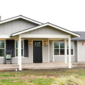
These homeowners came to us wanting to upgrade the curb appeal of their home and improve the layout of the interior. They hoped for an entry that would welcome guests to their home both inside and out, while also creating more defined and purposeful space within the home. The main goals of the project were to add a covered wrap around porch, add more windows for natural light, create a formal entry that housed the client’s baby grand piano, and add a home office for the clients to work from home.
With a dated exterior and facade that lacked dimension, there was little charm to be had. The front door was hidden from visitors and a lack of windows made the exterior unoriginal. We approached the exterior design pulling inspiration from the farmhouse style, southern porches, and craftsman style homes. Eventually we landed on a design that added numerous windows to the front façade, reminiscent of a farmhouse, and turned a Dutch hipped roof into an extended gable roof, creating a large front porch and adding curb appeal interest. By relocating the entry door to the front of the house and adding a gable accent over this new door, it created a focal point for guests and passersby. In addition to those design elements, we incorporated some exterior shutters rated for our northwest climate that echoed the southern style homes our client loved. A greige paint color (Benjamin Moore Cape May Cobblestone) accented with a white trim (Benjamin Moore Swiss Coffee) and a black front door, shutters, and window box (Sherwin Williams Black Magic) all work together to create a charming and welcoming façade.
On the interior we removed a half wall and coat closet that separated the original cramped entryway from the front room. The front room was a multipurpose space that didn’t have a designated use for the family, it became a catch-all space that was easily cluttered. Through the design process we came up with a plan to split the spaces into 2 rooms, a large open semi-formal entryway and a home office. The semi-formal entryway was intentionally designed to house the homeowner’s baby grand piano – a real showstopper. The flow created by this entryway is welcoming and ushers you into a beautifully curated home.
A new office now sits right off the entryway with beautiful French doors, built-in cabinetry, and an abundance of natural light – everything that one dreams of for their home office. The home office looks out to the front porch and front yard as well as the pastural side yard where the children frequently play. The office is an ideal location for a moment of inspiration, reflection, and focus. A warm white paint (Benjamin Moore Swiss Coffee) combined with the newly installed light oak luxury vinyl plank flooring runs throughout the home, creating continuity and a neutral canvas. Traditional and schoolhouse style statement light fixtures coordinate with the black door hardware for an added level of contrast.
There is one more improvement that made a big difference to this family. In the family room, we added a built-in window seat. This created a cozy nook that is used by all for reading and extra seating. This relatively small improvement had a big impact on how the family uses and enjoys the space.
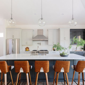
 Bianca Fathauer
We were more than thrilled when our Wisper Bay clients came to us looking to continue the remodel process in the downstairs area of their Palm City home. We had just finished their upstairs master bathroom and were officially in love with the design as well as our working relationship with this lovely couple. To have them trust us to now take on an even larger project, double the size of the first, was such a huge nod of confidence and we could not have been happier to oblige.
The downstairs had great space but lacked the personality and warmth the clients wanted. It felt dark, lacking natural light and did not reflect their taste or match the look of what we had just completed upstairs. The goal was to continue the flow that was created upstairs and making the entire home feel uniform and continuous.
We added a 12’ set of French doors, new waterproof vinyl flooring, removed the many walls enclosing the existing kitchen, and reconfigured the space to make more sense. We went with a two tone look featuring all new Dura Supreme cabinets, replaced all the appliances to include a Fulgor Milano gas range making the kitchen a true chefs dream. We also added a huge island with quartz countertops, making entertaining and cleaning a breeze.
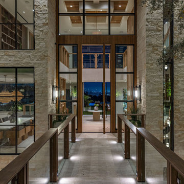
 Whipple Russell Architects
Beverly Crest modern Beverly Hills mansion luxury front entrance with modern architecture elegant glass wall interior & views
Design ideas for a large contemporary courtyard landscaping in Los Angeles.
Design ideas for a large contemporary courtyard landscaping in Los Angeles.
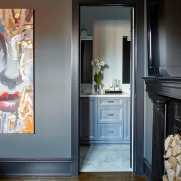
 Anthony Michael Interior Design, Ltd.
Single, upwardly mobile attorney who recently became partner at his firm at a very young age. This is his first “big boy house” and after years of living college and dorm mismatched items, the client decided to work with our firm. The space was awkward occupying a top floor of a four story walk up. The floorplan was very efficient; however it lacked any sense of “wow” There was no real foyer or entry. It was very awkward as it relates to the number of stairs. The solution: a very crisp black and while color scheme with accents of masculine blues. Since the foyer lacked architecture, we brought in a very bold and statement mural which resembles an ocean wave, creating movement. The sophisticated palette continues into the master bedroom where it is done in deep shades of warm gray. With a sense of cozy yet dramatic.
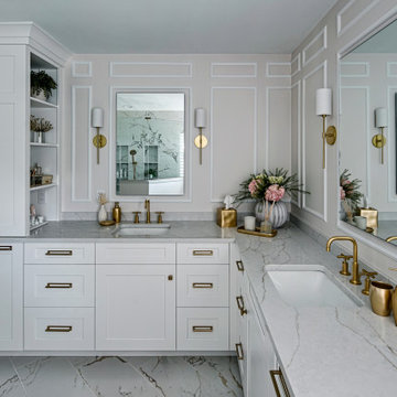 Drury Design
THE SETUP
The original primary bathroom was characterized by a disjointed and segmented layout. The shower featured a bulky glass-block enclosure that overwhelmed the space visually. There was a considerable amount of open, unused space, and despite having a his and hers vanity, the arrangement lacked personal space for each user, as they shared the conjoined space between the sinks. The toilet was inconveniently located right by the door, with a half-wall partition meant to provide privacy but instead contributing to a cramped and unbalanced feel. Overall, the bathroom’s layout and design were fragmented, failing to make the most of the available space and lacking adequate storage solutions.
Design objectives:
- Reconfigure the layout to enhance functionality and flow.
- Create an elegant, upscale aesthetic that is light and bright.
- Incorporate specialized storage solutions for female hair care needs.
- Increase overall storage capacity.
- Develop a spa-like shower experience.
- Provide a significant wow factor to the space.
THE REMODEL
Design challenges to be solved:
- Repositioning the toilet to a more suitable location.
- Designing hair care storage solutions without cluttering the elegant space.
- Balancing an upscale, elegant design with a feminine touch in the color palette.
- Increasing the brightness of the room without adding windows.
- Completely replacing the existing shower to create a spa-like experience.
- Planning new storage solutions without adding bulkiness or clutter to the cabinetry.
THE RENEWED SPACE
Design solutions:
Toilet Relocation: Moved the toilet by the window, creating a better overall layout that also opened up two full walls for cabinetry and storage solutions.
Specialized Vanity Storage: The left side of the left vanity is the wife’s. Open shelves facing across the vanity can be used for decorative or daily needs items. Pull-out docking drawers with power outlets and metal basins handle hot hair appliances.
Bright and Elegant Color Scheme: White cabinets, countertops, floors, and shower walls keep the space bright. The just-off-white wall color with a hint of pink adds a feminine touch. Thin wainscoting with white trim offers traditional-leaning elegance.
Layered Lighting Strategy: Ceiling can lights, sconces, lighted mirrors, and toe-kick lighting were installed. Natural light-rated bulbs keep the space bright and natural-feeling.
Spa-Like Shower: An extra-large shower was created using the same floor tile materials for continuity. Equipped with a Kohler Anthem system with a shower head, hand-held, and four body sprays. His and Hers niches for separate body care product storage.
Enhanced Storage Solutions: Added a linen cabinet within the vanity area for efficient storage of towels and bathroom essentials.
This elegant bathroom feels incredibly spacious now. The color palette and lights keep the room bright and cheery. Gold fixtures, the herringbone pattern on the floor, and exquisite trim work add an elegant touch. With the husband and wife having their own vanity wall sections joined at the corner, each user truly has their own space within the space. The clients are very happy with the final result.
 Porcea Stone Inc.
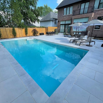
Porcea Indus is a close alternative to Venetian Gray, Cascade Limestone, Thermal Bluestone, Indus Valley, and Indus Gray Limestones. All of these natural stone products have unique challenges including staining from rust (Venetian Gray), lack of availability (Cascade), and a general lack of charm (Thermal Bluestone).
Porcea Indus solves all of these problems and packs a real punch. A sandblasted texture with a subtle off-grey colour tone that is stain-resistant and maintenance-free. The fleuri and shells found on this premium outdoor porcelain paver are both charming and subtle, allowing for an extremely premium and modern design profile. Perfect for modern or high-end projects.
Like all of Porcea Stone’s Elite Collection of outdoor porcelain tiles, this paver is Designed for North America.
 TVL Creative Ltd.
This project was such an incredible design opportunity, and instilled inspiration and excitement at every turn! Our amazing clients came to us with the challenge of converting their beloved family home into a welcoming haven for all members of the family. At the time that we met our clients, they were struggling with the difficult personal decision of the fate of the home. Their father/father-in-law had passed away and their mother/mother-in-law had recently been admitted into a nursing facility and was fighting Alzheimer’s. Resistant to loss of the home now that both parents were out of it, our clients purchased the home to keep in in the family. Despite their permanent home currently being in New Jersey, these clients dedicated themselves to keeping and revitalizing the house. We were moved by the story and became immediately passionate about bringing this dream to life.
The home was built by the parents of our clients and was only ever owned by them, making this a truly special space to the family. Our goal was to revitalize the home and to bring new energy into every room without losing the special characteristics that were original to the home when it was built. In this way, we were able to develop a house that maintains its own unique personality while offering a space of welcoming neutrality for all members of the family to enjoy over time.
The renovation touched every part of the home: the exterior, foyer, kitchen, living room, sun room, garage, six bedrooms, three bathrooms, the laundry room, and everything in between. The focus was to develop a style that carried consistently from space to space, but allowed for unique expression in the small details in every room.
Starting at the entry, we renovated the front door and entry point to offer more presence and to bring more of the mid-century vibe to the home’s exterior. We integrated a new modern front door, cedar shingle accents, new exterior paint, and gorgeous contemporary house numbers that really allow the home to stand out. Just inside the entry, we renovated the foyer to create a playful entry point worthy of attention. Cement look tile adorns the foyer floor, and we’ve added new lighting and upgraded the entry coat storage.
Upon entering the home, one will immediately be captivated by the stunning kitchen just off the entry. We transformed this space in just about every way. While the footprint of the home ultimately remained almost identical, the aesthetics were completely turned on their head. We re-worked the kitchen to maximize storage and to create an informal dining area that is great for casual hosting or morning coffee.
We removed the entry to the garage that was once in the informal dining, and created a peninsula in its place that offers a unique division between the kitchen/informal dining and the formal dining and living areas. The simple light warm light gray cabinetry offers a bit of traditional elegance, along with the marble backsplash and quartz countertops. We extended the original wood flooring into the kitchen and stained all floors to match for a warmth that truly resonates through all spaces. We upgraded appliances, added lighting everywhere, and finished the space with some gorgeous mid century furniture pieces.
In the formal dining and living room, we really focused on maintaining the original marble fireplace as a focal point. We cleaned the marble, repaired the mortar, and refinished the original fireplace screen to give a new sleek look in black. We then integrated a new gas insert for modern heating and painted the upper portion in a rich navy blue; an accent that is carried through the home consistently as a nod to our client’s love of the color.
The former entry into the old covered porch is now an elegant glass door leading to a stunning finished sunroom. This room was completely upgraded as well. We wrapped the entire space in cozy white shiplap to keep a casual feel with brightness. We tiled the floor with large format concrete look tile, and painted the old brick fireplace a bright white. We installed a new gas burning unit, and integrated transitional style lighting to bring warmth and elegance into the space. The new black-frame windows are adorned with decorative shades that feature hand-sketched bird prints, and we’ve created a dedicated garden-ware “nook” for our client who loves to work in the yard. The far end of this space is completed with two oversized chaise loungers and overhead lights…the most perfect little reading nook!
Just off the dining room, we created an entirely new space to the home: a mudroom. The clients lacked this space and desperately needed a landing spot upon entering the home from the garage. We uniquely planned existing space in the garage to utilize for this purpose, and were able to create a small but functional entry point without losing the ability to park cars in the garage. This new space features cement-look tile, gorgeous deep brown cabinetry, and plenty of storage for all the small items one might need to store while moving in and out of the home.
The remainder of the upstairs level includes massive renovations to the guest hall bathroom and guest bedroom, upstairs master bed/bath suite, and a third bedroom that we converted into a home office for the client.
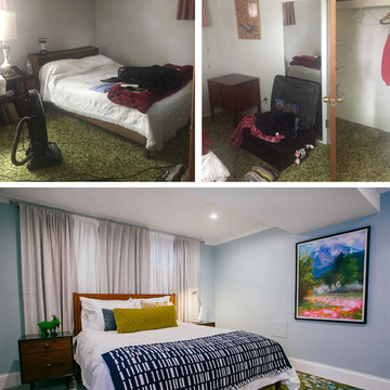
Some of the largest transformations were made in the basement, where unfinished space and lack of light were converted into gloriously lit, cozy, finished spaces. Our first task was to convert the massive basement living room into the new master bedroom for our clients. We removed existing built-ins, created an entirely new walk-in closet, painted the old brick fireplace, installed a new gas unit, added carpet, introduced new lighting, replaced windows, and upgraded every part of the aesthetic appearance. One of the most incredible features of this space is the custom double sliding barn door made by a Denver artisan. This space is truly a retreat for our clients!
We also completely transformed the laundry room, back storage room, basement master bathroom, and two bedrooms.
This home’s massive scope and ever-evolving challenges were thrilling and exciting to work with, and the result is absolutely amazing. At the end of the day, this home offers a look and feel that the clients love. Above all, though, the clients feel the spirit of their family home and have a welcoming environment for all members of the family to enjoy for years to come.
 Marwood Design
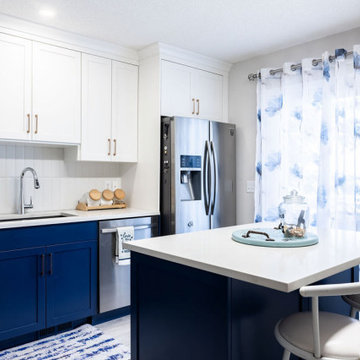
In this project Marwood Designs transformed a tired dark 1990's kitchen lacking storage space, area for dining and poor lighting into a modern galley. The owner moved into this older town house requiring a kitchen to be modern in design with added extra storage within a small space. We redesigned the cabinetry taking full advantage of the space up to the ceiling plus improving space efficiency. Marwood Designs added an island to solve the lack of extra counter space for those big holiday baking days. In addition, the island allowed for romantic intimate dinners without a large production in the dining room. The end result is a kitchen that allows the natural light to illuminate the space with a beautiful blue bottom cabinetry to offset the white. The transformation speaks of a southern sun room kitchen!
 Progressive Design Build
Challenge
As part-time residents of this Bonita Springs home, our clients were looking to update their outdoor entertainment area. They also planned to be away for the summer during the remodel and needed their renovation project to be finished prior to their return for the winter.
Their needs included:
Changing the color pallet to a monochromatic scheme, removing the yellow brick pavers, adding an outdoor kitchen area, adding an outdoor fireplace, resurfacing the pool and updating the tile, installing a new screen enclosure, and creating privacy from the neighbors, particularly the main sitting areas, pool and outdoor kitchen.
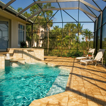
Although there was already a 1,221 sq. ft. lanai under the roof, it lacked functionality needed by the homeowners. Most of its amenities were located at one end of the lanai, and lacked privacy that the homeowners valued.
Solution
The final project design required two additions to the lanai area adding an accumulative 265 sq. ft. to the existing space expanding their sitting area and accommodating a much-needed outdoor kitchen. The new additions also needed to blend with the home’s existing style.
Addition #1—Sitting Area:
The first addition added approximately 145 sq. ft. to the end of the lanai. This allowed Progressive Design Build to tie into the existing gable room for the new space and create privacy from the neighbors.
Addition #2—Outdoor Kitchen:
The second addition was a bump out that added approximately 120 sq. ft. to the end of the house close to the interior kitchen. This allowed the client to add an outdoor over and 52” Viking grill (with a side burner) to their outdoor living space. Other amenities included a new sink and under counter fridge, granite countertops, tumbled stone stile and Cypress cabinetry, custom-fabricated with marine grade plywood boxes and marine grade finishes to withstand moisture, common in the Bonita Bay community.
Special attention was given to the preparation area on either side of the stove, the landing area next to the oven and the serving counter behind the bar. Bar seating was added to the outdoor kitchen, allowing guests to visit with the cook comfortably and easily.
Brick Pavers
During the design phase, we discovered that the original brick pavers were set in sand, with no concrete pad below. Consequently, the retaining wall and several pavers were starting to fail, caused by the shifting sands. To remedy the problem, we installed a new concrete deck and laid new nonslip pavers on top of the deck—ideal for wet area applications.
Pool Renovations
To dramatically improve the enjoyment and ambiance of their pool, Progressive Design Build completely re-plumbed it, putting in additional lighting and new water features. New decorative pool tile, coping, and a paver deck were also installed around the pool. The pool finish chosen by our clients was a nice tropical blue color.
Screen Enclosure
A new screen enclosure was installed in compliance with new local building codes, making it more stable and solid than the existing one. The color change from white to bronze coordinated well with the homeowners’ new color scheme; and the location of the service door and stairs provided convenient access to the new pool equipment.
Results
This project was completed on time and within budget before these homeowners returned for their winter holiday. They were thrilled with the weekly communication, which included two-way phone calls and email photo sharing. They always knew where their project was in the construction process and what was happening at all times—providing security and peace of mind.
64