
Search results for "Landed property layout" in Home Design Ideas
 ZeroEnergy Design
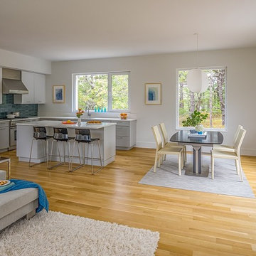
This modern green home offers both a vacation destination on Cape Cod near local family members and an opportunity for rental income.
FAMILY ROOTS. A West Coast couple living in the San Francisco Bay Area sought a permanent East Coast vacation home near family members living on Cape Cod. As academic professionals focused on sustainability, they sought a green, energy efficient home that was well-aligned with their values. With no green homes available for sale on Cape Cod, they decided to purchase land near their family and build their own.
SLOPED SITE. Comprised of a 3/4 acre lot nestled in the pines, the steeply sloping terrain called for a plan that embraced and took advantage of the slope. Of equal priority was optimizing solar exposure, preserving privacy from abutters, and creating outdoor living space. The design accomplished these goals with a simple, rectilinear form, offering living space on the both entry and lower/basement levels. The stepped foundation allows for a walk-out basement level with light-filled living space on the down-hill side of the home. The traditional basement on the eastern, up-hill side houses mechanical equipment and a home gym. The house welcomes natural light throughout, captures views of the forest, and delivers entertainment space that connects indoor living space to outdoor deck and dining patio.
MODERN VISION. The clean building form and uncomplicated finishes pay homage to the modern architectural legacy on the outer Cape. Durable and economical fiber cement panels, fixed with aluminum channels, clad the primary form. Cedar clapboards provide a visual accent at the south-facing living room, which extends a single roof plane to cover the entry porch.
SMART USE OF SPACE. On the entry level, the “L”-shaped living, dining, and kitchen space connects to the exterior living, dining, and grilling spaces to effectively double the home’s summertime entertainment area. Placed at the western end of the entry level (where it can retain privacy but still claim expansive downhill views) is the master suite with a built-in study. The lower level has two guest bedrooms, a second full bathroom, and laundry. The flexibility of the space—crucial in a house with a modest footprint—emerges in one of the guest bedrooms, which doubles as home office by opening the barn-style double doors to connect it to the bright, airy open stair leading up to the entry level. Thoughtful design, generous ceiling heights and large windows transform the modest 1,100 sf* footprint into a well-lit, spacious home. *(total finished space is 1800 sf)
RENTAL INCOME. The property works for its owners by netting rental income when the owners are home in San Francisco. The house especially caters to vacationers bound for nearby Mayo Beach and includes an outdoor shower adjacent to the lower level entry door. In contrast to the bare bones cottages that are typically available on the Cape, this home offers prospective tenants a modern aesthetic, paired with luxurious and green features. Durable finishes inside and out will ensure longevity with the heavier use that comes with a rental property.
COMFORT YEAR-ROUND. The home is super-insulated and air-tight, with mechanical ventilation to provide continuous fresh air from the outside. High performance triple-paned windows complement the building enclosure and maximize passive solar gain while ensuring a warm, draft-free winter, even when sitting close to the glass. A properly sized air source heat pump offers efficient heating & cooling, and includes a carefully designed the duct distribution system to provide even comfort throughout the house. The super-insulated envelope allows us to significantly reduce the equipment capacity, duct size, and airflow quantities, while maintaining unparalleled thermal comfort.
ENERGY EFFICIENT. The building’s shell and mechanical systems play instrumental roles in the home’s exceptional performance. The building enclosure reduces the most significant energy glutton: heating. Continuous super-insulation, thorough air sealing, triple-pane windows, and passive solar gain work together to yield a miniscule heating load. All active energy consumers are extremely efficient: an air source heat pump for heating and cooling, a heat pump hot water heater, LED lighting, energy recovery ventilation (ERV), and high efficiency appliances. The result is a home that uses 70% less energy than a similar new home built to code requirements.
OVERALL. The home embodies the owners’ goals and values while comprehensively enabling thermal comfort, energy efficiency, a vacation respite, and supplementary income.
PROJECT TEAM
ZeroEnergy Design - Architect & Mechanical Designer
A.F. Hultin & Co. - Contractor
Pamet Valley Landscape Design - Landscape & Masonry
Lisa Finch - Original Artwork
European Architectural Supply - Windows
Eric Roth Photography - Photography
 GS Property Management & Home Improvements, LLC
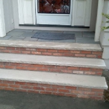
(Masonry Services) Installation of brick and limestone steps to front or rear entries... Installation of hand railings are available after masonry services...
 TKS Design Group
Download our free ebook, Creating the Ideal Kitchen. DOWNLOAD NOW
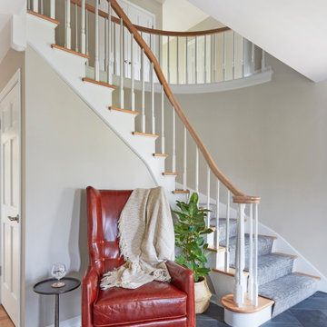
Lakefront property in the northwest suburbs of Chicago is hard to come by, so when we were hired by this young family with exactly that, we were immediately inspired by not just the unusually large footprint of this 1950’s colonial revival but also the lovely views of the manmade lake it was sited on. The large 5-bedroom home was solidly stuck in the 1980’s, but we saw tons of potential. We started out by updating the existing staircase with a fresh coat of paint and adding new herringbone slate to the entry hall.
The powder room off the entryway also got a refresh - new flooring, new cabinets and fixtures. We ran the new slate right through into this space for some consistency. A fun wallpaper and shiplap trim add a welcoming feel and set the tone for the home.
Next, we tackled the kitchen. Located away from the rest of the first floor, the kitchen felt a little isolated, so we immediately began planning for how to better connect it to the rest of the first floor. We landed on removing the wall between the kitchen and dining room and designed a modified galley style space with separate cooking and clean up zones. The cooking zone consists of the refrigerator, prep sink and cooktop, along with a nice long run of prep space at the island. The cleanup side of the kitchen consists of the main sink and dishwasher. Both areas are situated so that the user can view the lake during prep work and cleanup!
One of the home’s main puzzles was how to incorporate the mudroom and area in front of the patio doors at the back of the house. We already had a breakfast table area, so the space by the patio doors was a bit of a no man’s land. We decided to separate the kitchen proper from what became the new mudroom with a large set of barn doors. That way you can quickly hide any mudroom messes but have easy access to the light coming in through the patio doors as well as the outdoor grilling station. We also love the impact the barn doors add to the overall space.
The homeowners’ first words to us were “it’s time to ditch the brown,” so we did! We chose a lovely blue pallet that reflects the home’s location on the lake which is also vibrant yet easy on the eye. Countertops are white quartz, and the natural oak floor works well with the other honey accents. The breakfast table was given a refresh with new chairs, chandelier and window treatments that frame the gorgeous views of the lake out the back.
We coordinated the slate mudroom flooring with that used in the home’s main entrance for a consistent feel. The storage area consists of open and closed storage to allow for some clutter control as needed.
Next on our “to do” list was revamping the dated brown bar area in the neighboring dining room. We eliminated the clutter by adding some closed cabinets and did some easy updates to help the space feel more current. One snag we ran into here was the discovery of a beam above the existing open shelving that had to be modified with a smaller structural beam to allow for our new design to work. This was an unexpected surprise, but in the end we think it was well worth it!
We kept the colors here a bit more muted to blend with the homeowner’s existing furnishings. Open shelving and polished nickel hardware add some simple detail to the new entertainment zone which also looks out onto the lake!
Next we tackled the upstairs starting with the homeowner’s son’s bath. The bath originally had both a tub shower and a separate shower, so we decided to swap out the shower for a new laundry area. This freed up some space downstairs in what used to be the mudroom/laundry room and is much more convenient for daily laundry needs.
We continued the blue palette here with navy cabinetry and the navy tile in the shower. Porcelain floor tile and chrome fixtures keep maintenance to a minimum while matte black mirrors and lighting add some depth the design. A low maintenance runner adds some warmth underfoot and ties the whole space together.
We added a pocket door to the bathroom to minimize interference with the door swings. The left door of the laundry closet is on a 180 degree hinge to allow for easy full access to the machines. Next we tackled the master bath which is an en suite arrangement. The original was typical of the 1980’s with the vanity outside of the bathroom, situated near the master closet. And the brown theme continued here with multiple shades of brown.
Our first move was to segment off the bath and the closet from the master bedroom. We created a short hall from the bedroom to the bathroom with his and hers walk-in closets on the left and right as well as a separate toilet closet outside of the main bathroom for privacy and flexibility.
The original bathroom had a giant soaking tub with steps (dangerous!) as well as a small shower that did not work well for our homeowner who is 6’3”. With other bathtubs in the home, they decided to eliminate the tub and create an oversized shower which takes up the space where the old tub was located. The double vanity is on the opposite wall and a bench is located under the window for morning conversations and a place to set a couple of towels.
The pallet in here is light and airy with a mix of blond wood, creamy porcelain and marble tile, and brass accents. A simple roman shade adds some texture and it’s top-down mechanism allows for light and privacy.
This large whole house remodel gave our homeowners not only the ability to maximize the potential of their home but also created a lovely new frame from which to view their fabulous lake views.
Designed by: Susan Klimala, CKD, CBD
Photography by: Michael Kaskel
For more information on kitchen and bath design ideas go to: www.kitchenstudio-ge.com
Find the right local pro for your project
 Vitruvius Built
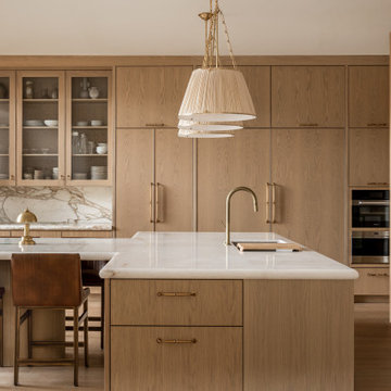
For a family putting down lasting roots in Park City, this 10,000-square-foot estate within the gated enclave of Quarry Mountain Ranch is conceived as both sanctuary and legacy. Designed to evolve alongside its owners, the home balances permanence with a deep sensitivity to the land it inhabits.
Thoughtfully positioned within an alpine meadow shaped by the gentle flow of McLeod Creek, the residence embraces its setting. The waterway threads through the property, sustaining native grasses and drawing elk, deer, and migratory birdlife, grounding daily life in the rhythms of season and landscape.
Broad planes of glass and sheltering rooflines frame uninterrupted views of ski slopes and distant ridgelines, while long sightlines pull natural light deep into the interior. Terraces and covered outdoor rooms mediate between house and meadow, creating spaces for gathering, reflection, and year-round connection to the outdoors.
A restrained palette of wood and stone echoes the textures of the terrain, lending warmth and durability to the home’s contemporary expression. A separate guest house extends the architectural language, forming a discreet compound that supports family life, hospitality, and the enduring cadence of alpine living.
Architecture: Advanced Design
Interior Design: Erin Brewer Design
 Amy Troute Inspired Interior Design
This designer’s ideal is homeowners with a clear vision, set priorities, and values that align seamlessly with ours. These clients, an accomplished artist and the owner of a generational hops growing farm, were collaborative and trusting from the start. They conscientiously selected a team of Architect (Green Hammer), General Contractor (Cellar Ridge) and ATIID for furnishings and finishing touches. Each firm was able to meticulously manage their leg of the project, while collaborating wholistically with each other and the homeowners.
The family farmhouse, lovingly named “Westwood,” was showing the wear one expects after serving a growing family for decades. The owner’s dream was to revive, open up, and breathe modern life into each space, while respecting the home’s heritage.
One of our first collaborations was the light fixture that would grace the main two-story entry hall. HiiH Lights in Astoria, Oregon, was commissioned to bring “the function of light, the craft of paper, and the art of sculpture” to the home. Visiting the maker’s space – a massive barn on his coastal property – was such an inspiring adventure! Original work by the resident artist sets an ethereal tone in the space, and an antique bench handsomely blends the old with the new.
A wall that divided the home’s living room and kitchen was removed, and the breezy and bright gathering room was born. Light walls, warm wood tones, cozy upholstery, clean lines and heritage elements create a welcoming atmosphere and invite lounging and conversation. The sun-drenched nook is the home’s main indoor dining area, with an extension table and sculpted chairs that are just right for family gatherings or morning rituals with the Sunday paper. The kitchen is a chef’s dream with every modern amenity, but its casual attitude is “let’s make a mess and eat!”
The owner’s artwork graces the mantel over the new fireplace that was carved from a tree felled on the property, illustrating the thoughtful consideration of each element. The muted wool area rugs in the entryways and great room are hard-wearing for farm life, and the furniture’s classic lines, bold contrasting colors, deep seating and soft textures encourage cozy conversations or large group gatherings.
The library is undoubtedly our favorite space in this home. Tucked in “speakeasy style” behind a hidden (wallpapered!) door in the moody wet bar, and drenched in deep green, the room offers a quiet retreat that hugs you in an embrace of books and family photos. The cozy settee nestled between the bookcases sits opposite a custom pair of modern cognac leather wing chairs. The area rug continues the storied look without the antique price tag with a piece from Loloi’s “Heritage Collection.”
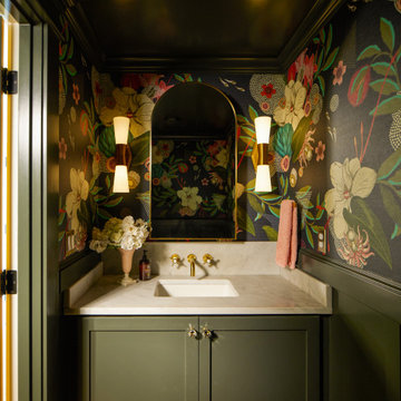
A little va-va-voom was requested for the powder bath and boy did we deliver! Custom wallpaper plays over original wainscotting and ceilings wrapped in more glorious green. The space evokes joy every time you open the door!
A primary suite that would “transport us to another world” and be “classic yet modern, peaceful, collected and uncluttered” was a tall order. Our new furniture layout takes full advantage of the view of wine country hills and the Willamette River, welcomes fireside lounging, and serves as a calm respite for the lovely owners.
Westwood Farmhouse truly was inspired by family, genuine love for home and graciousness for all who enter. Finishing the job was emotional for all involved because we were truly made to feel like part of the family.
Photography by George Barberis
 Jordan Design Build Group
When our clients purchased their Fairfax Station home at the beginning of the pandemic, the main living areas had already been updated. However, three bathrooms were still stuck in the1980s. We tackled the upstairs primary and hall bathrooms first to ensure our clients had a working bathroom while construction was underway. Once the upstairs renovations were completed, we moved on to the main level guest bathroom.
Primary Bathroom Transformation:
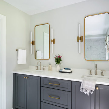
The old primary bathroom had a small dark shower stall, a basic alcove tub, and the original 40-year-old plumbing, vanities, and tile. We completely gutted the space and made some minor layout changes to maximize functionality and create a serene retreat complete with free-standing soaking tub and generous walk-in shower. Expanding the shower’s footprint and replacing the full-height walls with a glass surround opened up the space, making the entire bathroom feel larger and more airy. Marble shelves and a shaving ledge add convenience and style. A large double vanity provides ample storage and a full 7 feet of countertop space. Mixed metal finishes elevate the design, with soft gold accents and brushed nickel fixtures pairing perfectly with the classic gray vanity and muted marble tiles. We reconfigured the dressing area, added custom closet built-ins, and installed new carpet throughout to complete this tailored transformation.
Hall Bathroom Update:
The hall bathroom did not require any significant layout changes, but the dated fixtures and finishes all had to go. We wanted the new bathroom to feel both classic and fresh, so we opted for a polished finish palette, including sleek white subway tiles on the walls and marble-look hexagonal on the floor. A furniture-style vanity, in dark navy, was paired with a distinctive Carrara marble top and sleek chrome fixtures for a modern twist. The tub+shower combo features both a standard shower head and multi-function handheld for optimum flexibility – great for bathing children and pets alike. This renovation blended classic details with modern functionality, creating a bathroom that’s both timeless and fresh.
Guest Bathroom Update:
The home’s main level bathroom serves as both powder room and guest bathroom with 2 separate entrances. The in-swing door from the guest bedroom made the already narrow bathroom feel even more cramped. By installing a pocket door at the guest bedroom, we immediately improved the flow and usability of the space. The shower was upgraded with handcrafted white subway tile and contrasting grout, creating a clean, tailored look that elevates the room. Thoughtful details—like discreet grab bars and a handheld shower on a slide bar—make the space adaptable and comfortable for guests of all ages. A marble mosaic floor sets a refined backdrop for the freestanding black vanity, while the cross-bar handles offer a nod to the past on these modern-day fixtures.
 Metropolis Drafting and Construction Inc
Today’s investment landscape in California features a surge in transforming single-family lots into vibrant multi-family residences, facilitated by recent SB9 and ADU laws. This project exemplifies how a modest 6,750-square-foot lot can accommodate a 1,500-square-foot primary home alongside a 2,500-square-foot duplex, seamlessly integrating design, functionality, and neighborhood aesthetics.
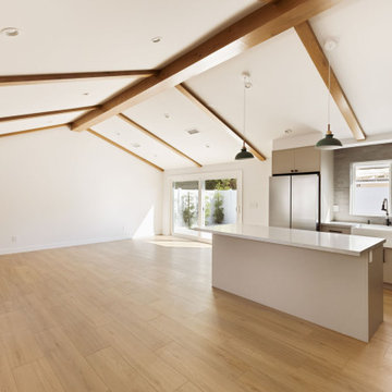
The primary residence underwent a meticulous interior transformation, evolving from a 3-bedroom, 1.5-bath layout into a spacious 4-bedroom, 2-bath home. Strategic reconfigurations centered around creating an expansive great room—an open-concept space adorned with vaulted ceilings—where the kitchen, dining, and living areas converge into a magnificent communal zone.
Exterior updates further distinguish the property. The front and side yards are enclosed with fencing and privacy hedges, linked by concrete pathways that enhance outdoor functionality while compensating for backyard space lost during renovations. The exterior façade was refreshed with darker tones, deliberately contrasting with the duplex to emphasize architectural separation.
Designed to preserve the suburban charm, the duplex visually mimics a single-family home from the street. Its facade creates an illusion of a two-story residence, maintaining harmony within the neighborhood fabric. The main unit, developed under SB9 guidelines, features three bedrooms and two bathrooms, with a luxurious parents’ suite situated upstairs. Downstairs, two bedrooms share a full bath, creating a balanced family-oriented layout.
The duplex’s interior boasts 9-foot ceilings throughout, elevating the sense of space and openness. The design thoughtfully places the kitchen at the front, inviting guests into the home, while stairs on the right lead to the private upstairs bedroom suite.
The ADU offers a two bedroom and two & half baths. the unit is accessible via a private side entrance with a dedicated walkway. Its layout includes a ground-floor living room, a galley kitchen, and a discreet powder room beneath the stairs, designed to contain guest traffic and maintain privacy upstairs. The upstairs bedrooms each feature luxurious bathrooms with expansive showers, adding an element of modern elegance.
Both units enjoy thoughtfully landscaped outdoor spaces—private patios, backyard areas, and gated front yards—creating welcoming environments for residents and visitors alike.
This project exemplifies innovative urban infill solutions, blending architectural elegance with legal compliance and community harmony—an inspiring blueprint for the future of residential development in California.
Sponsored
Fredericksburg, OH

High Point Cabinets
Columbus' Experienced Custom Cabinet Builder | 4x Best of Houzz Winner
 Envision Web
Stuart Wade, Envision Virtual Tours
The second-largest and most developed of Georgia's barrier islands, St. Simons is approximately twelve miles long and nearly three miles wide at its widest stretch (roughly the size of Manhattan Island in New York). The island is located in Glynn County on Georgia's coast and lies east of Brunswick (the seat of Glynn County), south of Little St. Simons Island and the Hampton River, and north of Jekyll Island. The resort community of Sea Island is separated from St. Simons on the east by the Black Banks River. Known for its oak tree canopies and historic landmarks, St. Simons is both a tourist destination and, according to the 2010 U.S. census, home to 12,743 residents.
Early History
The earliest
St. Simons Island Village
record of human habitation on the island dates to the Late Archaic Period, about 5,000 to 3,000 years ago. Remnants of shell rings left behind by Native Americans from this era survive on many of the barrier islands, including St. Simons. Centuries later, during the period known by historians as the chiefdom era, the Guale Indians established a chiefdom centered on St. Catherines Island and used St. Simons as their hunting and fishing grounds. By 1500 the Guale had established a permanent village of about 200 people on St. Simons, which they called Guadalquini.
Beginning in 1568, the Spanish attempted to create missions along the Georgia coast. Catholic missions were the primary means by which Georgia's indigenous Native American chiefdoms were assimilated into the Spanish colonial system along the northern frontier of greater Spanish Florida. In the 1600s St. Simons became home to two Spanish missions: San Buenaventura de Guadalquini, on the southern tip of the island, and Santo Domingo de Asao (or Asajo), on the northern tip. Located on the inland side of the island were the pagan refugee villages of San Simón, the island's namesake, and Ocotonico. In 1684 pirate raids left the missions and villages largely abandoned.
Colonial History
As
Fort Frederica
early as 1670, with Great Britain's establishment of the colony of Carolina and its expansion into Georgia territory, Spanish rule was threatened by the English. The Georgia coast was considered "debatable land" by England and Spain, even though Spain had fully retreated from St. Simons by 1702. Thirty-one years later General James Edward Oglethorpe founded the English settlement of Savannah. In 1736 he established Fort Frederica, named after the heir to the British throne, Frederick Louis, prince of Wales, on the west side of St. Simons Island to protect Savannah and the Carolinas from the Spanish threat.
Between 1736 and 1749 Fort Frederica was the hub of British military operations along the Georgia frontier. A town of the same name grew up around the fort and was of great importance to the new colony. By 1740 Frederica's population was 1,000. In 1736 the congregation of what would become Christ Church was organized within Fort Frederica as a mission of the Church of England. Charles Wesley led the first services. In 1742 Britain's decisive victory over Spain in the Battle of Bloody Marsh, during the War of Jenkins' Ear, ended the Spanish threat to the Georgia coast. When the British regimen disbanded in 1749, most of the townspeople relocated to the mainland. Fort Frederica went into decline and, except for a short time of prosperity during the 1760s and 1770s under the leadership of merchant James Spalding, never fully recovered. Today the historic citadel's tabby ruins are maintained by the National Park Service.
Plantation Era
By the start of the American Revolution (1775-83), Fort Frederica was obsolete, and St. Simons was left largely uninhabited as most of its residents joined the patriot army. Besides hosting a small Georgia naval victory on the Fort Frederica River, providing guns from its famous fort for use at Fort Morris in Sunbury, and serving as an arena for pillaging by privateers and British soldiers, the island played almost no role in the war.
Following the war, many of the townspeople, their businesses destroyed, turned to agriculture. The island was transformed into fourteen cotton plantations after acres of live oak trees were cleared for farm land and used for building American warships, including the famous USS Constitution, or "Old Ironsides." Although rice was the predominant crop along the neighboring Altamaha River, St. Simons was known for its production of long-staple cotton, which soon came to be known as Sea Island cotton.
Between
Ebos Landing
the 1780s and the outbreak of the Civil War (1861-65), St. Simons's plantation culture flourished. The saline atmosphere and the availability of cheap slave labor proved an ideal combination for the cultivation of Sea Island cotton. In 1803 a group of Ebo slaves who survived the Middle Passage and arrived on the west side of St. Simons staged a rebellion and drowned themselves. The sacred site is known today as Ebos Landing.
One of the largest owners of land and slaves on St. Simons was Pierce Butler, master of Hampton Point Plantation, located on the northern end of the island. By 1793 Butler owned more than 500 slaves, who cultivated 800 acres of cotton on St. Simons and 300 acres of rice on Butler's Island in the Altamaha River delta. Butler's grandson, Pierce Mease Butler, who at the age of sixteen inherited a share of his grandfather's estate in 1826, was responsible for the largest sale of human beings in the history of the United States: in 1859, to restore his squandered fortune, he sold 429 slaves in Savannah for more than $300,000. The British actress and writer Fanny Kemble, whose tumultuous marriage to Pierce ended in divorce in 1849, published an eyewitness account of the evils of slavery on St. Simons in her book Journal of a Residence on a Georgian Plantation in 1838-1839 (1863).
Another
Retreat Plantation
large owner of land and slaves on St. Simons was Major William Page, a friend and employee of Pierce Butler Sr. Before purchasing Retreat Plantation on the southwestern tip of the island in 1804, Page managed the Hampton plantation and Butler's Island. Upon Page's death in 1827, Thomas Butler King inherited the land together with his wife, Page's daughter, Anna Matilda Page King. King expanded his father-in-law's planting empire on St. Simons as well as on the mainland, and by 1835 Retreat Plantation alone was home to as many as 355 slaves.
The center of life during the island's plantation era was Christ Church, Frederica. Organized in 1807 by a group of island planters, the Episcopal church is the second oldest in the Diocese of Georgia. Embargoes imposed by the War of 1812 (1812-15) prevented the parishioners from building a church structure, so they worshiped in the home of John Beck, which stood on the site of Oglethorpe's only St. Simons residence, Orange Hall.
The first Christ Church building, finished on the present site in 1820, was ruined by occupying Union troops during the Civil War. In 1884 the Reverend Anson Dodge Jr. rebuilt the church as a memorial to his first wife, Ellen. The cruciform building with a trussed gothic roof and stained-glass windows remains active today as Christ Church.
Civil War and Beyond
The
St. Simons Island Lighthouse
outbreak of the Civil War in 1861 put a sudden end to St. Simons's lucrative plantation era. In January of that year, Confederate troops were stationed at the south end of the island to guard the entrance to Brunswick Harbor. Slaves from Retreat Plantation, owned by Thomas Butler King, built earthworks and batteries. Plantation residents were scattered—the men joined the Confederate army and their families moved to the mainland. Cannon fire was heard on the island in December 1861, and Confederate troops retreated in February 1862, after dynamiting the lighthouse to keep its beacon from aiding Union troops. Soon thereafter, Union troops occupied the island, which was used as a camp for freed slaves. By August 1862 more than 500 former slaves lived on St. Simons, including Susie King Taylor, who organized a school for freed slave children. But in November the ex-slaves were taken to Hilton Head, South Carolina, and Fernandina, Florida, leaving the island abandoned.
After the Civil War the island never returned to its status as an agricultural community. The plantations lay dormant because there were no slaves to work the fields. After Union general William T. Sherman's January 1865 Special Field Order No. 15 —a demand that former plantations be divided and distributed to former slaves—was overturned by U.S. president Andrew Johnson less than a year later, freedmen and women were forced to work as sharecroppers on the small farms that dotted the land previously occupied by the sprawling plantations.
By
St. Simons Lumber Mills
1870 real economic recovery began with the reestablishment of the timber industry. Norman Dodge and Titus G. Meigs of New York set up lumber mill operations at Gascoigne Bluff, formerly Hamilton Plantation. The lumber mills provided welcome employment for both blacks and whites and also provided mail and passenger boats to the mainland. Such water traffic, together with the construction of a new lighthouse in 1872, designed by architect Charles B. Cluskey, marked the beginning of St. Simons's tourism industry. The keeper of the lighthouse created a small amusement park, which drew many visitors, as did the seemingly miraculous light that traveled from the top of the lighthouse tower to the bottom. The island became a summer retreat for families from the mainland, particularly from Baxley, Brunswick, and Waycross.
The island's resort industry was thriving by the 1880s. Beachfront structures, such as a new pier and grand hotel, were built on the southeastern end of the island and could be accessed by ferry. Around this time wealthy northerners began vacationing on the island.
Twentieth Century
The
St. Simons Island Pier and Village
opening in 1924 of the Brunswick–St. Simons Highway, today known as the Torras Causeway, was a milestone in the development of resorts in the area. St. Simons's beaches were now easily accessible to locals and tourists alike. More than 5,000 automobiles took the short drive from Brunswick to St. Simons via the causeway on its opening day, paving the way for convenient residential and resort development.
In 1926 automotive pioneer Howard Coffin of Detroit, Michigan, bought large tracts of land on St. Simons, including the former Retreat Plantation, and constructed a golf course, yacht club, paved roads, and a residential subdivision. Although the causeway had brought large numbers of summer people to the island, St. Simons remained a small community with only a few hundred permanent residents until the 1940s.
The
St. Simons Island
outbreak of World War II (1941-45) brought more visitors and residents to St. Simons. Troops stationed at Jacksonville, Florida; Savannah; and nearby Camp Stewart took weekend vacations on the island, and a new naval air base and radar school became home to even more officers and soldiers. The increased wartime population brought the island its first public school. With a major shipyard for the production of Liberty ships in nearby Brunswick, the waters of St. Simons became active with German U-boats. In April 1942, just off the coast, the Texas Company oil tanker S. S. Oklahoma and the S. S. Esso Baton Rouge were torpedoed by the Germans, bringing the war very close to home for island residents.
Due in large part to the military's improvement of the island's infrastructure during the war, development on the island boomed in the 1950s and 1960s. More permanent homes and subdivisions were built, and the island was no longer just a summer resort but also a thriving community. In 1950 the Methodist conference and retreat center Epworth by the Sea opened on Gascoigne Bluff. In 1961 novelist Eugenia Price visited St. Simons and began work on her first works of fiction, known as the St. Simons Trilogy. Inspired by real events on the island, Price's trilogy renewed interest in the history of Georgia's coast, and the novelist herself relocated to the island in 1965 and lived there for thirty-one years. St. Simons is also home to contemporary Georgia writer Tina McElroy Ansa.
Since
Epworth by the Sea
1980 St. Simons's population has doubled. The island's continued status as a vacation destination and its ongoing development boom have put historic landmarks and natural areas at risk. While such landmarks as the Fort Frederica ruins and the Battle of Bloody Marsh site are preserved and maintained by the National Park Service, and while the historic lighthouse is maintained by the Coastal Georgia Historical Society, historic Ebos Landing has been taken over by a sewage treatment plant.
Several coastal organizations have formed in recent years to save natural areas on the island. The St. Simons Land Trust, for example, has received donations of large tracts of land and plans to protect property in the island's three traditional African American neighborhoods. Despite its rapid growth and development, St. Simons remains one of the most beautiful and important islands on the Georgia coast.
 Metropolis Drafting and Construction Inc
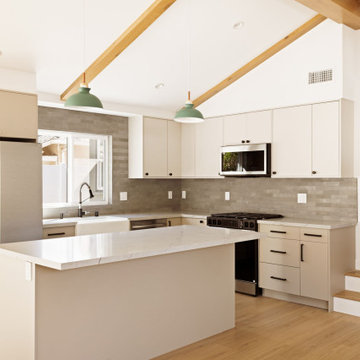
Today’s investment landscape in California features a surge in transforming single-family lots into vibrant multi-family residences, facilitated by recent SB9 and ADU laws. This project exemplifies how a modest 6,750-square-foot lot can accommodate a 1,500-square-foot primary home alongside a 2,500-square-foot duplex, seamlessly integrating design, functionality, and neighborhood aesthetics.
The primary residence underwent a meticulous interior transformation, evolving from a 3-bedroom, 1.5-bath layout into a spacious 4-bedroom, 2-bath home. Strategic reconfigurations centered around creating an expansive great room—an open-concept space adorned with vaulted ceilings—where the kitchen, dining, and living areas converge into a magnificent communal zone.
Exterior updates further distinguish the property. The front and side yards are enclosed with fencing and privacy hedges, linked by concrete pathways that enhance outdoor functionality while compensating for backyard space lost during renovations. The exterior façade was refreshed with darker tones, deliberately contrasting with the duplex to emphasize architectural separation.
Designed to preserve the suburban charm, the duplex visually mimics a single-family home from the street. Its facade creates an illusion of a two-story residence, maintaining harmony within the neighborhood fabric. The main unit, developed under SB9 guidelines, features three bedrooms and two bathrooms, with a luxurious parents’ suite situated upstairs. Downstairs, two bedrooms share a full bath, creating a balanced family-oriented layout.
The duplex’s interior boasts 9-foot ceilings throughout, elevating the sense of space and openness. The design thoughtfully places the kitchen at the front, inviting guests into the home, while stairs on the right lead to the private upstairs bedroom suite.
The ADU offers a two bedroom and two & half baths. the unit is accessible via a private side entrance with a dedicated walkway. Its layout includes a ground-floor living room, a galley kitchen, and a discreet powder room beneath the stairs, designed to contain guest traffic and maintain privacy upstairs. The upstairs bedrooms each feature luxurious bathrooms with expansive showers, adding an element of modern elegance.
Both units enjoy thoughtfully landscaped outdoor spaces—private patios, backyard areas, and gated front yards—creating welcoming environments for residents and visitors alike.
This project exemplifies innovative urban infill solutions, blending architectural elegance with legal compliance and community harmony—an inspiring blueprint for the future of residential development in California.
 Byggmeister Inc
Photo by Mike Casey
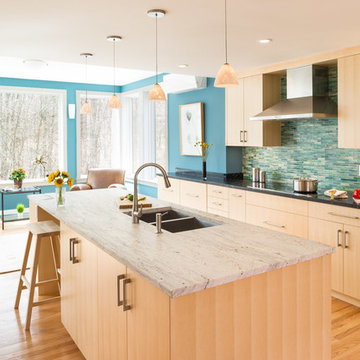
Cramped, uncomfortable, and out of date: when the owners of this home approached us about renovating their kitchen and adjoining sunroom, these were high on their list of complaints.
OPENING UP THE KITCHEN
Our plan kept the kitchen in the same location but took down the walls between both the dining room and the sunroom to create an expansive multi-purpose space with spectacular views to conservation land along the back of the property. We removed the powder room and in its place created a window-lined hallway to the living room—opening up direct access between these two previously disconnected spaces. We then built a new half bath between these two rooms, with a door along the back hallway. The result is a more private powder room that is easier to access than before.
Significantly improved cabinetry provides ample storage for both human and canine needs. An island countertop is functional and pleasant, enabling the owners to prep for and clean up from dinner all while enjoying the view of the woods behind their house.
CREATING COMFORT
We also completely rebuilt the sunroom, thickening the framing to allow for extra insulation and raising the roof to accommodate a higher ceiling and tall windows that let in as much natural light as the skylights they replaced, but much less of the solar gain that had made the room so intolerable in the summer.
We improved visual connections between spaces and admitted more natural light by converting the framing of the main stairway from full to half walls. We also insulated the attic and replaced an aging, inefficient central air conditioning system with ductless minisplit heat pumps, which can also be used as supplemental heat.
All in all, this was our kind of project: we made the home more attractive, more comfortable, and more energy-efficient—all over the course of a single, well-integrated project.
 ZeroEnergy Design
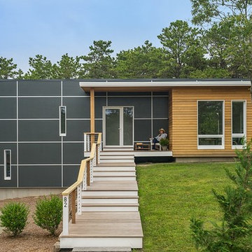
This modern green home offers both a vacation destination on Cape Cod near local family members and an opportunity for rental income.
FAMILY ROOTS. A West Coast couple living in the San Francisco Bay Area sought a permanent East Coast vacation home near family members living on Cape Cod. As academic professionals focused on sustainability, they sought a green, energy efficient home that was well-aligned with their values. With no green homes available for sale on Cape Cod, they decided to purchase land near their family and build their own.
SLOPED SITE. Comprised of a 3/4 acre lot nestled in the pines, the steeply sloping terrain called for a plan that embraced and took advantage of the slope. Of equal priority was optimizing solar exposure, preserving privacy from abutters, and creating outdoor living space. The design accomplished these goals with a simple, rectilinear form, offering living space on the both entry and lower/basement levels. The stepped foundation allows for a walk-out basement level with light-filled living space on the down-hill side of the home. The traditional basement on the eastern, up-hill side houses mechanical equipment and a home gym. The house welcomes natural light throughout, captures views of the forest, and delivers entertainment space that connects indoor living space to outdoor deck and dining patio.
MODERN VISION. The clean building form and uncomplicated finishes pay homage to the modern architectural legacy on the outer Cape. Durable and economical fiber cement panels, fixed with aluminum channels, clad the primary form. Cedar clapboards provide a visual accent at the south-facing living room, which extends a single roof plane to cover the entry porch.
SMART USE OF SPACE. On the entry level, the “L”-shaped living, dining, and kitchen space connects to the exterior living, dining, and grilling spaces to effectively double the home’s summertime entertainment area. Placed at the western end of the entry level (where it can retain privacy but still claim expansive downhill views) is the master suite with a built-in study. The lower level has two guest bedrooms, a second full bathroom, and laundry. The flexibility of the space—crucial in a house with a modest footprint—emerges in one of the guest bedrooms, which doubles as home office by opening the barn-style double doors to connect it to the bright, airy open stair leading up to the entry level. Thoughtful design, generous ceiling heights and large windows transform the modest 1,100 sf* footprint into a well-lit, spacious home. *(total finished space is 1800 sf)
RENTAL INCOME. The property works for its owners by netting rental income when the owners are home in San Francisco. The house especially caters to vacationers bound for nearby Mayo Beach and includes an outdoor shower adjacent to the lower level entry door. In contrast to the bare bones cottages that are typically available on the Cape, this home offers prospective tenants a modern aesthetic, paired with luxurious and green features. Durable finishes inside and out will ensure longevity with the heavier use that comes with a rental property.
COMFORT YEAR-ROUND. The home is super-insulated and air-tight, with mechanical ventilation to provide continuous fresh air from the outside. High performance triple-paned windows complement the building enclosure and maximize passive solar gain while ensuring a warm, draft-free winter, even when sitting close to the glass. A properly sized air source heat pump offers efficient heating & cooling, and includes a carefully designed the duct distribution system to provide even comfort throughout the house. The super-insulated envelope allows us to significantly reduce the equipment capacity, duct size, and airflow quantities, while maintaining unparalleled thermal comfort.
ENERGY EFFICIENT. The building’s shell and mechanical systems play instrumental roles in the home’s exceptional performance. The building enclosure reduces the most significant energy glutton: heating. Continuous super-insulation, thorough air sealing, triple-pane windows, and passive solar gain work together to yield a miniscule heating load. All active energy consumers are extremely efficient: an air source heat pump for heating and cooling, a heat pump hot water heater, LED lighting, energy recovery ventilation (ERV), and high efficiency appliances. The result is a home that uses 70% less energy than a similar new home built to code requirements.
OVERALL. The home embodies the owners’ goals and values while comprehensively enabling thermal comfort, energy efficiency, a vacation respite, and supplementary income.
PROJECT TEAM
ZeroEnergy Design - Architect & Mechanical Designer
A.F. Hultin & Co. - Contractor
Pamet Valley Landscape Design - Landscape & Masonry
Lisa Finch - Original Artwork
European Architectural Supply - Windows
Eric Roth Photography - Photography
 Metropolis Drafting and Construction Inc
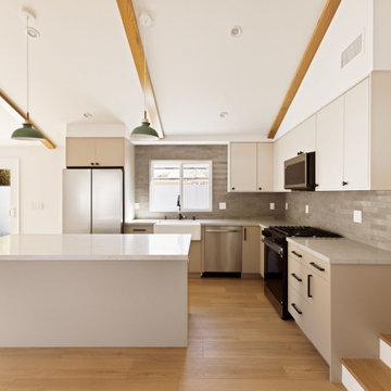
Today’s investment landscape in California features a surge in transforming single-family lots into vibrant multi-family residences, facilitated by recent SB9 and ADU laws. This project exemplifies how a modest 6,750-square-foot lot can accommodate a 1,500-square-foot primary home alongside a 2,500-square-foot duplex, seamlessly integrating design, functionality, and neighborhood aesthetics.
The primary residence underwent a meticulous interior transformation, evolving from a 3-bedroom, 1.5-bath layout into a spacious 4-bedroom, 2-bath home. Strategic reconfigurations centered around creating an expansive great room—an open-concept space adorned with vaulted ceilings—where the kitchen, dining, and living areas converge into a magnificent communal zone.
Exterior updates further distinguish the property. The front and side yards are enclosed with fencing and privacy hedges, linked by concrete pathways that enhance outdoor functionality while compensating for backyard space lost during renovations. The exterior façade was refreshed with darker tones, deliberately contrasting with the duplex to emphasize architectural separation.
Designed to preserve the suburban charm, the duplex visually mimics a single-family home from the street. Its facade creates an illusion of a two-story residence, maintaining harmony within the neighborhood fabric. The main unit, developed under SB9 guidelines, features three bedrooms and two bathrooms, with a luxurious parents’ suite situated upstairs. Downstairs, two bedrooms share a full bath, creating a balanced family-oriented layout.
The duplex’s interior boasts 9-foot ceilings throughout, elevating the sense of space and openness. The design thoughtfully places the kitchen at the front, inviting guests into the home, while stairs on the right lead to the private upstairs bedroom suite.
The ADU offers a two bedroom and two & half baths. the unit is accessible via a private side entrance with a dedicated walkway. Its layout includes a ground-floor living room, a galley kitchen, and a discreet powder room beneath the stairs, designed to contain guest traffic and maintain privacy upstairs. The upstairs bedrooms each feature luxurious bathrooms with expansive showers, adding an element of modern elegance.
Both units enjoy thoughtfully landscaped outdoor spaces—private patios, backyard areas, and gated front yards—creating welcoming environments for residents and visitors alike.
This project exemplifies innovative urban infill solutions, blending architectural elegance with legal compliance and community harmony—an inspiring blueprint for the future of residential development in California.
 Klopf Architecture
Malibu Glass Box House by Klopf Architecture
Following the devastating Woolsey Fire of 2018, the site in Malibu offered a unique opportunity to rebuild not just a home, but a new architectural composition that highlighted the property’s potential while navigating strict fire-rebuild codes in the area. Designed by Klopf Architecture, this project embraced a set of limitations and translated them into an architectural asset.
The city’s fire-rebuild process required the new structure to remain close to the original footprint, size and bulk, a constraint that ultimately clarified the architectural direction. Perched near the front of a long, narrow lot, the new home frames and overlooks a private, park-like rear expanse, an uncommon luxury especially in this part of Malibu .
Without a fixed program, the design process allowed for a different kind of creative focus allowing Klopf Architecture the opportunity to explore how a modernist home could best respond to this site. The team approached the project not with a list of requirements, but with a question: How might a modernist live here? What spatial qualities would inspire calm, connection, and a sense of wonder in this setting? The process became less about problem-solving and more about architectural storytelling—letting the site, the light, and the principles of modern design guide the form and flow of the home.
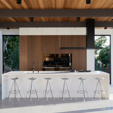
The response emerged in the form of a glass-box pavilion, an open, Mid-Century Modern inspired living, dining, and kitchen space that floats at the edge of the property’s natural descent. Connected to the more enclosed, private areas of the home by a glass-walled hallway, the living pavilion becomes a distinct centerpiece of the design. It opens on all four sides to the landscape with decks and patios on the flanks, an internal garden and water feature to the north, and a dramatic unguarded view of the expansive backyard and ocean horizon to the south.
Because of the mandated footprint, careful planning was required to ensure every space could still engage with light, landscape, or both. Strategic voids in the form of atriums and courtyards allow daylight to filter deep into the home’s core, while offering moments of surprise and retreat. These design gestures allow natural light to filter deep into the interior, creating a sense of brightness and openness throughout the day. At the same time, they expand the perceptual boundaries between inside and out, making the home feel more expansive while anchoring its connection to the surrounding landscape.
The siting of the house is what gives it its unique character. Rather than receding into the backyard like the neighboring homes, the house holds a slight prominence. From the central living pavilion, stepping down into the landscape feels more like entering a secluded park where a separate existing accessory structure, trail, and recreational areas await. The home’s modest street presence gives way to this unfolding drama of space, view, and nature.
Fire-resilient materials and assemblies are integrated seamlessly throughout including triple-pane glazing, under-slab and roof insulation, and locally sourced fire-rated cladding ensure the house not only meets Calfornia’s rigorous wildland-urban interface (WUI) standards, but feels effortlessly aligned with them. While technical decisions like fire-hardening and mechanical systems presented some construction challenges, particularly around the cantilevered glass box, the team found a functional compromise that preserved the integrity of the design.
Inside, a restrained palette and exposed post and beam design celebrate the ethos of mid-century modernism. A central circulation spine extends from the entry to the rear glass wall, offering a continuous visual link from street to ocean. Spaces such as the library and office, though more intimate in scale, are never cut off from nature as each opens to its own unique courtyard or garden view.
Though born out of a strict regulatory framework and developed without a specific client, the rebuild design unfolded with remarkable clarity. Grounded in site logic, refined by limitations and an emphasis on timeless spatial relationships – light, proportion, and a strong connection to nature, the resulting design feels both effortless and uplifting. The home lives lightly on the land, opens generously to its surroundings, and strikes a careful balance between privacy, openness, and calm. For Klopf Architecture, it stands as a compelling case study in how site, code, and circumstantial constraints can inspire enduring, modernist architecture. With years of experience reimagining mid-century modern design for how people live today, the firm took the project’s limitations as an opportunity. The result is a home shaped by open, flowing spaces, strong indoor-outdoor connections, and a calm, clear sense of structure. It’s a good reminder that even with strict constraints, there’s still room for architecture to breathe—and for modernism to keep moving forward.
Klopf Architecture project team: Geoff Campen, John Klopf, AIA, and Sherry Tan
Structural Engineer: ZFA
Contractor: Maison D’Artiste
Photography: ©2025 Mariko Reed
Year Completed: 2023

 Metropolis Drafting and Construction Inc
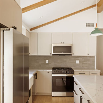
Today’s investment landscape in California features a surge in transforming single-family lots into vibrant multi-family residences, facilitated by recent SB9 and ADU laws. This project exemplifies how a modest 6,750-square-foot lot can accommodate a 1,500-square-foot primary home alongside a 2,500-square-foot duplex, seamlessly integrating design, functionality, and neighborhood aesthetics.
The primary residence underwent a meticulous interior transformation, evolving from a 3-bedroom, 1.5-bath layout into a spacious 4-bedroom, 2-bath home. Strategic reconfigurations centered around creating an expansive great room—an open-concept space adorned with vaulted ceilings—where the kitchen, dining, and living areas converge into a magnificent communal zone.
Exterior updates further distinguish the property. The front and side yards are enclosed with fencing and privacy hedges, linked by concrete pathways that enhance outdoor functionality while compensating for backyard space lost during renovations. The exterior façade was refreshed with darker tones, deliberately contrasting with the duplex to emphasize architectural separation.
Designed to preserve the suburban charm, the duplex visually mimics a single-family home from the street. Its facade creates an illusion of a two-story residence, maintaining harmony within the neighborhood fabric. The main unit, developed under SB9 guidelines, features three bedrooms and two bathrooms, with a luxurious parents’ suite situated upstairs. Downstairs, two bedrooms share a full bath, creating a balanced family-oriented layout.
The duplex’s interior boasts 9-foot ceilings throughout, elevating the sense of space and openness. The design thoughtfully places the kitchen at the front, inviting guests into the home, while stairs on the right lead to the private upstairs bedroom suite.
The ADU offers a two bedroom and two & half baths. the unit is accessible via a private side entrance with a dedicated walkway. Its layout includes a ground-floor living room, a galley kitchen, and a discreet powder room beneath the stairs, designed to contain guest traffic and maintain privacy upstairs. The upstairs bedrooms each feature luxurious bathrooms with expansive showers, adding an element of modern elegance.
Both units enjoy thoughtfully landscaped outdoor spaces—private patios, backyard areas, and gated front yards—creating welcoming environments for residents and visitors alike.
This project exemplifies innovative urban infill solutions, blending architectural elegance with legal compliance and community harmony—an inspiring blueprint for the future of residential development in California.
 ZeroEnergy Design
This LEED Platinum certified house reflects the homeowner's desire for an exceptionally healthy and comfortable living environment, within a traditional neighborhood.
INFILL SITE. The family, who moved from another area of Wellesley, sought out this property to be within walking distance of the high school and downtown area. An existing structure on the tight lot was removed to make way for the new home. 84% of the construction waste, from both the previous structure and the new home, was diverted from a landfill. ZED designed to preserve the existing mature trees on the perimeter of the property to minimize site impacts, and to maintain the character of the neighborhood as well as privacy on the site.
EXTERIOR EXPRESSION. The street facade of the home relates to the local New England vernacular. The rear uses contemporary language, a nod to the family’s Californian roots, to incorporate a roof deck, solar panels, outdoor living space, and the backyard swimming pool. ZED’s careful planning avoided to the need to face the garage doors towards the street, a common syndrome of a narrow lot.
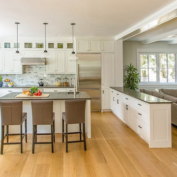
THOUGHTFUL SPACE. Homes with dual entries can often result in duplicate and unused spaces. In this home, the everyday and formal entry areas are one and the same; the front and garage doors share the entry program of coat closets, mudroom storage with bench for removing your shoes, and a laundry room with generous closets for the children's sporting equipment. The entry area leads directly to the living space, encompassing the kitchen, dining and sitting area areas in an L-shaped open plan arrangement. The kitchen is placed at the south-west corner of the space to allow for a strong connection to the dining, sitting and outdoor living spaces. A fire pit on the deck satisfies the family’s desire for an open flame while a sealed gas fireplace is used indoors - ZED’s preference after omitting gas burning appliances completely from an airtight home. A small study, with a window seat, is conveniently located just off of the living space. A first floor guest bedroom includes an accessible bathroom for aging visitors and can be used as a master suite to accommodate aging in place.
HEALTHY LIVING. The client requested a home that was easy to clean and would provide a respite from seasonal allergies and common contaminants that are found in many indoor spaces. ZED selected easy to clean solid surface flooring throughout, provided ample space for cleaning supplies on each floor, and designed a mechanical system with ventilation that provides a constant supply of fresh outdoor air. ZED selected durable materials, finishes, cabinetry, and casework with low or no volatile organic compounds (VOCs) and no added urea formaldehyde.
YEAR-ROUND COMFORT. The home is super insulated and air-tight, paired with high performance triple-paned windows, to ensure it is draft-free throughout the winter (even when in front of the large windows and doors). ZED designed a right-sized heating and cooling system to pair with the thermally improved building enclosure to ensure year-round comfort. The glazing on the home maximizes passive solar gains, and facilitates cross ventilation and daylighting.
ENERGY EFFICIENT. As one of the most energy efficient houses built to date in Wellesley, the home highlights a practical solution for Massachusetts. First, the building enclosure reduces the largest energy requirement for typical houses (heating). Super-insulation, exceptional air sealing, a thermally broken wall assembly, triple pane windows, and passive solar gain combine for a sizable heating load reduction. Second, within the house only efficient systems consume energy. These include an air source heat pump for heating & cooling, a heat pump hot water heater, LED lighting, energy recovery ventilation, and high efficiency appliances. Lastly, photovoltaics provide renewable energy help offset energy consumption. The result is an 89% reduction in energy use compared to a similar brand new home built to code requirements.
RESILIENT. The home will fare well in extreme weather events. During a winter power outage, heat loss will be very slow due to the super-insulated and airtight envelope– taking multiple days to drop to 60 degrees even with no heat source. An engineered drainage system, paired with careful the detailing of the foundation, will help to keep the finished basement dry. A generator will provide full operation of the all-electric house during a power outage.
OVERALL. The home is a reflection of the family goals and an expression of their values, beautifully enabling health, comfort, safety, resilience, and utility, all while respecting the planet.
ZED - Architect & Mechanical Designer
Bevilacqua Builders Inc - Contractor
Creative Land & Water Engineering - Civil Engineering
Barbara Peterson Landscape - Landscape Design
Nest & Company - Interior Furnishings
Eric Roth Photography - Photography
 Concept Renovations, Inc.
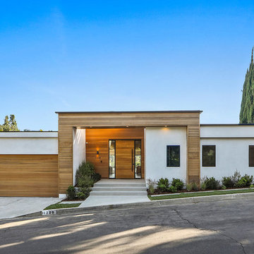
The Impressive Studio City Mid-Century Exterior Masterpiece was a comprehensive interior and exterior remodel, revitalizing a dated property into a stunning modern sanctuary. The homeowners sought to blend mid-century design with a contemporary twist, emphasizing clean lines, natural materials, and expansive views. We transformed the exterior with a sleek wood-paneled entrance, smooth stucco walls, and minimalist landscaping, creating an inviting curb appeal that reflects the home's architectural roots. Large, custom glass doors seamlessly connect the indoors with the outdoors, bathing the interior in natural light and offering breathtaking views of the surrounding Studio City landscape.
Inside, we continued the mid-century theme by selecting warm wood flooring, an open-concept layout, and modern fixtures that merge style with comfort. The homeowners wanted a space that felt sophisticated yet warm, and our team worked closely with them throughout the project to ensure every detail met their vision. As a Studio City-based company, we took pride in sourcing local materials and embracing the area's aesthetic. This remodel has resulted in a mid-century masterpiece that not only enhances the home’s functionality but also stands as a true statement piece in the neighborhood.
 Klopf Architecture
Malibu Glass Box House by Klopf Architecture
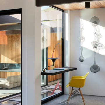
Following the devastating Woolsey Fire of 2018, the site in Malibu offered a unique opportunity to rebuild not just a home, but a new architectural composition that highlighted the property’s potential while navigating strict fire-rebuild codes in the area. Designed by Klopf Architecture, this project embraced a set of limitations and translated them into an architectural asset.
The city’s fire-rebuild process required the new structure to remain close to the original footprint, size and bulk, a constraint that ultimately clarified the architectural direction. Perched near the front of a long, narrow lot, the new home frames and overlooks a private, park-like rear expanse, an uncommon luxury especially in this part of Malibu .
Without a fixed program, the design process allowed for a different kind of creative focus allowing Klopf Architecture the opportunity to explore how a modernist home could best respond to this site. The team approached the project not with a list of requirements, but with a question: How might a modernist live here? What spatial qualities would inspire calm, connection, and a sense of wonder in this setting? The process became less about problem-solving and more about architectural storytelling—letting the site, the light, and the principles of modern design guide the form and flow of the home.
The response emerged in the form of a glass-box pavilion, an open, Mid-Century Modern inspired living, dining, and kitchen space that floats at the edge of the property’s natural descent. Connected to the more enclosed, private areas of the home by a glass-walled hallway, the living pavilion becomes a distinct centerpiece of the design. It opens on all four sides to the landscape with decks and patios on the flanks, an internal garden and water feature to the north, and a dramatic unguarded view of the expansive backyard and ocean horizon to the south.
Because of the mandated footprint, careful planning was required to ensure every space could still engage with light, landscape, or both. Strategic voids in the form of atriums and courtyards allow daylight to filter deep into the home’s core, while offering moments of surprise and retreat. These design gestures allow natural light to filter deep into the interior, creating a sense of brightness and openness throughout the day. At the same time, they expand the perceptual boundaries between inside and out, making the home feel more expansive while anchoring its connection to the surrounding landscape.
The siting of the house is what gives it its unique character. Rather than receding into the backyard like the neighboring homes, the house holds a slight prominence. From the central living pavilion, stepping down into the landscape feels more like entering a secluded park where a separate existing accessory structure, trail, and recreational areas await. The home’s modest street presence gives way to this unfolding drama of space, view, and nature.
Fire-resilient materials and assemblies are integrated seamlessly throughout including triple-pane glazing, under-slab and roof insulation, and locally sourced fire-rated cladding ensure the house not only meets Calfornia’s rigorous wildland-urban interface (WUI) standards, but feels effortlessly aligned with them. While technical decisions like fire-hardening and mechanical systems presented some construction challenges, particularly around the cantilevered glass box, the team found a functional compromise that preserved the integrity of the design.
Inside, a restrained palette and exposed post and beam design celebrate the ethos of mid-century modernism. A central circulation spine extends from the entry to the rear glass wall, offering a continuous visual link from street to ocean. Spaces such as the library and office, though more intimate in scale, are never cut off from nature as each opens to its own unique courtyard or garden view.
Though born out of a strict regulatory framework and developed without a specific client, the rebuild design unfolded with remarkable clarity. Grounded in site logic, refined by limitations and an emphasis on timeless spatial relationships – light, proportion, and a strong connection to nature, the resulting design feels both effortless and uplifting. The home lives lightly on the land, opens generously to its surroundings, and strikes a careful balance between privacy, openness, and calm. For Klopf Architecture, it stands as a compelling case study in how site, code, and circumstantial constraints can inspire enduring, modernist architecture. With years of experience reimagining mid-century modern design for how people live today, the firm took the project’s limitations as an opportunity. The result is a home shaped by open, flowing spaces, strong indoor-outdoor connections, and a calm, clear sense of structure. It’s a good reminder that even with strict constraints, there’s still room for architecture to breathe—and for modernism to keep moving forward.
Klopf Architecture project team: Geoff Campen, John Klopf, AIA, and Sherry Tan
Structural Engineer: ZFA
Contractor: Maison D’Artiste
Photography: ©2025 Mariko Reed
Year Completed: 2023

 SKP Design
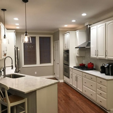
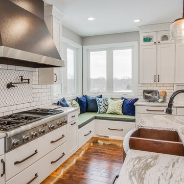
After finalizing the layout for their new build, the homeowners hired SKP Design to select all interior materials and finishes and exterior finishes. They wanted a comfortable inviting lodge style with a natural color palette to reflect the surrounding 100 wooded acres of their property. http://www.skpdesign.com/inviting-lodge
SKP designed three fireplaces in the great room, sunroom and master bedroom. The two-sided great room fireplace is the heart of the home and features the same stone used on the exterior, a natural Michigan stone from Stonemill. With Cambria countertops, the kitchen layout incorporates a large island and dining peninsula which coordinates with the nearby custom-built dining room table. Additional custom work includes two sliding barn doors, mudroom millwork and built-in bunk beds. Engineered wood floors are from Casabella Hardwood with a hand scraped finish. The black and white laundry room is a fresh looking space with a fun retro aesthetic.
Photography: Casey Spring
 ZeroEnergy Design
This LEED Platinum certified house reflects the homeowner's desire for an exceptionally healthy and comfortable living environment, within a traditional neighborhood.
INFILL SITE. The family, who moved from another area of Wellesley, sought out this property to be within walking distance of the high school and downtown area. An existing structure on the tight lot was removed to make way for the new home. 84% of the construction waste, from both the previous structure and the new home, was diverted from a landfill. ZED designed to preserve the existing mature trees on the perimeter of the property to minimize site impacts, and to maintain the character of the neighborhood as well as privacy on the site.
EXTERIOR EXPRESSION. The street facade of the home relates to the local New England vernacular. The rear uses contemporary language, a nod to the family’s Californian roots, to incorporate a roof deck, solar panels, outdoor living space, and the backyard swimming pool. ZED’s careful planning avoided to the need to face the garage doors towards the street, a common syndrome of a narrow lot.
THOUGHTFUL SPACE. Homes with dual entries can often result in duplicate and unused spaces. In this home, the everyday and formal entry areas are one and the same; the front and garage doors share the entry program of coat closets, mudroom storage with bench for removing your shoes, and a laundry room with generous closets for the children's sporting equipment. The entry area leads directly to the living space, encompassing the kitchen, dining and sitting area areas in an L-shaped open plan arrangement. The kitchen is placed at the south-west corner of the space to allow for a strong connection to the dining, sitting and outdoor living spaces. A fire pit on the deck satisfies the family’s desire for an open flame while a sealed gas fireplace is used indoors - ZED’s preference after omitting gas burning appliances completely from an airtight home. A small study, with a window seat, is conveniently located just off of the living space. A first floor guest bedroom includes an accessible bathroom for aging visitors and can be used as a master suite to accommodate aging in place.
HEALTHY LIVING. The client requested a home that was easy to clean and would provide a respite from seasonal allergies and common contaminants that are found in many indoor spaces. ZED selected easy to clean solid surface flooring throughout, provided ample space for cleaning supplies on each floor, and designed a mechanical system with ventilation that provides a constant supply of fresh outdoor air. ZED selected durable materials, finishes, cabinetry, and casework with low or no volatile organic compounds (VOCs) and no added urea formaldehyde.
YEAR-ROUND COMFORT. The home is super insulated and air-tight, paired with high performance triple-paned windows, to ensure it is draft-free throughout the winter (even when in front of the large windows and doors). ZED designed a right-sized heating and cooling system to pair with the thermally improved building enclosure to ensure year-round comfort. The glazing on the home maximizes passive solar gains, and facilitates cross ventilation and daylighting.
ENERGY EFFICIENT. As one of the most energy efficient houses built to date in Wellesley, the home highlights a practical solution for Massachusetts. First, the building enclosure reduces the largest energy requirement for typical houses (heating). Super-insulation, exceptional air sealing, a thermally broken wall assembly, triple pane windows, and passive solar gain combine for a sizable heating load reduction. Second, within the house only efficient systems consume energy. These include an air source heat pump for heating & cooling, a heat pump hot water heater, LED lighting, energy recovery ventilation, and high efficiency appliances. Lastly, photovoltaics provide renewable energy help offset energy consumption. The result is an 89% reduction in energy use compared to a similar brand new home built to code requirements.
RESILIENT. The home will fare well in extreme weather events. During a winter power outage, heat loss will be very slow due to the super-insulated and airtight envelope– taking multiple days to drop to 60 degrees even with no heat source. An engineered drainage system, paired with careful the detailing of the foundation, will help to keep the finished basement dry. A generator will provide full operation of the all-electric house during a power outage.
OVERALL. The home is a reflection of the family goals and an expression of their values, beautifully enabling health, comfort, safety, resilience, and utility, all while respecting the planet.
ZED - Architect & Mechanical Designer
Bevilacqua Builders Inc - Contractor
Creative Land & Water Engineering - Civil Engineering
Barbara Peterson Landscape - Landscape Design
Nest & Company - Interior Furnishings
Eric Roth Photography - Photography
 Gallery KBNY
The owner of this historic and landmarked town-home renovation in Hudson Square, originally built in 1826, hired Gallery Kitchen and Bath to fully gut-renovate this 3-unit row-home. The scope of work included a full-scale renovation of the owners unit, including the renovation of the kitchen, one 4-piece master ensuite bathroom, one 3-piece bathroom with a walk-in steam shower, and a beautiful powder room. Additional work in the owners unit also included flooring, electrical upgrade, major plumbing work, new HVAC system, restoration of a fireplace, installation of a fully integrated smart home system and landmarked approved windows.
CELLAR RENOVATION IN NYC LANDMARKED TOWN-HOME
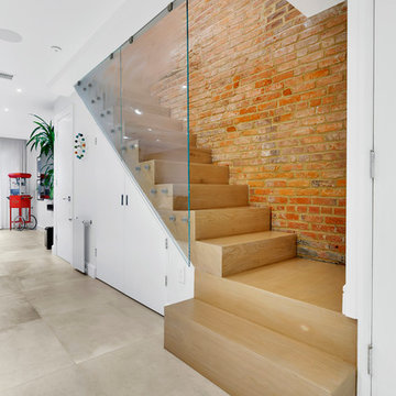
Rounding out the owners unit we renovated the cellar, which was converted into an entertainment space and featured a custom glass curtain wall, along with a custom staircase with an exposed brick wall. During the demolition phase of the cellar, our team discovered 56 wine jugs filled with wine from the prohibition era, leading us to name this project the prohibition house. For the two tenant units, Gallery Kitchen and Bath undertook the renovation of 2 kitchens, 4 bathrooms, new hardwood flooring throughout, along with detailed carpentry work in the entire home.
WHY GALLERY KITCHEN AND BATH
After interviewing multiple contractors, our client decided on Gallery Kitchen and Bath primarily because of our turnkey design, selection, and build process. In a renovation of this magnitude it is crucial to have a centralized full service contractor under one roof to handle all of the aspects and simultaneous moving parts of the project. Decentralizing the entire process by having multiple unaffiliated vendors handle various parts of the process can easily become chaotic, time consuming, and costly.
Because Gallery Kitchen and Bath undertook the entire process, from the design of the entire space to the selection and procurement of all finishes and fixtures, down to the procurement of all permits and LPC filings, it made a seemingly chaotic project a’lot more manageable.
PHASE 1: DESIGN, SELECTION, PROCUREMENT
Our client wanted the renovation to incorporate a fully modern design into his Hudson Square town-house. Being that this is a landmarked property, the exterior facade had to be restored and kept with the original aesthetic, the interior of the home however was a whole different story.
In keeping up with the modern aesthetic, our designers went to work to design a custom kitchen that included fully custom flat panel base cabinets in a white high gloss finish and an absolute matte black appliance/pantry wall. The kitchen design also included a white quartz countertop and backsplash with a waterfall edge island. To bring warmth to the modern kitchen, our designers incorporated a rifted and quartered select oak wood floor in a herringbone pattern, and custom blended stain with matte polyurethane finish. For continuity, the wood floor was also extended throughout the entire owners unit.
In the ensuite bathroom we created a “wet area” which houses a standalone soaking tub as well as a beautiful rainfall shower, completely leveled with the rest of the floor in the bathroom. Some highlights within this space include a tiled square drain, large niche cutouts with a carrera marble accents. Once again, to bring warmth to this modern bathroom, our designers incorporated a floating rustic oak vanity and carrera marble mosaic floor tile.
Last on the list on the owners unit floor was the cellar, which our client wanted to utilize as an entertainment space for his friends and family. During the design phase, we incorporated an open concept layout, wedding the indoor and outdoor space with a custom glass curtain wall. The design also included custom walnut built-ins that serve as a custom wet bar and storage piece.
With the design approved and selections made our office liaisons moved to procure all of the material selections and finishes.
PHASE 2: DEMO
Because this home is almost two centuries old, we had to take extra precaution during the interior demolition phase of the project. One specific area that we had to pay special attention to was the existing brick. Over time the mortar in old brick homes deteriorates and turns into dust – for this reason it was extremely important that a thorough and ongoing inspection of the exteriors and interior walls took place during the demolition of the space.
After 14 30-yard debris containers and 56 wine filled jugs from the prohibition era later , the demolition of this historic Hudson Square town-home came to an end. If you are wondering whether we tried the wine? After notifying the owner we agreed to open one of the jugs and try them together – nothing but vinegar.
PHASE 3: BUILD
One of the challenges in a renovation project of this scope is nailing down the logistics and delivery of fixtures and finish material. Adding to this challenge was a narrow entry door that required us to use a boom truck in order to deliver some of the larger materials on site. To ensure a succinct time schedule, we boomed all of the materials through the 3rd floor for the entire project and worked our renovation work from top floor to cellar. This technique also insured that any unexpected water issues during the renovation process would not damage a finished floor.
With all roughing and framing complete, the Gallery KBNY team proceeded to execute on the design plan.
THE REVEAL
From what was once a dilapidated town-home with nothing but potential, to a glamorous and luxurious modern interior space – the prohibition house was complete. Ready to speak with us about your renovation project? Contact us to schedule your free consultation and let Gallery KBNY show you why our all-inclusive approach to your renovation is the smartest way to renovating in NYC.
1