
Search results for "Larger goals" in Home Design Ideas
 Bilotta Kitchen & Home
Written by Mary Kate Hogan for Westchester Home Magazine.
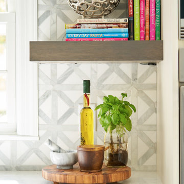
"The Goal: The family that cooks together has the most fun — especially when their kitchen is equipped with four ovens and tons of workspace. After a first-floor renovation of a home for a couple with four grown children, the new kitchen features high-tech appliances purchased through Royal Green and a custom island with a connected table to seat family, friends, and cooking spectators. An old dining room was eliminated, and the whole area was transformed into one open, L-shaped space with a bar and family room.
“They wanted to expand the kitchen and have more of an entertaining room for their family gatherings,” says designer Danielle Florie. She designed the kitchen so that two or three people can work at the same time, with a full sink in the island that’s big enough for cleaning vegetables or washing pots and pans.
Key Features:
Well-Stocked Bar: The bar area adjacent to the kitchen doubles as a coffee center. Topped with a leathered brown marble, the bar houses the coffee maker as well as a wine refrigerator, beverage fridge, and built-in ice maker. Upholstered swivel chairs encourage people to gather and stay awhile.
Finishing Touches: Counters around the kitchen and the island are covered with a Cambria quartz that has the light, airy look the homeowners wanted and resists stains and scratches. A geometric marble tile backsplash is an eye-catching decorative element.
Into the Wood: The larger table in the kitchen was handmade for the family and matches the island base. On the floor, wood planks with a warm gray tone run diagonally for added interest."
Bilotta Designer: Danielle Florie
Photographer: Phillip Ennis
 ORIJIN STONE, LLC
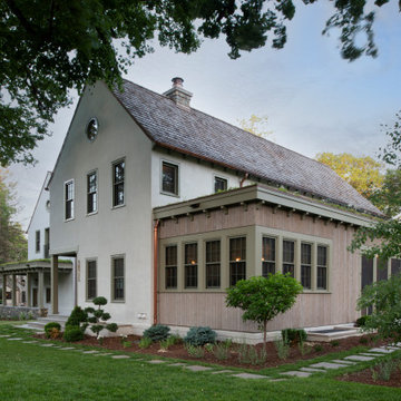
The main design goal of this Northern European country style home was to use traditional, authentic materials that would have been used ages ago. ORIJIN STONE premium stone was selected as one such material, taking the main stage throughout key living areas including the custom hand carved Alder™ Limestone fireplace in the living room, as well as the master bedroom Alder fireplace surround, the Greydon™ Sandstone cobbles used for flooring in the den, porch and dining room as well as the front walk, and for the Greydon Sandstone paving & treads forming the front entrance steps and landing, throughout the garden walkways and patios and surrounding the beautiful pool. This home was designed and built to withstand both trends and time, a true & charming heirloom estate.
Architecture: Rehkamp Larson Architects
Builder: Kyle Hunt & Partners
Landscape Design & Stone Install: Yardscapes
Mason: Meyer Masonry
Interior Design: Alecia Stevens Interiors
Photography: Scott Amundson Photography & Spacecrafting Photography


Find the right local pro for your project

 Wheatland Custom Cabinetry & Woodwork
The goal of this kitchen remodel was to create more space in the kitchen area as well as maximize storage. We designed a layout that included removing a wall and integrating the extra space from the mudroom into the kitchen. Stainless steel appliances and quartz countertops finished the look.
Walnut countertop on the island and matching shelves and bench seat adjacent. We also finished the eat-in kitchen with a dry bar and bench seat with storage drawers. Now this kitchen is ready for entertaining with plenty of space to mingle and sit.

 Katie Hutchison Studio
With two small children and a third on the way, the owners of an original eighteenth century Cape were quickly out-growing it, but they had no desire to move away from the Cape Cod home and location they loved. They simply needed a reconfigured layout and more space. Their goals included repurposing some existing rooms, adding a new kitchen/family area plus screen porch on the first level, and creating a master suite and roof deck with an outdoor shower on the second level, connected by a new stair.
Our challenge was to improve the flow between existing spaces, and design the two-story addition without overwhelming the pint-sized original Cape. We took advantage of the lower grade at the rear of the property to step the first floor of the addition down two steps from the existing main level. This allowed us to align the second floor in the addition with the existing second floor, while gaining ceiling height in the new first-floor kitchen/family area. We composed a cross-gabled form for the addition to improve the second floor headroom, while maintaining the existing eave line. We then extended some existing shed dormers to gain headroom and enhance function. We also expanded the outdoor living area with privacy walls along the roof deck.
New, larger, double–hung windows that match the lite configuration of the existing windows, along with new side-wall shingles and trim which resemble the existing exterior treatment help to tie the new addition to the old Cape. Though there’s no mistaking the new for the old, the two are simpatico.
Katie Hutchison Studio collaborated with Geoffrey Koper Architect of Yarmouth Port, Mass. on the Yarmouth Port Antique Cape Renovation and Addition. Kitchen fit-out and interior finishes, fixtures, and furnishings by others.
photo by Katie Hutchison
 Katie Hutchison Studio
With two small children and a third on the way, the owners of an original eighteenth century Cape were quickly out-growing it, but they had no desire to move away from the Cape Cod home and location they loved. They simply needed a reconfigured layout and more space. Their goals included repurposing some existing rooms, adding a new kitchen/family area plus screen porch on the first level, and creating a master suite and roof deck with an outdoor shower on the second level, connected by a new stair.
Our challenge was to improve the flow between existing spaces, and design the two-story addition without overwhelming the pint-sized original Cape. We took advantage of the lower grade at the rear of the property to step the first floor of the addition down two steps from the existing main level. This allowed us to align the second floor in the addition with the existing second floor, while gaining ceiling height in the new first-floor kitchen/family area. We composed a cross-gabled form for the addition to improve the second floor headroom, while maintaining the existing eave line. We then extended some existing shed dormers to gain headroom and enhance function. We also expanded the outdoor living area with privacy walls along the roof deck.
New, larger, double–hung windows that match the lite configuration of the existing windows, along with new side-wall shingles and trim which resemble the existing exterior treatment help to tie the new addition to the old Cape. Though there’s no mistaking the new for the old, the two are simpatico.
Katie Hutchison Studio collaborated with Geoffrey Koper Architect of Yarmouth Port, Mass. on the Yarmouth Port Antique Cape Renovation and Addition. Kitchen fit-out and interior finishes, fixtures, and furnishings by others.
photo by Katie Hutchison

 Isla Homes
I built this on my property for my aging father who has some health issues. Handicap accessibility was a factor in design. His dream has always been to try retire to a cabin in the woods. This is what he got.
It is a 1 bedroom, 1 bath with a great room. It is 600 sqft of AC space. The footprint is 40' x 26' overall.
The site was the former home of our pig pen. I only had to take 1 tree to make this work and I planted 3 in its place. The axis is set from root ball to root ball. The rear center is aligned with mean sunset and is visible across a wetland.
The goal was to make the home feel like it was floating in the palms. The geometry had to simple and I didn't want it feeling heavy on the land so I cantilevered the structure beyond exposed foundation walls. My barn is nearby and it features old 1950's "S" corrugated metal panel walls. I used the same panel profile for my siding. I ran it vertical to match the barn, but also to balance the length of the structure and stretch the high point into the canopy, visually. The wood is all Southern Yellow Pine. This material came from clearing at the Babcock Ranch Development site. I ran it through the structure, end to end and horizontally, to create a seamless feel and to stretch the space. It worked. It feels MUCH bigger than it is.
I milled the material to specific sizes in specific areas to create precise alignments. Floor starters align with base. Wall tops adjoin ceiling starters to create the illusion of a seamless board. All light fixtures, HVAC supports, cabinets, switches, outlets, are set specifically to wood joints. The front and rear porch wood has three different milling profiles so the hypotenuse on the ceilings, align with the walls, and yield an aligned deck board below. Yes, I over did it. It is spectacular in its detailing. That's the benefit of small spaces.
Concrete counters and IKEA cabinets round out the conversation.
For those who cannot live tiny, I offer the Tiny-ish House.
Photos by Ryan Gamma
Staging by iStage Homes
Design Assistance Jimmy Thornton


 ZeroEnergy Design
This modern green home offers both a vacation destination on Cape Cod near local family members and an opportunity for rental income.
FAMILY ROOTS. A West Coast couple living in the San Francisco Bay Area sought a permanent East Coast vacation home near family members living on Cape Cod. As academic professionals focused on sustainability, they sought a green, energy efficient home that was well-aligned with their values. With no green homes available for sale on Cape Cod, they decided to purchase land near their family and build their own.
SLOPED SITE. Comprised of a 3/4 acre lot nestled in the pines, the steeply sloping terrain called for a plan that embraced and took advantage of the slope. Of equal priority was optimizing solar exposure, preserving privacy from abutters, and creating outdoor living space. The design accomplished these goals with a simple, rectilinear form, offering living space on the both entry and lower/basement levels. The stepped foundation allows for a walk-out basement level with light-filled living space on the down-hill side of the home. The traditional basement on the eastern, up-hill side houses mechanical equipment and a home gym. The house welcomes natural light throughout, captures views of the forest, and delivers entertainment space that connects indoor living space to outdoor deck and dining patio.
MODERN VISION. The clean building form and uncomplicated finishes pay homage to the modern architectural legacy on the outer Cape. Durable and economical fiber cement panels, fixed with aluminum channels, clad the primary form. Cedar clapboards provide a visual accent at the south-facing living room, which extends a single roof plane to cover the entry porch.
SMART USE OF SPACE. On the entry level, the “L”-shaped living, dining, and kitchen space connects to the exterior living, dining, and grilling spaces to effectively double the home’s summertime entertainment area. Placed at the western end of the entry level (where it can retain privacy but still claim expansive downhill views) is the master suite with a built-in study. The lower level has two guest bedrooms, a second full bathroom, and laundry. The flexibility of the space—crucial in a house with a modest footprint—emerges in one of the guest bedrooms, which doubles as home office by opening the barn-style double doors to connect it to the bright, airy open stair leading up to the entry level. Thoughtful design, generous ceiling heights and large windows transform the modest 1,100 sf* footprint into a well-lit, spacious home. *(total finished space is 1800 sf)
RENTAL INCOME. The property works for its owners by netting rental income when the owners are home in San Francisco. The house especially caters to vacationers bound for nearby Mayo Beach and includes an outdoor shower adjacent to the lower level entry door. In contrast to the bare bones cottages that are typically available on the Cape, this home offers prospective tenants a modern aesthetic, paired with luxurious and green features. Durable finishes inside and out will ensure longevity with the heavier use that comes with a rental property.
COMFORT YEAR-ROUND. The home is super-insulated and air-tight, with mechanical ventilation to provide continuous fresh air from the outside. High performance triple-paned windows complement the building enclosure and maximize passive solar gain while ensuring a warm, draft-free winter, even when sitting close to the glass. A properly sized air source heat pump offers efficient heating & cooling, and includes a carefully designed the duct distribution system to provide even comfort throughout the house. The super-insulated envelope allows us to significantly reduce the equipment capacity, duct size, and airflow quantities, while maintaining unparalleled thermal comfort.
ENERGY EFFICIENT. The building’s shell and mechanical systems play instrumental roles in the home’s exceptional performance. The building enclosure reduces the most significant energy glutton: heating. Continuous super-insulation, thorough air sealing, triple-pane windows, and passive solar gain work together to yield a miniscule heating load. All active energy consumers are extremely efficient: an air source heat pump for heating and cooling, a heat pump hot water heater, LED lighting, energy recovery ventilation (ERV), and high efficiency appliances. The result is a home that uses 70% less energy than a similar new home built to code requirements.
OVERALL. The home embodies the owners’ goals and values while comprehensively enabling thermal comfort, energy efficiency, a vacation respite, and supplementary income.
PROJECT TEAM
ZeroEnergy Design - Architect & Mechanical Designer
A.F. Hultin & Co. - Contractor
Pamet Valley Landscape Design - Landscape & Masonry
Lisa Finch - Original Artwork
European Architectural Supply - Windows
Eric Roth Photography - Photography
 Katie Hutchison Studio
With two small children and a third on the way, the owners of an original eighteenth century Cape were quickly out-growing it, but they had no desire to move away from the Cape Cod home and location they loved. They simply needed a reconfigured layout and more space. Their goals included repurposing some existing rooms, adding a new kitchen/family area plus screen porch on the first level, and creating a master suite and roof deck with an outdoor shower on the second level, connected by a new stair.
Our challenge was to improve the flow between existing spaces, and design the two-story addition without overwhelming the pint-sized original Cape. We took advantage of the lower grade at the rear of the property to step the first floor of the addition down two steps from the existing main level. This allowed us to align the second floor in the addition with the existing second floor, while gaining ceiling height in the new first-floor kitchen/family area. We composed a cross-gabled form for the addition to improve the second floor headroom, while maintaining the existing eave line. We then extended some existing shed dormers to gain headroom and enhance function. We also expanded the outdoor living area with privacy walls along the roof deck.
New, larger, double–hung windows that match the lite configuration of the existing windows, along with new side-wall shingles and trim which resemble the existing exterior treatment help to tie the new addition to the old Cape. Though there’s no mistaking the new for the old, the two are simpatico.
Katie Hutchison Studio collaborated with Geoffrey Koper Architect of Yarmouth Port, Mass. on the Yarmouth Port Antique Cape Renovation and Addition. Kitchen fit-out and interior finishes, fixtures, and furnishings by others.
photo by Katie Hutchison

 Michael Nash Design, Build & Homes
The lake views from this townhome’s master bathroom are panoramic and breathtaking. Unfortunately, the original layout of the bathroom itself left much to be desired. An old whirlpool tub took up too much floor space, the shower stall was too small and the room itself was cramped and dysfunctional.
The homeowners’ goals called for improving the room’s traffic flow, creating a larger and more functional shower stall with dual use, taking full advantage of the lake view and bringing a Romanesque theme to the space.
The first step in the renovation was to replace the old whirlpool with a small corner tub that took up half the space. The rest of that side of the room is devoted to the beautiful Roman-style shower stall with double rain shower, double body sprays and built in niches, arch headers and a heavy glass enclosure. The stalls creative use of mosaic tiles and medallion has made this shower stall the jewel of this project.
The vanity uses dark cherry cabinetry which complements the cream rustic tumbled marble and oil rubbed bronze fixtures. A beautiful, curved slab of exotic marble was cut for the countertop and two hand-crafted vessel sinks made from tumbled stone are on top of it.
The homeowners have never been happier to use their master bathroom .They get to have their own Roman-style bath experience by taking a few steps from their bedroom. Looking out of this gorgeous bathroom overlooking the lake just cannot be expressed with words.

 Chester County Kitchen & Bath
Gorgeous bathroom remodel in Oxford, PA. Customers selected Kabinart cabinetry in Wakefield, Maple, Aspen white. Granite counter tops in New Venetian Gold. Frameless shower door. Warm, inviting bathroom.
 Katie Hutchison Studio
With two small children and a third on the way, the owners of an original eighteenth century Cape were quickly out-growing it, but they had no desire to move away from the Cape Cod home and location they loved. They simply needed a reconfigured layout and more space. Their goals included repurposing some existing rooms, adding a new kitchen/family area plus screen porch on the first level, and creating a master suite and roof deck with an outdoor shower on the second level, connected by a new stair.
Our challenge was to improve the flow between existing spaces, and design the two-story addition without overwhelming the pint-sized original Cape. We took advantage of the lower grade at the rear of the property to step the first floor of the addition down two steps from the existing main level. This allowed us to align the second floor in the addition with the existing second floor, while gaining ceiling height in the new first-floor kitchen/family area. We composed a cross-gabled form for the addition to improve the second floor headroom, while maintaining the existing eave line. We then extended some existing shed dormers to gain headroom and enhance function. We also expanded the outdoor living area with privacy walls along the roof deck.
New, larger, double–hung windows that match the lite configuration of the existing windows, along with new side-wall shingles and trim which resemble the existing exterior treatment help to tie the new addition to the old Cape. Though there’s no mistaking the new for the old, the two are simpatico.
Katie Hutchison Studio collaborated with Geoffrey Koper Architect of Yarmouth Port, Mass. on the Yarmouth Port Antique Cape Renovation and Addition. Kitchen fit-out and interior finishes, fixtures, and furnishings by others.
photo by Katie Hutchison
 Michael Nash Design, Build & Homes
The lake views from this townhome’s master bathroom are panoramic and breathtaking. Unfortunately, the original layout of the bathroom itself left much to be desired. An old whirlpool tub took up too much floor space, the shower stall was too small and the room itself was cramped and dysfunctional.
The homeowners’ goals called for improving the room’s traffic flow, creating a larger and more functional shower stall with dual use, taking full advantage of the lake view and bringing a Romanesque theme to the space.
The first step in the renovation was to replace the old whirlpool with a small corner tub that took up half the space. The rest of that side of the room is devoted to the beautiful Roman-style shower stall with double rain shower, double body sprays and built in niches, arch headers and a heavy glass enclosure. The stalls creative use of mosaic tiles and medallion has made this shower stall the jewel of this project.
The vanity uses dark cherry cabinetry which complements the cream rustic tumbled marble and oil rubbed bronze fixtures. A beautiful, curved slab of exotic marble was cut for the countertop and two hand-crafted vessel sinks made from tumbled stone are on top of it.
The homeowners have never been happier to use their master bathroom .They get to have their own Roman-style bath experience by taking a few steps from their bedroom. Looking out of this gorgeous bathroom overlooking the lake just cannot be expressed with words.
 Michael Nash Design, Build & Homes
The lake views from this townhome’s master bathroom are panoramic and breathtaking. Unfortunately, the original layout of the bathroom itself left much to be desired. An old whirlpool tub took up too much floor space, the shower stall was too small and the room itself was cramped and dysfunctional.
The homeowners’ goals called for improving the room’s traffic flow, creating a larger and more functional shower stall with dual use, taking full advantage of the lake view and bringing a Romanesque theme to the space.
The first step in the renovation was to replace the old whirlpool with a small corner tub that took up half the space. The rest of that side of the room is devoted to the beautiful Roman-style shower stall with double rain shower, double body sprays and built in niches, arch headers and a heavy glass enclosure. The stalls creative use of mosaic tiles and medallion has made this shower stall the jewel of this project.
The vanity uses dark cherry cabinetry which complements the cream rustic tumbled marble and oil rubbed bronze fixtures. A beautiful, curved slab of exotic marble was cut for the countertop and two hand-crafted vessel sinks made from tumbled stone are on top of it.
The homeowners have never been happier to use their master bathroom .They get to have their own Roman-style bath experience by taking a few steps from their bedroom. Looking out of this gorgeous bathroom overlooking the lake just cannot be expressed with words.
 Katie Hutchison Studio
With two small children and a third on the way, the owners of an original eighteenth century Cape were quickly out-growing it, but they had no desire to move away from the Cape Cod home and location they loved. They simply needed a reconfigured layout and more space. Their goals included repurposing some existing rooms, adding a new kitchen/family area plus screen porch on the first level, and creating a master suite and roof deck with an outdoor shower on the second level, connected by a new stair.
Our challenge was to improve the flow between existing spaces, and design the two-story addition without overwhelming the pint-sized original Cape. We took advantage of the lower grade at the rear of the property to step the first floor of the addition down two steps from the existing main level. This allowed us to align the second floor in the addition with the existing second floor, while gaining ceiling height in the new first-floor kitchen/family area. We composed a cross-gabled form for the addition to improve the second floor headroom, while maintaining the existing eave line. We then extended some existing shed dormers to gain headroom and enhance function. We also expanded the outdoor living area with privacy walls along the roof deck.
New, larger, double–hung windows that match the lite configuration of the existing windows, along with new side-wall shingles and trim which resemble the existing exterior treatment help to tie the new addition to the old Cape. Though there’s no mistaking the new for the old, the two are simpatico.
Katie Hutchison Studio collaborated with Geoffrey Koper Architect of Yarmouth Port, Mass. on the Yarmouth Port Antique Cape Renovation and Addition. Kitchen fit-out and interior finishes, fixtures, and furnishings by others.
photo by Katie Hutchison

 Metro Interiors
I first came to Mary Beth’s home to help with her living room. But that changed when we looked at the office, and started talking about how it wasn’t working. When I stepped it to take a look, I immediately noticed how heavy and cramped it felt. Too many large pieces and clutter created a feeling of overwhelm.
It needed to be redone. Since Mary Beth works full time from home, I wanted to help her make this a space where she could be productive, and feel good about being in for long periods of time.
The end result is an impressive transformation – and it was done very affordably. “Prior to the re-design, my office was a cluttered, disorganized mess that really said nothing about who I am. I tended to use it as a catch all for things I didn’t know where to put or what to do with,” tells Mary Beth. Now, she says it feels so much better working in there, and even got rave reviews from her family when they visited for the Holidays. “It’s now well-organized, bright and seems to flow in the way it’s laid out”.
To remove clutter and the “heavy” feeling, two large bookcases and the couch were removed, and lots of time was spent decluttering. A nicer bookcase was moved to a place that made more sense; together with a cozy rug and upholstered chair we created a lovely reading area, a place she can also relax.
A neutral green on the walls is also soothing, and brings an element of nature inside. Groupings of photos from her travels hang on the walls now, and a larger piece of art creates a focal point. A piece I was delighted to help her find – hand-painted but affordably priced – it makes Mary Beth feel happy, “The art above the desk is beautiful, and it showed me that big doesn’t have to be overwhelming”.
A new desk, relocated to the “command position” in the room (a more powerful placement) is also less weighty than what she had before, but functionally allows for more workspace. We upgraded her desk chair to a high-back leather one. In total, this setup was intentional, for an enhanced feeling of being in control. Mary Beth notes, “I love the desk and how it sits. I can either work by the window and look out at the garden and at the birds, which I love to do, or look out into the living room and be part of anything going on there”.
On the windows we replaced metal blinds with woven roman shades, also with a natural look. They’re cordless, so nothing hangs in front of the beautiful backyard view, and they feel lighter. With the new office design, we also gave Mary Beth plenty of places for storage. Now the things she does use and need don’t need to be out in plain sight, cluttering things up.
In the end, we accomplished our goal of creating a space for Mary Beth conducive to work and also enjoyable. She says, “My work attitude and feeling of what the office is has definitely changed – I like to be there even when I’m not working. It doesn’t feel only like an office but is actually a relaxing place to be”.

 Jarrett Design
Wrestling is this family’s sport. Applying lessons from the mat, this couple won their dream kitchen. Similar to pinning one’s opponent, the remodeling process takes visualization, determination, and keeping one’s eye on the prize. These clients came to us with a clear vision of their new kitchen. They knew what they wanted it to look like and how they needed the space to function for their family. Their goal was to transform an outdated floor plan that included a dark, small kitchen into a bright, open space with counters galore, an island with seating and room for a large dining table. The couple had recently purchased this home from the husband’s parents. This was where he was raised. The family home was very special to them and now it was time to make it ‘theirs’.
Just as in focus as their vision, was their budget. They knew it was tight, but were willing to make reasonable concessions. Walls were removed, flooring changed and the new kitchen switched places with the dining area. This change allowed the sun porch to become more inviting, an unexpected bonus. Semi-custom cabinetry, in contrasting paint colors, and quartz counter tops brighten the space. The galley design with island seating makes cooking for the family and entertaining larger groups enjoyable. The entire process was smooth and the result aesthetically fabulous with all the function they desired.
This project was one of our favorites because we were thrilled to be able to help provide this dream kitchen on a budget to some of the very nicest clients, a winning result for all.
Matt Villano Photography

 StoneUnlimited Kitchen and Bath Remodeling
This newly renovated kitchen by Stoneunlimited Kitchen and Bath Remodeling is located in Roswell GA and will truly inspire those of you looking to change up your kitchen. We love EVERYTHING about this kitchen! From the visual impact of the subway tile counter to ceiling back-splash , to the contrasting open shelves, and the storage solutions of the cabinetry, the goal was to open up the space and create an open concept layout that would be aesthetically pleasing, efficient and spacious. Removing the wall between the kitchen and dining area has completely changed the ebb and flow of this living space. The kitchen is open and airy as the light is able to flow fluidly from the dining area to the window above the sink. Re-configuring the layout to allow the installation of a large kitchen island with range and ample seating has maximized the space and created a larger area for gathering. If you haven't seen the before and after pictures of this kitchen, please check them out, you'll be amazed!
Demo: Existing Wall dividing the kitchen from the dinning area, taking away the raised bar countertop and installing a kitchen island with range
Countertops: 3 CM White Galaxy Granite with 1/4 round edge
Sink: Kohler White Haven Apron front Cast Iron 30" Faucet: Delta Cassidy Kohler
Tile: 3"x6" Cobsa Granada Crackled White Subway Tile Floating Shelves: Custom Made
 Bilotta Kitchen & Home
Written by Mary Kate Hogan for Westchester Home Magazine.
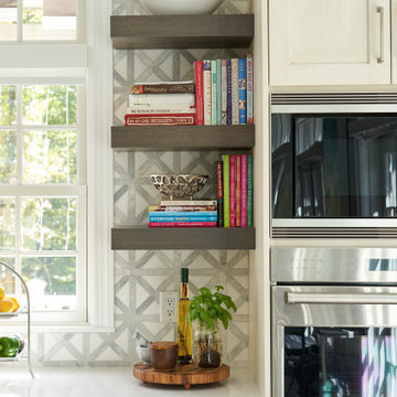
"The Goal: The family that cooks together has the most fun — especially when their kitchen is equipped with four ovens and tons of workspace. After a first-floor renovation of a home for a couple with four grown children, the new kitchen features high-tech appliances purchased through Royal Green and a custom island with a connected table to seat family, friends, and cooking spectators. An old dining room was eliminated, and the whole area was transformed into one open, L-shaped space with a bar and family room.
“They wanted to expand the kitchen and have more of an entertaining room for their family gatherings,” says designer Danielle Florie. She designed the kitchen so that two or three people can work at the same time, with a full sink in the island that’s big enough for cleaning vegetables or washing pots and pans.
Key Features:
Well-Stocked Bar: The bar area adjacent to the kitchen doubles as a coffee center. Topped with a leathered brown marble, the bar houses the coffee maker as well as a wine refrigerator, beverage fridge, and built-in ice maker. Upholstered swivel chairs encourage people to gather and stay awhile.
Finishing Touches: Counters around the kitchen and the island are covered with a Cambria quartz that has the light, airy look the homeowners wanted and resists stains and scratches. A geometric marble tile backsplash is an eye-catching decorative element.
Into the Wood: The larger table in the kitchen was handmade for the family and matches the island base. On the floor, wood planks with a warm gray tone run diagonally for added interest."
Bilotta Designer: Danielle Florie
Photographer: Phillip Ennis
 Michael Nash Design, Build & Homes
The lake views from this townhome’s master bathroom are panoramic and breathtaking. Unfortunately, the original layout of the bathroom itself left much to be desired. An old whirlpool tub took up too much floor space, the shower stall was too small and the room itself was cramped and dysfunctional.
The homeowners’ goals called for improving the room’s traffic flow, creating a larger and more functional shower stall with dual use, taking full advantage of the lake view and bringing a Romanesque theme to the space.
The first step in the renovation was to replace the old whirlpool with a small corner tub that took up half the space. The rest of that side of the room is devoted to the beautiful Roman-style shower stall with double rain shower, double body sprays and built in niches, arch headers and a heavy glass enclosure. The stalls creative use of mosaic tiles and medallion has made this shower stall the jewel of this project.
The vanity uses dark cherry cabinetry which complements the cream rustic tumbled marble and oil rubbed bronze fixtures. A beautiful, curved slab of exotic marble was cut for the countertop and two hand-crafted vessel sinks made from tumbled stone are on top of it.
The homeowners have never been happier to use their master bathroom .They get to have their own Roman-style bath experience by taking a few steps from their bedroom. Looking out of this gorgeous bathroom overlooking the lake just cannot be expressed with words.
68