
Search results for "Larger goals" in Home Design Ideas

 Native Edge Landscape
Another fun Crestview project! This young couple wanted a back yard that reflected their bohemian-eclectic style and could add additional privacy from the ever climbing construction around them. A place for “hanging out and drinking coffee or beer in the backyard.” But what was most exciting, was the air stream they had just purchased and were in the process of restoring. With the end goal of using it as a guest home for family and friends, we were challenged with creating a space that was cohesive and connected this new living space with the rest of the yard.
In the front we had another quark to fix. The sidewalk from their front door to the street suddenly stopped 5 feet from the curb, making a less than inviting entry for guests. So, creating a new usable entryway with additional curb appeal was a top priority.
We managed the entertainment space by using modern poured concrete pad’s as a focal. A poured concrete wall serves as a bench as well as creates a visual anchor for the patio area. To soften the hard materials, small plantings of succulents and ground cover were planted in the spaces between the pads. For a backdrop, a custom Cedar Plank wall and trellis combined to soften the vertical space and add plenty of privacy. The trellis is anchored by a Coral Vine to add interest. Cafe style lighting was strung across the area create a sense of intimacy.
We also completed the fence transition, and eliminated the grass areas that were not being utilized to reduce the amount of water waste in the landscape, and replaced these areas with beneficial plantings for the wildlife.
Overall, this landscape was completed with a cohesive Austin-friendly design in mind for these busy young professionals!
Caleb Kerr - http://www.calebkerr.com

 Michael Nash Design, Build & Homes
The lake views from this townhome’s master bathroom are panoramic and breathtaking. Unfortunately, the original layout of the bathroom itself left much to be desired. An old whirlpool tub took up too much floor space, the shower stall was too small and the room itself was cramped and dysfunctional.
The homeowners’ goals called for improving the room’s traffic flow, creating a larger and more functional shower stall with dual use, taking full advantage of the lake view and bringing a Romanesque theme to the space.
The first step in the renovation was to replace the old whirlpool with a small corner tub that took up half the space. The rest of that side of the room is devoted to the beautiful Roman-style shower stall with double rain shower, double body sprays and built in niches, arch headers and a heavy glass enclosure. The stalls creative use of mosaic tiles and medallion has made this shower stall the jewel of this project.
The vanity uses dark cherry cabinetry which complements the cream rustic tumbled marble and oil rubbed bronze fixtures. A beautiful, curved slab of exotic marble was cut for the countertop and two hand-crafted vessel sinks made from tumbled stone are on top of it.
The homeowners have never been happier to use their master bathroom .They get to have their own Roman-style bath experience by taking a few steps from their bedroom. Looking out of this gorgeous bathroom overlooking the lake just cannot be expressed with words.


Find the right local pro for your project
 Bilotta Kitchen & Home
Written by Mary Kate Hogan for Westchester Home Magazine.
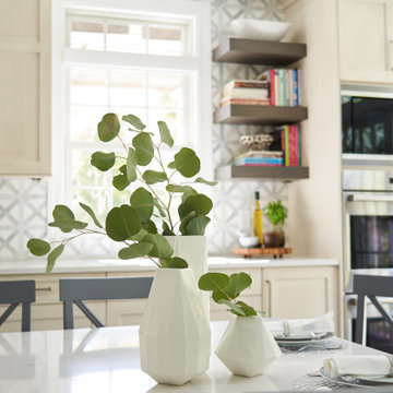
"The Goal: The family that cooks together has the most fun — especially when their kitchen is equipped with four ovens and tons of workspace. After a first-floor renovation of a home for a couple with four grown children, the new kitchen features high-tech appliances purchased through Royal Green and a custom island with a connected table to seat family, friends, and cooking spectators. An old dining room was eliminated, and the whole area was transformed into one open, L-shaped space with a bar and family room.
“They wanted to expand the kitchen and have more of an entertaining room for their family gatherings,” says designer Danielle Florie. She designed the kitchen so that two or three people can work at the same time, with a full sink in the island that’s big enough for cleaning vegetables or washing pots and pans.
Key Features:
Well-Stocked Bar: The bar area adjacent to the kitchen doubles as a coffee center. Topped with a leathered brown marble, the bar houses the coffee maker as well as a wine refrigerator, beverage fridge, and built-in ice maker. Upholstered swivel chairs encourage people to gather and stay awhile.
Finishing Touches: Counters around the kitchen and the island are covered with a Cambria quartz that has the light, airy look the homeowners wanted and resists stains and scratches. A geometric marble tile backsplash is an eye-catching decorative element.
Into the Wood: The larger table in the kitchen was handmade for the family and matches the island base. On the floor, wood planks with a warm gray tone run diagonally for added interest."
Bilotta Designer: Danielle Florie
Photographer: Phillip Ennis

 Tiffany Brooks, HGTV Host & Interior Designer
Inquire About Our Design Services
When we first started talking in the spring of 2015, I was impressed. She was witty, realistic, and understood that as much as she loves my shows on HGTV, design does not does not happen in 43 minutes! She told me about her space, and how she felt that her bedroom seemed “blah” to her. She had no retreat. Molly desperately longed for a place that she could spend time in, read in, play in and above all, relax in.
What we did:
Many people are terrified of hiring a designer. Rightfully so, they are investing a pretty penny in their homes. They want to make sure that everything, down to the last floral arrangement, is to their liking, because they will have to live it (and pay for it). Unfortunately, a client can unintentionally stifle a designer’s creativity through micro-management. This can produce lackluster results and ultimately cause more time (and money) to be spent on a project than is really necessary.
With Molly, that was never an issue. Before she even showed me the room in question, she said that I could have full creative license to do what I needed to do to her bedroom. SAY WHAAH!?
With Molly giving me complete creative freedom, I planned everything out and got down to business. The result: Bite-your-bottom-lip sexy. I don’t get jealous of too many of my clients’ spaces, but this one still takes my breath away every time I look at the pics!
The craziest part was that by adding more furniture, it actually made the space feel larger.
Molly and her husband Patrick loved the finished space, and promised me I will be back to finish the rest of the house!
Here’s the highlights of the rest of the project:
I came up with a space plan with three options.
Next, we reviewed mood boards and fabric schemes that would work for both Molly and her hubby Patrick.
We started with the bed. My goal was to add edge to its otherwise traditional style.
We decided to spice things up by painting the trim work in the room black.
We built in layers of lighting with dimmers. In a bedroom everything should be on dimmers, right? Right.
We designed and customized bedding, chairs and window treatments.
Together with Molly, we selected the most perfect wallpaper. This geometric “grasscloth” adds so much depth and dimension that was just missing before.
What I love:
That light fixture. I mean it is really, really amazing in person.
The porcupine mirror. This thing came packaged like it was the hope diamond, and everyone was terrified to handle it. But it really became a highlight of the room.

 Katie Hutchison Studio
With two small children and a third on the way, the owners of an original eighteenth century Cape were quickly out-growing it, but they had no desire to move away from the Cape Cod home and location they loved. They simply needed a reconfigured layout and more space. Their goals included repurposing some existing rooms, adding a new kitchen/family area plus screen porch on the first level, and creating a master suite and roof deck with an outdoor shower on the second level, connected by a new stair.
Our challenge was to improve the flow between existing spaces, and design the two-story addition without overwhelming the pint-sized original Cape. We took advantage of the lower grade at the rear of the property to step the first floor of the addition down two steps from the existing main level. This allowed us to align the second floor in the addition with the existing second floor, while gaining ceiling height in the new first-floor kitchen/family area. We composed a cross-gabled form for the addition to improve the second floor headroom, while maintaining the existing eave line. We then extended some existing shed dormers to gain headroom and enhance function. We also expanded the outdoor living area with privacy walls along the roof deck.
New, larger, double–hung windows that match the lite configuration of the existing windows, along with new side-wall shingles and trim which resemble the existing exterior treatment help to tie the new addition to the old Cape. Though there’s no mistaking the new for the old, the two are simpatico.
Katie Hutchison Studio collaborated with Geoffrey Koper Architect of Yarmouth Port, Mass. on the Yarmouth Port Antique Cape Renovation and Addition. Kitchen fit-out and interior finishes, fixtures, and furnishings by others.
photo by Katie Hutchison
 Katie Hutchison Studio
With two small children and a third on the way, the owners of an original eighteenth century Cape were quickly out-growing it, but they had no desire to move away from the Cape Cod home and location they loved. They simply needed a reconfigured layout and more space. Their goals included repurposing some existing rooms, adding a new kitchen/family area plus screen porch on the first level, and creating a master suite and roof deck with an outdoor shower on the second level, connected by a new stair.
Our challenge was to improve the flow between existing spaces, and design the two-story addition without overwhelming the pint-sized original Cape. We took advantage of the lower grade at the rear of the property to step the first floor of the addition down two steps from the existing main level. This allowed us to align the second floor in the addition with the existing second floor, while gaining ceiling height in the new first-floor kitchen/family area. We composed a cross-gabled form for the addition to improve the second floor headroom, while maintaining the existing eave line. We then extended some existing shed dormers to gain headroom and enhance function. We also expanded the outdoor living area with privacy walls along the roof deck.
New, larger, double–hung windows that match the lite configuration of the existing windows, along with new side-wall shingles and trim which resemble the existing exterior treatment help to tie the new addition to the old Cape. Though there’s no mistaking the new for the old, the two are simpatico.
Katie Hutchison Studio collaborated with Geoffrey Koper Architect of Yarmouth Port, Mass. on the Yarmouth Port Antique Cape Renovation and Addition. Kitchen fit-out and interior finishes, fixtures, and furnishings by others.
photo by Katie Hutchison


 StoneUnlimited Kitchen and Bath Remodeling
This newly renovated kitchen by Stoneunlimited Kitchen and Bath Remodeling is located in Roswell GA and will truly inspire those of you looking to change up your kitchen. We love EVERYTHING about this kitchen! From the visual impact of the subway tile counter to ceiling back-splash , to the contrasting open shelves, and the storage solutions of the cabinetry, the goal was to open up the space and create an open concept layout that would be aesthetically pleasing, efficient and spacious. Removing the wall between the kitchen and dining area has completely changed the ebb and flow of this living space. The kitchen is open and airy as the light is able to flow fluidly from the dining area to the window above the sink. Re-configuring the layout to allow the installation of a large kitchen island with range and ample seating has maximized the space and created a larger area for gathering. If you haven't seen the before and after pictures of this kitchen, please check them out, you'll be amazed!
Demo: Existing Wall dividing the kitchen from the dinning area, taking away the raised bar countertop and installing a kitchen island with range
Countertops: 3 CM White Galaxy Granite with 1/4 round edge
Sink: Kohler White Haven Apron front Cast Iron 30" Faucet: Delta Cassidy Kohler
Tile: 3"x6" Cobsa Granada Crackled White Subway Tile Floating Shelves: Custom Made
 Michael Nash Design, Build & Homes
The lake views from this townhome’s master bathroom are panoramic and breathtaking. Unfortunately, the original layout of the bathroom itself left much to be desired. An old whirlpool tub took up too much floor space, the shower stall was too small and the room itself was cramped and dysfunctional.
The homeowners’ goals called for improving the room’s traffic flow, creating a larger and more functional shower stall with dual use, taking full advantage of the lake view and bringing a Romanesque theme to the space.
The first step in the renovation was to replace the old whirlpool with a small corner tub that took up half the space. The rest of that side of the room is devoted to the beautiful Roman-style shower stall with double rain shower, double body sprays and built in niches, arch headers and a heavy glass enclosure. The stalls creative use of mosaic tiles and medallion has made this shower stall the jewel of this project.
The vanity uses dark cherry cabinetry which complements the cream rustic tumbled marble and oil rubbed bronze fixtures. A beautiful, curved slab of exotic marble was cut for the countertop and two hand-crafted vessel sinks made from tumbled stone are on top of it.
The homeowners have never been happier to use their master bathroom .They get to have their own Roman-style bath experience by taking a few steps from their bedroom. Looking out of this gorgeous bathroom overlooking the lake just cannot be expressed with words.
 Katie Hutchison Studio
With two small children and a third on the way, the owners of an original eighteenth century Cape were quickly out-growing it, but they had no desire to move away from the Cape Cod home and location they loved. They simply needed a reconfigured layout and more space. Their goals included repurposing some existing rooms, adding a new kitchen/family area plus screen porch on the first level, and creating a master suite and roof deck with an outdoor shower on the second level, connected by a new stair.
Our challenge was to improve the flow between existing spaces, and design the two-story addition without overwhelming the pint-sized original Cape. We took advantage of the lower grade at the rear of the property to step the first floor of the addition down two steps from the existing main level. This allowed us to align the second floor in the addition with the existing second floor, while gaining ceiling height in the new first-floor kitchen/family area. We composed a cross-gabled form for the addition to improve the second floor headroom, while maintaining the existing eave line. We then extended some existing shed dormers to gain headroom and enhance function. We also expanded the outdoor living area with privacy walls along the roof deck.
New, larger, double–hung windows that match the lite configuration of the existing windows, along with new side-wall shingles and trim which resemble the existing exterior treatment help to tie the new addition to the old Cape. Though there’s no mistaking the new for the old, the two are simpatico.
Katie Hutchison Studio collaborated with Geoffrey Koper Architect of Yarmouth Port, Mass. on the Yarmouth Port Antique Cape Renovation and Addition. Kitchen fit-out and interior finishes, fixtures, and furnishings by others.
photo by Katie Hutchison
 Katie Hutchison Studio
With two small children and a third on the way, the owners of an original eighteenth century Cape were quickly out-growing it, but they had no desire to move away from the Cape Cod home and location they loved. They simply needed a reconfigured layout and more space. Their goals included repurposing some existing rooms, adding a new kitchen/family area plus screen porch on the first level, and creating a master suite and roof deck with an outdoor shower on the second level, connected by a new stair.
Our challenge was to improve the flow between existing spaces, and design the two-story addition without overwhelming the pint-sized original Cape. We took advantage of the lower grade at the rear of the property to step the first floor of the addition down two steps from the existing main level. This allowed us to align the second floor in the addition with the existing second floor, while gaining ceiling height in the new first-floor kitchen/family area. We composed a cross-gabled form for the addition to improve the second floor headroom, while maintaining the existing eave line. We then extended some existing shed dormers to gain headroom and enhance function. We also expanded the outdoor living area with privacy walls along the roof deck.
New, larger, double–hung windows that match the lite configuration of the existing windows, along with new side-wall shingles and trim which resemble the existing exterior treatment help to tie the new addition to the old Cape. Though there’s no mistaking the new for the old, the two are simpatico.
Katie Hutchison Studio collaborated with Geoffrey Koper Architect of Yarmouth Port, Mass. on the Yarmouth Port Antique Cape Renovation and Addition. Kitchen fit-out and interior finishes, fixtures, and furnishings by others.
photo by Katie Hutchison
 Michael Nash Design, Build & Homes
The lake views from this townhome’s master bathroom are panoramic and breathtaking. Unfortunately, the original layout of the bathroom itself left much to be desired. An old whirlpool tub took up too much floor space, the shower stall was too small and the room itself was cramped and dysfunctional.
The homeowners’ goals called for improving the room’s traffic flow, creating a larger and more functional shower stall with dual use, taking full advantage of the lake view and bringing a Romanesque theme to the space.
The first step in the renovation was to replace the old whirlpool with a small corner tub that took up half the space. The rest of that side of the room is devoted to the beautiful Roman-style shower stall with double rain shower, double body sprays and built in niches, arch headers and a heavy glass enclosure. The stalls creative use of mosaic tiles and medallion has made this shower stall the jewel of this project.
The vanity uses dark cherry cabinetry which complements the cream rustic tumbled marble and oil rubbed bronze fixtures. A beautiful, curved slab of exotic marble was cut for the countertop and two hand-crafted vessel sinks made from tumbled stone are on top of it.
The homeowners have never been happier to use their master bathroom .They get to have their own Roman-style bath experience by taking a few steps from their bedroom. Looking out of this gorgeous bathroom overlooking the lake just cannot be expressed with words.

 Jarrett Design
Wrestling is this family’s sport. Applying lessons from the mat, this couple won their dream kitchen. Similar to pinning one’s opponent, the remodeling process takes visualization, determination, and keeping one’s eye on the prize. These clients came to us with a clear vision of their new kitchen. They knew what they wanted it to look like and how they needed the space to function for their family. Their goal was to transform an outdated floor plan that included a dark, small kitchen into a bright, open space with counters galore, an island with seating and room for a large dining table. The couple had recently purchased this home from the husband’s parents. This was where he was raised. The family home was very special to them and now it was time to make it ‘theirs’.
Just as in focus as their vision, was their budget. They knew it was tight, but were willing to make reasonable concessions. Walls were removed, flooring changed and the new kitchen switched places with the dining area. This change allowed the sun porch to become more inviting, an unexpected bonus. Semi-custom cabinetry, in contrasting paint colors, and quartz counter tops brighten the space. The galley design with island seating makes cooking for the family and entertaining larger groups enjoyable. The entire process was smooth and the result aesthetically fabulous with all the function they desired.
This project was one of our favorites because we were thrilled to be able to help provide this dream kitchen on a budget to some of the very nicest clients, a winning result for all.
Matt Villano Photography
 StoneUnlimited Kitchen and Bath Remodeling
This newly renovated kitchen by Stoneunlimited Kitchen and Bath Remodeling is located in Roswell GA and will truly inspire those of you looking to change up your kitchen. We love EVERYTHING about this kitchen! From the visual impact of the subway tile counter to ceiling back-splash , to the contrasting open shelves, and the storage solutions of the cabinetry, the goal was to open up the space and create an open concept layout that would be aesthetically pleasing, efficient and spacious. Removing the wall between the kitchen and dining area has completely changed the ebb and flow of this living space. The kitchen is open and airy as the light is able to flow fluidly from the dining area to the window above the sink. Re-configuring the layout to allow the installation of a large kitchen island with range and ample seating has maximized the space and created a larger area for gathering. If you haven't seen the before and after pictures of this kitchen, please check them out, you'll be amazed!
Demo: Existing Wall dividing the kitchen from the dinning area, taking away the raised bar countertop and installing a kitchen island with range
Countertops: 3 CM White Galaxy Granite with 1/4 round edge
Sink: Kohler White Haven Apron front Cast Iron 30" Faucet: Delta Cassidy Kohler
Tile: 3"x6" Cobsa Granada Crackled White Subway Tile Floating Shelves: Custom Made
 Michael Nash Design, Build & Homes
The lake views from this townhome’s master bathroom are panoramic and breathtaking. Unfortunately, the original layout of the bathroom itself left much to be desired. An old whirlpool tub took up too much floor space, the shower stall was too small and the room itself was cramped and dysfunctional.
The homeowners’ goals called for improving the room’s traffic flow, creating a larger and more functional shower stall with dual use, taking full advantage of the lake view and bringing a Romanesque theme to the space.
The first step in the renovation was to replace the old whirlpool with a small corner tub that took up half the space. The rest of that side of the room is devoted to the beautiful Roman-style shower stall with double rain shower, double body sprays and built in niches, arch headers and a heavy glass enclosure. The stalls creative use of mosaic tiles and medallion has made this shower stall the jewel of this project.
The vanity uses dark cherry cabinetry which complements the cream rustic tumbled marble and oil rubbed bronze fixtures. A beautiful, curved slab of exotic marble was cut for the countertop and two hand-crafted vessel sinks made from tumbled stone are on top of it.
The homeowners have never been happier to use their master bathroom .They get to have their own Roman-style bath experience by taking a few steps from their bedroom. Looking out of this gorgeous bathroom overlooking the lake just cannot be expressed with words.

 Jennifer Garner Interiors
The exercise room features cork flooring.
Inspiration for a timeless home gym remodel in Austin
Inspiration for a timeless home gym remodel in Austin
 Drury Design
THE SETUP
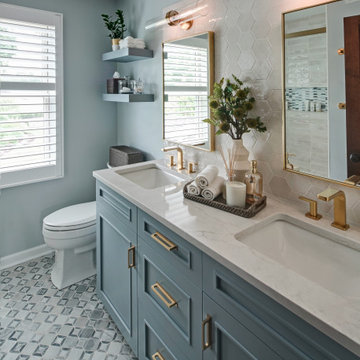
Sam’s clients wanted to update their hall bathroom used by their three children. The goal was to create a space that is both kid-friendly and elegant, ensuring it remains functional and stylish as the children grow. The original bathroom felt confined due to dark materials and a single-sink vanity. The challenge was to find a design that looks great now and in the future.
Design objectives:
Create a sense of spaciousness
Increase storage for bathroom necessities and daily routines
Enhance lighting
THE REMODEL
Design challenges to be solved:
No structural changes – must keep the tub and wall structure
Transforming a small, dark space into a bright, open one without adding a new window
Multi-user-minded – Improving functionality for multiple users simultaneously
Timeless & kid-friendly – create a comfy kid-friendly look that won’t appear dated as the kids grow older
THE RENEWED SPACE
Design solutions:
Slimmer Tub and Sliding Shower Door installed to free up functional space, making the bathroom feel larger.
Lighter Materials used to reflect more light and add a vibrant feel. Open shelves above the toilet provide storage without making the space feel cramped, while allowing light from the existing window to permeate.
Dual Sink Vanity added, and split the mirror into two, creating individual stations for the kids and enhancing usability during busy routines.
Kid-Friendly Features – Incorporated toe-kick lighting that works as a nightlight, a lower-mounted shower handheld, and a large, accessible shower niche. The geometric shapes and blue color palette contribute to a fun yet sophisticated look.
The clients are thrilled with the transformation. The bathroom is now fun and elegant, providing a timeless look that will grow with the kids. They appreciate the increased functionality and the bright, open feel of the space.
This remodel successfully blends practical solutions with stylish design, ensuring the hall bathroom meets the needs of a busy family while maintaining a sophisticated look.
 Outdoor Dreams
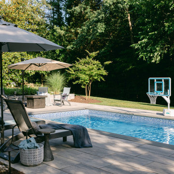
Large transitional backyard concrete paver and rectangular pool landscaping photo in Richmond
 Jarrett Design
Wrestling is this family’s sport. Applying lessons from the mat, this couple won their dream kitchen. Similar to pinning one’s opponent, the remodeling process takes visualization, determination, and keeping one’s eye on the prize. These clients came to us with a clear vision of their new kitchen. They knew what they wanted it to look like and how they needed the space to function for their family. Their goal was to transform an outdated floor plan that included a dark, small kitchen into a bright, open space with counters galore, an island with seating and room for a large dining table. The couple had recently purchased this home from the husband’s parents. This was where he was raised. The family home was very special to them and now it was time to make it ‘theirs’.
Just as in focus as their vision, was their budget. They knew it was tight, but were willing to make reasonable concessions. Walls were removed, flooring changed and the new kitchen switched places with the dining area. This change allowed the sun porch to become more inviting, an unexpected bonus. Semi-custom cabinetry, in contrasting paint colors, and quartz counter tops brighten the space. The galley design with island seating makes cooking for the family and entertaining larger groups enjoyable. The entire process was smooth and the result aesthetically fabulous with all the function they desired.
This project was one of our favorites because we were thrilled to be able to help provide this dream kitchen on a budget to some of the very nicest clients, a winning result for all.
Matt Villano Photography

 JRP Design & Remodel
The main goal to reawaken the beauty of this outdated kitchen was to create more storage and make it a more functional space. This husband and wife love to host their large extended family of kids and grandkids. The JRP design team tweaked the floor plan by reducing the size of an unnecessarily large powder bath. Since storage was key this allowed us to turn a small pantry closet into a larger walk-in pantry.
Keeping with the Mediterranean style of the house but adding a contemporary flair, the design features two-tone cabinets. Walnut island and base cabinets mixed with off white full height and uppers create a warm, welcoming environment. With the removal of the dated soffit, the cabinets were extended to the ceiling. This allowed for a second row of upper cabinets featuring a walnut interior and lighting for display. Choosing the right countertop and backsplash such as this marble-like quartz and arabesque tile is key to tying this whole look together.
The new pantry layout features crisp off-white open shelving with a contrasting walnut base cabinet. The combined open shelving and specialty drawers offer greater storage while at the same time being visually appealing.
The hood with its dark metal finish accented with antique brass is the focal point. It anchors the room above a new 60” Wolf range providing ample space to cook large family meals. The massive island features storage on all sides and seating on two for easy conversation making this kitchen the true hub of the home.
69