
Search results for "Larger goals" in Home Design Ideas
 CCM Contracting LLC
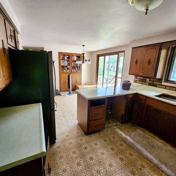
Full Kitchen Remodel in Green Bay, WI
Complete Transformation | Flooring, Cabinetry, Drywall & Finish Carpentry
This full kitchen remodel in Green Bay, Wisconsin transformed an outdated layout with original cabinetry and worn flooring into a clean, modern, highly functional space designed for long-term durability.
As a veteran-owned home remodeling contractor serving Brown County, our goal was to completely rebuild the space from the inside out — not simply update surface finishes.
Scope of Work Included:
• Full demolition of existing cabinetry and finishes
• New drywall installation and wall preparation
• Updated electrical layout coordination
• Interior painting throughout
• Installation of new shaker-style cabinets
• Modern cabinet hardware
• New laminate countertops
• Luxury vinyl plank flooring installation
• New base trim and window casing
• Updated sink and appliance integration
The original kitchen featured dated cabinetry, heavy trim details, and aging sheet vinyl flooring. By removing the old finishes and rebuilding with clean lines and neutral tones, the space now feels brighter, larger, and more functional.
The new layout maximizes wall space, improves workflow, and creates a cohesive transition into the adjoining dining area. Updated trim and casing details complete the project and elevate the overall finish quality.
Built for Homeowners Who Value Quality
CCM Contracting LLC is a veteran-owned remodeling contractor serving Green Bay and Brown County, Wisconsin.
We specialize in structured, full-scope renovations for homeowners who prioritize craftsmanship, communication, and professional execution.
We do not approach projects as surface upgrades. We rebuild spaces properly — with durable materials, disciplined process, and clean finish work.
If you are planning a kitchen remodel in Green Bay and are seeking a contractor who treats your home with precision and respect, we welcome the opportunity to discuss your vision.

 Michael Nash Design, Build & Homes
Built in the early 1950s, this small urban townhouse is located in North Old Town Alexandria in an area currently undergoing major redevelopment. The neighborhood is popular with, and affordable for, young people and families, and very convenient to Washington, DC.
In its heyday, the townhouse touted a stately brick exterior, plaster walls, tongue and groove wood flooring and beautiful wooden staircase. Sixty years later, however, the homeowners were faced with crumbling masonry, sagging floors, a double layer of wallpaper over the plaster walls, a crumbling staircase, a dysfunctional kitchen and small, dark second floor rooms. Additionally, the basement had a low ceiling, moldy and cinder block walls, no plumbing and a large boiler taking up most of the space.
The homeowners’ goal was to restore the exterior’s historic look while creating an interior up-to-date for the 21st Century. To turn their vision into reality, they turned to Michael Nash Design, Build & Homes.
Design Solutions
To maintain the townhome’s historic exterior, the Michael Nash team carefully removed, salvaged, restored and reused existing brick masonry. Matching fascia boards and windows were combined with existing windows to complete the exterior renovation.
All interior walls were gutted and reframed. New electrical work, new insulation and new drywall were installed. Much of the home’s original trim was salvaged and reused, as was a piece of art glass, all to keep a bit of the past in the renovation.
The sagging subfloors were fixed, new hard wood floors were installed and a new staircase and railing were designed in a style similar to the original.
The solid wall between the kitchen and the dining room was removed, plumbing was relocated for a new sink location and the kitchen got expanded with an island into the dining room. Closet and plumbing stacks were relocated to allow a new space for fridge. Stainless steel appliances, granite countertops and custom cabinetry highlight the new modern kitchen.
The plan called for redesigning the three bedrooms on the second floor to allow a larger bathroom, walk-in closet and wider hallways. In addition to new roofing, a large skylight was installed to allow natural light into the bathroom and the upper hallway.
The basement was totally revamped. New plumbing was put in place for a full bathroom, laundry room and a den. New e-grass window was installed in the basement to bring this basement up to current building codes.
This homeowners love the neighborhood and now their home gives them the opportunity to stay in the same location.
 Michael Nash Design, Build & Homes
Built in the early 1950s, this small urban townhouse is located in North Old Town Alexandria in an area currently undergoing major redevelopment. The neighborhood is popular with, and affordable for, young people and families, and very convenient to Washington, DC.
In its heyday, the townhouse touted a stately brick exterior, plaster walls, tongue and groove wood flooring and beautiful wooden staircase. Sixty years later, however, the homeowners were faced with crumbling masonry, sagging floors, a double layer of wallpaper over the plaster walls, a crumbling staircase, a dysfunctional kitchen and small, dark second floor rooms. Additionally, the basement had a low ceiling, moldy and cinder block walls, no plumbing and a large boiler taking up most of the space.
The homeowners’ goal was to restore the exterior’s historic look while creating an interior up-to-date for the 21st Century. To turn their vision into reality, they turned to Michael Nash Design, Build & Homes.
Design Solutions
To maintain the townhome’s historic exterior, the Michael Nash team carefully removed, salvaged, restored and reused existing brick masonry. Matching fascia boards and windows were combined with existing windows to complete the exterior renovation.
All interior walls were gutted and reframed. New electrical work, new insulation and new drywall were installed. Much of the home’s original trim was salvaged and reused, as was a piece of art glass, all to keep a bit of the past in the renovation.
The sagging subfloors were fixed, new hard wood floors were installed and a new staircase and railing were designed in a style similar to the original.
The solid wall between the kitchen and the dining room was removed, plumbing was relocated for a new sink location and the kitchen got expanded with an island into the dining room. Closet and plumbing stacks were relocated to allow a new space for fridge. Stainless steel appliances, granite countertops and custom cabinetry highlight the new modern kitchen.
The plan called for redesigning the three bedrooms on the second floor to allow a larger bathroom, walk-in closet and wider hallways. In addition to new roofing, a large skylight was installed to allow natural light into the bathroom and the upper hallway.
The basement was totally revamped. New plumbing was put in place for a full bathroom, laundry room and a den. New e-grass window was installed in the basement to bring this basement up to current building codes.
This homeowners love the neighborhood and now their home gives them the opportunity to stay in the same location.
Find the right local pro for your project

 JRP Design & Remodel
This home had a kitchen that wasn’t meeting the family’s needs, nor did it fit with the coastal Mediterranean theme throughout the rest of the house. The goals for this remodel were to create more storage space and add natural light. The biggest item on the wish list was a larger kitchen island that could fit a family of four. They also wished for the backyard to transform from an unsightly mess that the clients rarely used to a beautiful oasis with function and style.
One design challenge was incorporating the client’s desire for a white kitchen with the warm tones of the travertine flooring. The rich walnut tone in the island cabinetry helped to tie in the tile flooring. This added contrast, warmth, and cohesiveness to the overall design and complemented the transitional coastal theme in the adjacent spaces. Rooms alight with sunshine, sheathed in soft, watery hues are indicative of coastal decorating. A few essential style elements will conjure the coastal look with its casual beach attitude and renewing seaside energy, even if the shoreline is only in your mind's eye.
By adding two new windows, all-white cabinets, and light quartzite countertops, the kitchen is now open and bright. Brass accents on the hood, cabinet hardware and pendant lighting added warmth to the design. Blue accent rugs and chairs complete the vision, complementing the subtle grey ceramic backsplash and coastal blues in the living and dining rooms. Finally, the added sliding doors lead to the best part of the home: the dreamy outdoor oasis!
Every day is a vacation in this Mediterranean-style backyard paradise. The outdoor living space emphasizes the natural beauty of the surrounding area while offering all of the advantages and comfort of indoor amenities.
The swimming pool received a significant makeover that turned this backyard space into one that the whole family will enjoy. JRP changed out the stones and tiles, bringing a new life to it. The overall look of the backyard went from hazardous to harmonious. After finishing the pool, a custom gazebo was built for the perfect spot to relax day or night.
It’s an entertainer’s dream to have a gorgeous pool and an outdoor kitchen. This kitchen includes stainless-steel appliances, a custom beverage fridge, and a wood-burning fireplace. Whether you want to entertain or relax with a good book, this coastal Mediterranean-style outdoor living remodel has you covered.
Photographer: Andrew - OpenHouse VC

 River Valley Landscapes
The property is one of the original farm houses located on the main street of a small town. It has been in the family for many years and our client just inherited the property. They were trying to have balance of preserving the old while realizing modern day living has its benefits too. The house had a large addition added using mostly old style materials, but designed with function and modern day luxuries. Our goal was to carry that theme to the outside.
Our first problem we had to address was how to transition between the first floor elevation changes. The lower room was the husband’s office. He stated in the future he may have clients over and it would be nice to have an area to sit outside. The wife’s main concern was to renew the four corner garden. She also felt it was very important to be able to see it from the kitchen area. Finally there was an old wishing well stuck right outside the kitchen. They both felt it would be neat to be able to incorporate this in some how. They wanted a patio area with a built in grill to accommodate there family and friends. They also wanted to keep a large play area for the kids.
We were able to pull this off successfully. We addressed the first issue by having a small lower level flagstone area. This area is large enough for 1 to 2 people to sit comfortably. It also provides a transition from his office to the larger patio area. We installed a simple small gravel sitting area opposite of the main patio. This provides our client a secluded place to relax or do business. Mrs.... told me she is amazed how much her and her husband enjoys this area. It is so peaceful looking at the small creek over a glass of wine.
We built a natural limestone retaining wall to create the patio terrace. The stone was chosen to extend the houses architectural elements into the landscape. Irregular broken flagstone was used to give it a more casual feel. We installed three Serviceberries into the patio terrace to replace some trees that were taken down during the remodeling. She was very concern that they would block the view of the four corner garden. We new they were crucial to nestle in the terrace, so we placed them for a couple days for her to decide. Fortunately she agreed they not only kept the view open, but helped frame the garden.
The four corner garden was designed to be viewed from afar and experienced up close. We wanted the space to have some formal structure while keeping with the casual farm house feel. Another natural limestone retaining wall was created. This leveled the garden terrace and helped associate it with the rest of the property. The four corner garden is nestled into the existing woods edge. This provides three distinct experiences to entering the garden; a more formal from the driveway, an open feel from the lower lawn, and a more natural / casual experience from the wooded area. The Plymouth brown gravel was used for the center of the garden. This helped highlight the stone post that was found during construction. The gravel also brings the sense of sound into the garden space. Lamb’s ear was chosen as a fun way to get kids interest in horticulture.
The balance of using the new to create the old feel is what makes this project a success. The property has already hosted a local historical society event and won an award for its preservation efforts. When Mrs.... can’t find her husband, she knows he is either reading the newspaper by the grill or resting in the hammock along the wood’s path.

 Landis Architects | Builders
We worked with a corporation and their out-of-town architect on this residential condominium construction in Washington D.C. The company uses the apartment for executive housing and meetings. Its goal was to create a flexible space to be used for both purposes. We renovated the kitchen, two bathrooms, and one bedroom. The central focus is the sleek new open kitchen, though we worked on the entire 1200 square foot apartment.
The client provided the architectural design for the kitchen and the rest of the apartment. The biggest layout changes were:
*Removing the walls of the existing kitchen to create a dramatic open kitchen that runs all the way to the window on one side and an island with a waterfall countertop on the other side.
*A layout that provided space for a large conference table
*Closing off one door of the bedroom and creating a larger opening from the living room side and installing pocket doors
These changes required extensive systems work throughout the apartment, including redoing all the ductwork, modifying the sprinkler system and relocating sprinkler heads to meet fire code. We didn’t run into any surprises with the systems because our team had investigated the structure in the pre-construction stage and cut holes in the drywall to locate the plumbing pipes, columns, and wiring. We had to turn and move the existing HVAC system so we could hide it in one of the kitchen cabinets.
We built the structure that anchors one end of the kitchen. It hides a refrigerator (with flush panel doors), electrical panel, and writing for the flat screen television. A soffit above the kitchen hides all the ductwork, and is fitted with recessed lights and LED cove lighting above.
The client supplied the kitchen cabinetry. The countertops are quartz by Caesarstone in Haze. We installed the flooring material on the base of one side of the island.
Backsplash. The dramatic backsplash is made of thin sheets of porcelain. The 5 mm thick material by Fiandre comes in 5-foot by 10-foot sheets that comes in a continuous pattern or can be book-matched. A fabricator measured the layout and cuts for the wall outlets, cut the material and installed it. Our team delivered three sheets of the material up the stairwell of the building. Though they created a template of the material out of wood to make sure it would fit, the actual material was more rigid and it took them a while to maneuver it.
The new wide opening at the end of the living room has pocket doors. We closed off the original hallway door to the bedroom.
Michael K. Wilkinson
 Landis Architects | Builders
We worked with a corporation and their out-of-town architect on this residential condominium construction in Washington D.C. The company uses the apartment for executive housing and meetings. Its goal was to create a flexible space to be used for both purposes. We renovated the kitchen, two bathrooms, and one bedroom. The central focus is the sleek new open kitchen, though we worked on the entire 1200 square foot apartment.
The client provided the architectural design for the kitchen and the rest of the apartment. The biggest layout changes were:
*Removing the walls of the existing kitchen to create a dramatic open kitchen that runs all the way to the window on one side and an island with a waterfall countertop on the other side.
*A layout that provided space for a large conference table
*Closing off one door of the bedroom and creating a larger opening from the living room side and installing pocket doors
These changes required extensive systems work throughout the apartment, including redoing all the ductwork, modifying the sprinkler system and relocating sprinkler heads to meet fire code. We didn’t run into any surprises with the systems because our team had investigated the structure in the pre-construction stage and cut holes in the drywall to locate the plumbing pipes, columns, and wiring. We had to turn and move the existing HVAC system so we could hide it in one of the kitchen cabinets.
We built the structure that anchors one end of the kitchen. It hides a refrigerator (with flush panel doors), electrical panel, and writing for the flat screen television. A soffit above the kitchen hides all the ductwork, and is fitted with recessed lights and LED cove lighting above.
The client supplied the kitchen cabinetry. The countertops are quartz by Caesarstone in Haze. We installed the flooring material on the base of one side of the island.
Backsplash. The dramatic backsplash is made of thin sheets of porcelain. The 5 mm thick material by Fiandre comes in 5-foot by 10-foot sheets that comes in a continuous pattern or can be book-matched. A fabricator measured the layout and cuts for the wall outlets, cut the material and installed it. Our team delivered three sheets of the material up the stairwell of the building. Though they created a template of the material out of wood to make sure it would fit, the actual material was more rigid and it took them a while to maneuver it.
The new wide opening at the end of the living room has pocket doors. We closed off the original hallway door to the bedroom.
Michael K. Wilkinson


 Fiorito Interior Design
For this project, my client’s goal was to remove a rarely-used existing bath tub next to a medium-sized shower and replace it all with a roomy, open, walk-in shower. With soaring, ten-foot high ceilings, this space became a luxurious statement in minimalism!
I chose a neutral, linen-striated ceramic tile for the floor which, since we were creating a barrier-free shower, meant I could run this tile into the shower and add a hidden, tiled drain for a continuous, seamless look. This makes the bathroom appear even larger. For interest, I added opulent, large-format, ceramic tiles with a blue- and grey-veined marble pattern trimmed out with metal strips. A grand glass wall separates the wet area from the rest of the bathroom. Controls for the shower were wisely placed at the entrance which also features towel hooks and a towel bar on a coordinating panel of blue marble ceramic tile.
The rest of the bathroom received a modern makeover as well with a crisp, custom-built vanity and quartz counter top replacing the old tile counter. Undermount sinks and sculptural hardware sit under modern mirrors with integrated LED lights for maximum light on the face. To top this design off, I chose a glamorous but tailored chandelier with discreet crystal embellishments to infuse sophistication into this sleek, minimalist space.
The new room is light, bright, and uncluttered. For this client, the ultimate luxury is not having a space full of things, but having a space that is simply full of space!
Photo by Bernardo Grijalva
 Glenview Haus – Custom Doors & Wine Cellars
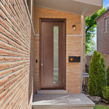
Durability and design are the most important components of every entry door. It is our goal to ensure that our clients do not have to compromise on either of these elements. Our Aluminum clad entry door line offers top of the line safety features that will not only perform beautifully but will have a visually pleasing appearance. This project is located along the lake on the North Shore of Chicago. It was important to provide a door that was aesthetically pleasing and complementary to this modern style home, but to also craft a product that can withstand below zero temperatures and direct sunlight. The duality of this product results in a perfectly secure and insulated entrance.
Durability of Aluminum Clad Entry Doors
Besides the sleek design, our aluminum clad entry door’s have a larger purpose. The durability of our aluminum shield product is unmatched. This shield is attached to our Euro-Tech door slab to ensure for sound insulation, and complete safety. With a thickness of 3-1/2”, our Aluminum Clad entry doors will protect your entryway from harsh elements, as well defend against damage from exposure to direct sunlight. These factors can create wear and tear on solid wood materials and causes aging to the surface. The aluminum shield is a barrier between the exterior elements, and the interior climate. Each aluminum shield has a powder coat finish and is available in any custom color. One feature that is important to note, is that this combination of our Euro-Technology door, paired with the Aluron Shield, creates a very secure and safe entrance.
The Beauty of Glenview Haus’ Aluminum Clad Entry Door
Ideal for residences in Chicago and the North Shore; this door line is built to last and to create a fully
insulated entrance. Our aluminum clad entry doors are incredibly sleek and will appeal to all modern
design enthusiasts. Fully customizable, these doors are guaranteed to stand out. The simple and elegant designs are complementary to Modern and Transitional home architecture.

 Tiffany Brooks, HGTV Host & Interior Designer
Inquire About Our Design Services
When we first started talking in the spring of 2015, I was impressed. She was witty, realistic, and understood that as much as she loves my shows on HGTV, design does not does not happen in 43 minutes! She told me about her space, and how she felt that her bedroom seemed “blah” to her. She had no retreat. Molly desperately longed for a place that she could spend time in, read in, play in and above all, relax in.
What we did:
Many people are terrified of hiring a designer. Rightfully so, they are investing a pretty penny in their homes. They want to make sure that everything, down to the last floral arrangement, is to their liking, because they will have to live it (and pay for it). Unfortunately, a client can unintentionally stifle a designer’s creativity through micro-management. This can produce lackluster results and ultimately cause more time (and money) to be spent on a project than is really necessary.
With Molly, that was never an issue. Before she even showed me the room in question, she said that I could have full creative license to do what I needed to do to her bedroom. SAY WHAAH!?
With Molly giving me complete creative freedom, I planned everything out and got down to business. The result: Bite-your-bottom-lip sexy. I don’t get jealous of too many of my clients’ spaces, but this one still takes my breath away every time I look at the pics!
The craziest part was that by adding more furniture, it actually made the space feel larger.
Molly and her husband Patrick loved the finished space, and promised me I will be back to finish the rest of the house!
Here’s the highlights of the rest of the project:
I came up with a space plan with three options.
Next, we reviewed mood boards and fabric schemes that would work for both Molly and her hubby Patrick.
We started with the bed. My goal was to add edge to its otherwise traditional style.
We decided to spice things up by painting the trim work in the room black.
We built in layers of lighting with dimmers. In a bedroom everything should be on dimmers, right? Right.
We designed and customized bedding, chairs and window treatments.
Together with Molly, we selected the most perfect wallpaper. This geometric “grasscloth” adds so much depth and dimension that was just missing before.
What I love:
That light fixture. I mean it is really, really amazing in person.
The porcupine mirror. This thing came packaged like it was the hope diamond, and everyone was terrified to handle it. But it really became a highlight of the room.

 Forward Design Build Remodel
Goals
While their home provided them with enough square footage, the original layout caused for many rooms to be underutilized. The closed off kitchen and dining room were disconnected from the other common spaces of the home causing problems with circulation and limited sight-lines. A tucked-away powder room was also inaccessible from the entryway and main living spaces in the house.
Our Design Solution
We sought out to improve the functionality of this home by opening up walls, relocating rooms, and connecting the entryway to the mudroom. By moving the kitchen into the formerly over-sized family room, it was able to really become the heart of the home with access from all of the other rooms in the house. Meanwhile, the adjacent family room was made into a cozy, comfortable space with updated fireplace and new cathedral style ceiling with skylights. The powder room was relocated to be off of the entry, making it more accessible for guests.
A transitional style with rustic accents was used throughout the remodel for a cohesive first floor design. White and black cabinets were complimented with brass hardware and custom wood features, including a hood top and accent wall over the fireplace. Between each room, walls were thickened and archway were put in place, providing the home with even more character.
 Michael Nash Design, Build & Homes
Built in the early 1950s, this small urban townhouse is located in North Old Town Alexandria in an area currently undergoing major redevelopment. The neighborhood is popular with, and affordable for, young people and families, and very convenient to Washington, DC.
In its heyday, the townhouse touted a stately brick exterior, plaster walls, tongue and groove wood flooring and beautiful wooden staircase. Sixty years later, however, the homeowners were faced with crumbling masonry, sagging floors, a double layer of wallpaper over the plaster walls, a crumbling staircase, a dysfunctional kitchen and small, dark second floor rooms. Additionally, the basement had a low ceiling, moldy and cinder block walls, no plumbing and a large boiler taking up most of the space.
The homeowners’ goal was to restore the exterior’s historic look while creating an interior up-to-date for the 21st Century. To turn their vision into reality, they turned to Michael Nash Design, Build & Homes.
Design Solutions
To maintain the townhome’s historic exterior, the Michael Nash team carefully removed, salvaged, restored and reused existing brick masonry. Matching fascia boards and windows were combined with existing windows to complete the exterior renovation.
All interior walls were gutted and reframed. New electrical work, new insulation and new drywall were installed. Much of the home’s original trim was salvaged and reused, as was a piece of art glass, all to keep a bit of the past in the renovation.
The sagging subfloors were fixed, new hard wood floors were installed and a new staircase and railing were designed in a style similar to the original.
The solid wall between the kitchen and the dining room was removed, plumbing was relocated for a new sink location and the kitchen got expanded with an island into the dining room. Closet and plumbing stacks were relocated to allow a new space for fridge. Stainless steel appliances, granite countertops and custom cabinetry highlight the new modern kitchen.
The plan called for redesigning the three bedrooms on the second floor to allow a larger bathroom, walk-in closet and wider hallways. In addition to new roofing, a large skylight was installed to allow natural light into the bathroom and the upper hallway.
The basement was totally revamped. New plumbing was put in place for a full bathroom, laundry room and a den. New e-grass window was installed in the basement to bring this basement up to current building codes.
This homeowners love the neighborhood and now their home gives them the opportunity to stay in the same location.

 Décor Aid
When Charlene’s family of four decided to move out of Manhattan, she reached out to Decor Aid, for assistance in furnishing and decorating the family’s new home in Westchester. Although she had already decorated a few upstairs rooms, Charlene needed help in sourcing and decorating the entire bottom floor of her house, and wanted the new home to feel reflective of her young family.
The original goal for the project was to infuse three separate design influences. First and foremost, we had to account for Charlene’s personal taste, which is a contemporary take on the mid-century modernist aesthetic. Second, we had to account for the house’s country-modern stylings. And finally, at the request of Charlene’s two young children, we had to incorporate primary colors, to fit the family’s fun and comfortable vibe.
Charlene wanted to furnish her home with a blue and grey color scheme, but didn’t want her new space to be stifled by this preference. To keep the home from feeling sterile, we incorporated heavily-textured accessories, fabrics, and rugs. And to contrast the modern with the familial, primary-colored art pieces were set against larger, neutral furnishings. We sourced a custom-made wood dining-room table, and other wood furniture pieces, to bridge the gap between the house’s country-modern vibe and Charlene’s own personal aesthetic.
Because of the home’s open floor plan, all of the rooms had to feel continuous, while being differentiated from each-other. So we added large area rugs, in the dining room, living room, and foyer, to distinguish each room. A large sectional sofa faces away from the kitchen, and is backed by a custom-made wood console table, to further separate the rooms.
Colorful accent pillows and decorative geometric objects were added throughout the home, to further distinguish each room, and to offset the tasteful, neutral palette. The final effect is a highly elegant and wholly modern interpretation of the American suburban home.
 Change Your Bathroom©
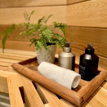
This transformation started with a builder grade bathroom and was expanded into a sauna wet room. With cedar walls and ceiling and a custom cedar bench, the sauna heats the space for a relaxing dry heat experience. The goal of this space was to create a sauna in the secondary bathroom and be as efficient as possible with the space. This bathroom transformed from a standard secondary bathroom to a ergonomic spa without impacting the functionality of the bedroom.
This project was super fun, we were working inside of a guest bedroom, to create a functional, yet expansive bathroom. We started with a standard bathroom layout and by building out into the large guest bedroom that was used as an office, we were able to create enough square footage in the bathroom without detracting from the bedroom aesthetics or function. We worked with the client on her specific requests and put all of the materials into a 3D design to visualize the new space.
Houzz Write Up: https://www.houzz.com/magazine/bathroom-of-the-week-stylish-spa-retreat-with-a-real-sauna-stsetivw-vs~168139419
The layout of the bathroom needed to change to incorporate the larger wet room/sauna. By expanding the room slightly it gave us the needed space to relocate the toilet, the vanity and the entrance to the bathroom allowing for the wet room to have the full length of the new space.
This bathroom includes a cedar sauna room that is incorporated inside of the shower, the custom cedar bench follows the curvature of the room's new layout and a window was added to allow the natural sunlight to come in from the bedroom. The aromatic properties of the cedar are delightful whether it's being used with the dry sauna heat and also when the shower is steaming the space. In the shower are matching porcelain, marble-look tiles, with architectural texture on the shower walls contrasting with the warm, smooth cedar boards. Also, by increasing the depth of the toilet wall, we were able to create useful towel storage without detracting from the room significantly.
This entire project and client was a joy to work with.
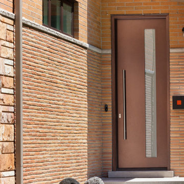 Glenview Haus – Custom Doors & Wine Cellars
Durability and design are the most important components of every entry door. It is our goal to ensure that our clients do not have to compromise on either of these elements. Our Aluminum clad entry door line offers top of the line safety features that will not only perform beautifully but will have a visually pleasing appearance. This project is located along the lake on the North Shore of Chicago. It was important to provide a door that was aesthetically pleasing and complementary to this modern style home, but to also craft a product that can withstand below zero temperatures and direct sunlight. The duality of this product results in a perfectly secure and insulated entrance.
Durability of Aluminum Clad Entry Doors
Besides the sleek design, our aluminum clad entry door’s have a larger purpose. The durability of our aluminum shield product is unmatched. This shield is attached to our Euro-Tech door slab to ensure for sound insulation, and complete safety. With a thickness of 3-1/2”, our Aluminum Clad entry doors will protect your entryway from harsh elements, as well defend against damage from exposure to direct sunlight. These factors can create wear and tear on solid wood materials and causes aging to the surface. The aluminum shield is a barrier between the exterior elements, and the interior climate. Each aluminum shield has a powder coat finish and is available in any custom color. One feature that is important to note, is that this combination of our Euro-Technology door, paired with the Aluron Shield, creates a very secure and safe entrance.
The Beauty of Glenview Haus’ Aluminum Clad Entry Door
Ideal for residences in Chicago and the North Shore; this door line is built to last and to create a fully
insulated entrance. Our aluminum clad entry doors are incredibly sleek and will appeal to all modern
design enthusiasts. Fully customizable, these doors are guaranteed to stand out. The simple and elegant designs are complementary to Modern and Transitional home architecture.
 Tiffany Brooks, HGTV Host & Interior Designer
Inquire About Our Design Services
When we first started talking in the spring of 2015, I was impressed. She was witty, realistic, and understood that as much as she loves my shows on HGTV, design does not does not happen in 43 minutes! She told me about her space, and how she felt that her bedroom seemed “blah” to her. She had no retreat. Molly desperately longed for a place that she could spend time in, read in, play in and above all, relax in.
What we did:
Many people are terrified of hiring a designer. Rightfully so, they are investing a pretty penny in their homes. They want to make sure that everything, down to the last floral arrangement, is to their liking, because they will have to live it (and pay for it). Unfortunately, a client can unintentionally stifle a designer’s creativity through micro-management. This can produce lackluster results and ultimately cause more time (and money) to be spent on a project than is really necessary.
With Molly, that was never an issue. Before she even showed me the room in question, she said that I could have full creative license to do what I needed to do to her bedroom. SAY WHAAH!?
With Molly giving me complete creative freedom, I planned everything out and got down to business. The result: Bite-your-bottom-lip sexy. I don’t get jealous of too many of my clients’ spaces, but this one still takes my breath away every time I look at the pics!
The craziest part was that by adding more furniture, it actually made the space feel larger.
Molly and her husband Patrick loved the finished space, and promised me I will be back to finish the rest of the house!
Here’s the highlights of the rest of the project:
I came up with a space plan with three options.
Next, we reviewed mood boards and fabric schemes that would work for both Molly and her hubby Patrick.
We started with the bed. My goal was to add edge to its otherwise traditional style.
We decided to spice things up by painting the trim work in the room black.
We built in layers of lighting with dimmers. In a bedroom everything should be on dimmers, right? Right.
We designed and customized bedding, chairs and window treatments.
Together with Molly, we selected the most perfect wallpaper. This geometric “grasscloth” adds so much depth and dimension that was just missing before.
What I love:
That light fixture. I mean it is really, really amazing in person.
The porcupine mirror. This thing came packaged like it was the hope diamond, and everyone was terrified to handle it. But it really became a highlight of the room.

 Thomas J. Pearson, Inc.
This spacious, yet extremely friendly and inviting home lacked a kitchen with personality and functionality for this growing family and their desire to entertain others. The goal for this renovation was to provide for new and larger appliances, maintain views to the rear yard, and provide family seating space within the kitchen.
The home’s existing exterior architecture provides references reminiscent Italian villas with terra cotta clay tile roofing, half-round steel windows and ornate stonework. The interior evokes similar images through the use of warm earth tone wall colors, hardwood floors, wrought-iron railings and plastered walls.
The home’s existing pallet of aged materials and their warm earth tones was reinforced with the selection of new finish materials such as: red brick, limestone veneer, linoleum flooring, African-mahogany cabinets, quartz perimeter countertops, copper sinks, exhaust hood and island counter, and oil-rubbed bronze hardware and fixtures. Because matching the exterior brick veneer was no longer a possibility, the combination of limestone veneer and copper sheet metal was selected for the new exterior; both being chosen for their warmth and timeless character. In addition, new hand-crafted wrought-iron doors and windows with energy-efficient insulated glass and ornate scrollwork were chosen in lieu of wood or clad-wood windows to replicate the home’s original steel and leaded-glass windows.
With time (and some patina), this inviting kitchen addition will blur the lines between “old” and “new.”
Project description written by Lee Constantine, Constantine Design Group.
 JRP Design & Remodel
This home had a kitchen that wasn’t meeting the family’s needs, nor did it fit with the coastal Mediterranean theme throughout the rest of the house. The goals for this remodel were to create more storage space and add natural light. The biggest item on the wish list was a larger kitchen island that could fit a family of four. They also wished for the backyard to transform from an unsightly mess that the clients rarely used to a beautiful oasis with function and style.
One design challenge was incorporating the client’s desire for a white kitchen with the warm tones of the travertine flooring. The rich walnut tone in the island cabinetry helped to tie in the tile flooring. This added contrast, warmth, and cohesiveness to the overall design and complemented the transitional coastal theme in the adjacent spaces. Rooms alight with sunshine, sheathed in soft, watery hues are indicative of coastal decorating. A few essential style elements will conjure the coastal look with its casual beach attitude and renewing seaside energy, even if the shoreline is only in your mind's eye.
By adding two new windows, all-white cabinets, and light quartzite countertops, the kitchen is now open and bright. Brass accents on the hood, cabinet hardware and pendant lighting added warmth to the design. Blue accent rugs and chairs complete the vision, complementing the subtle grey ceramic backsplash and coastal blues in the living and dining rooms. Finally, the added sliding doors lead to the best part of the home: the dreamy outdoor oasis!
Every day is a vacation in this Mediterranean-style backyard paradise. The outdoor living space emphasizes the natural beauty of the surrounding area while offering all of the advantages and comfort of indoor amenities.
The swimming pool received a significant makeover that turned this backyard space into one that the whole family will enjoy. JRP changed out the stones and tiles, bringing a new life to it. The overall look of the backyard went from hazardous to harmonious. After finishing the pool, a custom gazebo was built for the perfect spot to relax day or night.
It’s an entertainer’s dream to have a gorgeous pool and an outdoor kitchen. This kitchen includes stainless-steel appliances, a custom beverage fridge, and a wood-burning fireplace. Whether you want to entertain or relax with a good book, this coastal Mediterranean-style outdoor living remodel has you covered.
Photographer: Andrew - OpenHouse VC
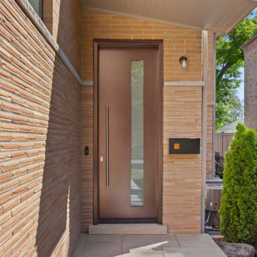 Glenview Haus – Custom Doors & Wine Cellars
Durability and design are the most important components of every entry door. It is our goal to ensure that our clients do not have to compromise on either of these elements. Our Aluminum clad entry door line offers top of the line safety features that will not only perform beautifully but will have a visually pleasing appearance. This project is located along the lake on the North Shore of Chicago. It was important to provide a door that was aesthetically pleasing and complementary to this modern style home, but to also craft a product that can withstand below zero temperatures and direct sunlight. The duality of this product results in a perfectly secure and insulated entrance.
Durability of Aluminum Clad Entry Doors
Besides the sleek design, our aluminum clad entry door’s have a larger purpose. The durability of our aluminum shield product is unmatched. This shield is attached to our Euro-Tech door slab to ensure for sound insulation, and complete safety. With a thickness of 3-1/2”, our Aluminum Clad entry doors will protect your entryway from harsh elements, as well defend against damage from exposure to direct sunlight. These factors can create wear and tear on solid wood materials and causes aging to the surface. The aluminum shield is a barrier between the exterior elements, and the interior climate. Each aluminum shield has a powder coat finish and is available in any custom color. One feature that is important to note, is that this combination of our Euro-Technology door, paired with the Aluron Shield, creates a very secure and safe entrance.
The Beauty of Glenview Haus’ Aluminum Clad Entry Door
Ideal for residences in Chicago and the North Shore; this door line is built to last and to create a fully
insulated entrance. Our aluminum clad entry doors are incredibly sleek and will appeal to all modern
design enthusiasts. Fully customizable, these doors are guaranteed to stand out. The simple and elegant designs are complementary to Modern and Transitional home architecture.
 Michael Nash Design, Build & Homes
Built in the early 1950s, this small urban townhouse is located in North Old Town Alexandria in an area currently undergoing major redevelopment. The neighborhood is popular with, and affordable for, young people and families, and very convenient to Washington, DC.
In its heyday, the townhouse touted a stately brick exterior, plaster walls, tongue and groove wood flooring and beautiful wooden staircase. Sixty years later, however, the homeowners were faced with crumbling masonry, sagging floors, a double layer of wallpaper over the plaster walls, a crumbling staircase, a dysfunctional kitchen and small, dark second floor rooms. Additionally, the basement had a low ceiling, moldy and cinder block walls, no plumbing and a large boiler taking up most of the space.
The homeowners’ goal was to restore the exterior’s historic look while creating an interior up-to-date for the 21st Century. To turn their vision into reality, they turned to Michael Nash Design, Build & Homes.
Design Solutions
To maintain the townhome’s historic exterior, the Michael Nash team carefully removed, salvaged, restored and reused existing brick masonry. Matching fascia boards and windows were combined with existing windows to complete the exterior renovation.
All interior walls were gutted and reframed. New electrical work, new insulation and new drywall were installed. Much of the home’s original trim was salvaged and reused, as was a piece of art glass, all to keep a bit of the past in the renovation.
The sagging subfloors were fixed, new hard wood floors were installed and a new staircase and railing were designed in a style similar to the original.
The solid wall between the kitchen and the dining room was removed, plumbing was relocated for new sink location and the kitchen got expanded with an eating island into the dining room. Closet and plumbing stacked were relocated to allow a new space for fridge. Stainless steel appliances, granite countertops and custom cabinetry highlight the new modern kitchen.
The plan called for redesigning the three bedrooms on the second floor to allow a larger bathroom, walk in closet and wider hallways. In addition to new roofing, a large skylight was installed to allow natural light into the bathroom and the upper hallway.
The basement was totally revamped. New plumbing was put in place for full bathroom, laundry room and a den. New e-grass window was installed in the basement to bring this basement up to current building codes.
This homeowners love the neighborhood and now their home gives them the opportunity to stay in the same location.
81