
Search results for "Lasting people" in Home Design Ideas
 Thomas Roszak Architecture, LLC
Photo credit: Scott McDonald @ Hedrich Blessing
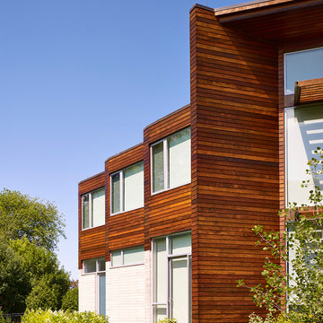
7RR-Ecohome:
The design objective was to build a house for a couple recently married who both had kids from previous marriages. How to bridge two families together?
The design looks forward in terms of how people live today. The home is an experiment in transparency and solid form; removing borders and edges from outside to inside the house, and to really depict “flowing and endless space”. The house floor plan is derived by pushing and pulling the house’s form to maximize the backyard and minimize the public front yard while welcoming the sun in key rooms by rotating the house 45-degrees to true north. The angular form of the house is a result of the family’s program, the zoning rules, the lot’s attributes, and the sun’s path. We wanted to construct a house that is smart and efficient in terms of construction and energy, both in terms of the building and the user. We could tell a story of how the house is built in terms of the constructability, structure and enclosure, with a nod to Japanese wood construction in the method in which the siding is installed and the exposed interior beams are placed in the double height space. We engineered the house to be smart which not only looks modern but acts modern; every aspect of user control is simplified to a digital touch button, whether lights, shades, blinds, HVAC, communication, audio, video, or security. We developed a planning module based on a 6-foot square room size and a 6-foot wide connector called an interstitial space for hallways, bathrooms, stairs and mechanical, which keeps the rooms pure and uncluttered. The house is 6,200 SF of livable space, plus garage and basement gallery for a total of 9,200 SF. A large formal foyer celebrates the entry and opens up to the living, dining, kitchen and family rooms all focused on the rear garden. The east side of the second floor is the Master wing and a center bridge connects it to the kid’s wing on the west. Second floor terraces and sunscreens provide views and shade in this suburban setting. The playful mathematical grid of the house in the x, y and z axis also extends into the layout of the trees and hard-scapes, all centered on a suburban one-acre lot.
Many green attributes were designed into the home; Ipe wood sunscreens and window shades block out unwanted solar gain in summer, but allow winter sun in. Patio door and operable windows provide ample opportunity for natural ventilation throughout the open floor plan. Minimal windows on east and west sides to reduce heat loss in winter and unwanted gains in summer. Open floor plan and large window expanse reduces lighting demands and maximizes available daylight. Skylights provide natural light to the basement rooms. Durable, low-maintenance exterior materials include stone, ipe wood siding and decking, and concrete roof pavers. Design is based on a 2' planning grid to minimize construction waste. Basement foundation walls and slab are highly insulated. FSC-certified walnut wood flooring was used. Light colored concrete roof pavers to reduce cooling loads by as much as 15%. 2x6 framing allows for more insulation and energy savings. Super efficient windows have low-E argon gas filled units, and thermally insulated aluminum frames. Permeable brick and stone pavers reduce the site’s storm-water runoff. Countertops use recycled composite materials. Energy-Star rated furnaces and smart thermostats are located throughout the house to minimize duct runs and avoid energy loss. Energy-Star rated boiler that heats up both radiant floors and domestic hot water. Low-flow toilets and plumbing fixtures are used to conserve water usage. No VOC finish options and direct venting fireplaces maintain a high interior air quality. Smart home system controls lighting, HVAC, and shades to better manage energy use. Plumbing runs through interior walls reducing possibilities of heat loss and freezing problems. A large food pantry was placed next to kitchen to reduce trips to the grocery store. Home office reduces need for automobile transit and associated CO2 footprint. Plan allows for aging in place, with guest suite than can become the master suite, with no need to move as family members mature.
 Custom Design & Construction
The homeowners had just purchased this home in El Segundo and they had remodeled the kitchen and one of the bathrooms on their own. However, they had more work to do. They felt that the rest of the project was too big and complex to tackle on their own and so they retained us to take over where they left off. The main focus of the project was to create a master suite and take advantage of the rather large backyard as an extension of their home. They were looking to create a more fluid indoor outdoor space.
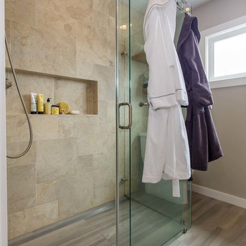
When adding the new master suite leaving the ceilings vaulted along with French doors give the space a feeling of openness. The window seat was originally designed as an architectural feature for the exterior but turned out to be a benefit to the interior! They wanted a spa feel for their master bathroom utilizing organic finishes. Since the plan is that this will be their forever home a curbless shower was an important feature to them. The glass barn door on the shower makes the space feel larger and allows for the travertine shower tile to show through. Floating shelves and vanity allow the space to feel larger while the natural tones of the porcelain tile floor are calming. The his and hers vessel sinks make the space functional for two people to use it at once. The walk-in closet is open while the master bathroom has a white pocket door for privacy.
Since a new master suite was added to the home we converted the existing master bedroom into a family room. Adding French Doors to the family room opened up the floorplan to the outdoors while increasing the amount of natural light in this room. The closet that was previously in the bedroom was converted to built in cabinetry and floating shelves in the family room. The French doors in the master suite and family room now both open to the same deck space.
The homes new open floor plan called for a kitchen island to bring the kitchen and dining / great room together. The island is a 3” countertop vs the standard inch and a half. This design feature gives the island a chunky look. It was important that the island look like it was always a part of the kitchen. Lastly, we added a skylight in the corner of the kitchen as it felt dark once we closed off the side door that was there previously.
Repurposing rooms and opening the floor plan led to creating a laundry closet out of an old coat closet (and borrowing a small space from the new family room).
The floors become an integral part of tying together an open floor plan like this. The home still had original oak floors and the homeowners wanted to maintain that character. We laced in new planks and refinished it all to bring the project together.
To add curb appeal we removed the carport which was blocking a lot of natural light from the outside of the house. We also re-stuccoed the home and added exterior trim.
 Eric Reinholdt, Architect
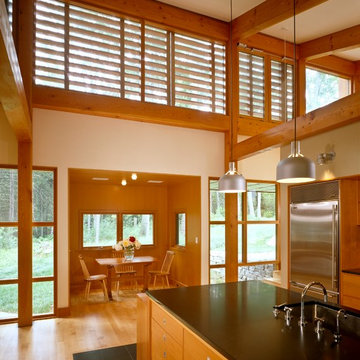
An interior palette of natural wood and subtle color shifts mimics the natural site. It also narrates a story of the rough bark (the exterior shell) concealing the warm interior heartwood.
Eric Reinholdt - Project Architect/Lead Designer with Elliott, Elliott, Norelius Architecture
Photo: Brian Vanden Brink
Find the right local pro for your project
 Brett Grinkmeyer
Twist Tours
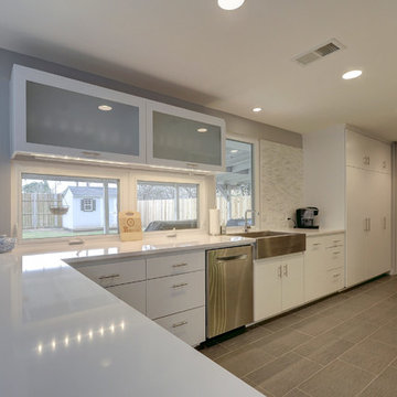
Example of a mid-sized minimalist u-shaped porcelain tile eat-in kitchen design in Austin with a farmhouse sink, flat-panel cabinets, white cabinets, solid surface countertops, blue backsplash, mosaic tile backsplash, stainless steel appliances and no island
Example of a mid-sized minimalist u-shaped porcelain tile eat-in kitchen design in Austin with a farmhouse sink, flat-panel cabinets, white cabinets, solid surface countertops, blue backsplash, mosaic tile backsplash, stainless steel appliances and no island
 Amandine Tosello
Peter Giles
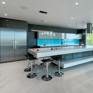
Huge trendy l-shaped porcelain tile and white floor eat-in kitchen photo in Nice with an integrated sink, flat-panel cabinets, gray cabinets, solid surface countertops, blue backsplash, glass tile backsplash, stainless steel appliances, an island and white countertops
Huge trendy l-shaped porcelain tile and white floor eat-in kitchen photo in Nice with an integrated sink, flat-panel cabinets, gray cabinets, solid surface countertops, blue backsplash, glass tile backsplash, stainless steel appliances, an island and white countertops
 Tiffany Brooks, HGTV Host & Interior Designer
Inquire About Our Design Services
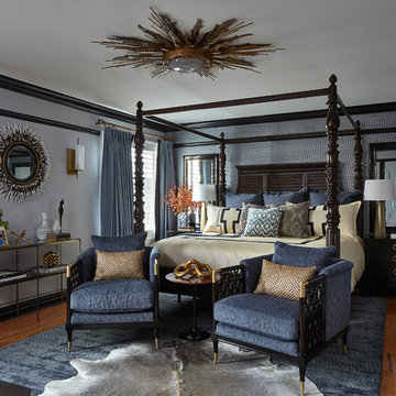
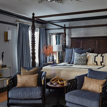
When we first started talking in the spring of 2015, I was impressed. She was witty, realistic, and understood that as much as she loves my shows on HGTV, design does not does not happen in 43 minutes! She told me about her space, and how she felt that her bedroom seemed “blah” to her. She had no retreat. Molly desperately longed for a place that she could spend time in, read in, play in and above all, relax in.
What we did:
Many people are terrified of hiring a designer. Rightfully so, they are investing a pretty penny in their homes. They want to make sure that everything, down to the last floral arrangement, is to their liking, because they will have to live it (and pay for it). Unfortunately, a client can unintentionally stifle a designer’s creativity through micro-management. This can produce lackluster results and ultimately cause more time (and money) to be spent on a project than is really necessary.
With Molly, that was never an issue. Before she even showed me the room in question, she said that I could have full creative license to do what I needed to do to her bedroom. SAY WHAAH!?
With Molly giving me complete creative freedom, I planned everything out and got down to business. The result: Bite-your-bottom-lip sexy. I don’t get jealous of too many of my clients’ spaces, but this one still takes my breath away every time I look at the pics!
The craziest part was that by adding more furniture, it actually made the space feel larger.
Molly and her husband Patrick loved the finished space, and promised me I will be back to finish the rest of the house!
Here’s the highlights of the rest of the project:
I came up with a space plan with three options.
Next, we reviewed mood boards and fabric schemes that would work for both Molly and her hubby Patrick.
We started with the bed. My goal was to add edge to its otherwise traditional style.
We decided to spice things up by painting the trim work in the room black.
We built in layers of lighting with dimmers. In a bedroom everything should be on dimmers, right? Right.
We designed and customized bedding, chairs and window treatments.
Together with Molly, we selected the most perfect wallpaper. This geometric “grasscloth” adds so much depth and dimension that was just missing before.
What I love:
That light fixture. I mean it is really, really amazing in person.
The porcupine mirror. This thing came packaged like it was the hope diamond, and everyone was terrified to handle it. But it really became a highlight of the room.


Sponsored
Columbus, OH

Wannemacher Interiors
Customized Award-Winning Interior Design Solutions in Franklin Cnty OH
 Santa Rita Landscaping, Inc.
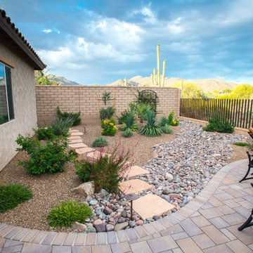
This is an example of a mid-sized southwestern drought-tolerant and partial sun backyard gravel water fountain landscape in Phoenix for summer.
 Tiffany Brooks, HGTV Host & Interior Designer
Inquire About Our Design Services
When we first started talking in the spring of 2015, I was impressed. She was witty, realistic, and understood that as much as she loves my shows on HGTV, design does not does not happen in 43 minutes! She told me about her space, and how she felt that her bedroom seemed “blah” to her. She had no retreat. Molly desperately longed for a place that she could spend time in, read in, play in and above all, relax in.
What we did:
Many people are terrified of hiring a designer. Rightfully so, they are investing a pretty penny in their homes. They want to make sure that everything, down to the last floral arrangement, is to their liking, because they will have to live it (and pay for it). Unfortunately, a client can unintentionally stifle a designer’s creativity through micro-management. This can produce lackluster results and ultimately cause more time (and money) to be spent on a project than is really necessary.
With Molly, that was never an issue. Before she even showed me the room in question, she said that I could have full creative license to do what I needed to do to her bedroom. SAY WHAAH!?
With Molly giving me complete creative freedom, I planned everything out and got down to business. The result: Bite-your-bottom-lip sexy. I don’t get jealous of too many of my clients’ spaces, but this one still takes my breath away every time I look at the pics!
The craziest part was that by adding more furniture, it actually made the space feel larger.
Molly and her husband Patrick loved the finished space, and promised me I will be back to finish the rest of the house!
Here’s the highlights of the rest of the project:
I came up with a space plan with three options.
Next, we reviewed mood boards and fabric schemes that would work for both Molly and her hubby Patrick.
We started with the bed. My goal was to add edge to its otherwise traditional style.
We decided to spice things up by painting the trim work in the room black.
We built in layers of lighting with dimmers. In a bedroom everything should be on dimmers, right? Right.
We designed and customized bedding, chairs and window treatments.
Together with Molly, we selected the most perfect wallpaper. This geometric “grasscloth” adds so much depth and dimension that was just missing before.
What I love:
That light fixture. I mean it is really, really amazing in person.
The porcupine mirror. This thing came packaged like it was the hope diamond, and everyone was terrified to handle it. But it really became a highlight of the room.
 TKS Design Group
Download our free ebook, Creating the Ideal Kitchen. DOWNLOAD NOW
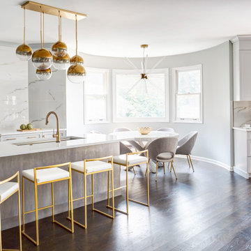
This client was referred to us from a past client. They are a busy 2-career household with young children and enjoy entertaining friends and family in their home. They have a beautiful open concept home but unfortunately the kitchen was not fitting for the rest of the home. They were not quite sure what to do with the space. We talked about trying to refresh it or do more of a minor remodel, but in the end they decided a full gut would get them to where they wanted to be.
One problem was there was no place for guests to hang out other than the large and awkward banquette area. The brick wall and tiled hood area were feeling a bit dated and tired. The space was just not functional for their lifestyle. There was no prep space near the cooktop and no landing area for items coming out of the ovens or refrigerator, plus a big dead zone in the center of the room.
Banquettes, like the one they previously had in the space, are great for small spaces, but when they get really large like this one, it makes getting in and out of the seating area awkward and uncomfortable. Plus, there was room for a large table, so we eliminated the awkward built in.
We started by removing the faux brick wall between the kitchen and back entry. We relocated the entry to the garage over a couple feet in order to get every last inch out of the new kitchen. We also made the decision to close up the primary window that faced the pretty ho hum brick wall of the neighbor’s house. There was plenty of light coming in from the seating area, so we just didn’t feel the window was adding much to the room.
Construction went smoothy. There was a bit of rework with electrical, flooring and HVAC, but in the end, we think it was well worth it.
The clients really wanted a sleek contemporary look, and we originally had planned for a full height slab backsplash, but due to it’s size, it was a budget buster. Instead, we got creative and settled on large format porcelain tiles that have a similar feel but were a fraction of the cost. We made sure the wall was plumb and level so that the fit and finish would mimic that of slab material.
The final space was quite a change. A large prep sink sits directly across from the new pro-style range with plenty additional prep space on the large island. The refrigerator and ovens now have miles of landing space, and a nice tight work triangle makes cooking a breeze.
Since we wanted a more contemporary feel, not many wall cabinets were included. Instead, we outfitted some of the drawers for dish storage with a peg system. Two large pantries flanking the refrigerator hold baking supplies and small appliances. Large drawers by the cooktop hold pots and pans, and an appliance garage tucked away to the left of the range hides away miscellaneous items. The large island also houses a microwave drawer and tons of storage, most of which is drawers offering maximum convenience.
The island now seats 5-6 people comfortably along with the new table in the seating area which can seat up to 8. Entertaining will be a breeze in this space. With such a clean backdrop, we knew we would need some drama with the lighting, so we chose two sets of staggered pendants, which we adjusted for the right visual balance above the island.
We also included a small coffee station to the right of the main kitchen, which helps keep the coffee clutter out of the kitchen proper. Two tones of complimentary gray are featured in this kitchen. The perimeter is a light gray that reads almost white. The island is a gray stain that adds some depth and interest with the visible wood texture. The countertops are clean white quartz, and the hardware, barstools and light fixtures add warm brass tones. I see lots of cooking and entertaining with family and friends in the near future in this bright and airy new space.
Designed by: Susan Klimala, CKD, CBD
Photography by: Michael Kaskel
For more information on kitchen and bath design ideas go to: www.kitchenstudio-ge.com
 Tiffany Brooks, HGTV Host & Interior Designer
Inquire About Our Design Services
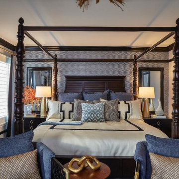
When we first started talking in the spring of 2015, I was impressed. She was witty, realistic, and understood that as much as she loves my shows on HGTV, design does not does not happen in 43 minutes! She told me about her space, and how she felt that her bedroom seemed “blah” to her. She had no retreat. Molly desperately longed for a place that she could spend time in, read in, play in and above all, relax in.
What we did:
Many people are terrified of hiring a designer. Rightfully so, they are investing a pretty penny in their homes. They want to make sure that everything, down to the last floral arrangement, is to their liking, because they will have to live it (and pay for it). Unfortunately, a client can unintentionally stifle a designer’s creativity through micro-management. This can produce lackluster results and ultimately cause more time (and money) to be spent on a project than is really necessary.
With Molly, that was never an issue. Before she even showed me the room in question, she said that I could have full creative license to do what I needed to do to her bedroom. SAY WHAAH!?
With Molly giving me complete creative freedom, I planned everything out and got down to business. The result: Bite-your-bottom-lip sexy. I don’t get jealous of too many of my clients’ spaces, but this one still takes my breath away every time I look at the pics!
The craziest part was that by adding more furniture, it actually made the space feel larger.
Molly and her husband Patrick loved the finished space, and promised me I will be back to finish the rest of the house!
Here’s the highlights of the rest of the project:
I came up with a space plan with three options.
Next, we reviewed mood boards and fabric schemes that would work for both Molly and her hubby Patrick.
We started with the bed. My goal was to add edge to its otherwise traditional style.
We decided to spice things up by painting the trim work in the room black.
We built in layers of lighting with dimmers. In a bedroom everything should be on dimmers, right? Right.
We designed and customized bedding, chairs and window treatments.
Together with Molly, we selected the most perfect wallpaper. This geometric “grasscloth” adds so much depth and dimension that was just missing before.
What I love:
That light fixture. I mean it is really, really amazing in person.
The porcupine mirror. This thing came packaged like it was the hope diamond, and everyone was terrified to handle it. But it really became a highlight of the room.
 Envision Web
Stuart Wade, Envision Virtual Tours
Envision Virtual Tours has been the high resolution photography standard for the last 13 years. When you require the best, Envision Virtual Tours is there!
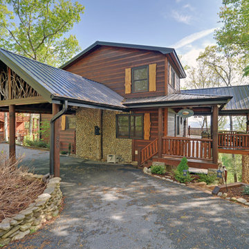
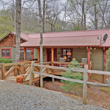
Surround yourself with beauty, relaxation and natural fun in Georgia’s Blue Ridge, only 90 miles north of Atlanta via I-575 and Hwy 515, but a million miles away from the traffic, stress and anxiety of the city. With 106,000 acres located in the Chattahoochee National Forest, Blue Ridge is definitely the cure for whatever ails you. Rent a cozy cabin or a luxury mountain home, or stay in a bed & breakfast inn or hotel -- and simply relax.
Enjoy Mother Nature at her best…
Renew your spirit on a day hiking to nearby waterfalls or horseback riding on forested trails in the Chattahoochee National Forest. Bring the family and discover the thrill of an Ocoee River whitewater rafting adventure, ride on the Blue Ridge Scenic Railway or treetop canopy adventure. Rent a pontoon or a jet ski on beautiful Lake Blue Ridge. Pick strawberries or blueberries at Mercier's, a 65 year old family orchard. Catch a trout on the tailwaters of the Toccoa River or a clear mountain stream; Blue Ridge is the Trout Fishing Capital of Georgia.
Fall in Love with Blue Ridge…
Fall in love with the authentic mountain towns of Blue Ridge and McCaysville. Blue Ridge is an Art Town, filled with art galleries, antique and specialty shops, restaurants, small town atmosphere and friendly people. A river runs through the quaint town of McCaysville, twin city with Copperhill, Tennessee. Stand in both states at one time at the Blue Line, which marks the spot where Georgia ends and Tennessee begins. Here the Toccoa River becomes the Ocoee River, flowing northward into Tennessee.
 Envision Web
Stuart Wade, Envision Virtual Tours
Envision Virtual Tours has been the high resolution photography standard for the last 13 years. When you require the best, Envision Virtual Tours is there!
Surround yourself with beauty, relaxation and natural fun in Georgia’s Blue Ridge, only 90 miles north of Atlanta via I-575 and Hwy 515, but a million miles away from the traffic, stress and anxiety of the city. With 106,000 acres located in the Chattahoochee National Forest, Blue Ridge is definitely the cure for whatever ails you. Rent a cozy cabin or a luxury mountain home, or stay in a bed & breakfast inn or hotel -- and simply relax.
Enjoy Mother Nature at her best…
Renew your spirit on a day hiking to nearby waterfalls or horseback riding on forested trails in the Chattahoochee National Forest. Bring the family and discover the thrill of an Ocoee River whitewater rafting adventure, ride on the Blue Ridge Scenic Railway or treetop canopy adventure. Rent a pontoon or a jet ski on beautiful Lake Blue Ridge. Pick strawberries or blueberries at Mercier's, a 65 year old family orchard. Catch a trout on the tailwaters of the Toccoa River or a clear mountain stream; Blue Ridge is the Trout Fishing Capital of Georgia.
Fall in Love with Blue Ridge…
Fall in love with the authentic mountain towns of Blue Ridge and McCaysville. Blue Ridge is an Art Town, filled with art galleries, antique and specialty shops, restaurants, small town atmosphere and friendly people. A river runs through the quaint town of McCaysville, twin city with Copperhill, Tennessee. Stand in both states at one time at the Blue Line, which marks the spot where Georgia ends and Tennessee begins. Here the Toccoa River becomes the Ocoee River, flowing northward into Tennessee.

Sponsored
Columbus, OH
Wannemacher Interiors
Customized Award-Winning Interior Design Solutions in Franklin Cnty OH
 Custom Design & Construction
The homeowners had just purchased this home in El Segundo and they had remodeled the kitchen and one of the bathrooms on their own. However, they had more work to do. They felt that the rest of the project was too big and complex to tackle on their own and so they retained us to take over where they left off. The main focus of the project was to create a master suite and take advantage of the rather large backyard as an extension of their home. They were looking to create a more fluid indoor outdoor space.
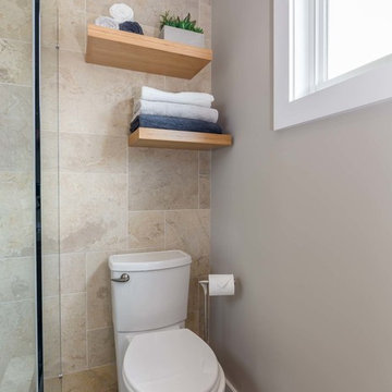
When adding the new master suite leaving the ceilings vaulted along with French doors give the space a feeling of openness. The window seat was originally designed as an architectural feature for the exterior but turned out to be a benefit to the interior! They wanted a spa feel for their master bathroom utilizing organic finishes. Since the plan is that this will be their forever home a curbless shower was an important feature to them. The glass barn door on the shower makes the space feel larger and allows for the travertine shower tile to show through. Floating shelves and vanity allow the space to feel larger while the natural tones of the porcelain tile floor are calming. The his and hers vessel sinks make the space functional for two people to use it at once. The walk-in closet is open while the master bathroom has a white pocket door for privacy.
Since a new master suite was added to the home we converted the existing master bedroom into a family room. Adding French Doors to the family room opened up the floorplan to the outdoors while increasing the amount of natural light in this room. The closet that was previously in the bedroom was converted to built in cabinetry and floating shelves in the family room. The French doors in the master suite and family room now both open to the same deck space.
The homes new open floor plan called for a kitchen island to bring the kitchen and dining / great room together. The island is a 3” countertop vs the standard inch and a half. This design feature gives the island a chunky look. It was important that the island look like it was always a part of the kitchen. Lastly, we added a skylight in the corner of the kitchen as it felt dark once we closed off the side door that was there previously.
Repurposing rooms and opening the floor plan led to creating a laundry closet out of an old coat closet (and borrowing a small space from the new family room).
The floors become an integral part of tying together an open floor plan like this. The home still had original oak floors and the homeowners wanted to maintain that character. We laced in new planks and refinished it all to bring the project together.
To add curb appeal we removed the carport which was blocking a lot of natural light from the outside of the house. We also re-stuccoed the home and added exterior trim.
 Creative Cabinets and Fine Finishes, LLC
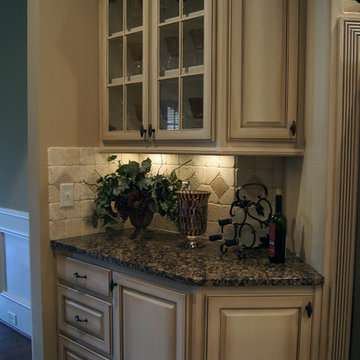
Originally Elder wood, Cabinets refinished to a factory smooth antique white painted finish with glaze. An old
world aged effect was achieved on the cabinets by a shadowing technique unique to CCFF. A protective topcoat professionally sprayed to ensure the highest level of durability
 Elizabeth Babb
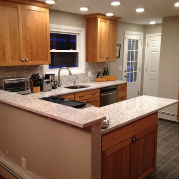
Dynasty Plainfield Cherry Natural
Cambria Quartz Berwyn with coordinating Ben Moore Paint recommended via Cambria's Website
Transitional kitchen photo in Portland Maine
Transitional kitchen photo in Portland Maine
 Thompson Remodeling
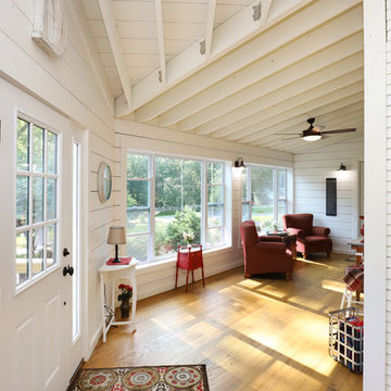
The owners of this beautiful historic farmhouse had been painstakingly restoring it bit by bit. One of the last items on their list was to create a wrap-around front porch to create a more distinct and obvious entrance to the front of their home.
Aside from the functional reasons for the new porch, our client also had very specific ideas for its design. She wanted to recreate her grandmother’s porch so that she could carry on the same wonderful traditions with her own grandchildren someday.
Key requirements for this front porch remodel included:
- Creating a seamless connection to the main house.
- A floorplan with areas for dining, reading, having coffee and playing games.
- Respecting and maintaining the historic details of the home and making sure the addition felt authentic.
Upon entering, you will notice the authentic real pine porch decking.
Real windows were used instead of three season porch windows which also have molding around them to match the existing home’s windows.
The left wing of the porch includes a dining area and a game and craft space.
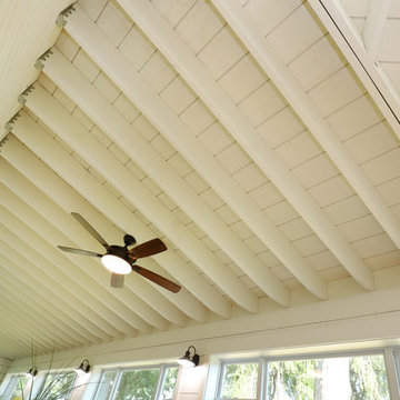
Ceiling fans provide light and additional comfort in the summer months. Iron wall sconces supply additional lighting throughout.
Exposed rafters with hidden fasteners were used in the ceiling.
Handmade shiplap graces the walls.
On the left side of the front porch, a reading area enjoys plenty of natural light from the windows.
The new porch blends perfectly with the existing home much nicer front facade. There is a clear front entrance to the home, where previously guests weren’t sure where to enter.
We successfully created a place for the client to enjoy with her future grandchildren that’s filled with nostalgic nods to the memories she made with her own grandmother.
"We have had many people who asked us what changed on the house but did not know what we did. When we told them we put the porch on, all of them made the statement that they did not notice it was a new addition and fit into the house perfectly.”
– Homeowner

Sponsored
Columbus, OH
Wannemacher Interiors
Customized Award-Winning Interior Design Solutions in Franklin Cnty OH
 Thompson Remodeling
The owners of this beautiful historic farmhouse had been painstakingly restoring it bit by bit. One of the last items on their list was to create a wrap-around front porch to create a more distinct and obvious entrance to the front of their home.
Aside from the functional reasons for the new porch, our client also had very specific ideas for its design. She wanted to recreate her grandmother’s porch so that she could carry on the same wonderful traditions with her own grandchildren someday.
Key requirements for this front porch remodel included:
- Creating a seamless connection to the main house.
- A floorplan with areas for dining, reading, having coffee and playing games.
- Respecting and maintaining the historic details of the home and making sure the addition felt authentic.
Upon entering, you will notice the authentic real pine porch decking.
Real windows were used instead of three season porch windows which also have molding around them to match the existing home’s windows.
The left wing of the porch includes a dining area and a game and craft space.
Ceiling fans provide light and additional comfort in the summer months. Iron wall sconces supply additional lighting throughout.
Exposed rafters with hidden fasteners were used in the ceiling.
Handmade shiplap graces the walls.
On the left side of the front porch, a reading area enjoys plenty of natural light from the windows.
The new porch blends perfectly with the existing home much nicer front facade. There is a clear front entrance to the home, where previously guests weren’t sure where to enter.
We successfully created a place for the client to enjoy with her future grandchildren that’s filled with nostalgic nods to the memories she made with her own grandmother.
"We have had many people who asked us what changed on the house but did not know what we did. When we told them we put the porch on, all of them made the statement that they did not notice it was a new addition and fit into the house perfectly.”
– Homeowner
 RG Design Studio Inc.
Builder - Westmark Construction;
Photography - Lance Sullivan of Concept Photo
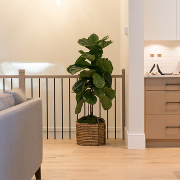
Example of a large trendy home design design in Vancouver
Example of a large trendy home design design in Vancouver
 Tim Davies Landscaping | Perth
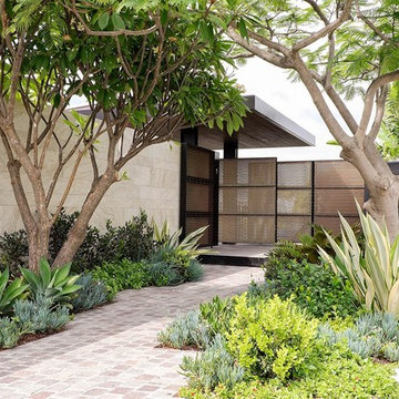
This is an example of a large partial sun front yard stone driveway in Perth.
26