
Search results for "Lasting people" in Home Design Ideas
 GMI Design Group
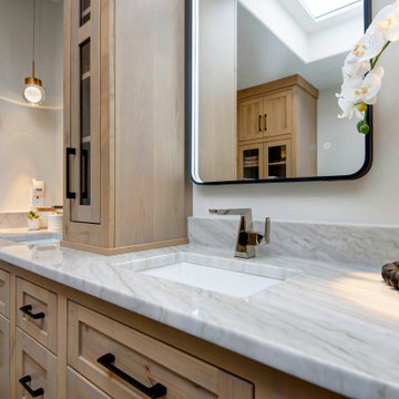
In this primary bathroom, the lighting scheme was key to achieve the client’s goals and create a space where the client would enjoy being. The bathroom felt cramped, dark, visually heavy. The client was also claustrophobic, making the use of the space uncomfortable.
The goal was to transform this space into a relaxed modern spa-like atmosphere, rethink and simplify the floorplan avoiding visual clutter, access natural light, add efficient lighting, and create more visual space.
The lighting plan was crucial to increase visual space. My first thought was to add a skylight to access natural light that is so effective in enlarging the feel of a space.
After looking at the attic and roof lines it became clear that this was not an option. After some research I found the perfect solution: a smart light fixture that mimics a window. It is installed between studs or ceiling joists. The fixture replicates the light of the sun during the day. It goes from soft morning light - to bright noon - to soft dawn light. By recessing the fixture into the ceiling, the skylight-look and extra height was achieved.
The benefits of this light go beyond beautiful design. The fixture is sustainable, energy efficient, and made to last for decades. It regulates the body’s circadian rhythm, helping against sleeping problems and seasonal affective disorder. It also integrates biophilic design, creating connections to nature and benefiting people that spend hours indoors.
The use of mood lighting was also key, creating a cozy, welcoming feel to this home-spa. All the lights are dimmable, and plenty of indirect light sources, like the gorgeous vanity pendants and LED mirrors, create the perfect setting. Not forgetting to mention the soft curves of the bathtub chandelier. This is the perfect place to relax in the bubbly bathtub!
 GMI Design Group
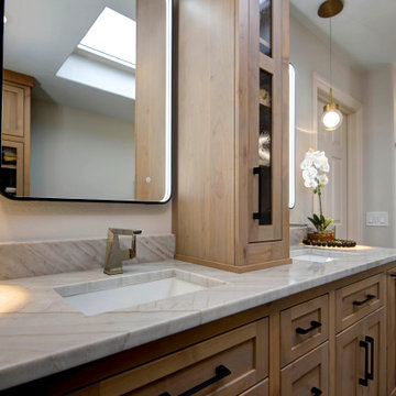
In this primary bathroom, the lighting scheme was key to achieve the client’s goals and create a space where the client would enjoy being. The bathroom felt cramped, dark, visually heavy. The client was also claustrophobic, making the use of the space uncomfortable.
The goal was to transform this space into a relaxed modern spa-like atmosphere, rethink and simplify the floorplan avoiding visual clutter, access natural light, add efficient lighting, and create more visual space.
The lighting plan was crucial to increase visual space. My first thought was to add a skylight to access natural light that is so effective in enlarging the feel of a space.
After looking at the attic and roof lines it became clear that this was not an option. After some research I found the perfect solution: a smart light fixture that mimics a window. It is installed between studs or ceiling joists. The fixture replicates the light of the sun during the day. It goes from soft morning light - to bright noon - to soft dawn light. By recessing the fixture into the ceiling, the skylight-look and extra height was achieved.
The benefits of this light go beyond beautiful design. The fixture is sustainable, energy efficient, and made to last for decades. It regulates the body’s circadian rhythm, helping against sleeping problems and seasonal affective disorder. It also integrates biophilic design, creating connections to nature and benefiting people that spend hours indoors.
The use of mood lighting was also key, creating a cozy, welcoming feel to this home-spa. All the lights are dimmable, and plenty of indirect light sources, like the gorgeous vanity pendants and LED mirrors, create the perfect setting. Not forgetting to mention the soft curves of the bathtub chandelier. This is the perfect place to relax in the bubbly bathtub!
 Simply Home Decorating
This beautiful North Vancouver home belongs to a nature-loving and health-conscious couple, Emma and Vince (names changed), their two young children, and their dog, Jasper. When they contacted us about renovating and furnishing their kitchen and family room, we walked in and saw a world of potential waiting to be uncovered.
Before: Larkhall Crescent Home:
Like many original North Vancouver homes, the interior was definitely dated. We encountered late ‘80s finishes in powder pink and teal green, old carpet, and a kitchen that wasn’t maximized to suit this family’s modern-day lifestyle. However, the size of the rooms offered us a ton of space with which to get creative.
Knowing our clients’ love of cooking, need for work spaces (Emma and Vince both work remotely), and growing family, we developed a design concept that would increase usable space, optimize storage, and create intimacy in this large area. As for the style, we were inspired by their European roots, inventing a new and modern take on “Belgian Farmhouse” style. Now, the home is truly one-of-a-kind.
After: Warm & Cozy Family Room:
Fresh, bright, and comfortable, this living area has been transformed! We started with the fireplace as a focal point, selecting aged brick tiles for added texture and a crisp wood mantle. The taupe-coloured sectional infuses the room with visual warmth and serves the added purpose of separating the family room from the kitchen.
Emma and Vince were also keen on using non-toxic materials in their home, and we were happy to oblige. To meet their needs, we sourced natural wood elements and sought out Canadian-made products - that adhere to high health standards - whenever possible.
Look closer at the elements of this space, and you will find this stunning, honeycomb-patterned rug in earthy gold, beige, and charcoal tones. It’s plush to the touch and full of visual texture that brings this room’s colour palette together. We sourced these two-tone chairs with caning, petrified wood side table, black sconces, and botanical prints in greyscale from local artist, Heather Johnston.
We topped off the space with this dark wood and rattan console that offers storage facing the kitchen and presents an opportunity to display cherished items. The result is a cozy lounging space brimming with comfort and functionality. It’s perfect for enjoying quality family time, or Emma can simply slide the coffee table away to make room for her morning yoga practice.
Now, let’s turn around and give some attention to the kitchen. Do you remember what the original kitchen looked like? If not, scroll back up, because the transformation is shocking…
Moody & Welcoming Kitchen for Healthy Living:
This kitchen looks very different from how it started, right? Though we didn’t touch any walls, the kitchen has almost doubled in usable space! We created a long, extended island with storage, an outlet for small appliances, and seating for comfortable prep, after-school snacking, or mingling among friends.
On the other side of the island, the family has even more storage and an integrated dishwasher within easy reach of the sink, perfect for quick clean-up. From this angle, you can also see the expansive custom Shaker cabinetry in white and the integrated double ovens. These facilitate their cooking experience and gave us the opportunity to add an additional surprise…
A coffee garage station and more hidden storage! Keeping these items located along the perimeter allows them to be accessed by the family or their guests without someone getting under the cook’s feet. These are the little details that make everyday life easier and more enjoyable.
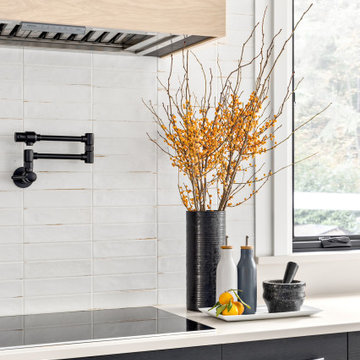
Moving deeper into the kitchen, the seamless induction cooktop topped with a freestanding concealed hood fan commands attention in a soft yet prominent way. The natural wood accent mirrors the fireplace mantle, and the choice of off-black wood-grain cabinets not only continues our black-and-white colour palette but adds a sense of depth and contrast. The corner sink is located to the right and perfectly positioned with a view of their thriving backyard.
To invite more of this family’s character into the space, we mixed metals for interest — matte black, dark pewter, and warm brass — and created open shelves in white oak for their plants and decor. You can also glimpse the tumbled edge of the backsplash tile, which echoes the rustic brick of the fireplace. It adds that farmhouse charm while still feeling timeless and sophisticated.
Last but not least, we designed this dining banquette in the bay window (with integrated bench storage, of course), where the family can share a meal together, the kids can do homework, or Emma and Vince can work and enjoy a change of scenery from their offices. Like the other spaces in the home, it was designed to be beautiful, multi-functional, and long-lasting.
Praise from Our Clients:
It is clear that we love this home, but what did our clients have to say?
“Lori is a visionary and masters execution to the finest detail all at the same time. When she first met us to know more about who we are and how we live, she could right away envision how we could use the space in our kitchen and living room…The results exceeded our expectations.
Lori and her team were also a delight to work with — coordination with all the trades, fast problem-solving, regular updates, professional and friendly attitude of her entire team — made it the dream team. Thank you SHD for making our space so beautiful!”
In turn, we are so grateful for this family’s trust, their open communication, and for being wonderful people with whom to work. (So, thank you!)
Find the right local pro for your project
 Sierra Living Concepts Inc
Dimension:
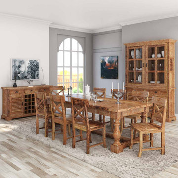
Dining Table: 96" L X 42" D X 30" H
Chair: 18" L X 18" D X 37" H
Buffet: 60" L X 16" W X 36" H
Hutch: 62" L X 18" D X 89" H
Allow your dining room to look exquisite and charming with our Britain Rustic Teak Wood Trestle Base 11 Piece Dining Room Set. Offering a large dining table with trestle base and six chairs, a hutch to display and store dining ware, and a wine buffet cabinet to take care of wine bottles and glasses, the set will surely entertain your guests to the maximum.
The set comes crafted from sturdy and beautiful teak wood that is enhanced by the long process of hand applied finish. Perfect for traditional to modern décor, the solid teak wood dining room set is what you need to make your dining space even more inviting.
Materials: This solid wood dining room collection is made of 100% rustic teak wood that gives a dining space classy appearance and long-lasting durability.
Finish: This rustic solid wood dining room collection features a natural hand rubbed stain and finish.
Special Features:
• 100% Handcrafted
• Solid Rustic Teak Wood Construction
• Environment-friendly
• Easy to clean and maintain
• Contemporary Style
• Seats eight people
• 20 wine bottle and a bar buffet sideboard
Note: Real wood is a product of nature, and as such, no two pieces are alike. Variations in solid wood grain patterns are to be expected and make each furniture uniquely beautiful, just like us humans.
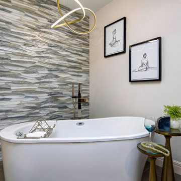 GMI Design Group
In this primary bathroom, the lighting scheme was key to achieve the client’s goals and create a space where the client would enjoy being. The bathroom felt cramped, dark, visually heavy. The client was also claustrophobic, making the use of the space uncomfortable.
The goal was to transform this space into a relaxed modern spa-like atmosphere, rethink and simplify the floorplan avoiding visual clutter, access natural light, add efficient lighting, and create more visual space.
The lighting plan was crucial to increase visual space. My first thought was to add a skylight to access natural light that is so effective in enlarging the feel of a space.
After looking at the attic and roof lines it became clear that this was not an option. After some research I found the perfect solution: a smart light fixture that mimics a window. It is installed between studs or ceiling joists. The fixture replicates the light of the sun during the day. It goes from soft morning light - to bright noon - to soft dawn light. By recessing the fixture into the ceiling, the skylight-look and extra height was achieved.
The benefits of this light go beyond beautiful design. The fixture is sustainable, energy efficient, and made to last for decades. It regulates the body’s circadian rhythm, helping against sleeping problems and seasonal affective disorder. It also integrates biophilic design, creating connections to nature and benefiting people that spend hours indoors.
The use of mood lighting was also key, creating a cozy, welcoming feel to this home-spa. All the lights are dimmable, and plenty of indirect light sources, like the gorgeous vanity pendants and LED mirrors, create the perfect setting. Not forgetting to mention the soft curves of the bathtub chandelier. This is the perfect place to relax in the bubbly bathtub!
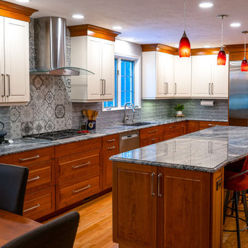
 Dream Kitchens
This two-toned white kitchen remodel includes brand new white cabinets, a large kitchen island with pop-up electrical outlets and extra storage, a lift cabinet to store small kitchen appliances with ease, glass cabinets, wine racks, a wet bar, and a beautiful light blue and grey backsplash that perfectly complements the white and brown cabinets.
First, let's talk about the new white cabinets. The white cabinets give the kitchen a fresh and modern look, while also providing a blank canvas to mix with other colors and decor. The cabinet doors have a simple design, but with the right hardware they can look more ornate. Plus, white cabinets are timeless and will never go out of style.
Now, let's dive into the large kitchen island. This island has pop-up electrical outlets, which adds convenience and ease to your cooking experience. No more struggling to find an outlet to plug in your mixer! The extra storage and prep space provided by the island is invaluable in the kitchen. It gives you the added counter space needed to spread out and really execute those complex recipes, or to have multiple people working in the kitchen at once.
The lift cabinet is also a game changer. Tired of pulling out your mixer or other kitchen appliances from a dark cabinet and struggling to get it back in, or even worse, struggling to get it out? With the simple press of a button, the cabinet will lift your appliance with ease and keep it at the perfect height for use.
Now, let's talk about storage. There are glass cabinets to perfectly display your favorite kitchen items and a wine rack to store your favorite bottles. The wet bar is perfect for entertaining guests, with a place to chill your bottles and serve up drinks. Overall, the storage options in this kitchen remodel are endless and perfectly designed to meet your everyday needs and lifestyle.
Lastly, the light blue and grey backsplash and countertop perfectly complement the white and brown cabinets. The backsplash adds a pop of color to your kitchen, while the countertop matches the backsplash and completes the whole look. This kitchen remodel is sure to make a statement and catch your guests' attention.
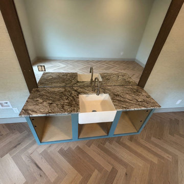
 Rocky Tops Granite & Marble LLC
This Chapin kitchen centers on Blue Dunes granite, a stone that earns its name honestly. It carries soft gray and blue-gray tones that shift with the light, moving from almost silver near the window to deeper charcoal in the shadowed corners. It's the kind of granite that reads calm and cool without going cold, which makes it a natural fit for a kitchen built around a farmhouse sink and a lot of white or painted cabinetry.
Granite like this comes out of the quarry with real movement in it, so templating and slab selection matter more than people think. We lay out the pattern before we ever cut, matching the veining so it doesn't feel choppy from one run of countertop to the next. Once it's templated, we fabricate the top with an eased edge, which keeps the line clean and lets the stone's natural pattern do the talking instead of a fussy profile competing with it.
The farmhouse sink is the centerpiece here. Setting an apron-front sink means cutting the countertop to expose the front face of the sink cleanly, with tight, straight lines on both sides and a level reveal so it sits right against the cabinet face. That's a step you don't get a second try on. The single-hole faucet keeps the deck simple and lets the sink itself be the statement, which is exactly how a lot of homeowners want a working kitchen sink to feel.
Day to day, granite like Blue Dunes holds up to everything a real kitchen throws at it. It's heat resistant enough to set a hot pan on without worry, it resists scratching under normal knife work, and with a good sealer it shrugs off water and food acids for years without staining. It's low maintenance stone that still looks like it took real craft to install, which is the whole point of choosing granite for a hardworking kitchen.
Chapin kitchens tend to mix classic cabinetry with stone that has some personality, and Blue Dunes splits that difference well. It's calm enough to live with every day but has enough movement in the surface to keep it from feeling flat. Once the backsplash and surrounding finish work are done, this one's going to read as a clean, well-built kitchen anchored by a stone that was picked to last.

Sponsored
Columbus, OH

Wannemacher Interiors
Customized Award-Winning Interior Design Solutions in Franklin Cnty OH
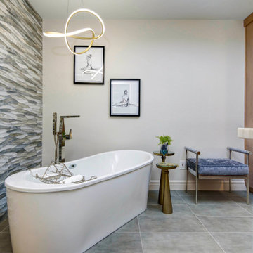 GMI Design Group
In this primary bathroom, the lighting scheme was key to achieve the client’s goals and create a space where the client would enjoy being. The bathroom felt cramped, dark, visually heavy. The client was also claustrophobic, making the use of the space uncomfortable.
The goal was to transform this space into a relaxed modern spa-like atmosphere, rethink and simplify the floorplan avoiding visual clutter, access natural light, add efficient lighting, and create more visual space.
The lighting plan was crucial to increase visual space. My first thought was to add a skylight to access natural light that is so effective in enlarging the feel of a space.
After looking at the attic and roof lines it became clear that this was not an option. After some research I found the perfect solution: a smart light fixture that mimics a window. It is installed between studs or ceiling joists. The fixture replicates the light of the sun during the day. It goes from soft morning light - to bright noon - to soft dawn light. By recessing the fixture into the ceiling, the skylight-look and extra height was achieved.
The benefits of this light go beyond beautiful design. The fixture is sustainable, energy efficient, and made to last for decades. It regulates the body’s circadian rhythm, helping against sleeping problems and seasonal affective disorder. It also integrates biophilic design, creating connections to nature and benefiting people that spend hours indoors.
The use of mood lighting was also key, creating a cozy, welcoming feel to this home-spa. All the lights are dimmable, and plenty of indirect light sources, like the gorgeous vanity pendants and LED mirrors, create the perfect setting. Not forgetting to mention the soft curves of the bathtub chandelier. This is the perfect place to relax in the bubbly bathtub!
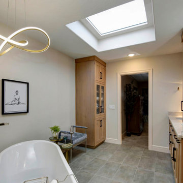 GMI Design Group
In this primary bathroom, the lighting scheme was key to achieve the client’s goals and create a space where the client would enjoy being. The bathroom felt cramped, dark, visually heavy. The client was also claustrophobic, making the use of the space uncomfortable.
The goal was to transform this space into a relaxed modern spa-like atmosphere, rethink and simplify the floorplan avoiding visual clutter, access natural light, add efficient lighting, and create more visual space.
The lighting plan was crucial to increase visual space. My first thought was to add a skylight to access natural light that is so effective in enlarging the feel of a space.
After looking at the attic and roof lines it became clear that this was not an option. After some research I found the perfect solution: a smart light fixture that mimics a window. It is installed between studs or ceiling joists. The fixture replicates the light of the sun during the day. It goes from soft morning light - to bright noon - to soft dawn light. By recessing the fixture into the ceiling, the skylight-look and extra height was achieved.
The benefits of this light go beyond beautiful design. The fixture is sustainable, energy efficient, and made to last for decades. It regulates the body’s circadian rhythm, helping against sleeping problems and seasonal affective disorder. It also integrates biophilic design, creating connections to nature and benefiting people that spend hours indoors.
The use of mood lighting was also key, creating a cozy, welcoming feel to this home-spa. All the lights are dimmable, and plenty of indirect light sources, like the gorgeous vanity pendants and LED mirrors, create the perfect setting. Not forgetting to mention the soft curves of the bathtub chandelier. This is the perfect place to relax in the bubbly bathtub!
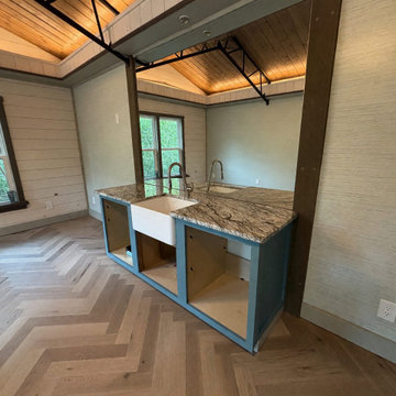 Rocky Tops Granite & Marble LLC
This Chapin kitchen centers on Blue Dunes granite, a stone that earns its name honestly. It carries soft gray and blue-gray tones that shift with the light, moving from almost silver near the window to deeper charcoal in the shadowed corners. It's the kind of granite that reads calm and cool without going cold, which makes it a natural fit for a kitchen built around a farmhouse sink and a lot of white or painted cabinetry.
Granite like this comes out of the quarry with real movement in it, so templating and slab selection matter more than people think. We lay out the pattern before we ever cut, matching the veining so it doesn't feel choppy from one run of countertop to the next. Once it's templated, we fabricate the top with an eased edge, which keeps the line clean and lets the stone's natural pattern do the talking instead of a fussy profile competing with it.
The farmhouse sink is the centerpiece here. Setting an apron-front sink means cutting the countertop to expose the front face of the sink cleanly, with tight, straight lines on both sides and a level reveal so it sits right against the cabinet face. That's a step you don't get a second try on. The single-hole faucet keeps the deck simple and lets the sink itself be the statement, which is exactly how a lot of homeowners want a working kitchen sink to feel.
Day to day, granite like Blue Dunes holds up to everything a real kitchen throws at it. It's heat resistant enough to set a hot pan on without worry, it resists scratching under normal knife work, and with a good sealer it shrugs off water and food acids for years without staining. It's low maintenance stone that still looks like it took real craft to install, which is the whole point of choosing granite for a hardworking kitchen.
Chapin kitchens tend to mix classic cabinetry with stone that has some personality, and Blue Dunes splits that difference well. It's calm enough to live with every day but has enough movement in the surface to keep it from feeling flat. Once the backsplash and surrounding finish work are done, this one's going to read as a clean, well-built kitchen anchored by a stone that was picked to last.
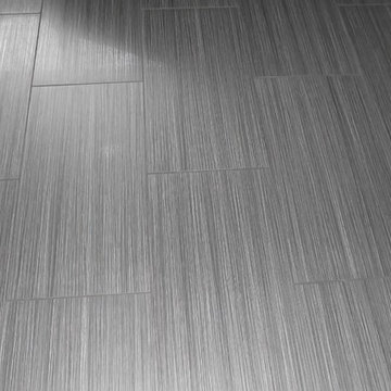
 McCullough's Flooring
Gorgeous master bath finished with Dal-Tile's Fabrique porcelain tile in the color Noir Linen polished. Tile size is 12"x24" installed in a brick joint pattern. The floor boasts underfloor heating on a timed thermostat.
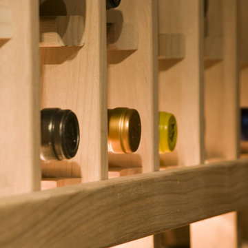
 Wine Cellar Specialists
These are 'Niche Size' custom wine racks Dallas. They are of mahogany, left unfinished in favor of a raw, natural appearance.
Just like the wine, Mahogany is known to age beautifully over time. It is also durable and high resistant to decay and shrinkage.
Niche Size racks promote optimum airflow between wines. This allows the individual bottles to enjoy the ideal temperature and humidity levels equally.
Wine Cellar Specialists
Follow us on Twitter: https://twitter.com/winecellarspec
Chicago Design Office
858 W. Armitage Ave #385
Chicago, IL 60614
See what other people say about us: https://www.google.com/search?q=Wine+Cellar+Specialists&ludocid=8538802152238743744#lrd=0x0:0x767feb51238800c0,1
 TKS Design Group
Download our free ebook, Creating the Ideal Kitchen. DOWNLOAD NOW
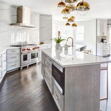
This client was referred to us from a past client. They are a busy 2-career household with young children and enjoy entertaining friends and family in their home. They have a beautiful open concept home but unfortunately the kitchen was not fitting for the rest of the home. They were not quite sure what to do with the space. We talked about trying to refresh it or do more of a minor remodel, but in the end they decided a full gut would get them to where they wanted to be.
One problem was there was no place for guests to hang out other than the large and awkward banquette area. The brick wall and tiled hood area were feeling a bit dated and tired. The space was just not functional for their lifestyle. There was no prep space near the cooktop and no landing area for items coming out of the ovens or refrigerator, plus a big dead zone in the center of the room.
Banquettes, like the one they previously had in the space, are great for small spaces, but when they get really large like this one, it makes getting in and out of the seating area awkward and uncomfortable. Plus, there was room for a large table, so we eliminated the awkward built in.
We started by removing the faux brick wall between the kitchen and back entry. We relocated the entry to the garage over a couple feet in order to get every last inch out of the new kitchen. We also made the decision to close up the primary window that faced the pretty ho hum brick wall of the neighbor’s house. There was plenty of light coming in from the seating area, so we just didn’t feel the window was adding much to the room.
Construction went smoothy. There was a bit of rework with electrical, flooring and HVAC, but in the end, we think it was well worth it.
The clients really wanted a sleek contemporary look, and we originally had planned for a full height slab backsplash, but due to it’s size, it was a budget buster. Instead, we got creative and settled on large format porcelain tiles that have a similar feel but were a fraction of the cost. We made sure the wall was plumb and level so that the fit and finish would mimic that of slab material.
The final space was quite a change. A large prep sink sits directly across from the new pro-style range with plenty additional prep space on the large island. The refrigerator and ovens now have miles of landing space, and a nice tight work triangle makes cooking a breeze.
Since we wanted a more contemporary feel, not many wall cabinets were included. Instead, we outfitted some of the drawers for dish storage with a peg system. Two large pantries flanking the refrigerator hold baking supplies and small appliances. Large drawers by the cooktop hold pots and pans, and an appliance garage tucked away to the left of the range hides away miscellaneous items. The large island also houses a microwave drawer and tons of storage, most of which is drawers offering maximum convenience.
The island now seats 5-6 people comfortably along with the new table in the seating area which can seat up to 8. Entertaining will be a breeze in this space. With such a clean backdrop, we knew we would need some drama with the lighting, so we chose two sets of staggered pendants, which we adjusted for the right visual balance above the island.
We also included a small coffee station to the right of the main kitchen, which helps keep the coffee clutter out of the kitchen proper. Two tones of complimentary gray are featured in this kitchen. The perimeter is a light gray that reads almost white. The island is a gray stain that adds some depth and interest with the visible wood texture. The countertops are clean white quartz, and the hardware, barstools and light fixtures add warm brass tones. I see lots of cooking and entertaining with family and friends in the near future in this bright and airy new space.
Designed by: Susan Klimala, CKD, CBD
Photography by: Michael Kaskel
For more information on kitchen and bath design ideas go to: www.kitchenstudio-ge.com

Sponsored
Columbus, OH
Wannemacher Interiors
Customized Award-Winning Interior Design Solutions in Franklin Cnty OH
 Manomin Resawn Timbers
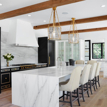
The warm reddish-brown tones of these reclaimed wood box beams are the defining design moment in this contemporary kitchen, their aged patina and honest grain standing in bold contrast against a white ceiling, black cabinetry, marble waterfall island, and brass hardware. In a space built around precision and polish, the beams introduce something irreplaceable: the warmth and authenticity of antique old growth hardwood that no modern material can fake. Sourced from 19th and early 20th century structures and prepared through our process of denailing, kiln drying, and precision milling, these box beams prove that reclaimed wood belongs in the most refined interiors as much as anywhere else.
Whether you are a homebuilder, a home remodeling contractor, or a homeowner looking to add reclaimed wood box beams to a contemporary kitchen, Manomin Resawn Timbers has been helping people discover the antique charm of reclaimed wood since 2002. We ship nationwide and are happy to help you find the right pieces from anywhere in the country. Visit our showroom in Hugo, MN or reach out to us with a call or a message to get started.
 Mafcohouse
Arnaud Marthouret
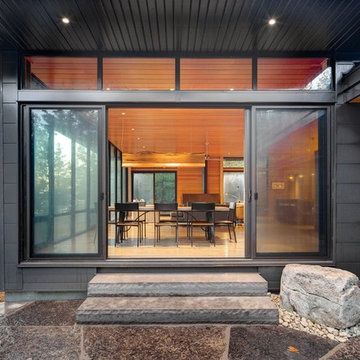
Large minimalist light wood floor great room photo in Toronto with a wood stove and a metal fireplace
Large minimalist light wood floor great room photo in Toronto with a wood stove and a metal fireplace
 Amile bills
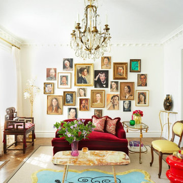
If you are googling about picking wall art for your home, then you probably fall into one of two categories. Either your walls are way too bare, or they're smothered in outdated and generic artwork that doesn't represent you anymore! Don’t worry – neither of these situations have to last forever, and there are plenty of stylish ways to make sure that your personality gets to shine in your room decor as well as in the rest of your life! Just follow these 8 wall art ideas from our bedroom designer below, and get ready to be the star of your own show!
1) Blank Walls can be Fun
If you're online researching how to buy any sort of wall art for your home, then you fall into one of two categories. It seems either your walls are bare, or your art isn't fitting. Either way, it doesn't represent you! But blank walls don’t have to be boring. In fact, they can be a canvas for you to express your unique personality.
2) Create an eye-catching Statement Piece
A big, bold piece of wall art is the perfect way to make a statement in your room. But if you’re not careful, it can also look like you’re trying too hard. The key is to find a piece that reflects your personality and style, without being too over-the-top.
3) Hang something Larger than Life
Go big or go home, right? Especially when it comes to wall art. Hanging a large piece of artwork will make a huge impact in your room. It’ll be the first thing people see when they walk in, and it’ll set the tone for the rest of your decor. Plus, it’s a great way to fill up a large wall space. Just make sure you pick a piece that you really love – you’ll be looking at it every day. For further Inspiration you can check out Wall Art Ideas from Unique-Canvas.com to decorate your Room.
4) Use a Vibrant Focal Point
A focal point is a great way to add drama and interest to a room. It can be anything from a piece of wall art to a piece of furniture. In this case, we’re going to focus on wall art. A vibrant focal point will add color and life to your room. Making a statement and displaying your personality is easy with this.
5) Smaller is Better
People often make the mistake of thinking that they need large, expensive pieces of art to fill up a large, empty wall. But the truth is, sometimes all you need is a small piece of art that packs a big punch. A small piece of art can be more intimate and personal, and it can also be less expensive. So if you’re looking for wall art ideas that are both unique and budget-friendly, try looking for smaller pieces!
6) Get Personal
When it comes to wall art, the most important thing is that it speaks to you on a personal level. You should let your home reflect who you are and what you love!
7) Adorn yourself with Soulful Quotes
A great way to show off your personality is with soulful quotes. Pick out a few of your favourites and have them printed on canvas. You can hang them up in your room or office as a daily reminder of what’s important to you.
8) Add some Colourful Décor Pieces
A blank wall is like a blank canvas—it’s begging to be filled with something colorful and eye-catching! That said, if you're still unsure of where to start, don't worry. We’ve got eight wall art ideas that will help you decorate your room and bring out your personality.
Final Thought
No matter what your style is, you can find wall art that represents you. The key is to take your time searching for the right piece, and don’t be afraid to step outside your comfort zone.
 K. Dakin Design Inc.
A small courtyard garden in San Francisco.
• Creative use of space in the dense, urban fabric of hilly SF.
• For the last several years the clients had carved out a make shift courtyard garden at the top of their driveway. It was one of the few flat spaces in their yard where they could sit in the sun and enjoy a cup of coffee. We turned the top of a steep driveway into a courtyard garden.
• The actual courtyard design was planned for the maximum dimensions possible to host a dining table and a seating area. The space is conveniently located outside their kitchen and home offices. However we needed to save driveway space for parking the cars and getting in and out.
• The design, fabrication and installation team was comprised of people we knew. I was an acquaintance to the clients having met them through good friends. The landscape contractor, Boaz Mor, http://www.boazmor.com/, is their neighbor and someone I worked with before. The metal fabricator is Murray Sandford of Moz Designs, https://mozdesigns.com/, https://www.instagram.com/moz_designs/ . Both contractors have long histories of working in the Bay Area on a variety of complex designs.
• The size of this garden belies the complexity of the design. We did not want to remove any of the concrete driveway which was 12” or more in thickness, except for the area where the large planter was going. The driveway sloped in two directions. In order to get a “level”, properly, draining patio, we had to start it at around 21” tall at the outside and end it flush by the garage doors.
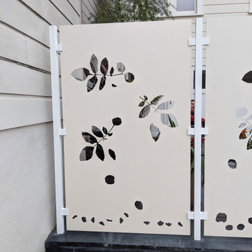
• The fence is the artful element in the garden. It is made of power-coated aluminum. The panels match the house color; and posts match the house trim. The effect is quiet, blending into the overall property. The panels are dramatic. Each fence panel is a different size with a unique pattern.
• The exterior panels that you see from the street are an abstract riff on the seasons of the Persian walnut tree in their front yard. The cut-outs illustrate spring bloom when the walnut leafs out to autumn when the nuts drop to the ground and the squirrels eats them, leaving a mess of shells everywhere. Even the pesky squirrel appears on one of the panels.
• The interior panels, lining the entry into the courtyard, are an abstraction of the entire walnut tree.
• Although the panel design is made of perforations, the openings are designed to retain privacy when you are inside the courtyard.
• There is a large planter on one side of the courtyard, big enough for a tree to soften a harsh expanse of a neighboring wall. Light through the branches cast playful shadows on the wall behind.
• The lighting, mounted on the house is a nod to the client’s love of New Orleans gas lights.
• The paving is black stone from India, dark enough to absorb the warmth of the sun on a cool, summer San Francisco day.

Sponsored
Columbus, OH
Wannemacher Interiors
Customized Award-Winning Interior Design Solutions in Franklin Cnty OH
 Davis & Daughters
Robineve Interiors
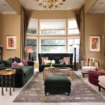
Living room - large transitional open concept carpeted living room idea in Boise with yellow walls, a standard fireplace and a plaster fireplace
Living room - large transitional open concept carpeted living room idea in Boise with yellow walls, a standard fireplace and a plaster fireplace
 Designs By Mark, Inc.
Design Statement:
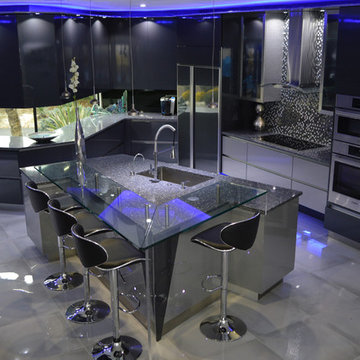
My design challenge was to create and build a new ultra modern kitchen with a futuristic flare. This state of the art kitchen was to be equipped with an ample amount of usable storage and a better view of the outside while balancing design and function.
Some of the project goals were to include the following; a multi-level island with seating for four people, dramatic use of lighting, state of the art appliances, a generous view of the outside and last but not least, to create a kitchen space that looks like no other...”The WOW Factor”.
This challenging project was a completely new design and full renovation. The existing kitchen was outdated and in desperate need help. My new design required me to remove existing walls, cabinetry, flooring, plumbing, electric…a complete demolition. My job functions were to be the interior designer, GC, electrician and a laborer.
Construction and Design
The existing kitchen had one small window in it like many kitchens. The main difficulty was…how to create more windows while gaining more cabinet storage. As a designer, our clients require us to think out of the box and give them something that they may have never dreamed of. I did just that. I created two 8’ glass backsplashes (with no visible supports) on the corner of the house. This was not easy task, engineering of massive blind headers and lam beams were used to support the load of the new floating walls. A generous amount of 48” high wall cabinets flank the new walls and appear floating in air seamlessly above the glass backsplash.
Technology and Design
The dramatic use of the latest in LED lighting was used. From color changing accent lights, high powered multi-directional spot lights, decorative soffit lights, under cabinet and above cabinet LED tape lights…all to be controlled from wall panels or mobile devises. A built-in ipad also controls not only the lighting, but a climate controlled thermostat, house wide music streaming with individually controlled zones, alarm system, video surveillance system and door bell.
Materials and design
Large amounts of glass and gloss; glass backsplash, iridescent glass tiles, raised glass island counter top, Quartz counter top with iridescent glass chips infused in it. 24” x 24” high polished porcelain tile flooring to give the appearance of water or glass. The custom cabinets are high gloss lacquer with a metallic fleck. All doors and drawers are Blum soft-close. The result is an ultra sleek and highly sophisticated design.
Appliances and design
All appliances were chosen for the ultimate in sleekness. These appliances include: a 48” built-in custom paneled subzero refrigerator/freezer, a built-in Miele dishwasher that is so quiet that it shoots a red led light on the floor to let you know that its on., a 36” Miele induction cook top and a built-in 200 bottle wine cooler. Some other cool features are the led kitchen faucet that changes color based on the water temperature. A stainless and glass wall hood with led lights. All duct work was built into the stainless steel toe kicks and grooves were cut into it to release airflow.
Photography by Mark Oser
 K. Dakin Design Inc.
A small courtyard garden in San Francisco.
• Creative use of space in the dense, urban fabric of hilly SF.
• For the last several years the clients had carved out a make shift courtyard garden at the top of their driveway. It was one of the few flat spaces in their yard where they could sit in the sun and enjoy a cup of coffee. We turned the top of a steep driveway into a courtyard garden.
• The actual courtyard design was planned for the maximum dimensions possible to host a dining table and a seating area. The space is conveniently located outside their kitchen and home offices. However we needed to save driveway space for parking the cars and getting in and out.
• The design, fabrication and installation team was comprised of people we knew. I was an acquaintance to the clients having met them through good friends. The landscape contractor, Boaz Mor, http://www.boazmor.com/, is their neighbor and someone I worked with before. The metal fabricator is Murray Sandford of Moz Designs, https://mozdesigns.com/, https://www.instagram.com/moz_designs/ . Both contractors have long histories of working in the Bay Area on a variety of complex designs.
• The size of this garden belies the complexity of the design. We did not want to remove any of the concrete driveway which was 12” or more in thickness, except for the area where the large planter was going. The driveway sloped in two directions. In order to get a “level”, properly, draining patio, we had to start it at around 21” tall at the outside and end it flush by the garage doors.
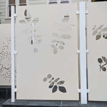
• The fence is the artful element in the garden. It is made of power-coated aluminum. The panels match the house color; and posts match the house trim. The effect is quiet, blending into the overall property. The panels are dramatic. Each fence panel is a different size with a unique pattern.
• The exterior panels that you see from the street are an abstract riff on the seasons of the Persian walnut tree in their front yard. The cut-outs illustrate spring bloom when the walnut leafs out to autumn when the nuts drop to the ground and the squirrels eats them, leaving a mess of shells everywhere. Even the pesky squirrel appears on one of the panels.
• The interior panels, lining the entry into the courtyard, are an abstraction of the entire walnut tree.
• Although the panel design is made of perforations, the openings are designed to retain privacy when you are inside the courtyard.
• There is a large planter on one side of the courtyard, big enough for a tree to soften a harsh expanse of a neighboring wall. Light through the branches cast playful shadows on the wall behind.
• The lighting, mounted on the house is a nod to the client’s love of New Orleans gas lights.
• The paving is black stone from India, dark enough to absorb the warmth of the sun on a cool, summer San Francisco day.
41