
Search results for "Learning goals" in Home Design Ideas

 TVL Creative Ltd.
Cramped kitchen be gone! That was the project motto and top priority. The goal was to transform the current layout from multiple smaller spaces into a connected whole that would activate the main level for our clients, a young family of four.
The biggest obstacle was the wall dividing the kitchen and the dining room. Removing this wall was central to opening up and integrating the main living spaces, but the existing ductwork that ran right through the center of the wall posed a design challenge, er design opportunity. The resulting design solution features a central pantry that captures the ductwork and provides valuable storage- especially when compared to the original kitchen's 18" wide pantry cabinet. The pantry also anchors the kitchen island and serves as a visual separation of space between the kitchen and homework area.
Through our design development process, we learned the formal living room was of no service to their lifestyle and therefore space they rarely spent time in. With that in mind, we proposed to eliminate the unused living room and make it the new dining room. Relocating the dining room to this space inherently felt right given the soaring ceiling and ample room for holiday dinners and celebrations. The new dining room was spacious enough for us to incorporate a conversational seating area in the warm, south-facing window alcove.
Now what to do with the old dining room?! To answer that question we took inspiration from our clients' shared profession in education and developed a craft area/homework station for both of their boys. The semi-custom cabinetry of the desk area carries over to the adjacent wall and forms window bench base with storage that we topped with butcher block for a touch of warmth. While the boys are young, the bench drawers are the perfect place for a stash of toys close to the kitchen.
The kitchen begins just beyond the window seat with their refrigerator enclosure. Opposite the refrigerator is the new pantry with twenty linear feet of shelving and space for brooms and a stick vacuum. Extending from the backside of the pantry the kitchen island design incorporates counter seating on the family room side and a cabinetry configuration on the kitchen side with drawer storage, a trashcan center, farmhouse sink, and dishwasher.
We took careful time in design and execution to align the range and sink because while it might seem like a small detail, it plays an important role in supporting the symmetrical configuration of the back wall of the kitchen. The rear wall design utilizes an appliance garage mirrors the visual impact of the refrigerator enclosure and helps keep the now open kitchen tidy. Between the appliance garage and refrigerator enclosure is the cooking zone with 30" of cabinetry and work surface on either side of the range, a chimney style vent hood, and a bold graphic tile backsplash.
The backsplash is just one of many personal touches we added to the space to reflect our client's modern eclectic style and love of color. Swooping lines of the mid-mod style barstools compliment the pendants and backsplash pattern. A pop of vibrant green on the frame of the pantry door adds a fresh wash of color to an otherwise neutral space. The big show stopper is the custom charcoal gray and copper chevron wall installation in the dining room. This was an idea our clients softly suggested, and we excitedly embraced the opportunity. It is also a kickass solution to the head-scratching design dilemma of how to fill a large and lofty wall.
We are so grateful to bring this design to life for our clients and now dear friends.
 MARGARITA BRAVO
We remodeled this kitchen and dining room under a strict timeline with the goal of having it ready for the holidays. Our clients love to entertain, and the new open layout creates a space that brings everybody together, even the cook!
The rich wooden eight-seater dining table sets a warm and welcoming tone while contrasting with the cool blue accents, which provide a unique focal point and draws one's attention to the middle of the room. For additional seating, the kitchen island boasts 4 sleek stools that can easily be integrated into the dining area or kept where they are.
Designed by Denver’s MARGARITA BRAVO who also serves Cherry Hills Village, Englewood, Greenwood Village, and Bow Mar, Colorado.
For more about MARGARITA BRAVO, click here: https://www.margaritabravo.com/
To learn more about this project, click here: https://www.margaritabravo.com/portfolio/golden-key-park-renovation/
 Lumar Interiors
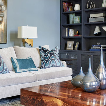
Our goal for this project was to transform this home from family-friendly to an empty nesters sanctuary. We opted for a sophisticated palette throughout the house, featuring blues, greys, taupes, and creams. The punches of colour and classic patterns created a warm environment without sacrificing sophistication.
Project by Richmond Hill interior design firm Lumar Interiors. Also serving Aurora, Newmarket, King City, Markham, Thornhill, Vaughan, York Region, and the Greater Toronto Area.
For more about Lumar Interiors, click here: https://www.lumarinteriors.com/
To learn more about this project, click here: https://www.lumarinteriors.com/portfolio/vaughan-renovation-and-decor/
Find the right local pro for your project
 The Cabinet Store + Culina Design
The home, built in the mid ’90s, needed an update. However, the family wanted to keep the renovations neutral enough to accommodate future changes and transformations. They had several project goals, including:
* Eliminate the family’s dining room table
* Add additional storage
* Create the new kitchen design within the footprint of their existing floor plan
* Make the refrigerator more easily accessible
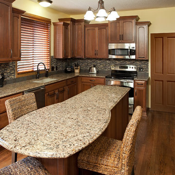
To accomplish this, we removed the clunky dining room table and integrated seating into the home’s kitchen island. To remedy their storage woes we installed three large pantry cabinets. We also relocated the fridge for easier access. To add some style to the space, the family upgraded their cabinets to Showplace cabinets featuring the freeport door style in lyptus wood with a truffle finish. They replaced their existing countertops with Cambria Canterbury and installed a complementary Elkay granite sink.
 TVL Creative Ltd.
Cramped kitchen be gone! That was the project motto and top priority. The goal was to transform the current layout from multiple smaller spaces into a connected whole that would activate the main level for our clients, a young family of four.
The biggest obstacle was the wall dividing the kitchen and the dining room. Removing this wall was central to opening up and integrating the main living spaces, but the existing ductwork that ran right through the center of the wall posed a design challenge, er design opportunity. The resulting design solution features a central pantry that captures the ductwork and provides valuable storage- especially when compared to the original kitchen's 18" wide pantry cabinet. The pantry also anchors the kitchen island and serves as a visual separation of space between the kitchen and homework area.
Through our design development process, we learned the formal living room was of no service to their lifestyle and therefore space they rarely spent time in. With that in mind, we proposed to eliminate the unused living room and make it the new dining room. Relocating the dining room to this space inherently felt right given the soaring ceiling and ample room for holiday dinners and celebrations. The new dining room was spacious enough for us to incorporate a conversational seating area in the warm, south-facing window alcove.
Now what to do with the old dining room?! To answer that question we took inspiration from our clients' shared profession in education and developed a craft area/homework station for both of their boys. The semi-custom cabinetry of the desk area carries over to the adjacent wall and forms window bench base with storage that we topped with butcher block for a touch of warmth. While the boys are young, the bench drawers are the perfect place for a stash of toys close to the kitchen.
The kitchen begins just beyond the window seat with their refrigerator enclosure. Opposite the refrigerator is the new pantry with twenty linear feet of shelving and space for brooms and a stick vacuum. Extending from the backside of the pantry the kitchen island design incorporates counter seating on the family room side and a cabinetry configuration on the kitchen side with drawer storage, a trashcan center, farmhouse sink, and dishwasher.
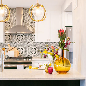
We took careful time in design and execution to align the range and sink because while it might seem like a small detail, it plays an important role in supporting the symmetrical configuration of the back wall of the kitchen. The rear wall design utilizes an appliance garage mirrors the visual impact of the refrigerator enclosure and helps keep the now open kitchen tidy. Between the appliance garage and refrigerator enclosure is the cooking zone with 30" of cabinetry and work surface on either side of the range, a chimney style vent hood, and a bold graphic tile backsplash.
The backsplash is just one of many personal touches we added to the space to reflect our client's modern eclectic style and love of color. Swooping lines of the mid-mod style barstools compliment the pendants and backsplash pattern. A pop of vibrant green on the frame of the pantry door adds a fresh wash of color to an otherwise neutral space. The big show stopper is the custom charcoal gray and copper chevron wall installation in the dining room. This was an idea our clients softly suggested, and we excitedly embraced the opportunity. It is also a kickass solution to the head-scratching design dilemma of how to fill a large and lofty wall.
We are so grateful to bring this design to life for our clients and now dear friends.
 Yoko Oda Interior Design
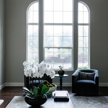
This traditional 4,000 square-foot home is located on a quiet cul de sac in Alamo, California. It served as a family home for San Francisco city professionals, but it was due for a remodel following a change in the lives of the owners. The homeowners are now empty nesters and came to Yoko Oda Interior Design to update their home. Our aim was to create a sophisticated timeless modern environment for this large estate in the San Francisco Bay Area. We were excited to take on the challenge and give the home a new lease of life now their children have grown up and left home.
Our sophisticated clients were drawn to traditional architectural details, global influences (i.e., Yoko’s Japanese modern aesthetics), contemporary clean lines, and neutral sophisticated color palettes. We have incorporated these interior design elements throughout the home, helping to maximize the space and features available to them while creating a more adult-friendly space to live. Neutral colors allow our clients to continue adding to the home in the future without committing to any colors that they may get tired of after some time. They are a classy option to add to any space and act as the backdrop for any artwork or home accessories that may be added later on.
Yoko’s design inspiration came from the clients’ personalities and the color palettes in their wardrobe. Our wardrobes say so much about us, and it’s a great way to learn more about the clients we are working with. A home needs to reflect the personalities of those living there, giving them a space to come back and relax in Alamo after a busy day.
We utilized the architectural features in their home such as a 22’ high ceiling, the large windows with natural light and the beautiful gardens outside. We incorporated each of these elements in an intentional way, with the goal of creating a home that was distinctive, layered and that felt collected over time. Yoko created a calm, global, understated city vibe in this family home, which is something that can be a challenge to cultivate in the San Francisco Bay Area. We hope the family will enjoy many more years of living in this beautiful property during this new stage in their lives.
Make sure you check out the other remodel projects we’ve completed on our site, to give you more inspiration for how we could help transform your home in the future.
 Everything Home
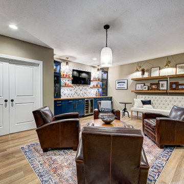
Our Carmel design-build studio was tasked with organizing our client’s basement and main floor to improve functionality and create spaces for entertaining.
In the basement, the goal was to include a simple dry bar, theater area, mingling or lounge area, playroom, and gym space with the vibe of a swanky lounge with a moody color scheme. In the large theater area, a U-shaped sectional with a sofa table and bar stools with a deep blue, gold, white, and wood theme create a sophisticated appeal. The addition of a perpendicular wall for the new bar created a nook for a long banquette. With a couple of elegant cocktail tables and chairs, it demarcates the lounge area. Sliding metal doors, chunky picture ledges, architectural accent walls, and artsy wall sconces add a pop of fun.
On the main floor, a unique feature fireplace creates architectural interest. The traditional painted surround was removed, and dark large format tile was added to the entire chase, as well as rustic iron brackets and wood mantel. The moldings behind the TV console create a dramatic dimensional feature, and a built-in bench along the back window adds extra seating and offers storage space to tuck away the toys. In the office, a beautiful feature wall was installed to balance the built-ins on the other side. The powder room also received a fun facelift, giving it character and glitz.
---
Project completed by Wendy Langston's Everything Home interior design firm, which serves Carmel, Zionsville, Fishers, Westfield, Noblesville, and Indianapolis.
For more about Everything Home, see here: https://everythinghomedesigns.com/
To learn more about this project, see here:
https://everythinghomedesigns.com/portfolio/carmel-indiana-posh-home-remodel
 Cantoni Dallas
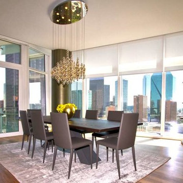
After receiving the opportunity in March 2014 to design the 3,000 square foot model home for Museum Tower, a 42-story luxury residential high-rise in the heart of the Dallas Arts District, Cantoni's dynamic duo, Josh De La Fuente and Elizabeth Lewis received an amazing response from clients as well as residents of Museum Tower and have been helping new residents furnish and design their spacious and luxurious units at Museum Tower.
Their most recent design project, a 2 bedroom, 2 bathroom and outdoor terrace with sweeping city views defines luxury high rise living at its best. The design goal was to create a clean and modern home that was also warm and inviting. By selecting a neutral color scheme featuring warm taupes with wood materials and pops of soft green and yellow tones contrasted with dramatic light fixtures and bold art accessories, Josh and Elizabeth achieved that modern and contemporary look that still exuded warmth. To learn more about this design project along with Cantoni Dallas designers Josh and Elizabeth, click here: http://cantoni.com/blog/2014/12/museum-tower-dallas/
Photos by David DeLeon
 Kimberlee Marie Interiors
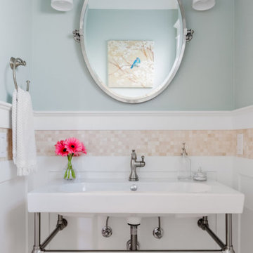
This 1950s home got a major update and addition. It went from a modest three bedroom, two bath house to a beautiful five bedroom, four bath house. Our clients were outgrowing their home but loved their neighborhood and didn't want to move. So they decided to modify their existing home to bring it up to speed with their family's needs. The main goals were to enlarge the main living spaces and make the floor plan more open. This was primarily achieved by adding a second story which allowed new bedrooms to be created, freeing up space on the main floor for a larger kitchen, dining room, and living room. The soothing creams, blues, grays, and warm wood tones used throughout help make this home inviting, and the craftsman details add charm and character, ensuring our clients will be proud to call this space "home" for years to come.
---
Project designed by interior design studio Kimberlee Marie Interiors. They serve the Seattle metro area including Seattle, Bellevue, Kirkland, Medina, Clyde Hill, and Hunts Point.
For more about Kimberlee Marie Interiors, see here: https://www.kimberleemarie.com/
To learn more about this project, see here
https://www.kimberleemarie.com/greenlakecraftsman
 Chi Renovation & Design
This is a redesigned studio apartment we recently renovated. The goal was to increase function and increase the feeling of separate functions. Luckily, this studio is of an impressive size and we were able to increase function via a large kitchen, dining area, home office, and bedroom area.
Each separated area serves its own purpose and gives the feeling that the apartment, though small, has plenty of space for differing tasks. The result is a highly functioning studio that doesn’t feel cramped, but rather like a one bed apartment.
Designed by Chi Renovation & Design who serve Chicago and its surrounding suburbs, with an emphasis on the North Side and North Shore. You'll find their work from the Loop through Lincoln Park, Skokie, Wilmette, and all the way up to Lake Forest.
For more about Chi Renovation & Design, click here: https://www.chirenovation.com/
To learn more about this project, click here: https://www.chirenovation.com/portfolio/upscale-chicago-studio-renovation-design/
 TVL Creative Ltd.
Cramped kitchen be gone! That was the project motto and top priority. The goal was to transform the current layout from multiple smaller spaces into a connected whole that would activate the main level for our clients, a young family of four.
The biggest obstacle was the wall dividing the kitchen and the dining room. Removing this wall was central to opening up and integrating the main living spaces, but the existing ductwork that ran right through the center of the wall posed a design challenge, er design opportunity. The resulting design solution features a central pantry that captures the ductwork and provides valuable storage- especially when compared to the original kitchen's 18" wide pantry cabinet. The pantry also anchors the kitchen island and serves as a visual separation of space between the kitchen and homework area.
Through our design development process, we learned the formal living room was of no service to their lifestyle and therefore space they rarely spent time in. With that in mind, we proposed to eliminate the unused living room and make it the new dining room. Relocating the dining room to this space inherently felt right given the soaring ceiling and ample room for holiday dinners and celebrations. The new dining room was spacious enough for us to incorporate a conversational seating area in the warm, south-facing window alcove.
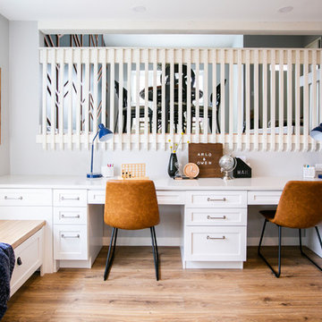
Now what to do with the old dining room?! To answer that question we took inspiration from our clients' shared profession in education and developed a craft area/homework station for both of their boys. The semi-custom cabinetry of the desk area carries over to the adjacent wall and forms window bench base with storage that we topped with butcher block for a touch of warmth. While the boys are young, the bench drawers are the perfect place for a stash of toys close to the kitchen.
The kitchen begins just beyond the window seat with their refrigerator enclosure. Opposite the refrigerator is the new pantry with twenty linear feet of shelving and space for brooms and a stick vacuum. Extending from the backside of the pantry the kitchen island design incorporates counter seating on the family room side and a cabinetry configuration on the kitchen side with drawer storage, a trashcan center, farmhouse sink, and dishwasher.
We took careful time in design and execution to align the range and sink because while it might seem like a small detail, it plays an important role in supporting the symmetrical configuration of the back wall of the kitchen. The rear wall design utilizes an appliance garage mirrors the visual impact of the refrigerator enclosure and helps keep the now open kitchen tidy. Between the appliance garage and refrigerator enclosure is the cooking zone with 30" of cabinetry and work surface on either side of the range, a chimney style vent hood, and a bold graphic tile backsplash.
The backsplash is just one of many personal touches we added to the space to reflect our client's modern eclectic style and love of color. Swooping lines of the mid-mod style barstools compliment the pendants and backsplash pattern. A pop of vibrant green on the frame of the pantry door adds a fresh wash of color to an otherwise neutral space. The big show stopper is the custom charcoal gray and copper chevron wall installation in the dining room. This was an idea our clients softly suggested, and we excitedly embraced the opportunity. It is also a kickass solution to the head-scratching design dilemma of how to fill a large and lofty wall.
We are so grateful to bring this design to life for our clients and now dear friends.
 Done Right Home Remodeling
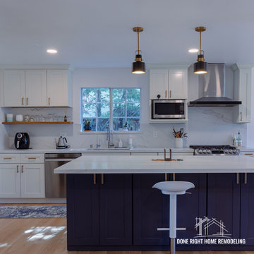
#KitchenRemodeling project completed in #SanJose #CA
It looks stylish, modern and cozy at the same time.
A big island with storage on both sides. Bright white cabinets and walls, wooden flooring, and lighting are the main focal point of this open-concept home.
? Contact #DoneRightHomeRemodeling today to schedule a consultation and learn more about how we can create your dream kitchen!
? Done Right Home Remodeling
? 1-800-816-0000
? https://www.donerighthomeremodelingca.com/san-jose/
Follow ? @doneright_remodeling_ca for more beautiful spaces ??♂️??
⏩ Follow us on Yelp https://www.yelp.com/biz/done-right-home-remodeling-santa-clara-2
? Find us on Houzz: https://www.houzz.com/pro/donerighthomeremodeling/
? Find Us on Google Maps https://goo.gl/maps/dmHDze6wAXTzwihC6
◼ LIC #: 1002689
#kitchendesign #KitchenIdeas #KitchenRenovation #KitchenInspiration #KitchenGoals #Cabinets #KitchenRemodel #BayArea
 TVL Creative Ltd.
Cramped kitchen be gone! That was the project motto and top priority. The goal was to transform the current layout from multiple smaller spaces into a connected whole that would activate the main level for our clients, a young family of four.
The biggest obstacle was the wall dividing the kitchen and the dining room. Removing this wall was central to opening up and integrating the main living spaces, but the existing ductwork that ran right through the center of the wall posed a design challenge, er design opportunity. The resulting design solution features a central pantry that captures the ductwork and provides valuable storage- especially when compared to the original kitchen's 18" wide pantry cabinet. The pantry also anchors the kitchen island and serves as a visual separation of space between the kitchen and homework area.
Through our design development process, we learned the formal living room was of no service to their lifestyle and therefore space they rarely spent time in. With that in mind, we proposed to eliminate the unused living room and make it the new dining room. Relocating the dining room to this space inherently felt right given the soaring ceiling and ample room for holiday dinners and celebrations. The new dining room was spacious enough for us to incorporate a conversational seating area in the warm, south-facing window alcove.
Now what to do with the old dining room?! To answer that question we took inspiration from our clients' shared profession in education and developed a craft area/homework station for both of their boys. The semi-custom cabinetry of the desk area carries over to the adjacent wall and forms window bench base with storage that we topped with butcher block for a touch of warmth. While the boys are young, the bench drawers are the perfect place for a stash of toys close to the kitchen.
The kitchen begins just beyond the window seat with their refrigerator enclosure. Opposite the refrigerator is the new pantry with twenty linear feet of shelving and space for brooms and a stick vacuum. Extending from the backside of the pantry the kitchen island design incorporates counter seating on the family room side and a cabinetry configuration on the kitchen side with drawer storage, a trashcan center, farmhouse sink, and dishwasher.
We took careful time in design and execution to align the range and sink because while it might seem like a small detail, it plays an important role in supporting the symmetrical configuration of the back wall of the kitchen. The rear wall design utilizes an appliance garage mirrors the visual impact of the refrigerator enclosure and helps keep the now open kitchen tidy. Between the appliance garage and refrigerator enclosure is the cooking zone with 30" of cabinetry and work surface on either side of the range, a chimney style vent hood, and a bold graphic tile backsplash.
The backsplash is just one of many personal touches we added to the space to reflect our client's modern eclectic style and love of color. Swooping lines of the mid-mod style barstools compliment the pendants and backsplash pattern. A pop of vibrant green on the frame of the pantry door adds a fresh wash of color to an otherwise neutral space. The big show stopper is the custom charcoal gray and copper chevron wall installation in the dining room. This was an idea our clients softly suggested, and we excitedly embraced the opportunity. It is also a kickass solution to the head-scratching design dilemma of how to fill a large and lofty wall.
We are so grateful to bring this design to life for our clients and now dear friends.
 Chi Renovation & Design
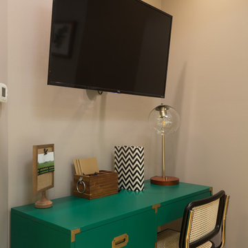
This is a redesigned studio apartment we recently renovated. The goal was to increase function and increase the feeling of separate functions. Luckily, this studio is of an impressive size and we were able to increase function via a large kitchen, dining area, home office, and bedroom area.
Each separated area serves its own purpose and gives the feeling that the apartment, though small, has plenty of space for differing tasks. The result is a highly functioning studio that doesn’t feel cramped, but rather like a one bed apartment.
Designed by Chi Renovation & Design who serve Chicago and its surrounding suburbs, with an emphasis on the North Side and North Shore. You'll find their work from the Loop through Lincoln Park, Skokie, Wilmette, and all the way up to Lake Forest.
For more about Chi Renovation & Design, click here: https://www.chirenovation.com/
To learn more about this project, click here: https://www.chirenovation.com/portfolio/upscale-chicago-studio-renovation-design/
 Chi Renovation & Design
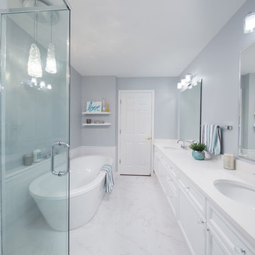
A glamorous bathroom renovation we completed for this busy client of ours. We were able to turn this outdated bathroom into a trendy master bath that promotes luxury and relaxation.
The goal was to keep the space feeling clean and open, so we exchanged the client's oversized jacuzzi tub for a modern freestanding tub and spa-inspired walk-in shower. For a truly lavish experience, we installed custom shelves around the bathtub, offering a perfect place for resting a glass of wine, storing towels, and adding a touch of decor. As for the brand new shower, the classic white subway tile, swinging glass door, and unique window add a timeless yet contemporary aesthetic. A hidden shower niche was installed on the back side of the half-height wall, great for hiding toiletries and keeping the overall look clean.
Lastly, we were able to reuse our client's old vanity with minor updates. We freshened up its look with new quartz countertops, custom-fitted mirrors, and stylish hardware.
Designed by Chi Renovations & Design who serve Chicago and it's surrounding suburbs, with an emphasis on the North Side and North Shore. You'll find their work from the Loop through Lincoln Park, Skokie, Wilmette, and all the way up to Lake Forest.
For more about Chi Renovation & Design, click here: https://www.chirenovation.com/
To learn more about this project, click here: https://www.chirenovation.com/portfolio/joans-bathroom-remodel/#bath-renovation
 Yoko Oda Interior Design
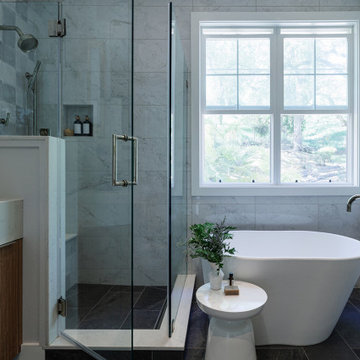
This traditional 4,000 square-foot home is located on a quiet cul de sac in Alamo, California. It served as a family home for San Francisco city professionals, but it was due for a remodel following a change in the lives of the owners. The homeowners are now empty nesters and came to Yoko Oda Interior Design to update their home. Our aim was to create a sophisticated timeless modern environment for this large estate in the San Francisco Bay Area. We were excited to take on the challenge and give the home a new lease of life now their children have grown up and left home.
Our sophisticated clients were drawn to traditional architectural details, global influences (i.e., Yoko’s Japanese modern aesthetics), contemporary clean lines, and neutral sophisticated color palettes. We have incorporated these interior design elements throughout the home, helping to maximize the space and features available to them while creating a more adult-friendly space to live. Neutral colors allow our clients to continue adding to the home in the future without committing to any colors that they may get tired of after some time. They are a classy option to add to any space and act as the backdrop for any artwork or home accessories that may be added later on.
Yoko’s design inspiration came from the clients’ personalities and the color palettes in their wardrobe. Our wardrobes say so much about us, and it’s a great way to learn more about the clients we are working with. A home needs to reflect the personalities of those living there, giving them a space to come back and relax in Alamo after a busy day.
We utilized the architectural features in their home such as a 22’ high ceiling, the large windows with natural light and the beautiful gardens outside. We incorporated each of these elements in an intentional way, with the goal of creating a home that was distinctive, layered and that felt collected over time. Yoko created a calm, global, understated city vibe in this family home, which is something that can be a challenge to cultivate in the San Francisco Bay Area. We hope the family will enjoy many more years of living in this beautiful property during this new stage in their lives.
Make sure you check out the other remodel projects we’ve completed on our site, to give you more inspiration for how we could help transform your home in the future.
 Kowalske Kitchen & Bath
This exciting ‘whole house’ project began when a couple contacted us while house shopping. They found a 1980s contemporary colonial in Delafield with a great wooded lot on Nagawicka Lake. The kitchen and bathrooms were outdated but it had plenty of space and potential.
We toured the home, learned about their design style and dream for the new space. The goal of this project was to create a contemporary space that was interesting and unique. Above all, they wanted a home where they could entertain and make a future.
At first, the couple thought they wanted to remodel only the kitchen and master suite. But after seeing Kowalske Kitchen & Bath’s design for transforming the entire house, they wanted to remodel it all. The couple purchased the home and hired us as the design-build-remodel contractor.
First Floor Remodel
The biggest transformation of this home is the first floor. The original entry was dark and closed off. By removing the dining room walls, we opened up the space for a grand entry into the kitchen and dining room. The open-concept kitchen features a large navy island, blue subway tile backsplash, bamboo wood shelves and fun lighting.
On the first floor, we also turned a bathroom/sauna into a full bathroom and powder room. We were excited to give them a ‘wow’ powder room with a yellow penny tile wall, floating bamboo vanity and chic geometric cement tile floor.
Second Floor Remodel
The second floor remodel included a fireplace landing area, master suite, and turning an open loft area into a bedroom and bathroom.
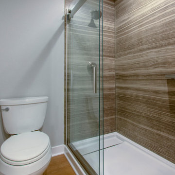
In the master suite, we removed a large whirlpool tub and reconfigured the bathroom/closet space. For a clean and classic look, the couple chose a black and white color pallet. We used subway tile on the walls in the large walk-in shower, a glass door with matte black finish, hexagon tile on the floor, a black vanity and quartz counters.
Flooring, trim and doors were updated throughout the home for a cohesive look.
 Lumar Interiors
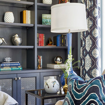
Our goal for this project was to transform this home from family-friendly to an empty nesters sanctuary. We opted for a sophisticated palette throughout the house, featuring blues, greys, taupes, and creams. The punches of colour and classic patterns created a warm environment without sacrificing sophistication.
Project by Richmond Hill interior design firm Lumar Interiors. Also serving Aurora, Newmarket, King City, Markham, Thornhill, Vaughan, York Region, and the Greater Toronto Area.
For more about Lumar Interiors, click here: https://www.lumarinteriors.com/
To learn more about this project, click here: https://www.lumarinteriors.com/portfolio/vaughan-renovation-and-decor/
 Coco Maison Design
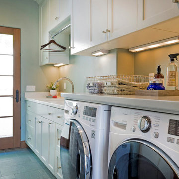
Warm, sandy woods, espresso tones, and light plush fabrics come together exquisitely in this open and bright living room. Our goal was to give our clients a luxurious but relaxed style which is why we introduced light earth tones and pale blues.
Clean lines and symmetry are the fundamental elements of this design, so it was important to add in the right amount of texture. With the right textiles, warm organic elements, and artisanal lighting and decor, we created the home of our client's dreams.
Project designed by Courtney Thomas Design in La Cañada. Serving Pasadena, Glendale, Monrovia, San Marino, Sierra Madre, South Pasadena, and Altadena.
For more about Courtney Thomas Design, click here: https://www.courtneythomasdesign.com/
To learn more about this project, click here: https://www.courtneythomasdesign.com/portfolio/la-canada-blvd-house/
 TVL Creative Ltd.
Cramped kitchen be gone! That was the project motto and top priority. The goal was to transform the current layout from multiple smaller spaces into a connected whole that would activate the main level for our clients, a young family of four.
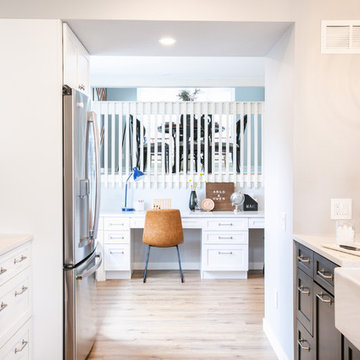
The biggest obstacle was the wall dividing the kitchen and the dining room. Removing this wall was central to opening up and integrating the main living spaces, but the existing ductwork that ran right through the center of the wall posed a design challenge, er design opportunity. The resulting design solution features a central pantry that captures the ductwork and provides valuable storage- especially when compared to the original kitchen's 18" wide pantry cabinet. The pantry also anchors the kitchen island and serves as a visual separation of space between the kitchen and homework area.
Through our design development process, we learned the formal living room was of no service to their lifestyle and therefore space they rarely spent time in. With that in mind, we proposed to eliminate the unused living room and make it the new dining room. Relocating the dining room to this space inherently felt right given the soaring ceiling and ample room for holiday dinners and celebrations. The new dining room was spacious enough for us to incorporate a conversational seating area in the warm, south-facing window alcove.
Now what to do with the old dining room?! To answer that question we took inspiration from our clients' shared profession in education and developed a craft area/homework station for both of their boys. The semi-custom cabinetry of the desk area carries over to the adjacent wall and forms window bench base with storage that we topped with butcher block for a touch of warmth. While the boys are young, the bench drawers are the perfect place for a stash of toys close to the kitchen.
The kitchen begins just beyond the window seat with their refrigerator enclosure. Opposite the refrigerator is the new pantry with twenty linear feet of shelving and space for brooms and a stick vacuum. Extending from the backside of the pantry the kitchen island design incorporates counter seating on the family room side and a cabinetry configuration on the kitchen side with drawer storage, a trashcan center, farmhouse sink, and dishwasher.
We took careful time in design and execution to align the range and sink because while it might seem like a small detail, it plays an important role in supporting the symmetrical configuration of the back wall of the kitchen. The rear wall design utilizes an appliance garage mirrors the visual impact of the refrigerator enclosure and helps keep the now open kitchen tidy. Between the appliance garage and refrigerator enclosure is the cooking zone with 30" of cabinetry and work surface on either side of the range, a chimney style vent hood, and a bold graphic tile backsplash.
The backsplash is just one of many personal touches we added to the space to reflect our client's modern eclectic style and love of color. Swooping lines of the mid-mod style barstools compliment the pendants and backsplash pattern. A pop of vibrant green on the frame of the pantry door adds a fresh wash of color to an otherwise neutral space. The big show stopper is the custom charcoal gray and copper chevron wall installation in the dining room. This was an idea our clients softly suggested, and we excitedly embraced the opportunity. It is also a kickass solution to the head-scratching design dilemma of how to fill a large and lofty wall.
We are so grateful to bring this design to life for our clients and now dear friends.
15