
Search results for "Maintenance plans" in Home Design Ideas
 Donald A. Gardner Architects
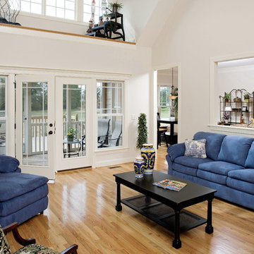
 Low-maintenance siding, a front-entry garage and architectural details make this narrow lot charmer perfect for beginning families and empty nesters. An abundance of windows and open floorplan flood this home with light. Custom-styled features include a plant shelf, fireplace, two-story ceiling, kitchen pass-thru and French doors leading to a porch.
 Shrock Premier Custom Construction
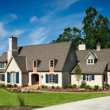
This French Country Charmer is a showpiece for Shrock Premier’s attention to detail and quality materials. Shrock Premier always selects the highest quality materials available. With two young children, these homeowners desired a home rich in beauty, one that would work hard, and also provide great durability & functionality. We were able to create a stunning home with classic lines, meet the family’s low maintenance requirements, and create open, flowing living spaces through a thoughtful floor plan.

Find the right local pro for your project

 Change Your Bathroom©
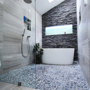
The goal of this project was to upgrade the builder grade finishes and create an ergonomic space that had a contemporary feel. This bathroom transformed from a standard, builder grade bathroom to a contemporary urban oasis. This was one of my favorite projects, I know I say that about most of my projects but this one really took an amazing transformation. By removing the walls surrounding the shower and relocating the toilet it visually opened up the space. Creating a deeper shower allowed for the tub to be incorporated into the wet area. Adding a LED panel in the back of the shower gave the illusion of a depth and created a unique storage ledge. A custom vanity keeps a clean front with different storage options and linear limestone draws the eye towards the stacked stone accent wall.
Houzz Write Up: https://www.houzz.com/magazine/inside-houzz-a-chopped-up-bathroom-goes-streamlined-and-swank-stsetivw-vs~27263720
The layout of this bathroom was opened up to get rid of the hallway effect, being only 7 foot wide, this bathroom needed all the width it could muster. Using light flooring in the form of natural lime stone 12x24 tiles with a linear pattern, it really draws the eye down the length of the room which is what we needed. Then, breaking up the space a little with the stone pebble flooring in the shower, this client enjoyed his time living in Japan and wanted to incorporate some of the elements that he appreciated while living there. The dark stacked stone feature wall behind the tub is the perfect backdrop for the LED panel, giving the illusion of a window and also creates a cool storage shelf for the tub. A narrow, but tasteful, oval freestanding tub fit effortlessly in the back of the shower. With a sloped floor, ensuring no standing water either in the shower floor or behind the tub, every thought went into engineering this Atlanta bathroom to last the test of time. With now adequate space in the shower, there was space for adjacent shower heads controlled by Kohler digital valves. A hand wand was added for use and convenience of cleaning as well. On the vanity are semi-vessel sinks which give the appearance of vessel sinks, but with the added benefit of a deeper, rounded basin to avoid splashing. Wall mounted faucets add sophistication as well as less cleaning maintenance over time. The custom vanity is streamlined with drawers, doors and a pull out for a can or hamper.
A wonderful project and equally wonderful client. I really enjoyed working with this client and the creative direction of this project.
Brushed nickel shower head with digital shower valve, freestanding bathtub, curbless shower with hidden shower drain, flat pebble shower floor, shelf over tub with LED lighting, gray vanity with drawer fronts, white square ceramic sinks, wall mount faucets and lighting under vanity. Hidden Drain shower system. Atlanta Bathroom.
 GFS Architectural Systems, Inc
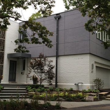
Example of a mid-sized minimalist gray two-story concrete fiberboard flat roof design in Chicago



 MossCreek
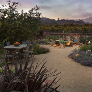
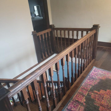
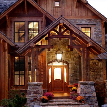
Designed by MossCreek, this beautiful timber frame home includes signature MossCreek style elements such as natural materials, expression of structure, elegant rustic design, and perfect use of space in relation to build site. Photo by Mark Smith
 DANE AUSTIN INTERIOR DESIGN Boston & Cambridge
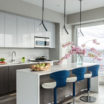
To make the most of this window-endowed penthouse, I designed sleek, pared-down spaces with low-slung lounge seating, floating consoles, and modern Italian pieces. The kitchen is an open-plan layout, and the narrow dining room features a Keith Fritz dining table complemented with Roche Bobois dining chairs.
Photography by: Sean Litchfield
---
Project designed by Boston interior design studio Dane Austin Design. They serve Boston, Cambridge, Hingham, Cohasset, Newton, Weston, Lexington, Concord, Dover, Andover, Gloucester, as well as surrounding areas.
For more about Dane Austin Design, click here: https://daneaustindesign.com/
To learn more about this project, click here:
https://daneaustindesign.com/alloy-penthouse
 Heather Wren Interiors
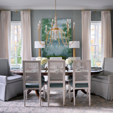
With a beautiful new grasscloth wallpaper to set the tone, this dining room makes a statement. A stunning new piece of art, creates a wow moment! We painted and re-upholstered the dining chairs and added new host and hostess chairs. The new rug pulls it all together.
 Thomas Roszak Architecture, LLC
Photo credit: Scott McDonald @ Hedrich Blessing
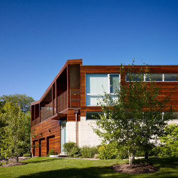
7RR-Ecohome:
The design objective was to build a house for a couple recently married who both had kids from previous marriages. How to bridge two families together?
The design looks forward in terms of how people live today. The home is an experiment in transparency and solid form; removing borders and edges from outside to inside the house, and to really depict “flowing and endless space”. The house floor plan is derived by pushing and pulling the house’s form to maximize the backyard and minimize the public front yard while welcoming the sun in key rooms by rotating the house 45-degrees to true north. The angular form of the house is a result of the family’s program, the zoning rules, the lot’s attributes, and the sun’s path. We wanted to construct a house that is smart and efficient in terms of construction and energy, both in terms of the building and the user. We could tell a story of how the house is built in terms of the constructability, structure and enclosure, with a nod to Japanese wood construction in the method in which the siding is installed and the exposed interior beams are placed in the double height space. We engineered the house to be smart which not only looks modern but acts modern; every aspect of user control is simplified to a digital touch button, whether lights, shades, blinds, HVAC, communication, audio, video, or security. We developed a planning module based on a 6-foot square room size and a 6-foot wide connector called an interstitial space for hallways, bathrooms, stairs and mechanical, which keeps the rooms pure and uncluttered. The house is 6,200 SF of livable space, plus garage and basement gallery for a total of 9,200 SF. A large formal foyer celebrates the entry and opens up to the living, dining, kitchen and family rooms all focused on the rear garden. The east side of the second floor is the Master wing and a center bridge connects it to the kid’s wing on the west. Second floor terraces and sunscreens provide views and shade in this suburban setting. The playful mathematical grid of the house in the x, y and z axis also extends into the layout of the trees and hard-scapes, all centered on a suburban one-acre lot.
Many green attributes were designed into the home; Ipe wood sunscreens and window shades block out unwanted solar gain in summer, but allow winter sun in. Patio door and operable windows provide ample opportunity for natural ventilation throughout the open floor plan. Minimal windows on east and west sides to reduce heat loss in winter and unwanted gains in summer. Open floor plan and large window expanse reduces lighting demands and maximizes available daylight. Skylights provide natural light to the basement rooms. Durable, low-maintenance exterior materials include stone, ipe wood siding and decking, and concrete roof pavers. Design is based on a 2' planning grid to minimize construction waste. Basement foundation walls and slab are highly insulated. FSC-certified walnut wood flooring was used. Light colored concrete roof pavers to reduce cooling loads by as much as 15%. 2x6 framing allows for more insulation and energy savings. Super efficient windows have low-E argon gas filled units, and thermally insulated aluminum frames. Permeable brick and stone pavers reduce the site’s storm-water runoff. Countertops use recycled composite materials. Energy-Star rated furnaces and smart thermostats are located throughout the house to minimize duct runs and avoid energy loss. Energy-Star rated boiler that heats up both radiant floors and domestic hot water. Low-flow toilets and plumbing fixtures are used to conserve water usage. No VOC finish options and direct venting fireplaces maintain a high interior air quality. Smart home system controls lighting, HVAC, and shades to better manage energy use. Plumbing runs through interior walls reducing possibilities of heat loss and freezing problems. A large food pantry was placed next to kitchen to reduce trips to the grocery store. Home office reduces need for automobile transit and associated CO2 footprint. Plan allows for aging in place, with guest suite than can become the master suite, with no need to move as family members mature.
 Thomas Roszak Architecture, LLC
Photo credit: Scott McDonald @ Hedrich Blessing
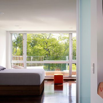
7RR-Ecohome:
The design objective was to build a house for a couple recently married who both had kids from previous marriages. How to bridge two families together?
The design looks forward in terms of how people live today. The home is an experiment in transparency and solid form; removing borders and edges from outside to inside the house, and to really depict “flowing and endless space”. The house floor plan is derived by pushing and pulling the house’s form to maximize the backyard and minimize the public front yard while welcoming the sun in key rooms by rotating the house 45-degrees to true north. The angular form of the house is a result of the family’s program, the zoning rules, the lot’s attributes, and the sun’s path. We wanted to construct a house that is smart and efficient in terms of construction and energy, both in terms of the building and the user. We could tell a story of how the house is built in terms of the constructability, structure and enclosure, with a nod to Japanese wood construction in the method in which the siding is installed and the exposed interior beams are placed in the double height space. We engineered the house to be smart which not only looks modern but acts modern; every aspect of user control is simplified to a digital touch button, whether lights, shades, blinds, HVAC, communication, audio, video, or security. We developed a planning module based on a 6-foot square room size and a 6-foot wide connector called an interstitial space for hallways, bathrooms, stairs and mechanical, which keeps the rooms pure and uncluttered. The house is 6,200 SF of livable space, plus garage and basement gallery for a total of 9,200 SF. A large formal foyer celebrates the entry and opens up to the living, dining, kitchen and family rooms all focused on the rear garden. The east side of the second floor is the Master wing and a center bridge connects it to the kid’s wing on the west. Second floor terraces and sunscreens provide views and shade in this suburban setting. The playful mathematical grid of the house in the x, y and z axis also extends into the layout of the trees and hard-scapes, all centered on a suburban one-acre lot.
Many green attributes were designed into the home; Ipe wood sunscreens and window shades block out unwanted solar gain in summer, but allow winter sun in. Patio door and operable windows provide ample opportunity for natural ventilation throughout the open floor plan. Minimal windows on east and west sides to reduce heat loss in winter and unwanted gains in summer. Open floor plan and large window expanse reduces lighting demands and maximizes available daylight. Skylights provide natural light to the basement rooms. Durable, low-maintenance exterior materials include stone, ipe wood siding and decking, and concrete roof pavers. Design is based on a 2' planning grid to minimize construction waste. Basement foundation walls and slab are highly insulated. FSC-certified walnut wood flooring was used. Light colored concrete roof pavers to reduce cooling loads by as much as 15%. 2x6 framing allows for more insulation and energy savings. Super efficient windows have low-E argon gas filled units, and thermally insulated aluminum frames. Permeable brick and stone pavers reduce the site’s storm-water runoff. Countertops use recycled composite materials. Energy-Star rated furnaces and smart thermostats are located throughout the house to minimize duct runs and avoid energy loss. Energy-Star rated boiler that heats up both radiant floors and domestic hot water. Low-flow toilets and plumbing fixtures are used to conserve water usage. No VOC finish options and direct venting fireplaces maintain a high interior air quality. Smart home system controls lighting, HVAC, and shades to better manage energy use. Plumbing runs through interior walls reducing possibilities of heat loss and freezing problems. A large food pantry was placed next to kitchen to reduce trips to the grocery store. Home office reduces need for automobile transit and associated CO2 footprint. Plan allows for aging in place, with guest suite than can become the master suite, with no need to move as family members mature.

Sponsored
Columbus, OH
Free consultation for landscape design!

Peabody Landscape Group
Franklin County's Reliable Landscape Design & Contracting
 User
UserExquisite Worktops and High-end Kitchen Guide
Homeowners
The fuel to every person's happiness: food; is stored in a kitchen. We gotta agree that even if life is created in a bedroom, it is certainly lived in a kitchen. Hence, It is undeniable that every homeowner would want to invest mindfully in creating a proper outlook of a place that nourishes the heart of both its family and its guests. While designing a kitchen unlike other spaces of a home one must pay attention to the choice of materials for worktops, floors, sinks, etc that suit the hygiene purposes alongside the aesthetic point of view, which might usually result in a very high budget plan. So this is where practicality hits a common man as no matter what one`s wishlist is, execution ultimately depends on their capability of expenditure.
However, with sufficient guidance on kitchen design planning, one can drastically minimise the expenses without necessarily having to purchase cheap worktops. The choice of the right materials is just as important as the ability to financially invest in the same, if not more. This means if a person has enough knowledge of what they are looking for, they can cleverly create an exquisite look under a much lesser budget-friendly scheme.
Key Points to Consider When on a Mission to Create a High-end Kitchen Under Restrained Pockets
Estimating a Budget Plan:
Setting a realistic budget before the investment is a very important aspect which shouldn't be overlooked. According to NKBA, a proper guide to setting one`s kitchen budget while planning a new one should look like- 29% cabinets and hardware, 17% installation, 14% appliances and ventilation, 10% countertops, 7% flooring, 5% walls and ceilings, 5% lighting, 5% faucets and plumbing, 4% doors and windows, 4% design fees and 1% miscellaneous.
Pick Your Beautiful Stone for Work-top:
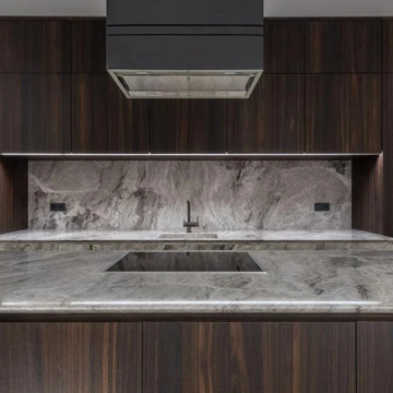
As we all know, beauty is not just conventional, so natural stones, as well as engineered stones, are beautiful in their own way. Engineered countertops are still impressively resistant to scratch and stains. They can almost replicate the intrinsic character and sparkle of granite and marbles. The manufacturing technique of engineered stones has made it so that, wherever they are incorporated, they add a sense of style and class. And with minimal maintenance, they can last for a very long time in a household. One can even go for the mix and matching technique where one can use both expensive and inexpensive buys in such a way that the former occupies the areas on display while the latter covers up for other units.
Being on a budget, though, must not mean hiring inexperienced fabricators to compromise on cost. The short-term result might be tempting but doing so will only increase the future risk thus being more of a loss than an advantage. However, if one is confident enough in their skills, DIY-ing the fittings will drastically reduce the cost of expenditure.
Reusing and Recycling Off Cuts:
While extending or renovating one always has the option to think about how some materials from the previous space can be given a second life. Worktops can be altered to fit a new plan, cupboard doors can be fitted to the kitchen and given a fresh look by repainting, and old appliances can be sold on to help contribute towards pitching in some money for purchasing new ones. The stone remnants and offcuts can always be utilised for smaller projects. Check out these Remnants that are available within your region.
Flooring:
Renovating a floor on a tight budget doesn't necessarily mean that one doesn't care about durability or looks. Ideally, one will still want a decent lifespan and great finish even if it's the most affordable kitchen floor out there. To avail this best possible combination of durability, style, and affordability, consider laminate and vinyl flooring designs. They mimic wood and tile flooring convincingly enough.
Work-top Lights:
Light fixtures are easy and impactful and one of the easiest ways to upgrade a room's look. Impeccable lighting not only makes the room look stunning but also provides effective task lighting to make the space easier and more enjoyable to use. If the plan is to introduce new lighting to an existing kitchen, one can try using battery-operated LED spotlights and strips that don’t need wiring in. Installing them over worktops, under cabinets and inside open or glass-fronted cupboards can create an expensive appearance.
Colour Details:
Choosing the right colour of paint has the potential to drastically change the outlook. For example, just visualise a completely white kitchen worktop. Done? Now similarly, a completely black kitchen. You can't deny that both would bring out completely different aesthetic values. Colour is one of the best ways to inject personality into a space but it's important to get the proportions right. For a guaranteed unregretted approach, you can choose neutral tones for the structural elements that are more costly and difficult to replace, including cabinets, floors, worktops, kitchen countertops, and appliances. Then introduce colour with less-expensive updates to the walls, backsplash, window treatments, lighting, and other accents. With this strategy, you can easily and affordably swap out your colour scheme as your tastes and popular trends change.
Creating Interest:
Worktops
One unique way to enhance the design is by introducing an interesting element to catch the eye and provide a focal point.
Decorating Walls:
Attractive wallpapers add a sense of style to the kitchen. It is a great way to freshen up a room without needing to do a lot of work or spending much money. In a rental property, one can try vinyl wall decals or temporary wallpaper. However, overdoing the work in the hype of excitement will make it worse than doing good.
Open Shelf:
One can utilize an empty wall for open shelves. It adds more storage and creates a display area. Go for a decorative or contrasting shelf to add character. Keeping the shelves clear of clutter and using them as a design piece to show off styled arrangements of recipe books, beautiful objects and interesting pieces is always recommended.
Upgrading Cabinet Doors:
Replacing the cabinet doors is a simple way to give the appearance a brand-new look. As long as the units are standard size and the main framework is in good condition, one can just swap the doors without having to worry about the worktop, splashback, plumbing or electrics. Another simple way to upgrade the units is to replace the handles. Vintage cabinets can be given a modification to look contemporary or vice versa with this simple trick. Similarly, cheap, basic-looking handles can be replaced with beautiful handmade ceramic knobs or adding a stylish leather door pull can upgrade the kitchen’s chic factor.
With all these points and our collection of stones, you will have an exquisite kitchen right in front of you. Our service charges are minimum to make kitchen renovation an achievable dream for all homeowners. Email info@work-tops.com for free quotes and to know about our special offers.
 Advance Design Studio, Ltd.
After six years of living in their Huntley IL home, Chris and Meghan were tired of their dark, dingy, outdated kitchen and it was finally time for a long-anticipated change. “The kitchen is the place where we live, it’s where we do everything,” Meghan said. “It was important that it be a space where we wanted to be.” Meghan loves cooking and enjoys including their girls in healthy meal prepping, this led them to want a brighter, more enjoyable kitchen with increased functionality and improved storage.
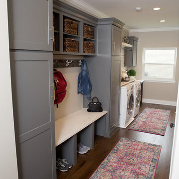
For Chris especially, the laundry room was an entirely dysfunctional eyesore. “We had a washer and a dryer, but it was all kind-of cobbled together!” Chris said. “There were always laundry piles everywhere, we weren’t really sure what we wanted to do in there, but it was time for us to make a change.” The mess of the space was stressful every time they walked in the door from the garage each day. Kids’ backpacks and shoes piled up haphazardly in the makeshift boot-bench closet left the family feeling disorganized and stressed. They needed space for folding clothes and locker cubbies to help keep the family organized.
Having known Christine and Todd in the Huntley community for years, Chris and Meghan were familiar with their work. “We already trusted them personally and having seen their projects for years we knew they did top notch work. After we reviewed the initial round of designs, we knew that hiring them was definitely the right choice,” Meghan and Chris said. Although Chris had done a lot of work in their home himself, the kitchen and laundry room renovation was such a large undertaking that he didn’t want to steal time away from his family to spend what would surely be many long weekends doing the job himself. “That would not have been a wise choice for us,” Chris laughed.
“Our designer, Michelle was very, very, easy to work with; anything we wanted to see or weren’t sure about, she went above and beyond to make this easy for us. She was easy to get hold of and always quick to respond,” the couple said. Michelle pulled ideas that mirrored the couple’s taste and style and was adept at directing the couple to limited choices that didn’t overwhelm them and kept the process moving. “I have a hard time making decisions. Michelle made the decision-making process so easy. I loved how she listened to what I liked and then presented three great options for me to choose from,” Meghan said.
The main objectives for the kitchen were better storage solutions, they wanted the space to reflect their lifestyle and taste, and they wanted it to last for years with low maintenance. One of the first steps in creating a more functional kitchen was relocating the refrigerator, creating an improved workflow for the busy family.
“We didn’t know that we could even move the refrigerator to a new location where it is now, that was something that we never would have thought of,” Chris said. “The new refrigerator location makes the kitchen feel so much bigger. We didn’t add any space, but our whole kitchen with the new design just seems like it’s so much larger than before!” Meghan said.
The perimeter mist colored cabinets helped warm and brighten the entire room, while the graphite colored cabinets on the island added contrast. Using this fresh, clean color palette satisfied the couple’s desire for a bright space that was the exact opposite of what they had before. Organization accessories were also added to the cabinets such as a spice drawer tray and roll outs to create hidden convenience.
“I absolutely love the hidden spices – it makes cooking so much more enjoyable!” Chris said. “And all the pull outs, and the double trash bin, who would think you could get so excited about organization!” the couple said in unison.
One thing they hated in their original kitchen was how dark the space felt. Added lighting on the ceiling with the new light fixtures combined with the lighter cabinetry colors throughout solved this problem. “Our new kitchen has this warm, almost cozy feeling that our old kitchen never had, it’s just a space that I love spending my time in now,” Meghan said. The light airy feeling was accentuated with the use of floating white shelves on either side of the decorative range hood. “We have so much cabinetry space, the new design is amazing we actually have more storage space than we will ever need,” Meghan said.
The island was extended to create more work surface and added space for stool seating. “The new island changes how we live. Now the kids can be in the kitchen with us, doing homework, eating breakfast, and the three of us have special dinners there when Chris is working late,” Meghan said.
The Carrara Marmi Quartz countertops were chosen because they are, not only beautiful, but are made from hard-working material that doesn’t require maintenance. The white subway tile backsplash that wraps to the ceiling behind the focal point cooktop range/hood compliments the crisp white countertops perfectly, while brushed brass hardware and light fixtures keep the design fresh and new.
The couple had a few fears at the beginning of the project, as most homeowners do. Their biggest fear was being out of their kitchen and laundry room for an extended time. The crew made it very easy for the family to work in a limited space keeping the washer and dryer hooked up the majority of the time, and also getting appliances working with minimal downtime.
“They above and beyond accommodated us to get us through the process,” Meghan said. “They did a great job making sure we were as comfortable as possible throughout the process,” Chris added.
“Our project manager DJ did a great job. He was very good at updating us on schedule changes, getting guys in as quickly as possible. Everyone that stepped in the house was nice and did great work,” said Chris. They thought Advance’s carpenter was phenomenal and were impressed when he took a conceptual idea from a photograph and worked with designer Michelle to create a one of a kind range/hood that has become the topic of conversation with friends and family who visit the new kitchen. “He was in our house literally every day for several weeks. He was easy to work with and good at what he did,” Meghan and Chris said.
The focal point of the kitchen; a hand-crafted, custom-built ventilation hood was clad with handpicked reclaimed barnwood. Advance Design’s carpenter built the framework and the cladding to create a one-of-a-kind design element that the couple loves.
“I think it was especially fun for him to create something unique from scratch, showcasing his talent in this area,” Meghan said. “I love that my kitchen is not like everyone else’s. I got to pick out the wood on my hood and watch it being built and was able to choose what pieces of wood went where on it. It’s totally unique.”
Red Oak flooring was toothed-in throughout the kitchen and the rest of the first floor anywhere changes were made. Then the whole floor was refinished to tone down the orange undertones in the existing floor stain, ultimately changing the color complexion of the entire first floor. The result is a completely new feeling to the entire home.
Renovating the laundry room was extremely important to Meghan and Chris, but they had trouble visualizing what the possibilities were for the seemingly small space. Michelle produced beautiful 3D illustrations that helped them envision the space in a whole new way.
“I must have told Michelle 100 times that I am a visual person, seeing the designs in 3D made it so easy to make decisions and see what we could really do with our space,” Meghan said.
A dividing wall and doorway were removed between the existing laundry room and hallway formerly containing a coat closet, providing space to design specialized graphite colored cabinetry matching the kitchen island to house custom storage cubbies for each family member. Adding the tall utility cabinetry in the new laundry area helped solve the storage issue, tucking away cleaning supplies, household items, and even the cat got its own cubby.
“I love how everything is now hidden in its own space. I can’t tell you how much I hated coming home and seeing everything sitting around on counters,” Chris said.
Electrical outlets were planned for the inside of utility cabinets, so devices could charge in hidden locations. Stacking the washer and dryer allowed for wider countertop space to provide a folding area and a special space for clothes to hang. “The way I do laundry has been completely transformed! I can actually fold clothes and hang them now right out of the washer and dryer,” Meghan said.
“The end result in the kitchen and the laundry/mud room was an updated light and bright space, with a smarter work flow that better meets the needs of this family,” Michelle said.
“I would totally recommend Advance Design,” Meghan said. “Sometimes I sit and just look at my kitchen and laundry room and think ‘Wow, I can’t believe I get to live here!’ It’s an understatement to say we love our new space.”
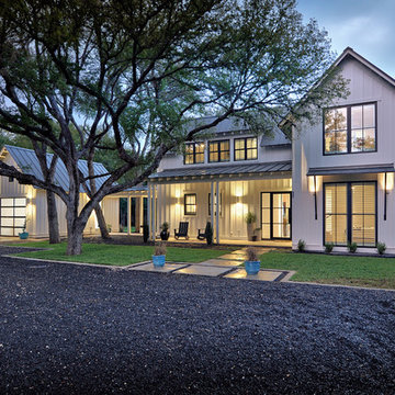
 Tanner Consulting LLC- Landscape Architecture
DRM Design Group provided Landscape Architecture services for a Local Austin, Texas residence. We worked closely with Redbud Custom Homes and Tim Brown Architecture to create a custom low maintenance- low water use contemporary landscape design. This Eco friendly design has a simple and crisp look with great contrasting colors that really accentuate the existing trees.
www.redbudaustin.com
www.timbrownarch.com
 Palmerston Design Consultants
Lisa Petrole
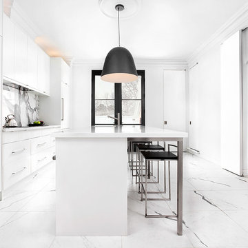
Kitchen pantry - large contemporary single-wall porcelain tile kitchen pantry idea in Toronto with an undermount sink, flat-panel cabinets, white cabinets, quartz countertops, white backsplash, stone slab backsplash, stainless steel appliances and an island
Kitchen pantry - large contemporary single-wall porcelain tile kitchen pantry idea in Toronto with an undermount sink, flat-panel cabinets, white cabinets, quartz countertops, white backsplash, stone slab backsplash, stainless steel appliances and an island
 1 Special Moment
Rick Janson
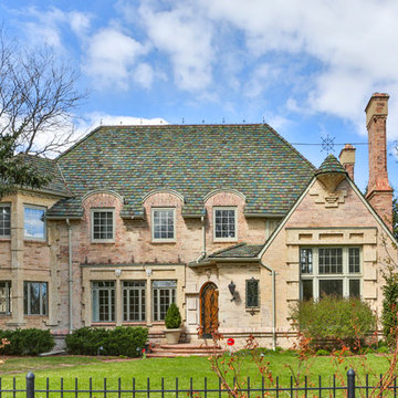
Example of a classic two-story brick exterior home design in Denver with a hip roof
Example of a classic two-story brick exterior home design in Denver with a hip roof
 Georgia Coast Design & Construction
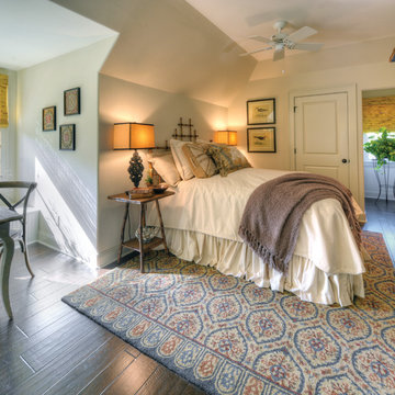
Georgia Coast Design & Construction - Southern Living Custom Builder Showcase Home at St. Simons Island, GA
Built on a one-acre, lakefront lot on the north end of St. Simons Island, the Southern Living Custom Builder Showcase Home is characterized as Old World European featuring exterior finishes of Mosstown brick and Old World stucco, Weathered Wood colored designer shingles, cypress beam accents and a handcrafted Mahogany door.
Inside the three-bedroom, 2,400-square-foot showcase home, Old World rustic and modern European style blend with high craftsmanship to create a sense of timeless quality, stability, and tranquility. Behind the scenes, energy efficient technologies combine with low maintenance materials to create a home that is economical to maintain for years to come. The home's open floor plan offers a dining room/kitchen/great room combination with an easy flow for entertaining or family interaction. The interior features arched doorways, textured walls and distressed hickory floors.
 MasterPLAN Outdoor Living
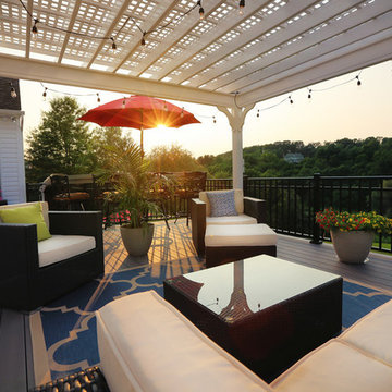
One special concern the homeowners had was that in the afternoon, the sun cooks the whole deck area. We addressed this by adding a decorative vinyl pergola with a lattice top to the dining area of the deck. This area will now be much cooler in the summer.
33