
Search results for "Major projects" in Home Design Ideas
 Milgard Windows & Doors
The Kiguchi family moved into their Austin, Texas home in 1994. Built in the 1980’s as part of a neighborhood development, they happily raised their family here but longed for something more contemporary. Once they became empty nesters, they decided it was time for a major remodel. After spending many years visiting Austin AIA Home Tours that highlight contemporary residential architecture, they had a lot of ideas and in 2013 were ready to interview architects and get their renovation underway.
The project turned into a major remodel due to an unstable foundation. Architects Ben Arbib and Ed Hughey, of Arbib Hughey Design were hired to solve the structural issue and look for inspiration in the bones of the house, which sat on top of a hillside and was surrounded by great views.
Unfortunately, with the old floor plan, the beautiful views were hidden by small windows that were poorly placed. In order to bring more natural light into the house the window sizes and configurations had to be addressed, all while keeping in mind the homeowners desire for a modern look and feel.
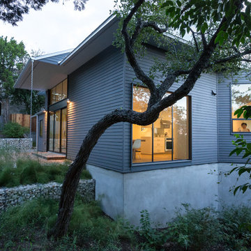
To achieve a more contemporary and sophisticated front of house, a new entry was designed that included removing a two-story bay window and porch. The entrance of the home also became more integrated with the landscape creating a template for new foliage to be planted. Older exterior materials were updated to incorporate a more muted palette of colors with a metal roof, dark grey siding in the back and white stucco in the front. Deep eaves were added over many of the new large windows for clean lines and sun protection.
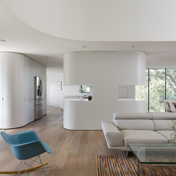
“Inside it was about opening up the floor plan, expanding the views throughout the house, and updating the material palette to get a modern look that was also warm and inviting,” said Ben from Arbib Hughey Design. “Prior to the remodel, the house had the typical separation of rooms. We removed the walls between them and changed all of the windows to Milgard Thermally Improved Aluminum to connect the inside with the outside. No matter where you are you get nice views and natural light.”
The architects wanted to create some drama, which they accomplished with the window placement and opening up the interior floor plan to an open concept approach. Cabinetry was used to help delineate intimate spaces. To add warmth to an all-white living room, white-washed oak wood floors were installed and pine planks were used around the fireplace. The large windows served as artwork bringing the color of nature into the space.
An octagon shaped, elevated dining room, (named “the turret”), had a big impact on the design of the house. They architects rounded the corners and added larger window openings overlooking a new sunken garden. The great room was also softened by rounding out the corners and that circular theme continued throughout the house, being picked up in skylight wells and kitchen cabinetry. A staircase leading to a catwalk was added and the result was a two-story window wall that flooded the home with natural light.
When asked why Milgard® Thermally Improved Aluminum windows were selected, the architectural team listed many reasons:
1) Aesthetics: “We liked the slim profiles and narrow sightlines. The window frames never get in the way of the view and that was important to us. They also have a very contemporary look that went well with our design.”
2) Options: “We liked that we could get large sliding doors that matched the windows, giving us a very cohesive look and feel throughout the project.”
3) Cost Effective: “Milgard windows are affordable. You get a good product at a good price.”
4) Custom Sizes: “Milgard windows are customizable, which allowed us to get the right window for each location.”
Ready to take on your own traditional to modern home remodeling project? Arbib Hughey Design advises, “Work with a good architect. That means picking a team that is creative, communicative, listens well and is responsive. We think it’s important for an architect to listen to their clients and give them something they want, not something the architect thinks they should have. At the same time you want an architect who is willing and able to think outside the box and offer up design options that you may not have considered. Design is about a lot of back and forth, trying out ideas, getting feedback and trying again.”
The home was completely transformed into a unique, contemporary house perfectly integrated with its site. Internally the home has a natural flow for the occupants and externally it is integrated with the surroundings taking advantage of great natural light. As a side note, it was highly praised as part of the Austin AIA homes tour.
 Axis Mundi
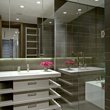
This NoHo apartment, in a landmarked circa 1870 building designed by Stephen Decatur Hatch and converted to lofts in 1987, had been interestingly renovated by a rock musician before being purchased by a young hedge fund manager and his gallery director girlfriend. Naturally, the couple brought to the project their collection of painting, photography and sculpture, mostly by young emerging artists. Axis Mundi accommodated these pieces within a neutral palette accented with occasional flashes of bright color that referenced the various artworks. Major furniture pieces – a sectional in the library, a 12-foot-long dining table–along with a rich blend of textures such as leather, linen, fur and warm woods, helped bring the sprawling dimensions of the loft down to human scale.
Photography: Mark Roskams
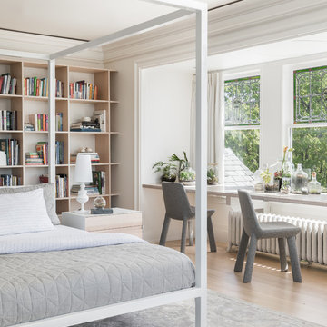
Example of a transitional light wood floor and beige floor bedroom design in Seattle with white walls
Find the right local pro for your project

 Dee Dee Lear
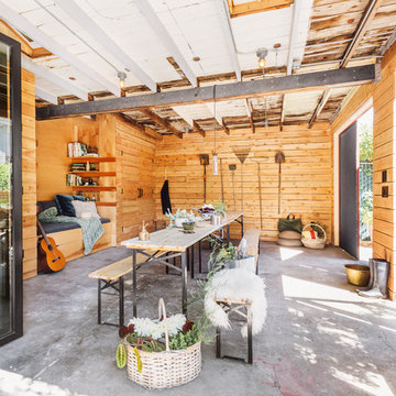
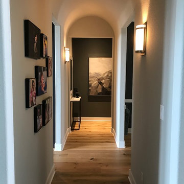
The Delaney's Design team was selected to decorate this beautiful new home in Frisco, Texas. The clients had selected their major furnishings, but weren't sure where to start when it came to decorating and creating a warm and welcoming home.
 Nextoffice
Sharifi-ha House
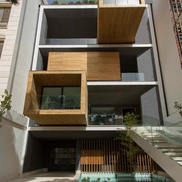
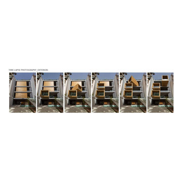
Uncertainty and flexibility lie at the heart of the design concept in Sharifi-ha House. The sensational, spatial qualities of the interiors, as well as the formal configuration of its exterior, directly respond to the displacement of turning boxes that lead the building volume to become open or closed, obtaining introverted or extroverted character. These changes may occur according to changing seasons or functional scenarios of floor plans.
Like many other urban plots, the land for this project had a noticeably narrow façade-width compared with its length. Consequently, our expertise in transforming a two-dimensional façade to a three-dimensional one became indispensable. Here, the openness /closure of the building volume is a reference to traditional Iranian houses, which would dynamically serve as seasonal modes of habitation by offering both a Zemestan-Neshin (winter living room) and Taabestan-Neshin (summer living room) to their residents. In summertime, Sharifi-ha House offers an open /transparent /perforated volume with wide, large terraces. In contrast, during Tehran’s cold, snowy winters the volume closes itself, offering minimal openings in total absence of those wide summer terraces. In this project, the challenges to the concepts of open/closed typology (introverted/extroverted character) led to an exciting spatial transformation of an ever-changing residential building.
The House is distributed over seven floors: the two basement floors are allocated to family conviviality, fitness facilities, and wellness areas, while the ground floor hosts parking and housekeeping rooms. Public activities all happen on the first and second floors, and the family’s private life takes place on the third and fourth floors.
The project consisted of four major parts; the fixed volume of the structure, the void, and the fixed volume and the mobile volume, respectively. When the turning boxes are closed, the building captures sunlight throughout the space of the central void, which also connects the two fixed volumes by suspended bridges.
The house adapts to the functional needs of its residents. For instance, depending on whether there is a guest or not, the guest room (located on the second floor) can be reconfigured for different purposes. Similarly, home office and breakfast room (turning rooms on the first and third floors) can change the formality of their appearance according to their residents’ desire. In other words, there is always the possibility of having different seasonal or lighting scenarios, some of which have been already considered in the BMS program of the project.
From the initial design steps, we noticed that three pine trees outside could be incorporated into the spaces of the interior. Now, in the open mode of the house, the trees are pleasantly captured by the window frames.
Stepping back for about three meters from the permitted construction boundary line allowed us to provide splendid daylight for the basement floors by inserting a glass fountain. The fitness and wellness areas are accommodated between this fountain and the basement pool where reflective installations reverberate the water’s radiance all over the space.
The applied manufacturing technique for the turning mechanism was in fact a simple one; the same method which is currently employed in turning theatrical scenes, turning the floor of car exhibitions, steel companies and the shipping industry in Iran. But as our client himself was into importing CNC and other similar industrial German machines, he preferred the structural system to be fabricated in Germany. In doing so, he could engage his employees in the manufacturing process and thus train them for future maintenance purposes.
Details of the handrails and air-penetration controlling methods were major issues considered in developing the design of the turning boxes. Designing foldable handrails and refining the edges of the boxes happened to be our feasible solutions.
Considering the specialties of this kind of architecture, the structural system was inevitably a customized one. After digitally modeling the structure, a series of SAP2000 analysis were undertaken to examine static/dynamic performance of the proposed system. Being partially moveable is the dominant feature of this structural assembly, which was contemplated throughout the fabrication process by the German manufacturer company. The main loads all rest on the beams of the living rooms.
Due to the various configurations the turning boxes may take, the loading calculation has been estimated based on the largest possible loading value applied to the system. Additionally, in order to prevent structural deformation controlling the probable vibrations in the turning boxes was taken into account during the design/calculations of the structure.
The house was titled Sharifi-ha House, in honor of traditional Iranian mansions.
 King of the Painters Inc.
King of the Painters
King of the Painters is the king of the painting jungle when it comes to interior and exterior projects. Our services include simple repainting of interior and exterior walls, basic and finished carpentry services, wall texturing, special wall surface effects (such as “marbleizing” and “faux finishes”), installation of recessed ceiling lights, all the way to drywall and acoustical ceiling repair. We also offer expert application of color glazes, specialty industrial coatings, including industrial enamels, epoxy, and urethane coatings.
We are proud of the fact that a major portion of our new clients are referrals. King of the Painters, Inc. has earned its reputation by not only being locally owned and operated, but by ensuring quality and satisfaction. Our goal is to minimize the hassles typically associated with painting and construction work by making your painting project an enjoyable experience . . . rather than one you would like to forget. Remember, there is no substitute or compromise for quality and professionalism. Just ask some of our past and current clients gladly provided on request!
Whether you need to paint your home, business, office building, shopping center or homeowners association, request a royal appointment right now by calling us anytime for a free, no-obligation estimate and expert color consultation.King of the Painters
King of the Painters is the king of the painting jungle when it comes to interior and exterior projects. Our services include simple repainting of interior and exterior walls, basic and finished carpentry services, wall texturing, special wall surface effects (such as “marbleizing” and “faux finishes”), installation of recessed ceiling lights, all the way to drywall and acoustical ceiling repair. We also offer expert application of color glazes, specialty industrial coatings, including industrial enamels, epoxy, and urethane coatings.
We are proud of the fact that a major portion of our new clients are referrals. King of the Painters, Inc. has earned its reputation by not only being locally owned and operated, but by ensuring quality and satisfaction. Our goal is to minimize the hassles typically associated with painting and construction work by making your painting project an enjoyable experience . . . rather than one you would like to forget. Remember, there is no substitute or compromise for quality and professionalism. Just ask some of our past and current clients gladly provided on request!
Whether you need to paint your home, business, office building, shopping center or homeowners association, request a royal appointment right now by calling us anytime for a free, no-obligation estimate and expert color consultation.

 Nextoffice
Sharifi-ha House
Uncertainty and flexibility lie at the heart of the design concept in Sharifi-ha House. The sensational, spatial qualities of the interiors, as well as the formal configuration of its exterior, directly respond to the displacement of turning boxes that lead the building volume to become open or closed, obtaining introverted or extroverted character. These changes may occur according to changing seasons or functional scenarios of floor plans.
Like many other urban plots, the land for this project had a noticeably narrow façade-width compared with its length. Consequently, our expertise in transforming a two-dimensional façade to a three-dimensional one became indispensable. Here, the openness /closure of the building volume is a reference to traditional Iranian houses, which would dynamically serve as seasonal modes of habitation by offering both a Zemestan-Neshin (winter living room) and Taabestan-Neshin (summer living room) to their residents. In summertime, Sharifi-ha House offers an open /transparent /perforated volume with wide, large terraces. In contrast, during Tehran’s cold, snowy winters the volume closes itself, offering minimal openings in total absence of those wide summer terraces. In this project, the challenges to the concepts of open/closed typology (introverted/extroverted character) led to an exciting spatial transformation of an ever-changing residential building.
The House is distributed over seven floors: the two basement floors are allocated to family conviviality, fitness facilities, and wellness areas, while the ground floor hosts parking and housekeeping rooms. Public activities all happen on the first and second floors, and the family’s private life takes place on the third and fourth floors.
The project consisted of four major parts; the fixed volume of the structure, the void, and the fixed volume and the mobile volume, respectively. When the turning boxes are closed, the building captures sunlight throughout the space of the central void, which also connects the two fixed volumes by suspended bridges.
The house adapts to the functional needs of its residents. For instance, depending on whether there is a guest or not, the guest room (located on the second floor) can be reconfigured for different purposes. Similarly, home office and breakfast room (turning rooms on the first and third floors) can change the formality of their appearance according to their residents’ desire. In other words, there is always the possibility of having different seasonal or lighting scenarios, some of which have been already considered in the BMS program of the project.
From the initial design steps, we noticed that three pine trees outside could be incorporated into the spaces of the interior. Now, in the open mode of the house, the trees are pleasantly captured by the window frames.
Stepping back for about three meters from the permitted construction boundary line allowed us to provide splendid daylight for the basement floors by inserting a glass fountain. The fitness and wellness areas are accommodated between this fountain and the basement pool where reflective installations reverberate the water’s radiance all over the space.
The applied manufacturing technique for the turning mechanism was in fact a simple one; the same method which is currently employed in turning theatrical scenes, turning the floor of car exhibitions, steel companies and the shipping industry in Iran. But as our client himself was into importing CNC and other similar industrial German machines, he preferred the structural system to be fabricated in Germany. In doing so, he could engage his employees in the manufacturing process and thus train them for future maintenance purposes.
Details of the handrails and air-penetration controlling methods were major issues considered in developing the design of the turning boxes. Designing foldable handrails and refining the edges of the boxes happened to be our feasible solutions.
Considering the specialties of this kind of architecture, the structural system was inevitably a customized one. After digitally modeling the structure, a series of SAP2000 analysis were undertaken to examine static/dynamic performance of the proposed system. Being partially moveable is the dominant feature of this structural assembly, which was contemplated throughout the fabrication process by the German manufacturer company. The main loads all rest on the beams of the living rooms.
Due to the various configurations the turning boxes may take, the loading calculation has been estimated based on the largest possible loading value applied to the system. Additionally, in order to prevent structural deformation controlling the probable vibrations in the turning boxes was taken into account during the design/calculations of the structure.
The house was titled Sharifi-ha House, in honor of traditional Iranian mansions.
 Milgard Windows & Doors
The Kiguchi family moved into their Austin, Texas home in 1994. Built in the 1980’s as part of a neighborhood development, they happily raised their family here but longed for something more contemporary. Once they became empty nesters, they decided it was time for a major remodel. After spending many years visiting Austin AIA Home Tours that highlight contemporary residential architecture, they had a lot of ideas and in 2013 were ready to interview architects and get their renovation underway.
The project turned into a major remodel due to an unstable foundation. Architects Ben Arbib and Ed Hughey, of Arbib Hughey Design were hired to solve the structural issue and look for inspiration in the bones of the house, which sat on top of a hillside and was surrounded by great views.
Unfortunately, with the old floor plan, the beautiful views were hidden by small windows that were poorly placed. In order to bring more natural light into the house the window sizes and configurations had to be addressed, all while keeping in mind the homeowners desire for a modern look and feel.
To achieve a more contemporary and sophisticated front of house, a new entry was designed that included removing a two-story bay window and porch. The entrance of the home also became more integrated with the landscape creating a template for new foliage to be planted. Older exterior materials were updated to incorporate a more muted palette of colors with a metal roof, dark grey siding in the back and white stucco in the front. Deep eaves were added over many of the new large windows for clean lines and sun protection.
“Inside it was about opening up the floor plan, expanding the views throughout the house, and updating the material palette to get a modern look that was also warm and inviting,” said Ben from Arbib Hughey Design. “Prior to the remodel, the house had the typical separation of rooms. We removed the walls between them and changed all of the windows to Milgard Thermally Improved Aluminum to connect the inside with the outside. No matter where you are you get nice views and natural light.”
The architects wanted to create some drama, which they accomplished with the window placement and opening up the interior floor plan to an open concept approach. Cabinetry was used to help delineate intimate spaces. To add warmth to an all-white living room, white-washed oak wood floors were installed and pine planks were used around the fireplace. The large windows served as artwork bringing the color of nature into the space.
An octagon shaped, elevated dining room, (named “the turret”), had a big impact on the design of the house. They architects rounded the corners and added larger window openings overlooking a new sunken garden. The great room was also softened by rounding out the corners and that circular theme continued throughout the house, being picked up in skylight wells and kitchen cabinetry. A staircase leading to a catwalk was added and the result was a two-story window wall that flooded the home with natural light.
When asked why Milgard® Thermally Improved Aluminum windows were selected, the architectural team listed many reasons:
1) Aesthetics: “We liked the slim profiles and narrow sightlines. The window frames never get in the way of the view and that was important to us. They also have a very contemporary look that went well with our design.”
2) Options: “We liked that we could get large sliding doors that matched the windows, giving us a very cohesive look and feel throughout the project.”
3) Cost Effective: “Milgard windows are affordable. You get a good product at a good price.”
4) Custom Sizes: “Milgard windows are customizable, which allowed us to get the right window for each location.”
Ready to take on your own traditional to modern home remodeling project? Arbib Hughey Design advises, “Work with a good architect. That means picking a team that is creative, communicative, listens well and is responsive. We think it’s important for an architect to listen to their clients and give them something they want, not something the architect thinks they should have. At the same time you want an architect who is willing and able to think outside the box and offer up design options that you may not have considered. Design is about a lot of back and forth, trying out ideas, getting feedback and trying again.”
The home was completely transformed into a unique, contemporary house perfectly integrated with its site. Internally the home has a natural flow for the occupants and externally it is integrated with the surroundings taking advantage of great natural light. As a side note, it was highly praised as part of the Austin AIA homes tour.
 Cantoni Irvine
Designed By: Sarah Buehlman
Marc and Mandy Maister were clients and fans of Cantoni before they purchased this harbor home on Balboa Island. The South African natives originally met designer Sarah Buehlman and Cantoni’s Founder and CEO Michael Wilkov at a storewide sale, and quickly established a relationship as they bought furnishings for their primary residence in Newport Beach.
So, when the couple decided to invest in this gorgeous second home, in one of the ritziest enclaves in North America, they sought Sarah’s help in transforming the outdated 1960’s residence into a modern marvel. “It’s now the ultimate beach house,” says Sarah, “and finished in Cantoni from top to bottom—including new custom cabinetry installed throughout.”
But let’s back up. This project began when Mandy contacted Sarah in the midst of the remodel process (in December 2010), asking if she could come take a look and help with the overall design.
“The plans were being drawn up with an architect, and they opted not to move anything major. Instead, they updated everything—as in the small carpeted staircase that became a gorgeous glass and metal sculpture,” Sarah explains. She took photographs and measurements, and then set to work creating the scaled renderings. “Marc and Mandy were drawn to the One and Only Collection. It features a high-gloss brown and white color scheme which served as inspiration for the project,” says Sarah.
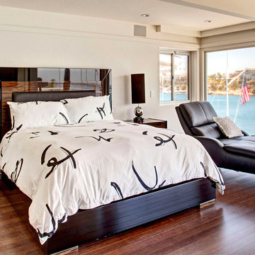
Primary pieces in the expansive living area include the Mondrian leather sectional, the Involution sculpture, and a pair of Vladimir Kagan Corkscrew swivel chairs. The Maisters needed a place to house all their electronics but didn’t want a typical entertainment center. The One and Only buffet was actually modified by our skilled shop technicians, in our distribution center, so it could accommodate all the couple’s media equipment. “These artisans are another one of our hidden strengths—in addition to the design tools, inventory and extensive resources we have to get a job done,” adds Sarah. Marc and Mandy also fell in love with the exotic Makassar ebony wood in the Ritz Collection, which Sarah combined in the master bedroom with the Ravenna double chaise to provide an extra place to sit and enjoy the beautiful harbor views.
Beyond new furnishings, the Maisters also decided to completely redo their kitchen. And though Marc and Mandy did not have a chance to actually see our kitchen displays, having worked with Sarah over the years, they had immense trust in our commitment to craftsmanship and quality. In fact, they opted for new cabinetry in four bathrooms as well as the laundry room based on our 3D renderings and lacquer samples alone—without ever opening a drawer. “Their trust in my expertise and Cantoni’s reputation were a major deciding factor,” says Sarah.
This plush second home, complete with a private boat dock right out back, counts as one of Sarah’s proudest accomplishments. “These long-time clients are great. They love Cantoni and appreciate high quality Italian furnishings in particular. The home is so gorgeous that once you are inside and open the Nano doors, you simply don’t want to leave.” The job took almost two years to complete, but everyone seems quite happy with the results, proving that large or small—and in cases necessitating a quick turnaround or execution of a long-term vision—Cantoni has the resources to come through for all clients.
 deVOL Kitchens
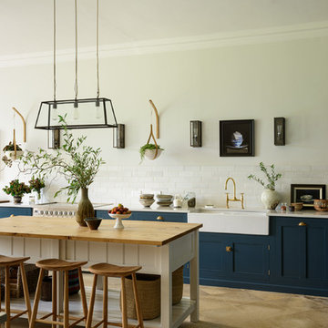
Elegant beige floor kitchen photo in Other with a farmhouse sink, shaker cabinets, blue cabinets, white backsplash, subway tile backsplash, an island and white countertops
 Metropolis Drafting and Construction Inc
A rejuvenation project of the entire first floor of approx. 1700sq.
The kitchen was completely redone and redesigned with relocation of all major appliances, construction of a new functioning island and creating a more open and airy feeling in the space.
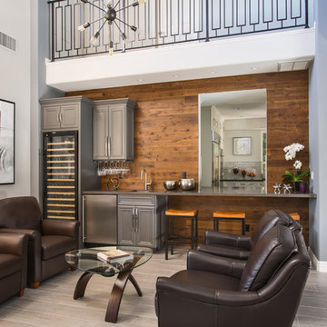
A "window" was opened from the kitchen to the living space to create a connection and practical work area between the kitchen and the new home bar lounge that was constructed in the living space.
New dramatic color scheme was used to create a "grandness" felling when you walk in through the front door and accent wall to be designated as the TV wall.
The stairs were completely redesigned from wood banisters and carpeted steps to a minimalistic iron design combining the mid-century idea with a bit of a modern Scandinavian look.
The old family room was repurposed to be the new official dinning area with a grand buffet cabinet line, dramatic light fixture and a new minimalistic look for the fireplace with 3d white tiles.
 LeichtUSA
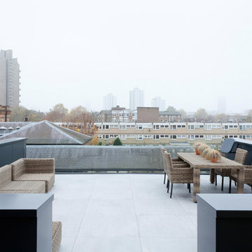
Attractive living as an architectural experiment: a 136-year-old water tower, a listed building with a spectacular 360-degree panorama view over the City of London. The task, to transform it into a superior residence, initially seemed an absolute impossibility. But when the owners came across architect Mike Collier, they had found a partner who was to make the impossible possible. The tower, which had been empty for decades, underwent radical renovation work and was extended by a four-storey cube containing kitchen, dining and living room - connected by glazed tunnels and a lift shaft. The kitchen, realised by Enclosure Interiors in Tunbridge Wells, Kent, with furniture from LEICHT is the very heart of living in this new building.
Shiny white matt-lacquered kitchen fronts (AVANCE-LR), tone-on-tone with the worktops, reflect the light in the room and thus create expanse and openness. The surface of the handle-less kitchen fronts has a horizontal relief embossing; depending on the light incidence, this results in a vitally structured surface. The free-standing preparation isle with its vertical side panels with a seamlessly integrated sink represents the transition between kitchen and living room. The fronts of the floor units facing the dining table were extended to the floor to do away with the plinth typical of most kitchens. Ceiling-high tall units on the wall provide plenty of storage space; the electrical appliances are integrated here invisible to the eye. Floor units on a high plinth which thus appear to be floating form the actual cooking centre within the kitchen, attached to the wall. A range of handle-less wall units concludes the glazed niche at the top.
LEICHT international: “Architecture and kitchen” in the centre of London. www.LeichtUSA.com
Sponsored
Delaware, OH

Buckeye Basements, Inc.
Central Ohio's Basement Finishing ExpertsBest Of Houzz '13-'21

 Teale Architecture
Photography: Ryan Garvin
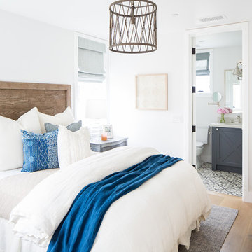
Beach style light wood floor and beige floor bedroom photo in Orange County with white walls
Beach style light wood floor and beige floor bedroom photo in Orange County with white walls

 New Leaf Custom Homes | Dallas
Example of a transitional freestanding desk light wood floor, beige floor and wall paneling home office design in Dallas with green walls, a standard fireplace and a stone fireplace
 Advance Design Studio, Ltd.
After six years of living in their Huntley IL home, Chris and Meghan were tired of their dark, dingy, outdated kitchen and it was finally time for a long-anticipated change. “The kitchen is the place where we live, it’s where we do everything,” Meghan said. “It was important that it be a space where we wanted to be.” Meghan loves cooking and enjoys including their girls in healthy meal prepping, this led them to want a brighter, more enjoyable kitchen with increased functionality and improved storage.
For Chris especially, the laundry room was an entirely dysfunctional eyesore. “We had a washer and a dryer, but it was all kind-of cobbled together!” Chris said. “There were always laundry piles everywhere, we weren’t really sure what we wanted to do in there, but it was time for us to make a change.” The mess of the space was stressful every time they walked in the door from the garage each day. Kids’ backpacks and shoes piled up haphazardly in the makeshift boot-bench closet left the family feeling disorganized and stressed. They needed space for folding clothes and locker cubbies to help keep the family organized.
Having known Christine and Todd in the Huntley community for years, Chris and Meghan were familiar with their work. “We already trusted them personally and having seen their projects for years we knew they did top notch work. After we reviewed the initial round of designs, we knew that hiring them was definitely the right choice,” Meghan and Chris said. Although Chris had done a lot of work in their home himself, the kitchen and laundry room renovation was such a large undertaking that he didn’t want to steal time away from his family to spend what would surely be many long weekends doing the job himself. “That would not have been a wise choice for us,” Chris laughed.
“Our designer, Michelle was very, very, easy to work with; anything we wanted to see or weren’t sure about, she went above and beyond to make this easy for us. She was easy to get hold of and always quick to respond,” the couple said. Michelle pulled ideas that mirrored the couple’s taste and style and was adept at directing the couple to limited choices that didn’t overwhelm them and kept the process moving. “I have a hard time making decisions. Michelle made the decision-making process so easy. I loved how she listened to what I liked and then presented three great options for me to choose from,” Meghan said.
The main objectives for the kitchen were better storage solutions, they wanted the space to reflect their lifestyle and taste, and they wanted it to last for years with low maintenance. One of the first steps in creating a more functional kitchen was relocating the refrigerator, creating an improved workflow for the busy family.
“We didn’t know that we could even move the refrigerator to a new location where it is now, that was something that we never would have thought of,” Chris said. “The new refrigerator location makes the kitchen feel so much bigger. We didn’t add any space, but our whole kitchen with the new design just seems like it’s so much larger than before!” Meghan said.
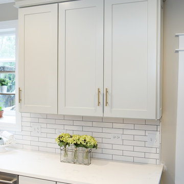
The perimeter mist colored cabinets helped warm and brighten the entire room, while the graphite colored cabinets on the island added contrast. Using this fresh, clean color palette satisfied the couple’s desire for a bright space that was the exact opposite of what they had before. Organization accessories were also added to the cabinets such as a spice drawer tray and roll outs to create hidden convenience.
“I absolutely love the hidden spices – it makes cooking so much more enjoyable!” Chris said. “And all the pull outs, and the double trash bin, who would think you could get so excited about organization!” the couple said in unison.
One thing they hated in their original kitchen was how dark the space felt. Added lighting on the ceiling with the new light fixtures combined with the lighter cabinetry colors throughout solved this problem. “Our new kitchen has this warm, almost cozy feeling that our old kitchen never had, it’s just a space that I love spending my time in now,” Meghan said. The light airy feeling was accentuated with the use of floating white shelves on either side of the decorative range hood. “We have so much cabinetry space, the new design is amazing we actually have more storage space than we will ever need,” Meghan said.
The island was extended to create more work surface and added space for stool seating. “The new island changes how we live. Now the kids can be in the kitchen with us, doing homework, eating breakfast, and the three of us have special dinners there when Chris is working late,” Meghan said.
The Carrara Marmi Quartz countertops were chosen because they are, not only beautiful, but are made from hard-working material that doesn’t require maintenance. The white subway tile backsplash that wraps to the ceiling behind the focal point cooktop range/hood compliments the crisp white countertops perfectly, while brushed brass hardware and light fixtures keep the design fresh and new.
The couple had a few fears at the beginning of the project, as most homeowners do. Their biggest fear was being out of their kitchen and laundry room for an extended time. The crew made it very easy for the family to work in a limited space keeping the washer and dryer hooked up the majority of the time, and also getting appliances working with minimal downtime.
“They above and beyond accommodated us to get us through the process,” Meghan said. “They did a great job making sure we were as comfortable as possible throughout the process,” Chris added.
“Our project manager DJ did a great job. He was very good at updating us on schedule changes, getting guys in as quickly as possible. Everyone that stepped in the house was nice and did great work,” said Chris. They thought Advance’s carpenter was phenomenal and were impressed when he took a conceptual idea from a photograph and worked with designer Michelle to create a one of a kind range/hood that has become the topic of conversation with friends and family who visit the new kitchen. “He was in our house literally every day for several weeks. He was easy to work with and good at what he did,” Meghan and Chris said.
The focal point of the kitchen; a hand-crafted, custom-built ventilation hood was clad with handpicked reclaimed barnwood. Advance Design’s carpenter built the framework and the cladding to create a one-of-a-kind design element that the couple loves.
“I think it was especially fun for him to create something unique from scratch, showcasing his talent in this area,” Meghan said. “I love that my kitchen is not like everyone else’s. I got to pick out the wood on my hood and watch it being built and was able to choose what pieces of wood went where on it. It’s totally unique.”
Red Oak flooring was toothed-in throughout the kitchen and the rest of the first floor anywhere changes were made. Then the whole floor was refinished to tone down the orange undertones in the existing floor stain, ultimately changing the color complexion of the entire first floor. The result is a completely new feeling to the entire home.
Renovating the laundry room was extremely important to Meghan and Chris, but they had trouble visualizing what the possibilities were for the seemingly small space. Michelle produced beautiful 3D illustrations that helped them envision the space in a whole new way.
“I must have told Michelle 100 times that I am a visual person, seeing the designs in 3D made it so easy to make decisions and see what we could really do with our space,” Meghan said.
A dividing wall and doorway were removed between the existing laundry room and hallway formerly containing a coat closet, providing space to design specialized graphite colored cabinetry matching the kitchen island to house custom storage cubbies for each family member. Adding the tall utility cabinetry in the new laundry area helped solve the storage issue, tucking away cleaning supplies, household items, and even the cat got its own cubby.
“I love how everything is now hidden in its own space. I can’t tell you how much I hated coming home and seeing everything sitting around on counters,” Chris said.
Electrical outlets were planned for the inside of utility cabinets, so devices could charge in hidden locations. Stacking the washer and dryer allowed for wider countertop space to provide a folding area and a special space for clothes to hang. “The way I do laundry has been completely transformed! I can actually fold clothes and hang them now right out of the washer and dryer,” Meghan said.
“The end result in the kitchen and the laundry/mud room was an updated light and bright space, with a smarter work flow that better meets the needs of this family,” Michelle said.
“I would totally recommend Advance Design,” Meghan said. “Sometimes I sit and just look at my kitchen and laundry room and think ‘Wow, I can’t believe I get to live here!’ It’s an understatement to say we love our new space.”


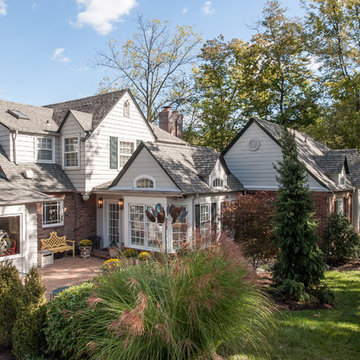
 FORNEY + architecture, LLC
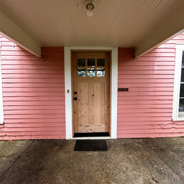
Master suite addition with adjacent sitting room
Inspiration for a mid-sized timeless beige one-story concrete fiberboard exterior home remodel in St Louis
Inspiration for a mid-sized timeless beige one-story concrete fiberboard exterior home remodel in St Louis
 Advance Design Studio, Ltd.
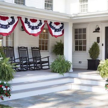
This 1930's Barrington Hills farmhouse was in need of some TLC when it was purchased by this southern family of five who planned to make it their new home. The renovation taken on by Advance Design Studio's designer Scott Christensen and master carpenter Justin Davis included a custom porch, custom built in cabinetry in the living room and children's bedrooms, 2 children's on-suite baths, a guest powder room, a fabulous new master bath with custom closet and makeup area, a new upstairs laundry room, a workout basement, a mud room, new flooring and custom wainscot stairs with planked walls and ceilings throughout the home.
The home's original mechanicals were in dire need of updating, so HVAC, plumbing and electrical were all replaced with newer materials and equipment. A dramatic change to the exterior took place with the addition of a quaint standing seam metal roofed farmhouse porch perfect for sipping lemonade on a lazy hot summer day.
In addition to the changes to the home, a guest house on the property underwent a major transformation as well. Newly outfitted with updated gas and electric, a new stacking washer/dryer space was created along with an updated bath complete with a glass enclosed shower, something the bath did not previously have. A beautiful kitchenette with ample cabinetry space, refrigeration and a sink was transformed as well to provide all the comforts of home for guests visiting at the classic cottage retreat.
The biggest design challenge was to keep in line with the charm the old home possessed, all the while giving the family all the convenience and efficiency of modern functioning amenities. One of the most interesting uses of material was the porcelain "wood-looking" tile used in all the baths and most of the home's common areas. All the efficiency of porcelain tile, with the nostalgic look and feel of worn and weathered hardwood floors. The home’s casual entry has an 8" rustic antique barn wood look porcelain tile in a rich brown to create a warm and welcoming first impression.
Painted distressed cabinetry in muted shades of gray/green was used in the powder room to bring out the rustic feel of the space which was accentuated with wood planked walls and ceilings. Fresh white painted shaker cabinetry was used throughout the rest of the rooms, accentuated by bright chrome fixtures and muted pastel tones to create a calm and relaxing feeling throughout the home.
Custom cabinetry was designed and built by Advance Design specifically for a large 70” TV in the living room, for each of the children’s bedroom’s built in storage, custom closets, and book shelves, and for a mudroom fit with custom niches for each family member by name.
The ample master bath was fitted with double vanity areas in white. A generous shower with a bench features classic white subway tiles and light blue/green glass accents, as well as a large free standing soaking tub nestled under a window with double sconces to dim while relaxing in a luxurious bath. A custom classic white bookcase for plush towels greets you as you enter the sanctuary bath.
43