Search results for "Master any space" in Home Design Ideas
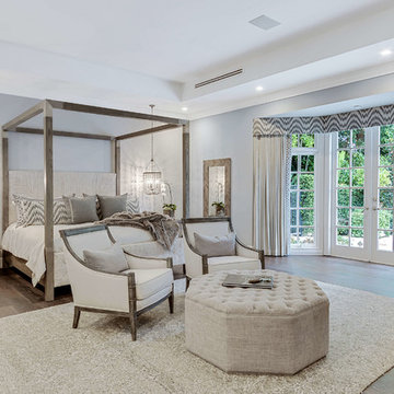
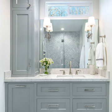
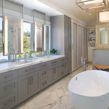
Remodeled layout provides new square footage that creates valuable space for an enlarged master bathroom retreat with spa like design and functional master closet.
Interiors by Mara Raphael; Photos by Tessa Neustadt

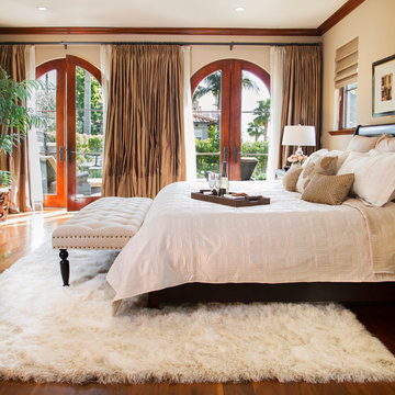
This master bedroom is a stunning example of interpreting neutrals with a 'twist'. Tonal wall stripes create a simple backdrop, white a pop of 'ginger' orange keeps the room from being anything but bland.
The mix of textural items - from nailhead chests - to silky faux bois area rug - and organic rattan lighting pendants (in lieu of traditional lamps) combine to create an especially warm & inviting space.

Our clients were looking to erase the 90s from their master bathroom and create a space that blended their contemporary tastes with natural elements. This bathroom had wonderful bones with a high ceiling and plenty of space, but we were able to work with our clients to create a design that better met their needs and utilized the space to its full potential. We wanted to create a sense of warmth in this large master bathroom and adding a fireplace to the space did the trick. By moving the tub location, we were able to create a stunning accent wall of stacked stone that provided a home for the fireplace and a perfectly dramatic backdrop for the new freestanding bathtub. The sculptural copper light fixture helps to soften the stone wall and allowed us to emphasize those vaulted ceiling. Playing with metal finishes is one of our favorite pastimes, and this bathroom was the perfect opportunity to blend sleek matte black plumbing fixtures with a mirrored copper finish on the light fixtures. We tied the vanity wall sconces in with a dramatic sculptural chandelier above the bath tub by using copper finishes on both and allowing the light fixtures to be the shining stars of this space. We selected a clean white finish for the custom vanity cabinets and lit them from below to accentuate their floating design. We then completed the look with a waterfall quartz counter to add an elegant texture to the area and extended the stone onto the shower bench to bring the two elements together. The existing shower had been on the small side, so we expanded it into the room and gave them a more spacious shower complete with a built-in bench and recessed niche. Hard surfaces play an important role in any bathroom design, and we wanted to use this opportunity to create an interesting layer of texture through our tile selections. The bathroom floor utilizes a large-scale plank tile installed in a herringbone pattern, while the shower and walls are tiled in a polished white tile to add a bit of reflectivity. The newly transformed bathroom is now a sophisticated space the brings together sleek contemporary finishes with textured natural elements and provides the perfect retreat from the outside world.
Find the right local pro for your project
Download our free ebook, Creating the Ideal Kitchen. DOWNLOAD NOW
For many, extra time at home during COVID left them wanting more from their homes. Whether you realized the shortcomings of your space or simply wanted to combat boredom, a well-designed and functional home was no longer a want, it became a need. Tina found herself wanting more from her Old Irving Park home and reached out to The Kitchen Studio about adding function to her kitchen to make the most of the available real estate.
At the end of the day, there is nothing better than returning home to a bright and happy space you love. And this kitchen wasn’t that for Tina. Dark and dated, with a palette from the past and features that didn’t make the most of the available square footage, this remodel required vision and a fresh approach to the space. Lead designer, Stephanie Cole’s main design goal was better flow, while adding greater functionality with organized storage, accessible open shelving, and an overall sense of cohesion with the adjoining family room.
The original kitchen featured a large pizza oven, which was rarely used, yet its footprint limited storage space. The nearby pantry had become a catch-all, lacking the organization needed in the home. The initial plan was to keep the pizza oven, but eventually Tina realized she preferred the design possibilities that came from removing this cumbersome feature, with the goal of adding function throughout the upgraded and elevated space. Eliminating the pantry added square footage and length to the kitchen for greater function and more storage. This redesigned space reflects how she lives and uses her home, as well as her love for entertaining.
The kitchen features a classic, clean, and timeless palette. White cabinetry, with brass and bronze finishes, contrasts with rich wood flooring, and lets the large, deep blue island in Woodland’s custom color Harbor – a neutral, yet statement color – draw your eye.
The kitchen was the main priority. In addition to updating and elevating this space, Tina wanted to maximize what her home had to offer. From moving the location of the patio door and eliminating a window to removing an existing closet in the mudroom and the cluttered pantry, the kitchen footprint grew. Once the floorplan was set, it was time to bring cohesion to her home, creating connection between the kitchen and surrounding spaces.
The color palette carries into the mudroom, where we added beautiful new cabinetry, practical bench seating, and accessible hooks, perfect for guests and everyday living. The nearby bar continues the aesthetic, with stunning Carrara marble subway tile, hints of brass and bronze, and a design that further captures the vibe of the kitchen.
Every home has its unique design challenges. But with a fresh perspective and a bit of creativity, there is always a way to give the client exactly what they want [and need]. In this particular kitchen, the existing soffits and high slanted ceilings added a layer of complexity to the lighting layout and upper perimeter cabinets.
While a space needs to look good, it also needs to function well. This meant making the most of the height of the room and accounting for the varied ceiling features, while also giving Tina everything she wanted and more. Pendants and task lighting paired with an abundance of natural light amplify the bright aesthetic. The cabinetry layout and design compliments the soffits with subtle profile details that bring everything together. The tile selections add visual interest, drawing the eye to the focal area above the range. Glass-doored cabinets further customize the space and give the illusion of even more height within the room.
While her family may be grown and out of the house, Tina was focused on adding function without sacrificing a stunning aesthetic and dreamy finishes that make the kitchen the gathering place of any home. It was time to love her kitchen again, and if you’re wondering what she loves most, it’s the niche with glass door cabinetry and open shelving for display paired with the marble mosaic backsplash over the range and complimenting hood. Each of these features is a stunning point of interest within the kitchen – both brag-worthy additions to a perimeter layout that previously felt limited and lacking.
Whether your remodel is the result of special needs in your home or simply the excitement of focusing your energy on creating a fun new aesthetic, we are here for it. We love a good challenge because there is always a way to make a space better – adding function and beauty simultaneously.

Master Ensuite is tucked away with double sinks and enough counter space for two. Free-standing soaker-tub is situated away from the water closet to create a more spa-like atmosphere.

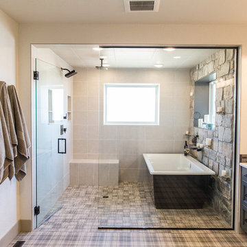
The clients asked for a master bath with a ranch style, tranquil spa feeling. The large master bathroom has two separate spaces; a bath tub/shower room and a spacious area for dressing, the vanity, storage and toilet. The floor in the wet room is a pebble mosaic. The walls are large porcelain, marble looking tile. The main room has a wood-like porcelain, plank tile.

The Laurel was a project that required a rigorous lesson in southern architectural vernacular. The site being located in the hot climate of the Carolina shoreline, the client was eager to capture cross breezes and utilize outdoor entertainment spaces. The home was designed with three covered porches, one partially covered courtyard, and one screened porch, all accessed by way of French doors and extra tall double-hung windows. The open main level floor plan centers on common livings spaces, while still leaving room for a luxurious master suite. The upstairs loft includes two individual bed and bath suites, providing ample room for guests. Native materials were used in construction, including a metal roof and local timber.

[Our Clients]
We were so excited to help these new homeowners re-envision their split-level diamond in the rough. There was so much potential in those walls, and we couldn’t wait to delve in and start transforming spaces. Our primary goal was to re-imagine the main level of the home and create an open flow between the space. So, we started by converting the existing single car garage into their living room (complete with a new fireplace) and opening up the kitchen to the rest of the level.
[Kitchen]
The original kitchen had been on the small side and cut-off from the rest of the home, but after we removed the coat closet, this kitchen opened up beautifully. Our plan was to create an open and light filled kitchen with a design that translated well to the other spaces in this home, and a layout that offered plenty of space for multiple cooks. We utilized clean white cabinets around the perimeter of the kitchen and popped the island with a spunky shade of blue. To add a real element of fun, we jazzed it up with the colorful escher tile at the backsplash and brought in accents of brass in the hardware and light fixtures to tie it all together. Through out this home we brought in warm wood accents and the kitchen was no exception, with its custom floating shelves and graceful waterfall butcher block counter at the island.
[Dining Room]
The dining room had once been the home’s living room, but we had other plans in mind. With its dramatic vaulted ceiling and new custom steel railing, this room was just screaming for a dramatic light fixture and a large table to welcome one-and-all.
[Living Room]
We converted the original garage into a lovely little living room with a cozy fireplace. There is plenty of new storage in this space (that ties in with the kitchen finishes), but the real gem is the reading nook with two of the most comfortable armchairs you’ve ever sat in.
[Master Suite]
This home didn’t originally have a master suite, so we decided to convert one of the bedrooms and create a charming suite that you’d never want to leave. The master bathroom aesthetic quickly became all about the textures. With a sultry black hex on the floor and a dimensional geometric tile on the walls we set the stage for a calm space. The warm walnut vanity and touches of brass cozy up the space and relate with the feel of the rest of the home. We continued the warm wood touches into the master bedroom, but went for a rich accent wall that elevated the sophistication level and sets this space apart.
[Hall Bathroom]
The floor tile in this bathroom still makes our hearts skip a beat. We designed the rest of the space to be a clean and bright white, and really let the lovely blue of the floor tile pop. The walnut vanity cabinet (complete with hairpin legs) adds a lovely level of warmth to this bathroom, and the black and brass accents add the sophisticated touch we were looking for.
[Office]
We loved the original built-ins in this space, and knew they needed to always be a part of this house, but these 60-year-old beauties definitely needed a little help. We cleaned up the cabinets and brass hardware, switched out the formica counter for a new quartz top, and painted wall a cheery accent color to liven it up a bit. And voila! We have an office that is the envy of the neighborhood.

The Back Bay House is comprised of two main structures, a nocturnal wing and a daytime wing, joined by a glass gallery space. The daytime wing maintains an informal living arrangement that includes the dining space placed in an intimate alcove, a large country kitchen and relaxing seating area which opens to a classic covered porch and on to the water’s edge. The nocturnal wing houses three bedrooms. The master at the water side enjoys views and sounds of the wildlife and the shore while the two subordinate bedrooms soak in views of the garden and neighboring meadow.
To bookend the scale and mass of the house, a whimsical tower was included to the nocturnal wing. The tower accommodates flex space for a bunk room, office or studio space. Materials and detailing of this house are based on a classic cottage vernacular language found in these sorts of buildings constructed in pre-war north america and harken back to a simpler time and scale. Eastern white cedar shingles, white painted trim and moulding collectively add a layer of texture and richness not found in today’s lexicon of detail. The house is 1,628 sf plus a 228 sf tower and a detached, two car garage which employs massing, detail and scale to allow the main house to read as dominant but not overbearing.
Designed by BC&J Architecture.

“Greensboro’s Grandest House” was recently selected as the 2013 ShowHouse presented by the Junior League of Greensboro and national media sponsor Traditional Home. Among the local and national design talent featured in this special fundraising event was design duo Patti Allen and Stephanie James of Furnitureland South, who transformed the estate’s patio into a classic, colorful and cozy space.
Built in the early 1920s, the Adamsleigh estate is more than 15,000 square feet and covers 13.5 acres that include pools, a lake, tennis courts, a stone gazebo and a five-car garage. The 30×60 patio presented a special design challenge – the space was in disrepair and sat unevenly on a downward slope. Rising to the challenge, Patti and Stephanie partnered with Outer Space Landscapes to change the elevation of the patio in order to draw attention to the focal point and inspiration of the project: a beautiful canopy sofa by Century Furniture.
The addition of 6 tons of landscaping material included Pennsylvania blue stone, pebbles, sand, cherry trees, azaleas and geraniums all blooming in the colors of the latest Sunbrella fabrics featured in the outdoor furnishings: crisp, sandy white, fuchsia and tangerine. Patti and Stephanie wanted to showcase clean and classic outdoor style with an edge of color and unexpected elements. Playful ottomans by Baker float in the space for multiple functions, adding an extra pop of color to the sophisticated setting which includes a dining table by Oscar de la Renta, organic spot tables from Phillips Collection, and daybeds and seating from Century Furniture.
Combining their passion for interior spaces with signature designs, Allen and James Designs gave this outdoor space the comfort, color and style it deserved.
Patti and Stephanie, co-founders of Allen and James Designs, are committed to inspire and influence unique spaces for home, work, play and relaxation. With over 25 years of experience and a dedication to client relationships, their infusion of international inspiration with style, color, texture and vision make Patti and Stephanie a creative duo capable of exceeding the expectations of any client’s design project. By forming over 400 connections with key manufactures such as Henredon, Century, Lillian August, Dovetail, Maitland Smith and Huntington House, Allen and James Designs can provide a broad range of options that virtually meet any need a client has to create their dream home.

OVERVIEW
Set into a mature Boston area neighborhood, this sophisticated 2900SF home offers efficient use of space, expression through form, and myriad of green features.
MULTI-GENERATIONAL LIVING
Designed to accommodate three family generations, paired living spaces on the first and second levels are architecturally expressed on the facade by window systems that wrap the front corners of the house. Included are two kitchens, two living areas, an office for two, and two master suites.
CURB APPEAL
The home includes both modern form and materials, using durable cedar and through-colored fiber cement siding, permeable parking with an electric charging station, and an acrylic overhang to shelter foot traffic from rain.
FEATURE STAIR
An open stair with resin treads and glass rails winds from the basement to the third floor, channeling natural light through all the home’s levels.
LEVEL ONE
The first floor kitchen opens to the living and dining space, offering a grand piano and wall of south facing glass. A master suite and private ‘home office for two’ complete the level.
LEVEL TWO
The second floor includes another open concept living, dining, and kitchen space, with kitchen sink views over the green roof. A full bath, bedroom and reading nook are perfect for the children.
LEVEL THREE
The third floor provides the second master suite, with separate sink and wardrobe area, plus a private roofdeck.
ENERGY
The super insulated home features air-tight construction, continuous exterior insulation, and triple-glazed windows. The walls and basement feature foam-free cavity & exterior insulation. On the rooftop, a solar electric system helps offset energy consumption.
WATER
Cisterns capture stormwater and connect to a drip irrigation system. Inside the home, consumption is limited with high efficiency fixtures and appliances.
TEAM
Architecture & Mechanical Design – ZeroEnergy Design
Contractor – Aedi Construction
Photos – Eric Roth Photography

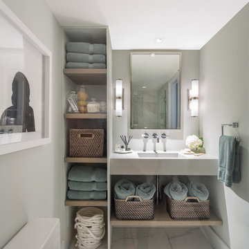
The space for the master bathroom is deceptively small. The glass enclosure opposite of the shower is a toilet closet for full privacy while making the space feel larger with the addition of the frosted glass. A floating vanity also visually tricks the eye into thinking the space is larger by keeping the flooring visible
all the way under the vanity.
Designed by Chi Renovation & Design who serve Chicago and it's surrounding suburbs, with an emphasis on the North Side and North Shore. You'll find their work from the Loop through Lincoln Park, Skokie, Wilmette, and all of the way up to Lake Forest.
For more about Chi Renovation & Design, click here: https://www.chirenovation.com/
To learn more about this project, click here: https://www.chirenovation.com/galleries/bathrooms/

Jean Bai/Konstrukt Photo
Example of a small trendy master concrete floor and gray floor bedroom design in San Francisco with brown walls

Sponsored
Columbus, OH
HomeCraft Remodeling
Custom Craftsmanship & Build Solutions in Franklin County, Ohio

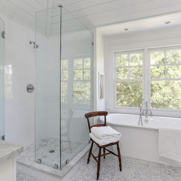
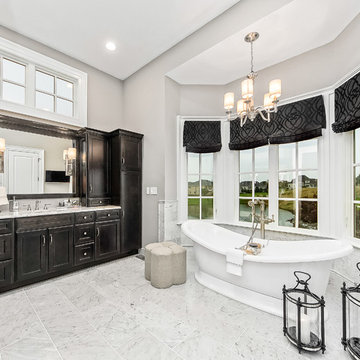
This beautiful home boasted fine architectural elements such as arched entryways and soaring ceilings but the master bathroom was dark and showing it’s age of nearly 30 years. This family wanted an elegant space that felt like the master bathroom but that their teenage daughters could still use without fear of ruining anything. The neutral color palette features both warm and cool elements giving the space dimension without being overpowering. The free standing bathtub creates space while the addition of the tall vanity cabinet means everything has a home in this clean and elegant space.

The Back Bay House is comprised of two main structures, a nocturnal wing and a daytime wing, joined by a glass gallery space. The daytime wing maintains an informal living arrangement that includes the dining space placed in an intimate alcove, a large country kitchen and relaxing seating area which opens to a classic covered porch and on to the water’s edge. The nocturnal wing houses three bedrooms. The master at the water side enjoys views and sounds of the wildlife and the shore while the two subordinate bedrooms soak in views of the garden and neighboring meadow.
To bookend the scale and mass of the house, a whimsical tower was included to the nocturnal wing. The tower accommodates flex space for a bunk room, office or studio space. Materials and detailing of this house are based on a classic cottage vernacular language found in these sorts of buildings constructed in pre-war north america and harken back to a simpler time and scale. Eastern white cedar shingles, white painted trim and moulding collectively add a layer of texture and richness not found in today’s lexicon of detail. The house is 1,628 sf plus a 228 sf tower and a detached, two car garage which employs massing, detail and scale to allow the main house to read as dominant but not overbearing.
Designed by BC&J Architecture.

Klopf Architecture, Arterra Landscape Architects and Henry Calvert of Calvert Ventures Designed and built a new warm, modern, Eichler-inspired, open, indoor-outdoor home on a deeper-than-usual San Mateo Highlands property where an original Eichler house had burned to the ground.
The owners wanted multi-generational living and larger spaces than the original home offered, but all parties agreed that the house should respect the neighborhood and blend in stylistically with the other Eichlers. At first the Klopf team considered re-using what little was left of the original home and expanding on it. But after discussions with the owner and builder, all parties agreed that the last few remaining elements of the house were not practical to re-use, so Klopf Architecture designed a new home that pushes the Eichler approach in new directions.
One disadvantage of Eichler production homes is that the house designs were not optimized for each specific lot. A new custom home offered the team a chance to start over. In this case, a longer house that opens up sideways to the south fit the lot better than the original square-ish house that used to open to the rear (west). Accordingly, the Klopf team designed an L-shaped “bar” house with a large glass wall with large sliding glass doors that faces sideways instead of to the rear like a typical Eichler. This glass wall opens to a pool and landscaped yard designed by Arterra Landscape Architects.
Driving by the house, one might assume at first glance it is an Eichler because of the horizontality, the overhanging flat roof eaves, the dark gray vertical siding, and orange solid panel front door, but the house is designed for the 21st Century and is not meant to be a “Likeler.” You won't see any posts and beams in this home. Instead, the ceiling decking is a western red cedar that covers over all the beams. Like Eichlers, this cedar runs continuously from inside to out, enhancing the indoor / outdoor feeling of the house, but unlike Eichlers it conceals a cavity for lighting, wiring, and insulation. Ceilings are higher, rooms are larger and more open, the master bathroom is light-filled and more generous, with a separate tub and shower and a separate toilet compartment, and there is plenty of storage. The garage even easily fits two of today's vehicles with room to spare.
A massive 49-foot by 12-foot wall of glass and the continuity of materials from inside to outside enhance the inside-outside living concept, so the owners and their guests can flow freely from house to pool deck to BBQ to pool and back.
During construction in the rough framing stage, Klopf thought the front of the house appeared too tall even though the house had looked right in the design renderings (probably because the house is uphill from the street). So Klopf Architecture paid the framer to change the roofline from how we had designed it to be lower along the front, allowing the home to blend in better with the neighborhood. One project goal was for people driving up the street to pass the home without immediately noticing there is an "imposter" on this lot, and making that change was essential to achieve that goal.
This 2,606 square foot, 3 bedroom, 3 bathroom Eichler-inspired new house is located in San Mateo in the heart of the Silicon Valley.
Klopf Architecture Project Team: John Klopf, AIA, Klara Kevane
Landscape Architect: Arterra Landscape Architects
Contractor: Henry Calvert of Calvert Ventures
Photography ©2016 Mariko Reed
Location: San Mateo, CA
Year completed: 2016

This downtown home was renovated with the goal of staying with in the existing footprint. Creating a functional master bath and closet became a welcomed challenge. The idea was to create the feeling of a master closet with a bathroom in it and not the other way around. Low ceiling, and accent lighting helped create a warn inviting space. Glass French doors were used to keep the space open and light.
Photo by:Zephyr McIntyre

Sponsored
Columbus, OH
Free consultation for landscape design!
Peabody Landscape Group
Franklin County's Reliable Landscape Design & Contracting

Our client’s charming cottage was no longer meeting the needs of their family. We needed to give them more space but not lose the quaint characteristics that make this little historic home so unique. So we didn’t go up, and we didn’t go wide, instead we took this master suite addition straight out into the backyard and maintained 100% of the original historic façade.
Master Suite
This master suite is truly a private retreat. We were able to create a variety of zones in this suite to allow room for a good night’s sleep, reading by a roaring fire, or catching up on correspondence. The fireplace became the real focal point in this suite. Wrapped in herringbone whitewashed wood planks and accented with a dark stone hearth and wood mantle, we can’t take our eyes off this beauty. With its own private deck and access to the backyard, there is really no reason to ever leave this little sanctuary.
Master Bathroom
The master bathroom meets all the homeowner’s modern needs but has plenty of cozy accents that make it feel right at home in the rest of the space. A natural wood vanity with a mixture of brass and bronze metals gives us the right amount of warmth, and contrasts beautifully with the off-white floor tile and its vintage hex shape. Now the shower is where we had a little fun, we introduced the soft matte blue/green tile with satin brass accents, and solid quartz floor (do you see those veins?!). And the commode room is where we had a lot fun, the leopard print wallpaper gives us all lux vibes (rawr!) and pairs just perfectly with the hex floor tile and vintage door hardware.
Hall Bathroom
We wanted the hall bathroom to drip with vintage charm as well but opted to play with a simpler color palette in this space. We utilized black and white tile with fun patterns (like the little boarder on the floor) and kept this room feeling crisp and bright.

Our clients were looking to erase the 90s from their master bathroom and create a space that blended their contemporary tastes with natural elements. This bathroom had wonderful bones with a high ceiling and plenty of space, but we were able to work with our clients to create a design that better met their needs and utilized the space to its full potential. We wanted to create a sense of warmth in this large master bathroom and adding a fireplace to the space did the trick. By moving the tub location, we were able to create a stunning accent wall of stacked stone that provided a home for the fireplace and a perfectly dramatic backdrop for the new freestanding bathtub. The sculptural copper light fixture helps to soften the stone wall and allowed us to emphasize those vaulted ceiling. Playing with metal finishes is one of our favorite pastimes, and this bathroom was the perfect opportunity to blend sleek matte black plumbing fixtures with a mirrored copper finish on the light fixtures. We tied the vanity wall sconces in with a dramatic sculptural chandelier above the bath tub by using copper finishes on both and allowing the light fixtures to be the shining stars of this space. We selected a clean white finish for the custom vanity cabinets and lit them from below to accentuate their floating design. We then completed the look with a waterfall quartz counter to add an elegant texture to the area and extended the stone onto the shower bench to bring the two elements together. The existing shower had been on the small side, so we expanded it into the room and gave them a more spacious shower complete with a built-in bench and recessed niche. Hard surfaces play an important role in any bathroom design, and we wanted to use this opportunity to create an interesting layer of texture through our tile selections. The bathroom floor utilizes a large-scale plank tile installed in a herringbone pattern, while the shower and walls are tiled in a polished white tile to add a bit of reflectivity. The newly transformed bathroom is now a sophisticated space the brings together sleek contemporary finishes with textured natural elements and provides the perfect retreat from the outside world.

Photo credit: Scott McDonald @ Hedrich Blessing
7RR-Ecohome:
The design objective was to build a house for a couple recently married who both had kids from previous marriages. How to bridge two families together?
The design looks forward in terms of how people live today. The home is an experiment in transparency and solid form; removing borders and edges from outside to inside the house, and to really depict “flowing and endless space”. The house floor plan is derived by pushing and pulling the house’s form to maximize the backyard and minimize the public front yard while welcoming the sun in key rooms by rotating the house 45-degrees to true north. The angular form of the house is a result of the family’s program, the zoning rules, the lot’s attributes, and the sun’s path. We wanted to construct a house that is smart and efficient in terms of construction and energy, both in terms of the building and the user. We could tell a story of how the house is built in terms of the constructability, structure and enclosure, with a nod to Japanese wood construction in the method in which the siding is installed and the exposed interior beams are placed in the double height space. We engineered the house to be smart which not only looks modern but acts modern; every aspect of user control is simplified to a digital touch button, whether lights, shades, blinds, HVAC, communication, audio, video, or security. We developed a planning module based on a 6-foot square room size and a 6-foot wide connector called an interstitial space for hallways, bathrooms, stairs and mechanical, which keeps the rooms pure and uncluttered. The house is 6,200 SF of livable space, plus garage and basement gallery for a total of 9,200 SF. A large formal foyer celebrates the entry and opens up to the living, dining, kitchen and family rooms all focused on the rear garden. The east side of the second floor is the Master wing and a center bridge connects it to the kid’s wing on the west. Second floor terraces and sunscreens provide views and shade in this suburban setting. The playful mathematical grid of the house in the x, y and z axis also extends into the layout of the trees and hard-scapes, all centered on a suburban one-acre lot.
Many green attributes were designed into the home; Ipe wood sunscreens and window shades block out unwanted solar gain in summer, but allow winter sun in. Patio door and operable windows provide ample opportunity for natural ventilation throughout the open floor plan. Minimal windows on east and west sides to reduce heat loss in winter and unwanted gains in summer. Open floor plan and large window expanse reduces lighting demands and maximizes available daylight. Skylights provide natural light to the basement rooms. Durable, low-maintenance exterior materials include stone, ipe wood siding and decking, and concrete roof pavers. Design is based on a 2' planning grid to minimize construction waste. Basement foundation walls and slab are highly insulated. FSC-certified walnut wood flooring was used. Light colored concrete roof pavers to reduce cooling loads by as much as 15%. 2x6 framing allows for more insulation and energy savings. Super efficient windows have low-E argon gas filled units, and thermally insulated aluminum frames. Permeable brick and stone pavers reduce the site’s storm-water runoff. Countertops use recycled composite materials. Energy-Star rated furnaces and smart thermostats are located throughout the house to minimize duct runs and avoid energy loss. Energy-Star rated boiler that heats up both radiant floors and domestic hot water. Low-flow toilets and plumbing fixtures are used to conserve water usage. No VOC finish options and direct venting fireplaces maintain a high interior air quality. Smart home system controls lighting, HVAC, and shades to better manage energy use. Plumbing runs through interior walls reducing possibilities of heat loss and freezing problems. A large food pantry was placed next to kitchen to reduce trips to the grocery store. Home office reduces need for automobile transit and associated CO2 footprint. Plan allows for aging in place, with guest suite than can become the master suite, with no need to move as family members mature.
10