
Search results for "Master continue" in Home Design Ideas


 Touch Interiors by Bronwyn Poole
Designer: Bronwyn Poole
Photographer: Matt Craig
Example of a beach style master carpeted bedroom design in Los Angeles with white walls
Example of a beach style master carpeted bedroom design in Los Angeles with white walls

 Klopf Architecture
, Arterra Landscape Architects and Henry Calvert of Calvert Ventures Designed and built a new warm, modern, Eichler-inspired, open, indoor-outdoor home on a deeper-than-usual San Mateo Highlands property where an original Eichler house had burned to the ground.
The owners wanted multi-generational living and larger spaces than the original home offered, but all parties agreed that the house should respect the neighborhood and blend in stylistically with the other Eichlers. At first the Klopf team considered re-using what little was left of the original home and expanding on it. But after discussions with the owner and builder, all parties agreed that the last few remaining elements of the house were not practical to re-use, so Klopf Architecture designed a new home that pushes the Eichler approach in new directions.
One disadvantage of Eichler production homes is that the house designs were not optimized for each specific lot. A new custom home offered the team a chance to start over. In this case, a longer house that opens up sideways to the south fit the lot better than the original square-ish house that used to open to the rear (west). Accordingly, the Klopf team designed an L-shaped “bar” house with a large glass wall with large sliding glass doors that faces sideways instead of to the rear like a typical Eichler. This glass wall opens to a pool and landscaped yard designed by Arterra Landscape Architects.
Driving by the house, one might assume at first glance it is an Eichler because of the horizontality, the overhanging flat roof eaves, the dark gray vertical siding, and orange solid panel front door, but the house is designed for the 21st Century and is not meant to be a “Likeler.” You won't see any posts and beams in this home. Instead, the ceiling decking is a western red cedar that covers over all the beams. Like Eichlers, this cedar runs continuously from inside to out, enhancing the indoor / outdoor feeling of the house, but unlike Eichlers it conceals a cavity for lighting, wiring, and insulation. Ceilings are higher, rooms are larger and more open, the master bathroom is light-filled and more generous, with a separate tub and shower and a separate toilet compartment, and there is plenty of storage. The garage even easily fits two of today's vehicles with room to spare.
A massive 49-foot by 12-foot wall of glass and the continuity of materials from inside to outside enhance the inside-outside living concept, so the owners and their guests can flow freely from house to pool deck to BBQ to pool and back.
During construction in the rough framing stage, Klopf thought the front of the house appeared too tall even though the house had looked right in the design renderings (probably because the house is uphill from the street). So Klopf Architecture paid the framer to change the roofline from how we had designed it to be lower along the front, allowing the home to blend in better with the neighborhood. One project goal was for people driving up the street to pass the home without immediately noticing there is an "imposter" on this lot, and making that change was essential to achieve that goal.
This 2,606 square foot, 3 bedroom, 3 bathroom Eichler-inspired new house is located in San Mateo in the heart of the Silicon Valley.
Klopf Architecture Project Team: John Klopf, AIA, Klara Kevane
Landscape Architect: Arterra Landscape Architects
Contractor: Henry Calvert of Calvert Ventures
Photography ©2016 Mariko Reed
Location: San Mateo, CA
Year completed: 2016
Find the right local pro for your project

 CI DESIGN + BUILD
Within the scope of the project we were asked to completely redesign a Master Suite and Kitchen in a 1400 sf residence. The home is essentially an art gallery as the owner continues to grow his collection of modern art. The inspiration for our design was to create a sleek White palette to showcase the collection. The white cabinets, light floors, marble counter top and backlit floating panels really let the Art pop. The bar and wine fridge can be hidden when not entertaining to keep the sleek design. The Kitchen plays well off the master bath with refined design, clean lines and white palette.
Photos by: Tony Soluri

 Michael Rex Architects
Photo Credit: kee sites
Living room - rustic formal and open concept dark wood floor living room idea in San Francisco with a ribbon fireplace and a stone fireplace
Living room - rustic formal and open concept dark wood floor living room idea in San Francisco with a ribbon fireplace and a stone fireplace


 Coats Homes
Walk-in shower - mid-sized transitional master gray tile, white tile and porcelain tile light wood floor and brown floor walk-in shower idea in Dallas with shaker cabinets, beige cabinets, white walls, a hinged shower door, white countertops and marble countertops
Sponsored
Delaware, OH

Buckeye Basements, Inc.
Central Ohio's Basement Finishing ExpertsBest Of Houzz '13-'21

 Regan Baker Design Inc.
Suzanna Scott Photography
Bedroom - 1960s master light wood floor bedroom idea in San Francisco with no fireplace and multicolored walls
Bedroom - 1960s master light wood floor bedroom idea in San Francisco with no fireplace and multicolored walls

 J.E.O. Construction
Inspiration for a small transitional 3/4 white tile and marble tile mosaic tile floor and white floor alcove shower remodel in San Francisco with shaker cabinets, gray cabinets, white walls, an undermount sink, solid surface countertops and a hinged shower door


 BuiltIN studio
Andrew Rugge
Walk-in closet - small modern men's dark wood floor walk-in closet idea in New York with open cabinets and dark wood cabinets
Walk-in closet - small modern men's dark wood floor walk-in closet idea in New York with open cabinets and dark wood cabinets

 Granoff Architects
Inspiration for a large rustic 3/4 stone tile pebble tile floor bathroom remodel in New York with a trough sink, open cabinets, medium tone wood cabinets, wood countertops, multicolored walls and brown countertops

 Krieger + Associates Architects, Inc.
Combining two smaller bedrooms, we carved out space for a new master suite in this whole-house renovation. The master bath has a long double vanity, a roomy shower, and plenty of storage. Tiles are glass mosaic, ceramic, and travertine; the counter is Caesarstone. Folding shower bench is by Moen. Photo: Jeffrey Totaro
Sponsored
Fredericksburg, OH

High Point Cabinets
Columbus' Experienced Custom Cabinet Builder | 4x Best of Houzz Winner

 G.B. Construction and Development, Inc.
Master Bathroom remodel in North Fork vacation house. The marble tile floor flows straight through to the shower eliminating the need for a curb. A stationary glass panel keeps the water in and eliminates the need for a door. Glass tile on the walls compliments the marble on the floor while maintaining the modern feel of the space.

 KBG Design
Mid-sized beach style master white tile and mosaic tile white floor and marble floor freestanding bathtub photo in San Francisco with shaker cabinets, white cabinets, white walls, an undermount sink, gray countertops, quartz countertops and a hinged shower door


 Granville Creek Custom Builder, LLC
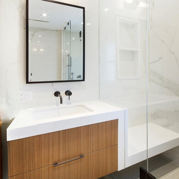
Bathroom remodel with walk in shower, new fixtures, cabinetry and tile
Inspiration for a small modern 3/4 white tile and ceramic tile ceramic tile alcove shower remodel in Richmond with an undermount sink, flat-panel cabinets, white cabinets, solid surface countertops, a one-piece toilet and gray walls
Inspiration for a small modern 3/4 white tile and ceramic tile ceramic tile alcove shower remodel in Richmond with an undermount sink, flat-panel cabinets, white cabinets, solid surface countertops, a one-piece toilet and gray walls
Sponsored
Delaware, OH
Buckeye Basements, Inc.
Central Ohio's Basement Finishing ExpertsBest Of Houzz '13-'21

 Hufft
Baulinder Haus is located just a few houses down from a landmark Kansas City area home designed by Bauhaus architect Marcel Breuer. Baulinder Haus draws inspiration from the details of the neighboring home. Vertically oriented wood siding, simple forms, and overhanging masses—these were part of Breuer’s modernist palette. The house’s form consists of a series of stacked boxes, with public spaces on the ground level and private spaces in the boxes above. The boxes are oriented in a U-shaped plan to create a generous private courtyard. This was designed as an extension of the interior living space, blurring the boundaries between indoors and outdoors.
Floor-to-ceiling south facing windows in the courtyard are shaded by the overhanging second floor above to prohibit solar heat gain, but allow for passive solar heating in the winter. Other sustainable elements of the home include a geothermal heat pump HVAC system, energy efficient windows and sprayed foam insulation. The exterior wood is a vertical shiplap siding milled from FSC certified Machiche. Baulinder Haus was designed to meet and exceed requirements put forward by the U.S. Environmental Protection Agency for their Indoor airPLUS qualified homes, and is working toward Energy Star qualification.
Machiche and steel screening elements provide depth and texture to front facade.

 VIF Studio
The new 3/4 bath incorporates a glass enclosed shower, custom wood shelving and herringbone tile.
Photo by Cindy Loughridge
Inspiration for a contemporary 3/4 white tile beige floor corner shower remodel in San Francisco with flat-panel cabinets, white cabinets, white walls and a drop-in sink
Inspiration for a contemporary 3/4 white tile beige floor corner shower remodel in San Francisco with flat-panel cabinets, white cabinets, white walls and a drop-in sink
 TKS Design Group
Download our free ebook, Creating the Ideal Kitchen. DOWNLOAD NOW
Lakefront property in the northwest suburbs of Chicago is hard to come by, so when we were hired by this young family with exactly that, we were immediately inspired by not just the unusually large footprint of this 1950’s colonial revival but also the lovely views of the manmade lake it was sited on. The large 5-bedroom home was solidly stuck in the 1980’s, but we saw tons of potential. We started out by updating the existing staircase with a fresh coat of paint and adding new herringbone slate to the entry hall.
The powder room off the entryway also got a refresh - new flooring, new cabinets and fixtures. We ran the new slate right through into this space for some consistency. A fun wallpaper and shiplap trim add a welcoming feel and set the tone for the home.
Next, we tackled the kitchen. Located away from the rest of the first floor, the kitchen felt a little isolated, so we immediately began planning for how to better connect it to the rest of the first floor. We landed on removing the wall between the kitchen and dining room and designed a modified galley style space with separate cooking and clean up zones. The cooking zone consists of the refrigerator, prep sink and cooktop, along with a nice long run of prep space at the island. The cleanup side of the kitchen consists of the main sink and dishwasher. Both areas are situated so that the user can view the lake during prep work and cleanup!
One of the home’s main puzzles was how to incorporate the mudroom and area in front of the patio doors at the back of the house. We already had a breakfast table area, so the space by the patio doors was a bit of a no man’s land. We decided to separate the kitchen proper from what became the new mudroom with a large set of barn doors. That way you can quickly hide any mudroom messes but have easy access to the light coming in through the patio doors as well as the outdoor grilling station. We also love the impact the barn doors add to the overall space.
The homeowners’ first words to us were “it’s time to ditch the brown,” so we did! We chose a lovely blue pallet that reflects the home’s location on the lake which is also vibrant yet easy on the eye. Countertops are white quartz, and the natural oak floor works well with the other honey accents. The breakfast table was given a refresh with new chairs, chandelier and window treatments that frame the gorgeous views of the lake out the back.
We coordinated the slate mudroom flooring with that used in the home’s main entrance for a consistent feel. The storage area consists of open and closed storage to allow for some clutter control as needed.
Next on our “to do” list was revamping the dated brown bar area in the neighboring dining room. We eliminated the clutter by adding some closed cabinets and did some easy updates to help the space feel more current. One snag we ran into here was the discovery of a beam above the existing open shelving that had to be modified with a smaller structural beam to allow for our new design to work. This was an unexpected surprise, but in the end we think it was well worth it!
We kept the colors here a bit more muted to blend with the homeowner’s existing furnishings. Open shelving and polished nickel hardware add some simple detail to the new entertainment zone which also looks out onto the lake!
Next we tackled the upstairs starting with the homeowner’s son’s bath. The bath originally had both a tub shower and a separate shower, so we decided to swap out the shower for a new laundry area. This freed up some space downstairs in what used to be the mudroom/laundry room and is much more convenient for daily laundry needs.
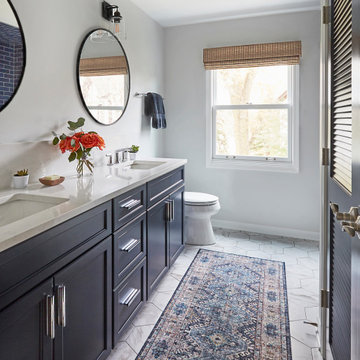
We continued the blue palette here with navy cabinetry and the navy tile in the shower. Porcelain floor tile and chrome fixtures keep maintenance to a minimum while matte black mirrors and lighting add some depth the design. A low maintenance runner adds some warmth underfoot and ties the whole space together.
We added a pocket door to the bathroom to minimize interference with the door swings. The left door of the laundry closet is on a 180 degree hinge to allow for easy full access to the machines. Next we tackled the master bath which is an en suite arrangement. The original was typical of the 1980’s with the vanity outside of the bathroom, situated near the master closet. And the brown theme continued here with multiple shades of brown.
Our first move was to segment off the bath and the closet from the master bedroom. We created a short hall from the bedroom to the bathroom with his and hers walk-in closets on the left and right as well as a separate toilet closet outside of the main bathroom for privacy and flexibility.
The original bathroom had a giant soaking tub with steps (dangerous!) as well as a small shower that did not work well for our homeowner who is 6’3”. With other bathtubs in the home, they decided to eliminate the tub and create an oversized shower which takes up the space where the old tub was located. The double vanity is on the opposite wall and a bench is located under the window for morning conversations and a place to set a couple of towels.
The pallet in here is light and airy with a mix of blond wood, creamy porcelain and marble tile, and brass accents. A simple roman shade adds some texture and it’s top-down mechanism allows for light and privacy.
This large whole house remodel gave our homeowners not only the ability to maximize the potential of their home but also created a lovely new frame from which to view their fabulous lake views.
Designed by: Susan Klimala, CKD, CBD
Photography by: Michael Kaskel
For more information on kitchen and bath design ideas go to: www.kitchenstudio-ge.com
42