
Search results for "Master creating" in Home Design Ideas

 Klopf Architecture
, Arterra Landscape Architects, and Flegels Construction updated a classic Eichler open, indoor-outdoor home. Expanding on the original walls of glass and connection to nature that is common in mid-century modern homes. The completely openable walls allow the homeowners to truly open up the living space of the house, transforming it into an open air pavilion, extending the living area outdoors to the private side yards, and taking maximum advantage of indoor-outdoor living opportunities. Taking the concept of borrowed landscape from traditional Japanese architecture, the fountain, concrete bench wall, and natural landscaping bound the indoor-outdoor space. The Truly Open Eichler is a remodeled single-family house in Palo Alto. This 1,712 square foot, 3 bedroom, 2.5 bathroom is located in the heart of the Silicon Valley.
Klopf Architecture Project Team: John Klopf, AIA, Geoff Campen, and Angela Todorova
Landscape Architect: Arterra Landscape Architects
Structural Engineer: Brian Dotson Consulting Engineers
Contractor: Flegels Construction
Photography ©2014 Mariko Reed
Location: Palo Alto, CA
Year completed: 2014

 AVID Associates LLC
Variations of materials implemented compose a pure color palette by their varying degrees of white and gray, while luminescent Italian Calacutta marble provides the narrative in this sleek master bathroom that is reminiscent of a hi-end spa, where the minimal distractions of modern lines create a haven for relaxation.
Dan Piassick

 Décor Aid
When a family living in Singapore decided to purchase a New York City pied-à-terre, they settled on the historic Langham Place, a 60-floor building along 5th Ave which features a mixture of permanent residencies and 5-star hotel suites. Immediately after purchasing the condo, they reached out to Decor Aid, and tasked us with designing a home that would reflect their jet-setting lifestyle and chic sensibility.
Book Your Free In-Home Consultation
Connecting to the historic Tiffany Building at 404 5th Ave, the exterior of Langham Place is a combination of highly contemporary architecture and 1920’s art deco design. And with this highly unique architecture, came highly angular, outward leaning floor-to-ceiling windows, which would prove to be our biggest design challenge.
One of the apartment’s quirks was negotiating an uneven balance of natural light throughout the space. Parts of the apartment, such one of the kids’ bedrooms, feature floor-to-ceiling windows and an abundance of natural light, while other areas, such as one corner of the living room, receive little natural light.
By sourcing a combination of contemporary, low-profile furniture pieces and metallic accents, we were able to compensate for apartment’s pockets of darkness. A low-profile beige sectional from Room & Board was an obvious choice, which we complemented with a lucite console and a bronze Riverstone coffee table from Mitchell Gold+Bob Williams.
Circular tables were placed throughout the apartment in order to establish a design scheme that would be easy to walk through. A marble tulip table from Sit Down New York provides an opulent dining room space, without crowding the floor plan. The finishing touches include a sumptuous swivel chair from Safavieh, to create a sleek, welcoming vacation home for this international client.
Find the right local pro for your project

 Hisel Flynn Architects
Eric Roth
Example of a large trendy formal and open concept dark wood floor living room design in Boston with a two-sided fireplace, white walls, a plaster fireplace and no tv
Example of a large trendy formal and open concept dark wood floor living room design in Boston with a two-sided fireplace, white walls, a plaster fireplace and no tv

 Crisp Architects
Alcove shower - traditional 3/4 white tile blue floor alcove shower idea in New York with raised-panel cabinets, blue cabinets, white walls, an undermount sink, a hinged shower door and white countertops

 Alair Homes Plano
This master closet is pure luxury! The floor to ceiling storage cabinets and drawers wastes not a single inch of space. Rotating automated shoe racks and wardrobe lifts make it easy to stay organized. Lighted clothes racks and glass cabinets highlight this beautiful space. Design by California Closets | Space by Hatfield Builders & Remodelers | Photography by Versatile Imaging
 TKS Design Group
Download our free ebook, Creating the Ideal Kitchen. DOWNLOAD NOW
Lakefront property in the northwest suburbs of Chicago is hard to come by, so when we were hired by this young family with exactly that, we were immediately inspired by not just the unusually large footprint of this 1950’s colonial revival but also the lovely views of the manmade lake it was sited on. The large 5-bedroom home was solidly stuck in the 1980’s, but we saw tons of potential. We started out by updating the existing staircase with a fresh coat of paint and adding new herringbone slate to the entry hall.
The powder room off the entryway also got a refresh - new flooring, new cabinets and fixtures. We ran the new slate right through into this space for some consistency. A fun wallpaper and shiplap trim add a welcoming feel and set the tone for the home.
Next, we tackled the kitchen. Located away from the rest of the first floor, the kitchen felt a little isolated, so we immediately began planning for how to better connect it to the rest of the first floor. We landed on removing the wall between the kitchen and dining room and designed a modified galley style space with separate cooking and clean up zones. The cooking zone consists of the refrigerator, prep sink and cooktop, along with a nice long run of prep space at the island. The cleanup side of the kitchen consists of the main sink and dishwasher. Both areas are situated so that the user can view the lake during prep work and cleanup!
One of the home’s main puzzles was how to incorporate the mudroom and area in front of the patio doors at the back of the house. We already had a breakfast table area, so the space by the patio doors was a bit of a no man’s land. We decided to separate the kitchen proper from what became the new mudroom with a large set of barn doors. That way you can quickly hide any mudroom messes but have easy access to the light coming in through the patio doors as well as the outdoor grilling station. We also love the impact the barn doors add to the overall space.
The homeowners’ first words to us were “it’s time to ditch the brown,” so we did! We chose a lovely blue pallet that reflects the home’s location on the lake which is also vibrant yet easy on the eye. Countertops are white quartz, and the natural oak floor works well with the other honey accents. The breakfast table was given a refresh with new chairs, chandelier and window treatments that frame the gorgeous views of the lake out the back.
We coordinated the slate mudroom flooring with that used in the home’s main entrance for a consistent feel. The storage area consists of open and closed storage to allow for some clutter control as needed.
Next on our “to do” list was revamping the dated brown bar area in the neighboring dining room. We eliminated the clutter by adding some closed cabinets and did some easy updates to help the space feel more current. One snag we ran into here was the discovery of a beam above the existing open shelving that had to be modified with a smaller structural beam to allow for our new design to work. This was an unexpected surprise, but in the end we think it was well worth it!
We kept the colors here a bit more muted to blend with the homeowner’s existing furnishings. Open shelving and polished nickel hardware add some simple detail to the new entertainment zone which also looks out onto the lake!
Next we tackled the upstairs starting with the homeowner’s son’s bath. The bath originally had both a tub shower and a separate shower, so we decided to swap out the shower for a new laundry area. This freed up some space downstairs in what used to be the mudroom/laundry room and is much more convenient for daily laundry needs.
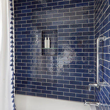
We continued the blue palette here with navy cabinetry and the navy tile in the shower. Porcelain floor tile and chrome fixtures keep maintenance to a minimum while matte black mirrors and lighting add some depth the design. A low maintenance runner adds some warmth underfoot and ties the whole space together.
We added a pocket door to the bathroom to minimize interference with the door swings. The left door of the laundry closet is on a 180 degree hinge to allow for easy full access to the machines. Next we tackled the master bath which is an en suite arrangement. The original was typical of the 1980’s with the vanity outside of the bathroom, situated near the master closet. And the brown theme continued here with multiple shades of brown.
Our first move was to segment off the bath and the closet from the master bedroom. We created a short hall from the bedroom to the bathroom with his and hers walk-in closets on the left and right as well as a separate toilet closet outside of the main bathroom for privacy and flexibility.
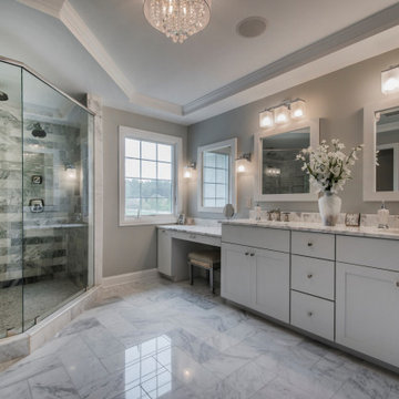
The original bathroom had a giant soaking tub with steps (dangerous!) as well as a small shower that did not work well for our homeowner who is 6’3”. With other bathtubs in the home, they decided to eliminate the tub and create an oversized shower which takes up the space where the old tub was located. The double vanity is on the opposite wall and a bench is located under the window for morning conversations and a place to set a couple of towels.
The pallet in here is light and airy with a mix of blond wood, creamy porcelain and marble tile, and brass accents. A simple roman shade adds some texture and it’s top-down mechanism allows for light and privacy.
This large whole house remodel gave our homeowners not only the ability to maximize the potential of their home but also created a lovely new frame from which to view their fabulous lake views.
Designed by: Susan Klimala, CKD, CBD
Photography by: Michael Kaskel
For more information on kitchen and bath design ideas go to: www.kitchenstudio-ge.com
Sponsored
Delaware, OH

Buckeye Basements, Inc.
Central Ohio's Basement Finishing ExpertsBest Of Houzz '13-'21

 CDK Architects
Jon Bolden
Inspiration for a small contemporary built-in desk medium tone wood floor home office remodel in Austin with white walls
Inspiration for a small contemporary built-in desk medium tone wood floor home office remodel in Austin with white walls
 Fox Interiors
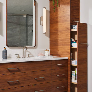
The bathroom was redesigned to improve flow and add functional storage with a modern aesthetic.
Natural walnut cabinetry brings warmth balanced by the subtle movement in the warm gray floor and wall tiles and the white quartz counters and shower surround. We created half walls framing the shower topped with quartz and glass treated for easy maintenance. The angled wall and extra square footage in the water closet were eliminated for a larger vanity.
Floating vanities make the space feel larger and fit the modern aesthetic. The tall pullout storage at her vanity is one-sided to prevent items falling out the back and features shelves with acrylic sides for full product visibility.
We removed the tub deck and bump-out walls with inset shelves for improved flow and wall space for towels.
Now the freestanding tub anchors the middle of the room while allowing easy access to the windows that were blocked by the previous built-in.
 Structure Home
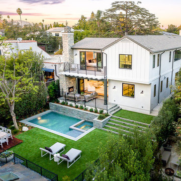
Set upon an oversized and highly sought-after creekside lot in Brentwood, this two story home and full guest home exude a casual, contemporary farmhouse style and vibe. The main residence boasts 5 bedrooms and 5.5 bathrooms, each ensuite with thoughtful touches that accentuate the home’s overall classic finishes. The master retreat opens to a large balcony overlooking the yard accented by mature bamboo and palms. Other features of the main house include European white oak floors, recessed lighting, built in speaker system, attached 2-car garage and a laundry room with 2 sets of state-of-the-art Samsung washers and dryers. The bedroom suite on the first floor enjoys its own entrance, making it ideal for guests. The open concept kitchen features Calacatta marble countertops, Wolf appliances, wine storage, dual sinks and dishwashers and a walk-in butler’s pantry. The loggia is accessed via La Cantina bi-fold doors that fully open for year-round alfresco dining on the terrace, complete with an outdoor fireplace. The wonderfully imagined yard contains a sparkling pool and spa and a crisp green lawn and lovely deck and patio areas. Step down further to find the detached guest home, which was recognized with a Decade Honor Award by the Los Angeles Chapter of the AIA in 2006, and, in fact, was a frequent haunt of Frank Gehry who inspired its cubist design. The guest house has a bedroom and bathroom, living area, a newly updated kitchen and is surrounded by lush landscaping that maximizes its creekside setting, creating a truly serene oasis.

 Structures Building Company
Beach style master marble floor and pink floor freestanding bathtub photo in Charleston with white cabinets, white walls, an undermount sink, marble countertops and white countertops

 Main Street Homes
Primary bath with walk in shower, soaking tub, bathroom vanity, and vanity lighting. To create your design for a Lancaster floor plan, please go visit https://www.gomsh.com/plans/two-story-home/lancaster/ifp
 Kristina Crestin Design
Photography by Jared Kuzia
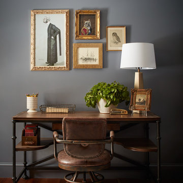
Inspiration for a country home design remodel in Boston
Inspiration for a country home design remodel in Boston


Sponsored
Sunbury, OH

J.Holderby - Renovations
Franklin County's Leading General Contractors - 2X Best of Houzz!

 O’Hara Interiors
Martha O’Hara Interiors, Interior Design & Photo Styling | John Kraemer & Sons, Builder | Troy Thies, Photography | Ben Nelson, Designer | Please Note: All “related,” “similar,” and “sponsored” products tagged or listed by Houzz are not actual products pictured. They have not been approved by Martha O’Hara Interiors nor any of the professionals credited. For info about our work: design@oharainteriors.com


 Breathe Design Studio
Completed in 2015, this project incorporates a Scandinavian vibe to enhance the modern architecture and farmhouse details. The vision was to create a balanced and consistent design to reflect clean lines and subtle rustic details, which creates a calm sanctuary. The whole home is not based on a design aesthetic, but rather how someone wants to feel in a space, specifically the feeling of being cozy, calm, and clean. This home is an interpretation of modern design without focusing on one specific genre; it boasts a midcentury master bedroom, stark and minimal bathrooms, an office that doubles as a music den, and modern open concept on the first floor. It’s the winner of the 2017 design award from the Austin Chapter of the American Institute of Architects and has been on the Tribeza Home Tour; in addition to being published in numerous magazines such as on the cover of Austin Home as well as Dwell Magazine, the cover of Seasonal Living Magazine, Tribeza, Rue Daily, HGTV, Hunker Home, and other international publications.
Featured on Dwell!
https://www.dwell.com/article/sustainability-is-the-centerpiece-of-this-new-austin-development-071e1a55
196