
Search results for "Master defining" in Home Design Ideas
 VPC Builders, LLC
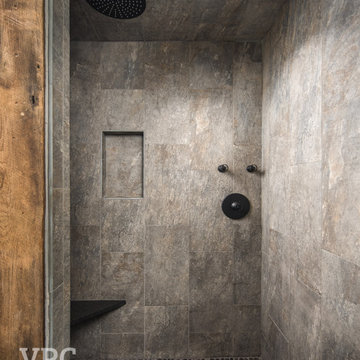
Nestled in a secluded mountaintop location is the captivating Contemporary Mountaintop Escape. Complementing its natural surroundings, the 2,955 square foot, four-bedroom, three-bathroom residence captures the panoramic view of the skyline and offers high-quality finishes with modern interior design.
The exterior features a timber frame porch, standing seam metal roof, custom chimney cap, Barnwood siding, and a glass garage door. Reclaimed timber derived from the homeowner’s family farmhouse is incorporated throughout the structure. It is decoratively used on the exterior as well as on the interior accent walls and ceiling beams. Other central interior elements include recessed lighting, flush baseboards, and caseless windows and doors. Hickory engineered flooring is displayed upstairs, and exposed concrete slab and foundation walls complement the downstairs decor.
The rustic and luxurious great room offers a wood-burning fireplace with an onsite extricated boulder hearth, reclaimed timber ceiling beams, a full reclaimed accent wall, and a charming stucco chimney. The main floor also exhibits a reclaimed, sliding barn door to enclose the in-home office space.
The kitchen is situated near the great room and is defined by stainless steel appliances that include a Thermador refrigerator/freezer, an induction range, and a coordinating farmhouse sink. Other standout features are leathered granite countertops, floating reclaimed timber shelves, and stunning ebony-colored drawers.
The home’s lower level provides ideal accommodations for hosting family and friends. It features a spacious living area with access to a multi-purpose mudroom complete with a kitchen. This level also includes two guest bedrooms, each with its own bathroom.
All bedrooms, including the master bedroom, have caseless windows and doors, floating reclaimed shelves, and flush baseboards. The master bathroom showcases a modern floating vanity with boulder vessel sinks, wall-mounted faucets, and large format floor tile.

 Manomin Resawn Timbers
Antique White Oak box beams follow the full pitch of the vaulted ceiling in this bright modern master bedroom, their warm natural tones and subtle gray patina adding softness and antique character to a clean, understated space defined by sage green walls, white trim, and dark hardwood flooring. The beams bring a quiet warmth to a room that could easily feel sparse without them, proving that reclaimed wood does not need to be dark or rustic to make a meaningful impact. Sourced from 19th century structures, our Antique White Oak carries a subtle gray patina earned over years of natural weathering alongside the unique grain patterns and exceptional density that only old growth Oak develops over time. Through our process of denailing, kiln drying, and precision milling, Manomin Resawn Timbers prepares these antique timbers for a beautiful role in any room.
Whether you are a homebuilder, a home remodeling contractor, or a homeowner looking to add Antique White Oak box beams to a bedroom ceiling, Manomin Resawn Timbers has been helping people discover the antique charm of reclaimed wood since 2002. We ship nationwide and are happy to help you find the right pieces from anywhere in the country. Visit our showroom in Hugo, MN or reach out to us with a call or a message to get started.

 James McNeal Architecture and Design
My client had recently visited England and wanted an authentic European look, with timber framing and steep pitch roofs. She also wanted lots of craftsman style woodwork in the home, with unique windows, balconies and overlooks.
I designed the home with all this in mind, but also defined the spaces to take advantage of the long views throughout the home. The land was flat, so I created ways to get daylight into the lower level. Without ever compromising the attributes that make a Tudor a Tudor, the home is designed and built to the level of the old Tudors, with the modern, open plan living for today.
Find the right local pro for your project
 Powell Construction
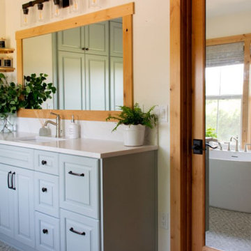
This serene primary bathroom was thoughtfully designed, transformed from an unfinished closet and oversized storage area into a light-filled retreat. What was once a forgotten corner of the home is now a private escape, with panoramic views of the Coast Range and, on a clear day, even Mary’s Peak.
It features all the essentials for comfort: a freestanding soaking tub, spacious shower, custom cabinetry, and a walk-in closet. To maximize functionality and flow, the layout was reimagined to include a private toilet compartment and a double shower with a corner bench and built-in niches. The cultured marble walls lend a timeless look with the added benefit of easy maintenance.
Framed by a large window, the freestanding tub is perfectly positioned to soak up stunning views of the farm and the landscape beyond. A soft, warm grey patterned vinyl adds comfort and subtle character, while custom cabinetry painted in Benjamin Moore’s Misted Green provides a calming, vintage-inspired backdrop and is topped with sleek quartz countertops.
Rustic knotty alder—used in the trim and custom-framed mirror— defines the aesthetic, bringing texture and natural warmth throughout. Farmhouse lighting and hardware tie the design together, adding a hint of heritage charm to this fresh new primary bathroom.

 Homes And Such LLC
The closet was a huge priority for this client, both in terms of how she wanted it to look and feel. The end result is reminiscent of an experience. Clothing is on display instead of simply stored away for later use. A large custom island provides necessary storage and is designed to resemble an impressive piece of furniture. Paired with the custom concrete top, the piece defines the space while also providing functional storage and an easy spot for ironing the next day’s clothes.
Around the perimeter of the room, you’ll find hanging storage that feels more like a high end boutique than your typical closet jam-packed with the season’s attire. Crafted and curated for an elevated aesthetic, the clothing bars and hooks feature a more vintage look that complements the intimate vibe for a space that maximizes function while also feeling like an experience in the comfort of your own home.
 Mike Schaap Builders
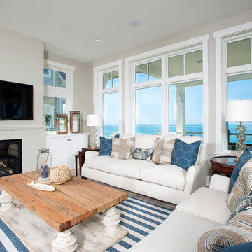
Captivated by South Haven’s natural charm and waterfront beauty, this storybook, waterfront abode is exceptionally true to its lakefront character.
Featuring over 3,600 square feet with five bedroom and three-and-a-half baths, the careful design of this open and charming layout paired with grand views from nearly every room, capture all the warmth and playfulness of lakefront living.
• A beach friendly fiber cement siding in a cheerful shade of blue blends seamlessly with the water backdrop, while contrasting white trim and darker blue window clad lend definition to the exterior.
• An impressive kitchen with stunning Ann Sachs tile backsplash, quartz countertops, richly stained bistro table and Viking Appliances overlook the generous, but clearly defined, living and dining rooms.
• Extensive built-ins with extra storage and workspace, such as a distinctive dining serving piece featuring quartz stone and a lake reflecting mirror, maximize space and make entertaining a breeze.
• Playful design elements like Thibaut wallpaper, braided hemp cabinet insets and white-washed European white oak floors complement the home’s coastal flair with nautical décor and warm hues.
• Fine finishes and rich trim details including wainscot, various painted ceilings, louvered doors on cabinetry, and fireplace surround with kitchen coordinating quartz stone, show off the intricate design gestures.
• Skillfully designed upstairs presents a restful master retreat with private balcony, two guest bedrooms, convenient laundry featuring sleek retractable doors and space maximizing built in bunk beds with ultra-clever steps that provide storage.
• The lower level’s extra guest quarters, additional laundry, full beach bath with top-to-bottom tiled shower, diligent kitchenette, beach-friendly stained concrete floors, outdoor shower that keeps sand at bay, and direct access to the sugary sands of Lake Michigan.
Photography by Chuck Heiney

 Axis Mundi | New York
When the Gimbels department store chain closed in 1986, many of its selling floors were converted into luxury apartments, including those of this branch at 86th Street and Lexington Avenue. The retailer’s soaring ceilings allowed Axis Mundi to create bedroom mezzanine spaces overlooking the living and dining rooms. Defining them with translucent glass welcomed natural light while retaining privacy. Downstairs, spaces bleed one into another, their basic monochromatic black-and-white palette acting as a unifying leitmotif. Yet each space feels distinct, with its own programmatic purpose, a feat largely achieved by varying floor and wall treatments—a graphic tile pattern in the entry, a red wall in the hall leading to the master suite, a colorful area rug in the living room. In the retailer’s heyday, the then-common saying, “Would Macy’s tell Gimbels?” implied the strategies the competitors kept from each other to gain the upper hand. Here, a structure iconic in its day also conceals something: a handsome, wholly contemporary repurposing that represents just the sort of innovation that made Gimbels the celebrated name that it was.
Project Team: John Beckmann, Nick Messerlian and Richard Rosenbloom
Kitchen by Minimal USA
Photography: Federica Carlet
Contractor: James Sappho
© Axis Mundi Design LLC.


 Visbeen Architects
Designed with an open floor plan and layered outdoor spaces, the Onaway is a perfect cottage for narrow lakefront lots. The exterior features elements from both the Shingle and Craftsman architectural movements, creating a warm cottage feel. An open main level skillfully disguises this narrow home by using furniture arrangements and low built-ins to define each spaces’ perimeter. Every room has a view to each other as well as a view of the lake. The cottage feel of this home’s exterior is carried inside with a neutral, crisp white, and blue nautical themed palette. The kitchen features natural wood cabinetry and a long island capped by a pub height table with chairs. Above the garage, and separate from the main house, is a series of spaces for plenty of guests to spend the night. The symmetrical bunk room features custom staircases to the top bunks with drawers built in. The best views of the lakefront are found on the master bedrooms private deck, to the rear of the main house. The open floor plan continues downstairs with two large gathering spaces opening up to an outdoor covered patio complete with custom grill pit.

 Kircher Design & Build
A mother and father of three children, these hard-working parents expressed their remodeling objectives:
•A clearly-defined master suite consisting of bathroom, walk-in closet and bedroom.
•The bathroom should be large enough for an additional shower, a tub, two sinks instead of one, and storage for towels and paper items.
•Their dream feature for the walk-in closet was an island to use as a place for shoe
 Homes And Such LLC
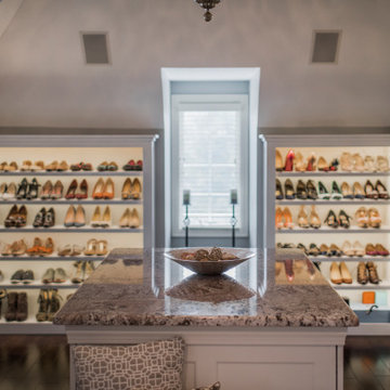
The closet was a huge priority for this client, both in terms of how she wanted it to look and feel. The end result is reminiscent of an experience. Clothing is on display instead of simply stored away for later use. A large custom island provides necessary storage and is designed to resemble an impressive piece of furniture. Paired with the custom concrete top, the piece defines the space while also providing functional storage and an easy spot for ironing the next day’s clothes.
Around the perimeter of the room, you’ll find hanging storage that feels more like a high end boutique than your typical closet jam-packed with the season’s attire. Crafted and curated for an elevated aesthetic, the clothing bars and hooks feature a more vintage look that complements the intimate vibe for a space that maximizes function while also feeling like an experience in the comfort of your own home.
 Homes And Such LLC
The closet was a huge priority for this client, both in terms of how she wanted it to look and feel. The end result is reminiscent of an experience. Clothing is on display instead of simply stored away for later use. A large custom island provides necessary storage and is designed to resemble an impressive piece of furniture. Paired with the custom concrete top, the piece defines the space while also providing functional storage and an easy spot for ironing the next day’s clothes.
Around the perimeter of the room, you’ll find hanging storage that feels more like a high end boutique than your typical closet jam-packed with the season’s attire. Crafted and curated for an elevated aesthetic, the clothing bars and hooks feature a more vintage look that complements the intimate vibe for a space that maximizes function while also feeling like an experience in the comfort of your own home.

 Axis Mundi | SF
When the Gimbels department store chain closed in 1986, many of its selling floors were converted into luxury apartments, including those of this branch at 86th Street and Lexington Avenue. The retailer’s soaring ceilings allowed Axis Mundi to create bedroom mezzanine spaces overlooking the living and dining rooms. Defining them with translucent glass welcomed natural light while retaining privacy. Downstairs, spaces bleed one into another, their basic monochromatic black-and-white palette acting as a unifying leitmotif. Yet each space feels distinct, with its own programmatic purpose, a feat largely achieved by varying floor and wall treatments—a graphic tile pattern in the entry, a red wall in the hall leading to the master suite, a colorful area rug in the living room. In the retailer’s heyday, the then-common saying, “Would Macy’s tell Gimbels?” implied the strategies the competitors kept from each other to gain the upper hand. Here, a structure iconic in its day also conceals something: a handsome, wholly contemporary repurposing that represents just the sort of innovation that made Gimbels the celebrated name that it was.
Project Team: John Beckmann, Nick Messerlian and Richard Rosenbloom
Kitchen by Minimal USA
Photography: Federica Carlet
© Axis Mundi Design LLC
 Axis Mundi | SF
When the Gimbels department store chain closed in 1986, many of its selling floors were converted into luxury apartments, including those of this branch at 86th Street and Lexington Avenue. The retailer’s soaring ceilings allowed Axis Mundi to create bedroom mezzanine spaces overlooking the living and dining rooms. Defining them with translucent glass welcomed natural light while retaining privacy. Downstairs, spaces bleed one into another, their basic monochromatic black-and-white palette acting as a unifying leitmotif. Yet each space feels distinct, with its own programmatic purpose, a feat largely achieved by varying floor and wall treatments—a graphic tile pattern in the entry, a red wall in the hall leading to the master suite, a colorful area rug in the living room. In the retailer’s heyday, the then-common saying, “Would Macy’s tell Gimbels?” implied the strategies the competitors kept from each other to gain the upper hand. Here, a structure iconic in its day also conceals something: a handsome, wholly contemporary repurposing that represents just the sort of innovation that made Gimbels the celebrated name that it was.
Project Team: John Beckmann, Nick Messerlian and Richard Rosenbloom
Kitchen by Minimal USA
Photography: Federica Carlet
© Axis Mundi Design LLC
Sponsored
Delaware, OH

Buckeye Basements, Inc.
Central Ohio's Basement Finishing ExpertsBest Of Houzz '13-'21

 Define Home
Mid-sized minimalist master white tile and ceramic tile ceramic tile and black floor doorless shower photo in Chicago with furniture-like cabinets, dark wood cabinets, a one-piece toilet, white walls, an undermount sink and quartzite countertops
 Axis Mundi | SF
When the Gimbels department store chain closed in 1986, many of its selling floors were converted into luxury apartments, including those of this branch at 86th Street and Lexington Avenue. The retailer’s soaring ceilings allowed Axis Mundi to create bedroom mezzanine spaces overlooking the living and dining rooms. Defining them with translucent glass welcomed natural light while retaining privacy. Downstairs, spaces bleed one into another, their basic monochromatic black-and-white palette acting as a unifying leitmotif. Yet each space feels distinct, with its own programmatic purpose, a feat largely achieved by varying floor and wall treatments—a graphic tile pattern in the entry, a red wall in the hall leading to the master suite, a colorful area rug in the living room. In the retailer’s heyday, the then-common saying, “Would Macy’s tell Gimbels?” implied the strategies the competitors kept from each other to gain the upper hand. Here, a structure iconic in its day also conceals something: a handsome, wholly contemporary repurposing that represents just the sort of innovation that made Gimbels the celebrated name that it was.
Project Team: John Beckmann, Nick Messerlian and Richard Rosenbloom
Kitchen by Minimal USA
Photography: Federica Carlet
© Axis Mundi Design LLC
 Homes And Such LLC
The closet was a huge priority for this client, both in terms of how she wanted it to look and feel. The end result is reminiscent of an experience. Clothing is on display instead of simply stored away for later use. A large custom island provides necessary storage and is designed to resemble an impressive piece of furniture. Paired with the custom concrete top, the piece defines the space while also providing functional storage and an easy spot for ironing the next day’s clothes.
Around the perimeter of the room, you’ll find hanging storage that feels more like a high end boutique than your typical closet jam-packed with the season’s attire. Crafted and curated for an elevated aesthetic, the clothing bars and hooks feature a more vintage look that complements the intimate vibe for a space that maximizes function while also feeling like an experience in the comfort of your own home.
 Powell Construction
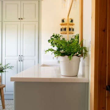
This serene primary bathroom was thoughtfully designed, transformed from an unfinished closet and oversized storage area into a light-filled retreat. What was once a forgotten corner of the home is now a private escape, with panoramic views of the Coast Range and, on a clear day, even Mary’s Peak.
It features all the essentials for comfort: a freestanding soaking tub, spacious shower, custom cabinetry, and a walk-in closet. To maximize functionality and flow, the layout was reimagined to include a private toilet compartment and a double shower with a corner bench and built-in niches. The cultured marble walls lend a timeless look with the added benefit of easy maintenance.
Framed by a large window, the freestanding tub is perfectly positioned to soak up stunning views of the farm and the landscape beyond. A soft, warm grey patterned vinyl adds comfort and subtle character, while custom cabinetry painted in Benjamin Moore’s Misted Green provides a calming, vintage-inspired backdrop and is topped with sleek quartz countertops.
Rustic knotty alder—used in the trim and custom-framed mirror— defines the aesthetic, bringing texture and natural warmth throughout. Farmhouse lighting and hardware tie the design together, adding a hint of heritage charm to this fresh new primary bathroom.
Sponsored
Delaware, OH
Buckeye Basements, Inc.
Central Ohio's Basement Finishing ExpertsBest Of Houzz '13-'21
 Axis Mundi | SF
When the Gimbels department store chain closed in 1986, many of its selling floors were converted into luxury apartments, including those of this branch at 86th Street and Lexington Avenue. The retailer’s soaring ceilings allowed Axis Mundi to create bedroom mezzanine spaces overlooking the living and dining rooms. Defining them with translucent glass welcomed natural light while retaining privacy. Downstairs, spaces bleed one into another, their basic monochromatic black-and-white palette acting as a unifying leitmotif. Yet each space feels distinct, with its own programmatic purpose, a feat largely achieved by varying floor and wall treatments—a graphic tile pattern in the entry, a red wall in the hall leading to the master suite, a colorful area rug in the living room. In the retailer’s heyday, the then-common saying, “Would Macy’s tell Gimbels?” implied the strategies the competitors kept from each other to gain the upper hand. Here, a structure iconic in its day also conceals something: a handsome, wholly contemporary repurposing that represents just the sort of innovation that made Gimbels the celebrated name that it was.
Project Team: John Beckmann, Nick Messerlian and Richard Rosenbloom
Kitchen by Minimal USA
Photography: Federica Carlet
© Axis Mundi Design LLC

 Morpurgo Architects
Press:
"Morpurgo Architects. Firm’s Aesthetic Spans the Centuries." American Builders Quarterly. March/April 2011.
"Morpurgo Architects’ contemporary design is known for a sculptural quality that is evidenced in the flowing shapes, overlapping forms, and soaring heights. Morpurgo has characteristically created distinctive spaces that exhibit an interplay of defining light and distinctive volumes."
– American Builders Quarterly
The steep topography of this site inspired Morpurgo Architects to situate this house on a promontory and design sweeping rooflines that float above expansive windows following the contours of the hill. The resulting dramatic interior spaces provide large open areas for family activity and interaction. The soaring, two-story entrance offers an unencumbered view of the gardens beyond the house.
Beneath a large, curved window wall, we designed a long credenza that incorporates an aquarium. It is one of many pieces of built-in and freestanding furniture throughout the house that is integral to the total aesthetic.
To ensure immediacy to their sons and privacy for the couple, we located the children’s rooms on a mid-level between their parents’ master bedroom suite and the living spaces. This programmatic requirement, along with the dynamic site, established the design configuration for this distinctive home.
 Axis Mundi | New York
When the Gimbels department store chain closed in 1986, many of its selling floors were converted into luxury apartments, including those of this branch at 86th Street and Lexington Avenue. The retailer’s soaring ceilings allowed Axis Mundi to create bedroom mezzanine spaces overlooking the living and dining rooms. Defining them with translucent glass welcomed natural light while retaining privacy. Downstairs, spaces bleed one into another, their basic monochromatic black-and-white palette acting as a unifying leitmotif. Yet each space feels distinct, with its own programmatic purpose, a feat largely achieved by varying floor and wall treatments—a graphic tile pattern in the entry, a red wall in the hall leading to the master suite, a colorful area rug in the living room. In the retailer’s heyday, the then-common saying, “Would Macy’s tell Gimbels?” implied the strategies the competitors kept from each other to gain the upper hand. Here, a structure iconic in its day also conceals something: a handsome, wholly contemporary repurposing that represents just the sort of innovation that made Gimbels the celebrated name that it was.
Project Team: John Beckmann, Nick Messerlian and Richard Rosenbloom
Kitchen by Minimal USA
Photography: Federica Carlet
Contractor: James Sappho
© Axis Mundi Design LLC.
131