
Search results for "Master giant" in Home Design Ideas

 Safferstone Interiors
Meet Kim: a partner in a downtown law firm. To say that she is short on time is a giant understatement. In the rare event she has a free moment, she wants to spend it with her kids, not fussing over home decor.
That’s my cue!
Kim is my favorite type of client. She didn’t know where to go or what to do. She leaned on me to explain and articulate design and style.
She looked to me to make her home a mirror of her best self. Easy peasy lemon squeezy. Fantastic human giving me a blank slate? Yes please!
While Kim’s traditional home had a great layout and good bones, it needed updating to make it contemporary and fresh. It needed fixtures and knobs from this century. It needed a Lulu DK roman shade in the powder room. It needed a durable, snuggle-ready sofa with tufting and little patterns of texture. It needed drapery with small-scale drama. Throw in a Thomas O’ Brian cocktail table, and now there’s no shortage of conversation pieces.
Little spaces make me happy – they are the most intimate snapshot of your entire home’s aesthetic – and this house has some good ones.
I couldn’t wait to work with the nooks and crannies of this house. Kim’s sitting room, a small den off of the master bedroom, morphed into a craveable cozy space, a quiet adult respite from the occasional chaos of raising a family. The kitchen evolved into something quite unique: playful yet modest, dressed-up but centered. We used a favorite Lucy Rose fabric and Galbraith & Paul pillows to work perfectly with a fresh color palette selected during a prior-to-me renovation. A locally made kitchen farm table fit right in with the high-fashioned quirky blend of color, texture, and pattern.
High-End + Color = Fun + Functional
This is how we articulated Kim’s style and personality. She trusted me with her inner self, allowing me to get to know her and her real, everyday life. I built her a special space to reflect the beautiful life she made for herself. Nothing too fancy or off-limits to little hands, nothing too stuffy (snore!). Everything 100% HER. #nailedit See more Safferstone stuff at www.safferstone.com. Connect with us on Facebook, get inspired on Pinterest, and share modern musings on life & design on Instagram. Or, send us a love note at hello@safferstone.com.
Photo: Angie Seckinger

 Peabody Landscape Group
Pictured here is a view from the back of the pool looking at the back of this Nantucket Styled home. Tucked seamlessly within the design, the pool offers an oasis of refreshment, reflecting the clear blue hues of the Atlantic.
 Safferstone Interiors
Meet Kim: a partner in a downtown law firm. To say that she is short on time is a giant understatement. In the rare event she has a free moment, she wants to spend it with her kids, not fussing over home decor.
That’s my cue!
Kim is my favorite type of client. She didn’t know where to go or what to do. She leaned on me to explain and articulate design and style.
She looked to me to make her home a mirror of her best self. Easy peasy lemon squeezy. Fantastic human giving me a blank slate? Yes please!
While Kim’s traditional home had a great layout and good bones, it needed updating to make it contemporary and fresh. It needed fixtures and knobs from this century. It needed a Lulu DK roman shade in the powder room. It needed a durable, snuggle-ready sofa with tufting and little patterns of texture. It needed drapery with small-scale drama. Throw in a Thomas O’ Brian cocktail table, and now there’s no shortage of conversation pieces.
Little spaces make me happy – they are the most intimate snapshot of your entire home’s aesthetic – and this house has some good ones.
I couldn’t wait to work with the nooks and crannies of this house. Kim’s sitting room, a small den off of the master bedroom, morphed into a craveable cozy space, a quiet adult respite from the occasional chaos of raising a family. The kitchen evolved into something quite unique: playful yet modest, dressed-up but centered. We used a favorite Lucy Rose fabric and Galbraith & Paul pillows to work perfectly with a fresh color palette selected during a prior-to-me renovation. A locally made kitchen farm table fit right in with the high-fashioned quirky blend of color, texture, and pattern.
High-End + Color = Fun + Functional
This is how we articulated Kim’s style and personality. She trusted me with her inner self, allowing me to get to know her and her real, everyday life. I built her a special space to reflect the beautiful life she made for herself. Nothing too fancy or off-limits to little hands, nothing too stuffy (snore!). Everything 100% HER. #nailedit See more Safferstone stuff at www.safferstone.com. Connect with us on Facebook, get inspired on Pinterest, and share modern musings on life & design on Instagram. Or, send us a love note at hello@safferstone.com.
Photo: Angie Seckinger
Find the right local pro for your project

 BK Landscape Design
San Rafael
Overview: This garden project began with the demolition of an existing pool and decks cantilevered over a hillside. The garden was originally a Japanese-themed garden retreat and free-form shaped pool. While the client wanted to update and replace many elements, they sought to keep the free-form characteristics of the existing design and repurpose existing materials. BK Landscape Design created a new garden with revetment walls and steps to a succulent garden with salvaged boulders from the pool and pool coping. We built a colored concrete path to access a new wood trellis constructed on the center-line view from the master bedroom. A combination of Bay friendly, native and evergreen plantings were chosen for the planting palette. The overhaul of the yard included low-voltage lighting and minimal drainage. A new wood deck replaced the existing one at the entrance as well as a deck off of the master bedroom that was also constructed from repurposed materials. The style mimics the architectural detail of the mansard roof and simple horizontal wood siding of the house. After removing a juniper (as required by the San Rafael Fire Department within the Wildland-Urban interface) we designed and developed a full front-yard planting plan. All plants are Bay-Friendly, native, and irrigated with a more efficient in-line drip irrigation system to minimize water use. Low-voltage lighting and minimal drainage were also part of the overhaul of the front yard redesign.

 User
Detail of Iridescent Venetian plaster finish on all walls in Living Room by Christianson Lee Studios
Example of a transitional home design design in New York
Example of a transitional home design design in New York
 User
Inspiration for a large timeless carpeted curved staircase remodel in Chicago with carpeted risers

 BRC Remodeling Group
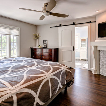
This contemporary/modern bathroom uses a combination of grey and beige to make a beautiful blend of Greige. The Charcoal stain on the cabinets is also a great blend of the 2 colors giving just enough warmth to the room. We used Marazzi Lounge 14 Spritzer 12x24 porcelain tile on the ground and the decorative inlay on the shower. New Caledonia Granite and BEHR- Studio Taupe on the walls.
Sponsored
Columbus, OH

Hope Restoration & General Contracting
Columbus Design-Build, Kitchen & Bath Remodeling, Historic Renovations

 KZ Design, LLC
Cambria counter Summerhill. Sundance stain on Candlelight Red Birch cabinets. Glass mosaic tile with 4 x 8 ceramic tile. Swanstone shower base. Kohler Forté in Chrome. Porcelain floor tile. Shower door by Kohler. All LED lighting.
Lead Designer: Jen Wright
Contractor: Doug Hanauer
Materials: Candlelight Cabinetry, Cambria, Glass mosaic tile, Swanstone, Kohler
Ithaca, NY

 Steven Paul Whitsitt Photography
©StevenPaulWhitsitt_Photography
Redesigned master bath to create more luxurious & inviting experience Solid granite slabs on shower wall, radius under mounted granite tub deck Heated Stone tile floor

 threshold interiors
Location: New York, NY, United States
This Loft was tastefully renovated back in the '90s, but was due for an update and an expansion of the kitchen and dining areas to accommodate the client's cooking skills and entertaining needs. EnlargIing the island and adding cabinetry to delineate the office, bar and dining areas was a priority. The bathroom was updated to feel like a tranquil spa with beautiful new tile, plumbing fixtures and cabinets. Our biggest challenge was coordinating the entire renovation while our client was out of town for the Summer!
Photographed by: James Salomon
 TKS Design Group
Download our free ebook, Creating the Ideal Kitchen. DOWNLOAD NOW
Lakefront property in the northwest suburbs of Chicago is hard to come by, so when we were hired by this young family with exactly that, we were immediately inspired by not just the unusually large footprint of this 1950’s colonial revival but also the lovely views of the manmade lake it was sited on. The large 5-bedroom home was solidly stuck in the 1980’s, but we saw tons of potential. We started out by updating the existing staircase with a fresh coat of paint and adding new herringbone slate to the entry hall.
The powder room off the entryway also got a refresh - new flooring, new cabinets and fixtures. We ran the new slate right through into this space for some consistency. A fun wallpaper and shiplap trim add a welcoming feel and set the tone for the home.
Next, we tackled the kitchen. Located away from the rest of the first floor, the kitchen felt a little isolated, so we immediately began planning for how to better connect it to the rest of the first floor. We landed on removing the wall between the kitchen and dining room and designed a modified galley style space with separate cooking and clean up zones. The cooking zone consists of the refrigerator, prep sink and cooktop, along with a nice long run of prep space at the island. The cleanup side of the kitchen consists of the main sink and dishwasher. Both areas are situated so that the user can view the lake during prep work and cleanup!
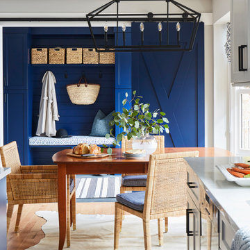
One of the home’s main puzzles was how to incorporate the mudroom and area in front of the patio doors at the back of the house. We already had a breakfast table area, so the space by the patio doors was a bit of a no man’s land. We decided to separate the kitchen proper from what became the new mudroom with a large set of barn doors. That way you can quickly hide any mudroom messes but have easy access to the light coming in through the patio doors as well as the outdoor grilling station. We also love the impact the barn doors add to the overall space.
The homeowners’ first words to us were “it’s time to ditch the brown,” so we did! We chose a lovely blue pallet that reflects the home’s location on the lake which is also vibrant yet easy on the eye. Countertops are white quartz, and the natural oak floor works well with the other honey accents. The breakfast table was given a refresh with new chairs, chandelier and window treatments that frame the gorgeous views of the lake out the back.
We coordinated the slate mudroom flooring with that used in the home’s main entrance for a consistent feel. The storage area consists of open and closed storage to allow for some clutter control as needed.
Next on our “to do” list was revamping the dated brown bar area in the neighboring dining room. We eliminated the clutter by adding some closed cabinets and did some easy updates to help the space feel more current. One snag we ran into here was the discovery of a beam above the existing open shelving that had to be modified with a smaller structural beam to allow for our new design to work. This was an unexpected surprise, but in the end we think it was well worth it!
We kept the colors here a bit more muted to blend with the homeowner’s existing furnishings. Open shelving and polished nickel hardware add some simple detail to the new entertainment zone which also looks out onto the lake!
Next we tackled the upstairs starting with the homeowner’s son’s bath. The bath originally had both a tub shower and a separate shower, so we decided to swap out the shower for a new laundry area. This freed up some space downstairs in what used to be the mudroom/laundry room and is much more convenient for daily laundry needs.
We continued the blue palette here with navy cabinetry and the navy tile in the shower. Porcelain floor tile and chrome fixtures keep maintenance to a minimum while matte black mirrors and lighting add some depth the design. A low maintenance runner adds some warmth underfoot and ties the whole space together.
We added a pocket door to the bathroom to minimize interference with the door swings. The left door of the laundry closet is on a 180 degree hinge to allow for easy full access to the machines. Next we tackled the master bath which is an en suite arrangement. The original was typical of the 1980’s with the vanity outside of the bathroom, situated near the master closet. And the brown theme continued here with multiple shades of brown.
Our first move was to segment off the bath and the closet from the master bedroom. We created a short hall from the bedroom to the bathroom with his and hers walk-in closets on the left and right as well as a separate toilet closet outside of the main bathroom for privacy and flexibility.
The original bathroom had a giant soaking tub with steps (dangerous!) as well as a small shower that did not work well for our homeowner who is 6’3”. With other bathtubs in the home, they decided to eliminate the tub and create an oversized shower which takes up the space where the old tub was located. The double vanity is on the opposite wall and a bench is located under the window for morning conversations and a place to set a couple of towels.
The pallet in here is light and airy with a mix of blond wood, creamy porcelain and marble tile, and brass accents. A simple roman shade adds some texture and it’s top-down mechanism allows for light and privacy.
This large whole house remodel gave our homeowners not only the ability to maximize the potential of their home but also created a lovely new frame from which to view their fabulous lake views.
Designed by: Susan Klimala, CKD, CBD
Photography by: Michael Kaskel
For more information on kitchen and bath design ideas go to: www.kitchenstudio-ge.com


 User
DECO Window Fashions
Sheer pleated custom made drapes, ceiling mount metal rod.
Trendy bedroom photo in Austin
Trendy bedroom photo in Austin
Sponsored
Fredericksburg, OH

High Point Cabinets
Columbus' Experienced Custom Cabinet Builder | 4x Best of Houzz Winner
 Safferstone Interiors
Meet Kim: a partner in a downtown law firm. To say that she is short on time is a giant understatement. In the rare event she has a free moment, she wants to spend it with her kids, not fussing over home decor.
That’s my cue!
Kim is my favorite type of client. She didn’t know where to go or what to do. She leaned on me to explain and articulate design and style.
She looked to me to make her home a mirror of her best self. Easy peasy lemon squeezy. Fantastic human giving me a blank slate? Yes please!
While Kim’s traditional home had a great layout and good bones, it needed updating to make it contemporary and fresh. It needed fixtures and knobs from this century. It needed a Lulu DK roman shade in the powder room. It needed a durable, snuggle-ready sofa with tufting and little patterns of texture. It needed drapery with small-scale drama. Throw in a Thomas O’ Brian cocktail table, and now there’s no shortage of conversation pieces.
Little spaces make me happy – they are the most intimate snapshot of your entire home’s aesthetic – and this house has some good ones.
I couldn’t wait to work with the nooks and crannies of this house. Kim’s sitting room, a small den off of the master bedroom, morphed into a craveable cozy space, a quiet adult respite from the occasional chaos of raising a family. The kitchen evolved into something quite unique: playful yet modest, dressed-up but centered. We used a favorite Lucy Rose fabric and Galbraith & Paul pillows to work perfectly with a fresh color palette selected during a prior-to-me renovation. A locally made kitchen farm table fit right in with the high-fashioned quirky blend of color, texture, and pattern.
High-End + Color = Fun + Functional
This is how we articulated Kim’s style and personality. She trusted me with her inner self, allowing me to get to know her and her real, everyday life. I built her a special space to reflect the beautiful life she made for herself. Nothing too fancy or off-limits to little hands, nothing too stuffy (snore!). Everything 100% HER. #nailedit See more Safferstone stuff at www.safferstone.com. Connect with us on Facebook, get inspired on Pinterest, and share modern musings on life & design on Instagram. Or, send us a love note at hello@safferstone.com.
Photo: Angie Seckinger
 Cavé Studio
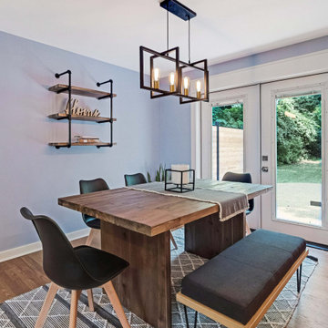
The dining room received a major transformation. The walls and ceilings were resurfaced, the sliding doors were replaced with a walk-out.
The light fixture was replaced with a trendy industrial style fixture and edison bulbs. The dining table felt hip and cool with its solid acacia wood, and contrasting bench with 4 chairs.
The exterior of the home received a major facelift and transformation, including new light fixtures, updated roof and facia, updated wood beams, wood door, wood ceiling and stone added to the entrance and more. This took the home from a dated look to an updated and fresh "modern farmhouse" aesthetic.
The kitchen layout remained intact, while appliances, fixtures, hardware, countertops and backsplashes were upgraded . All three bathrooms in the house were also renovated, original hardwood floors were refinished and carpet and tile flooring throughout replaced. Additionally, the dated built-in brick fireplace on the ground floor game room was redesigned. The new fireplace design would now directly tie in with the modern farmhouse style of the exterior, complete with the addition of a large wooden mantle.
DTSH Interiors formulated a plan for six rooms; the living room, dining room, master bedroom, two children's bedrooms and ground floor game room, with the inclusion of the complete fireplace re-design.
The interior also received major upgrades during the whole-house renovation. All of the walls and ceilings were resurfaced, the windows, doors and all interior trim was re-done.
The end result was a giant leap forward for this family; in design, style and functionality. The home felt completely new and refreshed, and once fully furnished, all elements of the renovation came together seamlessly and seemed to make all of the renovations shine.
During the "big reveal" moment, the day the family finally returned home for their summer away, it was difficult for me to decide who was more excited, the adults or the kids!
The home owners kept saying, with a look of delighted disbelief "I can't believe this is our house!"
As a designer, I absolutely loved this project, because it shows the potential of an average, older Pittsburgh area home, and how it can become a well designed and updated space.
It was rewarding to be part of a project which resulted in creating an elegant and serene living space the family loves coming home to everyday, while the exterior of the home became a standout gem in the neighborhood.
 Cavé Studio
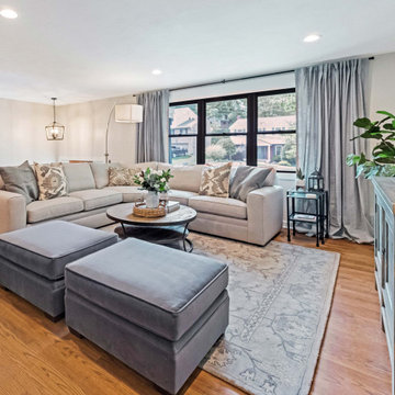
The living room took on a total transformation by changing the location of the TV and thus the furniture arrangement.
Custom French linen window treatments were added, which made the window seem much more expansive.
The exterior of the home received a major facelift and transformation, including new light fixtures, updated roof and facia, updated wood beams, wood door, wood ceiling and stone added to the entrance and more. This took the home from a dated look to an updated and fresh "modern farmhouse" aesthetic.
The kitchen layout remained intact, while appliances, fixtures, hardware, countertops and backsplashes were upgraded . All three bathrooms in the house were also renovated, original hardwood floors were refinished and carpet and tile flooring throughout replaced. Additionally, the dated built-in brick fireplace on the ground floor game room was redesigned. The new fireplace design would now directly tie in with the modern farmhouse style of the exterior, complete with the addition of a large wooden mantle.
DTSH Interiors formulated a plan for six rooms; the living room, dining room, master bedroom, two children's bedrooms and ground floor game room, with the inclusion of the complete fireplace re-design.
The interior also received major upgrades during the whole-house renovation. All of the walls and ceilings were resurfaced, the windows, doors and all interior trim was re-done.
The end result was a giant leap forward for this family; in design, style and functionality. The home felt completely new and refreshed, and once fully furnished, all elements of the renovation came together seamlessly and seemed to make all of the renovations shine.
During the "big reveal" moment, the day the family finally returned home for their summer away, it was difficult for me to decide who was more excited, the adults or the kids!
The home owners kept saying, with a look of delighted disbelief "I can't believe this is our house!"
As a designer, I absolutely loved this project, because it shows the potential of an average, older Pittsburgh area home, and how it can become a well designed and updated space.
It was rewarding to be part of a project which resulted in creating an elegant and serene living space the family loves coming home to everyday, while the exterior of the home became a standout gem in the neighborhood.


Sponsored
Sunbury, OH

J.Holderby - Renovations
Franklin County's Leading General Contractors - 2X Best of Houzz!
 TKS Design Group
Download our free ebook, Creating the Ideal Kitchen. DOWNLOAD NOW
Lakefront property in the northwest suburbs of Chicago is hard to come by, so when we were hired by this young family with exactly that, we were immediately inspired by not just the unusually large footprint of this 1950’s colonial revival but also the lovely views of the manmade lake it was sited on. The large 5-bedroom home was solidly stuck in the 1980’s, but we saw tons of potential. We started out by updating the existing staircase with a fresh coat of paint and adding new herringbone slate to the entry hall.
The powder room off the entryway also got a refresh - new flooring, new cabinets and fixtures. We ran the new slate right through into this space for some consistency. A fun wallpaper and shiplap trim add a welcoming feel and set the tone for the home.
Next, we tackled the kitchen. Located away from the rest of the first floor, the kitchen felt a little isolated, so we immediately began planning for how to better connect it to the rest of the first floor. We landed on removing the wall between the kitchen and dining room and designed a modified galley style space with separate cooking and clean up zones. The cooking zone consists of the refrigerator, prep sink and cooktop, along with a nice long run of prep space at the island. The cleanup side of the kitchen consists of the main sink and dishwasher. Both areas are situated so that the user can view the lake during prep work and cleanup!
One of the home’s main puzzles was how to incorporate the mudroom and area in front of the patio doors at the back of the house. We already had a breakfast table area, so the space by the patio doors was a bit of a no man’s land. We decided to separate the kitchen proper from what became the new mudroom with a large set of barn doors. That way you can quickly hide any mudroom messes but have easy access to the light coming in through the patio doors as well as the outdoor grilling station. We also love the impact the barn doors add to the overall space.
The homeowners’ first words to us were “it’s time to ditch the brown,” so we did! We chose a lovely blue pallet that reflects the home’s location on the lake which is also vibrant yet easy on the eye. Countertops are white quartz, and the natural oak floor works well with the other honey accents. The breakfast table was given a refresh with new chairs, chandelier and window treatments that frame the gorgeous views of the lake out the back.
We coordinated the slate mudroom flooring with that used in the home’s main entrance for a consistent feel. The storage area consists of open and closed storage to allow for some clutter control as needed.
Next on our “to do” list was revamping the dated brown bar area in the neighboring dining room. We eliminated the clutter by adding some closed cabinets and did some easy updates to help the space feel more current. One snag we ran into here was the discovery of a beam above the existing open shelving that had to be modified with a smaller structural beam to allow for our new design to work. This was an unexpected surprise, but in the end we think it was well worth it!
We kept the colors here a bit more muted to blend with the homeowner’s existing furnishings. Open shelving and polished nickel hardware add some simple detail to the new entertainment zone which also looks out onto the lake!
Next we tackled the upstairs starting with the homeowner’s son’s bath. The bath originally had both a tub shower and a separate shower, so we decided to swap out the shower for a new laundry area. This freed up some space downstairs in what used to be the mudroom/laundry room and is much more convenient for daily laundry needs.
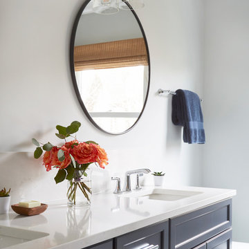
We continued the blue palette here with navy cabinetry and the navy tile in the shower. Porcelain floor tile and chrome fixtures keep maintenance to a minimum while matte black mirrors and lighting add some depth the design. A low maintenance runner adds some warmth underfoot and ties the whole space together.
We added a pocket door to the bathroom to minimize interference with the door swings. The left door of the laundry closet is on a 180 degree hinge to allow for easy full access to the machines. Next we tackled the master bath which is an en suite arrangement. The original was typical of the 1980’s with the vanity outside of the bathroom, situated near the master closet. And the brown theme continued here with multiple shades of brown.
Our first move was to segment off the bath and the closet from the master bedroom. We created a short hall from the bedroom to the bathroom with his and hers walk-in closets on the left and right as well as a separate toilet closet outside of the main bathroom for privacy and flexibility.
The original bathroom had a giant soaking tub with steps (dangerous!) as well as a small shower that did not work well for our homeowner who is 6’3”. With other bathtubs in the home, they decided to eliminate the tub and create an oversized shower which takes up the space where the old tub was located. The double vanity is on the opposite wall and a bench is located under the window for morning conversations and a place to set a couple of towels.
The pallet in here is light and airy with a mix of blond wood, creamy porcelain and marble tile, and brass accents. A simple roman shade adds some texture and it’s top-down mechanism allows for light and privacy.
This large whole house remodel gave our homeowners not only the ability to maximize the potential of their home but also created a lovely new frame from which to view their fabulous lake views.
Designed by: Susan Klimala, CKD, CBD
Photography by: Michael Kaskel
For more information on kitchen and bath design ideas go to: www.kitchenstudio-ge.com
 TKS Design Group
Download our free ebook, Creating the Ideal Kitchen. DOWNLOAD NOW
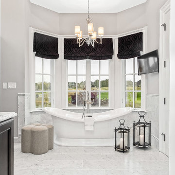
A tired primary bathroom, with varying ceiling heights and a beige-on-beige color scheme, was screaming for love. Squaring the room and adding natural materials erased the memory of the lack luster space and converted it to a bright and welcoming spa oasis. The home was a new build in 2005 and it looked like all the builder’s material choices remained. The client was clear on their design direction but were challenged by the differing ceiling heights and were looking to hire a design-build firm that could resolve that issue.
This local Glen Ellyn couple found us on Instagram (@kitchenstudioge, follow us ?). They loved our designs and felt like we fit their style. They requested a full primary bath renovation to include a large shower, soaking tub, double vanity with storage options, and heated floors. The wife also really wanted a separate make-up vanity. The biggest challenge presented to us was to architecturally marry the various ceiling heights and deliver a streamlined design.
The existing layout worked well for the couple, so we kept everything in place, except we enlarged the shower and replaced the built-in tub with a lovely free-standing model. We also added a sitting make-up vanity. We were able to eliminate the awkward ceiling lines by extending all the walls to the highest level. Then, to accommodate the sprinklers and HVAC, lowered the ceiling height over the entrance and shower area which then opens to the 2-story vanity and tub area. Very dramatic!
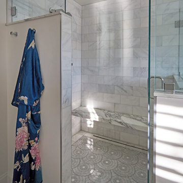
This high-end home deserved high-end fixtures. The homeowners also quickly realized they loved the look of natural marble and wanted to use as much of it as possible in their new bath. They chose a marble slab from the stone yard for the countertops and back splash, and we found complimentary marble tile for the shower. The homeowners also liked the idea of mixing metals in their new posh bathroom and loved the look of black, gold, and chrome.
Although our clients were very clear on their style, they were having a difficult time pulling it all together and envisioning the final product. As interior designers it is our job to translate and elevate our clients’ ideas into a deliverable design. We presented the homeowners with mood boards and 3D renderings of our modern, clean, white marble design. Since the color scheme was relatively neutral, at the homeowner’s request, we decided to add of interest with the patterns and shapes in the room.
We were first inspired by the shower floor tile with its circular/linear motif. We designed the cabinetry, floor and wall tiles, mirrors, cabinet pulls, and wainscoting to have a square or rectangular shape, and then to create interest we added perfectly placed circles to contrast with the rectangular shapes. The globe shaped chandelier against the square wall trim is a delightful yet subtle juxtaposition.
The clients were overjoyed with our interpretation of their vision and impressed with the level of detail we brought to the project. It’s one thing to know how you want a space to look, but it takes a special set of skills to create the design and see it thorough to implementation. Could hiring The Kitchen Studio be the first step to making your home dreams come to life?

 Magnus Anderson Hardwood Floors
Refinished red oak hardwood floors
Entryway - eclectic medium tone wood floor entryway idea in Denver with white walls
Entryway - eclectic medium tone wood floor entryway idea in Denver with white walls
90