
Search results for "Master guidelines" in Home Design Ideas
 Matt Fajkus Architecture
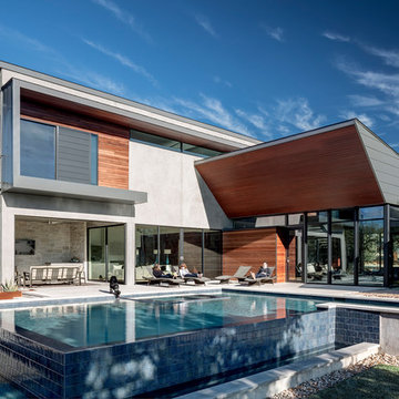
The Control/Shift House is perched on the high side of the site which takes advantage of the view to the southeast. A gradual descending path navigates the change in terrain from the street to the entry of the house. A series of low retaining walls/planter beds gather and release the earth upon the descent resulting in a fairly flat level for the house to sit on the top one third of the site. The entry axis is aligned with the celebrated stair volume and then re-centers on the actual entry axis once you approach the forecourt of the house.
The initial desire was for an “H” scheme house with common entertaining spaces bridging the gap between the more private spaces. After an investigation considering the site, program, and view, a key move was made: unfold the east wing of the “H” scheme to open all rooms to the southeast view resulting in a “T” scheme. The new derivation allows for both a swim pool which is on axis with the entry and main gathering space and a lap pool which occurs on the cross axis extending along the lengthy edge of the master suite, providing direct access for morning exercise and a view of the water throughout the day.
The Control/Shift House was derived from a clever way of following the “rules.” Strict HOA guidelines required very specific exterior massing restrictions which limits the lengths of unbroken elevations and promotes varying sizes of masses. The solution most often used in this neighborhood is one of addition - an aggregation of masses and program randomly attached to the inner core of the house which often results in a parasitic plan. The approach taken with the Control/Shift House was to push and pull program/massing to delineate and define the layout of the house. Massing is intentional and reiterated by the careful selection of materiality that tracks through the house. Voids and relief in the plan are a natural result of this method and allow for light and air to circulate throughout every space of the house, even into the most inner core.
Photography: Charles Davis Smith

 SURROUNDS Landscape Architecture + Construction
Our client desired a functional, tasteful, and improved environment to compliment their home. The overall goal was to create a landscape that was subtle and not overdone. The client was highly focused on their deck environment that would span across the rear of the house with an area for a Jacuzzi as well. A portion of the deck has a screened in porch due to the naturally buggy environment since the home is situated in the woods and a low area. A mosquito repellent injection system was incorporated into the irrigation system to help with the bug issue. We improved circulation of the driveway, increased the overall curb appeal of the entrance of the home, and created a scaled and proportional outdoor living environment for the clients to enjoy. The client has religious guidelines that needed to be adhered to with the overall function and design of the landscape, which included an arbor over the deck to support a Sukkah and a Green Egg smoker to cook Kosher foods. Two columns were added at the driveway entrance with lights to help define their driveway entrance since it's the end of a long pipe-stem. New light fixtures were also added to the rear of the house.
Our client desired multiple amenities with a limited budget, so everything had to be value engineered through the design and construction process. There is heavy deer pressure on the site, a mosquito issue, low site elevations, flat topography, poor soil, and overall poor drainage of the site. The original driveway was not sized appropriately and the front porch had structural issues, as well as leaked water onto the landing below. The septic tank was also situated close to the rear of the house and had to be contemplated during the design process.
Photography: Morgan Howarth. Landscape Architect: Howard Cohen, Surrounds Inc.
 Kyle Hunt & Partners, Incorporated
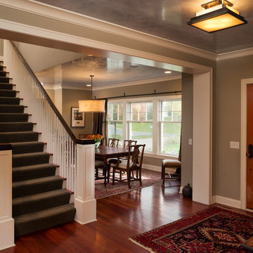
Builder & Interior Selections: Kyle Hunt & Partners, Architect: Sharratt Design Company, Landscape Design: Yardscapes, Photography by James Kruger, LandMark Photography
Find the right local pro for your project

 Guideline Studios, LLC
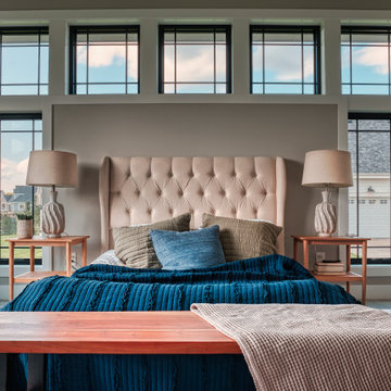
Primary Bedroom features windows designed to wrap around the bed set.
Example of a large transitional master carpeted and gray floor bedroom design in Milwaukee with gray walls
Example of a large transitional master carpeted and gray floor bedroom design in Milwaukee with gray walls
 Phase One Design
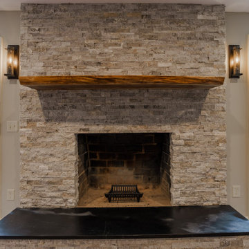
When designing this kitchen update and addition, Phase One had to keep function and style top of mind, all the time. The homeowners are masters in the kitchen and also wanted to highlight the great outdoors and the future location of their pool, so adding window banks were paramount, especially over the sink counter. The bathrooms renovations were hardly a second thought to the kitchen; one focuses on a large shower while the other, a stately bathtub, complete with frosted glass windows Stylistic details such as a bright red sliding door, and a hand selected fireplace mantle from the mountains were key indicators of the homeowners trend guidelines. Storage was also very important to the client and the home is now outfitted with 12.
 Novell Design Build & Novella Outdoors
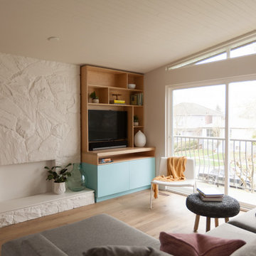
The renovation of our Renfrew Residence completely reimagined what we expected from a classic Vancouver Special home. The boxy shape of Vancouver Specials was a result of maximizing floor space under the zoning guidelines of their time. Builders in the 1960s and 1980s saw an opportunity and made the most of it! Today, renovating these homes are a common and rewarding project for Design Build firms. We love transforming Vancouver Specials because they have a lot of versatility and great foundations! Our Renfrew Residence is a great example of how all the common modernizations of a Vancouver Special are even better with Design Build.
To begin, we gave this home a more modern layout. We opened the walls upstairs, expanded the master bathroom, and gave the home an overall open feeling. In order to do so, we restructured and moved some of the walls.
Sponsored
Sunbury, OH

J.Holderby - Renovations
Franklin County's Leading General Contractors - 2X Best of Houzz!
 Advance Design Studio, Ltd.
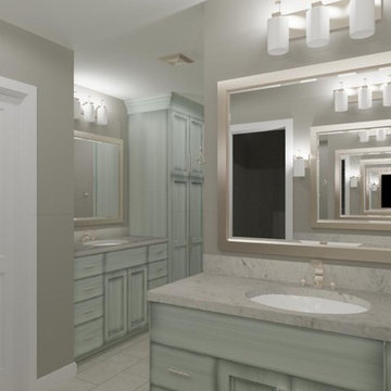
Mike and Anne of Barrington Hills desperately needed to update and renovate both their kid’s hall bath and guest bath, and in their 1980’s home each project presented a different set of unique challenges to overcome. When they set out to identify the right remodeling company to partner with, it was important to find a company that could help them to visualize design solutions for the bath renovations. When they came across Advance Design Studio’s website, they were immediately drawn to the solution-oriented remodeling process and the family friendly company.
They say they chose Advance Design because of the integrated approach of “Common Sense Remodeling”, making the design, project management and construction all happen in one place. When they met with Project Designer Michelle Lecinski, they knew they chose the right company. “Michelle’s excellent work on the initial designs made it easy to proceed with Advance Design Studio,” Mike said.
Like most homeowners anticipating a big renovation project, they had some healthy fears; with two bathrooms being remodeled at the same time they worried about timeframes and staying within budget. With the help of Michelle, and the “Common Sense” guidelines, they were confident that Advance Design would stay true, orchestrating all the moving parts to stay within both the estimated timeline and budget.
The guest bath offered the biggest design challenge. A dormer obstruction made the already cramped shower awkward to access. Mike and Anne also wanted the shower size to be expanded, making it more accommodating. Working with Advance’s construction expert DJ Yurik, Michelle relocated the shower concealing the original dormer and creating a larger, more comfortable and aesthetically pleasing guest shower.
The unsightly and not at all user-friendly closet was removed and replaced with elegant White Maple Dura Supreme cabinetry with much improved function featuring dual tall linen cabinets, a special makeup area and two sinks, providing a dual vanity which was extremely important for better guest use.
The Fossil Brown quartz countertop is in pleasing contrast to the white cabinetry, and coordinates nicely with the mocha porcelain tile gracing the shower for an accent. The decorative glazed turquoise tile backsplash, tile border, and bottle niche adds a taste of marine green to the room, while marble-looking porcelain tile makes guests feel they are staying in a 5-star hotel. Polished nickel Kohler plumbing fixtures were chosen to add a touch of sophistication. This renovated guest bath is comfortable and elegant, and Anne and Mike’s house guests may never want to leave!
“The end result was updated and restyled bathrooms that the client will enjoy and increase the value of their home,” Designer Michelle said.
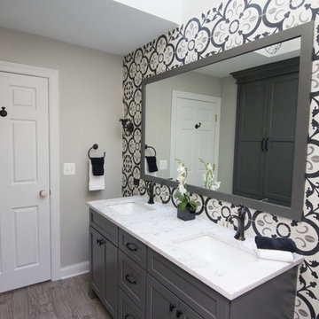
The children’s hall bath had its own set of challenges. The current placement of the sink was not conducive to the best use of the existing space, nor did it allow for any visual interest, something Advance’s designers always work to achieve even within the tight confines of a small bath. Advance removed the linen closet and used the gain in wall space to create a dramatic focal point on the vanity wall. They also took additional space that wasn’t being used for new Storm Gray Dura Supreme tall built-in linen cabinets, creating functional storage space that the former bath lacked. A customized glass splash panel was created for the bath, and the high ceilings with skylights were accented with a custom-made track lighting fixture featuring industrial pipe and cage materials.
Authentic cement encaustic tile was used wall to wall surrounding the vanity to create a dramatic and interesting back drop for the new elegant and stately furniture-like double sink wall. Hand-made encaustic tile originated in Western Europe beginning in the 1850’s and reminded Mike and Anne of tile they had seen and loved from their travels overseas. Today, encaustic tile has made a re-appearance in today’s modern bath design with its wide array of appealing patterns and artistic use of color.
Oil rubbed bronze Kohler fixtures echo the black accents in the beautiful tile pattern and reflect the matte black of the unique lighting detail. Easy to maintain Blanca Arabescato Quartz countertops add practicality and natural beauty and compliments the warm wood porcelain tile floors. This handsome bath has generated praise from friends and family even before it’s complete unveiling as photos of the space leaked out on social media! It’s not only completely functional to use, but especially pretty to look at.
“Advance Design Studio did a terrific job for us. We really appreciated how easy it was to work with them on a complex project of the complete remodeling of two bathrooms. They very capably handled all the details from design, to project management, to construction. It is a great group of people to work with and we would welcome the opportunity to work with them again anytime,” Mike said.
 Novell Design Build & Novella Outdoors
The renovation of our Renfrew Residence completely reimagined what we expected from a classic Vancouver Special home. The boxy shape of Vancouver Specials was a result of maximizing floor space under the zoning guidelines of their time. Builders in the 1960s and 1980s saw an opportunity and made the most of it! Today, renovating these homes are a common and rewarding project for Design Build firms. We love transforming Vancouver Specials because they have a lot of versatility and great foundations! Our Renfrew Residence is a great example of how all the common modernizations of a Vancouver Special are even better with Design Build.
To begin, we gave this home a more modern layout. We opened the walls upstairs, expanded the master bathroom, and gave the home an overall open feeling. In order to do so, we restructured and moved some of the walls.
 LUXE Linear Drains Inc
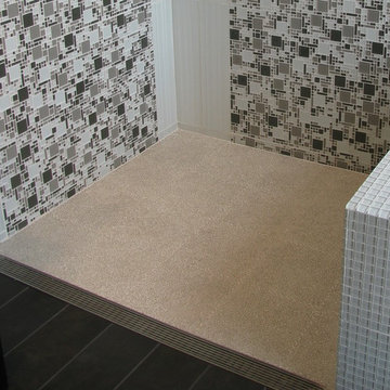
The proprietary design of LUXE wedgewire make it the only choice when separating wet areas from dry as the hydraulic function is unsurpassed. Eliminating the spillover at threshold for recommended flow rates of most showers. ALL LUXE linear drain products are compliant with the Americans with Disabilities Act. The ADA Accessibility Guidelines For Buildings and Facilities Section 4.5.4 specifies that ground and floor grates "shall have spaces no greater than 1/2 in (13 mm) wide in one direction."
 Arise Art Group
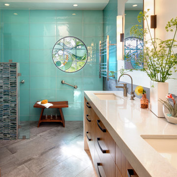
These clients have a high sense of design and have always built their own homes. They just downsized into a typical town home and needed this new space to stand out but also be accommodating of aging in place. The client, Jim, has a handful of challenges ahead of him with dealing with Parkinson and all of it symptoms. We optimized the shower, enlarging it by eliminating the tub and not using a shower door. We were able to do a curbless shower, reducing the likelihood of falling. We used larger tiles in the bathroom and shower but added the anti slip porcelain. I included a built-in seat in the shower and a stand-alone bench on the other side. We used a separate hand shower and easy to grab handles.
A natural palette peppered with some aqua and green breathes fresh, new life into a re-imagined UTC town home. Choosing materials and finishes that have higher contrast helps make the change from flooring to wall, as well as cabinet to counter, more obvious. Large glass wall tiles make the bathroom seem much larger. A flush installation of drywall to tile is easy on the eye while showing the attention to detail.
A modern custom floating vanity allows for walker wheels if needed. Personal touches like adding a filter faucet at the sink makes his trips to take medicine a bit easier.
One of my favorite things in design for any project is lighting. Not only can lighting add to the look and feel of the space, but it can also create a safer environment. Installing different types of lighting, including scones on either side of the mirror, recessed can lights both inside and outside of the shower, and LED strip lighting under the floating vanity, keep this modern bathroom current and very functional. Because of the skylight and the round window, light is allowed in to play with the different colors in the glass and the shapes around the room, which created a bright and playful bathroom.
It is not often that I get to play with stain-glass, but this existing circular window, that we could NOT change, needed some love. We used a local craftsman that allowed us to design a playful stain-glass piece for the inside of the bathroom window, reminding them of their front door in their custom home years ago.
 Guideline Studios, LLC
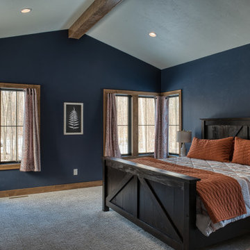
The spacious Primary Bedroom features corner windows with multiple views of the surrounding woods. Vaulted ceilings with a wood wrapped ridge beam bring a touch of warmth to the space.
 Phase One Design
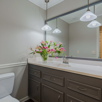
When designing this kitchen update and addition, Phase One had to keep function and style top of mind, all the time. The homeowners are masters in the kitchen and also wanted to highlight the great outdoors and the future location of their pool, so adding window banks were paramount, especially over the sink counter. The bathrooms renovations were hardly a second thought to the kitchen; one focuses on a large shower while the other, a stately bathtub, complete with frosted glass windows Stylistic details such as a bright red sliding door, and a hand selected fireplace mantle from the mountains were key indicators of the homeowners trend guidelines. Storage was also very important to the client and the home is now outfitted with 12.
Sponsored
Columbus, OH

Trish Takacs Design
Award Winning & Highly Skilled Kitchen & Bath Designer in Columbus
 Novell Design Build & Novella Outdoors
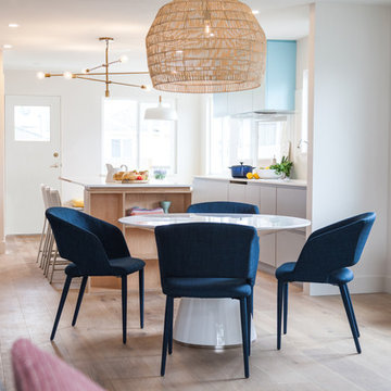
The renovation of our Renfrew Residence completely reimagined what we expected from a classic Vancouver Special home. The boxy shape of Vancouver Specials was a result of maximizing floor space under the zoning guidelines of their time. Builders in the 1960s and 1980s saw an opportunity and made the most of it! Today, renovating these homes are a common and rewarding project for Design Build firms. We love transforming Vancouver Specials because they have a lot of versatility and great foundations! Our Renfrew Residence is a great example of how all the common modernizations of a Vancouver Special are even better with Design Build.
To begin, we gave this home a more modern layout. We opened the walls upstairs, expanded the master bathroom, and gave the home an overall open feeling. In order to do so, we restructured and moved some of the walls.
 Novell Design Build & Novella Outdoors
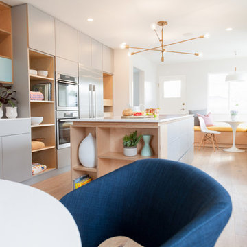
The renovation of our Renfrew Residence completely reimagined what we expected from a classic Vancouver Special home. The boxy shape of Vancouver Specials was a result of maximizing floor space under the zoning guidelines of their time. Builders in the 1960s and 1980s saw an opportunity and made the most of it! Today, renovating these homes are a common and rewarding project for Design Build firms. We love transforming Vancouver Specials because they have a lot of versatility and great foundations! Our Renfrew Residence is a great example of how all the common modernizations of a Vancouver Special are even better with Design Build.
To begin, we gave this home a more modern layout. We opened the walls upstairs, expanded the master bathroom, and gave the home an overall open feeling. In order to do so, we restructured and moved some of the walls.
 Visbeen Architects
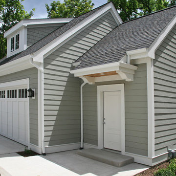
Building a new home in an old neighborhood can present many challenges for an architect. The Warren is a beautiful example of an exterior, which blends with the surrounding structures, while the floor plan takes advantage of the available space.
A traditional façade, combining brick, shakes, and wood trim enables the design to fit well in any early 20th century borough. Copper accents and antique-inspired lanterns solidify the home’s vintage appeal.
Despite the exterior throwback, the interior of the home offers the latest in amenities and layout. Spacious dining, kitchen and hearth areas open to a comfortable back patio on the main level, while the upstairs offers a luxurious master suite and three guests bedrooms.
 Phase One Design
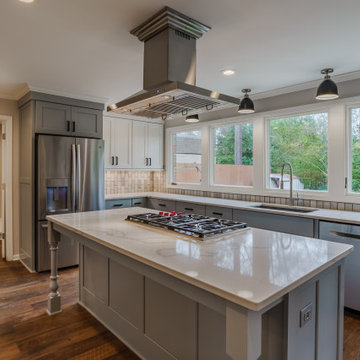
When designing this kitchen update and addition, Phase One had to keep function and style top of mind, all the time. The homeowners are masters in the kitchen and also wanted to highlight the great outdoors and the future location of their pool, so adding window banks were paramount, especially over the sink counter. The bathrooms renovations were hardly a second thought to the kitchen; one focuses on a large shower while the other, a stately bathtub, complete with frosted glass windows Stylistic details such as a bright red sliding door, and a hand selected fireplace mantle from the mountains were key indicators of the homeowners trend guidelines. Storage was also very important to the client and the home is now outfitted with 12.
Sponsored
Columbus, OH

Wannemacher Interiors
Customized Award-Winning Interior Design Solutions in Franklin Cnty OH
 Phase One Design
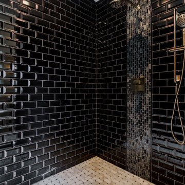
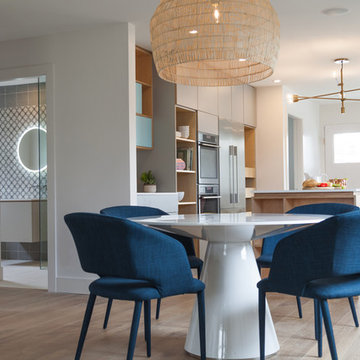
When designing this kitchen update and addition, Phase One had to keep function and style top of mind, all the time. The homeowners are masters in the kitchen and also wanted to highlight the great outdoors and the future location of their pool, so adding window banks were paramount, especially over the sink counter. The bathrooms renovations were hardly a second thought to the kitchen; one focuses on a large shower while the other, a stately bathtub, complete with frosted glass windows Stylistic details such as a bright red sliding door, and a hand selected fireplace mantle from the mountains were key indicators of the homeowners trend guidelines. Storage was also very important to the client and the home is now outfitted with 12.
 Novell Design Build & Novella Outdoors
The renovation of our Renfrew Residence completely reimagined what we expected from a classic Vancouver Special home. The boxy shape of Vancouver Specials was a result of maximizing floor space under the zoning guidelines of their time. Builders in the 1960s and 1980s saw an opportunity and made the most of it! Today, renovating these homes are a common and rewarding project for Design Build firms. We love transforming Vancouver Specials because they have a lot of versatility and great foundations! Our Renfrew Residence is a great example of how all the common modernizations of a Vancouver Special are even better with Design Build.
To begin, we gave this home a more modern layout. We opened the walls upstairs, expanded the master bathroom, and gave the home an overall open feeling. In order to do so, we restructured and moved some of the walls.
 Costa Bella Builders
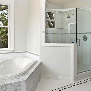
On this major remodel in Santa Cruz we were faced with a dilapidated Victorian built in 1904. We began by creating a complete set of building plans detailing the renovation and remodeling of the building. We added new square footage to the master bedroom, reengineered and rebuilt the back half of the structure and then completely replaced all of the plumbing and electrical services. All of our construction on the exterior was required to match the original in order to comply with the historical status of the building.
This project was conducted under the new green building guidelines established by the City of Santa Cruz. We were able to recycle nearly 80% of our demolition and construction refuse. We took care to preserve and renovate the existing redwood window casings and all of the original custom heart redwood doors in the home. These were planed, sanded and refinished to both save cost and maintain the vintage warmth of the original structure. The windows were recycled and new Marvin dual pane wood windows installed in their place. The original upstairs redwood flooring was preserved and the damaged sections replaced with material salvaged from the flooring at the first story. These surfaces were sanded and finished to recreate the look of the former flooring. We were also able to save and reuse the decorative fireplace mantle from the original construction.
3