
Search results for "Master limits" in Home Design Ideas

 Elizabeth Drake of Drake Interiors Limited
Example of a classic master white tile and ceramic tile mosaic tile floor, multicolored floor and double-sink bathroom design with recessed-panel cabinets, gray cabinets, blue walls, an integrated sink, marble countertops, white countertops and a built-in vanity
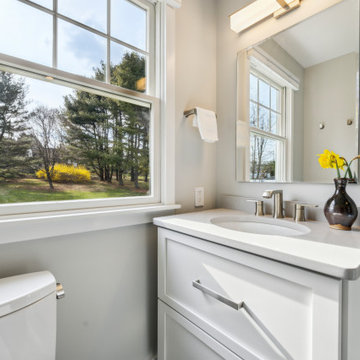
 Hillcrest Construction
 designed and executed a complete facelift for these West Chester clients’ master bathroom. The sink/toilet/shower layout stayed relatively unchanged due to the limitations of the small space, but major changes were slated for the overall functionality and aesthetic appeal.
The bathroom was gutted completely, the wiring was updated, and minor plumbing alterations were completed for code compliance.
Bathroom waterproofing was installed utilizing the state-of-the-industry Schluter substrate products, and the feature wall of the shower is tiled with a striking blue 12x12 tile set in a stacked pattern, which is a departure of color and layout from the staggered gray-tome wall tile and floor tile.
The original bathroom lacked storage, and what little storage it had lacked practicality.
The original 1’ wide by 4’ deep “reach-in closet” was abandoned and replaced with a custom cabinetry unit that featured six 30” drawers to hold a world of personal bathroom items which could pulled out for easy access. The upper cubbie was shallower at 13” and was sized right to hold a few spare towels without the towels being lost to an unreachable area. The custom furniture-style vanity, also built and finished at the Hillcrest custom shop facilitated a clutter-free countertop with its two deep drawers, one with a u-shaped cut out for the sink plumbing. Considering the relatively small size of the bathroom, and the vanity’s proximity to the toilet, the drawer design allows for greater access to the storage area as compared to a vanity door design that would only be accessed from the front. The custom niche in the shower serves and a consolidated home for soap, shampoo bottles, and all other shower accessories.
Moen fixtures at the sink and in the shower and a Toto toilet complete the contemporary feel. The controls at the shower allow the user to easily switch between the fixed rain head, the hand shower, or both. And for a finishing touch, the client chose between a number for shower grate color and design options to complete their tailor-made sanctuary.

 Copper Homes Limited
Shutter Avenue
Inspiration for a large transitional formal, enclosed and master medium tone wood floor bedroom remodel in Denver with beige walls, a standard fireplace and a stone fireplace
Inspiration for a large transitional formal, enclosed and master medium tone wood floor bedroom remodel in Denver with beige walls, a standard fireplace and a stone fireplace
Find the right local pro for your project

 Jagoe Homes Inc.
Jagoe Homes, Inc. Project: Olde Stone Home. Location: Owensboro, Kentucky.
Example of a large classic u-shaped medium tone wood floor eat-in kitchen design with an undermount sink, furniture-like cabinets, white cabinets, granite countertops, black backsplash, stainless steel appliances, green walls and an island
Example of a large classic u-shaped medium tone wood floor eat-in kitchen design with an undermount sink, furniture-like cabinets, white cabinets, granite countertops, black backsplash, stainless steel appliances, green walls and an island

 Matt Fajkus Architecture
The Control/Shift House is perched on the high side of the site which takes advantage of the view to the southeast. A gradual descending path navigates the change in terrain from the street to the entry of the house. A series of low retaining walls/planter beds gather and release the earth upon the descent resulting in a fairly flat level for the house to sit on the top one third of the site. The entry axis is aligned with the celebrated stair volume and then re-centers on the actual entry axis once you approach the forecourt of the house.
The initial desire was for an “H” scheme house with common entertaining spaces bridging the gap between the more private spaces. After an investigation considering the site, program, and view, a key move was made: unfold the east wing of the “H” scheme to open all rooms to the southeast view resulting in a “T” scheme. The new derivation allows for both a swim pool which is on axis with the entry and main gathering space and a lap pool which occurs on the cross axis extending along the lengthy edge of the master suite, providing direct access for morning exercise and a view of the water throughout the day.
The Control/Shift House was derived from a clever way of following the “rules.” Strict HOA guidelines required very specific exterior massing restrictions which limits the lengths of unbroken elevations and promotes varying sizes of masses. The solution most often used in this neighborhood is one of addition - an aggregation of masses and program randomly attached to the inner core of the house which often results in a parasitic plan. The approach taken with the Control/Shift House was to push and pull program/massing to delineate and define the layout of the house. Massing is intentional and reiterated by the careful selection of materiality that tracks through the house. Voids and relief in the plan are a natural result of this method and allow for light and air to circulate throughout every space of the house, even into the most inner core.
Photography: Charles Davis Smith
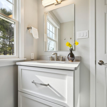 Hillcrest Construction
 designed and executed a complete facelift for these West Chester clients’ master bathroom. The sink/toilet/shower layout stayed relatively unchanged due to the limitations of the small space, but major changes were slated for the overall functionality and aesthetic appeal.
The bathroom was gutted completely, the wiring was updated, and minor plumbing alterations were completed for code compliance.
Bathroom waterproofing was installed utilizing the state-of-the-industry Schluter substrate products, and the feature wall of the shower is tiled with a striking blue 12x12 tile set in a stacked pattern, which is a departure of color and layout from the staggered gray-tome wall tile and floor tile.
The original bathroom lacked storage, and what little storage it had lacked practicality.
The original 1’ wide by 4’ deep “reach-in closet” was abandoned and replaced with a custom cabinetry unit that featured six 30” drawers to hold a world of personal bathroom items which could pulled out for easy access. The upper cubbie was shallower at 13” and was sized right to hold a few spare towels without the towels being lost to an unreachable area. The custom furniture-style vanity, also built and finished at the Hillcrest custom shop facilitated a clutter-free countertop with its two deep drawers, one with a u-shaped cut out for the sink plumbing. Considering the relatively small size of the bathroom, and the vanity’s proximity to the toilet, the drawer design allows for greater access to the storage area as compared to a vanity door design that would only be accessed from the front. The custom niche in the shower serves and a consolidated home for soap, shampoo bottles, and all other shower accessories.
Moen fixtures at the sink and in the shower and a Toto toilet complete the contemporary feel. The controls at the shower allow the user to easily switch between the fixed rain head, the hand shower, or both. And for a finishing touch, the client chose between a number for shower grate color and design options to complete their tailor-made sanctuary.

 Visbeen Architects
Function meets fashion in this relaxing retreat inspired by turn-of-the-century cottages. Perfect for a lot with limited space or a water view, this delightful design packs ample living into an open floor plan spread out on three levels. Elements of classic farmhouses and Craftsman-style bungalows can be seen in the updated exterior, which boasts shingles, porch columns, and decorative venting and windows. Inside, a covered front porch leads into an entry with a charming window seat and to the centrally located 17 by 12-foot kitchen. Nearby is an 11 by 15-foot dining and a picturesque outdoor patio. On the right side of the more than 1,500-square-foot main level is the 14 by 18-foot living room with a gas fireplace and access to the adjacent covered patio where you can enjoy the changing seasons. Also featured is a convenient mud room and laundry near the 700-square-foot garage, a large master suite and a handy home management center off the dining and living room. Upstairs, another approximately 1,400 square feet include two family bedrooms and baths, a 15 by 14-foot loft dedicated to music, and another area designed for crafts and sewing. Other hobbies and entertaining aren’t excluded in the lower level, where you can enjoy the billiards or games area, a large family room for relaxing, a guest bedroom, exercise area and bath.
Photographers: Ashley Avila Photography
Pat Chambers
Builder: Bouwkamp Builders, Inc.


 Wiedemann Architects LLC
This project is a new 5,900 sf. primary residence for a couple with three children. The site is slightly elevated above the residential street and enjoys winter views of the Potomac River.
The family’s requirements included five bedrooms, five full baths, a powder room, family room, dining room, eat-in kitchen, walk-in pantry, mudroom, lower level recreation room, exercise room, media room and numerous storage spaces. Also included was the request for an outdoor terrace and adequate outdoor storage, including provision for the storage of bikes and kayaks. The family needed a home that would have two entrances, the primary entrance, and a mudroom entry that would provide generous storage spaces for the family’s active lifestyle. Due to the small lot size, the challenge was to accommodate the family’s requirements, while remaining sympathetic to the scale of neighboring homes.
The residence employs a “T” shaped plan to aid in minimizing the massing visible from the street, while organizing interior spaces around a private outdoor terrace space accessible from the living and dining spaces. A generous front porch and a gambrel roof diminish the home’s scale, providing a welcoming view along the street front. A path along the right side of the residence leads to the family entrance and a small outbuilding that provides ready access to the bikes and kayaks while shielding the rear terrace from view of neighboring homes.
The two entrances join a central stair hall that leads to the eat-in kitchen overlooking the great room. Window seats and a custom built banquette provide gathering spaces, while the French doors connect the great room to the terrace where the arbor transitions to the garden. A first floor guest suite, separate from the family areas of the home, affords privacy for both guests and hosts alike. The second floor Master Suite enjoys views of the Potomac River through a second floor arched balcony visible from the front.
The exterior is composed of a board and batten first floor with a cedar shingled second floor and gambrel roof. These two contrasting materials and the inclusion of a partially recessed front porch contribute to the perceived diminution of the home’s scale relative to its smaller neighbors. The overall intention was to create a close fit between the residence and the neighboring context, both built and natural.
Builder: E.H. Johnstone Builders
Anice Hoachlander Photography

 InnovationLand
Houston Interior Designer Lisha Maxey took this Museum District condo from the dated, mirrored walls of the 1980s to Mid Century Modern with a gallery look featuring the client’s art collection.
The place was covered with glued-down, floor-to-ceiling mirrors,” says Lisha Maxey, senior designer for Homescapes of Houston and principal at LGH Design Services in Houston. “When we took them off the walls, the walls came apart. We ended up taking them down to the studs."
The makeover took six months to complete, primarily because of strict condo association rules that only gave the Houston interior designers very limited access to the elevator – through which all materials and team members had to go.
“Monday through Friday, we could only be noisy from 10 a.m. to 2 p.m., and if we had to do something extra loud, like sawing or drilling, we had to schedule it with the management and they had to communicate that to the condo owners. So it was just a lot of coordination. But a lot of Inner City Loopers live in these kinds of buildings, so we’re used to handling that kind of thing.”
The client, a child psychiatrist in her 60s, recently moved to Houston from northeast Texas to be with friends. After being widowed three years ago, she decided it was time to let go of the traditionally styled estate that wasn’t really her style anyway. An avid diver who has traveled around the world to pursue her passion, she has amassed a large collection of art from her travels. Downsizing to 1,600 feet and wanting to go more contemporary, she wanted the display – and the look – more streamlined.
“She wanted clean lines and muted colors, with the main focus being her artwork,” says Maxey. “So we made the space a palette for that.”
Enter the white, gallery-grade paint she chose for the walls: “It’s halfway between satin and flat,” explains Maxey. “It’s not glossy and it’s not chalky – just very smooth and clean."
Adding to the gallery theme is the satin nickel track lighting with lamps aimed to highlight pieces of art. “This lighting has no wires,” notes Maxey. “It’s powered by a positive and negative conduit.”
The new flooring throughout is a blended-grey porcelain tile that looks like wood planks. “It’s gorgeous, natural-looking and combines all the beauty of wood with the durability of tile,” says Maxey. “We used it throughout the condo to unify the space.”
After Maxey started looking at the client’s bright, vibrant, colorful artwork, she felt the palette couldn’t stay as muted anymore. Hence the Mid Century Modern orange leather sofas from West Elm and bright green chairs from Joybird, plus the throw pillows in different textures, patterns and shades of gold, orange and green.
The concave lines of the Danish-inspired chairs, she notes, help them look beautiful from all the way around – a key to designing spaces for loft living.
“The table in the living room is very interesting,” notes Maxey. “It was handmade for the client in 1974 and has a signature on it from the artist. She was adamant about including the piece, which has all these hand-painted black-and-white art tiles on the top. I took one look at it and said ‘It’s not really going to go.’”
However, after cutting 6 inches off the bottom and making it look a little distressed, the table ended up being the perfect complement to the sofas.
The dining room table – from Design Within Reach – is a solid piece of mahogany, the chair upholstery a mix of grey velvet and leather and the legs a shiny brass. “The side chairs are leather and the end ones are velvet,” says Maxey. “It’s a nice textural mix that lends depth and texture.”The galley kitchen, meanwhile, has been lightened and brightened, with new, white contemporary cabinetry, quartz countertops mimicking the look of Carrara marble, stainless steel appliances and a velvet green bench seat for a punch of color.The two bathrooms have been updated with contemporary white vanities and vessel sinks and the master bath now features a walk-in shower tiled in Dolomite white marble (the floor is Bianco Carrara marble mosaic, done in a herringbone pattern).In the master bedroom, Homescapes of Houston knocked down a wall between two smaller closets with swing doors to make one large walk-in closet with pocket doors. The closet in the guest bedroom also came out 13 more inches.The client’s artwork throughout personalizes the space and tells the story of a life. There’s a huge bowl of shells from the client’s diving adventures, framed art from her child psychiatry patients and a 16th century wood carving from a monastery that’s been in her family forever.
“Her collection is quite impressive,” says Maxey. “There’s even a framed piece of autographed songs written by John Lennon.” (You can see this black-framed piece of art on the wall in the photo above of two green chairs).
“We’re extremely happy with how the project turned out, and so is the client,” says Maxey. “No expense was spared for her. It was a labor of love and we were excited to do it.”

 MIG Furniture Design, Inc.
Modern Bedroom Silk by Huppe. The Silk collection is manufactured in birch veneer specially selected, which is timeless and sophisticated. The Bed repeats the lines of the night tables, giving a sense of balance to the collection. The headboard consists of 5 distinct sections with architectural details that let daylight or optional LED lighting pass through. Silk creates a warm and comforting atmosphere. Optionally, the set also offers a dresser, chest and nightstands to give the bed a comfortable storage system. Equipped with invisible self-clothing slides, the drawers close efficiently. The interior of the drawers is specially treated and stained to match the exterior. The platform bed only requires a mattress that sits on a European-style wooden base with metal slats.
The bed can be ordered with an optional Storage Platform, please check the additional images.
Available in a variety of finishes according to our color samples. Shown in Smoked #32 finish.
The starting price is for the Queen size Bed.
Contact our office to get Silk Bed for even better price! Limited Time Offer!
P: 718-676-1977 (MIG Furniture, Brooklyn NY)
Dimensions:
Queen Size Bed: W79" x D88.7" x H37"
King Size Bed: W97" x D88.7" x H37"
1 Drawer Night Stand: W21.7" x D20" x H13.5"
2 Drawer Night Stand: W22" x D19" x H16"
6 Drawer Dresser: W66" x D19" x H29"
5 Drawer Chest: W30" x D19" x H50"
Horizontal Mirror: W46" x D2.3" x H26"
Floor Mirror: W23" x D2.3" x H75"

 Safferstone Interiors
Meet Meridith: a super-mom who’s as busy as she is badass — and easily my favorite overachiever. She slays her office job and comes home to an equally high-octane family life.
We share a love for city living with farmhouse aspirations. There’s a vegetable garden in the backyard, a black cat, and a floppy eared rabbit named Rocky. There has been a mobile chicken coop and a colony of bees in the backyard. At one point they even had a pregnant hedgehog on their hands!
Between gardening, entertaining, and helping with homework, Meridith has zero time for interior design. Spending several days a week in New York for work, she has limited amount of time at home with her family. My goal was to let her make the most of it by taking her design projects off her to do list and let her get back to her family (and rabbit).
I wanted her to spend her weekends at her son's baseball games, not shopping for sofas. That’s my cue!
Meridith is wonderful. She is one of the kindest people I know. We had so much fun, it doesn’t seem fair to call this “work”. She is loving, and smart, and funny. She’s one of those girlfriends everyone wants to call their own best friend. I wanted her house to reflect that: to feel cozy and inviting, and encourage guests to stay a while.
Meridith is not your average beige person, and she has excellent taste. Plus, she was totally hands-on with design choices. It was a true collaboration. We played up her quirky side and built usable, inspiring spaces one lightbulb moment at a time.
I took her love for color (sacré blue!) and immediately started creating a plan for her space and thinking about her design wish list. I set out hunting for vibrant hues and intriguing patterns that spoke to her color palette and taste for pattern.
I focused on creating the right vibe in each space: a bit of drama in the dining room, a bit more refined and quiet atmosphere for the living room, and a neutral zen tone in their master bedroom.
Her stuff. My eye.
Meridith’s impeccable taste comes through in her art collection. The perfect placement of her beautiful paintings served as the design model for color and mood.
We had a bit of a chair graveyard on our hands, but we worked with some key pieces of her existing furniture and incorporated other traditional pieces, which struck a pleasant balance. French chairs, Asian-influenced footstools, turned legs, gilded finishes, glass hurricanes – a wonderful mash-up of traditional and contemporary.
Some special touches were custom-made (the marble backsplash in the powder room, the kitchen banquette) and others were happy accidents (a wallpaper we spotted via Pinterest). They all came together in a design aesthetic that feels warm, inviting, and vibrant — just like Meridith!
We built her space based on function.
We asked ourselves, “how will her family use each room on any given day?” Meridith throws legendary dinner parties, so we needed curated seating arrangements that could easily switch from family meals to elegant entertaining. We sought a cozy eat-in kitchen and decongested entryways that still made a statement. Above all, we wanted Meredith’s style and panache to shine through every detail. From the pendant in the entryway, to a wild use of pattern in her dining room drapery, Meredith’s space was a total win. See more of our work at www.safferstone.com. Connect with us on Facebook, get inspired on Pinterest, and share modern musings on life & design on Instagram. Or, share what's on your plate with us at hello@safferstone.com.
Photo: Angie Seckinger

 Grandeur Hills Group,Inc.
Inspiration for a mid-sized contemporary open concept light wood floor and gray floor game room remodel in New York with white walls

 LoneStar Design Build
Sonja Quintero
Drop-in bathtub - large transitional master beige tile and stone slab limestone floor drop-in bathtub idea in Dallas with an integrated sink, recessed-panel cabinets, white cabinets, marble countertops, a one-piece toilet and beige walls
Drop-in bathtub - large transitional master beige tile and stone slab limestone floor drop-in bathtub idea in Dallas with an integrated sink, recessed-panel cabinets, white cabinets, marble countertops, a one-piece toilet and beige walls
Sponsored
Columbus, OH
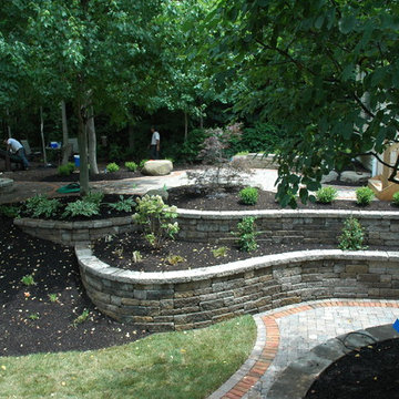
Free consultation for landscape design!

Peabody Landscape Group
Franklin County's Reliable Landscape Design & Contracting
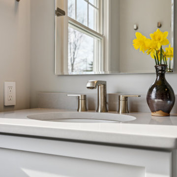 Hillcrest Construction
 designed and executed a complete facelift for these West Chester clients’ master bathroom. The sink/toilet/shower layout stayed relatively unchanged due to the limitations of the small space, but major changes were slated for the overall functionality and aesthetic appeal.
The bathroom was gutted completely, the wiring was updated, and minor plumbing alterations were completed for code compliance.
Bathroom waterproofing was installed utilizing the state-of-the-industry Schluter substrate products, and the feature wall of the shower is tiled with a striking blue 12x12 tile set in a stacked pattern, which is a departure of color and layout from the staggered gray-tome wall tile and floor tile.
The original bathroom lacked storage, and what little storage it had lacked practicality.
The original 1’ wide by 4’ deep “reach-in closet” was abandoned and replaced with a custom cabinetry unit that featured six 30” drawers to hold a world of personal bathroom items which could pulled out for easy access. The upper cubbie was shallower at 13” and was sized right to hold a few spare towels without the towels being lost to an unreachable area. The custom furniture-style vanity, also built and finished at the Hillcrest custom shop facilitated a clutter-free countertop with its two deep drawers, one with a u-shaped cut out for the sink plumbing. Considering the relatively small size of the bathroom, and the vanity’s proximity to the toilet, the drawer design allows for greater access to the storage area as compared to a vanity door design that would only be accessed from the front. The custom niche in the shower serves and a consolidated home for soap, shampoo bottles, and all other shower accessories.
Moen fixtures at the sink and in the shower and a Toto toilet complete the contemporary feel. The controls at the shower allow the user to easily switch between the fixed rain head, the hand shower, or both. And for a finishing touch, the client chose between a number for shower grate color and design options to complete their tailor-made sanctuary.
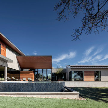 Matt Fajkus Architecture
The Control/Shift House is perched on the high side of the site which takes advantage of the view to the southeast. A gradual descending path navigates the change in terrain from the street to the entry of the house. A series of low retaining walls/planter beds gather and release the earth upon the descent resulting in a fairly flat level for the house to sit on the top one third of the site. The entry axis is aligned with the celebrated stair volume and then re-centers on the actual entry axis once you approach the forecourt of the house.
The initial desire was for an “H” scheme house with common entertaining spaces bridging the gap between the more private spaces. After an investigation considering the site, program, and view, a key move was made: unfold the east wing of the “H” scheme to open all rooms to the southeast view resulting in a “T” scheme. The new derivation allows for both a swim pool which is on axis with the entry and main gathering space and a lap pool which occurs on the cross axis extending along the lengthy edge of the master suite, providing direct access for morning exercise and a view of the water throughout the day.
The Control/Shift House was derived from a clever way of following the “rules.” Strict HOA guidelines required very specific exterior massing restrictions which limits the lengths of unbroken elevations and promotes varying sizes of masses. The solution most often used in this neighborhood is one of addition - an aggregation of masses and program randomly attached to the inner core of the house which often results in a parasitic plan. The approach taken with the Control/Shift House was to push and pull program/massing to delineate and define the layout of the house. Massing is intentional and reiterated by the careful selection of materiality that tracks through the house. Voids and relief in the plan are a natural result of this method and allow for light and air to circulate throughout every space of the house, even into the most inner core.
Photography: Charles Davis Smith
 Granit Architects + Interiors
The brief:
Our clients own an apartment in a mansion block overlooking Clapham Common. They wanted to modernise and bring the apartment up to date and had a few goals:
To change the existing small cellular spaces in the apartment to create a new open-plan room
To extend into the loft and create a new master bedroom suite
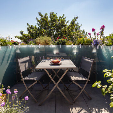
To create a roof terrace for some much-needed private outdoor space
The key to the brief was to ensure a good connection between the different levels of the apartment and ensure natural light could flood into all spaces. The apartment is in a conservation area, which was an important consideration.
The solution:
We changed the primary room space to run from the front to the back of the building. This change created the large kitchen dining living space our clients wanted, an area with good natural light throughout and at all times of the day.
We created a master bedroom suite in the loft space, with generous room size and lots of natural light.
The limitations of the building’s form meant that a critical aspect to creating these larger living spaces was carefully considered smaller areas, including the bathrooms and a pocket utility room. The circulation space was carefully considered, too, with the landings used for storage in the form of new joinery.
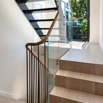
The stairs were vital in the design. Creating an in-between/half level meant we made the most of the flat roof extension for a bedroom suite and terrace. It also helped natural light get into the centre of the apartment, creating a clear connection between the different floors.
The stairs also help to mark the difference between the existing and the new. We shifted the design from a minimalist take on traditional metal balustraded stairs to open tread steel stairs with a glazed balustrade.
Externally, we kept the design quite simple and in keeping with the context. By adding dormers to the front and back, we created a sculptural and fun loft space.
The result:
A spacious, light and luxurious apartment for our clients Gareth and Mary in a Clapham Common Conservation area.
We asked about their experience with Granit, and we are pleased with their response:
Our experience overall is very good, even with the unexpected difficulties created by Covid.
If you are thinking of appointing an architect and interior design firm, Granit should be seriously considered.
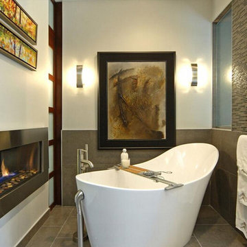
 Art Fireplace Technology Limited
With a super modern design and dimension, the central part of the AF66 bioethonal fireplace insert allows the flames to develop freely and in a very natural way without constraints. The intermediate solution for a dynamic fire which remains compatible with the medium-sized rooms.Really great for modern home interior design decorations.Share Leisure time and happiness with family.I believe it is Magic!!!


 Battery Island Lighthouse Limited
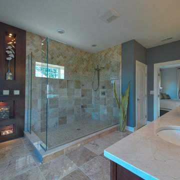
Drop-in bathtub - large traditional master black and white tile and marble tile marble floor, multicolored floor and double-sink drop-in bathtub idea in Charleston with raised-panel cabinets, brown cabinets, quartz countertops, a hinged shower door, white countertops, a niche and a freestanding vanity
 Grandeur Hills Group,Inc.
Inspiration for a large contemporary light wood floor and beige floor hallway remodel in New York with white walls
 Granit Architects + Interiors
The brief:
Our clients own an apartment in a mansion block overlooking Clapham Common. They wanted to modernise and bring the apartment up to date and had a few goals:
To change the existing small cellular spaces in the apartment to create a new open-plan room
To extend into the loft and create a new master bedroom suite
To create a roof terrace for some much-needed private outdoor space
The key to the brief was to ensure a good connection between the different levels of the apartment and ensure natural light could flood into all spaces. The apartment is in a conservation area, which was an important consideration.
The solution:
We changed the primary room space to run from the front to the back of the building. This change created the large kitchen dining living space our clients wanted, an area with good natural light throughout and at all times of the day.
We created a master bedroom suite in the loft space, with generous room size and lots of natural light.
The limitations of the building’s form meant that a critical aspect to creating these larger living spaces was carefully considered smaller areas, including the bathrooms and a pocket utility room. The circulation space was carefully considered, too, with the landings used for storage in the form of new joinery.
The stairs were vital in the design. Creating an in-between/half level meant we made the most of the flat roof extension for a bedroom suite and terrace. It also helped natural light get into the centre of the apartment, creating a clear connection between the different floors.
The stairs also help to mark the difference between the existing and the new. We shifted the design from a minimalist take on traditional metal balustraded stairs to open tread steel stairs with a glazed balustrade.
Externally, we kept the design quite simple and in keeping with the context. By adding dormers to the front and back, we created a sculptural and fun loft space.
The result:
A spacious, light and luxurious apartment for our clients Gareth and Mary in a Clapham Common Conservation area.
We asked about their experience with Granit, and we are pleased with their response:
Our experience overall is very good, even with the unexpected difficulties created by Covid.
If you are thinking of appointing an architect and interior design firm, Granit should be seriously considered.
138