
Search results for "Master originally" in Home Design Ideas
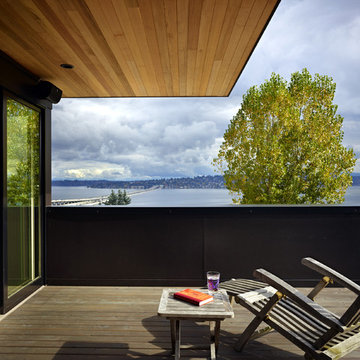
 chadbourne + doss architects
The roof deck of the Cycle House by chadbourne + doss architects includes a cantilevered roof that provides covered space for outdoor lounging.
photo by Benjamin Benschneider
 Klopf Architecture
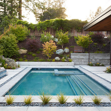
Klopf Architecture, Arterra Landscape Architects and Henry Calvert of Calvert Ventures Designed and built a new warm, modern, Eichler-inspired, open, indoor-outdoor home on a deeper-than-usual San Mateo Highlands property where an original Eichler house had burned to the ground.
The owners wanted multi-generational living and larger spaces than the original home offered, but all parties agreed that the house should respect the neighborhood and blend in stylistically with the other Eichlers. At first the Klopf team considered re-using what little was left of the original home and expanding on it. But after discussions with the owner and builder, all parties agreed that the last few remaining elements of the house were not practical to re-use, so Klopf Architecture designed a new home that pushes the Eichler approach in new directions.
One disadvantage of Eichler production homes is that the house designs were not optimized for each specific lot. A new custom home offered the team a chance to start over. In this case, a longer house that opens up sideways to the south fit the lot better than the original square-ish house that used to open to the rear (west). Accordingly, the Klopf team designed an L-shaped “bar” house with a large glass wall with large sliding glass doors that faces sideways instead of to the rear like a typical Eichler. This glass wall opens to a pool and landscaped yard designed by Arterra Landscape Architects.
Driving by the house, one might assume at first glance it is an Eichler because of the horizontality, the overhanging flat roof eaves, the dark gray vertical siding, and orange solid panel front door, but the house is designed for the 21st Century and is not meant to be a “Likeler.” You won't see any posts and beams in this home. Instead, the ceiling decking is a western red cedar that covers over all the beams. Like Eichlers, this cedar runs continuously from inside to out, enhancing the indoor / outdoor feeling of the house, but unlike Eichlers it conceals a cavity for lighting, wiring, and insulation. Ceilings are higher, rooms are larger and more open, the master bathroom is light-filled and more generous, with a separate tub and shower and a separate toilet compartment, and there is plenty of storage. The garage even easily fits two of today's vehicles with room to spare.
A massive 49-foot by 12-foot wall of glass and the continuity of materials from inside to outside enhance the inside-outside living concept, so the owners and their guests can flow freely from house to pool deck to BBQ to pool and back.
During construction in the rough framing stage, Klopf thought the front of the house appeared too tall even though the house had looked right in the design renderings (probably because the house is uphill from the street). So Klopf Architecture paid the framer to change the roofline from how we had designed it to be lower along the front, allowing the home to blend in better with the neighborhood. One project goal was for people driving up the street to pass the home without immediately noticing there is an "imposter" on this lot, and making that change was essential to achieve that goal.
This 2,606 square foot, 3 bedroom, 3 bathroom Eichler-inspired new house is located in San Mateo in the heart of the Silicon Valley.
Klopf Architecture Project Team: John Klopf, AIA, Klara Kevane
Landscape Architect: Arterra Landscape Architects
Contractor: Henry Calvert of Calvert Ventures
Photography ©2016 Mariko Reed
Location: San Mateo, CA
Year completed: 2016
 Barley|Pfeiffer Architecture
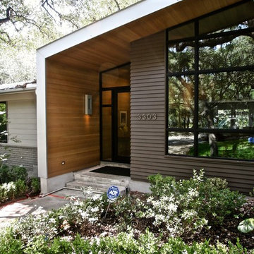
This 60's Style Ranch home was recently remodeled to withhold the Barley Pfeiffer standard. This home features large 8' vaulted ceilings, accented with stunning premium white oak wood. The large steel-frame windows and front door allow for the infiltration of natural light; specifically designed to let light in without heating the house. The fireplace is original to the home, but has been resurfaced with hand troweled plaster. Special design features include the rising master bath mirror to allow for additional storage.
Photo By: Alan Barley
Find the right local pro for your project
 Melinamade - Residential Design + Interiors
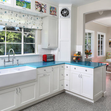
A remodeled retro kitchen mixed with a few original architectural elements of this Spanish home. Highlights here are aqua glazed lava stone counter tops, custom designed hand silk-screened fabrics, and children's art inside the upper cabinet panels. To know more about this makeover, please read the "Houzz Tour" feature article here: http://www.houzz.com/ideabooks/32975037/list/houzz-tour-midcentury-meets-mediterranean-in-california
Bernard Andre photography.
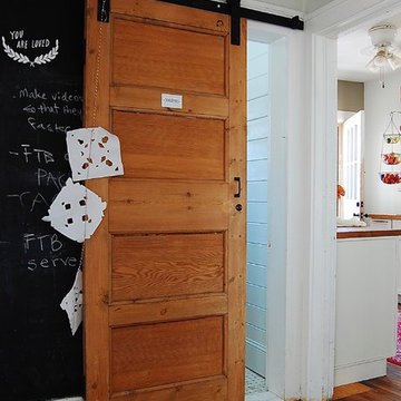

 HSH Interiors
David Duncan Livingston
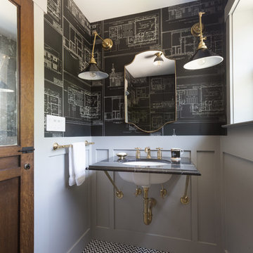
Small transitional black tile, white tile and black and white tile mosaic tile floor powder room photo in San Francisco with marble countertops, gray walls and an undermount sink
Small transitional black tile, white tile and black and white tile mosaic tile floor powder room photo in San Francisco with marble countertops, gray walls and an undermount sink
 Kukk Architecture & Design
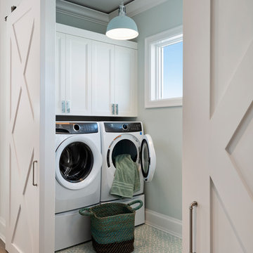
Transitional blue floor dedicated laundry room photo in Miami with recessed-panel cabinets, white cabinets, gray walls and a side-by-side washer/dryer

 NV Kitchen and Bath (D.M.V)
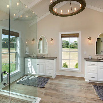
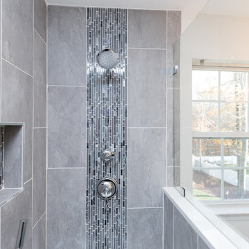
Example of a mid-sized trendy master gray tile and porcelain tile marble floor freestanding bathtub design in DC Metro with dark wood cabinets, white walls, an undermount sink, shaker cabinets, a two-piece toilet and quartz countertops
 kimberly peck architect
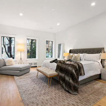
When the developer found this brownstone on the Upper Westside he immediately researched and found its potential for expansion. We were hired to maximize the existing brownstone and turn it from its current existence as 5 individual apartments into a large luxury single family home. The existing building was extended 16 feet into the rear yard and a new sixth story was added along with an occupied roof. The project was not a complete gut renovation, the character of the parlor floor was maintained, along with the original front facade, windows, shutters, and fireplaces throughout. A new solid oak stair was built from the garden floor to the roof in conjunction with a small supplemental passenger elevator directly adjacent to the staircase. The new brick rear facade features oversized windows; one special aspect of which is the folding window wall at the ground level that can be completely opened to the garden. The goal to keep the original character of the brownstone yet to update it with modern touches can be seen throughout the house. The large kitchen has Italian lacquer cabinetry with walnut and glass accents, white quartz counters and backsplash and a Calcutta gold arabesque mosaic accent wall. On the parlor floor a custom wetbar, large closet and powder room are housed in a new floor to ceiling wood paneled core. The master bathroom contains a large freestanding tub, a glass enclosed white marbled steam shower, and grey wood vanities accented by a white marble floral mosaic. The new forth floor front room is highlighted by a unique sloped skylight that offers wide skyline views. The house is topped off with a glass stair enclosure that contains an integrated window seat offering views of the roof and an intimate space to relax in the sun.
 Sweetlake Interior Design LLC
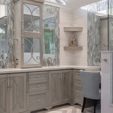
This is an older house in Rice University that needed an updated master bathroom. The original shower was only 36" x 36". Spa Bath Renovation Spring 2014, Design and build. We moved the tub, shower and toilet to different locations to make the bathroom look more organized. We used pure white Caeserstone countertops, Hansgrohe Metris faucet, glass mosaic tile (Daltile - City Lights), stand silver 12 x 24 porcelain floor cut into 4 x 24 strips to make the chevron pattern on the floor, shower glass panel, shower niche, rain shower head, wet bath floating tub. Custom cabinets in a grey stain with mirror doors and circle overlays. The tower in center features charging station for toothbrushes, iPADs, and cell phones. Spacious Spa Bath. TV in bathroom, large chandelier in bathroom. Half circle cabinet doors with mirrors. Anther chandelier in a master bathroom. Zig zag tile design, zig zag how to do floor, how to do a zig tag tile floor, chevron tile floor, zig zag floor cut tile, chevron floor cut tile, chevron tile pattern, how to make a tile chevron floor pattern, zig zag tile floor pattern.
 Jensen C. Vasil Architect PC
Jennifer Brown
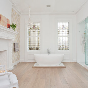
Example of a large ornate master light wood floor freestanding bathtub design in New York with a vessel sink, white walls, flat-panel cabinets and light wood cabinets
Example of a large ornate master light wood floor freestanding bathtub design in New York with a vessel sink, white walls, flat-panel cabinets and light wood cabinets
 Hudson Place Realty
Property Marketed by Hudson Place Realty - Seldom seen, this unique property offers the highest level of original period detail and old world craftsmanship. With its 19th century provenance, 6000+ square feet and outstanding architectural elements, 913 Hudson Street captures the essence of its prominent address and rich history. An extensive and thoughtful renovation has revived this exceptional home to its original elegance while being mindful of the modern-day urban family.
Perched on eastern Hudson Street, 913 impresses with its 33’ wide lot, terraced front yard, original iron doors and gates, a turreted limestone facade and distinctive mansard roof. The private walled-in rear yard features a fabulous outdoor kitchen complete with gas grill, refrigeration and storage drawers. The generous side yard allows for 3 sides of windows, infusing the home with natural light.
The 21st century design conveniently features the kitchen, living & dining rooms on the parlor floor, that suits both elaborate entertaining and a more private, intimate lifestyle. Dramatic double doors lead you to the formal living room replete with a stately gas fireplace with original tile surround, an adjoining center sitting room with bay window and grand formal dining room.
A made-to-order kitchen showcases classic cream cabinetry, 48” Wolf range with pot filler, SubZero refrigerator and Miele dishwasher. A large center island houses a Decor warming drawer, additional under-counter refrigerator and freezer and secondary prep sink. Additional walk-in pantry and powder room complete the parlor floor.
The 3rd floor Master retreat features a sitting room, dressing hall with 5 double closets and laundry center, en suite fitness room and calming master bath; magnificently appointed with steam shower, BainUltra tub and marble tile with inset mosaics.
Truly a one-of-a-kind home with custom milled doors, restored ceiling medallions, original inlaid flooring, regal moldings, central vacuum, touch screen home automation and sound system, 4 zone central air conditioning & 10 zone radiant heat.
 Klopf Architecture
Klopf Architecture, Arterra Landscape Architects and Henry Calvert of Calvert Ventures Designed and built a new warm, modern, Eichler-inspired, open, indoor-outdoor home on a deeper-than-usual San Mateo Highlands property where an original Eichler house had burned to the ground.
The owners wanted multi-generational living and larger spaces than the original home offered, but all parties agreed that the house should respect the neighborhood and blend in stylistically with the other Eichlers. At first the Klopf team considered re-using what little was left of the original home and expanding on it. But after discussions with the owner and builder, all parties agreed that the last few remaining elements of the house were not practical to re-use, so Klopf Architecture designed a new home that pushes the Eichler approach in new directions.
One disadvantage of Eichler production homes is that the house designs were not optimized for each specific lot. A new custom home offered the team a chance to start over. In this case, a longer house that opens up sideways to the south fit the lot better than the original square-ish house that used to open to the rear (west). Accordingly, the Klopf team designed an L-shaped “bar” house with a large glass wall with large sliding glass doors that faces sideways instead of to the rear like a typical Eichler. This glass wall opens to a pool and landscaped yard designed by Arterra Landscape Architects.
Driving by the house, one might assume at first glance it is an Eichler because of the horizontality, the overhanging flat roof eaves, the dark gray vertical siding, and orange solid panel front door, but the house is designed for the 21st Century and is not meant to be a “Likeler.” You won't see any posts and beams in this home. Instead, the ceiling decking is a western red cedar that covers over all the beams. Like Eichlers, this cedar runs continuously from inside to out, enhancing the indoor / outdoor feeling of the house, but unlike Eichlers it conceals a cavity for lighting, wiring, and insulation. Ceilings are higher, rooms are larger and more open, the master bathroom is light-filled and more generous, with a separate tub and shower and a separate toilet compartment, and there is plenty of storage. The garage even easily fits two of today's vehicles with room to spare.
A massive 49-foot by 12-foot wall of glass and the continuity of materials from inside to outside enhance the inside-outside living concept, so the owners and their guests can flow freely from house to pool deck to BBQ to pool and back.
During construction in the rough framing stage, Klopf thought the front of the house appeared too tall even though the house had looked right in the design renderings (probably because the house is uphill from the street). So Klopf Architecture paid the framer to change the roofline from how we had designed it to be lower along the front, allowing the home to blend in better with the neighborhood. One project goal was for people driving up the street to pass the home without immediately noticing there is an "imposter" on this lot, and making that change was essential to achieve that goal.
This 2,606 square foot, 3 bedroom, 3 bathroom Eichler-inspired new house is located in San Mateo in the heart of the Silicon Valley.
Klopf Architecture Project Team: John Klopf, AIA, Klara Kevane
Landscape Architect: Arterra Landscape Architects
Contractor: Henry Calvert of Calvert Ventures
Photography ©2016 Mariko Reed
Location: San Mateo, CA
Year completed: 2016

 Edmunds Studios Photography, Inc.
Edmunds Studios Photography
Warren Barnett Interiors
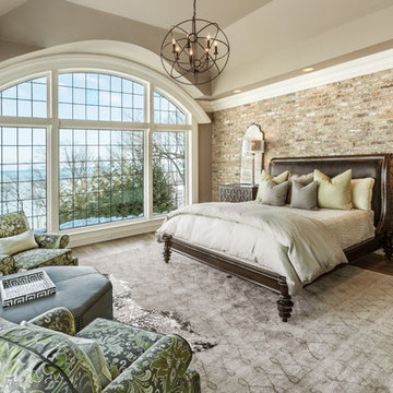
Example of a large classic master medium tone wood floor bedroom design in Milwaukee with brown walls and no fireplace
Example of a large classic master medium tone wood floor bedroom design in Milwaukee with brown walls and no fireplace
 Gardner Architects LLC
Photography by Jim Tetro
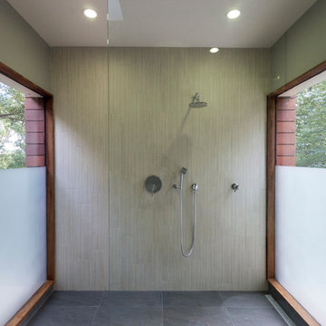
This house, built in the 1960s, sits southfacing on a terrific wooded lot in Bethesda, Maryland.
The owners desire a whole-house renovation which would improve the general building fabric and systems, and extend the sense of living out of doors in all seasons.
The original sixties-modern character is preserved and the renovation extends the design forward into a contemporary, modern approach. Connections to and through the site are enhanced through the creation of new larger window and door openings.
Screened porches and decks perch above the sloped and wooded site. The new kitchen and bathrooms allow for opportunities to feel out-of -doors while preparing, cooking, dining, and bathing.
Smart passive strategies guide the environmental choices for this project, including envelope improvements, updated mechanical systems, and on-site stormwater management.
 Haven Design and Construction
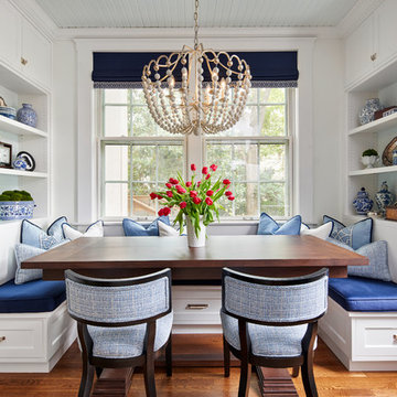
This 1902 San Antonio home was beautiful both inside and out, except for the kitchen, which was dark and dated. The original kitchen layout consisted of a breakfast room and a small kitchen separated by a wall. There was also a very small screened in porch off of the kitchen. The homeowners dreamed of a light and bright new kitchen and that would accommodate a 48" gas range, built in refrigerator, an island and a walk in pantry. At first, it seemed almost impossible, but with a little imagination, we were able to give them every item on their wish list. We took down the wall separating the breakfast and kitchen areas, recessed the new Subzero refrigerator under the stairs, and turned the tiny screened porch into a walk in pantry with a gorgeous blue and white tile floor. The french doors in the breakfast area were replaced with a single transom door to mirror the door to the pantry. The new transoms make quite a statement on either side of the 48" Wolf range set against a marble tile wall. A lovely banquette area was created where the old breakfast table once was and is now graced by a lovely beaded chandelier. Pillows in shades of blue and white and a custom walnut table complete the cozy nook. The soapstone island with a walnut butcher block seating area adds warmth and character to the space. The navy barstools with chrome nailhead trim echo the design of the transoms and repeat the navy and chrome detailing on the custom range hood. A 42" Shaws farmhouse sink completes the kitchen work triangle. Off of the kitchen, the small hallway to the dining room got a facelift, as well. We added a decorative china cabinet and mirrored doors to the homeowner's storage closet to provide light and character to the passageway. After the project was completed, the homeowners told us that "this kitchen was the one that our historic house was always meant to have." There is no greater reward for what we do than that.
 JWT Associates
Lee Manning Photography
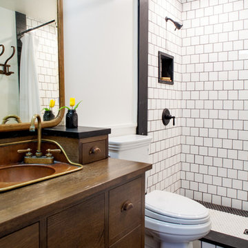
Example of a mid-sized cottage 3/4 ceramic tile and black and white tile mosaic tile floor alcove shower design in Los Angeles with a drop-in sink, dark wood cabinets, wood countertops, a two-piece toilet, white walls, brown countertops and flat-panel cabinets
Example of a mid-sized cottage 3/4 ceramic tile and black and white tile mosaic tile floor alcove shower design in Los Angeles with a drop-in sink, dark wood cabinets, wood countertops, a two-piece toilet, white walls, brown countertops and flat-panel cabinets
 Amanda Martocchio Architecture
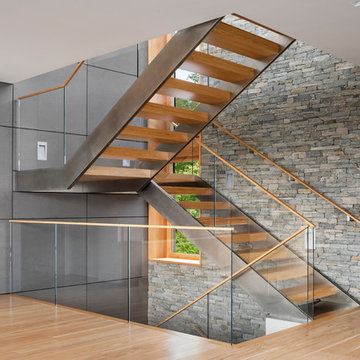
When a world class sailing champion approached us to design a Newport home for his family, with lodging for his sailing crew, we set out to create a clean, light-filled modern home that would integrate with the natural surroundings of the waterfront property, and respect the character of the historic district.
Our approach was to make the marine landscape an integral feature throughout the home. One hundred eighty degree views of the ocean from the top floors are the result of the pinwheel massing. The home is designed as an extension of the curvilinear approach to the property through the woods and reflects the gentle undulating waterline of the adjacent saltwater marsh. Floodplain regulations dictated that the primary occupied spaces be located significantly above grade; accordingly, we designed the first and second floors on a stone “plinth” above a walk-out basement with ample storage for sailing equipment. The curved stone base slopes to grade and houses the shallow entry stair, while the same stone clads the interior’s vertical core to the roof, along which the wood, glass and stainless steel stair ascends to the upper level.
One critical programmatic requirement was enough sleeping space for the sailing crew, and informal party spaces for the end of race-day gatherings. The private master suite is situated on one side of the public central volume, giving the homeowners views of approaching visitors. A “bedroom bar,” designed to accommodate a full house of guests, emerges from the other side of the central volume, and serves as a backdrop for the infinity pool and the cove beyond.
Also essential to the design process was ecological sensitivity and stewardship. The wetlands of the adjacent saltwater marsh were designed to be restored; an extensive geo-thermal heating and cooling system was implemented; low carbon footprint materials and permeable surfaces were used where possible. Native and non-invasive plant species were utilized in the landscape. The abundance of windows and glass railings maximize views of the landscape, and, in deference to the adjacent bird sanctuary, bird-friendly glazing was used throughout.
Photo: Michael Moran/OTTO Photography
 Karla Trincanello, CID, Interior Decisions, Inc.
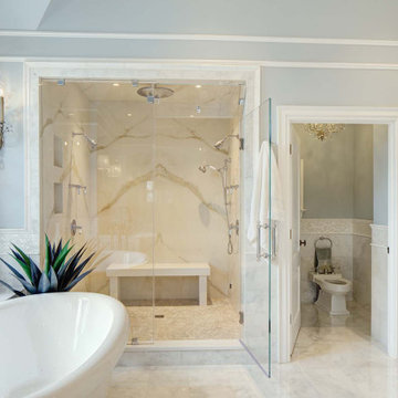
This well used but dreary bathroom was ready for an update but this time, materials were selected that not only looked great but would stand the test of time. The large steam shower (6x6') was like a dark cave with one glass door allowing light. To create a brighter shower space and the feel of an even larger shower, the wall was removed and full glass panels now allowed full sunlight streaming into the shower which avoids the growth of mold and mildew in this newly brighter space which also expands the bathroom by showing all the spaces. Originally the dark shower was permeated with cracks in the marble marble material and bench seat so mold and mildew had a home. The designer specified Porcelain slabs for a carefree un-penetrable material that had fewer grouted seams and added luxury to the new bath. Although Quartz is a hard material and fine to use in a shower, it is not suggested for steam showers because there is some porosity. A free standing bench was fabricated from quartz which works well. A new free
standing, hydrotherapy tub was installed allowing more free space around the tub area and instilling luxury with the use of beautiful marble for the walls and flooring. A lovely crystal chandelier emphasizes the height of the room and the lovely tall window.. Two smaller vanities were replaced by a larger U shaped vanity allotting two corner lazy susan cabinets for storing larger items. The center cabinet was used to store 3 laundry bins that roll out, one for towels and one for his and one for her delicates. Normally this space would be a makeup dressing table but since we were able to design a large one in her closet, she felt laundry bins were more needed in this bathroom. Instead of constructing a closet in the bathroom, the designer suggested an elegant glass front French Armoire to not encumber the space with a wall for the closet.The new bathroom is stunning and stops the heart on entering with all the luxurious amenities.
 Advance Design Studio, Ltd.
After six years of living in their Huntley IL home, Chris and Meghan were tired of their dark, dingy, outdated kitchen and it was finally time for a long-anticipated change. “The kitchen is the place where we live, it’s where we do everything,” Meghan said. “It was important that it be a space where we wanted to be.” Meghan loves cooking and enjoys including their girls in healthy meal prepping, this led them to want a brighter, more enjoyable kitchen with increased functionality and improved storage.
For Chris especially, the laundry room was an entirely dysfunctional eyesore. “We had a washer and a dryer, but it was all kind-of cobbled together!” Chris said. “There were always laundry piles everywhere, we weren’t really sure what we wanted to do in there, but it was time for us to make a change.” The mess of the space was stressful every time they walked in the door from the garage each day. Kids’ backpacks and shoes piled up haphazardly in the makeshift boot-bench closet left the family feeling disorganized and stressed. They needed space for folding clothes and locker cubbies to help keep the family organized.
Having known Christine and Todd in the Huntley community for years, Chris and Meghan were familiar with their work. “We already trusted them personally and having seen their projects for years we knew they did top notch work. After we reviewed the initial round of designs, we knew that hiring them was definitely the right choice,” Meghan and Chris said. Although Chris had done a lot of work in their home himself, the kitchen and laundry room renovation was such a large undertaking that he didn’t want to steal time away from his family to spend what would surely be many long weekends doing the job himself. “That would not have been a wise choice for us,” Chris laughed.
“Our designer, Michelle was very, very, easy to work with; anything we wanted to see or weren’t sure about, she went above and beyond to make this easy for us. She was easy to get hold of and always quick to respond,” the couple said. Michelle pulled ideas that mirrored the couple’s taste and style and was adept at directing the couple to limited choices that didn’t overwhelm them and kept the process moving. “I have a hard time making decisions. Michelle made the decision-making process so easy. I loved how she listened to what I liked and then presented three great options for me to choose from,” Meghan said.
The main objectives for the kitchen were better storage solutions, they wanted the space to reflect their lifestyle and taste, and they wanted it to last for years with low maintenance. One of the first steps in creating a more functional kitchen was relocating the refrigerator, creating an improved workflow for the busy family.
“We didn’t know that we could even move the refrigerator to a new location where it is now, that was something that we never would have thought of,” Chris said. “The new refrigerator location makes the kitchen feel so much bigger. We didn’t add any space, but our whole kitchen with the new design just seems like it’s so much larger than before!” Meghan said.
The perimeter mist colored cabinets helped warm and brighten the entire room, while the graphite colored cabinets on the island added contrast. Using this fresh, clean color palette satisfied the couple’s desire for a bright space that was the exact opposite of what they had before. Organization accessories were also added to the cabinets such as a spice drawer tray and roll outs to create hidden convenience.
“I absolutely love the hidden spices – it makes cooking so much more enjoyable!” Chris said. “And all the pull outs, and the double trash bin, who would think you could get so excited about organization!” the couple said in unison.
One thing they hated in their original kitchen was how dark the space felt. Added lighting on the ceiling with the new light fixtures combined with the lighter cabinetry colors throughout solved this problem. “Our new kitchen has this warm, almost cozy feeling that our old kitchen never had, it’s just a space that I love spending my time in now,” Meghan said. The light airy feeling was accentuated with the use of floating white shelves on either side of the decorative range hood. “We have so much cabinetry space, the new design is amazing we actually have more storage space than we will ever need,” Meghan said.
The island was extended to create more work surface and added space for stool seating. “The new island changes how we live. Now the kids can be in the kitchen with us, doing homework, eating breakfast, and the three of us have special dinners there when Chris is working late,” Meghan said.
The Carrara Marmi Quartz countertops were chosen because they are, not only beautiful, but are made from hard-working material that doesn’t require maintenance. The white subway tile backsplash that wraps to the ceiling behind the focal point cooktop range/hood compliments the crisp white countertops perfectly, while brushed brass hardware and light fixtures keep the design fresh and new.
The couple had a few fears at the beginning of the project, as most homeowners do. Their biggest fear was being out of their kitchen and laundry room for an extended time. The crew made it very easy for the family to work in a limited space keeping the washer and dryer hooked up the majority of the time, and also getting appliances working with minimal downtime.
“They above and beyond accommodated us to get us through the process,” Meghan said. “They did a great job making sure we were as comfortable as possible throughout the process,” Chris added.
“Our project manager DJ did a great job. He was very good at updating us on schedule changes, getting guys in as quickly as possible. Everyone that stepped in the house was nice and did great work,” said Chris. They thought Advance’s carpenter was phenomenal and were impressed when he took a conceptual idea from a photograph and worked with designer Michelle to create a one of a kind range/hood that has become the topic of conversation with friends and family who visit the new kitchen. “He was in our house literally every day for several weeks. He was easy to work with and good at what he did,” Meghan and Chris said.
The focal point of the kitchen; a hand-crafted, custom-built ventilation hood was clad with handpicked reclaimed barnwood. Advance Design’s carpenter built the framework and the cladding to create a one-of-a-kind design element that the couple loves.
“I think it was especially fun for him to create something unique from scratch, showcasing his talent in this area,” Meghan said. “I love that my kitchen is not like everyone else’s. I got to pick out the wood on my hood and watch it being built and was able to choose what pieces of wood went where on it. It’s totally unique.”
Red Oak flooring was toothed-in throughout the kitchen and the rest of the first floor anywhere changes were made. Then the whole floor was refinished to tone down the orange undertones in the existing floor stain, ultimately changing the color complexion of the entire first floor. The result is a completely new feeling to the entire home.
Renovating the laundry room was extremely important to Meghan and Chris, but they had trouble visualizing what the possibilities were for the seemingly small space. Michelle produced beautiful 3D illustrations that helped them envision the space in a whole new way.
“I must have told Michelle 100 times that I am a visual person, seeing the designs in 3D made it so easy to make decisions and see what we could really do with our space,” Meghan said.
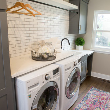
A dividing wall and doorway were removed between the existing laundry room and hallway formerly containing a coat closet, providing space to design specialized graphite colored cabinetry matching the kitchen island to house custom storage cubbies for each family member. Adding the tall utility cabinetry in the new laundry area helped solve the storage issue, tucking away cleaning supplies, household items, and even the cat got its own cubby.
“I love how everything is now hidden in its own space. I can’t tell you how much I hated coming home and seeing everything sitting around on counters,” Chris said.
Electrical outlets were planned for the inside of utility cabinets, so devices could charge in hidden locations. Stacking the washer and dryer allowed for wider countertop space to provide a folding area and a special space for clothes to hang. “The way I do laundry has been completely transformed! I can actually fold clothes and hang them now right out of the washer and dryer,” Meghan said.
“The end result in the kitchen and the laundry/mud room was an updated light and bright space, with a smarter work flow that better meets the needs of this family,” Michelle said.
“I would totally recommend Advance Design,” Meghan said. “Sometimes I sit and just look at my kitchen and laundry room and think ‘Wow, I can’t believe I get to live here!’ It’s an understatement to say we love our new space.”
18