
Search results for "Maximized" in Home Design Ideas
 Schumacher Homes
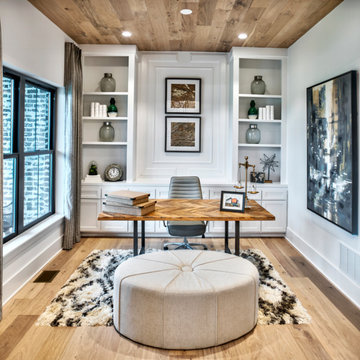
Built by Schumacher Homes, America's Largest Custom Home Builder, this stunning Charleston Modern Farmhouse model home in Louisville, Kentucky, effortlessly balances classic rustic architecture with contemporary modern design elements. As one of our most popular customizable floor plans, the Charleston open-concept layout maximizes both smart storage and everyday livability. The heart of the home features a gourmet chef’s kitchen equipped with expansive counter space, a large central island to gather around, and a massive walk-in pantry that ensures a highly organized, clutter-free workspace. Elevating the culinary space, a spectacular custom feature ceiling provides a classic, timeless architectural detail that serves as a gorgeous focal point above the kitchen island. For the remote professional, a dedicated home office is outfitted with beautiful custom built-in cabinets and open shelving, creating a productive, stylish, and organized work-from-home space.
Tucked away off the main living zone, a quiet pocket office offers additional organization space just before leading into the private owner's retreat. This primary suite serves as the ultimate sanctuary, boasting two large walk-in closets and a deluxe owner's bath designed with an oversized custom tile walk-in shower—offering a spa-like escape right at home. Designed with a split-bedroom layout to maximize privacy, the additional spacious bedrooms sit on the opposite side of the home, ensuring children or guests enjoy their own dedicated space. Blending highly sought-after modern farmhouse curb appeal with custom interior craftsmanship, this home provides endless inspiration for families looking to build their dream home.
 Cantoni Irvine
When Irvine designer, Richard Bustos’ client decided to remodel his Orange County 4,900 square foot home into a contemporary space, he immediately thought of Cantoni. His main concern though was based on the assumption that our luxurious modern furnishings came with an equally luxurious price tag. It was only after a visit to our Irvine store, where the client and Richard connected that the client realized our extensive collection of furniture and accessories was well within his reach.
“Richard was very thorough and straight forward as far as pricing,” says the client. "I became very intrigued that he was able to offer high quality products that I was looking for within my budget.”
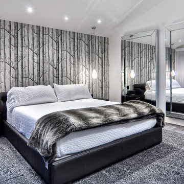
The next phases of the project involved looking over floor plans and discussing the client’s vision as far as design. The goal was to create a comfortable, yet stylish and modern layout for the client, his wife, and their three kids. In addition to creating a cozy and contemporary space, the client wanted his home to exude a tranquil atmosphere. Drawing most of his inspiration from Houzz, (the leading online platform for home remodeling and design) the client incorporated a Zen-like ambiance through the distressed greyish brown flooring, organic bamboo wall art, and with Richard’s help, earthy wall coverings, found in both the master bedroom and bathroom.
Over the span of approximately two years, Richard helped his client accomplish his vision by selecting pieces of modern furniture that possessed the right colors, earthy tones, and textures so as to complement the home’s pre-existing features.
The first room the duo tackled was the great room, and later continued furnishing the kitchen and master bedroom. Living up to its billing, the great room not only opened up to a breathtaking view of the Newport coast, it also was one great space. Richard decided that the best option to maximize the space would be to break the room into two separate yet distinct areas for living and dining.
While exploring our online collections, the client discovered the Jasper Shag rug in a bold and vibrant green. The grassy green rug paired with the sleek Italian made Montecarlo glass dining table added just the right amount of color and texture to compliment the natural beauty of the bamboo sculpture. The client happily adds, “I’m always receiving complements on the green rug!”
Once the duo had completed the dining area, they worked on furnishing the living area, and later added pieces like the classic Renoir bed to the master bedroom and Crescent Console to the kitchen, which adds both balance and sophistication. The living room, also known as the family room was the central area where Richard’s client and his family would spend quality time. As a fellow family man, Richard understood that that meant creating an inviting space with comfortable and durable pieces of furniture that still possessed a modern flare. The client loved the look and design of the Mercer sectional. With Cantoni’s ability to customize furniture, Richard was able to special order the sectional in a fabric that was both durable and aesthetically pleasing.
Selecting the color scheme for the living room was also greatly influenced by the client’s pre-existing artwork as well as unique distressed floors. Richard recommended adding dark pieces of furniture as seen in the Mercer sectional along with the Viera area rug. He explains, “The darker colors and contrast of the rug’s material worked really well with the distressed wood floor.” Furthermore, the comfortable American Leather Recliner, which was customized in red leather not only maximized the space, but also tied in the client’s picturesque artwork beautifully. The client adds gratefully, “Richard was extremely helpful with color; He was great at seeing if I was taking it too far or not enough.”
It is apparent that Richard and his client made a great team. With the client’s passion for great design and Richard’s design expertise, together they transformed the home into a modern sanctuary. Working with this particular client was a very rewarding experience for Richard. He adds, “My client and his family were so easy and fun to work with. Their enthusiasm, focus, and involvement are what helped me bring their ideas to life. I think we created a unique environment that their entire family can enjoy for many years to come.”
https://www.cantoni.com/project/a-contemporary-sanctuary
 Kitchen Solvers of Grayslake
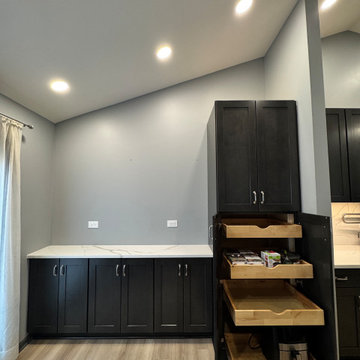
Before, this kitchen felt dated and lacked the functionality today’s homeowner needs. A bulky peninsula interrupted the flow, storage was limited, and the layout didn’t maximize usable workspace or reflect how the homeowner wanted to live in the space.
Now to the After… By removing the peninsula, we opened up the kitchen and extended the countertop along the window and wall, creating significantly more usable prep space and a brighter, more open feel. We also added a dedicated serving and pantry area along the dining room wall, giving the homeowner both additional storage and a functional space for entertaining.
This transitional kitchen remodel blends timeless design with modern functionality using all-new cabinetry in a rich Slate-stained finish on Birch wood with the sleek Catalina door style. The space is elevated with stunning Calacatta Laza quartz countertops and a full-height backsplash, creating a clean, seamless look that instantly modernizes the kitchen.
But this transformation isn’t just about looks. It is built for real life. Thoughtful upgrades like rollout shelves, a two-tier cutlery drawer, utensil and spice pullouts, a blind corner swing-out, and a double 50qt trash pullout maximize every inch of storage and make daily use effortless. The addition of solid maple floating shelves brings warmth and a custom, personalized touch.
The result is a kitchen that feels open, organized, and designed around how the homeowner actually lives. It is beautiful, functional, and perfect for everyday use and entertaining.
Find the right local pro for your project
 Gateway Kitchen + Bath
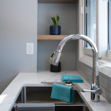
This custom kitchen renovation made use of what was once an eat-in area to maximize storage and cabinet space. The classic shaker-style cabinets in this kitchen design maximize longevity and keep the space looking bright and spacious.
 Powell Construction
This timeless mid-century ensuite bathroom was part of a large second-story addition completed for these homeowners. With a strong focus on both function and style, we prioritized ample storage while creating a serene and luxurious retreat. The design effortlessly unites classic elements with modern touches, resulting in a bathroom that is both practical and visually striking.
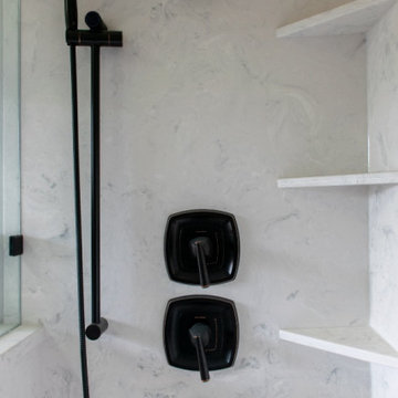
The spacious walk-in shower takes center stage, showcasing a sleek solid surface surround, a comfortable corner bench, and conveniently placed corner shelves to neatly store essentials. The frameless glass shower, paired with oil-rubbed bronze hardware, elevates the space with blend of modern refinement and timeless appeal.
The toilet closet, hidden with a pocket door, provides privacy while maintaining the open, airy feel of the space. The large double vanity, finished in a bold navy blue, adds a contemporary pop. It’s complemented by a crisp white quartz countertop and backsplash, which bring a refreshing brightness to the room.
To maximize natural light, a large window, skylight, and sun tunnel were thoughtfully integrated, filling the space with warmth and a sense of openness. The subtle shower surround, with its delicate interplay of white, grey, and blue hues, draws on the color palette throughout the room for a cohesive look.
The warm honey oak luxury vinyl plank floors add texture and durability, offering a waterproof solution that complements the rich oak wood doors and casing. These elements frame and ground the eye-catching navy cabinetry, balancing the room’s aesthetic with warmth and sophistication.
The completed design is a harmonious bathroom addition that combines luxury and functionality, maximizing space, light, and storage while maintaining classic elegance.
 Brooks + Scarpa Architects
The SIX is a 52-unit affordable housing project provides a home, support services and rehabilitation for disabled veterans. It is located in the MacArthur Park area of Los Angeles. McArthur Park has one of the highest densities in the USA with over 38,000 people per square mile and a total population of 120,000 people in 2.72 square miles.
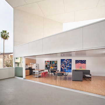
Offering shelter and comfort, the SIX breaks the prescriptive mold of the traditional shelter by creating public and private "zones" in which private space is deemphasized, in favor of large public areas. The organization of the space is intended to transform the way people live-away from a reclusive, isolating layout towards a community-oriented, interactive space.
The ground level contains offices, support spaces for the veterans, bike storage and parking while the second level has a large public courtyard. Surrounded by four levels of housing units with balconies wrapped with a wood screen made from recycle planking the courtyard has large openings with green roofs that visually connects the space to the street on the lower level beyond. This allows the tenants to enjoy a secured open space while still connecting to the larger community.
The uppermost level has a green roof, large public patio and edible garden with panoramic views of the area.
The SIX distinguishes itself from most conventionally developed projects in that it incorporates energy efficient measures that exceed standard practice, optimize building performance, and ensure reduced energy use during all phases of construction and occupancy. The planning and design emerged from close consideration and employment of passive design strategies. These strategies include: locating and orienting the building to control solar cooling loads; shaping and orienting the building for exposure to prevailing winds; shaping the building to induce buoyancy for natural ventilation; designing windows to maximize day lighting; shading south facing windows and minimizing west-facing glazing; designing windows to maximize natural ventilation; utilizing low flow fixtures and storm water management; shaping and planning the interior to enhance daylight and natural air flow distribution. These passive strategies alone make this building 50% more efficient than a conventionally designed structure.
 Alair Homes Plano
Our clients came to us wanting to maximize the space they had. They were not planning on moving anytime soon, as they loved their neighborhood. They wanted to renovate the front of their house, which included the front atrium, living room, kitchen, and powder bath. They hated their kitchen because it was completely closed off, had low ceilings, was dark and outdated, not to mention the floors were different in each of these rooms! The pantry was in the breakfast area and the kitchen table became a junk catcher, being the first thing you see when coming in from the garage/laundry room. In their living room, they wanted the spaces on either side of the fireplace to be symmetrical, whether that be bookshelves, a wet bar or closed off. Both parents are working professionals with no time and/or desire to design, create and figure this out on their own. They needed help figuring out how to reconfigure their current space in order to maximize what they already had, as they could not see an obvious solution. They could not envision how it would look so the fact that our designers were able to show them their new kitchen in 3D was pertinent.
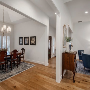
We removed the pass-through windows that surrounded the atrium and front dining room, as well as the entire kitchen wall, completely opening up those two rooms. We removed a hall that used to lead between the kitchen and the living room since it was a complete waste of space! The ceilings were raised to 10’ in the kitchen and we were able to leave the skylight, letting in that natural light they wanted. We were able to give them a much larger pantry with tons of shelving and increase the size of their laundry room by utilizing the space of their old breakfast nook.
We relocated the door to the garage into their new elongated laundry room, built a wet bar across from their new larger pantry (with a pocket door) and the flow and functionality of these new spaces is just perfect! All new Waypoint cabinets were installed one two main kitchen surrounding walls painted Linen. Calacatta Bianco Polished Porcelain Tile 4x12 was used for the backsplash. A large eat-at island was installed, painted Stone, where the family can now gather for homework, meals, and mingling. The soft champagne bronze hardware and accent lighting really give this white and gray kitchen a soft classic look.
In the living room, we removed the built-in bookshelves to the left of the fireplace and closed off the wet-bar on the other side, giving them more space in their master suite. White Oak wood flooring, stained Putney, was installed throughout the entire new space, giving it the continuity they were looking for.
In the guest bathroom, Carrara white herringbone marble mosaic 12x12 tile was used on the shower floor and niche, while basic marble Bianco polished 12x24 porcelain tile was used on the walls. Luxart polished chrome traditional hardware gives this timeless bathroom the perfect shine.
Our clients are so happy with the new functionality and look of their space. It has definitely changed their lives in a way they could have never imagined!

 Leicht Westchester-Greenwich
Designer: Goran Savic
Photographer: Zdravko Cota
IOS-M-Alpine Gray
Topos- Ash Madeira
Appliances-Miele
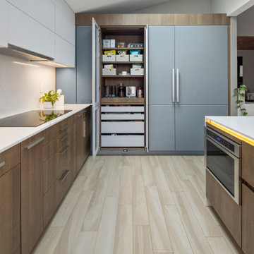
he European kitchen design gives the homeowner a perfect blend of high-end German engineering and sleek, architectural aesthetics. Leicht, renowned for its flawless contemporary look, stunning durable finishes, and integrated smart-storage systems, maximizes both spatial efficiency and visual minimalism beautifully.
The designer curates a mix of cabinet materials by assigning specific finishes to entire architectural blocks, resulting in a beautiful ambiance based on contemporary geometry. The design lines run continuously and all feels harmonious,, uncluttered, and inviting.
he European kitchen design gives the homeowner a perfect blend of high-end German engineering and sleek, architectural aesthetics. Leicht, renowned for its flawless contemporary look, stunning durable finishes, and integrated smart-storage systems, maximizes both spatial efficiency and visual minimalism beautifully.
The designer curates a mix of cabinet materials by assigning specific finishes to entire architectural blocks, resulting in a beautiful ambiance based on contemporary geometry. The design lines run continuously and all feels harmonious,, uncluttered, and inviting.
 George Ocampo
Lifestyle & Architecture!
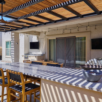
It was important to our clients that their outdoor living space matched their lifestyle! It was important to us that their new space also matched the architecture of their new home. Cool, contemporary, sophistcated & fun is what this space says without saying anything at all!!! Everything is better outside....now! Entertaining is easy! Cooling off in this custom spool is perfect
and when the weather starts to cool down...this oversized hot tub will be heating things up! 2" Smooth Limestone sawcut edge coping cubes the geometric lines of this contemporary spool. Elements accent tiles
enhances the black onyx pebble sheen pool finish along with led architectural pool light making this space light up! Watching shows from this pool is one of the best seats in this space...and watching shows at the bar or dining alfresco is a close second! Sitting under this custom shade structure is a must in this El Paso heat! Built to last with 1/4" steel & cedar slats. The custom outdoor kitchen, bar & serving station maximizes entertainment. This place has everything anyone would want! No need to go anywhere when you have a staycation in your own backyard! Designed to maximize our clients small space & built to last the test of time. 2" smooth limestone veneer, granite counter tops & stainless steel appliances add beauty & function! Plenty of space for parties...intimate vibe for private time. Whats your space say about you?
 Distinctive Interior Designs
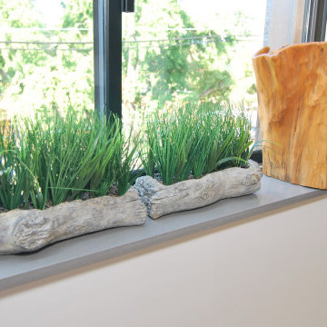
Inspiration for a small modern open concept medium tone wood floor and multicolored floor living room remodel in Philadelphia with white walls and a wall-mounted tv
 Windfall Lumber
This new custom house, completed in late 2012, was designed with an accessory dwelling unit to take advantage of an allowance in the single family zoning code in Seattle. The primary dwelling, 1300 square feet on the upper two stories houses a mother and teenager. The accessory dwelling, 750 square feet, provides a leasable smaller space that can be for a tenant or downsizing in the future.
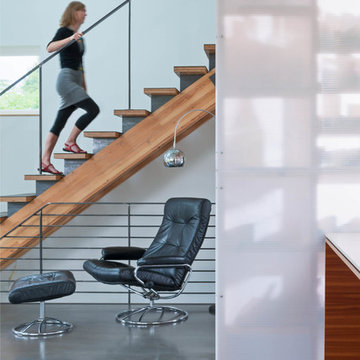
Seattle based RE Store began by completely deconstructing the original home so that its salvaged parts could have a new life in other design applications. The new design for the home is modern with a sustainable theme, incorporating a palette of natural materials. The Paperstone, wood and steel staircase connects the open-plan living, dining areas and kitchen to the upstairs bedrooms and open library. Exterior decks extend the main interior living spaces while sliding glass panels allow the primary bedroom to connect.
Stylishly visible from all rooms in the open interior living spaces are two complementary objects, both lit from within, a frosted lexan pantry and a slatted reclaimed fir bathroom, with wood sourced from Windfall Lumber. Throughout the home, finishes are simple and minimal: polished concrete flooring, bright-white walls, and formaldehyde-free sapele and maple cabinetry. The main kitchen is outfitted with Ecotop counters and a custom sapele wood island that has large, handle-free pullout drawers on the cooking side and a built-in wine rack on the other. Maximizing storage, a custom built-in apple plywood bench and open wooden box shelves provide extra space.
A model of efficiency, the home maximizes the performance of the envelope of the building. The reclaimed fir car decking wrapped around the exterior from Windfall Lumber, creates the rainscreen siding and is sourced locally from a deconstructed warehouse in Tacoma WA. In addition, access to daylight through high-performance glazing, solar preheat for domestic hot water needs, in-floor radiant heating and a green roof created by the owner adds to the efficiency.
Photo Credit & Design: b9 architects
URL
http://www.windfalllumber.com
Photographer: Ed Sozinho
 User
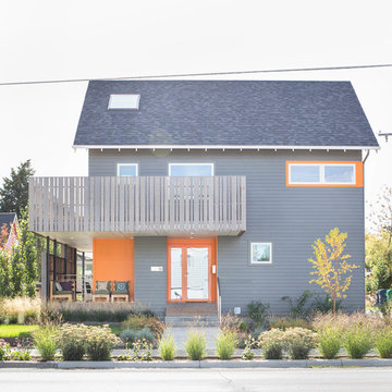
UserThis Bozeman, Montana tiny house residence blends an innovative use of space with high-performance Glo aluminum doors and proper building orientation. Situated specifically, taking advantage of the sun to power the Solar panels located on the southern side of the house. Careful consideration given to the floor plan allows this home to maximize space and keep the small footprint.
Full light exterior doors provide multiple access points across this house. The full lite entry doors provide plenty of natural light to this minimalist home. A full lite entry door adorned with a sidelite provide natural light for the cozy entrance.
This home uses stairs to connect the living spaces and bedrooms. The living and dining areas have soaring ceiling heights thanks to the inventive use of a loft above the kitchen. The living room space is optimized with a well placed window seat and the dining area bench provides comfortable seating on one side of the table to maximize space. Modern design principles and sustainable building practices create a comfortable home with a small footprint on an urban lot. The one car garage complements this home and provides extra storage for the small footprint home.
 The Well Dressed Window
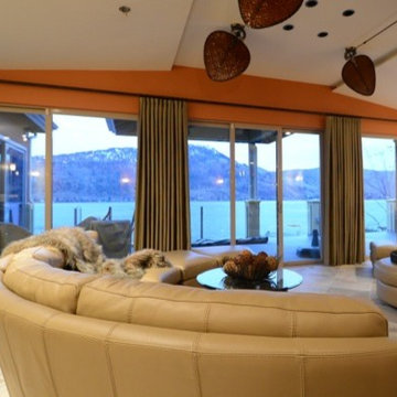
This newly renovated lakefront home had a budget set aside for new window coverings to finish the rooms and to maximize the beautiful view. A combination of drapery and blinds were used throughout. The living room’s bank of sliding doors looked like a lot of bare windows so custom side panels were added to separate them and soften the room. The Plantation style ceiling fans and newly installed pebble tile were the source of inspiration for the palm branch print that was used while the soft sage and copper tones added to the outdoor feel.
An outdoor space was created for use in the summer. On the deck, linen style sheers run on a ceiling mount channel rod so the fabric is able to bypass any brackets and not get in the way. When the sheers are pulled closed a room is created to block the intense sun, and in their open position the panels are pulled back to frame the stucco pillars. In the sun room, custom Sunbrella roman shades were installed into the divided glass ceiling which had always been an intense source of heat. A burnt orange striped fabric was used to incorporate the orange tones used in the living room.
Hunter Douglas Pirhouettes were installed throughout the rest of the house to give warmth and texture to the rest of the windows. Pirhouette blinds feature soft fabric vanes attached to a sheer backing that appear to be floating. When closed, they look just like a contemporary shade. The advantage to this type of blind is that they diffuse the light quite nicely, spreading it evenly throughout your room, so you can maximize daylight hours and reduce your need for artificial light.
The homeowners required a balance of style and practicality in their home and we delivered with custom window treatments that fit the unique needs of each area in the house.
 Mylightingsource
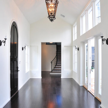
A Maxim foyer pendant casts delicate shadows on this beautiful open entryway. This eight light Kentucky bronze pendant also comes in a smaller option to fit any traditional foyer.
 JRP Design & Remodel
Our client’s large family of five was shrinking through the years, so they decided it was time for a downsize and a move from Westlake Village to Oak Park. They found the ideal single-story home on a large flag lot, but it needed a major overhaul, starting with the awkward spatial floorplan.
These clients knew the home needed much work. They were looking for a firm that could handle the necessary architectural spatial redesign, interior design details, and finishes as well as deliver a high-quality remodeling experience.
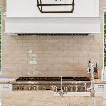
JRP’s design team got right to work on reconfiguring the entry by adding a new foyer and hallway leading to the enlarged kitchen while removing walls to open up the family room. The kitchen now boasts a 6’ x 10’ center island with natural quartz countertops. Stacked cabinetry was added for both storage and aesthetic to maximize the 10’ ceiling heights. Thanks to the large multi-slide doors in the family room, the kitchen area now flows naturally toward the outdoors, maximizing its connection to the backyard patio and entertaining space.
Light-filled and serene, the gracious master suite is a haven of peace with its ethereal color palette and curated amenities. The vanity, with its expanse of Sunstone Celestial countertops and the large curbless shower, add elements of luxury to this master retreat. Classy, simple, and clean, this remodel’s open-space design with its neutral palette and clean look adds traditional flair to the transitional-style our clients desired.
 Tefore Ltd
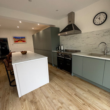
This striking green handleless kitchen is a perfect example of modern design meeting everyday functionality. Designed, supplied, and installed by our team, the space has been carefully planned to create a sleek, uncluttered look while maximising practicality.
The rich green cabinetry brings depth and character to the room, while the handleless design keeps the overall aesthetic clean, streamlined, and contemporary. At the heart of the kitchen sits a large statement island, complete with a lowered seating area—ideal for casual dining, entertaining, or simply gathering with family and friends.
A standout feature of this project is the bespoke chef’s pantry, offering a dedicated space for storage and preparation. Designed to keep the main kitchen area clutter-free, it provides both convenience and a touch of luxury for those who love to cook.
Clever internal solutions have been incorporated throughout, including pull-out storage that makes accessing everyday essentials effortless while maximising every inch of space. These thoughtful details ensure the kitchen not only looks stunning but works seamlessly for modern living.
The end result is a bold yet refined kitchen that combines style, innovation, and practicality perfectly tailored to suit the needs of a busy home.
 TVL Creative Ltd.
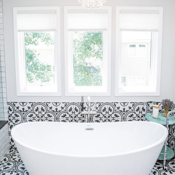
This project is an incredible transformation and the perfect example of successful style mixing! This client, and now a good friend of TVL (as they all become), is a wonderfully eclectic and adventurous one with immense interest in texture play, pops of color, and unique applications. Our scope in this home included a full kitchen renovation, main level powder room renovation, and a master bathroom overhaul. Taking just over a year to complete from the first design phases to final photos, this project was so insanely fun and packs an amazing amount of fun details and lively surprises. The original kitchen was large and fairly functional. However, the cabinetry was dated, the lighting was inefficient and frankly ugly, and the space was lacking personality in general. Our client desired maximized storage and a more personalized aesthetic. The existing cabinets were short and left the nice height of the space under-utilized. We integrated new gray shaker cabinets from Waypoint Living Spaces and ran them to the ceiling to really exaggerate the height of the space and to maximize usable storage as much as possible. The upper cabinets are glass and lit from within, offering display space or functional storage as the client needs. The central feature of this space is the large cobalt blue range from Viking as well as the custom made reclaimed wood range hood floating above. The backsplash along this entire wall is vertical slab of marble look quartz from Pental Surfaces. This matches the expanse of the same countertop that wraps the room. Flanking the range, we installed cobalt blue lantern penny tile from Merola Tile for a playful texture that adds visual interest and class to the entire room. We upgraded the lighting in the ceiling, under the cabinets, and within cabinets--we also installed accent sconces over each window on the sink wall to create cozy and functional illumination. The deep, textured front Whitehaven apron sink is a dramatic nod to the farmhouse aesthetic from KOHLER, and it's paired with the bold and industrial inspired Tournant faucet, also from Kohler. We finalized this space with other gorgeous appliances, a super sexy dining table and chair set from Room & Board, the Paxton dining light from Pottery Barn and a small bar area and pantry on the far end of the space. In the small powder room on the main level, we converted a drab builder-grade space into a super cute, rustic-inspired washroom. We utilized the Bonner vanity from Signature Hardware and paired this with the cute Ashfield faucet from Pfister. The most unique statements in this room include the water-drop light over the vanity from Shades Of Light, the copper-look porcelain floor tile from Pental Surfaces and the gorgeous Cashmere colored Tresham toilet from Kohler. Up in the master bathroom, elegance abounds. Using the same footprint, we upgraded everything in this space to reflect the client's desire for a more bright, patterned and pretty space. Starting at the entry, we installed a custom reclaimed plank barn door with bold large format hardware from Rustica Hardware. In the bathroom, the custom slate blue vanity from Tharp Cabinet Company is an eye catching statement piece. This is paired with gorgeous hardware from Amerock, vessel sinks from Kohler, and Purist faucets also from Kohler. We replaced the old built-in bathtub with a new freestanding soaker from Signature Hardware. The floor tile is a bold, graphic porcelain tile with a classic color scheme. The shower was upgraded with new tile and fixtures throughout: new clear glass, gorgeous distressed subway tile from the Castle line from TileBar, and a sophisticated shower panel from Vigo. We finalized the space with a small crystal chandelier and soft gray paint. This project is a stunning conversion and we are so thrilled that our client can enjoy these personalized spaces for years to come. Special thanks to the amazing Ian Burks of Burks Wurks Construction for bringing this to life!
 Vail Cabinets
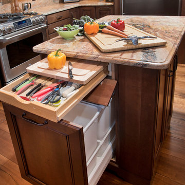
This is a recent project we completed at Vail Golf Course Townhomes. We helped the client create a real chef's kitchen by maximizing her small-medium sized kitchen space. We created cooking efficiences by including many smart storage features, such as: pullout spice racks, a base pullout pantry, two knife drawers, rollout trays in the base cabinets, a cutting board pullout, a base trash pullout and much more! This is a great example of how to maximize the functionality of your kitchen, even without a ton of space.
 K & S Design Build Inc
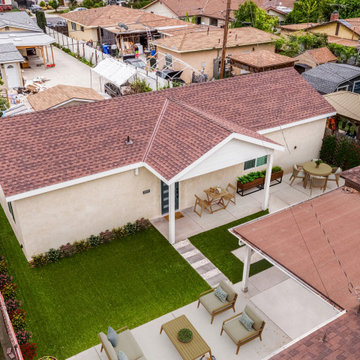
We recently completed a custom 900 sq. ft. ADU in San Gabriel for a young family seeking to maximize the potential of their property with a smart, functional living space. Designed from the ground up, this unit features three bedrooms, 2 full bathrooms, a bright and open-concept kitchen and living room, and a dedicated laundry area, all thoughtfully laid out to maximize the compact footprint.
Every inch of the space was carefully considered for modern family living. Large windows and vaulted ceilings were incorporated to enhance volume and natural light, while finishes were selected for both durability and style. The kitchen features clean lines and ample storage, creating a practical hub for day-to-day life. Throughout the ADU, we focused on high-function design that feels spacious, comfortable, and move-in ready.
This project reflects our commitment to delivering high-quality builds that meet the needs of growing families while adding long-term value to the property. We’re proud to have partnered with our clients to bring their vision to life.
 Swatch Design Group
As a part of a larger transformation, the kitchen served as an anchor for rethinking how the home could feel and function. The goal was to create a space that felt truly integrated, flowed naturally within itself, and connected seamlessly to the outdoors. Storage was a top priority, with an emphasis on keeping countertops clean and the space feeling calm and open. Flow was equally important. What began as a layout optimized for entertaining evolved into a more intentional approach, where every sightline and transition was thoughtfully considered. The clients also needed the kitchen to work hard for their lifestyle, with a commercial-size refrigerator and freezer, generous prep space, and room to gather. The challenge was to bring purpose and polish to a space that didn’t quite feel like it belonged. The result is a kitchen that’s not only highly functional but finally feels like part of the home.
Project challenges:
- Maximizing storage was a primary challenge, especially with the inclusion of a commercial-sized fridge and freezer that occupied valuable cabinetry space.
- The need for clean, uninterrupted lines throughout the kitchen required thoughtful detailing, especially around cabinetry transitions and appliance integration.
- The oversized island design required two stone slabs and waterfall edges on both sides which posed both visual and logistical challenges.
- Incorporating electrical outlets into the island in a way that felt intentional and unobtrusive demanded creative problem-solving.
- The unique rooflines created strong visual angles that required a considered design approach to ensure the space felt cohesive rather than disjointed.
- Balancing symmetry and flow in a kitchen with structural constraints required precise layout planning to maintain a cohesive visual rhythm.
- Creating an intentional indoor/outdoor living flow, especially in the transitional space between the sliding doors to the backyard and the kitchen.
Project solutions:
- To balance the visual weight of the commercial-grade fridge and freezer, we flanked the range and hood with full-height pocket cabinetry, which created symmetry while reclaiming storage space. We also took a look into internal organization and carefully mapped out where every kitchen item would live. This allowed us to make informed decisions about drawer versus door configurations, and when to incorporate features like roll-out shelving to maximize accessibility and function.
- Linear light fixtures above the island were chosen for their low visual impact, allowing sightlines to remain clear and emphasizing the thoughtful spatial layout.
- The oversized island was carefully executed using two coordinated slabs, with a subtle brass inlay detail between them to turn a logistical challenge into a design feature.
- Pop-up electrical outlets were integrated into the island to keep surfaces clutter-free while maintaining easy access, which combined form and function seamlessly.
- With multiple focal points and a peaked vaulted ceiling, layout precision was key. The island, hood, and adjacent staircase were all perfectly centered on the vault, creating a sense of alignment across the open space.
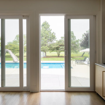
- In the transitional area between kitchen and backyard, we added a wet bar that visually and functionally connects the indoor space with the outdoors. This addition provides extra storage and creates a dedicated entertainment spot for guests, enhancing the overall flow and usability of the home.
171