
Search results for "Monitoring tightness" in Home Design Ideas


 Kimberley Bryan
Photo: Kimberley Bryan © 2013 Houzz
Home office - contemporary home office idea in Seattle
Home office - contemporary home office idea in Seattle

 Deco Design
This piece can either be an end table next to a couch or side tables for a bed. Elegant custom turned legs with floating shelf midway and table top. Custom two toned finish, espresso stain with hand burnished red paint. Close up of leg detail.
photos by Kimball Ungerman
Find the right local pro for your project
 Ambient Bamboo Products, Inc.
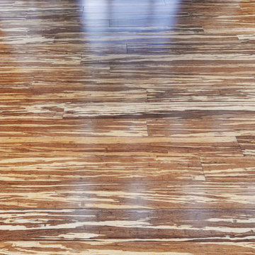
Home design - rustic bamboo floor and multicolored floor home design idea
 Pray on it Corp
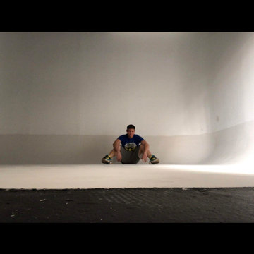
This was another Small Cyclorama its dimensions were 21 feet by 20 feet.. and they use this one specifically for photo and movie scenes, IT HAD NOT BEEN MAINTENANCE IN about 4 years WE CAME and were going to fix it and we did heres the finished product

 Wilde North
Contemporary basement remodel with games zone, custom bar and home theatre, additionally kitchen and washroom too.
Example of a large trendy look-out porcelain tile basement design in Toronto with blue walls and a standard fireplace
Example of a large trendy look-out porcelain tile basement design in Toronto with blue walls and a standard fireplace

 Artistic Kitchens - Kristi Hodson
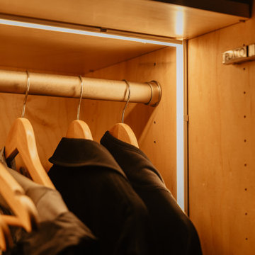
This custom wooden closet interior features warm LED strip lighting integrated beneath the shelving. A sturdy metal hanging rod holds wooden hangers with dark jackets, showcasing clean lines, natural wood grain textures, and a cozy, illuminated modern design.



 Pure Custom Integrations
Home Theater Dolby Atmos 5.1.2 Setup using Paradigm AMS SA Series speakers, Smart Dance floor with Lasers and smoke machine built into wall cavity
Home theater - large traditional home theater idea in Toronto
Home theater - large traditional home theater idea in Toronto




 TVL Creative Ltd.
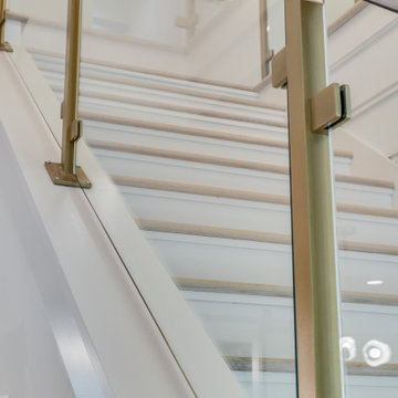
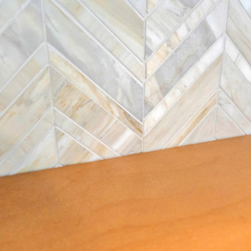
We were excited to take on this full home remodel with our Arvada clients! They have been living in their home for years, and were ready to delve into some major construction to make their home a perfect fit. This home had a lot of its original 1970s features, and we were able to work together to make updates throughout their home to make it fit their more modern tastes. We started by lowering their raised living room to make it level with the rest of their first floor; this not only removed a major tripping hazard, but also gave them a lot more flexibility when it came to placing furniture. To make their newly leveled first floor feel more cohesive we also replaced their mixed flooring with a gorgeous engineered wood flooring throughout the whole first floor. But the second floor wasn’t left out, we also updated their carpet with a subtle patterned grey beauty that tied in with the colors we utilized on the first floor. New taller baseboards throughout their entire home also helped to unify the spaces and brought the update full circle. One of the most dramatic changes we made was to take down all of the original wood railings and replace them custom steel railings. Our goal was to design a staircase that felt lighter and created less of a visual barrier between spaces. We painted the existing stringer a crisp white, and to balance out the cool steel finish, we opted for a wooden handrail. We also replaced the original carpet wrapped steps with dark wooden steps that coordinate with the finish of the handrail. Lighting has a major impact on how we feel about the space we’re in, and we took on this home’s lighting problems head on. By adding recessed lighting to the family room, and replacing all of the light fixtures on the first floor we were able to create more even lighting throughout their home as well as add in a few fun accents in the dining room and stairwell. To update the fireplace in the family room we replaced the original mantel with a dark solid wood beam to clean up the lines of the fireplace. We also replaced the original mirrored gold doors with a more contemporary dark steel finished to help them blend in better. The clients also wanted to tackle their powder room, and already had a beautiful new vanity selected, so we were able to design the rest of the space around it. Our favorite touch was the new accent tile installed from floor to ceiling behind the vanity adding a touch of texture and a clear focal point to the space. Little changes like replacing all of their door hardware, removing the popcorn ceiling, painting the walls, and updating the wet bar by painting the cabinets and installing a new quartz counter went a long way towards making this home a perfect fit for our clients





 THE Remodel Group
Kitchen drawer details.
Inspiration for a large timeless u-shaped eat-in kitchen remodel in Portland with an undermount sink, beaded inset cabinets, light wood cabinets, granite countertops, beige backsplash, mosaic tile backsplash, stainless steel appliances, an island and black countertops
Inspiration for a large timeless u-shaped eat-in kitchen remodel in Portland with an undermount sink, beaded inset cabinets, light wood cabinets, granite countertops, beige backsplash, mosaic tile backsplash, stainless steel appliances, an island and black countertops

 Badeloft
Factory Direct Pricing. Please Call 415-644-5888 to visit our Showroom or to get for more info. Please visit our website at www.badeloft.com. Our showroom is located at 2829 Bridgeway Sausalito, CA 94965. Photos Owned by Badeloft USA LLC.
 KURV Architecture DPC (Alex Hughes Architects)
Located in the heart of Manhattan’s Lower East Side, the building was erected on a shallow commercial lot between two 120 year old masonry buildings and a new residential rental building. 330 Grand Street is a mix of 725 SF 1BRs and 1050 SF 2BR apartments. It also contains a 1100 SF two story duplex as well as private and public rooftop space, large private balconies for most units and two large private terraces for the ground floor units.
330 Grand Street was originally designed and approved at the NYC DOB as a prefabricated modular building. During the pandemic, as shipping costs skyrocketed putting the project at risk, we suggested redesigning the building as a reinforced cast-in-place concrete structure. Concrete was readily available and prices had not been affected by the demand increase that many other materials suffered in the pandemic. We took this opportunity to raise floor to ceiling heights, enlarge high performance windows and redistribute the buildings MEPFS and Structural Systems to create very open floor plans.
The challenge was to create a luxurious sensorial living experience with very limited means. In a city with very high construction costs, low cost residential buildings in the area are usually devoid of good quality, design and character. Our approach was to aim high for the end user, prioritizing natural light, open space with long visual perspectives, high ceilings and as always, rejecting the use of predefined building templates.
Our biggest challenge was to ensure that the small spaces feel as clean cut, large and bright as possible. Several unique design decisions were made to ensure low cost and high quality;
Floor plans were laid out so that spaces were wide open and free of clutter from mechanical or structural interruptions. Therefore all infrastructure was placed in lateral demising walls, which in turn act as the unit’s storage and kitchen. The apartments feel wide open, are super quiet and have more storage space than any other comparable apartment in the city.
To solve the problem of the site’s shallow commercial lot which is typically prone to dark interior spaces we focused our attention on the building’s envelope. Instead of the usual small punched window openings, oversized high performance windows were designed to ensure that light penetrated as far as possible into the units. In the smaller 1BR units, the full 50’ depth of the lot is perceived by partitioning spaces with sliding pocket doors that can be retracted to allow deep visual perspectives, making the sight lines in the space feel longer, larger, more ample than normal. In addition to the full height glazing, each unit above the 2nd floor receives a 7 foot covered balcony, adding 120 to 240 sf to each apartment, something unusual in New York City buildings. The space is large enough for a full size dining table, when the weather permits being outside.
We also worked hard to ensure modularity. For example, all kitchen units are all identical throughout the building. The idea of modularity and the economy of the repetitive unit is exercised to the maximum through the building.
Hardware, appliances, flooring, wall coverings and material finishes are all carefully selected to feel bespoke, high quality and unique.
It was important to KURV that the result of this work manifest into something that would deeply connect with the end user and sustain relationships with the consumers of this space.
All images by KURV Architecture ©
36