
Search results for "Moving ahead" in Home Design Ideas
 RAJ Kitchen and Bath, LLC
 “Full apartment design”.
IF you have not yet seen this apartment conversion before, we strongly urge you to go to the bottom left of this page and click on the short 2-minutes video. It would put a lot of things into perspective when you come back and continue reading this.
It is true we were literally handed the keys and told a list of things that they wanted to have happen and we were to go into the apartment, look at the space and come up with a design that would satisfy all of that need. UNTIL we showed up! The unit had really seen some better days but we knew we had to look past that and come up with a concept that would work for them.
The immediate challenges were centered around 3 big ideas:
1. Adding a second bedroom to the already small footprint
2. Figuring out a way to make the kitchen bigger, better and brighter
3. Creating a master room walk in closet
It’s always difficult to add new rooms into existing footprint without expanding out or up and not incurring any opportunity cost. In this case, that was exactly what we had to do. Item one and two above had to be tackled as one. We went ahead and switched out the location of the dining room and eliminating an area where there was a “nook” type eat-in area. By doing so, we were able to cut right into that footprint and change the layout of the kitchen.
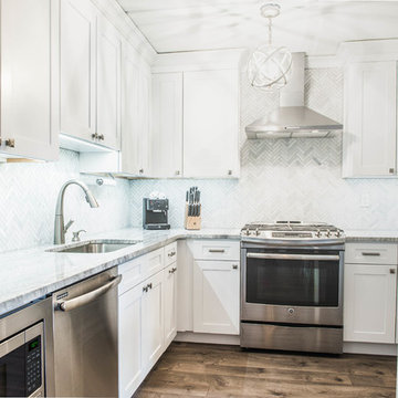
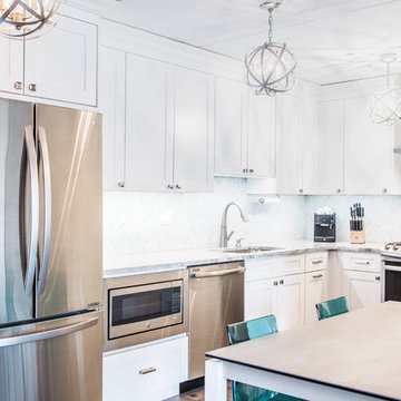
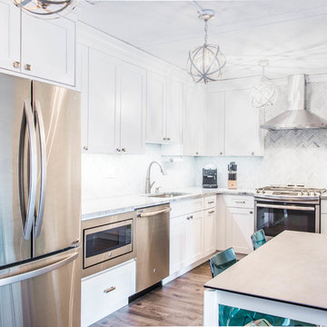
That one move allowed us to dig into the kitchen design because it was now the main focal point in the apartment. It was no longer an option to keep it in that tiny hole where it was, so we had to ensure that this design was functional and aesthetically pleasing at the same time. By adding the table into the space where an Island typically would go, we were able to both cut cost and still provide a dining experience. The Table serves as an Island as well when cooking.
We then proceeded to block in the existing doorway to the dining room. By doing this, we were able to create a full room which allowed us to put a door on the other side and called that room Bedroom #2. This was easier to do because all of the mechanicals were already in that space (light, heater and windows). By shifting things around, we also achieved a huge wall to wall closet from inside. PERFECT!
Then we moved into the Single bedroom. We thought it was a big room with a small closet, so by creatively adding an L shaped wall and steal some footprint into the bedroom side, we were able to put a door on that new room and design it for the walk-in closet. Even after this, the bedroom still holds a queen size bed with 2 night stands, a TV on the wall, a sitting chair and plenty of room to walk around. This was done by rethinking the location for the bed and night stands.
The bathroom was gutted to make sure there was no leaks and rebuild from the ground up. We kept all of the plumbing where it was, added a new vanity, medicine cabinet, tiles and lighting and it was done.
From there, the rest of the unit had new flooring all throughout, paint, and lighting. After completion and walk through, this project was handed over back to the clients.
Execution and collaboration between all the trades were: Reggie and his team from Premier Interiors and Rohan from RD Mechanical Services.
p.s. Please see our website to see the video.
 RAJ Kitchen and Bath, LLC
 “Full apartment design”.
IF you have not yet seen this apartment conversion before, we strongly urge you to go to the bottom left of this page and click on the short 2-minutes video. It would put a lot of things into perspective when you come back and continue reading this.
It is true we were literally handed the keys and told a list of things that they wanted to have happen and we were to go into the apartment, look at the space and come up with a design that would satisfy all of that need. UNTIL we showed up! The unit had really seen some better days but we knew we had to look past that and come up with a concept that would work for them.
The immediate challenges were centered around 3 big ideas:
1. Adding a second bedroom to the already small footprint
2. Figuring out a way to make the kitchen bigger, better and brighter
3. Creating a master room walk in closet
It’s always difficult to add new rooms into existing footprint without expanding out or up and not incurring any opportunity cost. In this case, that was exactly what we had to do. Item one and two above had to be tackled as one. We went ahead and switched out the location of the dining room and eliminating an area where there was a “nook” type eat-in area. By doing so, we were able to cut right into that footprint and change the layout of the kitchen.
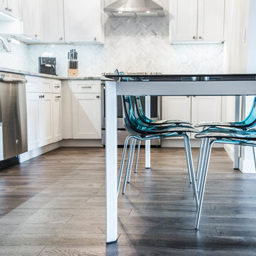
That one move allowed us to dig into the kitchen design because it was now the main focal point in the apartment. It was no longer an option to keep it in that tiny hole where it was, so we had to ensure that this design was functional and aesthetically pleasing at the same time. By adding the table into the space where an Island typically would go, we were able to both cut cost and still provide a dining experience. The Table serves as an Island as well when cooking.
We then proceeded to block in the existing doorway to the dining room. By doing this, we were able to create a full room which allowed us to put a door on the other side and called that room Bedroom #2. This was easier to do because all of the mechanicals were already in that space (light, heater and windows). By shifting things around, we also achieved a huge wall to wall closet from inside. PERFECT!
Then we moved into the Single bedroom. We thought it was a big room with a small closet, so by creatively adding an L shaped wall and steal some footprint into the bedroom side, we were able to put a door on that new room and design it for the walk-in closet. Even after this, the bedroom still holds a queen size bed with 2 night stands, a TV on the wall, a sitting chair and plenty of room to walk around. This was done by rethinking the location for the bed and night stands.
The bathroom was gutted to make sure there was no leaks and rebuild from the ground up. We kept all of the plumbing where it was, added a new vanity, medicine cabinet, tiles and lighting and it was done.
From there, the rest of the unit had new flooring all throughout, paint, and lighting. After completion and walk through, this project was handed over back to the clients.
Execution and collaboration between all the trades were: Reggie and his team from Premier Interiors and Rohan from RD Mechanical Services.
p.s. Please see our website to see the video.
 RAJ Kitchen and Bath, LLC
 “Full apartment design”.
IF you have not yet seen this apartment conversion before, we strongly urge you to go to the bottom left of this page and click on the short 2-minutes video. It would put a lot of things into perspective when you come back and continue reading this.
It is true we were literally handed the keys and told a list of things that they wanted to have happen and we were to go into the apartment, look at the space and come up with a design that would satisfy all of that need. UNTIL we showed up! The unit had really seen some better days but we knew we had to look past that and come up with a concept that would work for them.
The immediate challenges were centered around 3 big ideas:
1. Adding a second bedroom to the already small footprint
2. Figuring out a way to make the kitchen bigger, better and brighter
3. Creating a master room walk in closet
It’s always difficult to add new rooms into existing footprint without expanding out or up and not incurring any opportunity cost. In this case, that was exactly what we had to do. Item one and two above had to be tackled as one. We went ahead and switched out the location of the dining room and eliminating an area where there was a “nook” type eat-in area. By doing so, we were able to cut right into that footprint and change the layout of the kitchen.
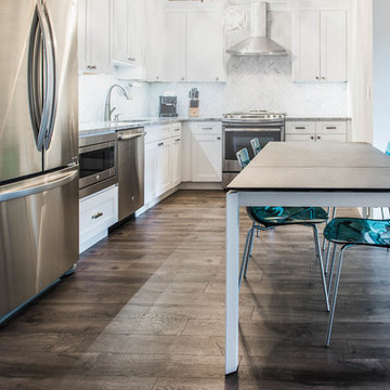
That one move allowed us to dig into the kitchen design because it was now the main focal point in the apartment. It was no longer an option to keep it in that tiny hole where it was, so we had to ensure that this design was functional and aesthetically pleasing at the same time. By adding the table into the space where an Island typically would go, we were able to both cut cost and still provide a dining experience. The Table serves as an Island as well when cooking.
We then proceeded to block in the existing doorway to the dining room. By doing this, we were able to create a full room which allowed us to put a door on the other side and called that room Bedroom #2. This was easier to do because all of the mechanicals were already in that space (light, heater and windows). By shifting things around, we also achieved a huge wall to wall closet from inside. PERFECT!
Then we moved into the Single bedroom. We thought it was a big room with a small closet, so by creatively adding an L shaped wall and steal some footprint into the bedroom side, we were able to put a door on that new room and design it for the walk-in closet. Even after this, the bedroom still holds a queen size bed with 2 night stands, a TV on the wall, a sitting chair and plenty of room to walk around. This was done by rethinking the location for the bed and night stands.
The bathroom was gutted to make sure there was no leaks and rebuild from the ground up. We kept all of the plumbing where it was, added a new vanity, medicine cabinet, tiles and lighting and it was done.
From there, the rest of the unit had new flooring all throughout, paint, and lighting. After completion and walk through, this project was handed over back to the clients.
Execution and collaboration between all the trades were: Reggie and his team from Premier Interiors and Rohan from RD Mechanical Services.
p.s. Please see our website to see the video.
Find the right local pro for your project
 RAJ Kitchen and Bath, LLC
 “Full apartment design”.
IF you have not yet seen this apartment conversion before, we strongly urge you to go to the bottom left of this page and click on the short 2-minutes video. It would put a lot of things into perspective when you come back and continue reading this.
It is true we were literally handed the keys and told a list of things that they wanted to have happen and we were to go into the apartment, look at the space and come up with a design that would satisfy all of that need. UNTIL we showed up! The unit had really seen some better days but we knew we had to look past that and come up with a concept that would work for them.
The immediate challenges were centered around 3 big ideas:
1. Adding a second bedroom to the already small footprint
2. Figuring out a way to make the kitchen bigger, better and brighter
3. Creating a master room walk in closet
It’s always difficult to add new rooms into existing footprint without expanding out or up and not incurring any opportunity cost. In this case, that was exactly what we had to do. Item one and two above had to be tackled as one. We went ahead and switched out the location of the dining room and eliminating an area where there was a “nook” type eat-in area. By doing so, we were able to cut right into that footprint and change the layout of the kitchen.
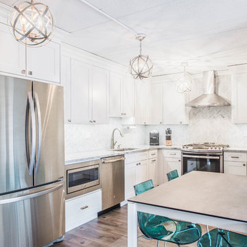
That one move allowed us to dig into the kitchen design because it was now the main focal point in the apartment. It was no longer an option to keep it in that tiny hole where it was, so we had to ensure that this design was functional and aesthetically pleasing at the same time. By adding the table into the space where an Island typically would go, we were able to both cut cost and still provide a dining experience. The Table serves as an Island as well when cooking.
We then proceeded to block in the existing doorway to the dining room. By doing this, we were able to create a full room which allowed us to put a door on the other side and called that room Bedroom #2. This was easier to do because all of the mechanicals were already in that space (light, heater and windows). By shifting things around, we also achieved a huge wall to wall closet from inside. PERFECT!
Then we moved into the Single bedroom. We thought it was a big room with a small closet, so by creatively adding an L shaped wall and steal some footprint into the bedroom side, we were able to put a door on that new room and design it for the walk-in closet. Even after this, the bedroom still holds a queen size bed with 2 night stands, a TV on the wall, a sitting chair and plenty of room to walk around. This was done by rethinking the location for the bed and night stands.
The bathroom was gutted to make sure there was no leaks and rebuild from the ground up. We kept all of the plumbing where it was, added a new vanity, medicine cabinet, tiles and lighting and it was done.
From there, the rest of the unit had new flooring all throughout, paint, and lighting. After completion and walk through, this project was handed over back to the clients.
Execution and collaboration between all the trades were: Reggie and his team from Premier Interiors and Rohan from RD Mechanical Services.
p.s. Please see our website to see the video.

 Jasper + Phoenix
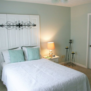
Amber works from home and was sacrificing a dining room for her home office. By utilizing the double wide closet space in her guest bedroom, she now walks into her home without the reminder of work, and can have guests over for a meal in her dining room (dining room reveal coming soon). The walls were freshly painted Sea Salt by Sherwin Williams. This gives the room a fresh, clean look and also adds contrast to the beige carpet.
Amber had her homework assignments cut out for her as she had to do some major purging in her throw all guest room. Once she started letting go, she was on a roll and continually surprised me as she cleaned out closets throughout the house. One dresser was filled with cds, dvds, books, albums, scrap-booking materials; items taking up precious real estate in her life that she didn't even know were there. There really wasn't a storage problem after-all, she was just holding on to a collection of things that no longer served her. Each time I would visit, and her space would become more open, I could see the weight lifting off her and her self love building. Amber had a recent breakup with her boyfriend and this makeover helped her not only focus on making a home sanctuary for herself, but helped her let go of the pains of the past and focus on the exciting future ahead. At one point when we were moving sofas in the living room (which we will also reveal soon), we found an ex's flip-flop. We were figuratively and literally sweeping away the past. Editing your home and your life makes room for your future; for new people and things. We are so happy to finally reveal the room to you! We can't wait to unveil the rest of Amber's home, once we complete the finishing touches.
Challenges:
Amber's home was filled with mix-matched furniture from family and college. She had no idea what her decorating style was. After shopping together and exchanging somepinterest boards, I was finally able to get a sense of what she loves.
I had to work on a tight budget, which meant really digging out the creativity and utilizing other items in the home. See how I transformed a table from the discard pile into a faux marble bedside table by clicking web link.
Amber's dad was able to help with the desk materials and building to cut costs.
We wanted to save the closet doors in the event she sold her home or no longer needed an office someday. There wasn't any extra space to store these closet doors, so I used them as a headboard.
The only items purchased were: Curtains, Curtain Rod, Bedspread Set, Throw Pillows, 2 Lamps and Paint.
 RAJ Kitchen and Bath, LLC
 “Full apartment design”.
IF you have not yet seen this apartment conversion before, we strongly urge you to go to the bottom left of this page and click on the short 2-minutes video. It would put a lot of things into perspective when you come back and continue reading this.
It is true we were literally handed the keys and told a list of things that they wanted to have happen and we were to go into the apartment, look at the space and come up with a design that would satisfy all of that need. UNTIL we showed up! The unit had really seen some better days but we knew we had to look past that and come up with a concept that would work for them.
The immediate challenges were centered around 3 big ideas:
1. Adding a second bedroom to the already small footprint
2. Figuring out a way to make the kitchen bigger, better and brighter
3. Creating a master room walk in closet
It’s always difficult to add new rooms into existing footprint without expanding out or up and not incurring any opportunity cost. In this case, that was exactly what we had to do. Item one and two above had to be tackled as one. We went ahead and switched out the location of the dining room and eliminating an area where there was a “nook” type eat-in area. By doing so, we were able to cut right into that footprint and change the layout of the kitchen.
That one move allowed us to dig into the kitchen design because it was now the main focal point in the apartment. It was no longer an option to keep it in that tiny hole where it was, so we had to ensure that this design was functional and aesthetically pleasing at the same time. By adding the table into the space where an Island typically would go, we were able to both cut cost and still provide a dining experience. The Table serves as an Island as well when cooking.
We then proceeded to block in the existing doorway to the dining room. By doing this, we were able to create a full room which allowed us to put a door on the other side and called that room Bedroom #2. This was easier to do because all of the mechanicals were already in that space (light, heater and windows). By shifting things around, we also achieved a huge wall to wall closet from inside. PERFECT!
Then we moved into the Single bedroom. We thought it was a big room with a small closet, so by creatively adding an L shaped wall and steal some footprint into the bedroom side, we were able to put a door on that new room and design it for the walk-in closet. Even after this, the bedroom still holds a queen size bed with 2 night stands, a TV on the wall, a sitting chair and plenty of room to walk around. This was done by rethinking the location for the bed and night stands.
The bathroom was gutted to make sure there was no leaks and rebuild from the ground up. We kept all of the plumbing where it was, added a new vanity, medicine cabinet, tiles and lighting and it was done.
From there, the rest of the unit had new flooring all throughout, paint, and lighting. After completion and walk through, this project was handed over back to the clients.
Execution and collaboration between all the trades were: Reggie and his team from Premier Interiors and Rohan from RD Mechanical Services.
p.s. Please see our website to see the video.

 RAJ Kitchen and Bath, LLC
 “Full apartment design”.
IF you have not yet seen this apartment conversion before, we strongly urge you to go to the bottom left of this page and click on the short 2-minutes video. It would put a lot of things into perspective when you come back and continue reading this.
It is true we were literally handed the keys and told a list of things that they wanted to have happen and we were to go into the apartment, look at the space and come up with a design that would satisfy all of that need. UNTIL we showed up! The unit had really seen some better days but we knew we had to look past that and come up with a concept that would work for them.
The immediate challenges were centered around 3 big ideas:
1. Adding a second bedroom to the already small footprint
2. Figuring out a way to make the kitchen bigger, better and brighter
3. Creating a master room walk in closet
It’s always difficult to add new rooms into existing footprint without expanding out or up and not incurring any opportunity cost. In this case, that was exactly what we had to do. Item one and two above had to be tackled as one. We went ahead and switched out the location of the dining room and eliminating an area where there was a “nook” type eat-in area. By doing so, we were able to cut right into that footprint and change the layout of the kitchen.
That one move allowed us to dig into the kitchen design because it was now the main focal point in the apartment. It was no longer an option to keep it in that tiny hole where it was, so we had to ensure that this design was functional and aesthetically pleasing at the same time. By adding the table into the space where an Island typically would go, we were able to both cut cost and still provide a dining experience. The Table serves as an Island as well when cooking.
We then proceeded to block in the existing doorway to the dining room. By doing this, we were able to create a full room which allowed us to put a door on the other side and called that room Bedroom #2. This was easier to do because all of the mechanicals were already in that space (light, heater and windows). By shifting things around, we also achieved a huge wall to wall closet from inside. PERFECT!
Then we moved into the Single bedroom. We thought it was a big room with a small closet, so by creatively adding an L shaped wall and steal some footprint into the bedroom side, we were able to put a door on that new room and design it for the walk-in closet. Even after this, the bedroom still holds a queen size bed with 2 night stands, a TV on the wall, a sitting chair and plenty of room to walk around. This was done by rethinking the location for the bed and night stands.
The bathroom was gutted to make sure there was no leaks and rebuild from the ground up. We kept all of the plumbing where it was, added a new vanity, medicine cabinet, tiles and lighting and it was done.
From there, the rest of the unit had new flooring all throughout, paint, and lighting. After completion and walk through, this project was handed over back to the clients.
Execution and collaboration between all the trades were: Reggie and his team from Premier Interiors and Rohan from RD Mechanical Services.
p.s. Please see our website to see the video.
 gamble + design
gamble + Design
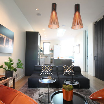
Inspiration for a mid-sized modern living room remodel in San Francisco
Inspiration for a mid-sized modern living room remodel in San Francisco
 Lodi Tile Works, Inc
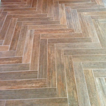
Wood-look tile floor using porcelain plank tiles in a herringbone pattern.
Living room - traditional porcelain tile living room idea in Sacramento
Living room - traditional porcelain tile living room idea in Sacramento
 Progressive Design Build
The Challenge
This beautiful waterfront home was begging for an update. Our clients wanted a contemporary design with modern finishes. They craved improved functionality in the kitchen, hardwood flooring in the living areas, and a spacious walk-in closet in the master bathroom. With two children in school, our clients also needed the project completed during their summer vacation – leaving a slim 90 days for the entire remodel. Could we do it? …Challenge accepted!
Our Solution
With their active summer travel schedule, our clients elected to vacate their home for the duration of the project. This was ideal for the intrusive nature of the scope of work.
In preparation, our design team created a project plan to suit our client’s needs. With such a clear timeline, we were able to select and order long-lead items in plenty of time for the project start date.
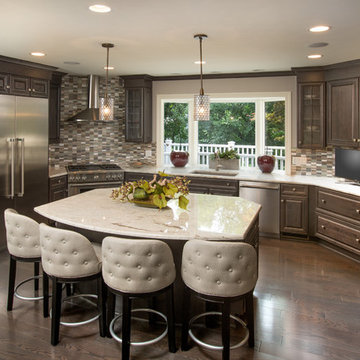
In the kitchen, we rearranged the layout to provide superior ventilation for the cooktop on the exterior wall. We added two large storage cabinets with glass doors, accented by a sleek mosaic backsplash of glass tile. We also incorporated a large contemporary waterfall island into the room. With seating at one end, the island provides both increased functionality and an eye-catching focal point for the center of the room. On the interior wall of the kitchen, we maximized storage with a wall of built-in cabinetry – complete with pullout pantry cabinets, a double oven, and a large stainless refrigerator.
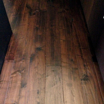
Our clients wisely chose rich, dark-colored wood flooring to add warmth to the contemporary design. After installing the flooring in the kitchen, we brought it into the main living areas as well. In the great room, we wrapped the existing gas fireplace in a neutral stack stone. The effect of the stone on the media and window wall is breathtaking.
In the master bathroom, we expanded the closet by pushing the wall back into the adjacent pass-through hallway. The new walk-in closet now includes an impressive closet organization system.
Returning to the master bathroom, we removed the single vanity and repositioned the toilet, allowing for a new, curb-less glass shower and a his-and-hers vanity. The entire vanity and shower wall is finished in white 12×24 porcelain tile. The vertical glass mosaic accent band and backlit floating mirrors add to the clean, modern style. To the left of the master bathroom entry, we even added a matching make-up area.
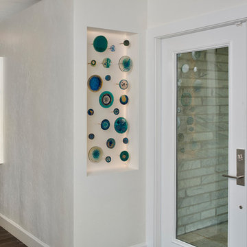
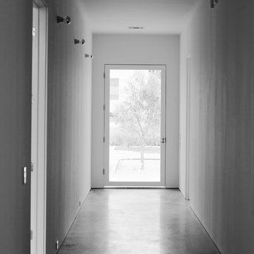
Finally, we installed a number of elegant enhancements in the remaining rooms. The clients chose a bronze metal relief accent wall as well as some colorful finishes and artwork for the entry and hallway.
Exceptional Results
Our clients were simply thrilled with the final product! Not only did they return from their summer vacation to a gorgeous home remodel, but we concluded the project a full week ahead of schedule. As a result, the family was able to move in sooner than planned, giving them plenty of time to acclimate to the renovated space before their kids returned to school. Ultimately, we provided the outstanding results and customer experience that our clients had been searching for.
“We met with many other contractors leading up to signing with Progressive Design Build. When we met Mike, we finally felt safe. We had heard so many horror stories about contractors! Progressive was the best move we could have made. They made our dream house become a reality. Vernon was in charge of our project and everything went better than we expected. Our project was completed earlier than expected, too. Our questions and concerns were dealt with quickly and professionally, the job site was always clean, and all subs were friendly and professional. We had a wonderful experience with Progressive Design Build. We’re so grateful we found them.” – The Mader Family
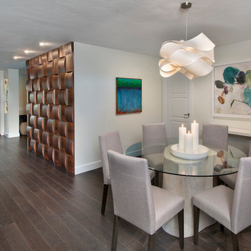 Progressive Design Build
The Challenge
This beautiful waterfront home was begging for an update. Our clients wanted a contemporary design with modern finishes. They craved improved functionality in the kitchen, hardwood flooring in the living areas, and a spacious walk-in closet in the master bathroom. With two children in school, our clients also needed the project completed during their summer vacation – leaving a slim 90 days for the entire remodel. Could we do it? …Challenge accepted!
Our Solution
With their active summer travel schedule, our clients elected to vacate their home for the duration of the project. This was ideal for the intrusive nature of the scope of work.
In preparation, our design team created a project plan to suit our client’s needs. With such a clear timeline, we were able to select and order long-lead items in plenty of time for the project start date.
In the kitchen, we rearranged the layout to provide superior ventilation for the cooktop on the exterior wall. We added two large storage cabinets with glass doors, accented by a sleek mosaic backsplash of glass tile. We also incorporated a large contemporary waterfall island into the room. With seating at one end, the island provides both increased functionality and an eye-catching focal point for the center of the room. On the interior wall of the kitchen, we maximized storage with a wall of built-in cabinetry – complete with pullout pantry cabinets, a double oven, and a large stainless refrigerator.
Our clients wisely chose rich, dark-colored wood flooring to add warmth to the contemporary design. After installing the flooring in the kitchen, we brought it into the main living areas as well. In the great room, we wrapped the existing gas fireplace in a neutral stack stone. The effect of the stone on the media and window wall is breathtaking.
In the master bathroom, we expanded the closet by pushing the wall back into the adjacent pass-through hallway. The new walk-in closet now includes an impressive closet organization system.
Returning to the master bathroom, we removed the single vanity and repositioned the toilet, allowing for a new, curb-less glass shower and a his-and-hers vanity. The entire vanity and shower wall is finished in white 12×24 porcelain tile. The vertical glass mosaic accent band and backlit floating mirrors add to the clean, modern style. To the left of the master bathroom entry, we even added a matching make-up area.
Finally, we installed a number of elegant enhancements in the remaining rooms. The clients chose a bronze metal relief accent wall as well as some colorful finishes and artwork for the entry and hallway.
Exceptional Results
Our clients were simply thrilled with the final product! Not only did they return from their summer vacation to a gorgeous home remodel, but we concluded the project a full week ahead of schedule. As a result, the family was able to move in sooner than planned, giving them plenty of time to acclimate to the renovated space before their kids returned to school. Ultimately, we provided the outstanding results and customer experience that our clients had been searching for.
“We met with many other contractors leading up to signing with Progressive Design Build. When we met Mike, we finally felt safe. We had heard so many horror stories about contractors! Progressive was the best move we could have made. They made our dream house become a reality. Vernon was in charge of our project and everything went better than we expected. Our project was completed earlier than expected, too. Our questions and concerns were dealt with quickly and professionally, the job site was always clean, and all subs were friendly and professional. We had a wonderful experience with Progressive Design Build. We’re so grateful we found them.” – The Mader Family

 Campion Walker Landscapes
In this extensive landscape transformation, Campion Walker took a secluded house nestled above a running stream and turned it into a multi layered masterpiece with five distinct ecological zones.
Using an established oak grove as a starting point, the team at Campion Walker sculpted the hillsides into a magnificent wonderland of color, scent and texture. Natural stone, copper, steel, river rock and sustainable Ipe hardwood work in concert with a dynamic mix of California natives, drought tolerant grasses and Mediterranean plants to create a truly breathtaking masterpiece where every detail has been considered, crafted, and reimagined.

Sponsored
Columbus, OH

Wannemacher Interiors
Customized Award-Winning Interior Design Solutions in Franklin Cnty OH



 Kathleen Jennison
An Arts & Crafts Bungalow is one of my favorite styles of homes. We have quite a few of them in our Stockton Mid-Town area. And when C&L called us to help them remodel their 1923 American Bungalow, I was beyond thrilled.
As per usual, when we get a new inquiry, we quickly Google the project location while we are talking to you on the phone. My excitement escalated when I saw the Google Earth Image of the sweet Sage Green bungalow in Mid-Town Stockton. "Yes, we would be interested in working with you," I said trying to keep my cool.
But what made it even better was meeting C&L and touring their home, because they are the nicest young couple, eager to make their home period perfect. Unfortunately, it had been slightly molested by some bad house-flippers, and we needed to bring the bathroom back to it "roots."
We knew we had to banish the hideous brown tile and cheap vanity quickly. But C&L complained about the condensation problems and the constant fight with mold. This immediately told me that improper remodeling had occurred and we needed to remedy that right away.
The Before: Frustrations with a Botched Remodel
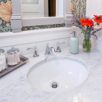
The bathroom needed to be brought back to period appropriate design with all the functionality of a modern bathroom. We thought of things like marble countertop, white mosaic floor tiles, white subway tile, board and batten molding, and of course a fabulous wallpaper.
This small (and only) bathroom on a tight budget required a little bit of design sleuthing to figure out how we could get the proper look and feel. Our goal was to determine where to splurge and where to economize and how to complete the remodel as quickly as possible because C&L would have to move out while construction was going on.
The Process: Hard Work to Remedy Design and Function
During our initial design study, (which included 2 hours in the owners’ home), we noticed framed images of William Morris Arts and Crafts textile patterns and knew this would be our design inspiration. We presented C&L with three options and they quickly selected the Pimpernel Design Concept.
We had originally selected the Black and Olive colors with a black vanity, mirror, and black and white floor tile. C&L liked it but weren’t quite sure about the black, We went back to the drawing board and decided the William & Co Pimpernel Wallpaper in Bayleaf and Manilla color with a softer gray painted vanity and mirror and white floor tile was more to their liking.
After the Design Concept was approved, we went to work securing the building permit, procuring all the elements, and scheduling our trusted tradesmen to perform the work.
We did uncover some shoddy work by the flippers such as live electrical wires hidden behind the wall, plumbing venting cut-off and buried in the walls (hence the constant dampness), the tub barely balancing on two fence boards across the floor joist, and no insulation on the exterior wall.
All of the previous blunders were fixed and the bathroom put back to its previous glory. We could feel the house thanking us for making it pretty again.
The After Reveal: Cohesive Design Decisions
We selected a simple white subway tile for the tub/shower. This is always classic and in keeping with the style of the house.
We selected a pre-fab vanity and mirror, but they look rich with the quartz countertop. There is much more storage in this small vanity than you would think.
The Transformation: A Period Perfect Refresh
We began the remodel just as the pandemic reared and stay-in-place orders went into effect. As C&L were already moved out and living with relatives, we got the go-ahead from city officials to get the work done (after all, how can you shelter in place without a bathroom?).
All our tradesmen were scheduled to work so that only one crew was on the job site at a time. We stayed on the original schedule with only a one week delay.
The end result is the sweetest little bathroom I've ever seen (and I can't wait to start work on C&L's kitchen next).
Thank you for joining me in this project transformation. I hope this inspired you to think about being creative with your design projects, determining what works best in keeping with the architecture of your space, and carefully assessing how you can have the best life in your home.
 Jasper + Phoenix
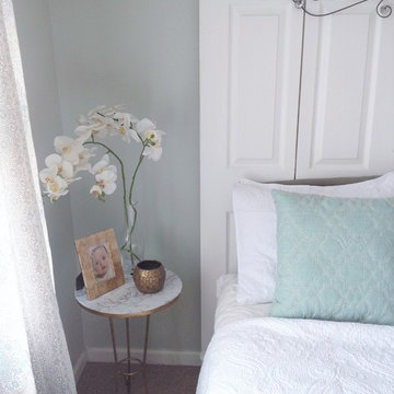
Amber works from home and was sacrificing a dining room for her home office. By utilizing the double wide closet space in her guest bedroom, she now walks into her home without the reminder of work, and can have guests over for a meal in her dining room (dining room reveal coming soon). The walls were freshly painted Sea Salt by Sherwin Williams. This gives the room a fresh, clean look and also adds contrast to the beige carpet.
Amber had her homework assignments cut out for her as she had to do some major purging in her throw all guest room. Once she started letting go, she was on a roll and continually surprised me as she cleaned out closets throughout the house. One dresser was filled with cds, dvds, books, albums, scrap-booking materials; items taking up precious real estate in her life that she didn't even know were there. There really wasn't a storage problem after-all, she was just holding on to a collection of things that no longer served her. Each time I would visit, and her space would become more open, I could see the weight lifting off her and her self love building. Amber had a recent breakup with her boyfriend and this makeover helped her not only focus on making a home sanctuary for herself, but helped her let go of the pains of the past and focus on the exciting future ahead. At one point when we were moving sofas in the living room (which we will also reveal soon), we found an ex's flip-flop. We were figuratively and literally sweeping away the past. Editing your home and your life makes room for your future; for new people and things. We are so happy to finally reveal the room to you! We can't wait to unveil the rest of Amber's home, once we complete the finishing touches.
Challenges:
Amber's home was filled with mix-matched furniture from family and college. She had no idea what her decorating style was. After shopping together and exchanging somepinterest boards, I was finally able to get a sense of what she loves.
I had to work on a tight budget, which meant really digging out the creativity and utilizing other items in the home. See how I transformed a table from the discard pile into a faux marble bedside table by clicking web link.
Amber's dad was able to help with the desk materials and building to cut costs.
We wanted to save the closet doors in the event she sold her home or no longer needed an office someday. There wasn't any extra space to store these closet doors, so I used them as a headboard.
The only items purchased were: Curtains, Curtain Rod, Bedspread Set, Throw Pillows, 2 Lamps and Paint.



 Carpet Design Group, LLC
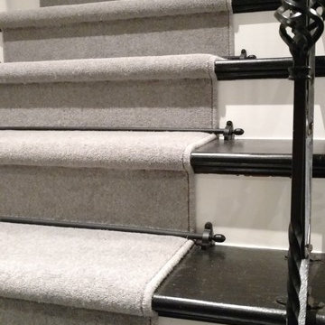
Example of a mid-sized classic wooden straight staircase design in Birmingham with painted risers
 Advance Design Studio, Ltd.
Chris and Sofia of Arlington Heights knew when they purchased their home that they would finish the basement. They needed a space for the kids to hang out, for family and friends to stay, and to have a better space for hosting holidays and parties. The dark unfinished space went mostly unused for three years, but once their kids reached the ideal age for use of a well-built basement, they moved ahead with their plan.
“The old basement was dark and cold, and the kids came down and played, but they didn’t like it. The new space is like a whole other house, so we have this space for family game nights and for watching games or Super Bowl parties,” Chris said.
The couple found Advance Design Studio through a friend who had their entire home renovated by the remodeling company. After the initial meeting and visiting the showroom, Chris and Sofia were positive that Advance Design was the company that could best turn their unfinished basement into a family friendly space for everyone to enjoy.
“We really liked the showroom, we liked being able to choose all of those finishes and meet with them in one place,” Chris said.
A Custom Space for a Family with Multiple Needs
The project began with a fireplace focal point complete with an amazing entertainment wall, a fantastic full kitchen complete with every amenity, and a brand new full bath. The new basement truly has a space for everyone. If the kids want to watch a movie and hang out on the couch they can, if family wants to play games and have a pizza party on the large island they can, and if guests want to stay over night on the pull-out sofa they can enjoy the entire private “suite” complete with a full bath. It is the true definition of a multifunctional basement.
The stunning, full kitchen is the highlight of this now bright and airy basement. You walk down the stairs and are immediately impressed with the detailed metal tile work on the ceiling, bringing to mind the classic feel of a comfortable old pub. Cherry Merlot cabinets provide a rich contrast against the soft neutral walls and the contrasting copper tin ceiling tile and backsplash. Rich Santa Cecelia granite countertops pair nicely with timeless stonework on the outer walls.
The island is large enough to provide a more than adequate entertaining space, and provides plenty of both seating and storage. The well-appointed kitchen houses a regular size refrigerator, a full size oven for pizza parties and cookie baking anytime, a microwave oven as well as complete sink and trash set up. One could easily do without a home kitchen forever in this generously designed secondary space!
The fireplace and buffet wall seating area is the ideal place to watch movies or sporting events. The coordinating stonework on the fireplace flows throughout the basement, and a burnt orange accent wall brings color and warmth to otherwise ordinary basement space. The Elite Merlot media buffet compliments the kitchen as well as provides storage and a unique functional display option, giving this part of the basement a sophisticated, yet functional feel.
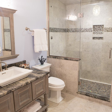
The full bath is complete with a unique furniture style cherry DuraSupreme vanity and matching custom designed mirror. The weathered look to the cabinets and mirror give the bathroom some earthy texture as does the stone floor in the walk-in shower. Soft blue makes the space a spa-like mini retreat, and the handsome wall to wall tile and granite speak luxury at every corner.
Advance Design added clever custom storage spaces to take advantage of otherwise wasted corners. They built a custom mudroom for the kids to house their sports equipment and a handy built in bench area with basket pull outs for a custom home gym. “They were able to custom fit this second mudroom with the lockers and the bench, they were able to custom build that, so the kids could store all of their equipment down here for the sports that they are in,” Chris said.
They Got The Amazing Space They Had Envisioned for Years!
The basement Chris and Sofia had envisioned had come to life in a few short months of planning, design and construction, just a perfect fit in the summer months. Advance Design Studio was able to design and build a custom, multifunctional space that the whole family can enjoy. “I would recommend Advance Design because of the showroom, because of the cleanliness on the jobsite and the professionalism, combined with Christine’s design side as well as Todd’s builder’s side - it’s nice to have it all together,” reminisced Chris after the project was complete.
11