
Search results for "Narrow close" in Home Design Ideas
 The Artisans Group, Inc.
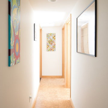
Winner of the 2018 Tour of Homes Best Remodel, this whole house re-design of a 1963 Bennet & Johnson mid-century raised ranch home is a beautiful example of the magic we can weave through the application of more sustainable modern design principles to existing spaces.
We worked closely with our client on extensive updates to create a modernized MCM gem.
Extensive alterations include:
- a completely redesigned floor plan to promote a more intuitive flow throughout
- vaulted the ceilings over the great room to create an amazing entrance and feeling of inspired openness
- redesigned entry and driveway to be more inviting and welcoming as well as to experientially set the mid-century modern stage
- the removal of a visually disruptive load bearing central wall and chimney system that formerly partitioned the homes’ entry, dining, kitchen and living rooms from each other
- added clerestory windows above the new kitchen to accentuate the new vaulted ceiling line and create a greater visual continuation of indoor to outdoor space
- drastically increased the access to natural light by increasing window sizes and opening up the floor plan
- placed natural wood elements throughout to provide a calming palette and cohesive Pacific Northwest feel
- incorporated Universal Design principles to make the home Aging In Place ready with wide hallways and accessible spaces, including single-floor living if needed
- moved and completely redesigned the stairway to work for the home’s occupants and be a part of the cohesive design aesthetic
- mixed custom tile layouts with more traditional tiling to create fun and playful visual experiences
- custom designed and sourced MCM specific elements such as the entry screen, cabinetry and lighting
- development of the downstairs for potential future use by an assisted living caretaker
- energy efficiency upgrades seamlessly woven in with much improved insulation, ductless mini splits and solar gain

 Studio Z Architecture
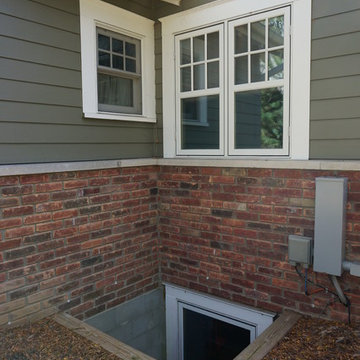
A close-up of the egress window in the new basement. Paint color: Pittsburgh Paints Manor Hall (deep tone base) Autumn Grey 511-6.
Photo by Studio Z Architecture
Find the right local pro for your project
 Design Builders, Inc.
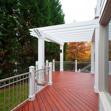
Zuri PVC decking installed inside a screen porch. A decking inlay breaks up the long runs of diagonal decking. PVC columns carry the closed gable roof with continuous eyebrow. Wrought iron handrails are installed between the decorative columns.
 A-Team Home Improvement
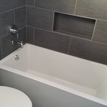
Minimalist gray tile ceramic tile bathroom photo in Kansas City with a one-piece toilet and gray walls
 SV Design
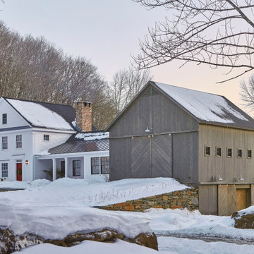
Nestled in the hills of Vermont is a relaxing winter retreat that looks like it was planted there a century ago. Our architects worked closely with the builder at Wild Apple Homes to create building sections that felt like they had been added on piece by piece over generations. With thoughtful design and material choices, the result is a cozy 3,300 square foot home with a weathered, lived-in feel; the perfect getaway for a family of ardent skiers.
The main house is a Federal-style farmhouse, with a vernacular board and batten clad connector. Connected to the home is the antique barn frame from Canada. The barn was reassembled on site and attached to the house. Using the antique post and beam frame is the kind of materials reuse seen throughout the main house and the connector to the barn, carefully creating an antique look without the home feeling like a theme house. Trusses in the family/dining room made with salvaged wood echo the design of the attached barn. Rustic in nature, they are a bold design feature. The salvaged wood was also used on the floors, kitchen island, barn doors, and walls. The focus on quality materials is seen throughout the well-built house, right down to the door knobs.
 DCI Home Resource
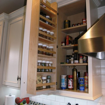
A Beautiful and Elegant Kitchen by DCI Home Resource and Dura Supreme Cabinetry.
Inspiration for a transitional kitchen remodel in Charlotte
Inspiration for a transitional kitchen remodel in Charlotte
Sponsored
Delaware, OH

Buckeye Basements, Inc.
Central Ohio's Basement Finishing ExpertsBest Of Houzz '13-'21
 Green Diva Designs
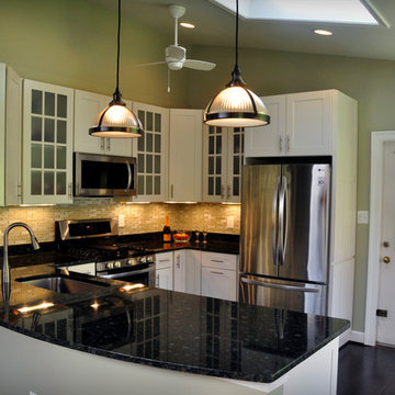
Eat-in kitchen - mid-sized transitional u-shaped dark wood floor eat-in kitchen idea in DC Metro with an undermount sink, white cabinets, granite countertops, green backsplash, glass tile backsplash, stainless steel appliances, a peninsula and shaker cabinets
 Union Studio, Architecture & Community Design
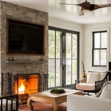
The masonry fireplace is a cozy gathering spot with flanking glass patio doors offering oblique views to the yard and pool.
Photo Jeff Roberts
 Design Perspective Interior Design, LLC
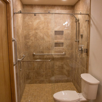
I designed this ADA bathroom and assisted the homeowner in making all of the fixture, material and finish choices while working at Corvallis Custom Kitchens and Baths.
Our client needed to update this bathroom for her husband who uses a walker and needs assistance with daily bathing and such.
We installed a frameless glass shower with a fixed panel and one slider section. In the fixed panel, we installed a small door so the controls for the shower can be accessed without having to enter the shower. A linear drain allows for a zero threshold entry into the shower allowing for the bather to enter without any barrier to step over.
We installed an American Standard Cadet Pro Right Height toilet and places blocking in the wall so drop down grab bars (one with a toilet paper holder) could be added if wanted at a later time.
We decided to install a narrower vanity than what was previously installed to allow more room in the toilet area. Maple flat panel cabinetry was installed with Silestone Phoenix quuartz countertops and backsplash with a Kohler Caxton undermount sink with a Moen single handle faucet.
Grab bars were installed in the shower stall and at the entry to the shower, along with a Speakman grab bar shower system with Hansgrohe shower controls. A combo niche for shampoo and such was installed close to the handheld showerhead for easy access.
LED lighting was added to the shower area on it's own dimmer switch. An additional LED fixture was installed over the vanity to provide excellent task lighting for anyone using the vanity.
The door to the bedroom was also changed to a pocket door and widened to allow easier access to the bathroom from the bedroom.
 HwRenewal
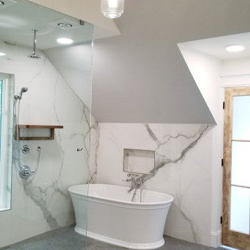
In this 90's cape cod home, we used the space from an overly large bedroom, an oddly deep but narrow closet and the existing garden-tub focused master bath with two dormers, to create a master suite trio that was perfectly proportioned to the client's needs. They wanted a much larger closet but also wanted a large dual shower, and a better-proportioned tub. We stuck with pedestal sinks but upgraded them to large recessed medicine cabinets, vintage styled. And they loved the idea of a concrete floor and large stone walls with low maintenance. For the walls, we brought in a European product that is new for the U.S. - Porcelain Panels that are an eye-popping 5.5 ft. x 10.5 ft. We used a 2ft x 4ft concrete-look porcelain tile for the floor. This bathroom has a mix of low and high ceilings, but a functional arrangement instead of the dreaded “vault-for-no-purpose-bathroom”. We used 8.5 ft ceiling areas for both the shower and the vanity’s producing a symmetry about the toilet room door. The right runner-rug in the center of this bath (not shown yet unfortunately), completes the functional layout, and will look pretty good too.
Of course, no design is close to finished without plenty of well thought out light. The bathroom uses all low-heat, high lumen, LED, 7” low profile surface mounting lighting (whoa that’s a mouthful- but, lighting is critical!). Two 7” LED fixtures light up the shower and the tub and we added two heat lamps for this open shower design. The shower also has a super-quiet moisture-exhaust fan. The customized (ikea) closet has the same lighting and the vanity space has both flanking and overhead LED lighting at 3500K temperature. Natural Light? Yes, and lot’s of it. On the second floor facing the woods, we added custom-sized operable casement windows in the shower, and custom antiqued expansive 4-lite doors on both the toilet room door and the main bath entry which is also a pocket door with a transom over it. We incorporated the trim style: fluted trims and door pediments, that was already throughout the home into these spaces, and we blended vintage and classic elements using modern proportions & patterns along with mix of metal finishes that were in tonal agreement with a simple color scheme. We added teak shower shelves and custom antiqued pine doors, adding these natural wood accents for that subtle warm contrast – and we presented!
Oh btw – we also matched the expansive doors we put in the master bath, on the front entry door, and added some gas lanterns on either side. We also replaced all the carpet in the home and upgraded their stairs with metal balusters and new handrails and coloring.
This client couple, they’re in love again!
 Real Hardwood Floors and Custom Cabinets
Alberto Antunes, Tom and Jenna McManus
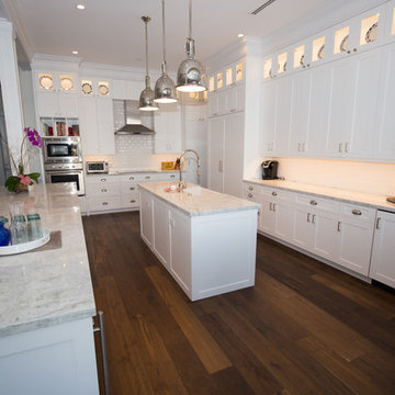
Large transitional u-shaped medium tone wood floor eat-in kitchen photo in Miami with a farmhouse sink, shaker cabinets, white cabinets, granite countertops, white backsplash, subway tile backsplash, paneled appliances and two islands
Large transitional u-shaped medium tone wood floor eat-in kitchen photo in Miami with a farmhouse sink, shaker cabinets, white cabinets, granite countertops, white backsplash, subway tile backsplash, paneled appliances and two islands
 Forward Design Build Remodel
Goals
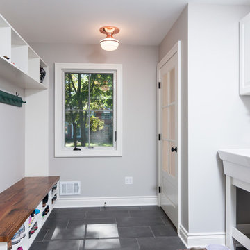
While their home provided them with enough square footage, the original layout caused for many rooms to be underutilized. The closed off kitchen and dining room were disconnected from the other common spaces of the home causing problems with circulation and limited sight-lines. A tucked-away powder room was also inaccessible from the entryway and main living spaces in the house.
Our Design Solution
We sought out to improve the functionality of this home by opening up walls, relocating rooms, and connecting the entryway to the mudroom. By moving the kitchen into the formerly over-sized family room, it was able to really become the heart of the home with access from all of the other rooms in the house. Meanwhile, the adjacent family room was made into a cozy, comfortable space with updated fireplace and new cathedral style ceiling with skylights. The powder room was relocated to be off of the entry, making it more accessible for guests.
A transitional style with rustic accents was used throughout the remodel for a cohesive first floor design. White and black cabinets were complimented with brass hardware and custom wood features, including a hood top and accent wall over the fireplace. Between each room, walls were thickened and archway were put in place, providing the home with even more character.
Sponsored
Plain City, OH

Kuhns Contracting, Inc.
Central Ohio's Trusted Home Remodeler Specializing in Kitchens & Baths
 Anthology Woods
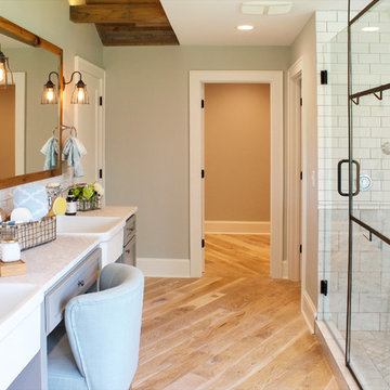
Products making their television debut in this project were Anthology Woods Northwest Blend (a naturally weathered wood installed on a section of the ceiling, unfinished) and the extremely hard & durable Left Coast White Oak, a unique species growing only in a narrow strip of Oregon and bit in California & Washington (installed for the flooring, finished with Rubio Monocoat White natural oil). The homeowners were able to easily apply the finish themselves prior to installing the floor, and the zero VOC nature of the oil insured it was safe to move right in! The White tint to the oil gives a subtle white-washed look to the floors while maintaining a natural look and a supple feel underfoot.
The couple participating in the episode loved their floor so much they decided to add more, installing it in their master bedroom, as well! The rich character of this natural Oak in a flat sawn (the old "European" way to cut Oak) wood product adds a timeless element & warmth to the feel of the space. Looking closely at the grain, you'll see cathedral patterns in many boards, along with a great mix of flat grain with rift areas as well. Finishing out the details of the room, the Bath Crashers team added natural carerra marble in the shower with tones of white & gray, and apron-front vanity sinks for extra charm.
 Olamar Interiors
This client came to us with a unique challenge: create a modern design that matches her fun and funky personality but to make it as "green" and chemical free as possible. We rose to the challenge, researching the best options for sustainable, green and chemical free furnishings. The upholstery pieces are made from sustainable and chemical free materials, the dining table is made of sustainable wood with a chemical free finish. The rugs are from a fair-trade company that supports education for women in India. The client had hired a Feng Shui expert to provide her with a report which we used to design the space. The wallpaper behind the living room sofa is custom designed and custom-made. It is a map made up of hundred of small photos that the homeowner provided to us. It represents the area in her home that will bring travel and connect her to the people she loves. The large, colorful art piece in the dining area is hung in the area of the home that will bring joy around family and children. The hearts and pink/red colored wallpaper in the den will evoke love and relationships.
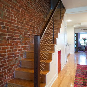
The client has a colorful, fun personality and we wanted to infuse the design with it. A white backdrop allows all of the pinks, reds, navy blues and turquoises to pop, creating a lively, modern feeling. The textures in the floor and wall coverings and in the fabrics create a lived in, collected feeling and add a touch of bohemian chic style. The new modern cable and walnut stair banister is in keeping with the original modern feel of the row house and keeps the narrow staircase from feeling tight and closed in.
This was a fun, creative and unique project for us. This particular client was one of Olamar's first clients eight years ago when we first opened our doors. At that time the house was nothing but a condemned shell that the client renovated, with our assistance. At that time we designed the kitchen, which is still in excellent condition and still looks amazing!
Photographer: Greg Tinius
 North Shore Kitchen & Bath
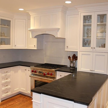
The original kitchen had wood cabinets which made the space seem dark and small, as well as not enough storage. It was in need of an update and brightening up. Working closely with the client we were able to come up with creative storage solutions to take advantage of every nook and cranny to maximize storage and ensure there was space for everything. To highlight the beautiful view form the window, we added glass cabinets on either side, as well as in the hutch cabinet to draw the eye around the room. By using white cabinetry, we were able to make the space seem larger within the same footprint of the kitchen. A custom wood hood adds an additional focal point. The beautiful soapstone countertops tie the whole space together and work with the look of the traditional home. The custom wood posts on the end of the peninsula add extra detail to the cabinetry and an extra detail to the countertop. The addition of wood floors ties the space to the rest of the home.
 Milgard Windows & Doors
The Kiguchi family moved into their Austin, Texas home in 1994. Built in the 1980’s as part of a neighborhood development, they happily raised their family here but longed for something more contemporary. Once they became empty nesters, they decided it was time for a major remodel. After spending many years visiting Austin AIA Home Tours that highlight contemporary residential architecture, they had a lot of ideas and in 2013 were ready to interview architects and get their renovation underway.
The project turned into a major remodel due to an unstable foundation. Architects Ben Arbib and Ed Hughey, of Arbib Hughey Design were hired to solve the structural issue and look for inspiration in the bones of the house, which sat on top of a hillside and was surrounded by great views.
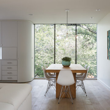
Unfortunately, with the old floor plan, the beautiful views were hidden by small windows that were poorly placed. In order to bring more natural light into the house the window sizes and configurations had to be addressed, all while keeping in mind the homeowners desire for a modern look and feel.
To achieve a more contemporary and sophisticated front of house, a new entry was designed that included removing a two-story bay window and porch. The entrance of the home also became more integrated with the landscape creating a template for new foliage to be planted. Older exterior materials were updated to incorporate a more muted palette of colors with a metal roof, dark grey siding in the back and white stucco in the front. Deep eaves were added over many of the new large windows for clean lines and sun protection.
“Inside it was about opening up the floor plan, expanding the views throughout the house, and updating the material palette to get a modern look that was also warm and inviting,” said Ben from Arbib Hughey Design. “Prior to the remodel, the house had the typical separation of rooms. We removed the walls between them and changed all of the windows to Milgard Thermally Improved Aluminum to connect the inside with the outside. No matter where you are you get nice views and natural light.”
The architects wanted to create some drama, which they accomplished with the window placement and opening up the interior floor plan to an open concept approach. Cabinetry was used to help delineate intimate spaces. To add warmth to an all-white living room, white-washed oak wood floors were installed and pine planks were used around the fireplace. The large windows served as artwork bringing the color of nature into the space.
An octagon shaped, elevated dining room, (named “the turret”), had a big impact on the design of the house. They architects rounded the corners and added larger window openings overlooking a new sunken garden. The great room was also softened by rounding out the corners and that circular theme continued throughout the house, being picked up in skylight wells and kitchen cabinetry. A staircase leading to a catwalk was added and the result was a two-story window wall that flooded the home with natural light.
When asked why Milgard® Thermally Improved Aluminum windows were selected, the architectural team listed many reasons:
1) Aesthetics: “We liked the slim profiles and narrow sightlines. The window frames never get in the way of the view and that was important to us. They also have a very contemporary look that went well with our design.”
2) Options: “We liked that we could get large sliding doors that matched the windows, giving us a very cohesive look and feel throughout the project.”
3) Cost Effective: “Milgard windows are affordable. You get a good product at a good price.”
4) Custom Sizes: “Milgard windows are customizable, which allowed us to get the right window for each location.”
Ready to take on your own traditional to modern home remodeling project? Arbib Hughey Design advises, “Work with a good architect. That means picking a team that is creative, communicative, listens well and is responsive. We think it’s important for an architect to listen to their clients and give them something they want, not something the architect thinks they should have. At the same time you want an architect who is willing and able to think outside the box and offer up design options that you may not have considered. Design is about a lot of back and forth, trying out ideas, getting feedback and trying again.”
The home was completely transformed into a unique, contemporary house perfectly integrated with its site. Internally the home has a natural flow for the occupants and externally it is integrated with the surroundings taking advantage of great natural light. As a side note, it was highly praised as part of the Austin AIA homes tour.

Sponsored
Sunbury, OH

J.Holderby - Renovations
Franklin County's Leading General Contractors - 2X Best of Houzz!

 Drummond House Plans
Majestic Rustic Cottage home design # 3827 by Drummond House Plans
Blueprints & PDF available starting at only $1049.
You are searching for a large cottage which can be built on a relatively narrow lot? This model easily fits the bill with its 45 foot width. Let’s examine it more closely.
On the exterior, the different masses and peaks, coupled with a three-sided wraparound veranda, create a look which will certainly not go unnoticed.
In the interior, we first appreciate a 9 foot ceiling throughout the main level, a spacious entrance and two staircases leading to the second level, one of which leads us to a beautiful bonus space and a generous family room with windows over three façades and centered fireplace. Let’s not forget the beautiful dining room at the rear, adjacent to a kitchen equipped with a lunch counter and a large pantry. Directly adjoining, we see a very functional laundry room and independent guest bahtroom. On the second level and in a very well organized fashion, we savour the presence of four bedrooms. The master suite includes a private bathroom and walk=in closet. The three secondary bedrooms share a hall bathroom.
If you are looking for other options, take pleasure in comparing the two models similar to this one!
 Roeser Home Remodeling
This Mid-Century home had been updated except for the kitchen and master bath. After a few years of being empty nesters, and with the neighborhood turning over drastically to infill property in the millions, this couple decided the time was right to update the last remaining rooms.
Starting in the Kitchen
Taking a dark, u-shaped kitchen out of the past and updating it for the future, was a dream come true for this family. They knew what they wanted in order to entertain their large extended family, which included their three kids; plus, his family, consisting of nine children, spouses, and now grandchildren. Requirements of an open space to hang out and help out, a banquet for food presentation without obstruction, bright and clean, easy storage, a place for her mother’s china decanters, and an instant hot for tea were all part of the “must haves” for this kitchen. We also needed to work around the homeowners’ existing appliances since many of them were practically new.
Vaulted ceilings, lots of high windows, and large openings to other spaces in the house, were challenges that only a galley style kitchen could address. Blending and lacing the hardwood floor with new flooring required both the new and existing to be sanded down and refinished. This provided a coherent look to the entire first floor of this home. Matching casings, baseboards and base shoe helped to make the updates look fresh, but original to the house.
In the kitchen, choosing the sandstone slate finish on our Wellborn Maple select series cabinets kept the space soft; but really opened it, making the space lighter and brighter. The Harmony style door choice blended with the décor in the rest of the house, while also giving straight clean lines the homeowner desired. Grounding the row of cabinets with their refrigerator and a pantry cabinet, gave symmetry to this side of the kitchen.
On the opposite side, a built-in pantry cabinet mirrors the refrigerator. A row of drawer cabinets expanded the storage and banquet space, to lay out food for entertaining. Also added were some much-needed wall cabinets with glass inserts to mirror the windows and keep the space open. This also allowed the taller canister to be displayed and admired. A few smaller shelves were added above the window space, to house the smaller canisters so loved by the homeowner.
An artist by trade, this homeowner added two narrow cabinets to the side of the pantry and the side of the refrigerator panel to house and create easy access to the various spices her husband loves to use while cooking. She painted them to blend with Wellborn’s Sandstone finish. The Caesarstone countertop with a 3cm eased edge in London Gray has a small pattern that is subtle and interesting. Cutting down the Caesarstone to 2 cm and carrying the same London Gray pattern up the backsplash area, lended to the clean lines and easy cleaning this homeowner requested.
Choosing chrome plumbing fixtures from Moen’s Brantford line is timeless choice. Chrome is always popular and yet in today’s market, also very trendy. The Brantford faucet has a pull-down spray and one side handle, leaving space for the all-important request of a Transcape hot water dispenser, also in chrome.
Scraping away the past included smoothing out the popcorn ceiling. Adding LED slope cans to the vaulted ceilings provided the necessary task lighting to elevate these homeowners’ joy of cooking. Removing the dated “popcorn look” enhanced the clean and spacious feel created by the architecture of the ceiling. Adding Top Knob chrome hardware was the final element that tied the kitchen all together.
Master Bathroom
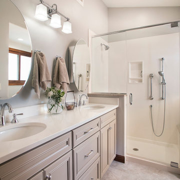
The original dated Master Bathroom had dark cabinets, a huge Jacuzzi tub and a small shower stall that provided barely enough room for even a child to shower. Removing the Jacuzzi tub that was never used, opened this floor plan to a grand shower that is comfortable and spacious. For easy cleaning, these homeowners opted for a panel system in their shower. Onyx shower walls with a shower seat and recess wide shower caddy were installed in place of the old Jacuzzi style tub.
The large panels were quite a challenge for our team, with an eight foot door and vaulted ceilings; but they were determined not to have a seam. These seamless panels are beautiful and very easy to clean. Keeping with the original floor plan, a double sink vanity from Wellborn’s select line with the Harmony door style in a pebble finish was installed. New Kohler Caxton under mount sinks were installed, along with the Moen Kinsley 8” wide spread faucets in chrome. Matching Kingsley 18” grab bars were added to the shower area, along with the Kohler Brantford fixed shower head and handheld slide bar.
The countertop was a beautiful Caesarstone in Frosty Carrina with an eased edge and 4” back and side splash. Matching Kinsley towel hooks were added, along with mirrors the homeowner purchased and we installed for her. Top Knobs chrome cabinet hardware finished the look along with a beautiful tile floor AO Mira 1224-S Silver Maple laid in a broken joint pattern. Matching marble sills were added on top of the knee walls and threshold in the doorway. A 3/8” frameless custom shower door with fixed panels surrounded the shower creating an open airy feel to the space.
Not shown: Kohler’s Wellworth highline toilet with a slow-close seat replaces the original toilet. The original shower stall became a space used to house a stackable washer and dryer, a top a safety pan and drain to slop sink in the basement. There was even enough room for small shelving to provide storage for laundry essentials. Adding a louver door keeps the laundry area behind the scene and opens the master area to multiple tasks needed.
Master Bedroom Fireplace
This homeowner really missed a bedroom fireplace they had in a previous home. Since we were going to be working on their master bathroom anyway; was there a way to create a fireplace without making it feel too odd in their large bedroom area? They had purchased a ventless gas fireplace and they had their original television as well.
Challenged by windows, a vaulted ceiling and the natural light streaming from the back window; this divided wall was created, keeping the lighting from the other side of the room and providing a dressing area opposite the fireplace. This was a perfect idea since the closets are now in the dressing area and the creative wall houses the fireplace and TV for cold winter nights of snuggling to a movie. Better yet, the fireplace and TV are all on remote control!
 Arcata Cabinet & Design Company
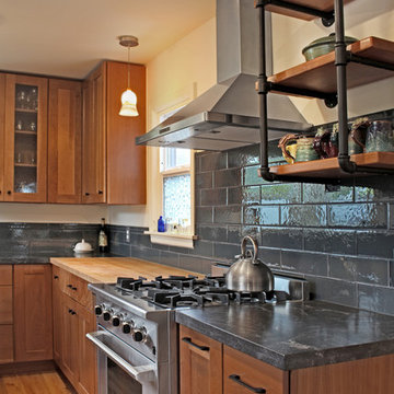
The 30" professional style range and hood make a statement in this compact layout. A narrow U shaped kitchen that boasts granite AND butcher block together.
Some sexy farmhouse features such as open shelves with custom plumbing brackets (thanks Fixer Upper), and large textured subway tile, create a custom look. Beautiful cabinetry by Diamond sets the scene for functionality and ease of use - all soft close hardware with tons of features built-in. This kitchen is the envy of the whole block!
Nicolette Patton, CKD
52