
Search results for "Narrow close" in Home Design Ideas

 Klopf Architecture
Malibu Glass Box House by Klopf Architecture
Following the devastating Woolsey Fire of 2018, the site in Malibu offered a unique opportunity to rebuild not just a home, but a new architectural composition that highlighted the property’s potential while navigating strict fire-rebuild codes in the area. Designed by Klopf Architecture, this project embraced a set of limitations and translated them into an architectural asset.
The city’s fire-rebuild process required the new structure to remain close to the original footprint, size and bulk, a constraint that ultimately clarified the architectural direction. Perched near the front of a long, narrow lot, the new home frames and overlooks a private, park-like rear expanse, an uncommon luxury especially in this part of Malibu .
Without a fixed program, the design process allowed for a different kind of creative focus allowing Klopf Architecture the opportunity to explore how a modernist home could best respond to this site. The team approached the project not with a list of requirements, but with a question: How might a modernist live here? What spatial qualities would inspire calm, connection, and a sense of wonder in this setting? The process became less about problem-solving and more about architectural storytelling—letting the site, the light, and the principles of modern design guide the form and flow of the home.
The response emerged in the form of a glass-box pavilion, an open, Mid-Century Modern inspired living, dining, and kitchen space that floats at the edge of the property’s natural descent. Connected to the more enclosed, private areas of the home by a glass-walled hallway, the living pavilion becomes a distinct centerpiece of the design. It opens on all four sides to the landscape with decks and patios on the flanks, an internal garden and water feature to the north, and a dramatic unguarded view of the expansive backyard and ocean horizon to the south.
Because of the mandated footprint, careful planning was required to ensure every space could still engage with light, landscape, or both. Strategic voids in the form of atriums and courtyards allow daylight to filter deep into the home’s core, while offering moments of surprise and retreat. These design gestures allow natural light to filter deep into the interior, creating a sense of brightness and openness throughout the day. At the same time, they expand the perceptual boundaries between inside and out, making the home feel more expansive while anchoring its connection to the surrounding landscape.
The siting of the house is what gives it its unique character. Rather than receding into the backyard like the neighboring homes, the house holds a slight prominence. From the central living pavilion, stepping down into the landscape feels more like entering a secluded park where a separate existing accessory structure, trail, and recreational areas await. The home’s modest street presence gives way to this unfolding drama of space, view, and nature.
Fire-resilient materials and assemblies are integrated seamlessly throughout including triple-pane glazing, under-slab and roof insulation, and locally sourced fire-rated cladding ensure the house not only meets Calfornia’s rigorous wildland-urban interface (WUI) standards, but feels effortlessly aligned with them. While technical decisions like fire-hardening and mechanical systems presented some construction challenges, particularly around the cantilevered glass box, the team found a functional compromise that preserved the integrity of the design.
Inside, a restrained palette and exposed post and beam design celebrate the ethos of mid-century modernism. A central circulation spine extends from the entry to the rear glass wall, offering a continuous visual link from street to ocean. Spaces such as the library and office, though more intimate in scale, are never cut off from nature as each opens to its own unique courtyard or garden view.
Though born out of a strict regulatory framework and developed without a specific client, the rebuild design unfolded with remarkable clarity. Grounded in site logic, refined by limitations and an emphasis on timeless spatial relationships – light, proportion, and a strong connection to nature, the resulting design feels both effortless and uplifting. The home lives lightly on the land, opens generously to its surroundings, and strikes a careful balance between privacy, openness, and calm. For Klopf Architecture, it stands as a compelling case study in how site, code, and circumstantial constraints can inspire enduring, modernist architecture. With years of experience reimagining mid-century modern design for how people live today, the firm took the project’s limitations as an opportunity. The result is a home shaped by open, flowing spaces, strong indoor-outdoor connections, and a calm, clear sense of structure. It’s a good reminder that even with strict constraints, there’s still room for architecture to breathe—and for modernism to keep moving forward.
Klopf Architecture project team: Geoff Campen, John Klopf, AIA, and Sherry Tan
Structural Engineer: ZFA
Contractor: Maison D’Artiste
Photography: ©2025 Mariko Reed
Year Completed: 2023
 Design Perspective Interior Design, LLC
I designed this ADA bathroom and assisted the homeowner in making all of the fixture, material and finish choices while working at Corvallis Custom Kitchens and Baths.
Our client needed to update this bathroom for her husband who uses a walker and needs assistance with daily bathing and such.
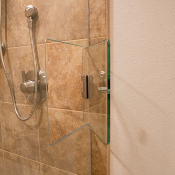
We installed a frameless glass shower with a fixed panel and one slider section. In the fixed panel, we installed a small door so the controls for the shower can be accessed without having to enter the shower. A linear drain allows for a zero threshold entry into the shower allowing for the bather to enter without any barrier to step over.
We installed an American Standard Cadet Pro Right Height toilet and places blocking in the wall so drop down grab bars (one with a toilet paper holder) could be added if wanted at a later time.
We decided to install a narrower vanity than what was previously installed to allow more room in the toilet area. Maple flat panel cabinetry was installed with Silestone Phoenix quuartz countertops and backsplash with a Kohler Caxton undermount sink with a Moen single handle faucet.
Grab bars were installed in the shower stall and at the entry to the shower, along with a Speakman grab bar shower system with Hansgrohe shower controls. A combo niche for shampoo and such was installed close to the handheld showerhead for easy access.
LED lighting was added to the shower area on it's own dimmer switch. An additional LED fixture was installed over the vanity to provide excellent task lighting for anyone using the vanity.
The door to the bedroom was also changed to a pocket door and widened to allow easier access to the bathroom from the bedroom.
 TKS Design Group
Typical of bungalows and city lots, the footprint of this home was narrow with living spaces in front, bedrooms in back and kitchen centrally located. However, unlike most bungalows, the hall running from front to back have been closed off to, presumably, accommodate a walk-in pantry. Couple that with the fact that this circa 1925 bungalow had seen a lot of living – read boisterous children and remodeling trends like z-brick, soffits, and fluorescent overhead lighting – the kitchen was due for a major overhaul.
Truly the hub of this house, the modest 11’ x 12’ kitchen was most in need of additional countertop space, convenient garbage/recycle bin, counter-depth refrigerator, storage aids, informal dining for two, and sound-proofing to enable this musically adept family to coexist despite varied schedules.
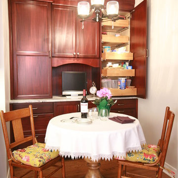
Gone are the wall soffits, boxy overhead lighting, six-foot baseboard heat unit, extra deep refrigerator, refurbished cabinets, laminate countertops, z-brick wall covering, and makeshift door swags. Enter rich mahogany cabinets, roll and pull-out storage units, endcap spice storage, gorgeous granite tops, marble backsplash, LED lighting, acoustic insulation and solid-wood doors.
Under the guise of such a handsome room, provisions such as a period style sink allow for more efficient use of corners with pull-out half-moon trays for storage. Redirecting the baseboard heat to a compact, toekick unit, means more cabinet and counter space – perfect for a baking and/or entertaining area removed from the basic work triangle. The eating area, also, doubles as a work station with drawers for office supplies and dedicated outlet for cable tv. Functional yet beautiful, this kitchen is at the ready as its owners look forward to their golden years.
Designed by: The Kitchen Studio of Glen Ellyn
Photography by: Dawn Jackman
For more information on kitchen and bath design ideas go to: www.kitchenstudio-ge.com
Find the right local pro for your project
 Bilotta Kitchen & Home
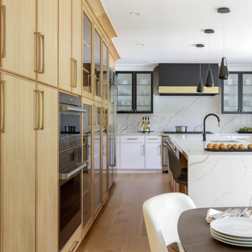
Contemporary took a 180 turn with this warm trio of white, light wood and black, instead of a stark all-white color scheme. Perimeter bases and uppers flanking the sink are painted “Simple White”; the island and tall cabinets are light-stained rift cut white oak; the hood and its accompanying uppers are painted black. Slab doors get a fresh take with a narrow square trim encircling the doors and drawers. The focal point is a wide brass strip around the hood. Brass is repeated in the honey bronze pulls and T-shaped knobs. Black-framed wall cabinets have white interiors with LED light trips on the sides; tall cabinets with glass doors received matching rift cut white oak interiors. Calacatta-patterned quartz accents the perimeter tops, the double waterfall island, and the slab backsplashes.
The workhorse of this kitchen is the wall of tall white oak cabinets. There’s a desk with open storage above; closed pantries with rollouts; glass-fronted cabinets displaying serving pieces and collectables; a built-in oven and convection-microwave; and a 48” stainless steel refrigerator. The island does its part as well, with a prep sink, paneled dishwasher, and room for four stools. Stainless undermount sinks feature matte black faucets highlighted with brass.
 Kelly Weldon Design
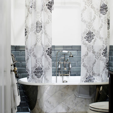
This bathroom consists of custom crackled wall tiles. The space for the tub was quite narrow so the tub had to be custom a piece. The overall aesthetic was to recreate a space that was close to it's original period.
 Pool & Hot Tub Alliance
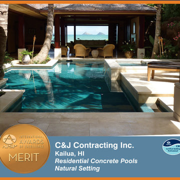
This pool was designed and built to be the focal point of the entire property. On this long narrow beachfront lot. We had the privilege of being able to work with the landscape architect to improve upon his aesthetic design to create a functional pool. While the house would be designed after around the pool. Upon walking into the front door, immediately you have a stunning view of the pool overlooking the Pacific Ocean with the Mokulua Islands in the background. We incorporated the materials used in both the pool and home to match seamlessly created a smooth transition from the indoor space to outdoor space. The walkway to the living room is actually floating stepping stones over the spa. The travertine on the deck is the same as the flooring in the house. The pool deck drain grout joint of the travertine, match the width and depth making the draining practically invisible. By working closely with the other contractors who were building the house, together we created a successful marriage of both outdoor and indoor spaces.
 Sheila Rich Interiors, LLC
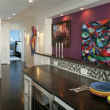
A once dark and enclosed narrow hallway was opened up. Soffits were added to the cement ceiling to accommodate the recessed lighting which creates a lighted path for way finding. The kitchen island in the foreground, complete with wine refrigerator and drawer microwave, was previously closed in by a full wall. The purple passion wall continues around the corner from the living room, strikingly enhancing the artist's original work and delineating the open area between the kitchen and the hallway.
Sponsored
Plain City, OH

Kuhns Contracting, Inc.
Central Ohio's Trusted Home Remodeler Specializing in Kitchens & Baths
 Gayler Design Build
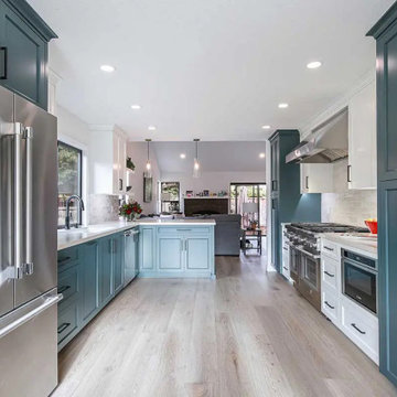
Removing the long, narrow center island immediately opened up the kitchen, creating a greater sense of space. Closing off an unnecessary doorway provided additional wall area, allowing the cooktop to be repositioned and improving the kitchen’s layout and flow.
The bold choice of a rich green for the cabinets gave the kitchen a striking, modern look, while still feeling balanced. The green acts as a neutral tone, complemented by calming pale oak flooring, neutral quartz countertops, and a textured backsplash in a similar hue for subtle visual interest.
The redesign also introduced functional zones: a dedicated baking area designed with their daughter in mind and a bar area perfect for entertaining family and friends.
 Corinthian Fine Homes
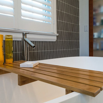
Our homeowner had worked with us in the past and asked us to design and renovate their 1980’s style master bathroom and closet into a modern oasis with a more functional layout. The original layout was chopped up and an inefficient use of space. Keeping the windows where they were, we simply swapped the vanity and the tub, and created an enclosed stool room. The shower was redesigned utilizing a gorgeous tile accent wall which was also utilized on the tub wall of the bathroom. A beautiful free-standing tub with modern tub filler were used to modernize the space and added a stunning focal point in the room. Two custom tall medicine cabinets were built to match the vanity and the closet cabinets for additional storage in the space with glass doors. The closet space was designed to match the bathroom cabinetry and provide closed storage without feeling narrow or enclosed. The outcome is a striking modern master suite that is not only functional but captures our homeowners’ great style.
 Corinthian Fine Homes
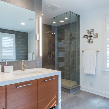
Our homeowner had worked with us in the past and asked us to design and renovate their 1980’s style master bathroom and closet into a modern oasis with a more functional layout. The original layout was chopped up and an inefficient use of space. Keeping the windows where they were, we simply swapped the vanity and the tub, and created an enclosed stool room. The shower was redesigned utilizing a gorgeous tile accent wall which was also utilized on the tub wall of the bathroom. A beautiful free-standing tub with modern tub filler were used to modernize the space and added a stunning focal point in the room. Two custom tall medicine cabinets were built to match the vanity and the closet cabinets for additional storage in the space with glass doors. The closet space was designed to match the bathroom cabinetry and provide closed storage without feeling narrow or enclosed. The outcome is a striking modern master suite that is not only functional but captures our homeowners’ great style
 Western Window Systems
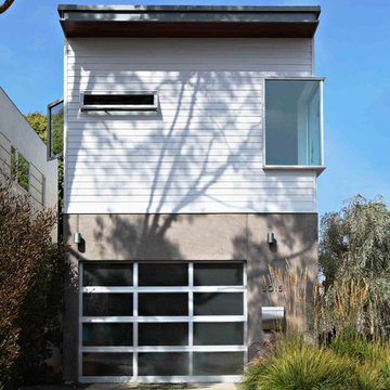
A prefab modular fits neatly on a tiny Santa Monica corner lot.
On a quiet corner lot near Santa Monica’s Ocean Park neighborhood, just blocks from the Pacific Ocean, architect Jennifer Siegal made the most of her unique talent in utilizing prefabricated modules to create an eye-catching home.
Working with a lot measuring only 25 feet wide by 100 feet long, Siegal, owner of Venice, California-based architecture firm Office of Mobile Design, carefully fitted two stacking prefab modules to form the two-story 2,330-square-foot home.
Siegal, winner of the 2016 ArcVision Prize-Women and Architecture, has been recognized internationally as “a fearless pioneer in the research and development of prefabricated construction systems.” It’s easy to see why with her Santa Monica prefab.
For such a seemingly confined area, the home features an airy, open floor plan, with a combined living-dining-kitchen space opening up to cozy, foliage-lined back patio via a three-panel Western Window Systems Series 600 Multi-Slide Door. When open, the door seamlessly merges the indoor living space with the patio, letting Pacific Ocean breezes course through the space. Bamboo flooring throughout augments the openness of the floor plan with its clean look and light color.
A small garage, just yards from the street, doubles as another indoor living space featuring a roll-up door with frosted glass panels to let in natural light when closed. When open, it provides a unique sitting experience.
The second floor also makes the most of the narrow space, with two bedrooms, two bathrooms and a master-bedroom terrace over the back patio. Various shapes and sizes of Western Window Systems Series 670 Awning and Casement Windows help the home make the most of the ideal Santa Monica weather.
Atop it all is a unique butterfly roof that gives the modular shape of the home a playful twist and a sense of mobility.
 Color Fresh Home Designs
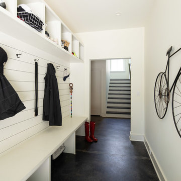
Mudroom with stained concrete floors, built-in bench with storage cubbies and hooks
Inspiration for a contemporary concrete floor and gray floor mudroom remodel in Atlanta with white walls
Inspiration for a contemporary concrete floor and gray floor mudroom remodel in Atlanta with white walls
 San Luis Kitchen Co.
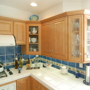
A narrow kitchen condo did not have accessible storage for the homeowner (she's on the short side). We added a chef's pantry for lots of easily reached storage space and made the upper cabinets bigger (to hang lower for easy reach). The cabinets to the side of the hood had to remain higher to give adequate clearance to the cooktop. We also held the upper cabinets down from the ceiling and created display space for the homeowner's glass collection -- she couldn't reach this space for everyday stuff anyway.
This also gave us the opportunity to provide indirect lighting from the tops of the cabinets.
Wood-Mode Fine Custom Cabinetry: Brookhaven's Pelham Manor

Sponsored
Sunbury, OH

J.Holderby - Renovations
Franklin County's Leading General Contractors - 2X Best of Houzz!
 Prestige Residential Construction
The owners of this stately 1903 Victorian home worked closely with Colleen Knowles Interior Design and Prestige Residential Construction to elevate each of the home’s four bathrooms.
The master bathroom echoes the curve of the large bow window, with the tub positioned in the window’s arch and surrounded by tree top vistas. The laser cut mosaic shower wall is a beautiful focal point that showcases a successful merging of style and craftsmanship. The dignified furniture-like walnut double vanity features white marble countertops, strategic storage, and elegant mirror-mounted sconce lighting.
Period-correct details were carried throughout the bathrooms on all three floors of the home. The jewelbox nature of the powder bath includes Brunschwig & Fils wallcovering, Phylrich Maison faucets, and a unique Calacatta Tucci polished counter and with metal console frame. The second floor guest bath includes additional period detailing, classic materials, and a soft color palate.
Special Construction Note: This project required a particularly high level of care to protect the home during construction. The new bathrooms spanned three floors and all were connected by a narrow, millwork-wrapped staircase. Prestige also managed a thoughtful sequencing to allow homeowner occupancy with at least one functional bath at all times.
 THE Remodel Group
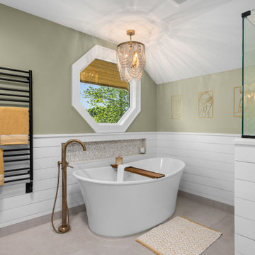
A luxurious en suite bath was created within this classic 1925 Portland bungalow by reconfiguring the second story’s original small bedrooms and tiny half bath. In this welcoming new urban boho space, eclectic finishes mingle harmoniously, integrated through subtle repetition of shapes and materials.
A furniture-style vanity sets the tone for this luxurious space, introducing materials, colors, shapes, and textures that repeat throughout. Individual walnut hexagons join to create distinctive vanity doors, offset beautifully by horizontal-grain drawers. Topping the cabinetry is a simple concrete countertop with integral sinks. An expansive framed mirror above enlarges and brightens the room. Within the mirror, sconces float, their globes a nod to the hexagons below. Champagne bronze fixtures reflect the warm walnut glow. Nestled into the back corner, a stunning shower features waterjet tiles in a double herringbone pattern, each precisely cut and laid to maintain design integrity at every surface transition. Teak floor tiles and a pebbled niche hint at the classic spa experience. Across from the shower, a large hexagonal window provides a treetop view from the free-standing tub below. The gentle oval of the tub and the beaded chandelier above provide a pleasing contrast to the strong lines surrounding it, as do the softly-shaded pebbles in the full-length niche. Shiplap wainscotting wraps the room, creating an illusion of height in the compact space. Subtle flooring and soft green walls create an understated backdrop for the bold mix of materials, unifying them into a serene oasis.
Asking a century-old home to accommodate a modern luxury bath is a tall order. Asbestos-laden plaster and flooring had to be abated. The subfloor had to be leveled and reinforced to increase strength and prevent deflection. Water lines and multiple electrical circuits had to be brought across and up without disturbing a beautifully-paneled ceiling, something we accomplished by firring out stair walls to hide the chases. Our client had visions of a leafy view from her tub, but the new layout eliminated existing windows. Placing a new window was complicated by deep eaves and flat soffits. By pushing the header into the roofline, however, we were able to accommodate a picture window. The flat soffit was replaced by an inverse hip lined with stained tongue and groove cedar, tying it to the bathroom finishes. Bringing materials up a narrow staircase became truly challenging when it was time to install the big items. However, strategic removal of drywall around the landing got the job done. Our attention to detail is showcased in the shower tile, where precise cuts were required at surface transitions to maintain the integrity of a complex double herringbone lay. The project was delivered on time.
Savvy layout choices minimized spending on structural changes. Because we were dealing with dormer space, head height was an issue. Raising the ceiling would have been complex and expensive so our design accommodated the constraints – tub on the low outside wall, shower on the full-height interior wall. The vanity spanned the spread, accommodating our petite client on the exterior side and her taller husband on the interior side. An under-eave closet was closed off to create room for both a freestanding tub and a separate shower. Rather than building replacement storage elsewhere, we simply added a new door into the closet from the primary bedroom. This was made possible by absorbing the short hallway separating the existing bed and bathroom into the primary bedroom. This new layout also created an en suite relationship between the primary bedroom and the new bath. We saved additional dollars by selecting a furniture-style vanity rather than using custom cabinetry, and the countertop with integral sinks provided a cost savings over a more traditional quartz countertop with undermount sinks. Affordable shower tiles allowed us to put more money into a dynamic tile layout. The project was delivered within budget.
 Anthology Woods
Products making their television debut in this project were Anthology Woods Northwest Blend (a naturally weathered wood installed on a section of the ceiling, unfinished) and the extremely hard & durable Left Coast White Oak, a unique species growing only in a narrow strip of Oregon and bit in California & Washington (installed for the flooring, finished with Rubio Monocoat White natural oil). The homeowners were able to easily apply the finish themselves prior to installing the floor, and the zero VOC nature of the oil insured it was safe to move right in! The White tint to the oil gives a subtle white-washed look to the floors while maintaining a natural look and a supple feel underfoot.
The couple participating in the episode loved their floor so much they decided to add more, installing it in their master bedroom, as well! The rich character of this natural Oak in a flat sawn (the old "European" way to cut Oak) wood product adds a timeless element & warmth to the feel of the space. Looking closely at the grain, you'll see cathedral patterns in many boards, along with a great mix of flat grain with rift areas as well. Finishing out the details of the room, the Bath Crashers team added natural carerra marble in the shower with tones of white & gray, and apron-front vanity sinks for extra charm.
 Dimensions in Wood Inc
This Historical Home was built in the Columbia Country Club in 1925 and was ready for a new, modern kitchen which kept the traditional feel of the home. A previous sunroom addition created a dining room, but the original kitchen layout kept the two rooms divided. The kitchen was a small and cramped c-shape with a narrow door leading into the dining area.
The kitchen and dining room were completely opened up, creating a long, galley style, open layout which maximized the space and created a very good flow. Dimensions In Wood worked in conjuction with the client’s architect and contractor to complete this renovation.
Custom cabinets were built to use every square inch of the floorplan, with the cabinets extending all the way to the ceiling for the most storage possible. Our woodworkers even created a step stool, staining it to match the kitchen for reaching these high cabinets. The family already had a kitchen table and chairs they were happy with, so we refurbished them to match the kitchen’s new stain and paint color.
Crown molding top the cabinet boxes and extends across the ceiling where they create a coffered ceiling, highlighting the beautiful light fixtures centered on a wood medallion.
Columns were custom built to provide separation between the different sections of the kitchen, while also providing structural support.
Our master craftsmen kept the original 1925 glass cabinet doors, fitted them with modern hardware, repainted and incorporated them into new cabinet boxes. TASK LED Lighting was added to this china cabinet, highlighting the family’s decorative dishes.
Appliance Garage
On one side of the kitchen we built an appliance garage with doors that slide back into the cabinet, integrated power outlets and door activated lighting. Beside this is a small Galley Workstation for beverage and bar service which has the Galley Bar Kit perfect for sliced limes and more.
Baking Cabinet with Pocket Doors
On the opposite side, a baking cabinet was built to house a mixer and all the supplies needed for creating confections. Automatic LED lights, triggered by opening the door, create a perfect baker’s workstation. Both pocket doors slide back inside the cabinet for maximum workspace, then close to hide everything, leaving a clean, minimal kitchen devoid of clutter.
Super deep, custom drawers feature custom dividers beneath the baking cabinet. Then beneath the appliance garage another deep drawer has custom crafted produce boxes per the customer’s request.
Central to the kitchen is a walnut accent island with a granite countertop and a Stainless Steel Galley Workstation and an overhang for seating. Matching bar stools slide out of the way, under the overhang, when not in use. A color matched outlet cover hides power for the island whenever appliances are needed during preparation.
The Galley Workstation has several useful attachments like a cutting board, drying rack, colander holder, and more. Integrated into the stone countertops are a drinking water spigot, a soap dispenser, garbage disposal button and the pull out, sprayer integrated faucet.
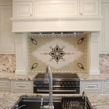
Directly across from the conveniently positioned stainless steel sink is a Bertazzoni Italia stove with 5 burner cooktop. A custom mosaic tile backsplash makes a beautiful focal point. Then, on opposite sides of the stove, columns conceal Rev-a-Shelf pull out towers which are great for storing small items, spices, and more. All outlets on the stone covered walls also sport dual USB outlets for charging mobile devices.
Stainless Steel Whirlpool appliances throughout keep a consistent and clean look. The oven has a matching microwave above it which also works as a convection oven. Dual Whirlpool dishwashers can handle all the family’s dirty dishes.
The flooring has black, marble tile inlays surrounded by ceramic tile, which are period correct for the age of this home, while still being modern, durable and easy to clean.
Finally, just off the kitchen we also remodeled their bar and snack alcove. A small liquor cabinet, with a refrigerator and wine fridge sits opposite a snack bar and wine glass cabinets. Crown molding, granite countertops and cabinets were all customized to match this space with the rest of the stunning kitchen.
Dimensions In Wood is more than 40 years of custom cabinets. We always have been, but we want YOU to know just how much more there is to our Dimensions.
The Dimensions we cover are endless: custom cabinets, quality water, appliances, countertops, wooden beams, Marvin windows, and more. We can handle every aspect of your kitchen, bathroom or home remodel.

Sponsored
Columbus, OH

Wannemacher Interiors
Customized Award-Winning Interior Design Solutions in Franklin Cnty OH
 Prestige Residential Construction
The owners of this stately 1903 Victorian home worked closely with Colleen Knowles Interior Design and Prestige Residential Construction to elevate each of the home’s four bathrooms.
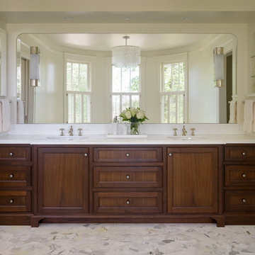
The master bathroom echoes the curve of the large bow window, with the tub positioned in the window’s arch and surrounded by tree top vistas. The laser cut mosaic shower wall is a beautiful focal point that showcases a successful merging of style and craftsmanship. The dignified furniture-like walnut double vanity features white marble countertops, strategic storage, and elegant mirror-mounted sconce lighting.
Period-correct details were carried throughout the bathrooms on all three floors of the home. The jewelbox nature of the powder bath includes Brunschwig & Fils wallcovering, Phylrich Maison faucets, and a unique Calacatta Tucci polished counter and with metal console frame. The second floor guest bath includes additional period detailing, classic materials, and a soft color palate.
Special Construction Note: This project required a particularly high level of care to protect the home during construction. The new bathrooms spanned three floors and all were connected by a narrow, millwork-wrapped staircase. Prestige also managed a thoughtful sequencing to allow homeowner occupancy with at least one functional bath at all times.
 Klopf Architecture
Malibu Glass Box House by Klopf Architecture
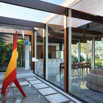
Following the devastating Woolsey Fire of 2018, the site in Malibu offered a unique opportunity to rebuild not just a home, but a new architectural composition that highlighted the property’s potential while navigating strict fire-rebuild codes in the area. Designed by Klopf Architecture, this project embraced a set of limitations and translated them into an architectural asset.
The city’s fire-rebuild process required the new structure to remain close to the original footprint, size and bulk, a constraint that ultimately clarified the architectural direction. Perched near the front of a long, narrow lot, the new home frames and overlooks a private, park-like rear expanse, an uncommon luxury especially in this part of Malibu .
Without a fixed program, the design process allowed for a different kind of creative focus allowing Klopf Architecture the opportunity to explore how a modernist home could best respond to this site. The team approached the project not with a list of requirements, but with a question: How might a modernist live here? What spatial qualities would inspire calm, connection, and a sense of wonder in this setting? The process became less about problem-solving and more about architectural storytelling—letting the site, the light, and the principles of modern design guide the form and flow of the home.
The response emerged in the form of a glass-box pavilion, an open, Mid-Century Modern inspired living, dining, and kitchen space that floats at the edge of the property’s natural descent. Connected to the more enclosed, private areas of the home by a glass-walled hallway, the living pavilion becomes a distinct centerpiece of the design. It opens on all four sides to the landscape with decks and patios on the flanks, an internal garden and water feature to the north, and a dramatic unguarded view of the expansive backyard and ocean horizon to the south.
Because of the mandated footprint, careful planning was required to ensure every space could still engage with light, landscape, or both. Strategic voids in the form of atriums and courtyards allow daylight to filter deep into the home’s core, while offering moments of surprise and retreat. These design gestures allow natural light to filter deep into the interior, creating a sense of brightness and openness throughout the day. At the same time, they expand the perceptual boundaries between inside and out, making the home feel more expansive while anchoring its connection to the surrounding landscape.
The siting of the house is what gives it its unique character. Rather than receding into the backyard like the neighboring homes, the house holds a slight prominence. From the central living pavilion, stepping down into the landscape feels more like entering a secluded park where a separate existing accessory structure, trail, and recreational areas await. The home’s modest street presence gives way to this unfolding drama of space, view, and nature.
Fire-resilient materials and assemblies are integrated seamlessly throughout including triple-pane glazing, under-slab and roof insulation, and locally sourced fire-rated cladding ensure the house not only meets Calfornia’s rigorous wildland-urban interface (WUI) standards, but feels effortlessly aligned with them. While technical decisions like fire-hardening and mechanical systems presented some construction challenges, particularly around the cantilevered glass box, the team found a functional compromise that preserved the integrity of the design.
Inside, a restrained palette and exposed post and beam design celebrate the ethos of mid-century modernism. A central circulation spine extends from the entry to the rear glass wall, offering a continuous visual link from street to ocean. Spaces such as the library and office, though more intimate in scale, are never cut off from nature as each opens to its own unique courtyard or garden view.
Though born out of a strict regulatory framework and developed without a specific client, the rebuild design unfolded with remarkable clarity. Grounded in site logic, refined by limitations and an emphasis on timeless spatial relationships – light, proportion, and a strong connection to nature, the resulting design feels both effortless and uplifting. The home lives lightly on the land, opens generously to its surroundings, and strikes a careful balance between privacy, openness, and calm. For Klopf Architecture, it stands as a compelling case study in how site, code, and circumstantial constraints can inspire enduring, modernist architecture. With years of experience reimagining mid-century modern design for how people live today, the firm took the project’s limitations as an opportunity. The result is a home shaped by open, flowing spaces, strong indoor-outdoor connections, and a calm, clear sense of structure. It’s a good reminder that even with strict constraints, there’s still room for architecture to breathe—and for modernism to keep moving forward.
Klopf Architecture project team: Geoff Campen, John Klopf, AIA, and Sherry Tan
Structural Engineer: ZFA
Contractor: Maison D’Artiste
Photography: ©2025 Mariko Reed
Year Completed: 2023
 Gallery 406 Interiors LLC
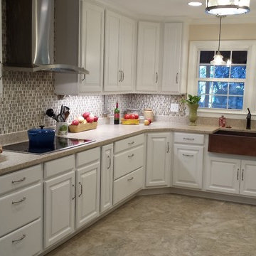
The kitchen remodel included eliminating the breakfast area, closing an unused window to the garage, improving the layout and flow of the space, and opening up the wall to the dining room, The entry to the laundry room was also enlarged, and a new back door with partial glass was installed from the laundry room to the backyard for easier access to a new patio area, and more natural light. New flooring, cabinetry, counter tops, tile, lighting and plumbing fixtures were installed.
80