
Search results for "Never before seen" in Home Design Ideas
 FOUR POINT DESIGN BUILD INC
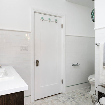
DESIGN BUILD REMODEL | Vintage Bathroom Transformation | FOUR POINT DESIGN BUILD INC
This vintage inspired master bath remodel project is a FOUR POINT FAVORITE. A complete design-build gut and re-do, this charming space complete with swap meet finds, new custom pieces, reclaimed wood, and extraordinary fixtures is one of our most successful design solution projects.
THANK YOU HOUZZ and Becky Harris for FEATURING this very special PROJECT!!! See it here at http://www.houzz.com/ideabooks/23834088/list/old-hollywood-style-for-a-newly-redone-los-angeles-bath
Photography by Riley Jamison
AS SEEN IN
Houzz
Martha Stewart
 Sherwin-Williams
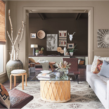
Some spirits can never be fenced in. They need to soak in the blue of endless horizon and the subtle earthy colors of the high plains and desert. Sun-washed and warm, this palette can be seen in the baked clay canyons, worn leather and woven wool blankets of the true New West.
INFLUENCERS:
Carefree Bohemian
Modern cowgirl
Unbridled adventure
Southwestern twist
PALETTE:
Origami White SW 7636
Cavern Clay SW 7701
Moth Wing SW 9174
Baked Cookie SW 9098
Dark Clove SW 9183
Distance SW 6243
Caramelized SW 9186
Main Walls: Moth Wing SW 9174
Back Accent Wall: Dark Clove SW 9183
Bookshelf Trim: Origami White SW 7636
 Sikora Creations
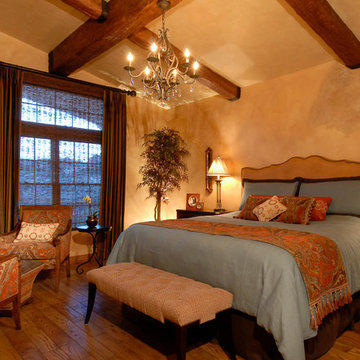
For our latest Master Bedroom remodel, Speas Interior Design added some truly unique details that make this space special. In the "before" photo you see a sliding glass door; this never-used door was removed and replaced with a stunning new window. For convenience, there is never a need to remember to shut the shade as the window-shade has been set up on a timer! Photo by Paul Kohlman
Find the right local pro for your project
 Tiffany Brooks, HGTV Host & Interior Designer
Inquire About Our Design Services
When we first started talking in the spring of 2015, I was impressed. She was witty, realistic, and understood that as much as she loves my shows on HGTV, design does not does not happen in 43 minutes! She told me about her space, and how she felt that her bedroom seemed “blah” to her. She had no retreat. Molly desperately longed for a place that she could spend time in, read in, play in and above all, relax in.
What we did:
Many people are terrified of hiring a designer. Rightfully so, they are investing a pretty penny in their homes. They want to make sure that everything, down to the last floral arrangement, is to their liking, because they will have to live it (and pay for it). Unfortunately, a client can unintentionally stifle a designer’s creativity through micro-management. This can produce lackluster results and ultimately cause more time (and money) to be spent on a project than is really necessary.
With Molly, that was never an issue. Before she even showed me the room in question, she said that I could have full creative license to do what I needed to do to her bedroom. SAY WHAAH!?
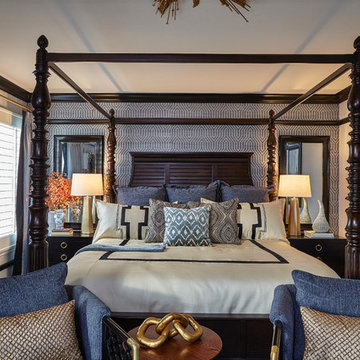
With Molly giving me complete creative freedom, I planned everything out and got down to business. The result: Bite-your-bottom-lip sexy. I don’t get jealous of too many of my clients’ spaces, but this one still takes my breath away every time I look at the pics!
The craziest part was that by adding more furniture, it actually made the space feel larger.
Molly and her husband Patrick loved the finished space, and promised me I will be back to finish the rest of the house!
Here’s the highlights of the rest of the project:
I came up with a space plan with three options.
Next, we reviewed mood boards and fabric schemes that would work for both Molly and her hubby Patrick.
We started with the bed. My goal was to add edge to its otherwise traditional style.
We decided to spice things up by painting the trim work in the room black.
We built in layers of lighting with dimmers. In a bedroom everything should be on dimmers, right? Right.
We designed and customized bedding, chairs and window treatments.
Together with Molly, we selected the most perfect wallpaper. This geometric “grasscloth” adds so much depth and dimension that was just missing before.
What I love:
That light fixture. I mean it is really, really amazing in person.
The porcupine mirror. This thing came packaged like it was the hope diamond, and everyone was terrified to handle it. But it really became a highlight of the room.
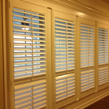
 OKLAHOMA SHUTTERS
Benefits of Plantation Shutters
Plantation shutters offer advantages and benefits to homeowners over other window coverings including:
• A permanent addition to a house: While they don't add much to the sale price and don't guarantee a return on investment, the curb appeal helps the house sell faster. The permanency of plantation shutters allows them to be included in appraisals.
• Versatility: Many have the ability to open only halfway if desired. If you want to let in all the light, plantation shutters swing away from the window to grant an unobstructed view.
• Insulation: When all louvers are closed, a good insulating barrier is created, trapping unwanted temperatures and saving you money on your energy bill.
• Easy maintenance: With wide louvers, a simple wipe-down is often all that's needed. Vinyl shutters can be taken off their hinges and sprayed off for a major cleaning.
• Elegance: The classic, yet modern look conveys a permanency like no other window dressing can. Whether painted or natural wood, they all have a look that says; welcome home.
Wood vs. Faux Wood
It's not hard to argue that natural wood is more appealing than vinyl or PVC. However, "faux wood," as it's sometimes called, has some advantages:
• Price -- Faux wood shutters are often lower in price than real wood.
• Weight -- Because some shutters are made "hollow core" (as opposed to vinyl-wrapped medium density fiberboard, MDF), they can be significantly lighter.
• Moisture Resistance -- If you live in an area with high humidity, hollow faux wood or aluminum core will resist expanding and sagging. (MDF core louvers will tend to expand and crack as the material swells with moisture.)
Natural wood is the choice for those who have a very healthy budget or for whom a specific appearance is a must. Among the advantages are:
• Size -- Because wood plantation shutters are made of hardwood, they can be quite a bit larger than plastic or vinyl. Vinyl shutters larger than 29 inches may be prone to sag, so they need divider rails or other supports which can destroy the traditional look of a plantation shutter.
• Natural -- While vinyl or plastic shutters can be painted to match any color scheme, the natural shades and finishes of the various species of wood have something for every look.
• Classic -- While many plastic shutters can be made to look like real wood, the faux wood finishes can vary significantly depending on manufacturer and model. Up close, it can be easy to tell they're plastic. The warmth of natural wood is a classic feel that's impossible to beat.
Popular Plantation Shutter Brands
When you go to purchase your plantation shutters, brands names may offer a good representation of high-, mid-, and low-cost range of what's available. Which one you choose depends on your budget and your tastes. Hunter-Douglas and Norman Shutters produce three lines of plantation shutters in both real wood and faux wood styles. A higher-end product, Hunter-Douglas may be worth the cost for beauty and quality of workmanship. The Window Outfitters and Sunland produce a mid-cost line of shutters. The mid-range pricing may be for those who are balancing aesthetics with a budget. National franchise and or box stores may not offer an in-house expert or designer. Look to local companies that specialize in plantation shutters looking online may offer a low-cost brand for budget-minded DIYers. Available in both faux and real wood, the affordability combines with the visual appeal to make this a very popular choice for plantation shutters. Regardless of which line you go with, be sure to ask about frames. Generally all manufactures offer frame choices and may add to the cost, but they add an unsurpassed beauty and warmth to a room with plantation shutters.
Plantation shutters look like similar to wooden blinds, but there are significant differences. Blinds are often narrow, made of aluminum or vinyl, and the slats tilt based on a gear and pulley mechanism and they hang in the window with cords. By contrast, plantation shutters have wide compound louvers that fit into a frame and are controlled by way of a wooden rod running up the middle. When not needed, they can be manufactured to swing back onto the wall. Options to are available to build a more contemporary look with a larger view with a “hidden tilt” feature.
Cost of Plantation Shutters
Nationally, the cost of plantation shutters, depending on their size and the material, whether or not they are custom arches and colors or stains, may vary. Most manufacturers want their shutters to be professionally installed to keep the warranty intact which is a benefit to the customer in the long run. They will usually have a limited lifetime warranty.
Cost of Installation
Costs for having plantation shutters installed by a contractor are a bit more predictable. Contractors who have installed plantation shutters before can quickly get accurate measurements and suggest which materials would work best in different rooms. For example, while natural wood may look beautiful in your living room, it might not be so practical in a bathroom where moisture will cause the wood to warp. The size, material, and quality of the shutter will have a significant effect on the cost. Contractors usually go through a shutter supplier and can get various sizes that are not normally available at home improvement stores. Hiring a professional team of knowledgeable suppliers and installers is a good choice.
Here are some sample prices of the shutters most contractors use for standard-sized windows: In general, plantation shutters should cost approximately $20 to $26 per square foot. Labor costs depend on factors such as the contractor's workload, remoteness of the location, environment, and the contractor's overhead. Labor generally runs about $100 per hour and will be added to the shutter cost.
• 16x20 -- Faux wood $120. Real wood $156
• 24x50 -- Faux wood $160. Real wood $208
• 36x54 -- Faux wood $270. Real wood $351
• 36x60 -- Faux wood $300 Real wood $390
• 42x72 -- Faux wood $420. Real wood $546
• 48x82 -- Faux wood $550. Real wood $715
DIY
Plantation shutters can be purchased and installed by the homeowners. How much they cost will depend on size and material. Faux wood shutter’s cost depends on size and wooden shutter’s cost will depend on size and whether or not they are painted or stained.
• Natural wood is $90-$600 depending on size. Many companies offer standard stained selection but custom color matching may be available from $175 -$250.
• Faux wood will be from $120-$500.
• Additional tools include: Hang Strips $4-$15 and about $4 for mounting hardware. Locks or closures can cost up to $15 for each shutter.
Finally, if you order them online, you can expect to pay $30-$70 shipping per shutter or per set of shutters per window depending on the supplier. Keep in mind that even if you're handy with tools, installing shutters can be time-consuming if you've never done it before there is defiantly a learning curve.
 Design Connection, Inc.
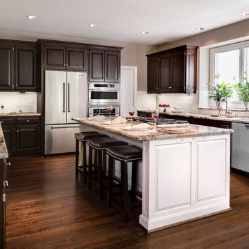
The kitchen is the most used room in the home. Our clients came to us asking for help with their outdated kitchen. The home was built in 2003 and had seen many years of use with two growing children, family and friends.
The original cabinets were of good quality and were still in excellent condition. We faux painted the old light maple cabinets with a beautiful dark Java stain.
See all of the Before & After pictures of this kitchen here: http://www.designconnectioninc.com/portfolio/kitchen-remodel-in-leawood-ks/
Design Connection, Inc. Kansas City Interior Designer provided- Space planning and project management-tile and countertop design and installation-appliance selection-paint and faux painting design and installation-custom cabinet design and installation, lighting design and installation and bar stools and kitchen table and chairs.
 Jinx McDonald Interior Designs
Randall Perry Photography
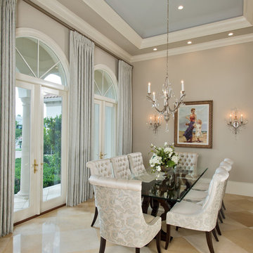
Elegant beige floor dining room photo in Other with gray walls
Elegant beige floor dining room photo in Other with gray walls

Sponsored
Sunbury, OH

J.Holderby - Renovations
Franklin County's Leading General Contractors - 2X Best of Houzz!
 Cummings Architecture + Interiors
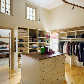
The beautiful, old barn on this Topsfield estate was at risk of being demolished. Before approaching Mathew Cummings, the homeowner had met with several architects about the structure, and they had all told her that it needed to be torn down. Thankfully, for the sake of the barn and the owner, Cummings Architects has a long and distinguished history of preserving some of the oldest timber framed homes and barns in the U.S.
Once the homeowner realized that the barn was not only salvageable, but could be transformed into a new living space that was as utilitarian as it was stunning, the design ideas began flowing fast. In the end, the design came together in a way that met all the family’s needs with all the warmth and style you’d expect in such a venerable, old building.
On the ground level of this 200-year old structure, a garage offers ample room for three cars, including one loaded up with kids and groceries. Just off the garage is the mudroom – a large but quaint space with an exposed wood ceiling, custom-built seat with period detailing, and a powder room. The vanity in the powder room features a vanity that was built using salvaged wood and reclaimed bluestone sourced right on the property.
Original, exposed timbers frame an expansive, two-story family room that leads, through classic French doors, to a new deck adjacent to the large, open backyard. On the second floor, salvaged barn doors lead to the master suite which features a bright bedroom and bath as well as a custom walk-in closet with his and hers areas separated by a black walnut island. In the master bath, hand-beaded boards surround a claw-foot tub, the perfect place to relax after a long day.
In addition, the newly restored and renovated barn features a mid-level exercise studio and a children’s playroom that connects to the main house.
From a derelict relic that was slated for demolition to a warmly inviting and beautifully utilitarian living space, this barn has undergone an almost magical transformation to become a beautiful addition and asset to this stately home.
 Studio Dearborn
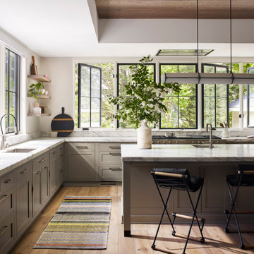
This expansive Victorian had tremendous historic charm but hadn’t seen a kitchen renovation since the 1950s. The homeowners wanted to take advantage of their views of the backyard and raised the roof and pushed the kitchen into the back of the house, where expansive windows could allow southern light into the kitchen all day. A warm historic gray/beige was chosen for the cabinetry, which was contrasted with character oak cabinetry on the appliance wall and bar in a modern chevron detail. Kitchen Design: Sarah Robertson, Studio Dearborn Architect: Ned Stoll, Interior finishes Tami Wassong Interiors

 FOUR POINT DESIGN BUILD INC
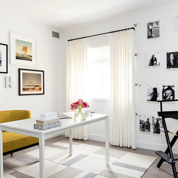
DESIGN BUILD REMODEL | Home Office Transformation | FOUR POINT DESIGN BUILD INC.
This space was once a child's bedroom and now doubles as a professional home photography post production office and a dressing room for graceful ballerinas!
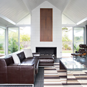
This completely transformed 3,500+ sf family dream home sits atop the gorgeous hills of Calabasas, CA and celebrates the strategic and eclectic merging of contemporary and mid-century modern styles with the earthy touches of a world traveler!
AS SEEN IN Better Homes and Gardens | BEFORE & AFTER | 10 page feature and COVER | Spring 2016
To see more of this fantastic transformation, watch for the launch of our NEW website and blog THE FOUR POINT REPORT, where we celebrate this and other incredible design build journey! Launching September 2016.
Photography by Riley Jamison
#ballet #photography #remodel #LAinteriordesigner #builder #dreamproject #oneinamillion

 Twelve Stones Designs, LLC
The owners of this kitchen had spent the money to upgrade the finishes in their kitchen upon building the home 12 years ago, but after living in the space for several years they realized how nonfunctional the layout really was. The (then) two preschool aged children had grown into busy, hungry teenagers with many friends who also liked to hang out at the house. So the family needed a more functional kitchen with better traffic flow, space for daily activities revolving around the kitchen at different times of day, and a kitchen that could accommodate cooking for and serving large groups. Furthermore, the dark, traditional finishes no longer reflected the homeowners’ style. They requested a brighter, more relaxed, coastal style that reflected their love of the seaside cities they like to visit.
Originally, the kitchen was U-shaped with a narrow island in the middle. The island created narrow aisles that bottle-necked at the dishwasher, refrigerator, and cooktop areas. There was a pass-through from the foyer into the kitchen, but the owners never liked that the pass-through was also located so close to the powder room. The awkward proximity was unappealing and made guests feel uncomfortable.
The kitchen’s storage was made up of lots of narrow cabinets, apothecary drawers, clipped corner units, and very few drawers. It lacked useful storage for the larger items the family used on a daily basis. And the kitchen’s only pantry was small closet that had only builder-grade, narrow shelving with no illumination to be able to see the contents inside.
Overall, the kitchen’s lighting plan was poorly executed. Only six recessed cans illuminated the entire kitchen and nook areas. The under cabinet lighting was not evenly distributed either. In fact, the builder had mis-placed the under cabinet lighting around the decorative pilasters which made for choppy, dark cubbies. Further, the builder didn’t include any lighting over the sink or the bar area, which meant whoever was doing the dishes was always in their own shadow. That, coupled with the steep overhang of the game room above made the bar area feel like a dim, cavernous space that wasn’t inviting or task oriented. The kitchen looked out into the main living space, but the raised bar and a narrow wall (which held the only large cabinet in the kitchen) created more of a barrier than a relationship to the living room or breakfast nook. In fact, one couldn’t even see the breakfast nook from the cooktop or sink areas due to its orientation. The raised bar top was too narrow to comfortably sit to either dine at or chat from due to the lack of knee space. The the homeowners confided that the kitchen felt more like a dark, dirty prison than place where the family, or their guests, wanted to gather and commune.
The clients' needs and desires were:
➢ to create a kitchen that would be a space the family loved to be in; to relate to the adjacent spaces all around, and to have better flow for entertaining large groups
➢ to remove the walls between the breakfast nook and living area and to be able to utilize the natural light from the windows in both those areas
➢ to incorporate a functional chopping block for prepping fresh food for home cooked meals, an island with a large sink and drain board, 2 pull out trash cans, and seating for at least the 2 teens to eat or do homework
➢ to design a kitchen and breakfast nook with an airy, coastal, relaxed vibe that blended with the rest of the house's coastal theme
➢ to integrate a layered lighting plan which would include ample general illumination, specific task lighting, decorative lighting, and lots of illuminated storage
➢ to design a kitchen with not only more storage for all the husband’s kitchen gadgets and collection of oils and spices, but smart storage, including a coffee/breakfast bar and a place to store and conceal the toaster oven and microwave
➢ to find a way to utilize the large open space between the kitchen, pantry area, and breakfast nook
Twelve Stones Designs achieved the owner's goals by:
➢ removing the walls between the kitchen and living room to allow the natural light to filter in from the adjacent rooms and to create a connection between the kitchen, nook, and living spaces for a sense of unity and communion
➢ removing the existing pantry and designing 3 large pantry style cabinets with LED tape lights and rollout drawers to house lots of kitchen appliances, gadgets, and tons of groceries. We also took the cabinets all the way up to the 9’ ceiling for additional storage for seasonal items and bulk storage.
➢ designing 2 islands - 1 with a gorgeous black walnut chopping block that houses a drawer for chopping and carving knives and a custom double pull out trash unit for point of use utilization - and 1 that houses the dishwasher, a large Blanco Gourmet sink with integrated drain board, woven baskets for fresh root vegetables and kitchen towels, plenty of drawer storage for kitchen items, and bar seating for up to 4 diners.
➢ closing off the space between the kitchen and the powder room to create a beautiful new private alcove for the powder room as well as adding some decorative storage. This also gave us space to include more tall storage near the new range for precision placement of the husband’s extensive oil and spice collection as well as a location for a combo-steam oven the wife wanted for baking and cooking healthy meals.
The project is enhanced functionally by:
➢ incorporated USB and standard receptacles for the kids’ laptops and phone charging in the large island
➢ designing the small island to include additional open shelving for items used on a daily basis such as a variety of bowls, plates, and colanders. This set up also works well for the husband who prefers to “plate” his dinners in restaurant-style fashion before presenting them to the table.
➢ the integration of specific storage units, such as double stacked cutlery drawers, a custom spice pull-out, a Kuerig coffee and tea pod drawer, and custom double stacked utensil drawers
➢ moving the refrigerator to the old oven location - this eliminated the bottle neck as well as created a better relationship to the eating table. It also utilizes the floor space between the pantry, nook, and kitchen
➢ creating a banquet style breakfast nook - this banquette seating not only doubles the amount of seating for large gatherings but it better utilizes the odd space between the kitchen and the previous nook area. It also helps to create a distinct pathway from the mudroom room through the pantry area, kitchen, nook, and living room.
➢ the coffee/breakfast bar area which includes the perfect location for the concealed microwave and toaster oven, convenient storage for the coffee pods and tea accoutrements. Roll-out drawers below also house the smoothie maker, hot water kettle, and a plethora of smoothie-making ingredients such as protein powders, smoothie additives, etc. Furthermore, the drawers below the Keurig house measuring utensil, cutlery, baking supplies and tupperware storage.
➢ incorporating lots of wide drawers and pullouts to accommodate large cookware.
➢ utilizing as much vertical space as possible by building storage to the ceiling which accommodates the family’s abundant amount of serving platters, baking sheets, bakeware, casserole dishes, and additional cutting boards.
The project is enhanced aesthetically by:
➢ new 5-piece Versailles pattern porcelain tile that now seamlessly joins the entire down stairs area together creating a bright, cohesiveness feeling instead of choppy separated spaces - it also adds a coastal feeling
➢ designing a cabinet to conceal the microwave and toaster oven
➢ the coastal influenced light fixtures over the nook table and island
➢ the sandy colors of the Langdon Cambria countertops. The swirling pattern and sparkling quartz pieces remind the homeowner of black-and-tan sandy beaches
➢ the striped banquet seating whose creamy white background and blue-green stripes were the inspiration for the cabinet and wall colors.
➢ All the interior doors were painted black to coordinate with the blacks and grays in the backsplash tile and countertop. This also adds a hint of tailored formality to an otherwise casual space.
➢ the use of WAC's Oculux small aperture LED units for the overhead lighting complimented with Diode LED strips for task lighting under the cabinets and inside the pantry and glass wall cabinets. All of the lighting applications are on separate dimmer switches.
Innovative uses of materials or construction methods by Realty Restoration LLC:
➢ Each 1-1/2” x 3” block of reclaimed end-grain black walnut that makes up the center island chopping block was hand milled and built in the shop. It was designed to look substantial and proportional to the surrounding elements, executed by creating the 4 inch tall top with a solid wood chamfered edge band.
➢ The metal doors on either side of the vent hood were also custom designed for this project and built in the Realty Restoration LLC shop. They are made 1x2, 11-gauge mild steel with ribbed glass. Weighing 60 lbs a piece, heavy duty cabinet hinges were added to support the weight of the door and keep them from sagging.
➢ Under-cabinet receptacles were added along the range wall in order to have a clean, uninterrupted backsplash.
Design obstacles to overcome:
➢ Because we were removing the demising walls between the kitchen and living room, we had to find a way to plumb and vent the new island. We did this by tunneling through the slab (the slab had post tension cables which prevented us from just trenching) to run a new wet vent through a nearby structural wall. We pulled the existing hot and cold lines between upper floor joists and ran them down the structural wall as well and up through a conduit in the tunnel.
➢ Since we were converting from wall overs to a gas range it allowed us to utilize the 220 feed for the wall ovens to provide a new sub panel for all the new kitchen circuits
➢ Due to framing deficiencies inherited from the original build there was a 1-1/2” differential in the floor-to-ceiling height over a 20 foot span; by utilizing the process of cutting and furring coupled with the crown moulding details on the cabinet elevations we were able to mask the problem and provide seamless transitions between the cabinet components.
Evidence of superior craftsmanship:
➢ uniquely designed, one-of-a-kind metal “X” end panels on the large island. The end panels were custom made in the Realty Restoration LLC shop and fitted to the exact dimensions of the island. The welding seams are completely indistinguishable - the posts look like they are cut from a single sheet of metal
➢ square metal posts on the small island were also custom made and designed to compliment and carry through the metal element s throughout the kitchen
➢ the beautiful, oversized end panels on the pantry cabinets which give the breakfast nook a tailored look
➢ integrating a large format 5 piece Versailles tile pattern to seamlessly flow from the existing spaces into the new kitchen space
➢ By constructing a custom cabinet that jogged around a corner we could not remodel (housing the entry way coat closet) we were able to camouflage the adjacent wall offset within the upper and lower cabinets. By designing around the existing jog in the structural walls we accomplished a few things: we were able to find the space to house, and hide, the microwave and toaster oven yet still have a clean cohesive appearance from the kitchen side. Additionally, the owners were able to keep their much needed coat closet and we didn’t have to increase the budget with unnecessary structural work.
 FOUR POINT DESIGN BUILD INC
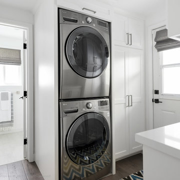
DESIGN BUILD REMODEL | Laundry Room and Guest Bath Remodel | FOUR POINT DESIGN BUILD INC.
This completely transformed 3500+ sf family dream home sits atop the gorgeous hills of Calabasas, CA and celebrates the strategic and eclectic merging of contemporary and mid-century modern styles with the earthy touches of a world traveler! Home to an active family, including three dogs, a cat, two kids, and a constant stream of friends and family, when considering the LAUNDRY ROOM AND GUEST BATH, our focus was on high function, durability, and organization!
AS SEEN IN Better Homes and Gardens BEFORE & AFTER | 10 page feature and COVER | Spring 2016
Photography by Riley Jamison

 Twelve Stones Designs, LLC
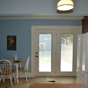
The owners of this kitchen had spent the money to upgrade the finishes in their kitchen upon building the home 12 years ago, but after living in the space for several years they realized how nonfunctional the layout really was. The (then) two preschool aged children had grown into busy, hungry teenagers with many friends who also liked to hang out at the house. So the family needed a more functional kitchen with better traffic flow, space for daily activities revolving around the kitchen at different times of day, and a kitchen that could accommodate cooking for and serving large groups. Furthermore, the dark, traditional finishes no longer reflected the homeowners’ style. They requested a brighter, more relaxed, coastal style that reflected their love of the seaside cities they like to visit.
Originally, the kitchen was U-shaped with a narrow island in the middle. The island created narrow aisles that bottle-necked at the dishwasher, refrigerator, and cooktop areas. There was a pass-through from the foyer into the kitchen, but the owners never liked that the pass-through was also located so close to the powder room. The awkward proximity was unappealing and made guests feel uncomfortable.
The kitchen’s storage was made up of lots of narrow cabinets, apothecary drawers, clipped corner units, and very few drawers. It lacked useful storage for the larger items the family used on a daily basis. And the kitchen’s only pantry was small closet that had only builder-grade, narrow shelving with no illumination to be able to see the contents inside.
Overall, the kitchen’s lighting plan was poorly executed. Only six recessed cans illuminated the entire kitchen and nook areas. The under cabinet lighting was not evenly distributed either. In fact, the builder had mis-placed the under cabinet lighting around the decorative pilasters which made for choppy, dark cubbies. Further, the builder didn’t include any lighting over the sink or the bar area, which meant whoever was doing the dishes was always in their own shadow. That, coupled with the steep overhang of the game room above made the bar area feel like a dim, cavernous space that wasn’t inviting or task oriented. The kitchen looked out into the main living space, but the raised bar and a narrow wall (which held the only large cabinet in the kitchen) created more of a barrier than a relationship to the living room or breakfast nook. In fact, one couldn’t even see the breakfast nook from the cooktop or sink areas due to its orientation. The raised bar top was too narrow to comfortably sit to either dine at or chat from due to the lack of knee space. The the homeowners confided that the kitchen felt more like a dark, dirty prison than place where the family, or their guests, wanted to gather and commune.
The clients' needs and desires were:
➢ to create a kitchen that would be a space the family loved to be in; to relate to the adjacent spaces all around, and to have better flow for entertaining large groups
➢ to remove the walls between the breakfast nook and living area and to be able to utilize the natural light from the windows in both those areas
➢ to incorporate a functional chopping block for prepping fresh food for home cooked meals, an island with a large sink and drain board, 2 pull out trash cans, and seating for at least the 2 teens to eat or do homework
➢ to design a kitchen and breakfast nook with an airy, coastal, relaxed vibe that blended with the rest of the house's coastal theme
➢ to integrate a layered lighting plan which would include ample general illumination, specific task lighting, decorative lighting, and lots of illuminated storage
➢ to design a kitchen with not only more storage for all the husband’s kitchen gadgets and collection of oils and spices, but smart storage, including a coffee/breakfast bar and a place to store and conceal the toaster oven and microwave
➢ to find a way to utilize the large open space between the kitchen, pantry area, and breakfast nook
Twelve Stones Designs achieved the owner's goals by:
➢ removing the walls between the kitchen and living room to allow the natural light to filter in from the adjacent rooms and to create a connection between the kitchen, nook, and living spaces for a sense of unity and communion
➢ removing the existing pantry and designing 3 large pantry style cabinets with LED tape lights and rollout drawers to house lots of kitchen appliances, gadgets, and tons of groceries. We also took the cabinets all the way up to the 9’ ceiling for additional storage for seasonal items and bulk storage.
➢ designing 2 islands - 1 with a gorgeous black walnut chopping block that houses a drawer for chopping and carving knives and a custom double pull out trash unit for point of use utilization - and 1 that houses the dishwasher, a large Blanco Gourmet sink with integrated drain board, woven baskets for fresh root vegetables and kitchen towels, plenty of drawer storage for kitchen items, and bar seating for up to 4 diners.
➢ closing off the space between the kitchen and the powder room to create a beautiful new private alcove for the powder room as well as adding some decorative storage. This also gave us space to include more tall storage near the new range for precision placement of the husband’s extensive oil and spice collection as well as a location for a combo-steam oven the wife wanted for baking and cooking healthy meals.
The project is enhanced functionally by:
➢ incorporated USB and standard receptacles for the kids’ laptops and phone charging in the large island
➢ designing the small island to include additional open shelving for items used on a daily basis such as a variety of bowls, plates, and colanders. This set up also works well for the husband who prefers to “plate” his dinners in restaurant-style fashion before presenting them to the table.
➢ the integration of specific storage units, such as double stacked cutlery drawers, a custom spice pull-out, a Kuerig coffee and tea pod drawer, and custom double stacked utensil drawers
➢ moving the refrigerator to the old oven location - this eliminated the bottle neck as well as created a better relationship to the eating table. It also utilizes the floor space between the pantry, nook, and kitchen
➢ creating a banquet style breakfast nook - this banquette seating not only doubles the amount of seating for large gatherings but it better utilizes the odd space between the kitchen and the previous nook area. It also helps to create a distinct pathway from the mudroom room through the pantry area, kitchen, nook, and living room.
➢ the coffee/breakfast bar area which includes the perfect location for the concealed microwave and toaster oven, convenient storage for the coffee pods and tea accoutrements. Roll-out drawers below also house the smoothie maker, hot water kettle, and a plethora of smoothie-making ingredients such as protein powders, smoothie additives, etc. Furthermore, the drawers below the Keurig house measuring utensil, cutlery, baking supplies and tupperware storage.
➢ incorporating lots of wide drawers and pullouts to accommodate large cookware.
➢ utilizing as much vertical space as possible by building storage to the ceiling which accommodates the family’s abundant amount of serving platters, baking sheets, bakeware, casserole dishes, and additional cutting boards.
The project is enhanced aesthetically by:
➢ new 5-piece Versailles pattern porcelain tile that now seamlessly joins the entire down stairs area together creating a bright, cohesiveness feeling instead of choppy separated spaces - it also adds a coastal feeling
➢ designing a cabinet to conceal the microwave and toaster oven
➢ the coastal influenced light fixtures over the nook table and island
➢ the sandy colors of the Langdon Cambria countertops. The swirling pattern and sparkling quartz pieces remind the homeowner of black-and-tan sandy beaches
➢ the striped banquet seating whose creamy white background and blue-green stripes were the inspiration for the cabinet and wall colors.
➢ All the interior doors were painted black to coordinate with the blacks and grays in the backsplash tile and countertop. This also adds a hint of tailored formality to an otherwise casual space.
➢ the use of WAC's Oculux small aperture LED units for the overhead lighting complimented with Diode LED strips for task lighting under the cabinets and inside the pantry and glass wall cabinets. All of the lighting applications are on separate dimmer switches.
Innovative uses of materials or construction methods by Realty Restoration LLC:
➢ Each 1-1/2” x 3” block of reclaimed end-grain black walnut that makes up the center island chopping block was hand milled and built in the shop. It was designed to look substantial and proportional to the surrounding elements, executed by creating the 4 inch tall top with a solid wood chamfered edge band.
➢ The metal doors on either side of the vent hood were also custom designed for this project and built in the Realty Restoration LLC shop. They are made 1x2, 11-gauge mild steel with ribbed glass. Weighing 60 lbs a piece, heavy duty cabinet hinges were added to support the weight of the door and keep them from sagging.
➢ Under-cabinet receptacles were added along the range wall in order to have a clean, uninterrupted backsplash.
Design obstacles to overcome:
➢ Because we were removing the demising walls between the kitchen and living room, we had to find a way to plumb and vent the new island. We did this by tunneling through the slab (the slab had post tension cables which prevented us from just trenching) to run a new wet vent through a nearby structural wall. We pulled the existing hot and cold lines between upper floor joists and ran them down the structural wall as well and up through a conduit in the tunnel.
➢ Since we were converting from wall overs to a gas range it allowed us to utilize the 220 feed for the wall ovens to provide a new sub panel for all the new kitchen circuits
➢ Due to framing deficiencies inherited from the original build there was a 1-1/2” differential in the floor-to-ceiling height over a 20 foot span; by utilizing the process of cutting and furring coupled with the crown moulding details on the cabinet elevations we were able to mask the problem and provide seamless transitions between the cabinet components.
Evidence of superior craftsmanship:
➢ uniquely designed, one-of-a-kind metal “X” end panels on the large island. The end panels were custom made in the Realty Restoration LLC shop and fitted to the exact dimensions of the island. The welding seams are completely indistinguishable - the posts look like they are cut from a single sheet of metal
➢ square metal posts on the small island were also custom made and designed to compliment and carry through the metal element s throughout the kitchen
➢ the beautiful, oversized end panels on the pantry cabinets which give the breakfast nook a tailored look
➢ integrating a large format 5 piece Versailles tile pattern to seamlessly flow from the existing spaces into the new kitchen space
➢ By constructing a custom cabinet that jogged around a corner we could not remodel (housing the entry way coat closet) we were able to camouflage the adjacent wall offset within the upper and lower cabinets. By designing around the existing jog in the structural walls we accomplished a few things: we were able to find the space to house, and hide, the microwave and toaster oven yet still have a clean cohesive appearance from the kitchen side. Additionally, the owners were able to keep their much needed coat closet and we didn’t have to increase the budget with unnecessary structural work.
 Abda Custom Window Fashions
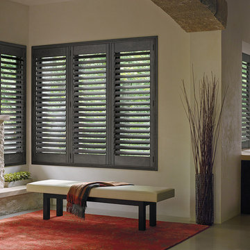
We love these gray, distressed shutters! This is a Restoration Hardware Style Shutter and will compliment your interior decor nicely.
The stained shutters come in a variety stains and are a perfect solution for contemporary style homes. Our shutters are flexible in design and let you decide how you want your shutters to operate and allows you to enjoy more view than ever before with louvers as large as 4.5” (plantation shutters). Our wood shutters have a satin coating, protecting them from common spills and making cleanup as simple as dusting with a soft, dry cloth. We have several types of shutters to match your needs and budget.
We have FREE in-home consultation and FREE showroom appointments. You can also stop in our showroom anytime during our normal business hours. Our professional Design Specialists are never pushy and believe in putting the client’s needs first. Give us a call today to get started on your shutter project today.
317-273-8343
Showroom:
1159 Country Club Road
Indianapolis, In 46234
M-F 9am-5pm
*Evenings & Saturdays by Appointments
 The Carpet Workroom
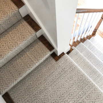
It’s #transformationtuesday which means we are sharing before and after photos of a #stairrunner project our installation team completed recently!
We interviewed the homeowner to learn more about how she discovered us and why she selected the style she chose for her stair runner! Here are is the response!
“I found you on Instagram from Candace of House of Paige (@_houseofpaige_)and also have seen Brenna Smith of Hope and Bay Design (@hopeandbay) go there too. You guys were local and I loved your instagram page - it was super easy to find inspiration ideas so I knew I needed to reach out.
We have two dogs and a toddler (with another baby on the way!) so we wanted something that would be durable but would match our style a bit more! We did Oil Nut Bay in Charcoal.
From my first visit to your work room to working with Billy over email, you made the process so easy! I really appreciated the honest feedback and opinions on the different styles we liked and if it would fit our lifestyle with dogs and kids at home. We must have had a dozen samples sent to us over the 2 months we worked together and it was just so easy to work with you virtually. We are so happy with the final product :)”
We thank every single one of you for sharing your story and experience with us at The Carpet Workroom!
 FOUR POINT DESIGN BUILD INC
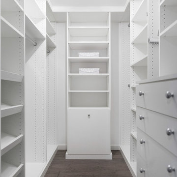
DESIGN BUILD REMODEL | Tween Bedroom Transformation | FOUR POINT DESIGN BUILD INC | Part Twelve
This completely transformed 3,500+ sf family dream home sits atop the gorgeous hills of Calabasas, CA and celebrates the strategic and eclectic merging of contemporary and mid-century modern styles with the earthy touches of a world traveler!
AS SEEN IN Better Homes and Gardens | BEFORE & AFTER | 10 page feature and COVER | Spring 2016
To see more of this fantastic transformation, watch for the launch of our NEW website and blog THE FOUR POINT REPORT, where we celebrate this and other incredible design build journey! Launching September 2016.
Photography by Riley Jamison
#TweenBedroom #remodel #LAinteriordesigner #builder #dreamproject #oneinamillion

 Illusions Vinyl Fence
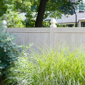
PVC vinyl tongue and groove privacy fencing that looks just like real wood without the maintenance! That's the Eastern White Cedar grain (W105) from Grand Illusions Vinyl WoodBond by Illusions Vinyl Fence. You have never seen a vinyl fence like this! It even has knots!
 Eldorado Stone
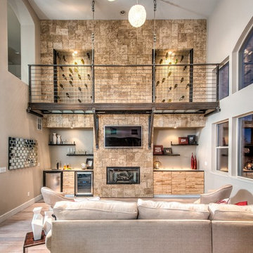
As seen on DIY Network’s “The Ultimate Crash”, designer Misha of Design by Misha chose Eldorado Stone’s Sanibel CoastalReef to add a rustic yet refined touch to the space, complimenting the raw steel beams and glass catwalk structure. “This project was meant to stand out and be striking while maintaining a sense of calm. The natural look of the CoastalReef conjured thoughts of an old wine cave in Tuscany but with a modern twist,” says Misha. Floor to ceiling use of Eldorado Stone provides interest to the focal wall of the fireplace, glass catwalk, and wine storage.
Eldorado Stone Profile Featured: Sanibel Coastal Reef installed with a Dry-Stack grout technique
Designer: Design by Misha
Website: www.designbymisha.com
Phone: (530) 867-0600
Contact Design by Misha
Houzz Portfolio: Design by Misha
Facebook: Design by Misha
Photography: Rich Baum
Website: www.richbaum.com
Phone: (916) 296-5778
Contact Rich Baum
Houzz Portfolio: Rich Baum
Builder: Doug Tolson Construction
Website: www.dougtolsonconstruction.com
Phone: (916) 343-2240
Contact Doug Tolson Construction
Facebook: Doug Tolson Construction
 Sophisticated Storage Solutions Custom Closets
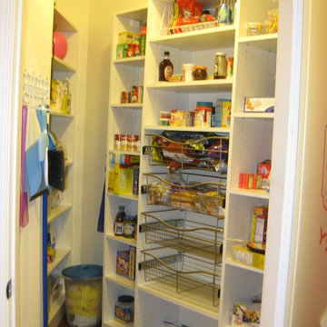
Shelves are custom to the space and the users needs. Shelves can be adjusted in height to meet changing needs. Shallow shelves for cans and other smaller items allow them to be seen and used. Baskets are great for snacks and loose packages.
23