
Search results for "New solutions" in Home Design Ideas
 Maya Williams Design
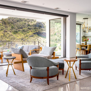
Inspiration for a contemporary open concept gray floor living room remodel in Los Angeles with white walls
 SHM Architects
Photography: Dan Piassick
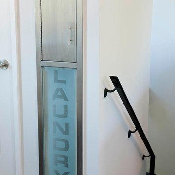
Transitional dark wood floor hallway photo in Dallas with white walls
Transitional dark wood floor hallway photo in Dallas with white walls
 Klopf Architecture
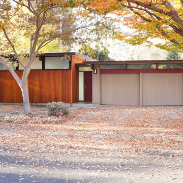
How do you expand an L shaped Eichler with the challenge of extending a long dark entry? Klopf Architecture's solution, to design a light filled atrium in the hallway to open up the bedroom expansion with green plants, sky lights and a glass wall. Not to mention the thoughtfulness of a blind door with wood siding similar to the rest of the home.
Klopf Architecture Project Team: John Klopf, AIA, Geoff Campen, Jeffrey Prose, and Angela Todorova
Contractor: William Lowe Construction
Photography ©2013 Mariko Reed
Location: Palo Alto, CA
Year completed: 2013
Find the right local pro for your project
 Built-Rite Closets
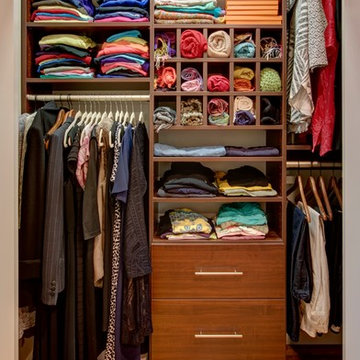
Reach-in closet - small transitional gender-neutral medium tone wood floor and beige floor reach-in closet idea in New York with flat-panel cabinets and dark wood cabinets
 J.P. Hoffman Design Build
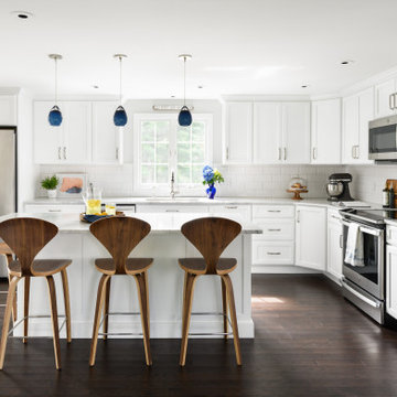
These homeowners came to J.P. Hoffman Design Build, looking for a creative solution to a problem they were told couldn’t be fixed. We defied the odds with our Design Build process and redesigned most of this Colonial’s first floor. Space for an island was number one on the want list. In order to achieve that goal, we did what we always do, We listened. We listened to what our client needed, how they used their space and how they envisioned their space. Then we designed a creative solution that made that seemingly unachievable vision, a reality. We removed the wall between the dining room and kitchen and expanded the kitchen cabinets into the hallway, once used to access the bathroom and garage. We simply re-routed the flow to the garage, through the now opened-up dining room, and in the process, created a new hallway with a coat closet, mudroom bench and access to the powder room which we also refreshed. In the kitchen, we relocated the slider leading out to the deck. This allowed for more cabinets and the floor space for that dream island. Our carpentry team installed a new kitchen window and slider, while modifying the existing deck to allow for the change. We installed new flooring, cabinets, countertops, plumbing fixtures and more. We receive lots of inquires about increasing function within the first floor. This project is a fantastic example of how it can be achieved, without an addition.
 kitchen & bath CRATE
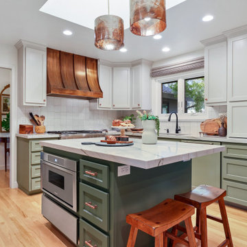
KitchenCRATE Custom Arrowwood Drive | Countertop: Bedrosians Glacier White Quartzite | Backsplash: Bedrosians Cloe Tile in White | Sink: Blanco Diamond Super Single Bowl in Concrete Gray | Faucet: Kohler Simplice Faucet in Matte Black | Cabinet Paint (Perimeter Uppers): Sherwin-Williams Worldly Gray in Eggshell | Cabinet Paint (Lowers): Sherwin-Williams Adaptive Shade in Eggshell | Cabinet Paint (Island): Sherwin-Williams Rosemary in Eggshell | Wall Paint: Sherwin-Williams Pearly White in Eggshell | For more visit: https://kbcrate.com/kitchencrate-custom-arrowwood-drive-in-riverbank-ca-is-complete/
 Convene Architecture
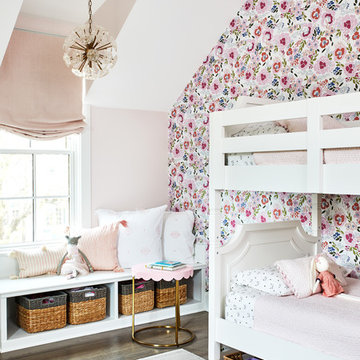
Child's Room
Photography: Stacy Zarin Goldberg Photography; Interior Design: Kristin Try Interiors; Builder: Harry Braswell, Inc.
Kids' room - coastal kids' room idea in DC Metro
Kids' room - coastal kids' room idea in DC Metro
Sponsored
Columbus, OH

Hope Restoration & General Contracting
Columbus Design-Build, Kitchen & Bath Remodeling, Historic Renovations
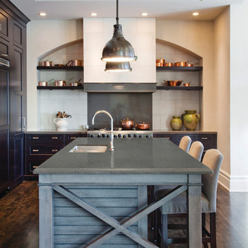
 ELEVATIONS | Design Solutions by Myers
Visit Our Showroom
8000 Locust Mill St.
Ellicott City, MD 21043
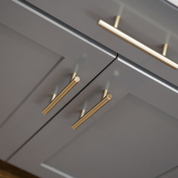
HanStone Sterling Grey Quartz Countertop
HanStone Quartz: This is a sample of Sterling Grey from the HanStone brand of quartz countertops. Han Stone quartz is the new and gorgeous lineup of quartz kitchen countertops offered by the large Korean congolmerate Hanwha.
 Advance Design Studio, Ltd.
After six years of living in their Huntley IL home, Chris and Meghan were tired of their dark, dingy, outdated kitchen and it was finally time for a long-anticipated change. “The kitchen is the place where we live, it’s where we do everything,” Meghan said. “It was important that it be a space where we wanted to be.” Meghan loves cooking and enjoys including their girls in healthy meal prepping, this led them to want a brighter, more enjoyable kitchen with increased functionality and improved storage.
For Chris especially, the laundry room was an entirely dysfunctional eyesore. “We had a washer and a dryer, but it was all kind-of cobbled together!” Chris said. “There were always laundry piles everywhere, we weren’t really sure what we wanted to do in there, but it was time for us to make a change.” The mess of the space was stressful every time they walked in the door from the garage each day. Kids’ backpacks and shoes piled up haphazardly in the makeshift boot-bench closet left the family feeling disorganized and stressed. They needed space for folding clothes and locker cubbies to help keep the family organized.
Having known Christine and Todd in the Huntley community for years, Chris and Meghan were familiar with their work. “We already trusted them personally and having seen their projects for years we knew they did top notch work. After we reviewed the initial round of designs, we knew that hiring them was definitely the right choice,” Meghan and Chris said. Although Chris had done a lot of work in their home himself, the kitchen and laundry room renovation was such a large undertaking that he didn’t want to steal time away from his family to spend what would surely be many long weekends doing the job himself. “That would not have been a wise choice for us,” Chris laughed.
“Our designer, Michelle was very, very, easy to work with; anything we wanted to see or weren’t sure about, she went above and beyond to make this easy for us. She was easy to get hold of and always quick to respond,” the couple said. Michelle pulled ideas that mirrored the couple’s taste and style and was adept at directing the couple to limited choices that didn’t overwhelm them and kept the process moving. “I have a hard time making decisions. Michelle made the decision-making process so easy. I loved how she listened to what I liked and then presented three great options for me to choose from,” Meghan said.
The main objectives for the kitchen were better storage solutions, they wanted the space to reflect their lifestyle and taste, and they wanted it to last for years with low maintenance. One of the first steps in creating a more functional kitchen was relocating the refrigerator, creating an improved workflow for the busy family.
“We didn’t know that we could even move the refrigerator to a new location where it is now, that was something that we never would have thought of,” Chris said. “The new refrigerator location makes the kitchen feel so much bigger. We didn’t add any space, but our whole kitchen with the new design just seems like it’s so much larger than before!” Meghan said.
The perimeter mist colored cabinets helped warm and brighten the entire room, while the graphite colored cabinets on the island added contrast. Using this fresh, clean color palette satisfied the couple’s desire for a bright space that was the exact opposite of what they had before. Organization accessories were also added to the cabinets such as a spice drawer tray and roll outs to create hidden convenience.
“I absolutely love the hidden spices – it makes cooking so much more enjoyable!” Chris said. “And all the pull outs, and the double trash bin, who would think you could get so excited about organization!” the couple said in unison.
One thing they hated in their original kitchen was how dark the space felt. Added lighting on the ceiling with the new light fixtures combined with the lighter cabinetry colors throughout solved this problem. “Our new kitchen has this warm, almost cozy feeling that our old kitchen never had, it’s just a space that I love spending my time in now,” Meghan said. The light airy feeling was accentuated with the use of floating white shelves on either side of the decorative range hood. “We have so much cabinetry space, the new design is amazing we actually have more storage space than we will ever need,” Meghan said.
The island was extended to create more work surface and added space for stool seating. “The new island changes how we live. Now the kids can be in the kitchen with us, doing homework, eating breakfast, and the three of us have special dinners there when Chris is working late,” Meghan said.
The Carrara Marmi Quartz countertops were chosen because they are, not only beautiful, but are made from hard-working material that doesn’t require maintenance. The white subway tile backsplash that wraps to the ceiling behind the focal point cooktop range/hood compliments the crisp white countertops perfectly, while brushed brass hardware and light fixtures keep the design fresh and new.
The couple had a few fears at the beginning of the project, as most homeowners do. Their biggest fear was being out of their kitchen and laundry room for an extended time. The crew made it very easy for the family to work in a limited space keeping the washer and dryer hooked up the majority of the time, and also getting appliances working with minimal downtime.
“They above and beyond accommodated us to get us through the process,” Meghan said. “They did a great job making sure we were as comfortable as possible throughout the process,” Chris added.
“Our project manager DJ did a great job. He was very good at updating us on schedule changes, getting guys in as quickly as possible. Everyone that stepped in the house was nice and did great work,” said Chris. They thought Advance’s carpenter was phenomenal and were impressed when he took a conceptual idea from a photograph and worked with designer Michelle to create a one of a kind range/hood that has become the topic of conversation with friends and family who visit the new kitchen. “He was in our house literally every day for several weeks. He was easy to work with and good at what he did,” Meghan and Chris said.
The focal point of the kitchen; a hand-crafted, custom-built ventilation hood was clad with handpicked reclaimed barnwood. Advance Design’s carpenter built the framework and the cladding to create a one-of-a-kind design element that the couple loves.
“I think it was especially fun for him to create something unique from scratch, showcasing his talent in this area,” Meghan said. “I love that my kitchen is not like everyone else’s. I got to pick out the wood on my hood and watch it being built and was able to choose what pieces of wood went where on it. It’s totally unique.”
Red Oak flooring was toothed-in throughout the kitchen and the rest of the first floor anywhere changes were made. Then the whole floor was refinished to tone down the orange undertones in the existing floor stain, ultimately changing the color complexion of the entire first floor. The result is a completely new feeling to the entire home.
Renovating the laundry room was extremely important to Meghan and Chris, but they had trouble visualizing what the possibilities were for the seemingly small space. Michelle produced beautiful 3D illustrations that helped them envision the space in a whole new way.
“I must have told Michelle 100 times that I am a visual person, seeing the designs in 3D made it so easy to make decisions and see what we could really do with our space,” Meghan said.
A dividing wall and doorway were removed between the existing laundry room and hallway formerly containing a coat closet, providing space to design specialized graphite colored cabinetry matching the kitchen island to house custom storage cubbies for each family member. Adding the tall utility cabinetry in the new laundry area helped solve the storage issue, tucking away cleaning supplies, household items, and even the cat got its own cubby.
“I love how everything is now hidden in its own space. I can’t tell you how much I hated coming home and seeing everything sitting around on counters,” Chris said.
Electrical outlets were planned for the inside of utility cabinets, so devices could charge in hidden locations. Stacking the washer and dryer allowed for wider countertop space to provide a folding area and a special space for clothes to hang. “The way I do laundry has been completely transformed! I can actually fold clothes and hang them now right out of the washer and dryer,” Meghan said.
“The end result in the kitchen and the laundry/mud room was an updated light and bright space, with a smarter work flow that better meets the needs of this family,” Michelle said.
“I would totally recommend Advance Design,” Meghan said. “Sometimes I sit and just look at my kitchen and laundry room and think ‘Wow, I can’t believe I get to live here!’ It’s an understatement to say we love our new space.”
 DHD Architecture and Interior Design
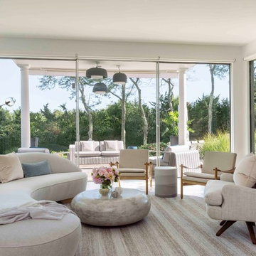
The Watermill House is a beautiful example of a classic Hamptons wood shingle style home. The design and renovation would maintain the character of the exterior while transforming the interiors to create an open and airy getaway for a busy and active family. The house comfortably sits within its one acre lot surrounded by tall hedges, old growth trees, and beautiful hydrangeas. The landscape influenced the design approach of the main floor interiors. Walls were removed and the kitchen was relocated to the front of the house to create an open plan for better flow and views to both the front and rear yards. The kitchen was designed to be both practical and beautiful. The u-shape design features modern appliances, white cabinetry and Corian countertops, and is anchored by a beautiful island with a knife-edge marble countertop. The island and the dining room table create a strong axis to the living room at the rear of the house. To further strengthen the connection to the outdoor decks and pool area of the rear yard, a full height sliding glass window system was installed. The clean lines and modern profiles of the window frames create unobstructed views and virtually remove the barrier between the interior and exterior spaces. The open plan allowed a new sitting area to be created between the dining room and stair. A screen, comprised of vertical fins, allows for a degree of openness, while creating enough separation to make the sitting area feel comfortable and nestled in its own area. The stair at the entry of the house was redesigned to match the new elegant and sophisticated spaces connected to it. New treads were installed to articulate and contrast the soft palette of finishes of the floors, walls, and ceilings. The new metal and glass handrail was intended to reduce visual noise and create subtle reflections of light.
Photo by Guillaume Gaudet
 Revealing Redesign
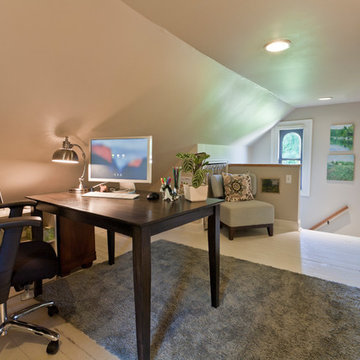
Trying to find a quiet corner in one's house for an office can be tough, but it also can be an adventure!
Reworking spaces in our homes so that they work better for our families as they grow and change is something we all need to do from time to time-- and it can give your house a new lease on life.
One room that took on a new identity in this old farmhouse was the third floor attic space--a room that is much like a treehouse with its small footprint, high perch, lofty views of the landscape, and sloping ceiling.
The space has been many things over the past two decades- a bedroom, a guest room, a hang-out for kids... but NOW it is the 'world headquarters' for my client's business. :)
Adding all the funky touches that make it a cozy personal space made all the difference...like lots of live green plants, vintage original artwork, architectural salvage window sashes, a repurposed and repainted dresser from the 1940's, and, of course, my client's favorite photos.

 JMorris Design LLC
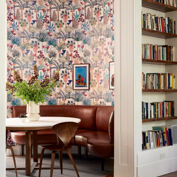
Breakfast nook - eclectic medium tone wood floor, brown floor and wallpaper breakfast nook idea in New York with multicolored walls
Sponsored
Fredericksburg, OH

High Point Cabinets
Columbus' Experienced Custom Cabinet Builder | 4x Best of Houzz Winner
 TKS Design Group
Download our free ebook, Creating the Ideal Kitchen. DOWNLOAD NOW
As with most projects, it all started with the kitchen layout. The home owners came to us wanting to upgrade their kitchen and overall aesthetic in their suburban home, with a combination of fresh paint, updated finishes, and improved flow for more ease when doing everyday activities.
A monochromatic, earth-toned palette left the kitchen feeling uninspired. It lacked the brightness they wanted from their space. An eat-in table underutilized the available square footage. The butler’s pantry was out of the way and hard to access, and the dining room felt detached from the kitchen.
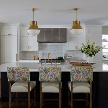
Lead Designer, Stephanie Cole, saw an improved layout for the spaces that were no longer working for this family. By eliminating an existing wall between the kitchen and dining room, and relocating the bar area to the dining room, we opened up the kitchen, providing all the space we needed to create a dreamy and functional layout. A new perimeter configuration promoted circulation while also making space for a large and functional island loaded with seating – a must for any family. Because an island that isn’t big enough for everyone (and a few more) is a recipe for disaster. The light white cabinetry is fresh and contrasts with the deeper tones in the wood flooring, creating a modern aesthetic that is elevated, yet approachable for everyday living.
With better flow as the overarching goal, we made some structural changes too. To remove a bottleneck in the entryway, we angled one of the dining room walls to create more natural separation between rooms and facilitate ease of movement throughout the large space.
At The Kitchen Studio, we believe a well-designed kitchen uses every square inch to the fullest. By starting from scratch, it was possible to rethink the entire kitchen layout and design the space according to how it is used, because the kitchen shouldn’t make it harder to feed the family. A new location for the existing range, flanked by a new column refrigerator and freezer on each side, worked to anchor the space. The very large and very spacious island (a dream island if we do say so ourselves) now houses the primary sink and provides ample space for food prep and family gathering.
The new kitchen table and coordinating banquette seating provide a cozy nook for quick breakfasts before school or work, and evening homework sessions. Elegant gold details catch the natural light, elevating the aesthetic.
The dining room was transformed into one of this client’s favorite spaces and we couldn’t agree more. We saw an opportunity to give the dining room a more distinguished identity by closing off the entrance from the foyer. The relocated wet bar enhances the sophisticated vibe of this gathering space, complete with beautiful antique mirror tiles and open shelving encased by moody built-in cabinets.
Updated furnishings add warmth. A rich walnut table is paired with custom chairs in a muted coral fabric. The large, transitional chandelier grounds the room, pairing beautifully with the gold finishes prevalent in the faucet and cabinet hardware. Linen-inspired wallpaper and cream-toned window treatments add to the glamorous feel of this entertainment space.
There is no way around it. The laundry room was cramped. The large washer and dryer blocked access to the sink and left little room for the space to serve its other essential function – as a mudroom. Because we reworked the kitchen layout to create more space overall, we could rethink the mudroom too – an essential for any busy family. The first step was moving the washer and dryer to an existing area on the second floor, where most of the family’s laundry lives (no one wants to carry laundry up and down the stairs if they don’t have to anyway). This is a more functional solution and opened up the space for all the mudroom necessities – including the existing kitchen refrigerator, loads of built-in cubbies, and a bench.
It’s hard to not fall in love with every detail of a new space, especially when it serves your day-to-day life. But that doesn’t mean the clients didn’t have their favorite features they use on the daily. This remodel was focused largely on function with a new kitchen layout. And it’s the functional features that have the biggest impact. The large island provides much needed workspace in the kitchen and is a spot where everyone gathers together – it grounds the space and the family. And the custom counter stools are the icing on the cake. The nearby mudroom has everything their previous space was lacking – ample storage, space for everyone’s essentials, and the beloved cement floor tiles that are both durable and artistic.
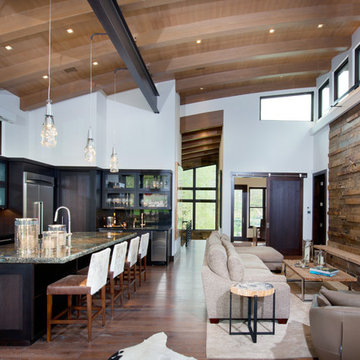
 Cohen Construction Inc.
Stovall Studio
Large mountain style open concept dark wood floor living room photo in Denver with brown walls, a standard fireplace, a stone fireplace and a wall-mounted tv
Large mountain style open concept dark wood floor living room photo in Denver with brown walls, a standard fireplace, a stone fireplace and a wall-mounted tv
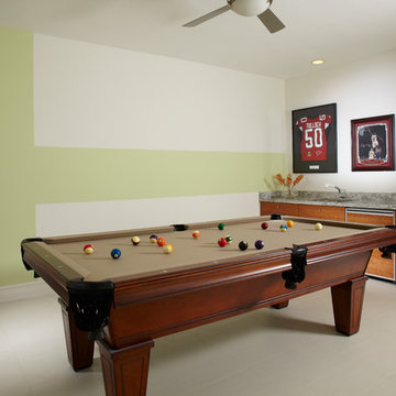
 J Design Group - Interior Designers Miami - Modern
Modern Interior Designs in Miami FL. by J Design Group in Miami.
Home is an incredible or lovely place where most of the people feel comfortable. Yes..! After a long and hectic day, house is the one place where you can relax. Gone are the days, when a “home” meant just a ceiling with four walls. Yes..! That's true, but nowadays a “house” is something beyond your expectation. Therefore, most of the people hire “premises decoration” services.
Nowadays, unlike old-age properties, various new apartments and homes are built to optimize the comfort of modern housing. Yes...! Everyone knows that “Home Decoration” is considered to be one of the most important and hottest trends all over the world. This is an amazing process of using creativity, imaginations and skills. Through this, you can make your house and any other building interesting and amazing. However, if you are looking for these kinds of services for your premises, then “J Design Group” is here just for you.
We are the one that provides renovation services to you so that you can make a building actually look like a house. Yes..! Other ordinary organizations who actually focus on the colors and other decorative items of any space, but we provide all these solutions efficiently. Creative and talented Contemporary Interior Designer under each and every requirement of our precious clients and provide different solutions accordingly. We provide all these services in commercial, residential and industrial sector like homes, restaurants, hotels, corporate facilities and financial institutions remodeling service.
Everyone knows that renovation is the one that makes a building actually look like a house. That's true “design” is the one that complement each and every section of a particular space. So, if you want to change the look of your interior within your budget, then Miami Interior Designers are here just for you. Our experts carefully understand your needs and design an outline plan before rendering outstanding solutions to you.
Interior design decorators of our firm have the potential and appropriate knowledge to decorate any kind of building. We render various reliable and credible solutions to our esteemed customers so that they can easily change the entire ambiance of their premises.
J Design Group – Miami Interior Designers Firm – Modern – Contemporary
Contact us: 305-444-4611
www.JDesignGroup.com
“Home Interior Designers”
"Miami modern"
“Contemporary Interior Designers”
“Modern Interior Designers”
“House Interior Designers”
“Coco Plum Interior Designers”
“Sunny Isles Interior Designers”
“Pinecrest Interior Designers”
"J Design Group interiors"
"South Florida designers"
“Best Miami Designers”
"Miami interiors"
"Miami decor"
“Miami Beach Designers”
“Best Miami Interior Designers”
“Miami Beach Interiors”
“Luxurious Design in Miami”
"Top designers"
"Deco Miami"
"Luxury interiors"
“Miami Beach Luxury Interiors”
“Miami Interior Design”
“Miami Interior Design Firms”
"Beach front"
“Top Interior Designers”
"top decor"
“Top Miami Decorators”
"Miami luxury condos"
"modern interiors"
"Modern”
"Pent house design"
"white interiors"
“Top Miami Interior Decorators”
“Top Miami Interior Designers”
“Modern Designers in Miami”
225 Malaga Ave.
Coral Gable, FL 33134
http://www.JDesignGroup.com
Call us at: 305.444.4611
Your friendly professional Interior design firm in Miami Florida.
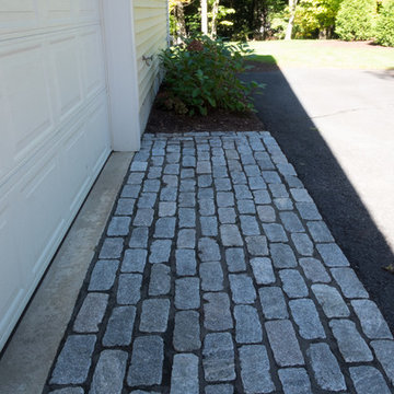
 Ream Design
This is an example of a huge traditional partial sun front yard concrete paver driveway in Boston.
Sponsored
Columbus, OH

Wannemacher Interiors
Customized Award-Winning Interior Design Solutions in Franklin Cnty OH
 TOC design & construction inc.
DESIGNED BY TOC design
CONSTRUCTION BY TOC design & Construction inc.
PHOTOS BY : Tania Scardellato
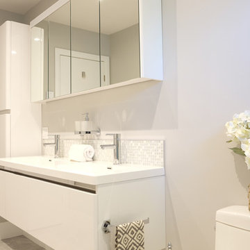
I was fortunate to have a young family approach me in desperate need to renovate there only 3 piece bathroom. This space was In dire need of a remodel, with old brown wall to wall tiles and a dated bulky yellow brown single sink vanity.
Storage was a must, lighting a necessity, and proper accessibility to the shower bath area.
We had a tight budget to respect, but a full gut of this bathroom was required. And a good thing too, once we started doing the demolition we noticed that mildew and rotting floors and walls had accumulated throughout the years. Doing it right the first time is no joke when dealing with water and electrical issues.
We discarded all reminisce of old and built from scratch, new walls, new plumbing, new electrical ,new insulation and a new window, a new fan that actually exhausted outside ( I say this laughing as you would be amazed at how many fans are installed but don’t exhaust outside, and you the client would never know unless you go inside the attic space.
Once all the hard stuff was done, the rest is just a matter of smart design. If you have a small bathroom here are some tips to guide you.
10 tips for making a small bathroom feel larger
Is your tiny bathroom cramping your functionality and style, leaving you longing for the enormous bathrooms gracing the pages of design magazines? Even if your bathroom is a fraction of the size, all it takes is some design savvy to make the most of the space you have. Consider these 10 smart tips that will help your bathroom look, feel and function like those larger contenders.
1-Get creative with corners
Space is at a premium in small bathrooms, so it's important to maximize every inch. Corners, for example, provide extra space for shelving, storage units and even hooks. Get creative and install unique design solutions that are not only functional, but also eye-catching. If you love the airiness of floating cabinets, add baskets or decorative boxes under for extra storage. If you are installing floating cabinets insure that they are installed securely to studs or plywood at wall.
2- Let solid colors shine
Busy patterns have a shrinking effect and make small bathrooms seem even smaller. Conversely, light natural hues make a space feel more open. If you're itching to get creative with design, experiment with textures but keep overpowering patterns to a minimum. Tone on tone is the best to achieve this.
3 - Maximize your bathtub
A bathtub takes up a significant portion of the room, but modern, compact options with curved basins, can make the tub feel larger when in use, all while conserving space.
4 - Select a smaller faucet
A faucet is jewelry for the bathroom. And just as accessories can overpower an outfit, a big bulky faucet isn't flattering in a small bath. Single-handle designs conserve counter space, while a wall-mount installation frees it up all together and can create quite the wow-factor, if the budget can accommodate the required changes to plumbing behind the wall.
5 - Make vanity storage simple
If you're in a storage war with your small bathroom, you're not alone in the battle. Toiletries and personal supplies without a place to call home only add clutter and chaos. Store smart with a space-saving vanity, the dual sink vanity shown here, looks quite simple, but in reality it has 4 sets of full extension drawers, and the vanity tower adds extra storage without overpowering the use of space.
6 - Show off the shower
Shower curtains may be pretty, but they interrupt the visual flow of a bathing space and make it feel significantly smaller. In bathrooms with small footprints, opt for a clear glass sliding shower door that doesn't require the clearance of one with a hinged design. Or as shown in this design and for fraction less expensive a half hinged panel installed on a fixed tempered glass panel. If you're embarking on a big remodel, create the illusion of more space by using same tile in the shower that's used throughout; instead of seeing them as two separate zones, the eye will read them as one.
7 - Discover the treasure of hidden storage
Work with a contractor, and you just might find some serious storage potential hidden behind your walls. Whether it's utilizing space between the studs for shallow shelving or a creating a small linen closet by annexing space from an adjacent room, even small additions can make a big difference.
8 - Focal Point
Tile is a beautiful, durable addition to any bathroom. For dainty spaces, consider installing tile at a diagonal to accentuate the focal point or as in this bathroom I used an oversized textured pattern to bring depth to the space at the window wall.
9 - Choose the right lights
Strategically install light to reflect and brighten a small bathroom to make it appear larger. Recessed lighting is an affordable solution for tiny rooms, offering ample light while taking up little space. Wall sconces alongside a mirror also reflect off the walls and make a room feel bright and airy. I always recommend going with LED lighting at 2800 to 3000K.
10 – Accessorize
This is your time to shine in your decorating skills, have fun with your towels, you can change the color scheme daily just by adding pops of color in your accessories, make sure to get items that serve a dual purpose, like baskets, boxes they can always be used as hampers, storing of towels and even a nice display for your guest.
 Klopf Architecture
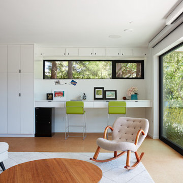
The Roger Lee designed house from 1962 was purchased by the current homeowners in almost original condition, as the previous owners elected to defer most maintenance projects over the years. The clients were able to see beyond the dated materials and finishes, single-paned glass and uninsulated walls and they approached Klopf Architecture to help them expand and update the entire home, one the family could settle into and enjoy for years to come. It was important that the new designs were aligned with Lee's original intent not only because of the client's appreciation for mid-century modern architecture, but also because the house was deemed historical. The Stanford Real Estate Office requires a stringent design review which safeguards the integrity of the community, which Klopf Architecture was happy to oblige going into their updated designs.
As with many original mid-century modern homes, the house was scaled to the 1960s lifestyle where rooms were smaller and openings to views were limited and tightly framed. The original conditions defined the direction the family of four would take in updating the house and making it comfortable for their modern lifestyle. Klopf designed a full gut remodel and major addition to bring the house into the 21st century and provide the living area needed for the client's family. The newly expanded house added just about 1,100 sf to create an airy, comfortable and family friendly house, taking full advantage of the beautiful southwestern views that extend out to the hills beyond. The enclosed garage created an additional 240 sf of covered space for long-term storage.
A cracked swimming pool created an eyesore taking up a majority of the backyard landscape, so it was one of the first elements to go during the transformation. Working with Outer Space Landscape Architects, the family asked for a mix of relaxing outdoor patio spaces that eventually blend into the native landscaping, extending their views outward toward the natural greenery of the trees beyond their property. Filling in the old pool was a smart way to expand the living spaces outward. The orientation of the house was designed to enjoy the views, but the original architecture provided the first homeowners with mere glimpses of the landscape outside.
Klopf was able to broaden those views, continuing and extending on the original architecture to take full advantage of the unobstructed natural views across the rear facade of the house. Small horizontal openings in the primary bedroom and office were replaced with much taller windows that now follow the angled roof line upward, extending across almost all of the facade. We worked with Western Windows, whose designs included an oblique-shaped, operable casement that allowed our design to rise with the slope. A new corner office added to the primary suite, offers a bright and functional work-from-home solution that looks out at the distant views and added natural light from the expanded window configuration that now wraps around the corner.
The existing lower level was designed by Lee as a utilitarian space, serving as a wet pool room with a drain in the center of the floor, bathroom, laundry and storage areas. Without the need for a pool room, Klopf was able to convert the area into a much more comfortable and functional living space with a new family room and guest suite. The new spaces enjoy easy access to a new outdoor patio through floor to ceiling, full-width glass sliders.
Continuing along the rear facade, a previously exposed deck extending from the living room and hallway provided access to the backyard through a single set of stairs leading toward the side of the house which made sense when the pool was in place. The new deck was re-envisioned as an extension of the main living room and now serves as a second outdoor living room. A new slatted pergola above provides the homeowners welcome relief from the hot afternoon sun. A second set of stairs now creates a better connection to the redesigned lower level. Klopf was able to reconfigure the spaces, extending the living room outward toward the views, where the family now claims it as the heart of the home, spending a large majority of their time outdoors.
Back inside, the original wood-burning Malm fireplace was beautifully restored and a gas burner installed to comply with California's strict air standards. It now rests in front of a wall of Heath accent tiles where a dated red brick wall used to stand. A new taller window brings more light and views into the refreshed interior living room. The original glass doors opposite the fireplace were replaced by larger sliders that when fully opened, create a seamless transition to the new outdoor living area so the two spaces feel like one connected space. The original utilitarian kitchen was needlessly tucked into the far back corner and closed-off, out of sight from the living room, so the clients asked Klopf to open it up and expand the kitchen forward so it felt more connected. Today the much larger kitchen is connected to the living area where a short wall with a cutout offers a visual glimpse into the kitchen and a handy pass-through counter for serving guests. A new breakfast nook was also added to create another spot where the family can gather for casual meals. Just outside, a new built-in outdoor grill and prep area extends the kitchen outside and connects to a new outdoor dining spot nestled amongst the trees, taking advantage of the views out back.
Klopf was able to expand the other two bedrooms, add a new laundry room and half-bath and convert the carport to an enclosed garage to add more storage areas which was lost when the pool house was converted to the family and guest room.
To maintain a historical connection to the original designs, the exterior siding was repeated on all exterior walls, a full-height stained glass window at the front entryway restored, and an interior slatted screen element repeated outside at the exterior entry courtyard and over the new outdoor living room to create a shade trellis. The new house stands proudly and shines against it's new landscaping features, while respecting and expanding on the original intent of Roger Lee's designs epitomizing the comforts of indoor-outdoor living in Northern California.
Completion year: 2020
Klopf Architecture project team: John Klopf, Klara Kevane, Noel Andrade
Contractor: ORB Construction, Brendan O'Reilly
Structural engineer: Sezen and Moon
Landscape architect: Outer space
Furnishings and decoration: Urbanism Designs
Photographer: Mariko Reed
 Cameo Homes Inc.
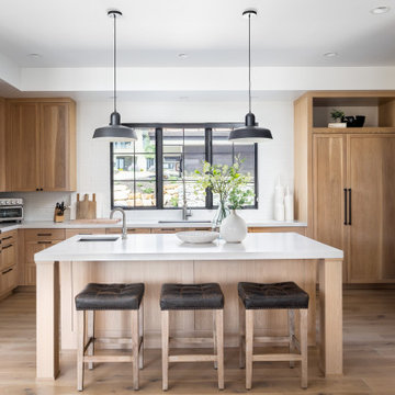
A gorgeous kitchen with neutral colors in this home located in Promontory, Park City, Utah. Built by Cameo Homes Inc.
Kitchen - rustic kitchen idea in Salt Lake City
Kitchen - rustic kitchen idea in Salt Lake City
14