
Search results for "Nicely surprisingly" in Home Design Ideas
 La Moda Tile & Design Studio
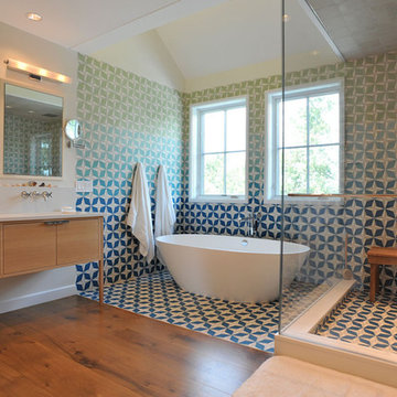
Bathroom - large contemporary master blue tile, green tile, multicolored tile and cement tile medium tone wood floor and brown floor bathroom idea in New York with flat-panel cabinets, medium tone wood cabinets, a one-piece toilet, white walls, an undermount sink, quartz countertops and a hinged shower door
 Dynamic Garage Door
Getting your homeowner's association board to approve your new custom garage doors can seem daunting. Dynamic Garage Door as a custom design and manufacturing firm has come across this situation quite frequently with a phenomenal success approval rate!
In order to get approval for your custom garage door approval there are a few basic points you must understand. First off, your HOA is committed to preserving the neighborhood's curb appeal integrity by focusing on the impact your new custom garage doors might have on your house and the houses of your neighbors. It is important to understand that your curb appeal decisions will impact your home and neighborhood alike. Too many companies offer semi-custom wood doors without the true understanding of the client's need and the essence of their home's architectural style. The garage door design you choose needs to comply with neighborhood regulations while complement your home's architecture. At Dynamic Garage Door, our designers are well-rounded in the garage door industry and so we can suggest or develop designs that will reinforce the natural appearance of your home's style. If you can prove to your HOA that you've done your homework and that the garage door design you chose will complement not only your home but the neighborhood you'll be surprised when your proposal is marked with the approval stamp!
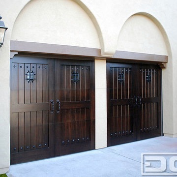
This garage door is actually a single double-car door not two as it appears. The reason is that this garage used to have two separate doors with a post in the middle. The post in the middle made it difficult to use the garage on a daily basis so the post was removed to facilitate the use of the garage. The HOA wasn't too happy about the removal of the post as it was an essential part of the arches located right above the garage doors. You can clearly see how that would have been disruptive if the homeowner went with a regular wood door and not one custom designed and manufactured by Dynamic Garage Door.
This garage door was specifically designed to address the HOA's concern about the center post removal and the effect it would have on the curb appeal of the home with the incomplete double arch look. So we addressed this by crafting the door with a false center post in the middle that was textured and painted the same color of the house to give off that illusion that the post is still there. Overall, it gives the home a complete finished appearance with two independent-looking doors and original post. The homeowner got the entire width of the opening to use at the push of a button so having a larger car won't be a problem anymore. The neighbors are all happy and no one seems to notice the center post is actually fake!
Got an interesting garage door project you want our designers to review and price out for you? Give us a call at (855) 343-DOOR
 Designerpaint
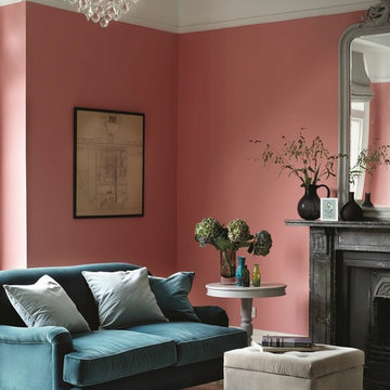
Teal looks great with this coral paint colour.
Living room - contemporary living room idea in Sussex
Living room - contemporary living room idea in Sussex
Find the right local pro for your project
![Design Fixation [Faith Provencher]](https://st.hzcdn.com/fimgs/07a3fbf7003fc8b3_6655-w32-h32-b0-p0--.jpg) Design Fixation [Faith Provencher]
Design Fixation [Faith Provencher]Photo: Faith Towers © 2017 Houzz
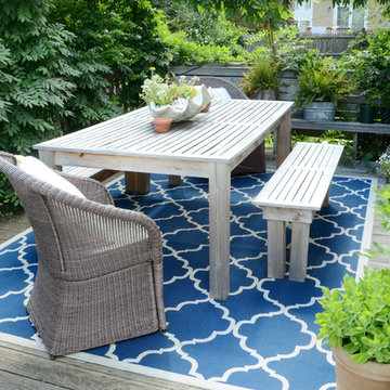
Example of an eclectic deck design in Boston
Example of an eclectic deck design in Boston
 Kitchen Design Concepts
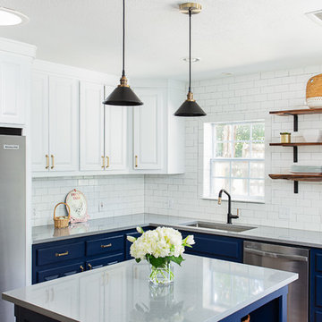
We introduce to you one of our newer services we are providing here at Kitchen Design Concepts: spaces that just need a little reviving! As of recent, we are taking on projects that are in need of minimal updating, as in, spaces that don’t need a full-on remodel. Yes, you heard right! If your space has good bones, you like the layout of your kitchen, and you just need a few cosmetic changes, then today’s feature is for you! Recently, we updated a space where we did just this! The kitchen was in need of a little love, some fresh paint, and new finishes. And if we’re being honest here, the result looks almost as if the kitchen had a full-on remodel! To learn more about this space and how we did our magic, continue reading below:
The Before and After
First, see what an impact new finishes can make! The “before” image shows a kitchen with outdated finishes such as the tile countertops, backsplash, and cabinetry finish. The “after” image, is a kitchen that looks almost as if its brand new, the image speaks for itself!
Cabinetry
With the wooden cabinetry in this kitchen already having great bones, all we needed to do was our refinishing process that involved removing door and drawer fronts, sanding, priming, and painting. The main color of the cabinetry is white (Sherwin Williams Pure White 7005) and as an accent, we applied a deep navy blue that really pops in this space (Sherwin Willaims Naval 6244). As a special design element, we incorporated a natural wooden band across the hood which is subtle but adds an element of surprise.
Countertops
The original countertops in this space were a 12×12 tile with cracks and discolored grout from all the wear and tear. To replace the countertops, we installed a clean and crisp quartz that is not only durable but easy to maintain (no grout here!). The 3cm countertops are a Cambria quartz in a grey-tone color (Carrick).
Backsplash
Keeping things simple, yet classic, we installed a 3×6 subway tile from Interceramic. The crisp white pairs well with all the other finishes of the space and really brighten the space up! To spice things up, we paired the white tile with a contrasting grout color (Cape Grey) that matches the countertop. This is a simple method to add interest to your white backsplash!
Fixtures and Fittings
For the fixtures and fittings of the kitchen, we wanted pieces that made a statement. That’s why we selected this industrial style faucet from Brizo! The faucet is a Brizo LITZE™ PULL-DOWN FAUCET WITH ARC SPOUT AND INDUSTRIAL HANDLE (63044LF-BLGL). The matte black paired with the luxe gold elements really make a statement! To match the gold elements of the faucet, we installed cabinetry hardware from Topknobs in the same gold finish. The hardware is a Channing pull TK743HB. Lastly, the large single bowl sink (who doesn’t want a large sink?!) is a great functional touch to the kitchen. The sink is a Blanco Precision 16″ R10 super single with 16″ Drainer in stainless steel (516216).
 Reborn Cabinets Inc.
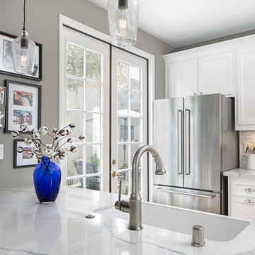
“We want to redo our cabinets…but my kitchen is so small!” We hear this a lot here at Reborn Cabinets. You might be surprised how many people put off refreshing their kitchen simply because homeowners can’t see beyond their own square footage. Not all of us can live in a big, sprawling ranch house, but that doesn’t mean that a small kitchen can’t be polished into a real gem! This project is a great example of how dramatic the difference can be when we rethink our space—even just a little! By removing hanging cabinets, this kitchen opened-up very nicely. The light from the preexisting French doors could flow wonderfully into the adjacent family room. The finishing touches were made by transforming a very small “breakfast nook” into a clean and useful storage space.

Sponsored
Columbus, OH

Hope Restoration & General Contracting
Columbus Design-Build, Kitchen & Bath Remodeling, Historic Renovations
 TKS Design Group
Download our free ebook, Creating the Ideal Kitchen. DOWNLOAD NOW
Lakefront property in the northwest suburbs of Chicago is hard to come by, so when we were hired by this young family with exactly that, we were immediately inspired by not just the unusually large footprint of this 1950’s colonial revival but also the lovely views of the manmade lake it was sited on. The large 5-bedroom home was solidly stuck in the 1980’s, but we saw tons of potential. We started out by updating the existing staircase with a fresh coat of paint and adding new herringbone slate to the entry hall.
The powder room off the entryway also got a refresh - new flooring, new cabinets and fixtures. We ran the new slate right through into this space for some consistency. A fun wallpaper and shiplap trim add a welcoming feel and set the tone for the home.
Next, we tackled the kitchen. Located away from the rest of the first floor, the kitchen felt a little isolated, so we immediately began planning for how to better connect it to the rest of the first floor. We landed on removing the wall between the kitchen and dining room and designed a modified galley style space with separate cooking and clean up zones. The cooking zone consists of the refrigerator, prep sink and cooktop, along with a nice long run of prep space at the island. The cleanup side of the kitchen consists of the main sink and dishwasher. Both areas are situated so that the user can view the lake during prep work and cleanup!
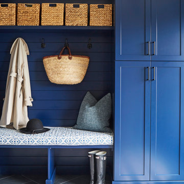
One of the home’s main puzzles was how to incorporate the mudroom and area in front of the patio doors at the back of the house. We already had a breakfast table area, so the space by the patio doors was a bit of a no man’s land. We decided to separate the kitchen proper from what became the new mudroom with a large set of barn doors. That way you can quickly hide any mudroom messes but have easy access to the light coming in through the patio doors as well as the outdoor grilling station. We also love the impact the barn doors add to the overall space.
The homeowners’ first words to us were “it’s time to ditch the brown,” so we did! We chose a lovely blue pallet that reflects the home’s location on the lake which is also vibrant yet easy on the eye. Countertops are white quartz, and the natural oak floor works well with the other honey accents. The breakfast table was given a refresh with new chairs, chandelier and window treatments that frame the gorgeous views of the lake out the back.
We coordinated the slate mudroom flooring with that used in the home’s main entrance for a consistent feel. The storage area consists of open and closed storage to allow for some clutter control as needed.
Next on our “to do” list was revamping the dated brown bar area in the neighboring dining room. We eliminated the clutter by adding some closed cabinets and did some easy updates to help the space feel more current. One snag we ran into here was the discovery of a beam above the existing open shelving that had to be modified with a smaller structural beam to allow for our new design to work. This was an unexpected surprise, but in the end we think it was well worth it!
We kept the colors here a bit more muted to blend with the homeowner’s existing furnishings. Open shelving and polished nickel hardware add some simple detail to the new entertainment zone which also looks out onto the lake!
Next we tackled the upstairs starting with the homeowner’s son’s bath. The bath originally had both a tub shower and a separate shower, so we decided to swap out the shower for a new laundry area. This freed up some space downstairs in what used to be the mudroom/laundry room and is much more convenient for daily laundry needs.
We continued the blue palette here with navy cabinetry and the navy tile in the shower. Porcelain floor tile and chrome fixtures keep maintenance to a minimum while matte black mirrors and lighting add some depth the design. A low maintenance runner adds some warmth underfoot and ties the whole space together.
We added a pocket door to the bathroom to minimize interference with the door swings. The left door of the laundry closet is on a 180 degree hinge to allow for easy full access to the machines. Next we tackled the master bath which is an en suite arrangement. The original was typical of the 1980’s with the vanity outside of the bathroom, situated near the master closet. And the brown theme continued here with multiple shades of brown.
Our first move was to segment off the bath and the closet from the master bedroom. We created a short hall from the bedroom to the bathroom with his and hers walk-in closets on the left and right as well as a separate toilet closet outside of the main bathroom for privacy and flexibility.
The original bathroom had a giant soaking tub with steps (dangerous!) as well as a small shower that did not work well for our homeowner who is 6’3”. With other bathtubs in the home, they decided to eliminate the tub and create an oversized shower which takes up the space where the old tub was located. The double vanity is on the opposite wall and a bench is located under the window for morning conversations and a place to set a couple of towels.
The pallet in here is light and airy with a mix of blond wood, creamy porcelain and marble tile, and brass accents. A simple roman shade adds some texture and it’s top-down mechanism allows for light and privacy.
This large whole house remodel gave our homeowners not only the ability to maximize the potential of their home but also created a lovely new frame from which to view their fabulous lake views.
Designed by: Susan Klimala, CKD, CBD
Photography by: Michael Kaskel
For more information on kitchen and bath design ideas go to: www.kitchenstudio-ge.com


 Pillar 3 Design Group
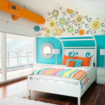
Interior by Pillar 3 Design
Mural by Pillar 3 Design
Custom bed by Pillar 3 Design and Garrett Stovall
Photo by Brian Wilson
Inspiration for a coastal kids' room remodel in Other
Inspiration for a coastal kids' room remodel in Other
 TKS Design Group
Download our free ebook, Creating the Ideal Kitchen. DOWNLOAD NOW
Lakefront property in the northwest suburbs of Chicago is hard to come by, so when we were hired by this young family with exactly that, we were immediately inspired by not just the unusually large footprint of this 1950’s colonial revival but also the lovely views of the manmade lake it was sited on. The large 5-bedroom home was solidly stuck in the 1980’s, but we saw tons of potential. We started out by updating the existing staircase with a fresh coat of paint and adding new herringbone slate to the entry hall.
The powder room off the entryway also got a refresh - new flooring, new cabinets and fixtures. We ran the new slate right through into this space for some consistency. A fun wallpaper and shiplap trim add a welcoming feel and set the tone for the home.
Next, we tackled the kitchen. Located away from the rest of the first floor, the kitchen felt a little isolated, so we immediately began planning for how to better connect it to the rest of the first floor. We landed on removing the wall between the kitchen and dining room and designed a modified galley style space with separate cooking and clean up zones. The cooking zone consists of the refrigerator, prep sink and cooktop, along with a nice long run of prep space at the island. The cleanup side of the kitchen consists of the main sink and dishwasher. Both areas are situated so that the user can view the lake during prep work and cleanup!
One of the home’s main puzzles was how to incorporate the mudroom and area in front of the patio doors at the back of the house. We already had a breakfast table area, so the space by the patio doors was a bit of a no man’s land. We decided to separate the kitchen proper from what became the new mudroom with a large set of barn doors. That way you can quickly hide any mudroom messes but have easy access to the light coming in through the patio doors as well as the outdoor grilling station. We also love the impact the barn doors add to the overall space.
The homeowners’ first words to us were “it’s time to ditch the brown,” so we did! We chose a lovely blue pallet that reflects the home’s location on the lake which is also vibrant yet easy on the eye. Countertops are white quartz, and the natural oak floor works well with the other honey accents. The breakfast table was given a refresh with new chairs, chandelier and window treatments that frame the gorgeous views of the lake out the back.
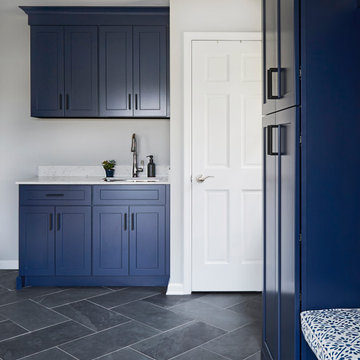
We coordinated the slate mudroom flooring with that used in the home’s main entrance for a consistent feel. The storage area consists of open and closed storage to allow for some clutter control as needed.
Next on our “to do” list was revamping the dated brown bar area in the neighboring dining room. We eliminated the clutter by adding some closed cabinets and did some easy updates to help the space feel more current. One snag we ran into here was the discovery of a beam above the existing open shelving that had to be modified with a smaller structural beam to allow for our new design to work. This was an unexpected surprise, but in the end we think it was well worth it!
We kept the colors here a bit more muted to blend with the homeowner’s existing furnishings. Open shelving and polished nickel hardware add some simple detail to the new entertainment zone which also looks out onto the lake!
Next we tackled the upstairs starting with the homeowner’s son’s bath. The bath originally had both a tub shower and a separate shower, so we decided to swap out the shower for a new laundry area. This freed up some space downstairs in what used to be the mudroom/laundry room and is much more convenient for daily laundry needs.
We continued the blue palette here with navy cabinetry and the navy tile in the shower. Porcelain floor tile and chrome fixtures keep maintenance to a minimum while matte black mirrors and lighting add some depth the design. A low maintenance runner adds some warmth underfoot and ties the whole space together.
We added a pocket door to the bathroom to minimize interference with the door swings. The left door of the laundry closet is on a 180 degree hinge to allow for easy full access to the machines. Next we tackled the master bath which is an en suite arrangement. The original was typical of the 1980’s with the vanity outside of the bathroom, situated near the master closet. And the brown theme continued here with multiple shades of brown.
Our first move was to segment off the bath and the closet from the master bedroom. We created a short hall from the bedroom to the bathroom with his and hers walk-in closets on the left and right as well as a separate toilet closet outside of the main bathroom for privacy and flexibility.
The original bathroom had a giant soaking tub with steps (dangerous!) as well as a small shower that did not work well for our homeowner who is 6’3”. With other bathtubs in the home, they decided to eliminate the tub and create an oversized shower which takes up the space where the old tub was located. The double vanity is on the opposite wall and a bench is located under the window for morning conversations and a place to set a couple of towels.
The pallet in here is light and airy with a mix of blond wood, creamy porcelain and marble tile, and brass accents. A simple roman shade adds some texture and it’s top-down mechanism allows for light and privacy.
This large whole house remodel gave our homeowners not only the ability to maximize the potential of their home but also created a lovely new frame from which to view their fabulous lake views.
Designed by: Susan Klimala, CKD, CBD
Photography by: Michael Kaskel
For more information on kitchen and bath design ideas go to: www.kitchenstudio-ge.com
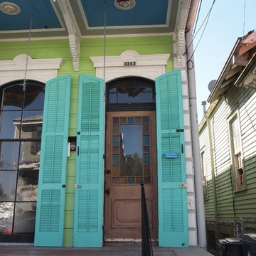
 Kayla Stark
Photo: Kayla Stark © 2016 Houzz
Inspiration for an eclectic exterior home remodel in New Orleans
Inspiration for an eclectic exterior home remodel in New Orleans

 KraftMaster Renovations
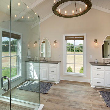
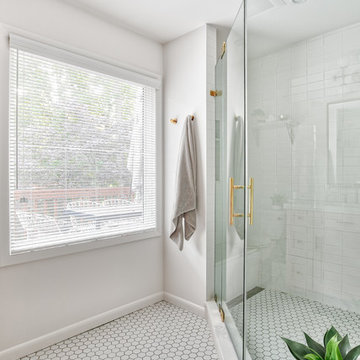
This beautiful master bath shower got a complete makeover and even has a great view to this spacious backyard.
Photos by Chris Veith.
Corner shower - mid-sized mid-century modern master white tile and subway tile mosaic tile floor and white floor corner shower idea in New York with beaded inset cabinets, a two-piece toilet, white walls, a drop-in sink, a hinged shower door and white countertops
Corner shower - mid-sized mid-century modern master white tile and subway tile mosaic tile floor and white floor corner shower idea in New York with beaded inset cabinets, a two-piece toilet, white walls, a drop-in sink, a hinged shower door and white countertops
 Thomas Shafer Architects LLC
Steve Hall, Dave Burk@Hedrich Blessing, Doug Snower Photography
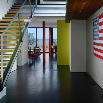
Large minimalist dark wood floor foyer photo in Chicago with white walls
Large minimalist dark wood floor foyer photo in Chicago with white walls
 Thyme & Place Design LLC
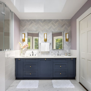
This medium-sized bathroom had ample space to create a luxurious bathroom for this young professional couple with 3 young children. My clients really wanted a place to unplug and relax where they could retreat and recharge.
New cabinets were a must with customized interiors to reduce cluttered countertops and make morning routines easier and more organized. We selected Hale Navy for the painted finish with an upscale recessed panel door. Honey bronze hardware is a nice contrast to the navy paint instead of an expected brushed silver. For storage, a grooming center to organize hair dryer, curling iron and brushes keeps everything in place for morning routines. On the opposite, a pull-out organizer outfitted with trays for smaller personal items keeps everything at the fingertips. I included a pull-out hamper to keep laundry and towels off the floor. Another design detail I like to include is drawers in the sink cabinets. It is much better to have drawers notched for the plumbing when organizing bathroom products instead of filling up a large base cabinet.
The room already had beautiful windows and was bathed in natural light from an existing skylight. I enhanced the natural lighting with some recessed can lights, a light in the shower as well as sconces around the mirrored medicine cabinets. The best thing about the medicine cabinets is not only the additional storage but when both doors are opened you can see the back of your head. The inside of the cabinet doors are mirrored. Honey Bronze sconces are perfect lighting at the vanity for makeup and shaving.
A larger shower for my very tall client with a built-in bench was a priority for this bathroom. I recommend stream showers whenever designing a bathroom and my client loved the idea of that feature as a surprise for his wife. Steam adds to the wellness and health aspect of any good bathroom design. We were able to access a small closet space just behind the shower a perfect spot for the steam unit. In addition to the steam, a handheld shower is another “standard” item in our shower designs. I like to locate these near a bench so you can sit while you target sore shoulder and back muscles. Another benefit is the cleanability of the shower walls and being able to take a quick shower without getting your hair wet. The slide bar is just the thing to accommodate different heights.
For Mrs., a tub for soaking and relaxing were the main ingredients required for this remodel. Here I specified a Bain Ultra freestanding tub complete with air massage, chromatherapy, and a heated backrest. The tub filer is floor mounted and adds another element of elegance to the bath. I located the tub in a bay window so the bather can enjoy the beautiful view out of the window. It is also a great way to relax after a round of golf. Either way, both of my clients can enjoy the benefits of this tub.
The tiles selected for the shower and the lower walls of the bathroom are slightly oversized subway tiles in a clean and bright white. The floors are 12x24 porcelain marble. The shower floor features a flat-cut marble pebble tile. Behind the vanity, the wall is tiled with Zellige tile in a herringbone pattern. The colors of the tile connect all the colors used in the bath.
The final touches of elegance and luxury to complete our design, are the soft lilac paint on the walls, the mix of metal materials on the faucets, cabinet hardware, lighting, and yes, an oversized heated towel warmer complete with robe hooks.
This truly is a space for rejuvenation and wellness.
 Soko Design
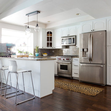
Inspiration for a mid-sized mid-century modern u-shaped dark wood floor eat-in kitchen remodel in Los Angeles with white cabinets, granite countertops, multicolored backsplash, stone slab backsplash, stainless steel appliances and a peninsula
 J. Stephens Interiors
Hamptons-Inspired Kitchen
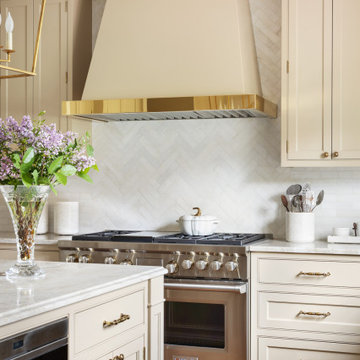
One cannot help but feel a distinct sense of serenity and timeless beauty when entering this Hamptons-style kitchen. Bathed in natural light and shimmering with inspired accents and details, this complete kitchen transformation is at once elegant and inviting. Plans and elevations were conceived to create balance and function without sacrificing harmony and visual intrigue.
A metal custom hood, with an eye-catching brass band and impeccably balanced cabinets on either side, provides a strong focal point for the kitchen, which can be viewed from the adjacent living room. Brass faucets, hardware and light fixtures complement and draw further attention to this anchoring element. A wall of glass cabinetry enhances the existing windows and pleasantly expands the sense of openness in the space.
Taj Mahal quartzite blends gracefully with the cabinet finishes. Cream-tone, herringbone tiles are custom-cut into different patterns to create a sense of visual movement as the eyes move across the room. An elegant, marble-top island paired with sumptuous, leather-covered stools, not only offers extra counterspace, but also an ideal gathering place for loved ones to enjoy.
This unforgettable kitchen gem shines even brighter with the addition of glass cabinets, designed to display the client’s collection of Portmeirion china. Careful consideration was given to the selection of stone for the countertops, as well as the color of paint for the cabinets, to highlight this inspiring collection.
Breakfast room
A thoughtfully blended mix of furniture styles introduces a splash of European charm to this Hamptons-style kitchen, with French, cane-back chairs providing a sense of airy elegance and delight.
A performance velvet adorns the banquette, which is piled high with lush cushions for optimal comfort while lounging in the room. Another layer of texture is achieved with a wool area rug that defines and accentuates this gorgeous breakfast nook with sprawling views of the outdoors.
Finishing features include drapery fabric and Brunschwig and Fils Bird and Thistle paper, whose natural, botanic pattern combines with the beautiful vistas of the backyard to inspire a sense of being in a botanical, outdoor wonderland.
 Sayler | Owens | Kerr design studio
Sayler Architecture / Woods Wheatcroft
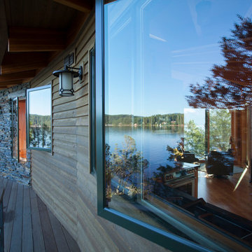
Mountain style deck photo in Seattle
Mountain style deck photo in Seattle
 Thomas Roszak Architecture, LLC
Photo credit: Scott McDonald @ Hedrich Blessing
7RR-Ecohome:
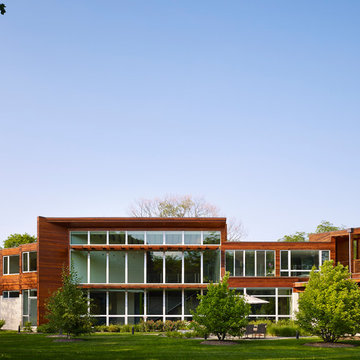
The design objective was to build a house for a couple recently married who both had kids from previous marriages. How to bridge two families together?
The design looks forward in terms of how people live today. The home is an experiment in transparency and solid form; removing borders and edges from outside to inside the house, and to really depict “flowing and endless space”. The house floor plan is derived by pushing and pulling the house’s form to maximize the backyard and minimize the public front yard while welcoming the sun in key rooms by rotating the house 45-degrees to true north. The angular form of the house is a result of the family’s program, the zoning rules, the lot’s attributes, and the sun’s path. We wanted to construct a house that is smart and efficient in terms of construction and energy, both in terms of the building and the user. We could tell a story of how the house is built in terms of the constructability, structure and enclosure, with a nod to Japanese wood construction in the method in which the siding is installed and the exposed interior beams are placed in the double height space. We engineered the house to be smart which not only looks modern but acts modern; every aspect of user control is simplified to a digital touch button, whether lights, shades, blinds, HVAC, communication, audio, video, or security. We developed a planning module based on a 6-foot square room size and a 6-foot wide connector called an interstitial space for hallways, bathrooms, stairs and mechanical, which keeps the rooms pure and uncluttered. The house is 6,200 SF of livable space, plus garage and basement gallery for a total of 9,200 SF. A large formal foyer celebrates the entry and opens up to the living, dining, kitchen and family rooms all focused on the rear garden. The east side of the second floor is the Master wing and a center bridge connects it to the kid’s wing on the west. Second floor terraces and sunscreens provide views and shade in this suburban setting. The playful mathematical grid of the house in the x, y and z axis also extends into the layout of the trees and hard-scapes, all centered on a suburban one-acre lot.
Many green attributes were designed into the home; Ipe wood sunscreens and window shades block out unwanted solar gain in summer, but allow winter sun in. Patio door and operable windows provide ample opportunity for natural ventilation throughout the open floor plan. Minimal windows on east and west sides to reduce heat loss in winter and unwanted gains in summer. Open floor plan and large window expanse reduces lighting demands and maximizes available daylight. Skylights provide natural light to the basement rooms. Durable, low-maintenance exterior materials include stone, ipe wood siding and decking, and concrete roof pavers. Design is based on a 2' planning grid to minimize construction waste. Basement foundation walls and slab are highly insulated. FSC-certified walnut wood flooring was used. Light colored concrete roof pavers to reduce cooling loads by as much as 15%. 2x6 framing allows for more insulation and energy savings. Super efficient windows have low-E argon gas filled units, and thermally insulated aluminum frames. Permeable brick and stone pavers reduce the site’s storm-water runoff. Countertops use recycled composite materials. Energy-Star rated furnaces and smart thermostats are located throughout the house to minimize duct runs and avoid energy loss. Energy-Star rated boiler that heats up both radiant floors and domestic hot water. Low-flow toilets and plumbing fixtures are used to conserve water usage. No VOC finish options and direct venting fireplaces maintain a high interior air quality. Smart home system controls lighting, HVAC, and shades to better manage energy use. Plumbing runs through interior walls reducing possibilities of heat loss and freezing problems. A large food pantry was placed next to kitchen to reduce trips to the grocery store. Home office reduces need for automobile transit and associated CO2 footprint. Plan allows for aging in place, with guest suite than can become the master suite, with no need to move as family members mature.
22