
Search results for "Non rooted methods" in Home Design Ideas
 Rooted By Design
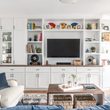
Philadelphia Row Home Renovation focusing on maximizing storage for a young family of 5. We created a "mudroom" in the front of the row home with a large living room space for family time + hosting. We used kid-friendly furnishings with performance fabrics that are durable and easy to clean. Prioritized eco-friendly selections, utilizing locally sourced + American made pieces.
 Twelve Stones Designs, LLC
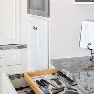
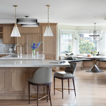
The owners of this kitchen had spent the money to upgrade the finishes in their kitchen upon building the home 12 years ago, but after living in the space for several years they realized how nonfunctional the layout really was. The (then) two preschool aged children had grown into busy, hungry teenagers with many friends who also liked to hang out at the house. So the family needed a more functional kitchen with better traffic flow, space for daily activities revolving around the kitchen at different times of day, and a kitchen that could accommodate cooking for and serving large groups. Furthermore, the dark, traditional finishes no longer reflected the homeowners’ style. They requested a brighter, more relaxed, coastal style that reflected their love of the seaside cities they like to visit.
Originally, the kitchen was U-shaped with a narrow island in the middle. The island created narrow aisles that bottle-necked at the dishwasher, refrigerator, and cooktop areas. There was a pass-through from the foyer into the kitchen, but the owners never liked that the pass-through was also located so close to the powder room. The awkward proximity was unappealing and made guests feel uncomfortable.
The kitchen’s storage was made up of lots of narrow cabinets, apothecary drawers, clipped corner units, and very few drawers. It lacked useful storage for the larger items the family used on a daily basis. And the kitchen’s only pantry was small closet that had only builder-grade, narrow shelving with no illumination to be able to see the contents inside.
Overall, the kitchen’s lighting plan was poorly executed. Only six recessed cans illuminated the entire kitchen and nook areas. The under cabinet lighting was not evenly distributed either. In fact, the builder had mis-placed the under cabinet lighting around the decorative pilasters which made for choppy, dark cubbies. Further, the builder didn’t include any lighting over the sink or the bar area, which meant whoever was doing the dishes was always in their own shadow. That, coupled with the steep overhang of the game room above made the bar area feel like a dim, cavernous space that wasn’t inviting or task oriented. The kitchen looked out into the main living space, but the raised bar and a narrow wall (which held the only large cabinet in the kitchen) created more of a barrier than a relationship to the living room or breakfast nook. In fact, one couldn’t even see the breakfast nook from the cooktop or sink areas due to its orientation. The raised bar top was too narrow to comfortably sit to either dine at or chat from due to the lack of knee space. The the homeowners confided that the kitchen felt more like a dark, dirty prison than place where the family, or their guests, wanted to gather and commune.
The clients' needs and desires were:
➢ to create a kitchen that would be a space the family loved to be in; to relate to the adjacent spaces all around, and to have better flow for entertaining large groups
➢ to remove the walls between the breakfast nook and living area and to be able to utilize the natural light from the windows in both those areas
➢ to incorporate a functional chopping block for prepping fresh food for home cooked meals, an island with a large sink and drain board, 2 pull out trash cans, and seating for at least the 2 teens to eat or do homework
➢ to design a kitchen and breakfast nook with an airy, coastal, relaxed vibe that blended with the rest of the house's coastal theme
➢ to integrate a layered lighting plan which would include ample general illumination, specific task lighting, decorative lighting, and lots of illuminated storage
➢ to design a kitchen with not only more storage for all the husband’s kitchen gadgets and collection of oils and spices, but smart storage, including a coffee/breakfast bar and a place to store and conceal the toaster oven and microwave
➢ to find a way to utilize the large open space between the kitchen, pantry area, and breakfast nook
Twelve Stones Designs achieved the owner's goals by:
➢ removing the walls between the kitchen and living room to allow the natural light to filter in from the adjacent rooms and to create a connection between the kitchen, nook, and living spaces for a sense of unity and communion
➢ removing the existing pantry and designing 3 large pantry style cabinets with LED tape lights and rollout drawers to house lots of kitchen appliances, gadgets, and tons of groceries. We also took the cabinets all the way up to the 9’ ceiling for additional storage for seasonal items and bulk storage.
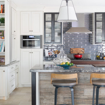
➢ designing 2 islands - 1 with a gorgeous black walnut chopping block that houses a drawer for chopping and carving knives and a custom double pull out trash unit for point of use utilization - and 1 that houses the dishwasher, a large Blanco Gourmet sink with integrated drain board, woven baskets for fresh root vegetables and kitchen towels, plenty of drawer storage for kitchen items, and bar seating for up to 4 diners.
➢ closing off the space between the kitchen and the powder room to create a beautiful new private alcove for the powder room as well as adding some decorative storage. This also gave us space to include more tall storage near the new range for precision placement of the husband’s extensive oil and spice collection as well as a location for a combo-steam oven the wife wanted for baking and cooking healthy meals.
The project is enhanced functionally by:
➢ incorporated USB and standard receptacles for the kids’ laptops and phone charging in the large island
➢ designing the small island to include additional open shelving for items used on a daily basis such as a variety of bowls, plates, and colanders. This set up also works well for the husband who prefers to “plate” his dinners in restaurant-style fashion before presenting them to the table.
➢ the integration of specific storage units, such as double stacked cutlery drawers, a custom spice pull-out, a Kuerig coffee and tea pod drawer, and custom double stacked utensil drawers
➢ moving the refrigerator to the old oven location - this eliminated the bottle neck as well as created a better relationship to the eating table. It also utilizes the floor space between the pantry, nook, and kitchen
➢ creating a banquet style breakfast nook - this banquette seating not only doubles the amount of seating for large gatherings but it better utilizes the odd space between the kitchen and the previous nook area. It also helps to create a distinct pathway from the mudroom room through the pantry area, kitchen, nook, and living room.
➢ the coffee/breakfast bar area which includes the perfect location for the concealed microwave and toaster oven, convenient storage for the coffee pods and tea accoutrements. Roll-out drawers below also house the smoothie maker, hot water kettle, and a plethora of smoothie-making ingredients such as protein powders, smoothie additives, etc. Furthermore, the drawers below the Keurig house measuring utensil, cutlery, baking supplies and tupperware storage.
➢ incorporating lots of wide drawers and pullouts to accommodate large cookware.
➢ utilizing as much vertical space as possible by building storage to the ceiling which accommodates the family’s abundant amount of serving platters, baking sheets, bakeware, casserole dishes, and additional cutting boards.
The project is enhanced aesthetically by:
➢ new 5-piece Versailles pattern porcelain tile that now seamlessly joins the entire down stairs area together creating a bright, cohesiveness feeling instead of choppy separated spaces - it also adds a coastal feeling
➢ designing a cabinet to conceal the microwave and toaster oven
➢ the coastal influenced light fixtures over the nook table and island
➢ the sandy colors of the Langdon Cambria countertops. The swirling pattern and sparkling quartz pieces remind the homeowner of black-and-tan sandy beaches
➢ the striped banquet seating whose creamy white background and blue-green stripes were the inspiration for the cabinet and wall colors.
➢ All the interior doors were painted black to coordinate with the blacks and grays in the backsplash tile and countertop. This also adds a hint of tailored formality to an otherwise casual space.
➢ the use of WAC's Oculux small aperture LED units for the overhead lighting complimented with Diode LED strips for task lighting under the cabinets and inside the pantry and glass wall cabinets. All of the lighting applications are on separate dimmer switches.
Innovative uses of materials or construction methods by Realty Restoration LLC:
➢ Each 1-1/2” x 3” block of reclaimed end-grain black walnut that makes up the center island chopping block was hand milled and built in the shop. It was designed to look substantial and proportional to the surrounding elements, executed by creating the 4 inch tall top with a solid wood chamfered edge band.
➢ The metal doors on either side of the vent hood were also custom designed for this project and built in the Realty Restoration LLC shop. They are made 1x2, 11-gauge mild steel with ribbed glass. Weighing 60 lbs a piece, heavy duty cabinet hinges were added to support the weight of the door and keep them from sagging.
➢ Under-cabinet receptacles were added along the range wall in order to have a clean, uninterrupted backsplash.
Design obstacles to overcome:
➢ Because we were removing the demising walls between the kitchen and living room, we had to find a way to plumb and vent the new island. We did this by tunneling through the slab (the slab had post tension cables which prevented us from just trenching) to run a new wet vent through a nearby structural wall. We pulled the existing hot and cold lines between upper floor joists and ran them down the structural wall as well and up through a conduit in the tunnel.
➢ Since we were converting from wall overs to a gas range it allowed us to utilize the 220 feed for the wall ovens to provide a new sub panel for all the new kitchen circuits
➢ Due to framing deficiencies inherited from the original build there was a 1-1/2” differential in the floor-to-ceiling height over a 20 foot span; by utilizing the process of cutting and furring coupled with the crown moulding details on the cabinet elevations we were able to mask the problem and provide seamless transitions between the cabinet components.
Evidence of superior craftsmanship:
➢ uniquely designed, one-of-a-kind metal “X” end panels on the large island. The end panels were custom made in the Realty Restoration LLC shop and fitted to the exact dimensions of the island. The welding seams are completely indistinguishable - the posts look like they are cut from a single sheet of metal
➢ square metal posts on the small island were also custom made and designed to compliment and carry through the metal element s throughout the kitchen
➢ the beautiful, oversized end panels on the pantry cabinets which give the breakfast nook a tailored look
➢ integrating a large format 5 piece Versailles tile pattern to seamlessly flow from the existing spaces into the new kitchen space
➢ By constructing a custom cabinet that jogged around a corner we could not remodel (housing the entry way coat closet) we were able to camouflage the adjacent wall offset within the upper and lower cabinets. By designing around the existing jog in the structural walls we accomplished a few things: we were able to find the space to house, and hide, the microwave and toaster oven yet still have a clean cohesive appearance from the kitchen side. Additionally, the owners were able to keep their much needed coat closet and we didn’t have to increase the budget with unnecessary structural work.

Find the right local pro for your project
 Twelve Stones Designs, LLC
The owners of this kitchen had spent the money to upgrade the finishes in their kitchen upon building the home 12 years ago, but after living in the space for several years they realized how nonfunctional the layout really was. The (then) two preschool aged children had grown into busy, hungry teenagers with many friends who also liked to hang out at the house. So the family needed a more functional kitchen with better traffic flow, space for daily activities revolving around the kitchen at different times of day, and a kitchen that could accommodate cooking for and serving large groups. Furthermore, the dark, traditional finishes no longer reflected the homeowners’ style. They requested a brighter, more relaxed, coastal style that reflected their love of the seaside cities they like to visit.
Originally, the kitchen was U-shaped with a narrow island in the middle. The island created narrow aisles that bottle-necked at the dishwasher, refrigerator, and cooktop areas. There was a pass-through from the foyer into the kitchen, but the owners never liked that the pass-through was also located so close to the powder room. The awkward proximity was unappealing and made guests feel uncomfortable.
The kitchen’s storage was made up of lots of narrow cabinets, apothecary drawers, clipped corner units, and very few drawers. It lacked useful storage for the larger items the family used on a daily basis. And the kitchen’s only pantry was small closet that had only builder-grade, narrow shelving with no illumination to be able to see the contents inside.
Overall, the kitchen’s lighting plan was poorly executed. Only six recessed cans illuminated the entire kitchen and nook areas. The under cabinet lighting was not evenly distributed either. In fact, the builder had mis-placed the under cabinet lighting around the decorative pilasters which made for choppy, dark cubbies. Further, the builder didn’t include any lighting over the sink or the bar area, which meant whoever was doing the dishes was always in their own shadow. That, coupled with the steep overhang of the game room above made the bar area feel like a dim, cavernous space that wasn’t inviting or task oriented. The kitchen looked out into the main living space, but the raised bar and a narrow wall (which held the only large cabinet in the kitchen) created more of a barrier than a relationship to the living room or breakfast nook. In fact, one couldn’t even see the breakfast nook from the cooktop or sink areas due to its orientation. The raised bar top was too narrow to comfortably sit to either dine at or chat from due to the lack of knee space. The the homeowners confided that the kitchen felt more like a dark, dirty prison than place where the family, or their guests, wanted to gather and commune.
The clients' needs and desires were:
➢ to create a kitchen that would be a space the family loved to be in; to relate to the adjacent spaces all around, and to have better flow for entertaining large groups
➢ to remove the walls between the breakfast nook and living area and to be able to utilize the natural light from the windows in both those areas
➢ to incorporate a functional chopping block for prepping fresh food for home cooked meals, an island with a large sink and drain board, 2 pull out trash cans, and seating for at least the 2 teens to eat or do homework
➢ to design a kitchen and breakfast nook with an airy, coastal, relaxed vibe that blended with the rest of the house's coastal theme
➢ to integrate a layered lighting plan which would include ample general illumination, specific task lighting, decorative lighting, and lots of illuminated storage
➢ to design a kitchen with not only more storage for all the husband’s kitchen gadgets and collection of oils and spices, but smart storage, including a coffee/breakfast bar and a place to store and conceal the toaster oven and microwave
➢ to find a way to utilize the large open space between the kitchen, pantry area, and breakfast nook
Twelve Stones Designs achieved the owner's goals by:
➢ removing the walls between the kitchen and living room to allow the natural light to filter in from the adjacent rooms and to create a connection between the kitchen, nook, and living spaces for a sense of unity and communion
➢ removing the existing pantry and designing 3 large pantry style cabinets with LED tape lights and rollout drawers to house lots of kitchen appliances, gadgets, and tons of groceries. We also took the cabinets all the way up to the 9’ ceiling for additional storage for seasonal items and bulk storage.
➢ designing 2 islands - 1 with a gorgeous black walnut chopping block that houses a drawer for chopping and carving knives and a custom double pull out trash unit for point of use utilization - and 1 that houses the dishwasher, a large Blanco Gourmet sink with integrated drain board, woven baskets for fresh root vegetables and kitchen towels, plenty of drawer storage for kitchen items, and bar seating for up to 4 diners.
➢ closing off the space between the kitchen and the powder room to create a beautiful new private alcove for the powder room as well as adding some decorative storage. This also gave us space to include more tall storage near the new range for precision placement of the husband’s extensive oil and spice collection as well as a location for a combo-steam oven the wife wanted for baking and cooking healthy meals.
The project is enhanced functionally by:
➢ incorporated USB and standard receptacles for the kids’ laptops and phone charging in the large island
➢ designing the small island to include additional open shelving for items used on a daily basis such as a variety of bowls, plates, and colanders. This set up also works well for the husband who prefers to “plate” his dinners in restaurant-style fashion before presenting them to the table.
➢ the integration of specific storage units, such as double stacked cutlery drawers, a custom spice pull-out, a Kuerig coffee and tea pod drawer, and custom double stacked utensil drawers
➢ moving the refrigerator to the old oven location - this eliminated the bottle neck as well as created a better relationship to the eating table. It also utilizes the floor space between the pantry, nook, and kitchen
➢ creating a banquet style breakfast nook - this banquette seating not only doubles the amount of seating for large gatherings but it better utilizes the odd space between the kitchen and the previous nook area. It also helps to create a distinct pathway from the mudroom room through the pantry area, kitchen, nook, and living room.
➢ the coffee/breakfast bar area which includes the perfect location for the concealed microwave and toaster oven, convenient storage for the coffee pods and tea accoutrements. Roll-out drawers below also house the smoothie maker, hot water kettle, and a plethora of smoothie-making ingredients such as protein powders, smoothie additives, etc. Furthermore, the drawers below the Keurig house measuring utensil, cutlery, baking supplies and tupperware storage.
➢ incorporating lots of wide drawers and pullouts to accommodate large cookware.
➢ utilizing as much vertical space as possible by building storage to the ceiling which accommodates the family’s abundant amount of serving platters, baking sheets, bakeware, casserole dishes, and additional cutting boards.
The project is enhanced aesthetically by:
➢ new 5-piece Versailles pattern porcelain tile that now seamlessly joins the entire down stairs area together creating a bright, cohesiveness feeling instead of choppy separated spaces - it also adds a coastal feeling
➢ designing a cabinet to conceal the microwave and toaster oven
➢ the coastal influenced light fixtures over the nook table and island
➢ the sandy colors of the Langdon Cambria countertops. The swirling pattern and sparkling quartz pieces remind the homeowner of black-and-tan sandy beaches
➢ the striped banquet seating whose creamy white background and blue-green stripes were the inspiration for the cabinet and wall colors.
➢ All the interior doors were painted black to coordinate with the blacks and grays in the backsplash tile and countertop. This also adds a hint of tailored formality to an otherwise casual space.
➢ the use of WAC's Oculux small aperture LED units for the overhead lighting complimented with Diode LED strips for task lighting under the cabinets and inside the pantry and glass wall cabinets. All of the lighting applications are on separate dimmer switches.
Innovative uses of materials or construction methods by Realty Restoration LLC:
➢ Each 1-1/2” x 3” block of reclaimed end-grain black walnut that makes up the center island chopping block was hand milled and built in the shop. It was designed to look substantial and proportional to the surrounding elements, executed by creating the 4 inch tall top with a solid wood chamfered edge band.
➢ The metal doors on either side of the vent hood were also custom designed for this project and built in the Realty Restoration LLC shop. They are made 1x2, 11-gauge mild steel with ribbed glass. Weighing 60 lbs a piece, heavy duty cabinet hinges were added to support the weight of the door and keep them from sagging.
➢ Under-cabinet receptacles were added along the range wall in order to have a clean, uninterrupted backsplash.
Design obstacles to overcome:
➢ Because we were removing the demising walls between the kitchen and living room, we had to find a way to plumb and vent the new island. We did this by tunneling through the slab (the slab had post tension cables which prevented us from just trenching) to run a new wet vent through a nearby structural wall. We pulled the existing hot and cold lines between upper floor joists and ran them down the structural wall as well and up through a conduit in the tunnel.
➢ Since we were converting from wall overs to a gas range it allowed us to utilize the 220 feed for the wall ovens to provide a new sub panel for all the new kitchen circuits
➢ Due to framing deficiencies inherited from the original build there was a 1-1/2” differential in the floor-to-ceiling height over a 20 foot span; by utilizing the process of cutting and furring coupled with the crown moulding details on the cabinet elevations we were able to mask the problem and provide seamless transitions between the cabinet components.
Evidence of superior craftsmanship:
➢ uniquely designed, one-of-a-kind metal “X” end panels on the large island. The end panels were custom made in the Realty Restoration LLC shop and fitted to the exact dimensions of the island. The welding seams are completely indistinguishable - the posts look like they are cut from a single sheet of metal
➢ square metal posts on the small island were also custom made and designed to compliment and carry through the metal element s throughout the kitchen
➢ the beautiful, oversized end panels on the pantry cabinets which give the breakfast nook a tailored look
➢ integrating a large format 5 piece Versailles tile pattern to seamlessly flow from the existing spaces into the new kitchen space
➢ By constructing a custom cabinet that jogged around a corner we could not remodel (housing the entry way coat closet) we were able to camouflage the adjacent wall offset within the upper and lower cabinets. By designing around the existing jog in the structural walls we accomplished a few things: we were able to find the space to house, and hide, the microwave and toaster oven yet still have a clean cohesive appearance from the kitchen side. Additionally, the owners were able to keep their much needed coat closet and we didn’t have to increase the budget with unnecessary structural work.
 Twelve Stones Designs, LLC
The owners of this kitchen had spent the money to upgrade the finishes in their kitchen upon building the home 12 years ago, but after living in the space for several years they realized how nonfunctional the layout really was. The (then) two preschool aged children had grown into busy, hungry teenagers with many friends who also liked to hang out at the house. So the family needed a more functional kitchen with better traffic flow, space for daily activities revolving around the kitchen at different times of day, and a kitchen that could accommodate cooking for and serving large groups. Furthermore, the dark, traditional finishes no longer reflected the homeowners’ style. They requested a brighter, more relaxed, coastal style that reflected their love of the seaside cities they like to visit.
Originally, the kitchen was U-shaped with a narrow island in the middle. The island created narrow aisles that bottle-necked at the dishwasher, refrigerator, and cooktop areas. There was a pass-through from the foyer into the kitchen, but the owners never liked that the pass-through was also located so close to the powder room. The awkward proximity was unappealing and made guests feel uncomfortable.
The kitchen’s storage was made up of lots of narrow cabinets, apothecary drawers, clipped corner units, and very few drawers. It lacked useful storage for the larger items the family used on a daily basis. And the kitchen’s only pantry was small closet that had only builder-grade, narrow shelving with no illumination to be able to see the contents inside.
Overall, the kitchen’s lighting plan was poorly executed. Only six recessed cans illuminated the entire kitchen and nook areas. The under cabinet lighting was not evenly distributed either. In fact, the builder had mis-placed the under cabinet lighting around the decorative pilasters which made for choppy, dark cubbies. Further, the builder didn’t include any lighting over the sink or the bar area, which meant whoever was doing the dishes was always in their own shadow. That, coupled with the steep overhang of the game room above made the bar area feel like a dim, cavernous space that wasn’t inviting or task oriented. The kitchen looked out into the main living space, but the raised bar and a narrow wall (which held the only large cabinet in the kitchen) created more of a barrier than a relationship to the living room or breakfast nook. In fact, one couldn’t even see the breakfast nook from the cooktop or sink areas due to its orientation. The raised bar top was too narrow to comfortably sit to either dine at or chat from due to the lack of knee space. The the homeowners confided that the kitchen felt more like a dark, dirty prison than place where the family, or their guests, wanted to gather and commune.
The clients' needs and desires were:
➢ to create a kitchen that would be a space the family loved to be in; to relate to the adjacent spaces all around, and to have better flow for entertaining large groups
➢ to remove the walls between the breakfast nook and living area and to be able to utilize the natural light from the windows in both those areas
➢ to incorporate a functional chopping block for prepping fresh food for home cooked meals, an island with a large sink and drain board, 2 pull out trash cans, and seating for at least the 2 teens to eat or do homework
➢ to design a kitchen and breakfast nook with an airy, coastal, relaxed vibe that blended with the rest of the house's coastal theme
➢ to integrate a layered lighting plan which would include ample general illumination, specific task lighting, decorative lighting, and lots of illuminated storage
➢ to design a kitchen with not only more storage for all the husband’s kitchen gadgets and collection of oils and spices, but smart storage, including a coffee/breakfast bar and a place to store and conceal the toaster oven and microwave
➢ to find a way to utilize the large open space between the kitchen, pantry area, and breakfast nook
Twelve Stones Designs achieved the owner's goals by:
➢ removing the walls between the kitchen and living room to allow the natural light to filter in from the adjacent rooms and to create a connection between the kitchen, nook, and living spaces for a sense of unity and communion
➢ removing the existing pantry and designing 3 large pantry style cabinets with LED tape lights and rollout drawers to house lots of kitchen appliances, gadgets, and tons of groceries. We also took the cabinets all the way up to the 9’ ceiling for additional storage for seasonal items and bulk storage.
➢ designing 2 islands - 1 with a gorgeous black walnut chopping block that houses a drawer for chopping and carving knives and a custom double pull out trash unit for point of use utilization - and 1 that houses the dishwasher, a large Blanco Gourmet sink with integrated drain board, woven baskets for fresh root vegetables and kitchen towels, plenty of drawer storage for kitchen items, and bar seating for up to 4 diners.
➢ closing off the space between the kitchen and the powder room to create a beautiful new private alcove for the powder room as well as adding some decorative storage. This also gave us space to include more tall storage near the new range for precision placement of the husband’s extensive oil and spice collection as well as a location for a combo-steam oven the wife wanted for baking and cooking healthy meals.
The project is enhanced functionally by:
➢ incorporated USB and standard receptacles for the kids’ laptops and phone charging in the large island
➢ designing the small island to include additional open shelving for items used on a daily basis such as a variety of bowls, plates, and colanders. This set up also works well for the husband who prefers to “plate” his dinners in restaurant-style fashion before presenting them to the table.
➢ the integration of specific storage units, such as double stacked cutlery drawers, a custom spice pull-out, a Kuerig coffee and tea pod drawer, and custom double stacked utensil drawers
➢ moving the refrigerator to the old oven location - this eliminated the bottle neck as well as created a better relationship to the eating table. It also utilizes the floor space between the pantry, nook, and kitchen
➢ creating a banquet style breakfast nook - this banquette seating not only doubles the amount of seating for large gatherings but it better utilizes the odd space between the kitchen and the previous nook area. It also helps to create a distinct pathway from the mudroom room through the pantry area, kitchen, nook, and living room.
➢ the coffee/breakfast bar area which includes the perfect location for the concealed microwave and toaster oven, convenient storage for the coffee pods and tea accoutrements. Roll-out drawers below also house the smoothie maker, hot water kettle, and a plethora of smoothie-making ingredients such as protein powders, smoothie additives, etc. Furthermore, the drawers below the Keurig house measuring utensil, cutlery, baking supplies and tupperware storage.
➢ incorporating lots of wide drawers and pullouts to accommodate large cookware.
➢ utilizing as much vertical space as possible by building storage to the ceiling which accommodates the family’s abundant amount of serving platters, baking sheets, bakeware, casserole dishes, and additional cutting boards.
The project is enhanced aesthetically by:
➢ new 5-piece Versailles pattern porcelain tile that now seamlessly joins the entire down stairs area together creating a bright, cohesiveness feeling instead of choppy separated spaces - it also adds a coastal feeling
➢ designing a cabinet to conceal the microwave and toaster oven
➢ the coastal influenced light fixtures over the nook table and island
➢ the sandy colors of the Langdon Cambria countertops. The swirling pattern and sparkling quartz pieces remind the homeowner of black-and-tan sandy beaches
➢ the striped banquet seating whose creamy white background and blue-green stripes were the inspiration for the cabinet and wall colors.
➢ All the interior doors were painted black to coordinate with the blacks and grays in the backsplash tile and countertop. This also adds a hint of tailored formality to an otherwise casual space.
➢ the use of WAC's Oculux small aperture LED units for the overhead lighting complimented with Diode LED strips for task lighting under the cabinets and inside the pantry and glass wall cabinets. All of the lighting applications are on separate dimmer switches.
Innovative uses of materials or construction methods by Realty Restoration LLC:
➢ Each 1-1/2” x 3” block of reclaimed end-grain black walnut that makes up the center island chopping block was hand milled and built in the shop. It was designed to look substantial and proportional to the surrounding elements, executed by creating the 4 inch tall top with a solid wood chamfered edge band.
➢ The metal doors on either side of the vent hood were also custom designed for this project and built in the Realty Restoration LLC shop. They are made 1x2, 11-gauge mild steel with ribbed glass. Weighing 60 lbs a piece, heavy duty cabinet hinges were added to support the weight of the door and keep them from sagging.
➢ Under-cabinet receptacles were added along the range wall in order to have a clean, uninterrupted backsplash.
Design obstacles to overcome:
➢ Because we were removing the demising walls between the kitchen and living room, we had to find a way to plumb and vent the new island. We did this by tunneling through the slab (the slab had post tension cables which prevented us from just trenching) to run a new wet vent through a nearby structural wall. We pulled the existing hot and cold lines between upper floor joists and ran them down the structural wall as well and up through a conduit in the tunnel.
➢ Since we were converting from wall overs to a gas range it allowed us to utilize the 220 feed for the wall ovens to provide a new sub panel for all the new kitchen circuits
➢ Due to framing deficiencies inherited from the original build there was a 1-1/2” differential in the floor-to-ceiling height over a 20 foot span; by utilizing the process of cutting and furring coupled with the crown moulding details on the cabinet elevations we were able to mask the problem and provide seamless transitions between the cabinet components.
Evidence of superior craftsmanship:
➢ uniquely designed, one-of-a-kind metal “X” end panels on the large island. The end panels were custom made in the Realty Restoration LLC shop and fitted to the exact dimensions of the island. The welding seams are completely indistinguishable - the posts look like they are cut from a single sheet of metal
➢ square metal posts on the small island were also custom made and designed to compliment and carry through the metal element s throughout the kitchen
➢ the beautiful, oversized end panels on the pantry cabinets which give the breakfast nook a tailored look
➢ integrating a large format 5 piece Versailles tile pattern to seamlessly flow from the existing spaces into the new kitchen space
➢ By constructing a custom cabinet that jogged around a corner we could not remodel (housing the entry way coat closet) we were able to camouflage the adjacent wall offset within the upper and lower cabinets. By designing around the existing jog in the structural walls we accomplished a few things: we were able to find the space to house, and hide, the microwave and toaster oven yet still have a clean cohesive appearance from the kitchen side. Additionally, the owners were able to keep their much needed coat closet and we didn’t have to increase the budget with unnecessary structural work.

 Good Earth Design
This peach tree was nearly dead in an abandoned corner of the landscape. Peaches like more water and
'cool' feet than is available here in the high mountain desert. I revived this tree by adding deep mulch out past its drip line and planting a non-spreading variety of comfrey all around. Comfrey is one of the most amazing beneficial plants in the garden, it deserves an article, even a book of its own. In addition to herbal and medical properties comfrey is a powerful dynamic accumulator and mulch plant, it brings a variety of nutrients from deep in the ground and accumulates them on the surface in its leaves. The leaves break down quickly into rich black soil.
 Bare Root Design Studio
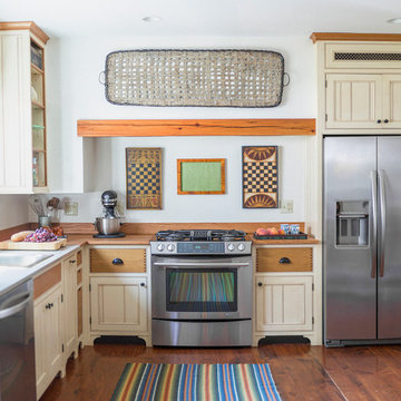
A modest budget doesn't have to mean dull. Interior and kitchen designer, Nancy Gracia incorporated some key details that make this charming cottage kitchen come to life. Exposed dovetails, hand glazed custom cabinetry and smart layout are just some of the custom features this space offers. Photography: Joe Kyle

Sponsored
Columbus, OH

Structural Remodeling
Franklin County's Heavy Timber Specialists | Best of Houzz 2020!
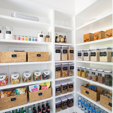
 NEAT Method Santa Barbara
Mid-sized transitional white floor kitchen pantry photo in Santa Barbara with open cabinets and white cabinets
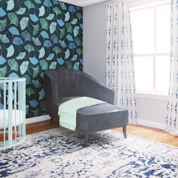
 Eco Method Interiors
The Project: 182 SQFT | Residential
Eco Features:
Non-toxic, low-impact dye wallpaper
Custom crib made with low-toxin adhesives, finishes and formaldehyde-free, FSC wood
Fire retardant-free nursing chaise lounge
Organic bedding
Organic GOTs certified area rug
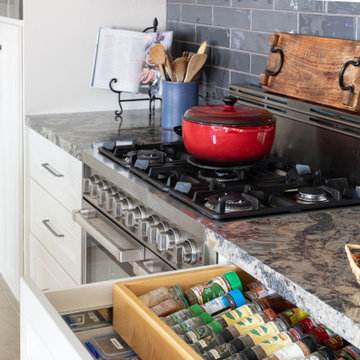 Twelve Stones Designs, LLC
The owners of this kitchen had spent the money to upgrade the finishes in their kitchen upon building the home 12 years ago, but after living in the space for several years they realized how nonfunctional the layout really was. The (then) two preschool aged children had grown into busy, hungry teenagers with many friends who also liked to hang out at the house. So the family needed a more functional kitchen with better traffic flow, space for daily activities revolving around the kitchen at different times of day, and a kitchen that could accommodate cooking for and serving large groups. Furthermore, the dark, traditional finishes no longer reflected the homeowners’ style. They requested a brighter, more relaxed, coastal style that reflected their love of the seaside cities they like to visit.
Originally, the kitchen was U-shaped with a narrow island in the middle. The island created narrow aisles that bottle-necked at the dishwasher, refrigerator, and cooktop areas. There was a pass-through from the foyer into the kitchen, but the owners never liked that the pass-through was also located so close to the powder room. The awkward proximity was unappealing and made guests feel uncomfortable.
The kitchen’s storage was made up of lots of narrow cabinets, apothecary drawers, clipped corner units, and very few drawers. It lacked useful storage for the larger items the family used on a daily basis. And the kitchen’s only pantry was small closet that had only builder-grade, narrow shelving with no illumination to be able to see the contents inside.
Overall, the kitchen’s lighting plan was poorly executed. Only six recessed cans illuminated the entire kitchen and nook areas. The under cabinet lighting was not evenly distributed either. In fact, the builder had mis-placed the under cabinet lighting around the decorative pilasters which made for choppy, dark cubbies. Further, the builder didn’t include any lighting over the sink or the bar area, which meant whoever was doing the dishes was always in their own shadow. That, coupled with the steep overhang of the game room above made the bar area feel like a dim, cavernous space that wasn’t inviting or task oriented. The kitchen looked out into the main living space, but the raised bar and a narrow wall (which held the only large cabinet in the kitchen) created more of a barrier than a relationship to the living room or breakfast nook. In fact, one couldn’t even see the breakfast nook from the cooktop or sink areas due to its orientation. The raised bar top was too narrow to comfortably sit to either dine at or chat from due to the lack of knee space. The the homeowners confided that the kitchen felt more like a dark, dirty prison than place where the family, or their guests, wanted to gather and commune.
The clients' needs and desires were:
➢ to create a kitchen that would be a space the family loved to be in; to relate to the adjacent spaces all around, and to have better flow for entertaining large groups
➢ to remove the walls between the breakfast nook and living area and to be able to utilize the natural light from the windows in both those areas
➢ to incorporate a functional chopping block for prepping fresh food for home cooked meals, an island with a large sink and drain board, 2 pull out trash cans, and seating for at least the 2 teens to eat or do homework
➢ to design a kitchen and breakfast nook with an airy, coastal, relaxed vibe that blended with the rest of the house's coastal theme
➢ to integrate a layered lighting plan which would include ample general illumination, specific task lighting, decorative lighting, and lots of illuminated storage
➢ to design a kitchen with not only more storage for all the husband’s kitchen gadgets and collection of oils and spices, but smart storage, including a coffee/breakfast bar and a place to store and conceal the toaster oven and microwave
➢ to find a way to utilize the large open space between the kitchen, pantry area, and breakfast nook
Twelve Stones Designs achieved the owner's goals by:
➢ removing the walls between the kitchen and living room to allow the natural light to filter in from the adjacent rooms and to create a connection between the kitchen, nook, and living spaces for a sense of unity and communion
➢ removing the existing pantry and designing 3 large pantry style cabinets with LED tape lights and rollout drawers to house lots of kitchen appliances, gadgets, and tons of groceries. We also took the cabinets all the way up to the 9’ ceiling for additional storage for seasonal items and bulk storage.
➢ designing 2 islands - 1 with a gorgeous black walnut chopping block that houses a drawer for chopping and carving knives and a custom double pull out trash unit for point of use utilization - and 1 that houses the dishwasher, a large Blanco Gourmet sink with integrated drain board, woven baskets for fresh root vegetables and kitchen towels, plenty of drawer storage for kitchen items, and bar seating for up to 4 diners.
➢ closing off the space between the kitchen and the powder room to create a beautiful new private alcove for the powder room as well as adding some decorative storage. This also gave us space to include more tall storage near the new range for precision placement of the husband’s extensive oil and spice collection as well as a location for a combo-steam oven the wife wanted for baking and cooking healthy meals.
The project is enhanced functionally by:
➢ incorporated USB and standard receptacles for the kids’ laptops and phone charging in the large island
➢ designing the small island to include additional open shelving for items used on a daily basis such as a variety of bowls, plates, and colanders. This set up also works well for the husband who prefers to “plate” his dinners in restaurant-style fashion before presenting them to the table.
➢ the integration of specific storage units, such as double stacked cutlery drawers, a custom spice pull-out, a Kuerig coffee and tea pod drawer, and custom double stacked utensil drawers
➢ moving the refrigerator to the old oven location - this eliminated the bottle neck as well as created a better relationship to the eating table. It also utilizes the floor space between the pantry, nook, and kitchen
➢ creating a banquet style breakfast nook - this banquette seating not only doubles the amount of seating for large gatherings but it better utilizes the odd space between the kitchen and the previous nook area. It also helps to create a distinct pathway from the mudroom room through the pantry area, kitchen, nook, and living room.
➢ the coffee/breakfast bar area which includes the perfect location for the concealed microwave and toaster oven, convenient storage for the coffee pods and tea accoutrements. Roll-out drawers below also house the smoothie maker, hot water kettle, and a plethora of smoothie-making ingredients such as protein powders, smoothie additives, etc. Furthermore, the drawers below the Keurig house measuring utensil, cutlery, baking supplies and tupperware storage.
➢ incorporating lots of wide drawers and pullouts to accommodate large cookware.
➢ utilizing as much vertical space as possible by building storage to the ceiling which accommodates the family’s abundant amount of serving platters, baking sheets, bakeware, casserole dishes, and additional cutting boards.
The project is enhanced aesthetically by:
➢ new 5-piece Versailles pattern porcelain tile that now seamlessly joins the entire down stairs area together creating a bright, cohesiveness feeling instead of choppy separated spaces - it also adds a coastal feeling
➢ designing a cabinet to conceal the microwave and toaster oven
➢ the coastal influenced light fixtures over the nook table and island
➢ the sandy colors of the Langdon Cambria countertops. The swirling pattern and sparkling quartz pieces remind the homeowner of black-and-tan sandy beaches
➢ the striped banquet seating whose creamy white background and blue-green stripes were the inspiration for the cabinet and wall colors.
➢ All the interior doors were painted black to coordinate with the blacks and grays in the backsplash tile and countertop. This also adds a hint of tailored formality to an otherwise casual space.
➢ the use of WAC's Oculux small aperture LED units for the overhead lighting complimented with Diode LED strips for task lighting under the cabinets and inside the pantry and glass wall cabinets. All of the lighting applications are on separate dimmer switches.
Innovative uses of materials or construction methods by Realty Restoration LLC:
➢ Each 1-1/2” x 3” block of reclaimed end-grain black walnut that makes up the center island chopping block was hand milled and built in the shop. It was designed to look substantial and proportional to the surrounding elements, executed by creating the 4 inch tall top with a solid wood chamfered edge band.
➢ The metal doors on either side of the vent hood were also custom designed for this project and built in the Realty Restoration LLC shop. They are made 1x2, 11-gauge mild steel with ribbed glass. Weighing 60 lbs a piece, heavy duty cabinet hinges were added to support the weight of the door and keep them from sagging.
➢ Under-cabinet receptacles were added along the range wall in order to have a clean, uninterrupted backsplash.
Design obstacles to overcome:
➢ Because we were removing the demising walls between the kitchen and living room, we had to find a way to plumb and vent the new island. We did this by tunneling through the slab (the slab had post tension cables which prevented us from just trenching) to run a new wet vent through a nearby structural wall. We pulled the existing hot and cold lines between upper floor joists and ran them down the structural wall as well and up through a conduit in the tunnel.
➢ Since we were converting from wall overs to a gas range it allowed us to utilize the 220 feed for the wall ovens to provide a new sub panel for all the new kitchen circuits
➢ Due to framing deficiencies inherited from the original build there was a 1-1/2” differential in the floor-to-ceiling height over a 20 foot span; by utilizing the process of cutting and furring coupled with the crown moulding details on the cabinet elevations we were able to mask the problem and provide seamless transitions between the cabinet components.
Evidence of superior craftsmanship:
➢ uniquely designed, one-of-a-kind metal “X” end panels on the large island. The end panels were custom made in the Realty Restoration LLC shop and fitted to the exact dimensions of the island. The welding seams are completely indistinguishable - the posts look like they are cut from a single sheet of metal
➢ square metal posts on the small island were also custom made and designed to compliment and carry through the metal element s throughout the kitchen
➢ the beautiful, oversized end panels on the pantry cabinets which give the breakfast nook a tailored look
➢ integrating a large format 5 piece Versailles tile pattern to seamlessly flow from the existing spaces into the new kitchen space
➢ By constructing a custom cabinet that jogged around a corner we could not remodel (housing the entry way coat closet) we were able to camouflage the adjacent wall offset within the upper and lower cabinets. By designing around the existing jog in the structural walls we accomplished a few things: we were able to find the space to house, and hide, the microwave and toaster oven yet still have a clean cohesive appearance from the kitchen side. Additionally, the owners were able to keep their much needed coat closet and we didn’t have to increase the budget with unnecessary structural work.
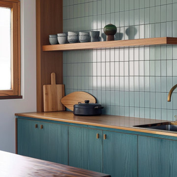
 OMZ architects
As a Flagstaff custom home architect, our approach to every project is to balance innovative solutions with bold design aesthetics. The Micro Mini, a compact and modern accessory dwelling unit (ADU) nestled in the heart of Flagstaff, is the perfect example of how thoughtful design can solve space constraints while offering a stylish, functional, and delightful living environment.
Our client came to us with a unique challenge: to create an additional living space on their property that was efficient, visually striking, and flexible in its function. They wanted to maximize a small footprint while incorporating pops of vibrant, monochrome color throughout the ADU to give it personality and make it feel like an extension of their larger home. The solution we provided, as your trusted Flagstaff custom home architect, was Micro Mini—a design that offers both efficiency and fun while making a big impact in a small space.
The first challenge we tackled was how to make the most of the limited square footage. Our approach, rooted in the principles of modern architecture, was to keep the floor plan as open and flexible as possible. By eliminating unnecessary walls and creating multifunctional spaces, we were able to design an interior that feels spacious and airy, despite the small footprint.
The living area, kitchen, and bedroom all flow seamlessly into each other, using strategic cabinetry, sliding doors, and built-in storage to keep the space uncluttered. The use of glass for windows and doors amplifies the sense of space, bringing in abundant natural light and connecting the interior to the outdoor landscape—a key consideration in any Flagstaff custom home architect project.
One of the most striking elements of the Micro Mini is its creative use of color. The client wanted each space to feel distinct, while still maintaining a cohesive design language. To achieve this, we incorporated monochrome color schemes in various sections of the ADU, starting with the kitchen.
The kitchen is a bold statement in shades of blue, with blue-stained cabinets, blue backsplash tile, and even blue fixtures. This color immersion gives the kitchen a distinctive identity while still blending harmoniously with the rest of the space. In other areas of the ADU, we played with pops of other fun colors—each carefully chosen to complement the modern aesthetic of the home while adding a personalized touch.
As your Flagstaff custom home architect, we believe that color is an integral part of design, and Micro Mini is a testament to how thoughtful color application can elevate a space. The bold monochrome interiors are a fun, creative twist that make this ADU stand out while ensuring it remains functional and inviting.
Beyond the bold use of color, the interior of Micro Mini is designed with simplicity and function in mind. We utilized clean lines, minimal ornamentation, and carefully selected materials to keep the overall look sleek and modern. Light wood floors contrast with the bold color accents and add warmth to the otherwise minimalistic design.
Attention to detail is paramount in all of our projects, and as a Flagstaff custom home architect, we take pride in the craftsmanship and quality materials used throughout the Micro Mini. From the custom-built cabinetry to the thoughtfully designed storage solutions, every inch of the ADU was considered for both aesthetics and practicality.
A key problem we solved for the client was how to make the ADU feel spacious and functional despite its small footprint. As your trusted Flagstaff custom home architect, we used a range of design solutions to achieve this.
First, we incorporated high ceilings to enhance the sense of volume and space, creating an airy feel throughout the ADU. The placement of windows and the strategic use of sliding glass doors allow light to flood in, further opening up the interior and blurring the lines between inside and out. These elements not only make the ADU feel larger but also create a strong connection to the surrounding landscape.
Another key element was the use of built-in furniture and storage solutions to keep the space clutter-free. From hidden storage under the bed to custom cabinetry in the kitchen, every corner of the Micro Mini was designed with functionality in mind. This approach ensured that the ADU met the client’s needs for both comfort and practicality, while still adhering to the modern design aesthetic they desired.
Being based in Northern Arizona, we are acutely aware of how important it is for our designs to harmonize with the surrounding landscape. As a Flagstaff custom home architect, we carefully consider the site’s natural beauty and how our projects can integrate with it.
With Micro Mini, we focused on making sure that the ADU feels like a natural extension of the client’s existing property. The large windows and sliding glass doors bring in views of the surrounding landscape, while the outdoor deck extends the living space, creating a seamless indoor-outdoor experience. Whether you’re standing in the living room or on the deck, you are always connected to the beautiful Flagstaff setting.
In line with our commitment to responsible design, sustainability was a key consideration for Micro Mini. As your Flagstaff custom home architect, we prioritize energy-efficient building methods and materials. The ADU was designed to be energy-efficient, with high-performance windows and insulation that keep it cool in the summer and warm in the winter.
Additionally, the color choices and materials used in the interior were chosen not just for their aesthetic appeal, but also for their durability and sustainability. Low-VOC paints and finishes were used throughout the ADU to ensure good indoor air quality, while the energy-efficient lighting and appliances help minimize the ADU’s overall environmental impact.
At HEY! designs, we believe in a collaborative approach to architecture that puts the client’s needs and vision at the forefront. Whether designing a large custom home or a compact ADU like Micro Mini, we bring the same level of dedication, creativity, and attention to detail to every project.
Our work is rooted in modern design principles but always infused with personality and a sense of fun. Micro Mini exemplifies this approach—a bold, colorful, and efficient ADU that meets the client’s needs while also reflecting their unique style.
If you’re considering a custom home or ADU in Flagstaff, HEY! designs is here to help bring your vision to life. As a Flagstaff custom home architect, we specialize in creating spaces that are not only beautiful and functional but also responsive to the unique qualities of the site and the needs of the client.
Micro Mini is a testament to how small spaces can still be big on style and function. By incorporating bold color schemes, maximizing space efficiency, and maintaining a strong connection to the outdoors, this ADU achieves everything the client wanted—a modern, fun, and functional space.
As your Flagstaff custom home architect, we would be thrilled to help you create a unique and personalized space that meets your needs, no matter the size or scope of your project. Contact us today to learn more about how we can bring your vision to life.
 Twelve Stones Designs, LLC
The owners of this kitchen had spent the money to upgrade the finishes in their kitchen upon building the home 12 years ago, but after living in the space for several years they realized how nonfunctional the layout really was. The (then) two preschool aged children had grown into busy, hungry teenagers with many friends who also liked to hang out at the house. So the family needed a more functional kitchen with better traffic flow, space for daily activities revolving around the kitchen at different times of day, and a kitchen that could accommodate cooking for and serving large groups. Furthermore, the dark, traditional finishes no longer reflected the homeowners’ style. They requested a brighter, more relaxed, coastal style that reflected their love of the seaside cities they like to visit.
Originally, the kitchen was U-shaped with a narrow island in the middle. The island created narrow aisles that bottle-necked at the dishwasher, refrigerator, and cooktop areas. There was a pass-through from the foyer into the kitchen, but the owners never liked that the pass-through was also located so close to the powder room. The awkward proximity was unappealing and made guests feel uncomfortable.
The kitchen’s storage was made up of lots of narrow cabinets, apothecary drawers, clipped corner units, and very few drawers. It lacked useful storage for the larger items the family used on a daily basis. And the kitchen’s only pantry was small closet that had only builder-grade, narrow shelving with no illumination to be able to see the contents inside.
Overall, the kitchen’s lighting plan was poorly executed. Only six recessed cans illuminated the entire kitchen and nook areas. The under cabinet lighting was not evenly distributed either. In fact, the builder had mis-placed the under cabinet lighting around the decorative pilasters which made for choppy, dark cubbies. Further, the builder didn’t include any lighting over the sink or the bar area, which meant whoever was doing the dishes was always in their own shadow. That, coupled with the steep overhang of the game room above made the bar area feel like a dim, cavernous space that wasn’t inviting or task oriented. The kitchen looked out into the main living space, but the raised bar and a narrow wall (which held the only large cabinet in the kitchen) created more of a barrier than a relationship to the living room or breakfast nook. In fact, one couldn’t even see the breakfast nook from the cooktop or sink areas due to its orientation. The raised bar top was too narrow to comfortably sit to either dine at or chat from due to the lack of knee space. The the homeowners confided that the kitchen felt more like a dark, dirty prison than place where the family, or their guests, wanted to gather and commune.
The clients' needs and desires were:
➢ to create a kitchen that would be a space the family loved to be in; to relate to the adjacent spaces all around, and to have better flow for entertaining large groups
➢ to remove the walls between the breakfast nook and living area and to be able to utilize the natural light from the windows in both those areas
➢ to incorporate a functional chopping block for prepping fresh food for home cooked meals, an island with a large sink and drain board, 2 pull out trash cans, and seating for at least the 2 teens to eat or do homework
➢ to design a kitchen and breakfast nook with an airy, coastal, relaxed vibe that blended with the rest of the house's coastal theme
➢ to integrate a layered lighting plan which would include ample general illumination, specific task lighting, decorative lighting, and lots of illuminated storage
➢ to design a kitchen with not only more storage for all the husband’s kitchen gadgets and collection of oils and spices, but smart storage, including a coffee/breakfast bar and a place to store and conceal the toaster oven and microwave
➢ to find a way to utilize the large open space between the kitchen, pantry area, and breakfast nook
Twelve Stones Designs achieved the owner's goals by:
➢ removing the walls between the kitchen and living room to allow the natural light to filter in from the adjacent rooms and to create a connection between the kitchen, nook, and living spaces for a sense of unity and communion
➢ removing the existing pantry and designing 3 large pantry style cabinets with LED tape lights and rollout drawers to house lots of kitchen appliances, gadgets, and tons of groceries. We also took the cabinets all the way up to the 9’ ceiling for additional storage for seasonal items and bulk storage.
➢ designing 2 islands - 1 with a gorgeous black walnut chopping block that houses a drawer for chopping and carving knives and a custom double pull out trash unit for point of use utilization - and 1 that houses the dishwasher, a large Blanco Gourmet sink with integrated drain board, woven baskets for fresh root vegetables and kitchen towels, plenty of drawer storage for kitchen items, and bar seating for up to 4 diners.
➢ closing off the space between the kitchen and the powder room to create a beautiful new private alcove for the powder room as well as adding some decorative storage. This also gave us space to include more tall storage near the new range for precision placement of the husband’s extensive oil and spice collection as well as a location for a combo-steam oven the wife wanted for baking and cooking healthy meals.
The project is enhanced functionally by:
➢ incorporated USB and standard receptacles for the kids’ laptops and phone charging in the large island
➢ designing the small island to include additional open shelving for items used on a daily basis such as a variety of bowls, plates, and colanders. This set up also works well for the husband who prefers to “plate” his dinners in restaurant-style fashion before presenting them to the table.
➢ the integration of specific storage units, such as double stacked cutlery drawers, a custom spice pull-out, a Kuerig coffee and tea pod drawer, and custom double stacked utensil drawers
➢ moving the refrigerator to the old oven location - this eliminated the bottle neck as well as created a better relationship to the eating table. It also utilizes the floor space between the pantry, nook, and kitchen
➢ creating a banquet style breakfast nook - this banquette seating not only doubles the amount of seating for large gatherings but it better utilizes the odd space between the kitchen and the previous nook area. It also helps to create a distinct pathway from the mudroom room through the pantry area, kitchen, nook, and living room.
➢ the coffee/breakfast bar area which includes the perfect location for the concealed microwave and toaster oven, convenient storage for the coffee pods and tea accoutrements. Roll-out drawers below also house the smoothie maker, hot water kettle, and a plethora of smoothie-making ingredients such as protein powders, smoothie additives, etc. Furthermore, the drawers below the Keurig house measuring utensil, cutlery, baking supplies and tupperware storage.
➢ incorporating lots of wide drawers and pullouts to accommodate large cookware.
➢ utilizing as much vertical space as possible by building storage to the ceiling which accommodates the family’s abundant amount of serving platters, baking sheets, bakeware, casserole dishes, and additional cutting boards.
The project is enhanced aesthetically by:
➢ new 5-piece Versailles pattern porcelain tile that now seamlessly joins the entire down stairs area together creating a bright, cohesiveness feeling instead of choppy separated spaces - it also adds a coastal feeling
➢ designing a cabinet to conceal the microwave and toaster oven
➢ the coastal influenced light fixtures over the nook table and island
➢ the sandy colors of the Langdon Cambria countertops. The swirling pattern and sparkling quartz pieces remind the homeowner of black-and-tan sandy beaches
➢ the striped banquet seating whose creamy white background and blue-green stripes were the inspiration for the cabinet and wall colors.
➢ All the interior doors were painted black to coordinate with the blacks and grays in the backsplash tile and countertop. This also adds a hint of tailored formality to an otherwise casual space.
➢ the use of WAC's Oculux small aperture LED units for the overhead lighting complimented with Diode LED strips for task lighting under the cabinets and inside the pantry and glass wall cabinets. All of the lighting applications are on separate dimmer switches.
Innovative uses of materials or construction methods by Realty Restoration LLC:
➢ Each 1-1/2” x 3” block of reclaimed end-grain black walnut that makes up the center island chopping block was hand milled and built in the shop. It was designed to look substantial and proportional to the surrounding elements, executed by creating the 4 inch tall top with a solid wood chamfered edge band.
➢ The metal doors on either side of the vent hood were also custom designed for this project and built in the Realty Restoration LLC shop. They are made 1x2, 11-gauge mild steel with ribbed glass. Weighing 60 lbs a piece, heavy duty cabinet hinges were added to support the weight of the door and keep them from sagging.
➢ Under-cabinet receptacles were added along the range wall in order to have a clean, uninterrupted backsplash.
Design obstacles to overcome:
➢ Because we were removing the demising walls between the kitchen and living room, we had to find a way to plumb and vent the new island. We did this by tunneling through the slab (the slab had post tension cables which prevented us from just trenching) to run a new wet vent through a nearby structural wall. We pulled the existing hot and cold lines between upper floor joists and ran them down the structural wall as well and up through a conduit in the tunnel.
➢ Since we were converting from wall overs to a gas range it allowed us to utilize the 220 feed for the wall ovens to provide a new sub panel for all the new kitchen circuits
➢ Due to framing deficiencies inherited from the original build there was a 1-1/2” differential in the floor-to-ceiling height over a 20 foot span; by utilizing the process of cutting and furring coupled with the crown moulding details on the cabinet elevations we were able to mask the problem and provide seamless transitions between the cabinet components.
Evidence of superior craftsmanship:
➢ uniquely designed, one-of-a-kind metal “X” end panels on the large island. The end panels were custom made in the Realty Restoration LLC shop and fitted to the exact dimensions of the island. The welding seams are completely indistinguishable - the posts look like they are cut from a single sheet of metal
➢ square metal posts on the small island were also custom made and designed to compliment and carry through the metal element s throughout the kitchen
➢ the beautiful, oversized end panels on the pantry cabinets which give the breakfast nook a tailored look
➢ integrating a large format 5 piece Versailles tile pattern to seamlessly flow from the existing spaces into the new kitchen space
➢ By constructing a custom cabinet that jogged around a corner we could not remodel (housing the entry way coat closet) we were able to camouflage the adjacent wall offset within the upper and lower cabinets. By designing around the existing jog in the structural walls we accomplished a few things: we were able to find the space to house, and hide, the microwave and toaster oven yet still have a clean cohesive appearance from the kitchen side. Additionally, the owners were able to keep their much needed coat closet and we didn’t have to increase the budget with unnecessary structural work.
 Twelve Stones Designs, LLC
The owners of this kitchen had spent the money to upgrade the finishes in their kitchen upon building the home 12 years ago, but after living in the space for several years they realized how nonfunctional the layout really was. The (then) two preschool aged children had grown into busy, hungry teenagers with many friends who also liked to hang out at the house. So the family needed a more functional kitchen with better traffic flow, space for daily activities revolving around the kitchen at different times of day, and a kitchen that could accommodate cooking for and serving large groups. Furthermore, the dark, traditional finishes no longer reflected the homeowners’ style. They requested a brighter, more relaxed, coastal style that reflected their love of the seaside cities they like to visit.
Originally, the kitchen was U-shaped with a narrow island in the middle. The island created narrow aisles that bottle-necked at the dishwasher, refrigerator, and cooktop areas. There was a pass-through from the foyer into the kitchen, but the owners never liked that the pass-through was also located so close to the powder room. The awkward proximity was unappealing and made guests feel uncomfortable.
The kitchen’s storage was made up of lots of narrow cabinets, apothecary drawers, clipped corner units, and very few drawers. It lacked useful storage for the larger items the family used on a daily basis. And the kitchen’s only pantry was small closet that had only builder-grade, narrow shelving with no illumination to be able to see the contents inside.
Overall, the kitchen’s lighting plan was poorly executed. Only six recessed cans illuminated the entire kitchen and nook areas. The under cabinet lighting was not evenly distributed either. In fact, the builder had mis-placed the under cabinet lighting around the decorative pilasters which made for choppy, dark cubbies. Further, the builder didn’t include any lighting over the sink or the bar area, which meant whoever was doing the dishes was always in their own shadow. That, coupled with the steep overhang of the game room above made the bar area feel like a dim, cavernous space that wasn’t inviting or task oriented. The kitchen looked out into the main living space, but the raised bar and a narrow wall (which held the only large cabinet in the kitchen) created more of a barrier than a relationship to the living room or breakfast nook. In fact, one couldn’t even see the breakfast nook from the cooktop or sink areas due to its orientation. The raised bar top was too narrow to comfortably sit to either dine at or chat from due to the lack of knee space. The the homeowners confided that the kitchen felt more like a dark, dirty prison than place where the family, or their guests, wanted to gather and commune.
The clients' needs and desires were:
➢ to create a kitchen that would be a space the family loved to be in; to relate to the adjacent spaces all around, and to have better flow for entertaining large groups
➢ to remove the walls between the breakfast nook and living area and to be able to utilize the natural light from the windows in both those areas
➢ to incorporate a functional chopping block for prepping fresh food for home cooked meals, an island with a large sink and drain board, 2 pull out trash cans, and seating for at least the 2 teens to eat or do homework
➢ to design a kitchen and breakfast nook with an airy, coastal, relaxed vibe that blended with the rest of the house's coastal theme
➢ to integrate a layered lighting plan which would include ample general illumination, specific task lighting, decorative lighting, and lots of illuminated storage
➢ to design a kitchen with not only more storage for all the husband’s kitchen gadgets and collection of oils and spices, but smart storage, including a coffee/breakfast bar and a place to store and conceal the toaster oven and microwave
➢ to find a way to utilize the large open space between the kitchen, pantry area, and breakfast nook
Twelve Stones Designs achieved the owner's goals by:
➢ removing the walls between the kitchen and living room to allow the natural light to filter in from the adjacent rooms and to create a connection between the kitchen, nook, and living spaces for a sense of unity and communion
➢ removing the existing pantry and designing 3 large pantry style cabinets with LED tape lights and rollout drawers to house lots of kitchen appliances, gadgets, and tons of groceries. We also took the cabinets all the way up to the 9’ ceiling for additional storage for seasonal items and bulk storage.
➢ designing 2 islands - 1 with a gorgeous black walnut chopping block that houses a drawer for chopping and carving knives and a custom double pull out trash unit for point of use utilization - and 1 that houses the dishwasher, a large Blanco Gourmet sink with integrated drain board, woven baskets for fresh root vegetables and kitchen towels, plenty of drawer storage for kitchen items, and bar seating for up to 4 diners.
➢ closing off the space between the kitchen and the powder room to create a beautiful new private alcove for the powder room as well as adding some decorative storage. This also gave us space to include more tall storage near the new range for precision placement of the husband’s extensive oil and spice collection as well as a location for a combo-steam oven the wife wanted for baking and cooking healthy meals.
The project is enhanced functionally by:
➢ incorporated USB and standard receptacles for the kids’ laptops and phone charging in the large island
➢ designing the small island to include additional open shelving for items used on a daily basis such as a variety of bowls, plates, and colanders. This set up also works well for the husband who prefers to “plate” his dinners in restaurant-style fashion before presenting them to the table.
➢ the integration of specific storage units, such as double stacked cutlery drawers, a custom spice pull-out, a Kuerig coffee and tea pod drawer, and custom double stacked utensil drawers
➢ moving the refrigerator to the old oven location - this eliminated the bottle neck as well as created a better relationship to the eating table. It also utilizes the floor space between the pantry, nook, and kitchen
➢ creating a banquet style breakfast nook - this banquette seating not only doubles the amount of seating for large gatherings but it better utilizes the odd space between the kitchen and the previous nook area. It also helps to create a distinct pathway from the mudroom room through the pantry area, kitchen, nook, and living room.
➢ the coffee/breakfast bar area which includes the perfect location for the concealed microwave and toaster oven, convenient storage for the coffee pods and tea accoutrements. Roll-out drawers below also house the smoothie maker, hot water kettle, and a plethora of smoothie-making ingredients such as protein powders, smoothie additives, etc. Furthermore, the drawers below the Keurig house measuring utensil, cutlery, baking supplies and tupperware storage.
➢ incorporating lots of wide drawers and pullouts to accommodate large cookware.
➢ utilizing as much vertical space as possible by building storage to the ceiling which accommodates the family’s abundant amount of serving platters, baking sheets, bakeware, casserole dishes, and additional cutting boards.
The project is enhanced aesthetically by:
➢ new 5-piece Versailles pattern porcelain tile that now seamlessly joins the entire down stairs area together creating a bright, cohesiveness feeling instead of choppy separated spaces - it also adds a coastal feeling
➢ designing a cabinet to conceal the microwave and toaster oven
➢ the coastal influenced light fixtures over the nook table and island
➢ the sandy colors of the Langdon Cambria countertops. The swirling pattern and sparkling quartz pieces remind the homeowner of black-and-tan sandy beaches
➢ the striped banquet seating whose creamy white background and blue-green stripes were the inspiration for the cabinet and wall colors.
➢ All the interior doors were painted black to coordinate with the blacks and grays in the backsplash tile and countertop. This also adds a hint of tailored formality to an otherwise casual space.
➢ the use of WAC's Oculux small aperture LED units for the overhead lighting complimented with Diode LED strips for task lighting under the cabinets and inside the pantry and glass wall cabinets. All of the lighting applications are on separate dimmer switches.
Innovative uses of materials or construction methods by Realty Restoration LLC:
➢ Each 1-1/2” x 3” block of reclaimed end-grain black walnut that makes up the center island chopping block was hand milled and built in the shop. It was designed to look substantial and proportional to the surrounding elements, executed by creating the 4 inch tall top with a solid wood chamfered edge band.
➢ The metal doors on either side of the vent hood were also custom designed for this project and built in the Realty Restoration LLC shop. They are made 1x2, 11-gauge mild steel with ribbed glass. Weighing 60 lbs a piece, heavy duty cabinet hinges were added to support the weight of the door and keep them from sagging.
➢ Under-cabinet receptacles were added along the range wall in order to have a clean, uninterrupted backsplash.
Design obstacles to overcome:
➢ Because we were removing the demising walls between the kitchen and living room, we had to find a way to plumb and vent the new island. We did this by tunneling through the slab (the slab had post tension cables which prevented us from just trenching) to run a new wet vent through a nearby structural wall. We pulled the existing hot and cold lines between upper floor joists and ran them down the structural wall as well and up through a conduit in the tunnel.
➢ Since we were converting from wall overs to a gas range it allowed us to utilize the 220 feed for the wall ovens to provide a new sub panel for all the new kitchen circuits
➢ Due to framing deficiencies inherited from the original build there was a 1-1/2” differential in the floor-to-ceiling height over a 20 foot span; by utilizing the process of cutting and furring coupled with the crown moulding details on the cabinet elevations we were able to mask the problem and provide seamless transitions between the cabinet components.
Evidence of superior craftsmanship:
➢ uniquely designed, one-of-a-kind metal “X” end panels on the large island. The end panels were custom made in the Realty Restoration LLC shop and fitted to the exact dimensions of the island. The welding seams are completely indistinguishable - the posts look like they are cut from a single sheet of metal
➢ square metal posts on the small island were also custom made and designed to compliment and carry through the metal element s throughout the kitchen
➢ the beautiful, oversized end panels on the pantry cabinets which give the breakfast nook a tailored look
➢ integrating a large format 5 piece Versailles tile pattern to seamlessly flow from the existing spaces into the new kitchen space
➢ By constructing a custom cabinet that jogged around a corner we could not remodel (housing the entry way coat closet) we were able to camouflage the adjacent wall offset within the upper and lower cabinets. By designing around the existing jog in the structural walls we accomplished a few things: we were able to find the space to house, and hide, the microwave and toaster oven yet still have a clean cohesive appearance from the kitchen side. Additionally, the owners were able to keep their much needed coat closet and we didn’t have to increase the budget with unnecessary structural work.
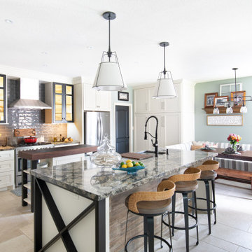 Twelve Stones Designs, LLC
The owners of this kitchen had spent the money to upgrade the finishes in their kitchen upon building the home 12 years ago, but after living in the space for several years they realized how nonfunctional the layout really was. The (then) two preschool aged children had grown into busy, hungry teenagers with many friends who also liked to hang out at the house. So the family needed a more functional kitchen with better traffic flow, space for daily activities revolving around the kitchen at different times of day, and a kitchen that could accommodate cooking for and serving large groups. Furthermore, the dark, traditional finishes no longer reflected the homeowners’ style. They requested a brighter, more relaxed, coastal style that reflected their love of the seaside cities they like to visit.
Originally, the kitchen was U-shaped with a narrow island in the middle. The island created narrow aisles that bottle-necked at the dishwasher, refrigerator, and cooktop areas. There was a pass-through from the foyer into the kitchen, but the owners never liked that the pass-through was also located so close to the powder room. The awkward proximity was unappealing and made guests feel uncomfortable.
The kitchen’s storage was made up of lots of narrow cabinets, apothecary drawers, clipped corner units, and very few drawers. It lacked useful storage for the larger items the family used on a daily basis. And the kitchen’s only pantry was small closet that had only builder-grade, narrow shelving with no illumination to be able to see the contents inside.
Overall, the kitchen’s lighting plan was poorly executed. Only six recessed cans illuminated the entire kitchen and nook areas. The under cabinet lighting was not evenly distributed either. In fact, the builder had mis-placed the under cabinet lighting around the decorative pilasters which made for choppy, dark cubbies. Further, the builder didn’t include any lighting over the sink or the bar area, which meant whoever was doing the dishes was always in their own shadow. That, coupled with the steep overhang of the game room above made the bar area feel like a dim, cavernous space that wasn’t inviting or task oriented. The kitchen looked out into the main living space, but the raised bar and a narrow wall (which held the only large cabinet in the kitchen) created more of a barrier than a relationship to the living room or breakfast nook. In fact, one couldn’t even see the breakfast nook from the cooktop or sink areas due to its orientation. The raised bar top was too narrow to comfortably sit to either dine at or chat from due to the lack of knee space. The the homeowners confided that the kitchen felt more like a dark, dirty prison than place where the family, or their guests, wanted to gather and commune.
The clients' needs and desires were:
➢ to create a kitchen that would be a space the family loved to be in; to relate to the adjacent spaces all around, and to have better flow for entertaining large groups
➢ to remove the walls between the breakfast nook and living area and to be able to utilize the natural light from the windows in both those areas
➢ to incorporate a functional chopping block for prepping fresh food for home cooked meals, an island with a large sink and drain board, 2 pull out trash cans, and seating for at least the 2 teens to eat or do homework
➢ to design a kitchen and breakfast nook with an airy, coastal, relaxed vibe that blended with the rest of the house's coastal theme
➢ to integrate a layered lighting plan which would include ample general illumination, specific task lighting, decorative lighting, and lots of illuminated storage
➢ to design a kitchen with not only more storage for all the husband’s kitchen gadgets and collection of oils and spices, but smart storage, including a coffee/breakfast bar and a place to store and conceal the toaster oven and microwave
➢ to find a way to utilize the large open space between the kitchen, pantry area, and breakfast nook
Twelve Stones Designs achieved the owner's goals by:
➢ removing the walls between the kitchen and living room to allow the natural light to filter in from the adjacent rooms and to create a connection between the kitchen, nook, and living spaces for a sense of unity and communion
➢ removing the existing pantry and designing 3 large pantry style cabinets with LED tape lights and rollout drawers to house lots of kitchen appliances, gadgets, and tons of groceries. We also took the cabinets all the way up to the 9’ ceiling for additional storage for seasonal items and bulk storage.
➢ designing 2 islands - 1 with a gorgeous black walnut chopping block that houses a drawer for chopping and carving knives and a custom double pull out trash unit for point of use utilization - and 1 that houses the dishwasher, a large Blanco Gourmet sink with integrated drain board, woven baskets for fresh root vegetables and kitchen towels, plenty of drawer storage for kitchen items, and bar seating for up to 4 diners.
➢ closing off the space between the kitchen and the powder room to create a beautiful new private alcove for the powder room as well as adding some decorative storage. This also gave us space to include more tall storage near the new range for precision placement of the husband’s extensive oil and spice collection as well as a location for a combo-steam oven the wife wanted for baking and cooking healthy meals.
The project is enhanced functionally by:
➢ incorporated USB and standard receptacles for the kids’ laptops and phone charging in the large island
➢ designing the small island to include additional open shelving for items used on a daily basis such as a variety of bowls, plates, and colanders. This set up also works well for the husband who prefers to “plate” his dinners in restaurant-style fashion before presenting them to the table.
➢ the integration of specific storage units, such as double stacked cutlery drawers, a custom spice pull-out, a Kuerig coffee and tea pod drawer, and custom double stacked utensil drawers
➢ moving the refrigerator to the old oven location - this eliminated the bottle neck as well as created a better relationship to the eating table. It also utilizes the floor space between the pantry, nook, and kitchen
➢ creating a banquet style breakfast nook - this banquette seating not only doubles the amount of seating for large gatherings but it better utilizes the odd space between the kitchen and the previous nook area. It also helps to create a distinct pathway from the mudroom room through the pantry area, kitchen, nook, and living room.
➢ the coffee/breakfast bar area which includes the perfect location for the concealed microwave and toaster oven, convenient storage for the coffee pods and tea accoutrements. Roll-out drawers below also house the smoothie maker, hot water kettle, and a plethora of smoothie-making ingredients such as protein powders, smoothie additives, etc. Furthermore, the drawers below the Keurig house measuring utensil, cutlery, baking supplies and tupperware storage.
➢ incorporating lots of wide drawers and pullouts to accommodate large cookware.
➢ utilizing as much vertical space as possible by building storage to the ceiling which accommodates the family’s abundant amount of serving platters, baking sheets, bakeware, casserole dishes, and additional cutting boards.
The project is enhanced aesthetically by:
➢ new 5-piece Versailles pattern porcelain tile that now seamlessly joins the entire down stairs area together creating a bright, cohesiveness feeling instead of choppy separated spaces - it also adds a coastal feeling
➢ designing a cabinet to conceal the microwave and toaster oven
➢ the coastal influenced light fixtures over the nook table and island
➢ the sandy colors of the Langdon Cambria countertops. The swirling pattern and sparkling quartz pieces remind the homeowner of black-and-tan sandy beaches
➢ the striped banquet seating whose creamy white background and blue-green stripes were the inspiration for the cabinet and wall colors.
➢ All the interior doors were painted black to coordinate with the blacks and grays in the backsplash tile and countertop. This also adds a hint of tailored formality to an otherwise casual space.
➢ the use of WAC's Oculux small aperture LED units for the overhead lighting complimented with Diode LED strips for task lighting under the cabinets and inside the pantry and glass wall cabinets. All of the lighting applications are on separate dimmer switches.
Innovative uses of materials or construction methods by Realty Restoration LLC:
➢ Each 1-1/2” x 3” block of reclaimed end-grain black walnut that makes up the center island chopping block was hand milled and built in the shop. It was designed to look substantial and proportional to the surrounding elements, executed by creating the 4 inch tall top with a solid wood chamfered edge band.
➢ The metal doors on either side of the vent hood were also custom designed for this project and built in the Realty Restoration LLC shop. They are made 1x2, 11-gauge mild steel with ribbed glass. Weighing 60 lbs a piece, heavy duty cabinet hinges were added to support the weight of the door and keep them from sagging.
➢ Under-cabinet receptacles were added along the range wall in order to have a clean, uninterrupted backsplash.
Design obstacles to overcome:
➢ Because we were removing the demising walls between the kitchen and living room, we had to find a way to plumb and vent the new island. We did this by tunneling through the slab (the slab had post tension cables which prevented us from just trenching) to run a new wet vent through a nearby structural wall. We pulled the existing hot and cold lines between upper floor joists and ran them down the structural wall as well and up through a conduit in the tunnel.
➢ Since we were converting from wall overs to a gas range it allowed us to utilize the 220 feed for the wall ovens to provide a new sub panel for all the new kitchen circuits
➢ Due to framing deficiencies inherited from the original build there was a 1-1/2” differential in the floor-to-ceiling height over a 20 foot span; by utilizing the process of cutting and furring coupled with the crown moulding details on the cabinet elevations we were able to mask the problem and provide seamless transitions between the cabinet components.
Evidence of superior craftsmanship:
➢ uniquely designed, one-of-a-kind metal “X” end panels on the large island. The end panels were custom made in the Realty Restoration LLC shop and fitted to the exact dimensions of the island. The welding seams are completely indistinguishable - the posts look like they are cut from a single sheet of metal
➢ square metal posts on the small island were also custom made and designed to compliment and carry through the metal element s throughout the kitchen
➢ the beautiful, oversized end panels on the pantry cabinets which give the breakfast nook a tailored look
➢ integrating a large format 5 piece Versailles tile pattern to seamlessly flow from the existing spaces into the new kitchen space
➢ By constructing a custom cabinet that jogged around a corner we could not remodel (housing the entry way coat closet) we were able to camouflage the adjacent wall offset within the upper and lower cabinets. By designing around the existing jog in the structural walls we accomplished a few things: we were able to find the space to house, and hide, the microwave and toaster oven yet still have a clean cohesive appearance from the kitchen side. Additionally, the owners were able to keep their much needed coat closet and we didn’t have to increase the budget with unnecessary structural work.
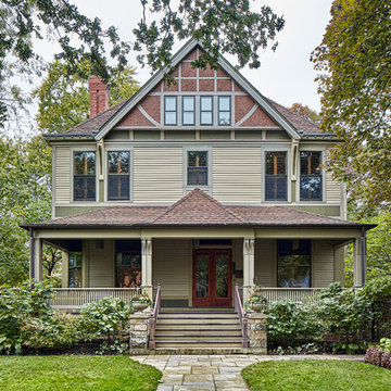
 Frank Lloyd Wright Trust
Charles E. Roberts House (Burnham & Root, 1885; Wright remodel, 1896)
A majestic Queen Anne with Wright’s hand evidenced in the extensive decorative woodwork.
Courtesy of Frank Lloyd Wright Trust. Photographer James Caulfield.
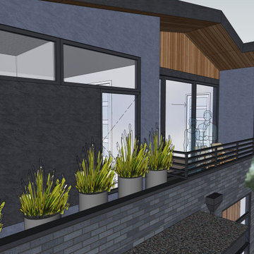
 Aardvark Architecture
This proposal is for a new two-story home on the vacant heavily wooded lot with an existing 150-foot-long driveway lined by several beautiful oak trees culminating in a behemoth 43-inch oak tree where the driveway meets the main lot. The far end of the driveway terminates in a grove of three 43/40/43-inch redwoods and at the very center of the vacant lot stands a gargantuan V-twin 59-inch redwood tree paired with a “small” 29-inch redwood tree. The owners want to build a beautiful contemporary-styled home for their family that fully enjoys and embraces the mature trees on their cozy 65-foot by 100-foot lot.
As with all small, constrained lots, this project’s site design started first with meeting the relatively large parking and car maneuvering requirements. Menlo Park’s Department of Transportation typically requires side-facing garages to have 24-feet of backup space. So that they could give the largest feature redwood tree on site an added four feet (50%) of clearance outside of its critical root zone, the owners agreed to install a vehicle turntable at the end of their driveway to eliminate the extra four feet of space needed to back up and turnaround. This allowed them to pull their garage forward an additional four feet towards the front property line on the panhandle side, drastically reducing the rest of the home’s impact on the gargantuan V-Twin paired redwood tree at the center of the lot.
One of the owners has mobility issues, and accordingly, they first sought to design a one-story floor plan that incorporated all their family’s needs including plenty of covered patio and deck space to enjoy our fantastic California weather. But that single-story footprint spread too far into the critical root zones of several of the redwood trees on site, even despite the use of the vehicle turntable. During my interview process with the owners, they made it clear to me that one of their primary concerns is ensuring that the largest trees on site would thrive and become features of their new home after construction is complete. The single-story designs that removed the grove of three huge redwood trees were non-starters, as was the skimpy 5x10 master bath I designed when trying to squeeze the whole house program into an overly compromised single-story design. It was therefore deemed necessary to go with a two-story design despite the owner’s mobility issues. This two-story design has a much more compact ground floor footprint and has no bedrooms downstairs, other than the detached ADU. The owners must give up the floor area and incur the costs to install a residential elevator to access their upstairs master suite.
Our ground floor footprint is smaller due to the two-story design decision, and our foundation is pulled away from the trees thanks to the vehicle turntable. Yet, a tiny portion of the home’s ground floor footprint still encroaches into the critical root zones of the largest 59” redwood tree. Therefore, as outlined in the Arborist Report prepared by Aesculus Arboricultural Consulting, the structural engineers are incorporating an array of drilled piers and shallow-grade beams for the main home’s foundation and deck area nearest the redwood’s critical root zone. This drilled piers and grade beam foundation is a type of “bridging” foundation as outlined in Aesculus’ report to preserve the health of these trees that the property was designed around. The rest of the foundation will be constructed as an insulated slab-on-grade foundation to minimize the number of steps and ramps needed for the owners to enjoy their home and patio areas.
Despite the owner’s desire to keep as many trees as possible on site, and despite the smaller ground floor footprint and the advantage of the vehicle turntable, the need for a 20x20-foot garage and 20x20/25-foot guest parking space on our panhandle lot requires the removal of two heritage trees in the required driveway, a 16” coast redwood, and a 17” coast redwood. An alternate design, such as swapping the garage and guest parking locations north-to-south, still requires the removal of these two trees for vehicle maneuvering but has the added disadvantage of cutting off the home’s sightlines to the behemoth 43” oak tree just outside the currently proposed front patio space and living room. Jim Redman of Elements Landscape is proposing 13 new trees be planted on site to replace the lost value of these two heritage coast redwood trees.
This contemporary architectural design features clean lines, and an abundance of full-height windows and large skylights to best take in the immense trees on site. To blend in with the forest-like setting, the home boasts a mix of rich textures and features a color palette of natural wood tones contrasted with dark blue and black. Once through the new steel gate at the street and down the 150-foot tree-lined driveway, a large covered front patio becomes visible past the neighbor’s detached accessory structure. The covered patio is just across the driveway from the beautiful 43” behemoth coast live oak. The single plane of the covered patio roof is delicately supported by a pair of steel posts in a “V-twin” configuration much like the largest redwood trees that tower over the center of the lot and will still be visible above the new two-story home, even from the front yard. The patio is covered in a dark-colored standing seam roof, with steel C-channel fascias, and tongue-and-groove wood ceiling planks on the underside. Generously sized skylights on the patio roof and inside the living area allow for impressive views of the amazing oak canopy as well as precious natural light.
Supporting the sloped covered patio on the other side is the two-car garage with a secondary bedroom suite stacked above the garage. This two-story volume is to be clad in vertical clear-coated redwood siding, to tie in with the grove of three 43-inch redwood trees just beyond. The garage door, and the bank of windows for Bedroom#2 above feature a steel fascia eyebrow header feature to provide shade and overhang protection, as we are not proposing a large overhang at this “redwood trunk”. The garage and bedroom volume are pulled 16 feet away from the side property line, instead of the minimum required setback of 6’-6”, thus leaving plenty of room for the redwood grove and existing mature pear tree to continue to thrive. This existing mature green screen in this 16-foot-wide side yard is a feature worth soaking in, which is why tall windows with low sill heights are proposed for both the stairs and the upstairs hallway. Though it may be infrequent to approve side-facing 2nd floor windows with sill heights as low as what we’re proposing, we are confident that the mature green screen and the over 16-foot-wide side yard are sufficient to provide for the continued privacy of our neighbor’s rear yard space, especially considering theses windows are in walkway zones.
The covered patio at the front entry is also bound by the 10-foot-tall living room. The great room is clad in a dark blue brick veneer, which wraps around all three sides of the living room. Upon entering the home from the covered patio, you are immediately greeted with one of the most impressive features of the home’s design: a 10-foot-tall by 24-foot-wide set of sliding glass doors. From the entry, this huge opening gives merely an initial glimpse of the massive trunks of the gargantuan V-twin redwoods sitting at the center of the lot. All three sliding glass panels open directly out into the smaller partially covered deck in the rear. This roof overhang element matches the design of the front patio with a steel C-channel fascia and a large skylight. But the rear deck’s roof element is set flat at a ten-foot ceiling height so that the living room’s ceiling seems to float above and out beyond the expanse of full-height sliding doors, thus creating an indoor-outdoor living space that will feel much larger than the home’s actual footprint. This rear covered deck is smaller than the patio in the front and also has a mix of solid and open-slatted roofing to allow for more solar access for the relatively small amount of open sky available.
The downstairs living room is open to the dining and kitchen areas, as well as the stair-and-elevator tower beyond. The stair tower is very open and glassy, and the stairs wind up and around the redwood-clad elevator tower. From certain perspectives in the 16-foot-wide side yard, it will almost seem as if the grove of three redwoods has a fourth tree that the house and the stairs were carefully built around. Other than the 3-foot-wide windows, the exterior walls of the stair tower, downstairs utility spaces, and Bedroom#3 above are finished in cement plaster, painted dark blue and black. The sloped roof over the stair-and-elevator tower continues cleanly over the area of upstairs Bedroom#3. This roof level is set by the side daylight plane and only yields an inside wall height of just under 6 feet in height. The owners are satisfied that the rest of this upstairs room has a nice vaulted ceiling to make up for the one short wall under the daylight plane.
The rest of the ground floor adjacent to the stair tower consists of a small utility wing containing a half-bath, laundry, storage area, and an exterior alcove for the electric heat pump HVAC unit. This short wing also gives more accessible access to the rear yard deck, as well as a backdrop for an outdoor kitchen. The bright white stone backsplash for the outdoor kitchen provides contrast to the otherwise consistent use of cement plaster painted dark blue and black for the two-story wing closest to the detached ADU. Though Bedroom#3 is stacked directly above this small wing, it is relatively short to comply with the side daylight plane of this narrow lot. Still, to further help break up the scale of this wall, another steel fascia eyebrow element is set about 8 feet above the rear deck.
The master suite sits centered above the ten-foot-tall great room. The master bedroom and its balcony, as well as the master bathtub area, have a commanding view of the central redwood trees and their impressive canopy, though the balcony is mostly recessed and should pose no privacy concerns to the neighbor’s rear yards. The master balcony parapet is clad in the same brick veneer continuing up from the living room below. A dark-painted metal rail makes up the rest of the open guardrail height. The entire length of the master balcony is comprised of 9-foot-tall sliding glass doors, but the area above the doors, as well as the area below the master bathroom windows, is accented with more redwood siding. The remainder of the master suite bathroom and walk-in closet is finished in cement plaster painted dark blue. The master bathroom has one side yard-facing window but will be frosted glass for both the owner’s and the neighbor’s privacy.
The 2nd floor is capped under a simple gable roof design with one roof ridge and varying eave and rake overhangs depending on the 2nd-floor layout and solar orientation. Since these roof planes are quite difficult to see in the middle of the heavily wooded panhandle lot, we are proposing a white TPO roofing for these two upper roof planes as a more sustainable choice compared to more dark-colored roofing like the covered patios and detached ADU.
The owners also wish to build a detached 292-square-foot Accessory Dwelling Unit (ADU) as an office and guest suite. For the ADU foundation to be situated outside the central redwood tree’s critical root zone, this relatively tiny structure takes advantage of the narrower 4-foot side and rear setbacks allowed for ADUs smaller than 800 square feet. The small L-shaped detached ADU frames a wonderful quasi-courtyard around the gargantuan V-twin redwoods at the center of the lot. The ADU shares a matching material palette consisting of cement plaster painted blue and black, vertical redwood siding and soffits, and thin brick veneer. The ADU also features large full-height windows. The only difference between the main home and the ADU material palette is that the roofing will be a dark composition shingle roofing since it will be quite visible from the master balcony.
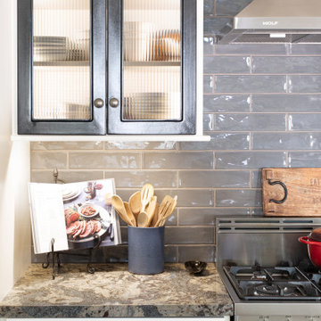 Twelve Stones Designs, LLC
The owners of this kitchen had spent the money to upgrade the finishes in their kitchen upon building the home 12 years ago, but after living in the space for several years they realized how nonfunctional the layout really was. The (then) two preschool aged children had grown into busy, hungry teenagers with many friends who also liked to hang out at the house. So the family needed a more functional kitchen with better traffic flow, space for daily activities revolving around the kitchen at different times of day, and a kitchen that could accommodate cooking for and serving large groups. Furthermore, the dark, traditional finishes no longer reflected the homeowners’ style. They requested a brighter, more relaxed, coastal style that reflected their love of the seaside cities they like to visit.
Originally, the kitchen was U-shaped with a narrow island in the middle. The island created narrow aisles that bottle-necked at the dishwasher, refrigerator, and cooktop areas. There was a pass-through from the foyer into the kitchen, but the owners never liked that the pass-through was also located so close to the powder room. The awkward proximity was unappealing and made guests feel uncomfortable.
The kitchen’s storage was made up of lots of narrow cabinets, apothecary drawers, clipped corner units, and very few drawers. It lacked useful storage for the larger items the family used on a daily basis. And the kitchen’s only pantry was small closet that had only builder-grade, narrow shelving with no illumination to be able to see the contents inside.
Overall, the kitchen’s lighting plan was poorly executed. Only six recessed cans illuminated the entire kitchen and nook areas. The under cabinet lighting was not evenly distributed either. In fact, the builder had mis-placed the under cabinet lighting around the decorative pilasters which made for choppy, dark cubbies. Further, the builder didn’t include any lighting over the sink or the bar area, which meant whoever was doing the dishes was always in their own shadow. That, coupled with the steep overhang of the game room above made the bar area feel like a dim, cavernous space that wasn’t inviting or task oriented. The kitchen looked out into the main living space, but the raised bar and a narrow wall (which held the only large cabinet in the kitchen) created more of a barrier than a relationship to the living room or breakfast nook. In fact, one couldn’t even see the breakfast nook from the cooktop or sink areas due to its orientation. The raised bar top was too narrow to comfortably sit to either dine at or chat from due to the lack of knee space. The the homeowners confided that the kitchen felt more like a dark, dirty prison than place where the family, or their guests, wanted to gather and commune.
The clients' needs and desires were:
➢ to create a kitchen that would be a space the family loved to be in; to relate to the adjacent spaces all around, and to have better flow for entertaining large groups
➢ to remove the walls between the breakfast nook and living area and to be able to utilize the natural light from the windows in both those areas
➢ to incorporate a functional chopping block for prepping fresh food for home cooked meals, an island with a large sink and drain board, 2 pull out trash cans, and seating for at least the 2 teens to eat or do homework
➢ to design a kitchen and breakfast nook with an airy, coastal, relaxed vibe that blended with the rest of the house's coastal theme
➢ to integrate a layered lighting plan which would include ample general illumination, specific task lighting, decorative lighting, and lots of illuminated storage
➢ to design a kitchen with not only more storage for all the husband’s kitchen gadgets and collection of oils and spices, but smart storage, including a coffee/breakfast bar and a place to store and conceal the toaster oven and microwave
➢ to find a way to utilize the large open space between the kitchen, pantry area, and breakfast nook
Twelve Stones Designs achieved the owner's goals by:
➢ removing the walls between the kitchen and living room to allow the natural light to filter in from the adjacent rooms and to create a connection between the kitchen, nook, and living spaces for a sense of unity and communion
➢ removing the existing pantry and designing 3 large pantry style cabinets with LED tape lights and rollout drawers to house lots of kitchen appliances, gadgets, and tons of groceries. We also took the cabinets all the way up to the 9’ ceiling for additional storage for seasonal items and bulk storage.
➢ designing 2 islands - 1 with a gorgeous black walnut chopping block that houses a drawer for chopping and carving knives and a custom double pull out trash unit for point of use utilization - and 1 that houses the dishwasher, a large Blanco Gourmet sink with integrated drain board, woven baskets for fresh root vegetables and kitchen towels, plenty of drawer storage for kitchen items, and bar seating for up to 4 diners.
➢ closing off the space between the kitchen and the powder room to create a beautiful new private alcove for the powder room as well as adding some decorative storage. This also gave us space to include more tall storage near the new range for precision placement of the husband’s extensive oil and spice collection as well as a location for a combo-steam oven the wife wanted for baking and cooking healthy meals.
The project is enhanced functionally by:
➢ incorporated USB and standard receptacles for the kids’ laptops and phone charging in the large island
➢ designing the small island to include additional open shelving for items used on a daily basis such as a variety of bowls, plates, and colanders. This set up also works well for the husband who prefers to “plate” his dinners in restaurant-style fashion before presenting them to the table.
➢ the integration of specific storage units, such as double stacked cutlery drawers, a custom spice pull-out, a Kuerig coffee and tea pod drawer, and custom double stacked utensil drawers
➢ moving the refrigerator to the old oven location - this eliminated the bottle neck as well as created a better relationship to the eating table. It also utilizes the floor space between the pantry, nook, and kitchen
➢ creating a banquet style breakfast nook - this banquette seating not only doubles the amount of seating for large gatherings but it better utilizes the odd space between the kitchen and the previous nook area. It also helps to create a distinct pathway from the mudroom room through the pantry area, kitchen, nook, and living room.
➢ the coffee/breakfast bar area which includes the perfect location for the concealed microwave and toaster oven, convenient storage for the coffee pods and tea accoutrements. Roll-out drawers below also house the smoothie maker, hot water kettle, and a plethora of smoothie-making ingredients such as protein powders, smoothie additives, etc. Furthermore, the drawers below the Keurig house measuring utensil, cutlery, baking supplies and tupperware storage.
➢ incorporating lots of wide drawers and pullouts to accommodate large cookware.
➢ utilizing as much vertical space as possible by building storage to the ceiling which accommodates the family’s abundant amount of serving platters, baking sheets, bakeware, casserole dishes, and additional cutting boards.
The project is enhanced aesthetically by:
➢ new 5-piece Versailles pattern porcelain tile that now seamlessly joins the entire down stairs area together creating a bright, cohesiveness feeling instead of choppy separated spaces - it also adds a coastal feeling
➢ designing a cabinet to conceal the microwave and toaster oven
➢ the coastal influenced light fixtures over the nook table and island
➢ the sandy colors of the Langdon Cambria countertops. The swirling pattern and sparkling quartz pieces remind the homeowner of black-and-tan sandy beaches
➢ the striped banquet seating whose creamy white background and blue-green stripes were the inspiration for the cabinet and wall colors.
➢ All the interior doors were painted black to coordinate with the blacks and grays in the backsplash tile and countertop. This also adds a hint of tailored formality to an otherwise casual space.
➢ the use of WAC's Oculux small aperture LED units for the overhead lighting complimented with Diode LED strips for task lighting under the cabinets and inside the pantry and glass wall cabinets. All of the lighting applications are on separate dimmer switches.
Innovative uses of materials or construction methods by Realty Restoration LLC:
➢ Each 1-1/2” x 3” block of reclaimed end-grain black walnut that makes up the center island chopping block was hand milled and built in the shop. It was designed to look substantial and proportional to the surrounding elements, executed by creating the 4 inch tall top with a solid wood chamfered edge band.
➢ The metal doors on either side of the vent hood were also custom designed for this project and built in the Realty Restoration LLC shop. They are made 1x2, 11-gauge mild steel with ribbed glass. Weighing 60 lbs a piece, heavy duty cabinet hinges were added to support the weight of the door and keep them from sagging.
➢ Under-cabinet receptacles were added along the range wall in order to have a clean, uninterrupted backsplash.
Design obstacles to overcome:
➢ Because we were removing the demising walls between the kitchen and living room, we had to find a way to plumb and vent the new island. We did this by tunneling through the slab (the slab had post tension cables which prevented us from just trenching) to run a new wet vent through a nearby structural wall. We pulled the existing hot and cold lines between upper floor joists and ran them down the structural wall as well and up through a conduit in the tunnel.
➢ Since we were converting from wall overs to a gas range it allowed us to utilize the 220 feed for the wall ovens to provide a new sub panel for all the new kitchen circuits
➢ Due to framing deficiencies inherited from the original build there was a 1-1/2” differential in the floor-to-ceiling height over a 20 foot span; by utilizing the process of cutting and furring coupled with the crown moulding details on the cabinet elevations we were able to mask the problem and provide seamless transitions between the cabinet components.
Evidence of superior craftsmanship:
➢ uniquely designed, one-of-a-kind metal “X” end panels on the large island. The end panels were custom made in the Realty Restoration LLC shop and fitted to the exact dimensions of the island. The welding seams are completely indistinguishable - the posts look like they are cut from a single sheet of metal
➢ square metal posts on the small island were also custom made and designed to compliment and carry through the metal element s throughout the kitchen
➢ the beautiful, oversized end panels on the pantry cabinets which give the breakfast nook a tailored look
➢ integrating a large format 5 piece Versailles tile pattern to seamlessly flow from the existing spaces into the new kitchen space
➢ By constructing a custom cabinet that jogged around a corner we could not remodel (housing the entry way coat closet) we were able to camouflage the adjacent wall offset within the upper and lower cabinets. By designing around the existing jog in the structural walls we accomplished a few things: we were able to find the space to house, and hide, the microwave and toaster oven yet still have a clean cohesive appearance from the kitchen side. Additionally, the owners were able to keep their much needed coat closet and we didn’t have to increase the budget with unnecessary structural work.
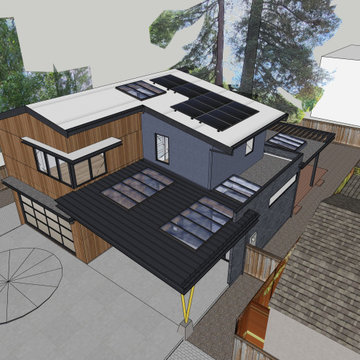 Aardvark Architecture
This proposal is for a new two-story home on the vacant heavily wooded lot with an existing 150-foot-long driveway lined by several beautiful oak trees culminating in a behemoth 43-inch oak tree where the driveway meets the main lot. The far end of the driveway terminates in a grove of three 43/40/43-inch redwoods and at the very center of the vacant lot stands a gargantuan V-twin 59-inch redwood tree paired with a “small” 29-inch redwood tree. The owners want to build a beautiful contemporary-styled home for their family that fully enjoys and embraces the mature trees on their cozy 65-foot by 100-foot lot.
As with all small, constrained lots, this project’s site design started first with meeting the relatively large parking and car maneuvering requirements. Menlo Park’s Department of Transportation typically requires side-facing garages to have 24-feet of backup space. So that they could give the largest feature redwood tree on site an added four feet (50%) of clearance outside of its critical root zone, the owners agreed to install a vehicle turntable at the end of their driveway to eliminate the extra four feet of space needed to back up and turnaround. This allowed them to pull their garage forward an additional four feet towards the front property line on the panhandle side, drastically reducing the rest of the home’s impact on the gargantuan V-Twin paired redwood tree at the center of the lot.
One of the owners has mobility issues, and accordingly, they first sought to design a one-story floor plan that incorporated all their family’s needs including plenty of covered patio and deck space to enjoy our fantastic California weather. But that single-story footprint spread too far into the critical root zones of several of the redwood trees on site, even despite the use of the vehicle turntable. During my interview process with the owners, they made it clear to me that one of their primary concerns is ensuring that the largest trees on site would thrive and become features of their new home after construction is complete. The single-story designs that removed the grove of three huge redwood trees were non-starters, as was the skimpy 5x10 master bath I designed when trying to squeeze the whole house program into an overly compromised single-story design. It was therefore deemed necessary to go with a two-story design despite the owner’s mobility issues. This two-story design has a much more compact ground floor footprint and has no bedrooms downstairs, other than the detached ADU. The owners must give up the floor area and incur the costs to install a residential elevator to access their upstairs master suite.
Our ground floor footprint is smaller due to the two-story design decision, and our foundation is pulled away from the trees thanks to the vehicle turntable. Yet, a tiny portion of the home’s ground floor footprint still encroaches into the critical root zones of the largest 59” redwood tree. Therefore, as outlined in the Arborist Report prepared by Aesculus Arboricultural Consulting, the structural engineers are incorporating an array of drilled piers and shallow-grade beams for the main home’s foundation and deck area nearest the redwood’s critical root zone. This drilled piers and grade beam foundation is a type of “bridging” foundation as outlined in Aesculus’ report to preserve the health of these trees that the property was designed around. The rest of the foundation will be constructed as an insulated slab-on-grade foundation to minimize the number of steps and ramps needed for the owners to enjoy their home and patio areas.
Despite the owner’s desire to keep as many trees as possible on site, and despite the smaller ground floor footprint and the advantage of the vehicle turntable, the need for a 20x20-foot garage and 20x20/25-foot guest parking space on our panhandle lot requires the removal of two heritage trees in the required driveway, a 16” coast redwood, and a 17” coast redwood. An alternate design, such as swapping the garage and guest parking locations north-to-south, still requires the removal of these two trees for vehicle maneuvering but has the added disadvantage of cutting off the home’s sightlines to the behemoth 43” oak tree just outside the currently proposed front patio space and living room. Jim Redman of Elements Landscape is proposing 13 new trees be planted on site to replace the lost value of these two heritage coast redwood trees.
This contemporary architectural design features clean lines, and an abundance of full-height windows and large skylights to best take in the immense trees on site. To blend in with the forest-like setting, the home boasts a mix of rich textures and features a color palette of natural wood tones contrasted with dark blue and black. Once through the new steel gate at the street and down the 150-foot tree-lined driveway, a large covered front patio becomes visible past the neighbor’s detached accessory structure. The covered patio is just across the driveway from the beautiful 43” behemoth coast live oak. The single plane of the covered patio roof is delicately supported by a pair of steel posts in a “V-twin” configuration much like the largest redwood trees that tower over the center of the lot and will still be visible above the new two-story home, even from the front yard. The patio is covered in a dark-colored standing seam roof, with steel C-channel fascias, and tongue-and-groove wood ceiling planks on the underside. Generously sized skylights on the patio roof and inside the living area allow for impressive views of the amazing oak canopy as well as precious natural light.
Supporting the sloped covered patio on the other side is the two-car garage with a secondary bedroom suite stacked above the garage. This two-story volume is to be clad in vertical clear-coated redwood siding, to tie in with the grove of three 43-inch redwood trees just beyond. The garage door, and the bank of windows for Bedroom#2 above feature a steel fascia eyebrow header feature to provide shade and overhang protection, as we are not proposing a large overhang at this “redwood trunk”. The garage and bedroom volume are pulled 16 feet away from the side property line, instead of the minimum required setback of 6’-6”, thus leaving plenty of room for the redwood grove and existing mature pear tree to continue to thrive. This existing mature green screen in this 16-foot-wide side yard is a feature worth soaking in, which is why tall windows with low sill heights are proposed for both the stairs and the upstairs hallway. Though it may be infrequent to approve side-facing 2nd floor windows with sill heights as low as what we’re proposing, we are confident that the mature green screen and the over 16-foot-wide side yard are sufficient to provide for the continued privacy of our neighbor’s rear yard space, especially considering theses windows are in walkway zones.
The covered patio at the front entry is also bound by the 10-foot-tall living room. The great room is clad in a dark blue brick veneer, which wraps around all three sides of the living room. Upon entering the home from the covered patio, you are immediately greeted with one of the most impressive features of the home’s design: a 10-foot-tall by 24-foot-wide set of sliding glass doors. From the entry, this huge opening gives merely an initial glimpse of the massive trunks of the gargantuan V-twin redwoods sitting at the center of the lot. All three sliding glass panels open directly out into the smaller partially covered deck in the rear. This roof overhang element matches the design of the front patio with a steel C-channel fascia and a large skylight. But the rear deck’s roof element is set flat at a ten-foot ceiling height so that the living room’s ceiling seems to float above and out beyond the expanse of full-height sliding doors, thus creating an indoor-outdoor living space that will feel much larger than the home’s actual footprint. This rear covered deck is smaller than the patio in the front and also has a mix of solid and open-slatted roofing to allow for more solar access for the relatively small amount of open sky available.
The downstairs living room is open to the dining and kitchen areas, as well as the stair-and-elevator tower beyond. The stair tower is very open and glassy, and the stairs wind up and around the redwood-clad elevator tower. From certain perspectives in the 16-foot-wide side yard, it will almost seem as if the grove of three redwoods has a fourth tree that the house and the stairs were carefully built around. Other than the 3-foot-wide windows, the exterior walls of the stair tower, downstairs utility spaces, and Bedroom#3 above are finished in cement plaster, painted dark blue and black. The sloped roof over the stair-and-elevator tower continues cleanly over the area of upstairs Bedroom#3. This roof level is set by the side daylight plane and only yields an inside wall height of just under 6 feet in height. The owners are satisfied that the rest of this upstairs room has a nice vaulted ceiling to make up for the one short wall under the daylight plane.
The rest of the ground floor adjacent to the stair tower consists of a small utility wing containing a half-bath, laundry, storage area, and an exterior alcove for the electric heat pump HVAC unit. This short wing also gives more accessible access to the rear yard deck, as well as a backdrop for an outdoor kitchen. The bright white stone backsplash for the outdoor kitchen provides contrast to the otherwise consistent use of cement plaster painted dark blue and black for the two-story wing closest to the detached ADU. Though Bedroom#3 is stacked directly above this small wing, it is relatively short to comply with the side daylight plane of this narrow lot. Still, to further help break up the scale of this wall, another steel fascia eyebrow element is set about 8 feet above the rear deck.
The master suite sits centered above the ten-foot-tall great room. The master bedroom and its balcony, as well as the master bathtub area, have a commanding view of the central redwood trees and their impressive canopy, though the balcony is mostly recessed and should pose no privacy concerns to the neighbor’s rear yards. The master balcony parapet is clad in the same brick veneer continuing up from the living room below. A dark-painted metal rail makes up the rest of the open guardrail height. The entire length of the master balcony is comprised of 9-foot-tall sliding glass doors, but the area above the doors, as well as the area below the master bathroom windows, is accented with more redwood siding. The remainder of the master suite bathroom and walk-in closet is finished in cement plaster painted dark blue. The master bathroom has one side yard-facing window but will be frosted glass for both the owner’s and the neighbor’s privacy.
The 2nd floor is capped under a simple gable roof design with one roof ridge and varying eave and rake overhangs depending on the 2nd-floor layout and solar orientation. Since these roof planes are quite difficult to see in the middle of the heavily wooded panhandle lot, we are proposing a white TPO roofing for these two upper roof planes as a more sustainable choice compared to more dark-colored roofing like the covered patios and detached ADU.
The owners also wish to build a detached 292-square-foot Accessory Dwelling Unit (ADU) as an office and guest suite. For the ADU foundation to be situated outside the central redwood tree’s critical root zone, this relatively tiny structure takes advantage of the narrower 4-foot side and rear setbacks allowed for ADUs smaller than 800 square feet. The small L-shaped detached ADU frames a wonderful quasi-courtyard around the gargantuan V-twin redwoods at the center of the lot. The ADU shares a matching material palette consisting of cement plaster painted blue and black, vertical redwood siding and soffits, and thin brick veneer. The ADU also features large full-height windows. The only difference between the main home and the ADU material palette is that the roofing will be a dark composition shingle roofing since it will be quite visible from the master balcony.
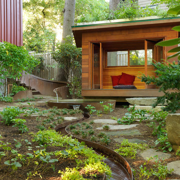
 Julie Moir Messervy Design Studio (JMMDS)
The “handrill” of Corten steel follows the peastone and steel steps down a steep slope to pour into a round basin, emptying into a channel that meanders through the narrow back garden at ground level, ending finally in a boulder fountain.
Devised to minimize root disturbance for the tall existing pines on the property, the continuous Corten steel structure is supported by concrete tubes rather than a foundation that would have required extensive excavation.
Architect: Wolf Architects, Inc.
General Contractor: GF Rhode Construction, Inc.
Landscape Contractor: Robert Hanss, Inc.
Steel Fabrication: Wovensteel and Richard Duca
Water Systems: Pond Creations by Sean
Photo by Susan Teare.
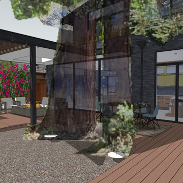 Aardvark Architecture
This proposal is for a new two-story home on the vacant heavily wooded lot with an existing 150-foot-long driveway lined by several beautiful oak trees culminating in a behemoth 43-inch oak tree where the driveway meets the main lot. The far end of the driveway terminates in a grove of three 43/40/43-inch redwoods and at the very center of the vacant lot stands a gargantuan V-twin 59-inch redwood tree paired with a “small” 29-inch redwood tree. The owners want to build a beautiful contemporary-styled home for their family that fully enjoys and embraces the mature trees on their cozy 65-foot by 100-foot lot.
As with all small, constrained lots, this project’s site design started first with meeting the relatively large parking and car maneuvering requirements. Menlo Park’s Department of Transportation typically requires side-facing garages to have 24-feet of backup space. So that they could give the largest feature redwood tree on site an added four feet (50%) of clearance outside of its critical root zone, the owners agreed to install a vehicle turntable at the end of their driveway to eliminate the extra four feet of space needed to back up and turnaround. This allowed them to pull their garage forward an additional four feet towards the front property line on the panhandle side, drastically reducing the rest of the home’s impact on the gargantuan V-Twin paired redwood tree at the center of the lot.
One of the owners has mobility issues, and accordingly, they first sought to design a one-story floor plan that incorporated all their family’s needs including plenty of covered patio and deck space to enjoy our fantastic California weather. But that single-story footprint spread too far into the critical root zones of several of the redwood trees on site, even despite the use of the vehicle turntable. During my interview process with the owners, they made it clear to me that one of their primary concerns is ensuring that the largest trees on site would thrive and become features of their new home after construction is complete. The single-story designs that removed the grove of three huge redwood trees were non-starters, as was the skimpy 5x10 master bath I designed when trying to squeeze the whole house program into an overly compromised single-story design. It was therefore deemed necessary to go with a two-story design despite the owner’s mobility issues. This two-story design has a much more compact ground floor footprint and has no bedrooms downstairs, other than the detached ADU. The owners must give up the floor area and incur the costs to install a residential elevator to access their upstairs master suite.
Our ground floor footprint is smaller due to the two-story design decision, and our foundation is pulled away from the trees thanks to the vehicle turntable. Yet, a tiny portion of the home’s ground floor footprint still encroaches into the critical root zones of the largest 59” redwood tree. Therefore, as outlined in the Arborist Report prepared by Aesculus Arboricultural Consulting, the structural engineers are incorporating an array of drilled piers and shallow-grade beams for the main home’s foundation and deck area nearest the redwood’s critical root zone. This drilled piers and grade beam foundation is a type of “bridging” foundation as outlined in Aesculus’ report to preserve the health of these trees that the property was designed around. The rest of the foundation will be constructed as an insulated slab-on-grade foundation to minimize the number of steps and ramps needed for the owners to enjoy their home and patio areas.
Despite the owner’s desire to keep as many trees as possible on site, and despite the smaller ground floor footprint and the advantage of the vehicle turntable, the need for a 20x20-foot garage and 20x20/25-foot guest parking space on our panhandle lot requires the removal of two heritage trees in the required driveway, a 16” coast redwood, and a 17” coast redwood. An alternate design, such as swapping the garage and guest parking locations north-to-south, still requires the removal of these two trees for vehicle maneuvering but has the added disadvantage of cutting off the home’s sightlines to the behemoth 43” oak tree just outside the currently proposed front patio space and living room. Jim Redman of Elements Landscape is proposing 13 new trees be planted on site to replace the lost value of these two heritage coast redwood trees.
This contemporary architectural design features clean lines, and an abundance of full-height windows and large skylights to best take in the immense trees on site. To blend in with the forest-like setting, the home boasts a mix of rich textures and features a color palette of natural wood tones contrasted with dark blue and black. Once through the new steel gate at the street and down the 150-foot tree-lined driveway, a large covered front patio becomes visible past the neighbor’s detached accessory structure. The covered patio is just across the driveway from the beautiful 43” behemoth coast live oak. The single plane of the covered patio roof is delicately supported by a pair of steel posts in a “V-twin” configuration much like the largest redwood trees that tower over the center of the lot and will still be visible above the new two-story home, even from the front yard. The patio is covered in a dark-colored standing seam roof, with steel C-channel fascias, and tongue-and-groove wood ceiling planks on the underside. Generously sized skylights on the patio roof and inside the living area allow for impressive views of the amazing oak canopy as well as precious natural light.
Supporting the sloped covered patio on the other side is the two-car garage with a secondary bedroom suite stacked above the garage. This two-story volume is to be clad in vertical clear-coated redwood siding, to tie in with the grove of three 43-inch redwood trees just beyond. The garage door, and the bank of windows for Bedroom#2 above feature a steel fascia eyebrow header feature to provide shade and overhang protection, as we are not proposing a large overhang at this “redwood trunk”. The garage and bedroom volume are pulled 16 feet away from the side property line, instead of the minimum required setback of 6’-6”, thus leaving plenty of room for the redwood grove and existing mature pear tree to continue to thrive. This existing mature green screen in this 16-foot-wide side yard is a feature worth soaking in, which is why tall windows with low sill heights are proposed for both the stairs and the upstairs hallway. Though it may be infrequent to approve side-facing 2nd floor windows with sill heights as low as what we’re proposing, we are confident that the mature green screen and the over 16-foot-wide side yard are sufficient to provide for the continued privacy of our neighbor’s rear yard space, especially considering theses windows are in walkway zones.
The covered patio at the front entry is also bound by the 10-foot-tall living room. The great room is clad in a dark blue brick veneer, which wraps around all three sides of the living room. Upon entering the home from the covered patio, you are immediately greeted with one of the most impressive features of the home’s design: a 10-foot-tall by 24-foot-wide set of sliding glass doors. From the entry, this huge opening gives merely an initial glimpse of the massive trunks of the gargantuan V-twin redwoods sitting at the center of the lot. All three sliding glass panels open directly out into the smaller partially covered deck in the rear. This roof overhang element matches the design of the front patio with a steel C-channel fascia and a large skylight. But the rear deck’s roof element is set flat at a ten-foot ceiling height so that the living room’s ceiling seems to float above and out beyond the expanse of full-height sliding doors, thus creating an indoor-outdoor living space that will feel much larger than the home’s actual footprint. This rear covered deck is smaller than the patio in the front and also has a mix of solid and open-slatted roofing to allow for more solar access for the relatively small amount of open sky available.
The downstairs living room is open to the dining and kitchen areas, as well as the stair-and-elevator tower beyond. The stair tower is very open and glassy, and the stairs wind up and around the redwood-clad elevator tower. From certain perspectives in the 16-foot-wide side yard, it will almost seem as if the grove of three redwoods has a fourth tree that the house and the stairs were carefully built around. Other than the 3-foot-wide windows, the exterior walls of the stair tower, downstairs utility spaces, and Bedroom#3 above are finished in cement plaster, painted dark blue and black. The sloped roof over the stair-and-elevator tower continues cleanly over the area of upstairs Bedroom#3. This roof level is set by the side daylight plane and only yields an inside wall height of just under 6 feet in height. The owners are satisfied that the rest of this upstairs room has a nice vaulted ceiling to make up for the one short wall under the daylight plane.
The rest of the ground floor adjacent to the stair tower consists of a small utility wing containing a half-bath, laundry, storage area, and an exterior alcove for the electric heat pump HVAC unit. This short wing also gives more accessible access to the rear yard deck, as well as a backdrop for an outdoor kitchen. The bright white stone backsplash for the outdoor kitchen provides contrast to the otherwise consistent use of cement plaster painted dark blue and black for the two-story wing closest to the detached ADU. Though Bedroom#3 is stacked directly above this small wing, it is relatively short to comply with the side daylight plane of this narrow lot. Still, to further help break up the scale of this wall, another steel fascia eyebrow element is set about 8 feet above the rear deck.
The master suite sits centered above the ten-foot-tall great room. The master bedroom and its balcony, as well as the master bathtub area, have a commanding view of the central redwood trees and their impressive canopy, though the balcony is mostly recessed and should pose no privacy concerns to the neighbor’s rear yards. The master balcony parapet is clad in the same brick veneer continuing up from the living room below. A dark-painted metal rail makes up the rest of the open guardrail height. The entire length of the master balcony is comprised of 9-foot-tall sliding glass doors, but the area above the doors, as well as the area below the master bathroom windows, is accented with more redwood siding. The remainder of the master suite bathroom and walk-in closet is finished in cement plaster painted dark blue. The master bathroom has one side yard-facing window but will be frosted glass for both the owner’s and the neighbor’s privacy.
The 2nd floor is capped under a simple gable roof design with one roof ridge and varying eave and rake overhangs depending on the 2nd-floor layout and solar orientation. Since these roof planes are quite difficult to see in the middle of the heavily wooded panhandle lot, we are proposing a white TPO roofing for these two upper roof planes as a more sustainable choice compared to more dark-colored roofing like the covered patios and detached ADU.
The owners also wish to build a detached 292-square-foot Accessory Dwelling Unit (ADU) as an office and guest suite. For the ADU foundation to be situated outside the central redwood tree’s critical root zone, this relatively tiny structure takes advantage of the narrower 4-foot side and rear setbacks allowed for ADUs smaller than 800 square feet. The small L-shaped detached ADU frames a wonderful quasi-courtyard around the gargantuan V-twin redwoods at the center of the lot. The ADU shares a matching material palette consisting of cement plaster painted blue and black, vertical redwood siding and soffits, and thin brick veneer. The ADU also features large full-height windows. The only difference between the main home and the ADU material palette is that the roofing will be a dark composition shingle roofing since it will be quite visible from the master balcony.
1