
Search results for "Offered people" in Home Design Ideas

 Décor Aid
New Yorkers are always on the prowl for innovative ways to make the most of the space they have. An upper east side couple, challenged with a slightly narrow L shaped apartment sought out Decor Aid’s help to make the most of their Manhattan condo. Paired with one of our senior designer, Kimberly P., we learned that the clients wanted a space that looked beautiful, comfortable and also packed with functionality for everyday living.
“Immediately upon seeing the space, I knew that we needed to create a narrative that allowed the design to control how you moved through the space,” reports Kimberly, senior interior designer.
After surveying each room and learning a bit more about their personal style, we started with the living room remodel. It was clear that the couple wanted to infuse mid-century modern into the design plan. Sourcing the Room & Board Jasper Sofa with its narrow arms and tapered legs, it offered the mid-century look, with the modern comfort the clients are used to. Velvet accent pillows from West Elm and Crate & Barrel add pops of colors but also a subtle touch of luxury, while framed pictures from the couple’s honeymoon personalize the space.
Moving to the dining room next, Kimberly decided to add a blue accent wall to emphasize the Horchow two piece Percussion framed art that was to be the focal point of the dining area. The Seno sideboard from Article perfectly accentuated the mid-century style the clients loved while providing much-needed storage space. The palette used throughout both rooms were very New York style, grays, blues, beiges, and whites, to add depth, Kimberly sourced decorative pieces in a mixture of different metals.
“The artwork above their bureau in the bedroom is photographs that her father took,”
Moving into the bedroom renovation, our designer made sure to continue to stick to the client’s style preference while once again creating a personalized, warm and comforting space by including the photographs taken by the client’s father. The Avery bed added texture and complimented the other colors in the room, while a hidden drawer at the foot pulls out for attached storage, which thrilled the clients. A deco-inspired Faceted mirror from West Elm was a perfect addition to the bedroom due to the illusion of space it provides. The result was a bedroom that was full of mid-century design, personality, and area so they can freely move around.
The project resulted in the form of a layered mid-century modern design with touches of luxury but a space that can not only be lived in but serves as an extension of the people who live there. Our designer was able to take a very narrowly shaped Manhattan apartment and revamp it into a spacious home that is great for sophisticated entertaining or comfortably lazy nights in.

 Living Stone Design + Build
A rustic kids' room designed for ages 4 to 10, featuring cozy double deck beds, soft gray carpet flooring, and a warm, playful ambiance. This functional and eco-friendly space is part of the sustainable organic modern mountain home.

 Heartwood Kitchens
Boxford, MA kitchen renovation designed by north of Boston kitchen design showroom Heartwood Kitchens.
This kitchen includes white painted cabinetry with a glaze and dark wood island. Heartwood included a large, deep boxed out window on the window wall to brighten up the kitchen. This kitchen includes a large island with seating for 4, Wolf range, Sub-Zero refrigerator/freezer, large pantry cabinets and glass front china cabinet. Island/Tabletop items provided by Savoir Faire Home Andover, MA Oriental rugs from First Rugs in Acton, MA Photo credit: Eric Roth Photography.
Find the right local pro for your project

 Paul Moon Design
Image Credit: Subtle Light Photography
Example of a mid-sized transitional backyard deck design in Seattle with a roof extension
Example of a mid-sized transitional backyard deck design in Seattle with a roof extension

 Blackfish Homes Ltd.
Ema Peter | www.emapeter.com
Mid-sized beach style built-in desk medium tone wood floor study room photo in Vancouver with white walls and no fireplace
Mid-sized beach style built-in desk medium tone wood floor study room photo in Vancouver with white walls and no fireplace

 Amber Interiors
Tessa Neustadt
http://tessaneustadt.com
Kitchen/dining room combo - eclectic kitchen/dining room combo idea in Los Angeles
Kitchen/dining room combo - eclectic kitchen/dining room combo idea in Los Angeles

 Schuler Cabinetry
The simple lines of Denali and Hilton come together for a sensible approach to modern style; designed to complement today's busy lifestyle. Denali's textured surface offers rich dimensional flair, while Hilton adds a touch of glimmer with a reflective gloss surface. Both finishes come together on the island as a design focal point offering seating, a second sink and generous storage.


 Stephanie James Interiors
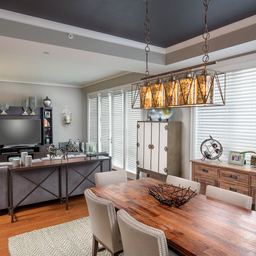
Stephanie James: “Understanding the client’s style preferences, we sought out timeless pieces that also offered a little bling. The room is open to multiple dining and living spaces and the scale of the furnishings by Chaddock, Ambella, Wesley Hall and Mr. Brown and lighting by John Richards and Visual Comfort were very important. The living room area with its vaulted ceilings created a need for dramatic fixtures and furnishings to complement the scale. The mixture of textiles and leather offer comfortable seating options whether for a family gathering or an intimate evening with a book.”
Photographer: Michael Blevins Photo

 Shakespeare Gordon Studio
Francis Dzlkowski
Inspiration for a bedroom contemporary boy medium tone wood floor kids' bedroom remodel in New York with white walls
Inspiration for a bedroom contemporary boy medium tone wood floor kids' bedroom remodel in New York with white walls

 Solitude Homes
Mid-sized country light wood floor and beige floor foyer photo in Boise with white walls and a white front door


 Closet Factory
A reach-in closet - one of our specialties - works hard to store many of our most important possessions and with one of our custom closet organizers, you can literally double your storage.
Most reach-in closets start with a single hanging rod and shelf above it. Imagine adding multiple rods, custom-built trays, shelving, and cabinets that will utilize even the hard-to-reach areas behind the walls. Your closet organizer system will have plenty of space for your shoes, accessories, laundry, and valuables. We can do that, and more.
Please browse our gallery of custom closet organizers and start visualizing ideas for your own closet, and let your designer know which ones appeal to you the most. Have fun and keep in mind – this is just the beginning of all the storage solutions and customization we offer.

 Orren Pickell Building Group
A home office off the kitchen can be concealed with a pocket door. Gray-painted maple Wood-Mode cabinetry complements the kitchen finishes but makes the space unique.
**Project Overview**
A small, quiet, efficient office space for one that is perfect for sorting mail and paying bills. Though small it has a great deal of natural light and views out the front of the house of the lush landscaping and wildlife. A pocket door makes the office disappear when it's time to entertain.
**What Makes This Project Unique?**
Small yet incredibly functional, this desk space is a comfortable, quiet place to catch up on home management tasks. Filled with natural light and offering a view of lush landscaping, the compact space is light and airy. To keep it from feeling cramped or crowded, we complemented warm gray-painted maple cabinetry with light countertops and tile. Taller ceilings allow ample storage, including full-height open storage, to manage all of the papers, files and extras that find their way into the home.
**Design Challenges**
While the office was intentionally designed into a tiny nook off the kitchen and pantry, we didn't want it to feel small for the people using it. By keeping the color palette light, taking cabinetry to the ceiling, incorporating open storage and maximizing natural light, the space feels cozy, and larger than it actually is.
Photo by MIke Kaskel.


 User
UserDavid Land
Home office - coastal freestanding desk light wood floor home office idea in Jacksonville with gray walls
Home office - coastal freestanding desk light wood floor home office idea in Jacksonville with gray walls

 Klopf Architecture
Klopf Architecture, Arterra Landscape Architects and Henry Calvert of Calvert Ventures Designed and built a new warm, modern, Eichler-inspired, open, indoor-outdoor home on a deeper-than-usual San Mateo Highlands property where an original Eichler house had burned to the ground.
The owners wanted multi-generational living and larger spaces than the original home offered, but all parties agreed that the house should respect the neighborhood and blend in stylistically with the other Eichlers. At first the Klopf team considered re-using what little was left of the original home and expanding on it. But after discussions with the owner and builder, all parties agreed that the last few remaining elements of the house were not practical to re-use, so Klopf Architecture designed a new home that pushes the Eichler approach in new directions.
One disadvantage of Eichler production homes is that the house designs were not optimized for each specific lot. A new custom home offered the team a chance to start over. In this case, a longer house that opens up sideways to the south fit the lot better than the original square-ish house that used to open to the rear (west). Accordingly, the Klopf team designed an L-shaped “bar” house with a large glass wall with large sliding glass doors that faces sideways instead of to the rear like a typical Eichler. This glass wall opens to a pool and landscaped yard designed by Arterra Landscape Architects.
Driving by the house, one might assume at first glance it is an Eichler because of the horizontality, the overhanging flat roof eaves, the dark gray vertical siding, and orange solid panel front door, but the house is designed for the 21st Century and is not meant to be a “Likeler.” You won't see any posts and beams in this home. Instead, the ceiling decking is a western red cedar that covers over all the beams. Like Eichlers, this cedar runs continuously from inside to out, enhancing the indoor / outdoor feeling of the house, but unlike Eichlers it conceals a cavity for lighting, wiring, and insulation. Ceilings are higher, rooms are larger and more open, the master bathroom is light-filled and more generous, with a separate tub and shower and a separate toilet compartment, and there is plenty of storage. The garage even easily fits two of today's vehicles with room to spare.
A massive 49-foot by 12-foot wall of glass and the continuity of materials from inside to outside enhance the inside-outside living concept, so the owners and their guests can flow freely from house to pool deck to BBQ to pool and back.
During construction in the rough framing stage, Klopf thought the front of the house appeared too tall even though the house had looked right in the design renderings (probably because the house is uphill from the street). So Klopf Architecture paid the framer to change the roofline from how we had designed it to be lower along the front, allowing the home to blend in better with the neighborhood. One project goal was for people driving up the street to pass the home without immediately noticing there is an "imposter" on this lot, and making that change was essential to achieve that goal.
This 2,606 square foot, 3 bedroom, 3 bathroom Eichler-inspired new house is located in San Mateo in the heart of the Silicon Valley.
Klopf Architecture Project Team: John Klopf, AIA, Klara Kevane
Landscape Architect: Arterra Landscape Architects
Contractor: Henry Calvert of Calvert Ventures
Photography ©2016 Mariko Reed
Location: San Mateo, CA
Year completed: 2016
 Pete Veilleux, East Bay Wilds
Ribes malvaceum / Pink chaparral currant
Photo: Pete Veilleux, East Bay Wilds

 Bravo Living
Kitchen - small traditional u-shaped dark wood floor kitchen idea in Austin with an undermount sink, white cabinets, multicolored backsplash, stainless steel appliances, a peninsula and recessed-panel cabinets


 FineLine Kitchens, Inc.
Hi everyone, I'm Sarah and Ogun we are here with fine line kitchens. So we are a couple working together. I do the interior design and remodeling of the space material selection meeting with the clients. And I handled operations outside, you know meaning all the construction work that is taking place the inside. The houses that we work in. I handle all the aspects of the construction, so today's project is very special. We're in Vienna and the client had a very big family. It's a family of seven that lives here. So we had a few aspects that we needed to keep in mind while designing this one. Having everybody be able to sit on the island. So we wanted plenty of seating all the way around. We didn't want anybody standing or anything like that. So what we did is we maximize the space. The center island is the biggest part of the kitchen. We use a natural stone to kind of give it a beautiful texture versus quartz. It's kind of standard white or kind of fabricated, so I wanted something very natural. We did this because I took my inspiration from the outside, so the inspiration if you look at the view right in front of me is there are so many greens there's a lot of brass accents and I wanted to bring this. Into this kitchen while designing it for my clients. She is very warm very. She wanted a very homey, comfy kind of look for the kitchen. So that's what we did today. As you can see, the cabinets are sage green, very light, so I still think it's a neutral, but it's a lighter color that again brings the outside in and we combine that with the oak right behind me so it's a slightly warm oak. It's not very dark. It's not very light. It's a medium brown and the same color went on the island. To kind of tie these two in and the backsplash, my favorite part is where you can see a little bit of design. It is, in my opinion still classic, but includes a pattern so the outside part is as we said in the beginning, is handled by my husband. I'd like him to speak a little bit about that. Thanks, Sarah, I want to talk to you guys a little bit about the construction part of this project. Originally this kitchen was located mostly in this area. They had their stove there sing. It was more of a peninsula layout in Sarah's and the customer vision they wanted. They wanted to get rid of the peninsula and they want to be able to have a huge island that can at least sit seven people because they're familiar with seven. So we wanted to make sure that we can achieve this design and bring it to life so that they can be happy with this layout. Some of the challenges we had, the house, the home being, you know, old home. There were a lot of you know the older electrical and plumbing that had to be replaced. We had to relocate the stove from here to this area. Over here we had put a nice foot fan that we had to relocate all the ductwork and the plumbing. Was being on the peninsula area. We had to relocate it to the center islands. So we achieved all this and kind of like bring it to bring in this kitchen up to date it looks beautiful. That's true, so yes, the old layout did not function for my clients because everything was kind of gathered on one side of the kitchen. So there was like a peninsula right there. So the end of this island kind of continued straight. And that was just the L shape. Kind of where everything was and there used to be another big table here, so they were using only kind of half of the space. So like I said at the beginning, our vision was to kind of feed everybody at the island, create some symmetry. 'cause I love that. So as you can see behind me, this is kind of the focal point symmetrical. Everything is kind of even we wanted to also panel the fridge here so it mimics the pantry and another size. So when you're looking at it, it is bringing again that symmetry back again. I hope you enjoyed this kitchen and this video and I'll see you soon. So how do you think this project turned out? It's nice. I like the color. I think it turned out nice. It's kind of like a little bit different color than what we always do. So I realize. Are you giving me a little bit of credit here that I did something different? Are you proud? I'm so proud of you. Other than that I like it. That they have kind of like a two sink. So if this was our kitchen, if we ever like you can have your own. I can have mine if we ever get into a fight then this can be like my own kitchen. Why are we gonna bring in a fight right now? So I'm cooking anyway. You're grilling most of the time, So what are you even talking about? My kitchen? That's my kitchen. You can just take the small sink. That's fine. It's always good to have your own space right there, so anyways. Thank you guys for watching. We hope to see you soon and if you have any questions please click the link below. It'll lead you to our website, house, YouTube and all of the social media is so nice to have you guys. We'll see you soon. Thanks bye bye-bye.
 J.P. Hoffman Design Build
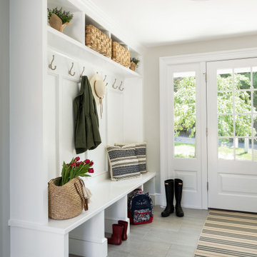
As seen in this photo, the front to back view offers homeowners and guests alike a direct view and access to the deck off the back of the house. In addition to holding access to the garage, this space holds two closets. One, the homeowners are using as a coat closest and the other, a pantry closet. You also see a custom built in unit with a bench and storage. There is also access to a powder room, a bathroom that was relocated from middle of the 1st floor layout. Relocating the bathroom allowed us to open up the floor plan, offering a view directly into and out of the playroom and dining room.

 Otto/Walker Architects
Living room - large contemporary open concept and formal medium tone wood floor living room idea in Salt Lake City with a standard fireplace, a stone fireplace, white walls and no tv
1