
Search results for "Opposite typical" in Home Design Ideas
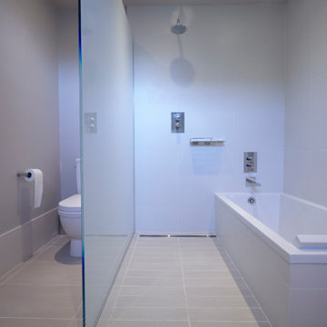
 Dale Cohen Designstudio
Asked by her client to review a typically mundane South Hampton ‘50s saltbox because “the last designer they talked to said they would have to add on to make the house anything,” Ms. Cohen approached the renovation in exactly the opposite manner. To refine the small building footprint, precise architectural gestures were used with a series of finely calibrated moments make the space more gracious and welcoming. Architectural acts were bold in concept but not in actual construction work; such as capturing the car garage to add a hyper modern sunroom/den along with a powder room and laundry. Reconfiguring one side of the house’s roofline to manipulate the space into a sensational master suite saved the north side of the house from remaining an un-useful attic space. This inner sanctum of bedroom and master bath is reminiscent of a Hampton’s beachscape in all its elegance and minimalism. The only square footage actually added was a tiny 4X4 corner as an addition to the front entry, oddly an essential piece of real estate to make an actual vestibule. All these refinements make for a crafted, articulate result rather than bowing to the bigger is better theme, which is more prevalent in the Hamptons.
The function of the plan and the accompanying finishes are impressive. The Jack and Jill bathroom, an invention of the American post-war housing boom, was outfitted in handsome walnut Duravit vanity cabinets and neutral finishes. The master bath, with its expansive skylights, might be mistaken for a conceptual art installation due to its evocative marble countertop in striped ethereal hues. Finally, Ms. Cohen uses wallpaper like a museum curator, hanging an iconic Knoll pattern to punctuate the dining/media space.
Each room in the house was sculpted via a palette of watercolor blue of varying saturations. Fabrics were culled from the greats of modernist textiles, Maharam’s Quatrefoil pattern in blue and Knoll classic Sway pattern in sea shades. The blue on white “beach” scheme runs from a soft cotton candy sky in the girl’s room to an immersive David Sutherland Park Bark wallpaper in the powder room. This intellectual inquiry as to what are the true colors at the beach belays the sophistication that surpasses the usual nautical curse of the average beach house. Out of the corner of your eye, in almost every quadrant of the house, is a burst of colorful expression and delight; this serves as Ms. Cohen’s painterly gift to the client.
Ms. Cohen’s hidden strength is her ability to choreograph a seating area. Whether it is a formal living room or the ultimate hang out spot, each space has the right amount of distance, intimacy and dare I say intrigue to make the arrangements inviting. Each conversation, because it really looks like a fine chat can be had, has an elegant side table ready for duty and all tête-à-têtes are regulated to a sumptuous area rugs. Habitants in Ms. Cohen’s world only work through deep discourse.
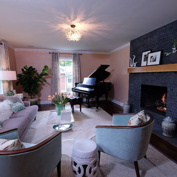
 TKS Design Group
Free ebook, Creating the Ideal Kitchen. DOWNLOAD NOW
The Klimala’s and their three kids are no strangers to moving, this being their fifth house in the same town over the 20-year period they have lived there. “It must be the 7-year itch, because every seven years, we seem to find ourselves antsy for a new project or a new environment. I think part of it is being a designer, I see my own taste evolve and I want my environment to reflect that. Having easy access to wonderful tradesmen and a knowledge of the process makes it that much easier”.
This time, Klimala’s fell in love with a somewhat unlikely candidate. The 1950’s ranch turned cape cod was a bit of a mutt, but it’s location 5 minutes from their design studio and backing up to the high school where their kids can roll out of bed and walk to school, coupled with the charm of its location on a private road and lush landscaping made it an appealing choice for them.
“The bones of the house were really charming. It was typical 1,500 square foot ranch that at some point someone added a second floor to. Its sloped roofline and dormered bedrooms gave it some charm.” With the help of architect Maureen McHugh, Klimala’s gutted and reworked the layout to make the house work for them. An open concept kitchen and dining room allows for more frequent casual family dinners and dinner parties that linger. A dingy 3-season room off the back of the original house was insulated, given a vaulted ceiling with skylights and now opens up to the kitchen. This room now houses an 8’ raw edge white oak dining table and functions as an informal dining room. “One of the challenges with these mid-century homes is the 8’ ceilings. I had to have at least one room that had a higher ceiling so that’s how we did it” states Klimala.
The kitchen features a 10’ island which houses a 5’0” Galley Sink. The Galley features two faucets, and double tiered rail system to which accessories such as cutting boards and stainless steel bowls can be added for ease of cooking. Across from the large sink is an induction cooktop. “My two teen daughters and I enjoy cooking, and the Galley and induction cooktop make it so easy.” A wall of tall cabinets features a full size refrigerator, freezer, double oven and built in coffeemaker. The area on the opposite end of the kitchen features a pantry with mirrored glass doors and a beverage center below.
The rest of the first floor features an entry way, a living room with views to the front yard’s lush landscaping, a family room where the family hangs out to watch TV, a back entry from the garage with a laundry room and mudroom area, one of the home’s four bedrooms and a full bath. There is a double sided fireplace between the family room and living room. The home features pops of color from the living room’s peach grass cloth to purple painted wall in the family room. “I’m definitely a traditionalist at heart but because of the home’s Midcentury roots, I wanted to incorporate some of those elements into the furniture, lighting and accessories which also ended up being really fun. We are not formal people so I wanted a house that my kids would enjoy, have their friends over and feel comfortable.”
The second floor houses the master bedroom suite, two of the kids’ bedrooms and a back room nicknamed “the library” because it has turned into a quiet get away area where the girls can study or take a break from the rest of the family. The area was originally unfinished attic, and because the home was short on closet space, this Jack and Jill area off the girls’ bedrooms houses two large walk-in closets and a small sitting area with a makeup vanity. “The girls really wanted to keep the exposed brick of the fireplace that runs up the through the space, so that’s what we did, and I think they feel like they are in their own little loft space in the city when they are up there” says Klimala.
Designed by: Susan Klimala, CKD, CBD
Photography by: Carlos Vergara
For more information on kitchen and bath design ideas go to: www.kitchenstudio-ge.com
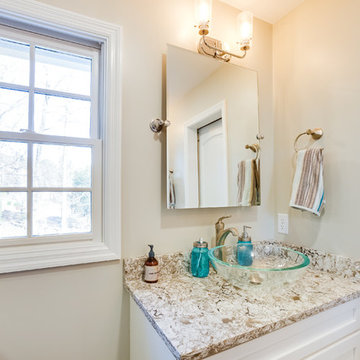
 Highland Design+Build
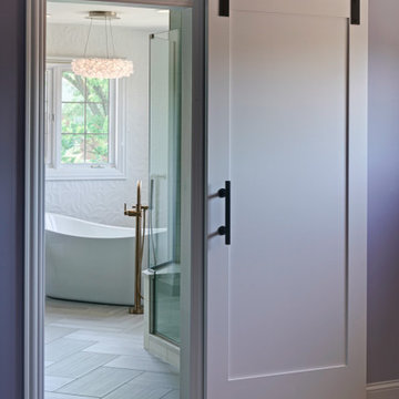
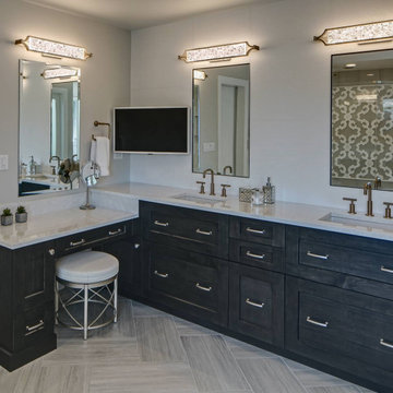
This typical 1980͛s master bath was a 5͛ x 8͛ foot space with a single vanity, small, angled shower and modest linen closet. The homeowner͛s desire was to have two sinks, a soaking tub, shower and toilet all in the same 5͛ x 8͛ space. This certainly posed a design challenge. Deleting the linen closet and relocating the toilet allowed for a ͚wet room͛ design concept. This enabled the homeowner͛s to incorporate both a soaking tub and a tile shower with a frameless glass enclosure. A sliding barn door replaced the old existing inswing door making room for his & her vanities opposite each other. The 12 x 24 porcelain tile covers the bath floor and wraps the shower walls to the ceiling. This adds visual depth to this small space. A glass and metal hexagon accent band create a pop of color and texture in the shower. This bath was made complete with Cambria Bellingham quartz countertops, glass vessel bowls and coordinating glass knobs on the vanity cabinetry.
205 Photography
Find the right local pro for your project
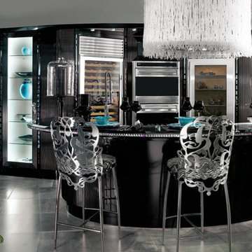
 Art & Smart Inc
It’s a fascinating evolution of one of the best seller collection, now even more stylish and really haute couture. It now proposed with palm wood, combined with white mother pearl color. The contrast between colors and grains becomes “the game of opposite” between the kitchen area and dining area with wine cellar column as ideal partition of spaces. Design of pillars is now more essential and clean and matches perfectly with the well-known design of vertical lines typical of Diamond style.
 Drury Design
The original idea was to update the tile floor and the tub. That’s it.
A further discussion of wants and needs revealed intentions for an eventual larger shower and an improved vanity storage. It made sense to map out the possibilities and design our update with potential next steps in mind. The process was exciting, ultimately leading to the decision to do a full primary bath remodel.
Design Objectives:
-Maintain existing locations for all major bathroom functions
-Make the shower larger and more open
-Use luxurious materials throughout
-Improve vanity storage and define accessories for specific items
-Incorporate luxury shower fixtures
-Include the latest technology
Design Challenges
-Enlarging the shower in a typical rectangular shape would block the view and light from the alcove windows behind the tub
-Logical placement of the built-in shower caddy and all shower components in accordance with how and where they were to be used
-Keeping the long, back wall free from any shower modules to maintain the decorative tile design
-Combining the owner’s existing smart home system with a comprehensive shower system
-Planning cabinetry for hidden storage and use for various small appliances and make-up
-Integrating expensive shower wall tile with less expensive wall tile for aesthetic and budget purposes
-Incorporating special design features to balance the highly decorative shower tile
Design solutions:
-A clipped corner was planned for the shower bench seat – this allowed for a larger glass wall. The glass wall at the angled bench also brought more natural light into the shower
-Thoughtful shower space design prevented the crowding of features – the shower caddy and handheld shower head were placed on the full-height wall by the shower bench, the regular shower head and body sprays remained on the opposite wall, and the rain head was placed in the center of the shower
-A multi-port DTV system was installed, providing control of all shower components, including chromotherapy and music inside and outside the shower
-The lavish water-jet stone and glass decorative tile was paired with a less-expensive glass tile found in the mosaic
-Pull-out grooming organizers and electrical docking stations were incorporated into the cabinetry
Additional storage was created in the lower corner cabinet
The homeowners are thrilled with their new primary bathroom. Clear goals and carefully evaluated materials informed a fun and functional design that is both thoughtful and sumptuous!
 Dale Cohen Designstudio
Asked by her client to review a typically mundane South Hampton ‘50s saltbox because “the last designer they talked to said they would have to add on to make the house anything,” Ms. Cohen approached the renovation in exactly the opposite manner. To refine the small building footprint, precise architectural gestures were used with a series of finely calibrated moments make the space more gracious and welcoming. Architectural acts were bold in concept but not in actual construction work; such as capturing the car garage to add a hyper modern sunroom/den along with a powder room and laundry. Reconfiguring one side of the house’s roofline to manipulate the space into a sensational master suite saved the north side of the house from remaining an un-useful attic space. This inner sanctum of bedroom and master bath is reminiscent of a Hampton’s beachscape in all its elegance and minimalism. The only square footage actually added was a tiny 4X4 corner as an addition to the front entry, oddly an essential piece of real estate to make an actual vestibule. All these refinements make for a crafted, articulate result rather than bowing to the bigger is better theme, which is more prevalent in the Hamptons.
The function of the plan and the accompanying finishes are impressive. The Jack and Jill bathroom, an invention of the American post-war housing boom, was outfitted in handsome walnut Duravit vanity cabinets and neutral finishes. The master bath, with its expansive skylights, might be mistaken for a conceptual art installation due to its evocative marble countertop in striped ethereal hues. Finally, Ms. Cohen uses wallpaper like a museum curator, hanging an iconic Knoll pattern to punctuate the dining/media space.
Each room in the house was sculpted via a palette of watercolor blue of varying saturations. Fabrics were culled from the greats of modernist textiles, Maharam’s Quatrefoil pattern in blue and Knoll classic Sway pattern in sea shades. The blue on white “beach” scheme runs from a soft cotton candy sky in the girl’s room to an immersive David Sutherland Park Bark wallpaper in the powder room. This intellectual inquiry as to what are the true colors at the beach belays the sophistication that surpasses the usual nautical curse of the average beach house. Out of the corner of your eye, in almost every quadrant of the house, is a burst of colorful expression and delight; this serves as Ms. Cohen’s painterly gift to the client.
Ms. Cohen’s hidden strength is her ability to choreograph a seating area. Whether it is a formal living room or the ultimate hang out spot, each space has the right amount of distance, intimacy and dare I say intrigue to make the arrangements inviting. Each conversation, because it really looks like a fine chat can be had, has an elegant side table ready for duty and all tête-à-têtes are regulated to a sumptuous area rugs. Habitants in Ms. Cohen’s world only work through deep discourse.
 Drury Design
The original idea was to update the tile floor and the tub. That’s it.
A further discussion of wants and needs revealed intentions for an eventual larger shower and an improved vanity storage. It made sense to map out the possibilities and design our update with potential next steps in mind. The process was exciting, ultimately leading to the decision to do a full primary bath remodel.
Design Objectives:
-Maintain existing locations for all major bathroom functions
-Make the shower larger and more open
-Use luxurious materials throughout
-Improve vanity storage and define accessories for specific items
-Incorporate luxury shower fixtures
-Include the latest technology
Design Challenges
-Enlarging the shower in a typical rectangular shape would block the view and light from the alcove windows behind the tub
-Logical placement of the built-in shower caddy and all shower components in accordance with how and where they were to be used
-Keeping the long, back wall free from any shower modules to maintain the decorative tile design
-Combining the owner’s existing smart home system with a comprehensive shower system
-Planning cabinetry for hidden storage and use for various small appliances and make-up
-Integrating expensive shower wall tile with less expensive wall tile for aesthetic and budget purposes
-Incorporating special design features to balance the highly decorative shower tile
Design solutions:
-A clipped corner was planned for the shower bench seat – this allowed for a larger glass wall. The glass wall at the angled bench also brought more natural light into the shower
-Thoughtful shower space design prevented the crowding of features – the shower caddy and handheld shower head were placed on the full-height wall by the shower bench, the regular shower head and body sprays remained on the opposite wall, and the rain head was placed in the center of the shower
-A multi-port DTV system was installed, providing control of all shower components, including chromotherapy and music inside and outside the shower
-The lavish water-jet stone and glass decorative tile was paired with a less-expensive glass tile found in the mosaic
-Pull-out grooming organizers and electrical docking stations were incorporated into the cabinetry
Additional storage was created in the lower corner cabinet
The homeowners are thrilled with their new primary bathroom. Clear goals and carefully evaluated materials informed a fun and functional design that is both thoughtful and sumptuous!
Sponsored
Columbus, OH

Hope Restoration & General Contracting
Columbus Design-Build, Kitchen & Bath Remodeling, Historic Renovations
 Sans Soucie Art Glass
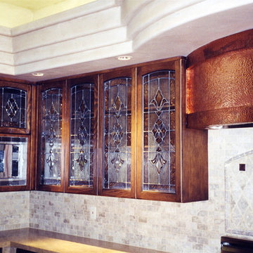
Decorative frosted and etched cabinet glass by Sans Soucie is hand-crafted, sandblast frosted and 3D carved. Cabinet glass can be created in any size or glass thickness, but will typically be 3/16" thick unless otherwise specified. The glass will have seamed edges (not polished, but rough sanded so the edges are not sharp) and will be tempered for strength and safety. Sans Soucie designs are sandblasted different ways, creating different effects for different levels of price and obscurity, depending on the need. The two most popular effects for cabinet glass are what's known as solid frosted glass: negative and positive effects. Solid frosted means that the sandblasted design elements are solid white, and have no varying sandblast density or depths. Positive is where the design elements are frosted and the background is clear. Negative is just the opposite: The design elements are clear glass and the background is frosted. Of the Sans Soucie Art Glass effects, these two are the lowest in price. Next up is 2D surface etched. 2D features "shaded" areas where the sandblast density will vary from solid frost, then fades back out to clear glass, creating a dimensional effect. The sandblasting is on the top surface only and is not cut deep into the glass like 3D carved glass. 3D carved glass is our most popular, trademark effect. Along with the shading or varying density in the sandblasting, 3D carving features a sculpted, relief texture of varying depths. The sandblast artist literally cuts deep into the glass. The edges of the carving illuminate bright as they pick up and reflect the surrounding light. If color is desired, the 3D carved glass is airbrushed with color, creating our 3D carved and painted glass. Sans Soucie has hundreds of designs available in our archives, from simple to extravagant. Let Sans Soucie Art Glass create the perfect cabinet glass to compliment and coordinate with your kitchen decor!
 Renovisions
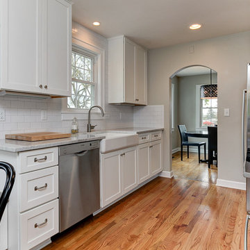
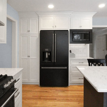
This client requested that we design her new kitchen space to look and function with her and her family’s usage in mind. She was not happy with her existing kitchen due to builder-grade ceramic flooring, lack of countertop space, poor lighting, inadequate and unorganized storage and the closed off feel of the area. Renovisions resolved all of these issues by designing and building an impressive, transitional styled kitchen; delivering a beautifully well thought-out space that provides a multi-functional approach and meets the needs of this busy and dynamic household.
Typically, we encounter challenges in every project, and this was no different. The upstairs bathroom plumbing ran across the entire length of the kitchen sink wall and it was necessary to work with it by moving the plumbing as far up as possible and then building a soffit to hide it.
Creating a space that has a more open feel was top of mind for our client. Installing a new wood floor that matched the existing dining room floor helped with this and in addition, warmed up the room. By relocating the refrigerator to the opposite wall and adding a bar area at the end toward the family room, the flow of traffic for family members and guests became more managed.
The open floor plan allowed for additional island cabinets to accommodate smart storage and better functionality when prepping meals, sitting to eat or gathering with friends and family. We believe having ample countertop surface space is a critical improvement in any renovation and this particular project now boasts a large countertop area with a stunning wide vein pattern that accentuates the design instead of overpowering it. The soft look of the Blanco Arabescato quartz enhances the space and looks lovely with the white inset styled cabinetry.
Beauty and function go hand-in-hand in this kitchen with several exceptional elements such as under-cabinet lighting with dimmers to control the mood light. Glass doors were added to the wall cabinets which flank the wine rack for displaying their decorative glassware and a beverage cooler below provided added convenience and access to cold beverages. The GE Café line of appliances in ‘Slate’ and ‘Stainless Steel’ finishes are a stunning contrast here.
The sensational looking decorative marble 6”x6” backsplash tile over the gas range and in the bar area creates nice focal points by creating a unique look for her that family and guests love.
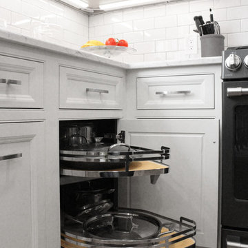
Convenient and functional elements were added such as a blind corner pull-out for easier pot/pan storage, a sweep-o-vac under cabinet vacuum system for those constant quick clean-ups, a pull-out caddy under the sink base for storage of cleaning products and a protective mat to collect potential spills.
Our client let us know it was time for a change and we listened. She shared a few pictures she loved from a home magazine, we shared our insight and then designed/built the kitchen of her dreams! … A fabulous and functional space.
 Renovisions
This client requested that we design her new kitchen space to look and function with her and her family’s usage in mind. She was not happy with her existing kitchen due to builder-grade ceramic flooring, lack of countertop space, poor lighting, inadequate and unorganized storage and the closed off feel of the area. Renovisions resolved all of these issues by designing and building an impressive, transitional styled kitchen; delivering a beautifully well thought-out space that provides a multi-functional approach and meets the needs of this busy and dynamic household.
Typically, we encounter challenges in every project, and this was no different. The upstairs bathroom plumbing ran across the entire length of the kitchen sink wall and it was necessary to work with it by moving the plumbing as far up as possible and then building a soffit to hide it.
Creating a space that has a more open feel was top of mind for our client. Installing a new wood floor that matched the existing dining room floor helped with this and in addition, warmed up the room. By relocating the refrigerator to the opposite wall and adding a bar area at the end toward the family room, the flow of traffic for family members and guests became more managed.
The open floor plan allowed for additional island cabinets to accommodate smart storage and better functionality when prepping meals, sitting to eat or gathering with friends and family. We believe having ample countertop surface space is a critical improvement in any renovation and this particular project now boasts a large countertop area with a stunning wide vein pattern that accentuates the design instead of overpowering it. The soft look of the Blanco Arabescato quartz enhances the space and looks lovely with the white inset styled cabinetry.
Beauty and function go hand-in-hand in this kitchen with several exceptional elements such as under-cabinet lighting with dimmers to control the mood light. Glass doors were added to the wall cabinets which flank the wine rack for displaying their decorative glassware and a beverage cooler below provided added convenience and access to cold beverages. The GE Café line of appliances in ‘Slate’ and ‘Stainless Steel’ finishes are a stunning contrast here.
The sensational looking decorative marble 6”x6” backsplash tile over the gas range and in the bar area creates nice focal points by creating a unique look for her that family and guests love.
Convenient and functional elements were added such as a blind corner pull-out for easier pot/pan storage, a sweep-o-vac under cabinet vacuum system for those constant quick clean-ups, a pull-out caddy under the sink base for storage of cleaning products and a protective mat to collect potential spills.
Our client let us know it was time for a change and we listened. She shared a few pictures she loved from a home magazine, we shared our insight and then designed/built the kitchen of her dreams! … A fabulous and functional space.
 K Squared Builders - Dale Kramer
Warmly Inviting
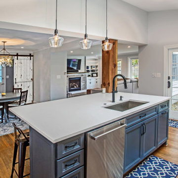
Kitchen and Dining room"
Out: brick bearing walls, old porch, tiny kitchen, confining dining room,
In: light filled addition, open floorplan with front to back sight lines, stunning kitchen, spacious island, warm reclaimed column and shelving.
"The Dining and Mud Rooms"
After converting the tiny kitchen into a mudroom with a centered doorway, the typical daily accumulated shoes, backpacks and coats now can easily be hidden from view simply by sliding together the unique re-purposed barn doors. Narrow openings to the left and right were enlarged inviting guests to explore the warm and fun new spaces while allowing plenty of room to expand the table
 Tres McKinney Design
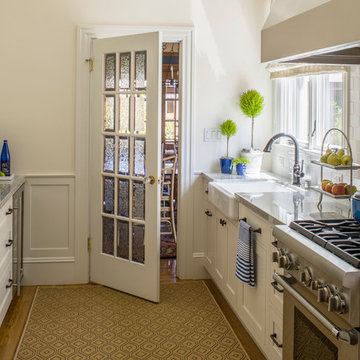
This galley kitchen was enlarged by combining it with a small service porch. The stove was moved to the window wall and a plaster hood was built in a typical turn of the century style. A new larger window was installed over the sink. The existing door to the dining room was left in place. Another existing door to a hall was moved to allow for the row of cabinetry and counter opposite the sink and stove wall. This bank of cabinets houses storage, refrigerator, pull out pantry and wine refrigerator. A microwave is housed behind closed doors.
Cabinets by Domicile SF.
General Contractor Elliot Pederson, Pederson Construction.
Photography: Andrew McKinney
 Jacobson Construction
A few years ago, the owners added two stories with finished basement to their Edina home. It was a big project that greatly expanded and enhanced the first-floor kitchen, dining room and living room. The project also added a second-floor bedroom/home office.
Their home has another two bedrooms and ¾ bath on the first floor, plus a beautiful master bedroom and ¾ bath on the second floor which they’ve been using for years.
Looking into the future they began to consider aging in place: What living on one floor might look like. They determined that the only thing that needed attention was the first-floor bath – it was pretty dated. So, they built their dream bath. They began with tearing everything out, right down to the studs.
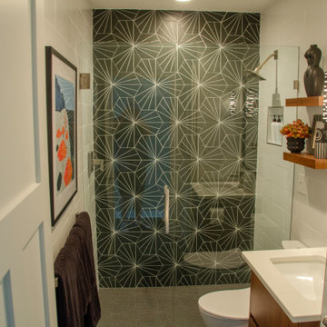
The new 5’ X 9’ ¾ bath includes a 5’ X 3’ walk-in glass enclosed shower, with a twist. The shower control has been moved from the typical location (just below the shower head) to the opposite wall, just inside the shower door. This allows one to turn on the shower and wait for it to get hot without having to step into the shower and then just stand there and get wet with cold water. A small detail that has proven to be a good idea.
The shower floor is made using 3/4" x 3/4" Penny round matte Porcelain mosaic tile set in charcoal grout. The back shower wall and the remaining bathroom floor is constructed with Aster 9" x 10" hexagon glazed Porcelain patterned wall & floor tile. Hexagonal tile adds an unusual feature that establishes a unique, interesting, repeated design.
The main bath’s walls feature white matt finish 6" x 18" ceramic Subway Wall tile in white grout.
A TOTO center flushing toilet looks great on the dark hexagonal floor tile.
The custom vanity features a walnut base with white Silestone top and undermounted Kohler sink with brushed nickel fixtures.
Another interesting feature are two 3” X 6” X 18” floating Walnut shelves – just the right touch to add character to the bath without taking up too much space.
Finally, the dimmable can lighting is enhanced with two black cylinder slotted pendant lights on either side of the vanity.
This project fulfills the promise of down-the-road one floor living with an efficient, comfortable ¾ bath.
Sponsored
Columbus, OH
Hope Restoration & General Contracting
Columbus Design-Build, Kitchen & Bath Remodeling, Historic Renovations
 Lauren Shadid Architecture + Interiors
photos by Holly Lepere
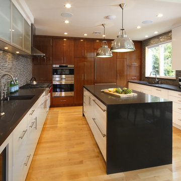
Enclosed kitchen - large contemporary u-shaped light wood floor enclosed kitchen idea in Los Angeles with an undermount sink, flat-panel cabinets, white cabinets, solid surface countertops, gray backsplash, matchstick tile backsplash, stainless steel appliances and an island
Enclosed kitchen - large contemporary u-shaped light wood floor enclosed kitchen idea in Los Angeles with an undermount sink, flat-panel cabinets, white cabinets, solid surface countertops, gray backsplash, matchstick tile backsplash, stainless steel appliances and an island
15