
Search results for "Optimal" in Home Design Ideas
 Donald A. Gardner Architects
This two-story modern farmhouse is ideal for a narrow lot with a modest width and a front entry garage. Inside, the floor plan is optimized with the master suite and an office downstairs and two bedrooms and an optional bonus room upstairs. The gourmet kitchen is a treat with an island and a sun tunnel overhead. Enjoy family togetherness with a spacious great room and dining area and a back porch for outdoor relaxation.
 Colorado Kitchen Designs
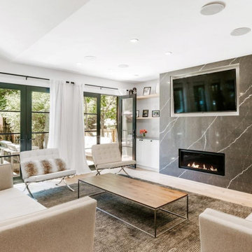
Beautiful living and dinning room in Cherry Creek Country Club. Custom cabinetry and shelving for built-in look around the fireplace wall. Gray quartz with white veining make the fireplace and tv area pop. 4 sets of glass French doors tie the back yard into the space of optimal natural light and fresh Colorado air.
 Nancy Finneson | DeMane Design
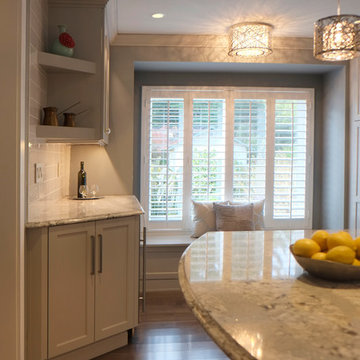
The corner has a wine cooler and handy bar area. These great cooks needed a space that allowed for entertaining and multiple work zones. Storage was optimized and is efficient with pull-outs and dividers. The kitchen has almost doubled in size and now includes two dishwashers for easy clean up. Lighting was appointed with sparkling pendants, task lighting under cabinets and even the island has a soft glow. A happy space with room to work and entertain. Photo: DeMane Design
Winner: 1st Place ASID WA, Large Kitchen
Find the right local pro for your project
 Old Saratoga Restorations Incorporated
This project was a tribute to the vision and optimism of the owners. This once-glorious home was so far gone that many people would have taken the easy path -tear it down and start over. Instead, the family hired Old Saratoga Restorations to save every original bit of material that could be salvaged and rebuild the home to its previous grandeur.
OSR gutted the interior and reinvented it based on the archaeological evidence for this home restoration. They added a new kitchen and bathrooms with high-end fixtures, custom-cabinetry and top-of-the-line appliances. Outside, everything from the siding and trim to the dilapidated cupola on top needed to be replaced with duplicates.
 Citation Kitchens
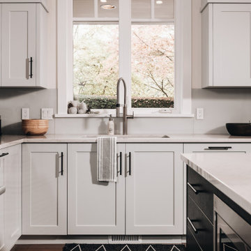
To create ample storage space, we optimized as much room as we could by installing floor to ceiling cabinetry.
Kitchen photo in Vancouver
Kitchen photo in Vancouver
 HEP Sales/North Main Lumber Waterloo
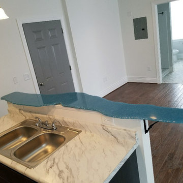
Historic 19th century block refurbished as apartment complex. Shaker-style cabinets in compact kitchen with island (apartment style #2), optimizing space while keeping everything within arm's reach. Island contains double-bowl sink and unique custom acrylic countertop on island..
 Wiles Design Group
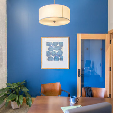
Project by Wiles Design Group. Their Cedar Rapids-based design studio offers commercial interior design services, creating functional and aesthetically pleasing environments tailored to enhance brand identity and optimize workspace efficiency. They serve the entire Midwest, including Iowa City, Dubuque, Davenport, and Waterloo, as well as North Missouri and St. Louis.
 Building Designers Association of Australia
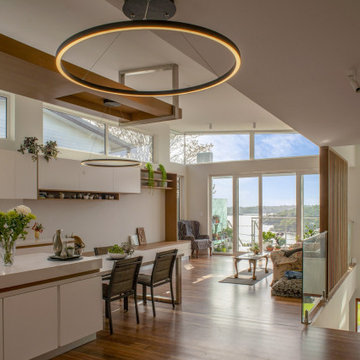
The client approached us as he had a property that benefited from an elevated position and water views over the Georges River. The current home needed a change to the layout, additional bedrooms and living spaces that captured the magnificent views and catering for their retirement. The existing property had a garage, rumpus room and two terrace’s within the front setback along the boundary which needed to remain as part of the proposal as it would not be permissible to reinstate them under the current planning rules. The floor plan of the development is meticulous in providing for the needs of the client. As seniors in their 70’s we were keen to provide easy access on a steep sloping block. The driveway, lift and elevation of the main floor level adjacent to the rear garden has achieved this brilliantly. Enjoyment of the stunning views over the river was of paramount importance and this has been elegantly achieved. There are great views from all three terraces, the entire upper floor, including the master bedroom, the lift, the rear patio and rear garden. The highlight of this home, however, is the enthusiastic manner which, both the client and designer approached the picturesque views. Large double glazed windows and doors optimally located provide wonderful thermal efficiency and a seamless connection between indoors and outdoors whilst ensuring privacy from neighbouring sites. The light and airy feeling in this space is complemented with the natural coastal finishes prevalent throughout the home.
 RAJ Kitchen and Bath, LLC
**Check out the video of this transformation on our website**
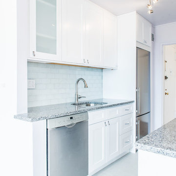
This small kitchen was way too small for this 2 bedrooms, 2 bathrooms apartment. Not only was it a very small kitchen, but the physical location of it made it very difficult to make it any bigger. There wasn't much that could have been done without incurring astronomical cost, which would get little or no return on the investment. The client wanted a kitchen that can be optimized in its current location to add a ton of value for resale.
This was difficult to do, because there was no moving of any mechanical around in the kitchen and even if we wanted to, the management of the building would not allow. For those of you who live in condos, co-ops or apartment building, you know how difficult it is to rework these foot prints. When we showed up, we saw the problems, but we also saw a huge opportunity where we can achieve those goals in the small space. This was accomplished by making some key changes and to incorporate some new things that was not possible when this kitchen was built years ago.
The crucial part of the design that would drive the entire new layout, was selecting the only appliance; that was the Refrigerator. Once we nailed down that refrigerator, we then proceeded to design the kitchen around it. We moved it to the other side of the wall where the sink was so that we can tap into the water line from the sink plumbing. It was crucial that it stays exactly 24" deep, not an inch more because we had to keep the entry as open as possible. Also, it was going to be directly in front of another big storage unit - The pantry. It is not ideal in most cases, but we needed the rest of the space to ramp up the design and open feel towards the side where all of the activities would take place, which happend to be the dining room and the view.
Once all that was figured out, we re-positioned the sink, dishwasher and the range and proceeded to wrap the cabinets around the columns to integrate them into the space. Thirty- six inches cabinets height was used so that they can be installed higher towards the ceiling height to give more room rather than the standard 18" required height between the counter tops. This was done to make the room feel a lot bigger than it really was. Not to mention, we also didn't want the faucet to be buried under the cabinets so that was also a necessary design detail for the space.
We then lowered both knee walls so that the counter top can sit on top of them, by removing that stop point that would have otherwise defined the kitchen area. This allowed us to pick up that extra footprint into the room for added prep space and enabled us to create the illusion of a kitchen that is looking longer than it really is. Every inch mattered when designing this kitchen and we made a conscious decision to use every one of that inch.
White cabinets were selected to do just what white cabinets are design to do; make a small or dark room appear bigger, brighter and more open. In this kitchen, this was amplified the more because of the kitchen location. It was perfect! We knew we did justice to the space because while we were there taking some photos, a few potential buyers walked in and went straight for the kitchen! They said its design just to fit the apartment.
Pantry roll out shelving, Double recycle bin, fancy handles, LED lighting, Quartz counter top, beautiful backslash tiles and grey linen floors finished off the kitchen which looked over a beautiful view of the George Washington Bridge from the top of this lovely 4th floor apartment.
Credit to Masterpiece Tile and Marble (Annmarie on the selection of Tiles and countertop and Val on the Construction to complete this project).
Davor Kokic Photography
 Level Custom Build
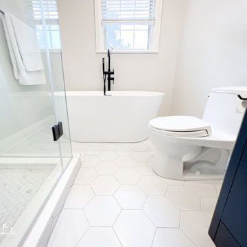
In 2022 Level Custom Build completed the renovation of this Etobicoke 4-piece bathroom. We optimized the space in order to accommodate both a freestanding tub and standing shower. The result was a modern and comfortable space.
 Tag & Associates, LLC
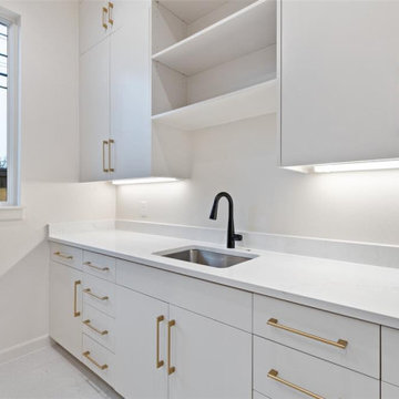
Experience the evolution of laundry rooms: multifunctional spaces blending utility with aesthetics. Smart technology enhances efficiency and sustainability. With homes shrinking, stackable units and foldable workstations optimize space. Sustainable materials address environmental concerns. Accommodating accessibility ensures everyone navigates with ease. Enjoy bright, versatile lighting, a marble counter, and scenic window views.
 Wiles Design Group
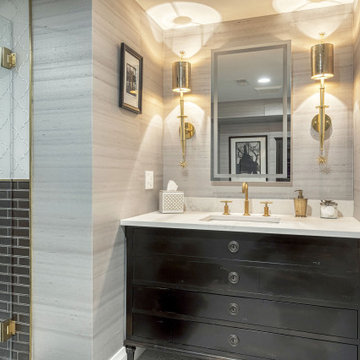
This grand and historic home renovation transformed the structure from the ground up, creating a versatile, multifunctional space. Meticulous planning and creative design brought the client's vision to life, optimizing functionality throughout.
In this en suite bathroom, a tasteful blend of two-toned shower tiles, an elegant vanity with a complementary mirror, and gold-toned fixtures create a luxurious appeal.
 Rodwin Architecture & Skycastle Construction
Rodwin Architecture and Skycastle Homes
Location: Boulder, CO, United States
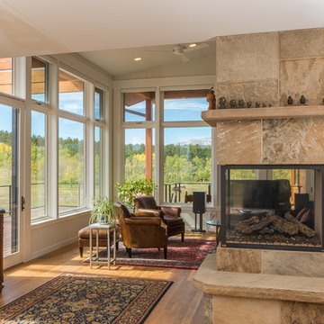
We recently completed the design and construction of this beautiful 3800 s.f. contemporary Colorado mountain home, above the foothills of Boulder. We designed the house to maximize the sweeping views of Indian Peaks mountain range, while simultaneously optimizing passive solar design. The open floor plan brings natural light and passive cooling into every part of the house; the vaulted ceilings create an airy, sunny feeling. Every room opens to generous patios and decks to facilitate easy indoor/outdoor living. White Oak floors, granite counters and local flagstone finishes lend a warm modern texture to the home. We carefully preserved one hand-built quartz wall that was part of the house that formerly occupied the site, and restored the original adjacent homestead, successfully receiving Historic Landmark designation. This very energy efficient home (HERS 40 – uses 60% less energy than allowed by code), uses solar–photovoltaics, foam insulation, Energy Star windows & appliances, LED lighting, and a high-efficiency mechanical system. It uses EPA Watersense plumbing fixtures and Xeric landscaping to dramatically reduce water
 Building Designers Association of Australia
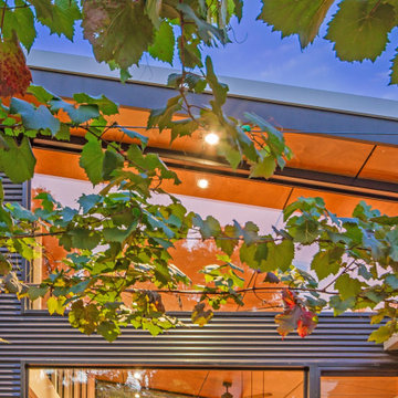
The Magpies are delighted! This stunning project is nestled in the South Australian country township of Willunga, whose name is derived from the Aboriginal word meaning “The locality of green trees”. During the course of the renovations a family of 11 magpies swooped in and now call this abundantly treed property ‘Home’. The clever design frames the natural views to the north, uninhibited by the alfresco structure. Passive solar design methodology is employed by utilising optimal eaves overhang allowing warming winter sun to penetrate into the interior of the building, whilst excluding the harsh rays during summer. A blending of the old and new help to keep a sense of history whilst combining a modern, natural feel with a semi industrial working space. Bringing the outdoors in by maximising the views of the abundant vegetation and birdlife is a feature of this addition. Well known local identities, and the owners of this spectacular building, are now enjoying their lifestyle passion for preparing food and entertaining in this enlarged, purpose built space…. As are their fine feathered friends.

 WEST STUDIO Architects & Construction Services
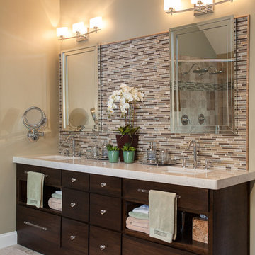
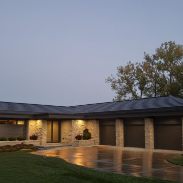
A "Positive Energy House" powered entirely by the Sun and Earth that generates more clean energy than is needed to maintain itself. Solar Roof Shingles, Optimal Site Orientation, Battery Storage, Geothermal Heating and Cooling systems combine to power, heat and cool this home.
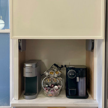
 Andersonville Kitchen & Bath
Easy access lift cabinetry here, optimal for storing those kitchen appliances like mixers, coffee machines, small microwaves, etc, keep them nearby but out of sight!
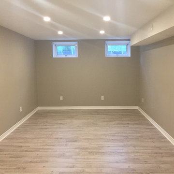
 EZDimensions - Home Renovation Design to Permits
Large one bedroom space.
Bedroom - contemporary bedroom idea in Other
Bedroom - contemporary bedroom idea in Other
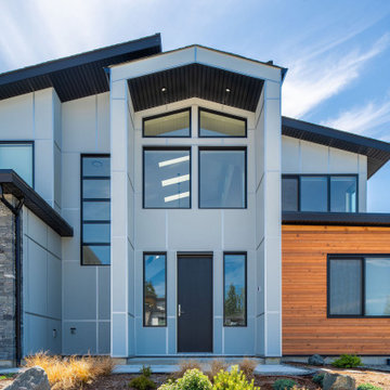
 Made To Last Custom Homes Ltd.
This modern style custom home is 2,642 sq.ft. over two levels. Modern Valley has 3 bedrooms, 3 bathrooms, and an office.
The grand entryway is a major feature of this home. Our client desired to make a statement with a unique architectural design. The tall open gable entry achieves that.
Expansive windows flood the whole home with natural light. In addition, they enhance the exterior design. They also optimize views of the surrounding valley.
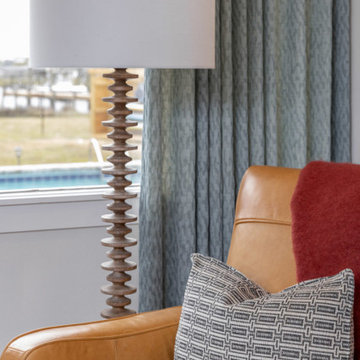
 In Detail Interiors
Cozy and Colorful Beach House Remodel!
When you think funky little house by the beach – images like what you are about to see may not be what you would have anticipated. This furnishings project aimed to capture a colorful, fun, active space for a family who wanted to feel at home .Thus, creating casual and comfortable but not boring in the least. A little traveled, a lot of texture, and not much clutter!
From the start, the space was not much to write home about!
The common living areas were boxy with lower ceilings. Quirky ins and outs needed to be optimized. Overall, this project was a prime opportunity for us to really dig in. From treating each room top to bottom and finding the client’s mojo when it came to wallcoverings. Selecting funky lighting and the right mix and match of bold colors and more natural, organic textures.
We came in too late to get involved with the kitchen but helped the client with a few little accents and color choices. Thus, acting as a jumping off point for the large dining space featuring a beautiful (and resilient!) wooden trestle table. We created a mix of seating that offers a little funk, and the fun additional cabinet storage to each end which offered a hideaway. We loved that this vista had such opportunity for great lighting and art, also!
A Colorful, Cozy Living Room
We knew we needed a cozy, lower profile seating area but also some sort of great reading nook by the fireplace. With the large windows and the main entry just off this space, a traffic pattern was delianted that helped guide decisions with the furniture. A funky, nubbier woven fabric on the sectional that hinted towards mid-century modern. The irregular shaped, petrified wood coffee table. The bold statement and colors carried through in the wallcovering and area rug. Jumping to the fireplace area where you can lounge or read with those gorgeous cognac leather recliners. This space needed to feel separate and the same all at once. The balance of scale and colors really helped achieve this!
Can’t forget the bedrooms!
Of course we can’t get by without mentioning a little bedroom love, either.
In the master the overall designs dictated by a bold, saturated woven wood cloth on the headboard wall. We love the mix of color and pattern in here. The bold, sexier mood is 100% a byproduct of the level of rich colors and unusual combinations. Those bold hand-glazed ceramic lamps against those strict geo-pattern bed pillows – so good!
Our sweet tween bedroom that should grow with her for a good, long time. All in all, filled with original art and layered in a softer palette. There was a lot of matching in here at first, but once we convinced her to trust us she started to understand why adding in the unexpected hit of bright coral and spring green made everything sing!
157