
Search results for "Original indoor" in Home Design Ideas
 Dyna Builders
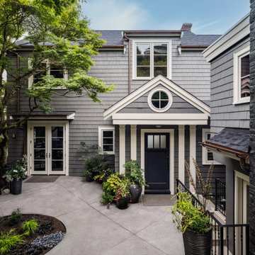
Nestled on a hillside in Seattle’s Magnolia neighborhood, this meticulously renovated home reflects a
decade-plus evolution of thoughtful design, craftsmanship, and connection to its waterfront
surroundings. Originally built in 1925 as a modest beach cabin, the house underwent significant
changes over the years, culminating in a recent third-floor addition and comprehensive updates to its
interiors and finishes. The latest iteration was constructed by Dyna Builders in collaboration with Paul
Moon Design, whose architectural and interior design infused the space with a distinct nautical
sensibility.
The home’s transformation began with a full rebuild by Paul Moon Design in 2010, maintaining the
original footprint but completely reimagining the structure. Challenges such as the site’s steep slope
and the structure’s aging infrastructure necessitated rebuilding atop the existing foundation. In 2018,
this latest design phase introduced a third floor to accommodate an office, primary suite, and a deck
with expansive views of Discovery Park, Bainbridge Island, and the Puget Sound. Design inspiration was drawn from the compact efficiency of a yacht’s interior, where every inch of space serves a
purpose. This maritime influence extended to material choices, with teak used in the bathrooms and
porthole-style windows nodding to the home's waterside location.
The interiors blend natural woods, light tones, and brass accents, balancing a refined yet
approachable aesthetic. White oak flooring and stained cedar shiplap bring warmth to the main living
areas, accentuated by salvaged wood beams incorporated into vaulted ceilings. These cohesive
elements extend from the media room on the lower level to the primary suite’s chevron-patterned
flooring and bespoke wardrobe systems.
Kitchen updates preserved its compact, efficient layout but was updated with brass hardware, glass-
fronted cabinetry and a new steel hood fabricated by the Dyna metal shop. The dining area features
custom wine storage and a dining bar that opens to the outdoors, blurring the line between indoor
and outdoor spaces.
With multiple intimate lounge areas, the home encourages a lifestyle of relaxation and connection to
nature. Its design celebrates the challenges of its hillside site, transforming a once-simple cottage into
a finely tuned retreat that captures the quintessential feeling of living on the water.

 Marvin
Architect: Patrick Ahearn Architect LLC
Construction: Rosbeck
BuildersInteriors: Slifer Designs
Photography By: Greg Premru
“Rigorously symmetrical yet relaxed in shape and proportions, this house is very well executed inside and out. It feels appropriately sized for its site and is well detailed. It’s by far the best of the Shingle Style submittals.”
The project is a new construction of a family compound consisting of two new houses and associated site development along South Beach. Due to the topography of the nearby dunes, the living spaces of the main and guest houses were located on the second floor in order to gain the panoramic views of the ocean and extended coastline beyond. The challenge was to create a shingle-style island vernacular architecture that did not reflect the upside-down nature of the primary living space.
The inspiration was based on the desire to take a large program and break it into smaller architectural elements based on the idea that the homes could have originally been constructed in the 1920s or 1930s and then added onto over time. This concept of "implied history" is one that creates a legacy of a seaside architecture from the rich history of New England’s past, yet has evolved into how people want to live today.
The Marvin products, with their hurricane-resistant capabilities, were a clear choice based on this locale. The use of the folding door systems allowed for the ease of flow from indoor to outdoor spaces in a timeless way.
 Granit Architects + Interiors
Our clients for this project are a professional couple with a young family. They approached us to help with extending and improving their home in London SW2 to create an enhanced space both aesthetically and functionally for their growing family. We were appointed to provide a full architectural and interior design service, including the design of some bespoke furniture too.
A core element of the brief was to design a kitchen living and dining space that opened into the garden and created clear links from inside to out. This new space would provide a large family area they could enjoy all year around. We were also asked to retain the good bits of the current period living spaces while creating a more modern day area in an extension to the rear.
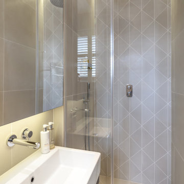
It was also a key requirement to refurbish the upstairs bathrooms while the extension and refurbishment works were underway.
The solution was a 21m2 extension to the rear of the property that mirrored the neighbouring property in shape and size. However, we added some additional features, such as the projecting glass box window seat. The new kitchen features a large island unit to create a workspace with storage, but also room for seating that is perfect for entertaining friends, or homework when the family gets to that age.
The sliding folding doors, paired with floor tiling that ran from inside to out, created a clear link from the garden to the indoor living space. Exposed brick blended with clean white walls creates a very contemporary finish throughout the extension, while the period features have been retained in the original parts of the house.
Find the right local pro for your project

 Corinthian Fine Homes
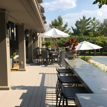
These homeowners loved their outdoor space, complete with a pool and deck, but wanted to better utilize the space for entertaining with the full kitchen experience and amenities. This update was designed keeping the Tuscan architecture of their home in mind. We built a cabana with an Italian design, complete with a kegerator, icemaker, fridge, grill with custom hood and tile backsplash and full overlay custom cabinetry. A sink for meal prep and clean up enhanced the full kitchen function. A cathedral ceiling with stained bead board and ceiling fans make this space comfortable. Additionally, we built a screened in porch with stained bead board ceiling, ceiling fans, and custom trim including custom columns tying the exterior architecture to the interior. Limestone columns with brick pedestals, limestone pavers and a screened in porch with pergola and a pool bath finish the experience, with a new exterior space that is not only reminiscent of the original home but allows for modern amenities for this family to enjoy for years to come.

 Carlton Edwards
Located in the historic Central Gardens neighborhood in Memphis, the project sought to revive the outdoor space of a 1920’s traditional home with a new pool, screened porch and garden design. After renovating the 1920’s kitchen, the client sought to improve their outdoor space. The first step was replacing the existing kidney pool with a smaller pool more suited to the charm of the site. With careful insertion of key elements the design creates spaces which accommodate, swimming, lounging, entertaining, gardening, cooking and more. “Strong, organized geometry makes all of this work and creates a simple and relaxing environment,” Designer Jeff Edwards explains. “Our detailing takes on updated freshness, so there is a distinction between new and old, but both reside harmoniously.”
The screened porch actually has some modern detailing that compliments the previous kitchen renovation, but the proportions in materiality are very complimentary to the original architecture from the 1920s. The screened porch opens out onto a small outdoor terrace that then flows down into the backyard and overlooks a small pool. We wanted to incorporate as much green as possible in the small space, so there is no pool deck. The sod of the lawn comes right up to a limestone coping around the perimeter of the pool.
Inside the pool, we used a dark plaster so that it feels more like a reflecting pool in the small space. We nestled it in around an existing Japanese maple that's bordered in seal edging and underplanted in dwarf mondo grass. The backyard is really divided into a couple of zones. So there's the central zone with the pool and lawn. There are an existing garage and guesthouse beyond, just now used as a pool house.

 Pamela Dailey Design
In the backyard of a home dating to 1910 in the Hudson Valley, a modest 250 square-foot outbuilding, at one time used as a bootleg moonshine distillery, and more recently as a bare bones man-cave, was given new life as a sumptuous home office replete with not only its own WiFi, but also abundant southern light brought in by new windows, bespoke furnishings, a double-height workstation, and a utilitarian loft.
The original barn door slides open to reveal a new set of sliding glass doors opening into the space. Dark hardwood floors are a foil to crisp white defining the walls and ceiling in the lower office, and soft shell pink in the double-height volume punctuated by charcoal gray barn stairs and iron pipe railings up to a dollhouse-like loft space overhead. The desktops -- clad on the top surface only with durable, no-nonsense, mushroom-colored laminate -- leave birch maple edges confidently exposed atop punchy red painted bases perforated with circles for visual and functional relief. Overhead a wrought iron lantern alludes to a birdcage, highlighting the feeling of being among the treetops when up in the loft.

 Jessica Leigh Interiors
Stephani Buchman Photography
Example of a mid-sized trendy u-shaped porcelain tile eat-in kitchen design in Toronto with an undermount sink, flat-panel cabinets, gray cabinets, granite countertops, gray backsplash, stone tile backsplash, stainless steel appliances and a peninsula
Example of a mid-sized trendy u-shaped porcelain tile eat-in kitchen design in Toronto with an undermount sink, flat-panel cabinets, gray cabinets, granite countertops, gray backsplash, stone tile backsplash, stainless steel appliances and a peninsula
Sponsored
Columbus, OH

Snider & Metcalf Interior Design, LTD
Leading Interior Designers in Columbus, Ohio & Ponte Vedra, Florida

 Cascade West Development
Paint by Sherwin Williams
Body Color - Wool Skein - SW 6148
Flooring & Tile by Macadam Floor & Design
Carpet Products by Dream Weaver Carpet
Main Level Carpet Cosmopolitan in Iron Frost
Counter Backsplash & Shower Niche by Glazzio Tiles
Tile Product - Orbit Series in Meteor Shower
Shower Wall & Mud Set Shower Pan by Emser Tile
Shower Wall Product - Esplanade in Alley
Mud Set Shower Pan Product - Venetian Pebbles in Medici Blend
Bathroom Floor by Florida Tile
Bathroom Floor Product - Sequence in Drift
Tub Wall Tile by Pental Surfaces
Tub Wall Tile Product - Parc in Botticino - 3D Bloom
Freestanding Tub by MAAX
Freestanding Tub Product - Ariosa Tub
Sinks by Decolav
Faucets by Delta Faucet
Slab Countertops by Wall to Wall Stone Corp
Main Level Granite Product Colonial Cream
Downstairs Quartz Product True North Silver Shimmer
Windows by Milgard Windows & Doors
Window Product Style Line® Series
Window Supplier Troyco - Window & Door
Window Treatments by Budget Blinds
Lighting by Destination Lighting
Interior Design by Creative Interiors & Design
Custom Cabinetry & Storage by Northwood Cabinets
Customized & Built by Cascade West Development
Photography by ExposioHDR Portland
Original Plans by Alan Mascord Design Associates

 Tradition Outdoor Living
This project included a Patio Cover Addition, Outdoor Kitchen, Gas-Burning Fireplace, and Stamped Concrete walking surface with a custom pattern. The attention is immediately drawn to the Ledgestone fire place with a rustic cedar mantel. The Ledgestone flows continuously throughout the space, found on the base of the patio columns and outdoor kitchen. The kitchen sparkles with Stainless Steel appliances, containing storage compartments, refrigerator, and grill. Topped with Venetian Gold Granite, this cooking space provides ample counter space that is easily maintained. The overall appeal of this Outdoor Living area remains beautifully traditional, with cedar-trimmed columns and beams. Also, though it has custom features, this addition is built to look original to the home with matching paint, shingles, gutters, and framing materials. The elaborate, pre-stained Tongue and Groove ceiling is quite an attractive feature to this patio cover, and the recessed lighting illuminates the evening. The fans provide adequate air-flow and the sound system keeps the patio atmosphere in tune.

 Klopf Architecture
 and Jesse Ososki Art remodeled an existing Eichler atrium home into a brighter, more open, and more functional version of its original self.
The goals were to preserve the Eichler look and feel without the need to strictly adhere to it. The scope of work included re-configuring the master bedroom/bath, the kitchen, and the hall bath/laundry area, as well as updating interior finishes throughout to be more sophisticated.
The owners are detail-oriented and were very involved in the design process, down to the selection of lighting controls and stainless steel faceplates.Their design aesthetic leans toward the Scandinavian — light and bright, with simple straight lines and pure geometric shapes.
The finish flooring is large porcelain tile (24” x 24”) in a neutral grey tone, providing a uniform backdrop against which other materials can stand out. The same tile continues into the shower floor (with a different finish texture for slip-resistance) and up the shower/tub walls (in a smaller size). Heath Classic Field ceramic tile in Modern Blue was used sparingly, to add color at the hall bath vanity backsplash and at the shampoo niches in both bathrooms. Back-painted soda glass in pale blue to match the Heath tile was used at the kitchen backsplash. This same accent color was also used at the front entry atrium door. Kitchen cabinetry, countertops, appliances, and light fixtures are all white, making the kitchen feel more airy and light. Countertops are Caesarstone Blizzard.
The owners chose to keep some of the original Eichler elements: the concrete masonry fireplace; the stained tongue-and-groove redwood ceiling decking; and the luan wall paneling. The luan paneling was lightly sanded, cleaned, and re-stained. The owners also kept an added element that was installed by a previous owner: sliding shoji panels at all bedroom windows and sliding glass doors, for both privacy and sun control. Grooves were cut into the new tile flooring for the shoji panels to slide in, creating a more integrated look. Walnut was used to add warmth and contrast at the kitchen bar top and niche, the bathroom vanities, and the window sill/ledge under the kitchen window.
This Burlingame Eichler Remodel is a 2,121 sf, 4 bedroom/2 bath home located in the heart of Silicon Valley.
Klopf Architecture Project Team: John Klopf, Klara Kevane and Yegvenia Torres Zavala
Contractor: Jesse Ososki Art
Structural Engineer: Emmanuel Pun
Photography ©2018 Mariko Reed
Location: Burlingame, CA
Year completed: 2017
 A Designed Space
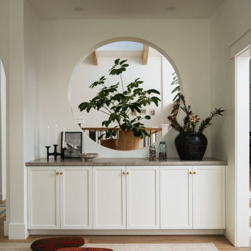
Our client sought to modernize their classic 1970s home while preserving its original charm. This full-home renovation prioritized openness and functionality. We transformed the kitchen into a bright, welcoming space, leveled the sunken living room to expand the living area, and designed seamless indoor-outdoor connections to showcase breathtaking south-west facing golf course & ocean views. The result? A beautifully updated home that harmonizes mid-century character with contemporary comfort.
The architecture was fun to work with, featuring dramatic roof pitches, a striking two-story double-sided fireplace, and thoughtfully designed room-to-room connections. Strategic wall cutouts and varying floor levels added interest and character, making this home a truly unique and dynamic space.
The kitchen connects to the exterior, dining room, and living room, and features a peninsula and a cozy morning nook for gathering. Thoughtful flow was essential for this busy space, creating distinct yet harmonious spaces to enjoy throughout the home.
Texture was thoughtfully incorporated using natural materials, including quartzite with cloud-like movement, woven light fixtures, and high-variation ceramic tile. The oak flooring, rich with knots and striking grain patterns, adds warmth and character to the space.
 KitchenLab Interiors
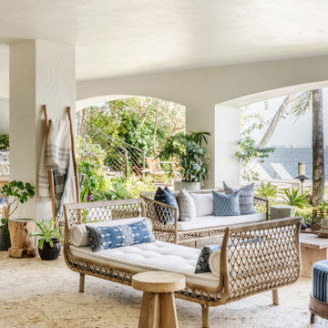
Coconut Grove is Southwest of Miami beach near coral gables and south of downtown. It’s a very lush and charming neighborhood. It’s one of the oldest neighborhoods and is protected historically. It hugs the shoreline of Biscayne Bay. The 10,000sft project was originally built
17 years ago and was purchased as a vacation home. Prior to the renovation the owners could not get past all the brown. He sails and they have a big extended family with 6 kids in between them. The clients wanted a comfortable and causal vibe where nothing is too precious. They wanted to be able to sit on anything in a bathing suit. KitchenLab interiors used lots of linen and indoor/outdoor fabrics to ensure durability. Much of the house is outside with a covered logia.
The design doctor ordered the 1st prescription for the house- retooling but not gutting. The clients wanted to be living and functioning in the home by November 1st with permits the construction began in August. The KitchenLab Interiors (KLI) team began design in May so it was a tight timeline! KLI phased the project and did a partial renovation on all guest baths. They waited to do the master bath until May. The home includes 7 bathrooms + the master. All existing plumbing fixtures were Waterworks so KLI kept those along with some tile but brought in Tabarka tile. The designers wanted to bring in vintage hacienda Spanish with a small European influence- the opposite of Miami modern. One of the ways they were able to accomplish this was with terracotta flooring that has patina. KLI set out to create a boutique hotel where each bath is similar but different. Every detail was designed with the guest in mind- they even designed a place for suitcases.

 SGDI - Sarah Gallop Design Inc.
The objective was to create a warm neutral space to later customize to a specific colour palate/preference of the end user for this new construction home being built to sell. A high-end contemporary feel was requested to attract buyers in the area. An impressive kitchen that exuded high class and made an impact on guests as they entered the home, without being overbearing. The space offers an appealing open floorplan conducive to entertaining with indoor-outdoor flow.
Due to the spec nature of this house, the home had to remain appealing to the builder, while keeping a broad audience of potential buyers in mind. The challenge lay in creating a unique look, with visually interesting materials and finishes, while not being so unique that potential owners couldn’t envision making it their own. The focus on key elements elevates the look, while other features blend and offer support to these striking components. As the home was built for sale, profitability was important; materials were sourced at best value, while retaining high-end appeal. Adaptations to the home’s original design plan improve flow and usability within the kitchen-greatroom. The client desired a rich dark finish. The chosen colours tie the kitchen to the rest of the home (creating unity as combination, colours and materials, is repeated throughout).
Photos- Paul Grdina
Sponsored
Columbus, OH

Wannemacher Interiors
Customized Award-Winning Interior Design Solutions in Franklin Cnty OH
 SGDI - Sarah Gallop Design Inc.
The objective was to create a warm neutral space to later customize to a specific colour palate/preference of the end user for this new construction home being built to sell. A high-end contemporary feel was requested to attract buyers in the area. An impressive kitchen that exuded high class and made an impact on guests as they entered the home, without being overbearing. The space offers an appealing open floorplan conducive to entertaining with indoor-outdoor flow.
Due to the spec nature of this house, the home had to remain appealing to the builder, while keeping a broad audience of potential buyers in mind. The challenge lay in creating a unique look, with visually interesting materials and finishes, while not being so unique that potential owners couldn’t envision making it their own. The focus on key elements elevates the look, while other features blend and offer support to these striking components. As the home was built for sale, profitability was important; materials were sourced at best value, while retaining high-end appeal. Adaptations to the home’s original design plan improve flow and usability within the kitchen-greatroom. The client desired a rich dark finish. The chosen colours tie the kitchen to the rest of the home (creating unity as combination, colours and materials, is repeated throughout).
Photos- Paul Grdina

 Mark Levy Studio
"Looking Out", whose individual window size is 36" x 42" each, is located in our clients' hers-masterbath. Privacy was chief among the requirements for the space, so we used two heavily-textured clear glass selections along with the colors that were taken from their art collection.
The windows are contained in operable maple frames (for fresh air when desired) that feature 1" thick I.G.U.'s (Insulated Glass Units) that encapsulate the art-glass between two sheets of tempered glass. This feature allows for ease of care, and offers superb acoustical properties for noise reduction.
Photo: Mark Levy Studio
 Cascade West Development
Paint by Sherwin Williams
Body Color - Wool Skein - SW 6148
Flex Suite Color - Universal Khaki - SW 6150
Downstairs Guest Suite Color - Silvermist - SW 7621
Downstairs Media Room Color - Quiver Tan - SW 6151
Exposed Beams & Banister Stain - Northwood Cabinets - Custom Truffle Stain
Gas Fireplace by Heat & Glo
Flooring & Tile by Macadam Floor & Design
Hardwood by Shaw Floors
Hardwood Product Kingston Oak in Tapestry
Carpet Products by Dream Weaver Carpet
Main Level Carpet Cosmopolitan in Iron Frost
Downstairs Carpet Santa Monica in White Orchid
Kitchen Backsplash by Z Tile & Stone
Tile Product - Textile in Ivory
Kitchen Backsplash Mosaic Accent by Glazzio Tiles
Tile Product - Versailles Series in Dusty Trail Arabesque Mosaic
Sinks by Decolav
Slab Countertops by Wall to Wall Stone Corp
Main Level Granite Product Colonial Cream
Downstairs Quartz Product True North Silver Shimmer
Windows by Milgard Windows & Doors
Window Product Style Line® Series
Window Supplier Troyco - Window & Door
Window Treatments by Budget Blinds
Lighting by Destination Lighting
Interior Design by Creative Interiors & Design
Custom Cabinetry & Storage by Northwood Cabinets
Customized & Built by Cascade West Development
Photography by ExposioHDR Portland
Original Plans by Alan Mascord Design Associates

 ODS Architecture
Originally a nearly three-story tall 1920’s European-styled home was turned into a modern villa for work and home. A series of low concrete retaining wall planters and steps gradually takes you up to the second level entry, grounding or anchoring the house into the site, as does a new wrap around veranda and trellis. Large eave overhangs on the upper roof were designed to give the home presence and were accented with a Mid-century orange color. The new master bedroom addition white box creates a better sense of entry and opens to the wrap around veranda at the opposite side. Inside the owners live on the lower floor and work on the upper floor with the garage basement for storage, archives and a ceramics studio. New windows and open spaces were created for the graphic designer owners; displaying their mid-century modern furnishings collection.
A lot of effort went into attempting to lower the house visually by bringing the ground plane higher with the concrete retaining wall planters, steps, wrap around veranda and trellis, and the prominent roof with exaggerated overhangs. That the eaves were painted orange is a cool reflection of the owner’s Dutch heritage. Budget was a driver for the project and it was determined that the footprint of the home should have minimal extensions and that the new windows remain in the same relative locations as the old ones. Wall removal was utilized versus moving and building new walls where possible.
Photo Credit: John Sutton Photography.
Sponsored
Columbus, OH
Wannemacher Interiors
Customized Award-Winning Interior Design Solutions in Franklin Cnty OH

 AV Architects + Builders
Location: Great Falls, VA, US
We suggested a French Country design to solve our clients’ needs and they couldn’t agree more. Originally, the kitchen was way to widespread and disjointed, not allowing for easy access to their backyard where they spend most of their time with their kids. The main house entry was misplaced in the mudroom and the food prep area was far too small. We made sure to integrate the kitchen with the rest of the home, as the other parts were already modernized and renovated. The kitchen layout was streamlined to include a large and comfortable dining room space, with a prep area now sitting comfortably off to the side where as it doesn’t interfere with guests but still in walking distance.
Stacy Zarin Photography
 SGDI - Sarah Gallop Design Inc.
The objective was to create a warm neutral space to later customize to a specific colour palate/preference of the end user for this new construction home being built to sell. A high-end contemporary feel was requested to attract buyers in the area. An impressive kitchen that exuded high class and made an impact on guests as they entered the home, without being overbearing. The space offers an appealing open floorplan conducive to entertaining with indoor-outdoor flow.
Due to the spec nature of this house, the home had to remain appealing to the builder, while keeping a broad audience of potential buyers in mind. The challenge lay in creating a unique look, with visually interesting materials and finishes, while not being so unique that potential owners couldn’t envision making it their own. The focus on key elements elevates the look, while other features blend and offer support to these striking components. As the home was built for sale, profitability was important; materials were sourced at best value, while retaining high-end appeal. Adaptations to the home’s original design plan improve flow and usability within the kitchen-greatroom. The client desired a rich dark finish. The chosen colours tie the kitchen to the rest of the home (creating unity as combination, colours and materials, is repeated throughout).
Photos- Paul Grdina
 SGDI - Sarah Gallop Design Inc.
The objective was to create a warm neutral space to later customize to a specific colour palate/preference of the end user for this new construction home being built to sell. A high-end contemporary feel was requested to attract buyers in the area. An impressive kitchen that exuded high class and made an impact on guests as they entered the home, without being overbearing. The space offers an appealing open floorplan conducive to entertaining with indoor-outdoor flow.
Due to the spec nature of this house, the home had to remain appealing to the builder, while keeping a broad audience of potential buyers in mind. The challenge lay in creating a unique look, with visually interesting materials and finishes, while not being so unique that potential owners couldn’t envision making it their own. The focus on key elements elevates the look, while other features blend and offer support to these striking components. As the home was built for sale, profitability was important; materials were sourced at best value, while retaining high-end appeal. Adaptations to the home’s original design plan improve flow and usability within the kitchen-greatroom. The client desired a rich dark finish. The chosen colours tie the kitchen to the rest of the home (creating unity as combination, colours and materials, is repeated throughout).
Photos- Paul Grdina
181