
Search results for "Original shape" in Home Design Ideas

 Swatt | Miers Architects
Russell Abraham
Inspiration for a mid-sized modern open concept light wood floor living room remodel in San Francisco with white walls, no fireplace and no tv
Inspiration for a mid-sized modern open concept light wood floor living room remodel in San Francisco with white walls, no fireplace and no tv


Find the right local pro for your project

 Spacecrafting / Architectural Photography
Builder: John Kraemer & Sons, Inc. - Architect: Charlie & Co. Design, Ltd. - Interior Design: Martha O’Hara Interiors - Photo: Spacecrafting Photography

 Shakuff
"Houzz 20 Most Popular Dining Room Photos 2015" - read more: http://www.houzz.com/ideabooks/58093756?utm_source=Houzz&utm_campaign=u2236&utm_medium=email&utm_content=gallery11

 Studio Dearborn
INTERNATIONAL AWARD WINNER. 2018 NKBA Design Competition Best Overall Kitchen. 2018 TIDA International USA Kitchen of the Year. 2018 Best Traditional Kitchen - Westchester Home Magazine design awards.
The designer's own kitchen was gutted and renovated in 2017, with a focus on classic materials and thoughtful storage. The 1920s craftsman home has been in the family since 1940, and every effort was made to keep finishes and details true to the original construction. For sources, please see the website at www.studiodearborn.com. Photography, Adam Kane Macchia and Timothy Lenz
 FineLine Kitchens, Inc.
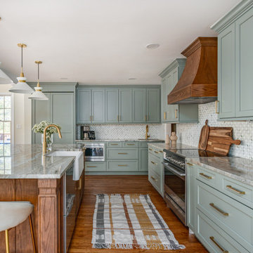
Hi everyone, I'm Sarah and Ogun we are here with fine line kitchens. So we are a couple working together. I do the interior design and remodeling of the space material selection meeting with the clients. And I handled operations outside, you know meaning all the construction work that is taking place the inside. The houses that we work in. I handle all the aspects of the construction, so today's project is very special. We're in Vienna and the client had a very big family. It's a family of seven that lives here. So we had a few aspects that we needed to keep in mind while designing this one. Having everybody be able to sit on the island. So we wanted plenty of seating all the way around. We didn't want anybody standing or anything like that. So what we did is we maximize the space. The center island is the biggest part of the kitchen. We use a natural stone to kind of give it a beautiful texture versus quartz. It's kind of standard white or kind of fabricated, so I wanted something very natural. We did this because I took my inspiration from the outside, so the inspiration if you look at the view right in front of me is there are so many greens there's a lot of brass accents and I wanted to bring this. Into this kitchen while designing it for my clients. She is very warm very. She wanted a very homey, comfy kind of look for the kitchen. So that's what we did today. As you can see, the cabinets are sage green, very light, so I still think it's a neutral, but it's a lighter color that again brings the outside in and we combine that with the oak right behind me so it's a slightly warm oak. It's not very dark. It's not very light. It's a medium brown and the same color went on the island. To kind of tie these two in and the backsplash, my favorite part is where you can see a little bit of design. It is, in my opinion still classic, but includes a pattern so the outside part is as we said in the beginning, is handled by my husband. I'd like him to speak a little bit about that. Thanks, Sarah, I want to talk to you guys a little bit about the construction part of this project. Originally this kitchen was located mostly in this area. They had their stove there sing. It was more of a peninsula layout in Sarah's and the customer vision they wanted. They wanted to get rid of the peninsula and they want to be able to have a huge island that can at least sit seven people because they're familiar with seven. So we wanted to make sure that we can achieve this design and bring it to life so that they can be happy with this layout. Some of the challenges we had, the house, the home being, you know, old home. There were a lot of you know the older electrical and plumbing that had to be replaced. We had to relocate the stove from here to this area. Over here we had put a nice foot fan that we had to relocate all the ductwork and the plumbing. Was being on the peninsula area. We had to relocate it to the center islands. So we achieved all this and kind of like bring it to bring in this kitchen up to date it looks beautiful. That's true, so yes, the old layout did not function for my clients because everything was kind of gathered on one side of the kitchen. So there was like a peninsula right there. So the end of this island kind of continued straight. And that was just the L shape. Kind of where everything was and there used to be another big table here, so they were using only kind of half of the space. So like I said at the beginning, our vision was to kind of feed everybody at the island, create some symmetry. 'cause I love that. So as you can see behind me, this is kind of the focal point symmetrical. Everything is kind of even we wanted to also panel the fridge here so it mimics the pantry and another size. So when you're looking at it, it is bringing again that symmetry back again. I hope you enjoyed this kitchen and this video and I'll see you soon. So how do you think this project turned out? It's nice. I like the color. I think it turned out nice. It's kind of like a little bit different color than what we always do. So I realize. Are you giving me a little bit of credit here that I did something different? Are you proud? I'm so proud of you. Other than that I like it. That they have kind of like a two sink. So if this was our kitchen, if we ever like you can have your own. I can have mine if we ever get into a fight then this can be like my own kitchen. Why are we gonna bring in a fight right now? So I'm cooking anyway. You're grilling most of the time, So what are you even talking about? My kitchen? That's my kitchen. You can just take the small sink. That's fine. It's always good to have your own space right there, so anyways. Thank you guys for watching. We hope to see you soon and if you have any questions please click the link below. It'll lead you to our website, house, YouTube and all of the social media is so nice to have you guys. We'll see you soon. Thanks bye bye-bye.
Sponsored
Fredericksburg, OH

High Point Cabinets
Columbus' Experienced Custom Cabinet Builder | 4x Best of Houzz Winner

 Kitchen Designs by Ken Kelly, Inc. (CKD, CBD, CR)
kitchendesigns.com
Designed by Mario Mulea at Kitchen Designs by Ken Kelly, Inc.
Cabinetry: Brookhaven by Wood Mode
Example of a large classic u-shaped medium tone wood floor eat-in kitchen design in New York with recessed-panel cabinets, black cabinets, beige backsplash, black appliances and an island
Example of a large classic u-shaped medium tone wood floor eat-in kitchen design in New York with recessed-panel cabinets, black cabinets, beige backsplash, black appliances and an island

 TKS Design Group
Download our free ebook, Creating the Ideal Kitchen. DOWNLOAD NOW
The homeowners came to us looking to update the kitchen in their historic 1897 home. The home had gone through an extensive renovation several years earlier that added a master bedroom suite and updates to the front façade. The kitchen however was not part of that update and a prior 1990’s update had left much to be desired. The client is an avid cook, and it was just not very functional for the family.
The original kitchen was very choppy and included a large eat in area that took up more than its fair share of the space. On the wish list was a place where the family could comfortably congregate, that was easy and to cook in, that feels lived in and in check with the rest of the home’s décor. They also wanted a space that was not cluttered and dark – a happy, light and airy room. A small powder room off the space also needed some attention so we set out to include that in the remodel as well.
See that arch in the neighboring dining room? The homeowner really wanted to make the opening to the dining room an arch to match, so we incorporated that into the design.
Another unfortunate eyesore was the state of the ceiling and soffits. Turns out it was just a series of shortcuts from the prior renovation, and we were surprised and delighted that we were easily able to flatten out almost the entire ceiling with a couple of little reworks.
Other changes we made were to add new windows that were appropriate to the new design, which included moving the sink window over slightly to give the work zone more breathing room. We also adjusted the height of the windows in what was previously the eat-in area that were too low for a countertop to work. We tried to keep an old island in the plan since it was a well-loved vintage find, but the tradeoff for the function of the new island was not worth it in the end. We hope the old found a new home, perhaps as a potting table.
Designed by: Susan Klimala, CKD, CBD
Photography by: Michael Kaskel
For more information on kitchen and bath design ideas go to: www.kitchenstudio-ge.com

 Hudson Place Realty
Property Marketed by Hudson Place Realty - Sophisticated , Elegant & Unique in design. this pristine single family brownstone enjoys a seamless blend of original details and modern amenities. Tastefully and extensively renovated , this gracious home features 5-6 BR , 3.5B , new and upgraded mechanical systems, full height cellar, intricate plasterwork , inlaid exotic wood floors , 9 beautiful mantels & deep architect designed yard. Unique center staircase allows for full width floors . This very rare beauty is the ideal urban family home

 Mann Design Studio
Peter Molick Photography
Inspiration for a transitional white two-story brick gable roof remodel in Houston
Inspiration for a transitional white two-story brick gable roof remodel in Houston

 ZeroEnergy Design
Modern family loft in Boston’s South End. Open living area includes a custom fireplace with warm stone texture paired with functional seamless wall cabinets for clutter free storage.
Photos by Eric Roth.
Construction by Ralph S. Osmond Company.
Green architecture by ZeroEnergy Design. http://www.zeroenergy.com

 Anne Sneed Architectural Interiors
Jim Brady Architectural Photography
Example of a country galley dark wood floor dedicated laundry room design in San Diego with a farmhouse sink, multicolored walls, a stacked washer/dryer, white cabinets and recessed-panel cabinets
Example of a country galley dark wood floor dedicated laundry room design in San Diego with a farmhouse sink, multicolored walls, a stacked washer/dryer, white cabinets and recessed-panel cabinets


 Bill Fry Construction - Wm. H. Fry Const. Co.
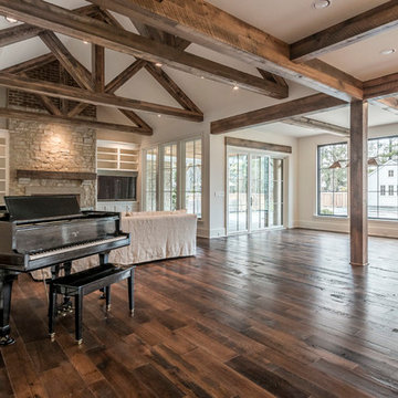
The Nelson Cigar Pendant Light in Entry of Palo Alto home reconstruction and addition gives a mid-century feel to what was originally a ranch home. Beyond the entry with a skylight is the great room with a vaulted ceiling which opens to the backyard.


 The Design Gallery
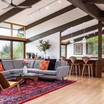
Our remodeled 1994 Deck House was a stunning hit with our clients. All original moulding, trim, truss systems, exposed posts and beams and mahogany windows were kept in tact and refinished as requested. All wood ceilings in each room were painted white to brighten and lift the interiors. This is the view looking from the living room toward the kitchen. Our mid-century design is timeless and remains true to the modernism movement.

 place architecture:design
The shape of the angled porch-roof, sets the tone for a truly modern entryway. This protective covering makes a dramatic statement, as it hovers over the front door. The blue-stone terrace conveys even more interest, as it gradually moves upward, morphing into steps, until it reaches the porch.
Porch Detail
The multicolored tan stone, used for the risers and retaining walls, is proportionally carried around the base of the house. Horizontal sustainable-fiber cement board replaces the original vertical wood siding, and widens the appearance of the facade. The color scheme — blue-grey siding, cherry-wood door and roof underside, and varied shades of tan and blue stone — is complimented by the crisp-contrasting black accents of the thin-round metal columns, railing, window sashes, and the roof fascia board and gutters.
This project is a stunning example of an exterior, that is both asymmetrical and symmetrical. Prior to the renovation, the house had a bland 1970s exterior. Now, it is interesting, unique, and inviting.
Photography Credit: Tom Holdsworth Photography
Contractor: Owings Brothers Contracting


 Gardner/Fox Associates, Inc
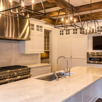
The original breakfast room was removed and the corner corner squared off a the site of the new sink. The removal of the wall dividing the kitchen and dining areas allowed the kitchen to expand and accommodate the open concept floor plan. The result is an amazingly comfortable & beautiful space in which to cook & entertain.
 Earthwood Custom Remodeling, Inc.
MG ProPhoto
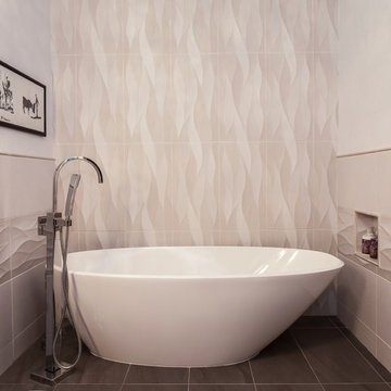
Mid-sized trendy master beige tile and ceramic tile porcelain tile freestanding bathtub photo in Denver with flat-panel cabinets, medium tone wood cabinets, solid surface countertops, an integrated sink and beige walls
Mid-sized trendy master beige tile and ceramic tile porcelain tile freestanding bathtub photo in Denver with flat-panel cabinets, medium tone wood cabinets, solid surface countertops, an integrated sink and beige walls
8