
Search results for "Originates" in Home Design Ideas
 Waterlily Interiors
Stylish Productions
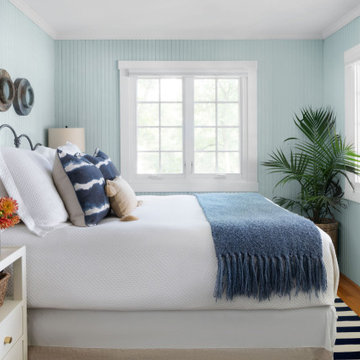
Inspiration for a coastal medium tone wood floor, brown floor and wall paneling bedroom remodel in Baltimore with blue walls
Inspiration for a coastal medium tone wood floor, brown floor and wall paneling bedroom remodel in Baltimore with blue walls

Find the right local pro for your project
 Flavin Architects
New Additions to Hoover + Hill
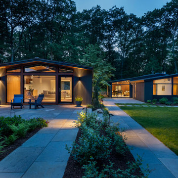
This project is a continuation of the renovation and updating work Flavin Architects had previously completed at the 1958 Wales house, designed by architect Henry Hoover and Walter Hill. Our clients, a young family, desired more space for guests, a home office, a yoga studio, and covered car parking. The challenge was to respect the architects’ original vision and not to interfere with the perfect cruciform plan of the house. To accomplish these goals, we converted the existing garage/workshop structure into a guest house and then designed a new, separate carport/storage building.
The new carport building shares the low-slope gable of the original Hoover structure. The post and beam structure characteristic of Hoover’s design is updated through the use of galvanized steel posts and I beams. The galvanized beams cantilever to support a sheltered walkway leading from the parking to a guest house terrace defined in relationship to the three structures surrounding it. The terrace is paved in slate with a central rain garden. Wood lattice clads the carport, providing good ventilation and letting the building glow like a lantern at night. Our guest house renovation celebrates the unique structural timber ceiling of the original garage. We replaced opaque plywood trusses with a slender cable truss structurally engineered by Webb Structural Services. This cable truss allows for a view of the timber ceiling. A wall of glass facing the courtyard replaced the original garage door. A murphy bed in the rear room enables quick conversion from guest quarters to weight room.
 Lenox House Design
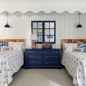
A cottage room was created in the lower level bedroom - mimicking the screen porch of the original cottage on the property. We patterened the scalloping from the eaves, removed an original window and custom framed it here and applied glass behind, duplicated the board and batten siding and added Norwegian accents to play up the family heritage. Not seen in the pictures is the 2 single beds on the opposite side of the room - so 6 people can sleep comfortably in this spacious space.
 Judith Wright Design
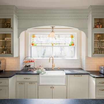
Saving the original stained glass picture window from 1916, we created a focal point with a custom designed arch alcove with dentil molding. Leaded glass upper cabinets add ambiance and sparkle to the compact kitchen.
 TKS Design Group
Download our free ebook, Creating the Ideal Kitchen. DOWNLOAD NOW
The homeowners built their traditional Colonial style home 17 years’ ago. It was in great shape but needed some updating. Over the years, their taste had drifted into a more contemporary realm, and they wanted our help to bridge the gap between traditional and modern.
We decided the layout of the kitchen worked well in the space and the cabinets were in good shape, so we opted to do a refresh with the kitchen. The original kitchen had blond maple cabinets and granite countertops. This was also a great opportunity to make some updates to the functionality that they were hoping to accomplish.
After re-finishing all the first floor wood floors with a gray stain, which helped to remove some of the red tones from the red oak, we painted the cabinetry Benjamin Moore “Repose Gray” a very soft light gray. The new countertops are hardworking quartz, and the waterfall countertop to the left of the sink gives a bit of the contemporary flavor.
We reworked the refrigerator wall to create more pantry storage and eliminated the double oven in favor of a single oven and a steam oven. The existing cooktop was replaced with a new range paired with a Venetian plaster hood above. The glossy finish from the hood is echoed in the pendant lights. A touch of gold in the lighting and hardware adds some contrast to the gray and white. A theme we repeated down to the smallest detail illustrated by the Jason Wu faucet by Brizo with its similar touches of white and gold (the arrival of which we eagerly awaited for months due to ripples in the supply chain – but worth it!).
The original breakfast room was pleasant enough with its windows looking into the backyard. Now with its colorful window treatments, new blue chairs and sculptural light fixture, this space flows seamlessly into the kitchen and gives more of a punch to the space.
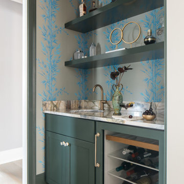
The original butler’s pantry was functional but was also starting to show its age. The new space was inspired by a wallpaper selection that our client had set aside as a possibility for a future project. It worked perfectly with our pallet and gave a fun eclectic vibe to this functional space. We eliminated some upper cabinets in favor of open shelving and painted the cabinetry in a high gloss finish, added a beautiful quartzite countertop and some statement lighting. The new room is anything but cookie cutter.
Next the mudroom. You can see a peek of the mudroom across the way from the butler’s pantry which got a facelift with new paint, tile floor, lighting and hardware. Simple updates but a dramatic change! The first floor powder room got the glam treatment with its own update of wainscoting, wallpaper, console sink, fixtures and artwork. A great little introduction to what’s to come in the rest of the home.
The whole first floor now flows together in a cohesive pallet of green and blue, reflects the homeowner’s desire for a more modern aesthetic, and feels like a thoughtful and intentional evolution. Our clients were wonderful to work with! Their style meshed perfectly with our brand aesthetic which created the opportunity for wonderful things to happen. We know they will enjoy their remodel for many years to come!
Photography by Margaret Rajic Photography

Sponsored
Columbus, OH

Wannemacher Interiors
Customized Award-Winning Interior Design Solutions in Franklin Cnty OH

 Adrienne DeRosa
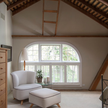
The master bedroom, while snug, receives a dose of grandeur from the vaulted ceiling and wide arched window. The original slats in the ceiling offer contrast to the white elements, while a skylight lends an open feeling. The ladder was also a piece of the original barn. It becomes an interesting sculptural element as it mirrors the staircases in the house.
 Balboa Design Group
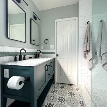
Our clients wanted a REAL master bathroom with enough space for both of them to be in there at the same time. Their house, built in the 1940’s, still had plenty of the original charm, but also had plenty of its original tiny spaces that just aren’t very functional for modern life.
The original bathroom had a tiny stall shower, and just a single vanity with very limited storage and counter space. Not to mention kitschy pink subway tile on every wall. With some creative reconfiguring, we were able to reclaim about 25 square feet of space from the bedroom. Which gave us the space we needed to introduce a double vanity with plenty of storage, and a HUGE walk-in shower that spans the entire length of the new bathroom!
While we knew we needed to stay true to the original character of the house, we also wanted to bring in some modern flair! Pairing strong graphic floor tile with some subtle (and not so subtle) green tones gave us the perfect blend of classic sophistication with a modern glow up.
Our clients were thrilled with the look of their new space, and were even happier about how large and open it now feels!
 Susan Yeley Homes
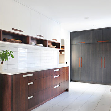
This gem of a house was built in the 1950s, when its neighborhood undoubtedly felt remote. The university footprint has expanded in the 70 years since, however, and today this home sits on prime real estate—easy biking and reasonable walking distance to campus.
When it went up for sale in 2017, it was largely unaltered. Our clients purchased it to renovate and resell, and while we all knew we'd need to add square footage to make it profitable, we also wanted to respect the neighborhood and the house’s own history. Swedes have a word that means “just the right amount”: lagom. It is a guiding philosophy for us at SYH, and especially applied in this renovation. Part of the soul of this house was about living in just the right amount of space. Super sizing wasn’t a thing in 1950s America. So, the solution emerged: keep the original rectangle, but add an L off the back.
With no owner to design with and for, SYH created a layout to appeal to the masses. All public spaces are the back of the home--the new addition that extends into the property’s expansive backyard. A den and four smallish bedrooms are atypically located in the front of the house, in the original 1500 square feet. Lagom is behind that choice: conserve space in the rooms where you spend most of your time with your eyes shut. Put money and square footage toward the spaces in which you mostly have your eyes open.
In the studio, we started calling this project the Mullet Ranch—business up front, party in the back. The front has a sleek but quiet effect, mimicking its original low-profile architecture street-side. It’s very Hoosier of us to keep appearances modest, we think. But get around to the back, and surprise! lofted ceilings and walls of windows. Gorgeous.
 Timeless Walls
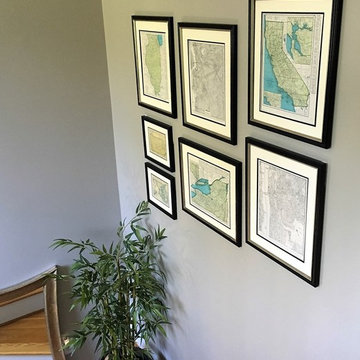
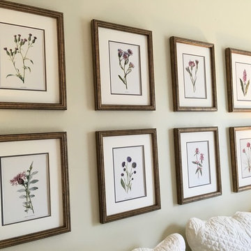
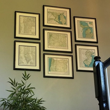
Original Vintage Framed Maps by Timeless Walls are Not Reproductions. This high quality framed maps will bring style and conversation to any room! These maps also make perfect gifts since they are authentic!

Sponsored
Columbus, OH
Wannemacher Interiors
Customized Award-Winning Interior Design Solutions in Franklin Cnty OH
 Bruns Architecture
Tricia Shay Photography
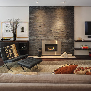
Example of a mid-sized trendy formal and open concept dark wood floor and brown floor living room design in Milwaukee with a metal fireplace, white walls, a ribbon fireplace and a wall-mounted tv
Example of a mid-sized trendy formal and open concept dark wood floor and brown floor living room design in Milwaukee with a metal fireplace, white walls, a ribbon fireplace and a wall-mounted tv
 User
User http://mollywinnphotography.com
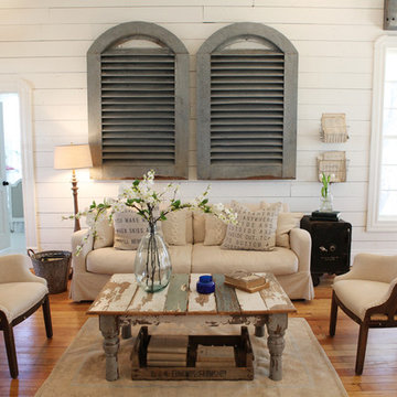
Living room - mid-sized shabby-chic style open concept and formal medium tone wood floor living room idea in Austin with white walls, no fireplace and no tv
Living room - mid-sized shabby-chic style open concept and formal medium tone wood floor living room idea in Austin with white walls, no fireplace and no tv
 Julia Contacessi Fine Art
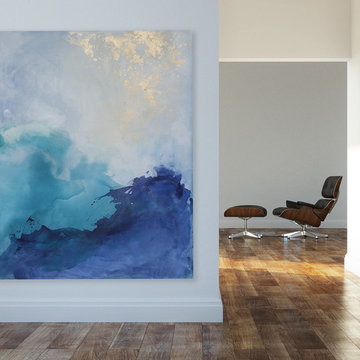
Hanging on the wall, 48 x 60 original painting "Rising" by artist Julia Contacessi. Dynamic blue tones are the only pop of color, accented by the metallic gold texture floating atop.
This original work has sold. Canvas prints are available at http://www.juliacontacessi.com/shop/rising-canvas-print
 Peter Lyons Photography
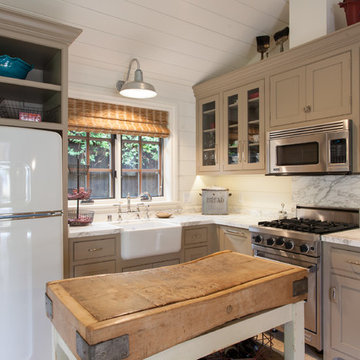
This was a new construction project photographed for Jim Clopton of McGuire Real Estate. Construction is by Lou Vierra of Vierra Fine Homes ( http://www.vierrafinehomes.com).
Photography by peterlyonsphoto.com

Sponsored
Columbus, OH
Wannemacher Interiors
Customized Award-Winning Interior Design Solutions in Franklin Cnty OH
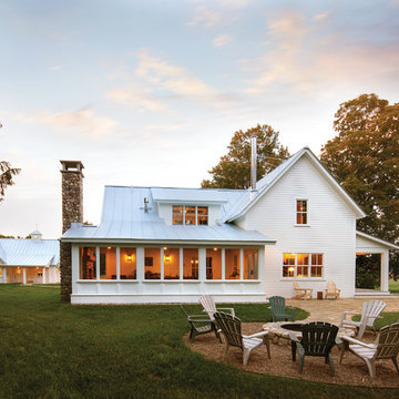
 Lendrum Photography LLC
Jeffrey Lendrum / Lendrum Photography LLC
Cottage white two-story exterior home photo in Other
Cottage white two-story exterior home photo in Other
 HAUS | Architecture For Modern Lifestyles
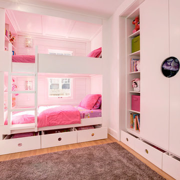
Custom Bunk Beds integrate storage cubbies within and roller-drawers beneath. Original storage closet to right opened-up to create full-integrated millwork closet system to match with bunks - Architect: HAUS | Architecture - Construction: WERK | Build - Photo: HAUS | Architecture
 JN Interior Spaces
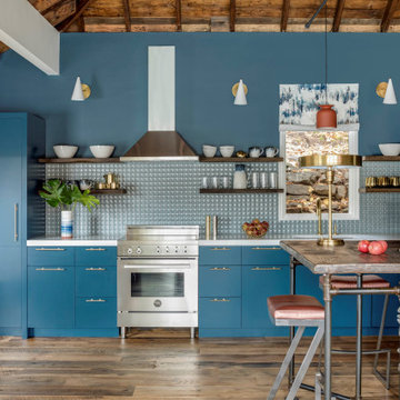
The renovation of a mid century cottage on the lake, now serves as a guest house. The renovation preserved the original architectural elements such as the ceiling and original stone fireplace to preserve the character, personality and history and provide the inspiration and canvas to which everything else would be added. To prevent the space from feeling dark & too rustic, the lines were kept clean, the furnishings modern and the use of saturated color was strategically placed throughout.
25