
Search results for "Originates" in Home Design Ideas
 Janice Russillo Design
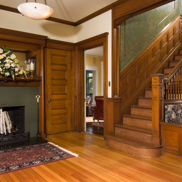
Restoration of Shingle style / Queen Anne home in coastal New Hampshire with welcoming fireplace in Front foyer. Original wood work, Barley twist stair banister, and original seat.
 Rosenberg Kolb Architects
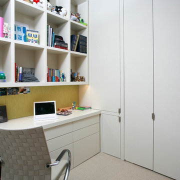
Our client came to us with the idea of renovating some of the rooms for their three growing children, twin boys and a girl, in this apartment on Riverside Drive with breath-taking views of the Hudson River. The original bedrooms were crowded with built-in pieces and the boys used to share one room. As their needs are changing as they grow, our clients wanted to renovate their childish bedrooms and give them new bedrooms for each one of them that would still feel ‘updated’ and ‘grown up’ for many more years to come. A previously room used as a Den, was transformed into a bedroom for one of the boys, while the other one kept the original bedroom. Both spaces have similar materials and fabrics, but each has a color scheme that was developed from the kids’ favorite colors, the built-in desk, shelving and platform bed in dark mahogany gives the rooms a more masculine and grown up feel. The girl’s room was a very small and odd space with angled walls; to make the room more square and symmetrical, a new desk with shelves, built-in closet, night-stand and platform bed were installed around the perimeter of the room. This layout allowed for additional space for a reading chair, floor lamp and side table. The color palette for this bedroom was also based on the girl’s favorite colors: purple and green, which were wisely used over a background of cream color used throughout the cabinetry and carpet to avoid feeling overwhelming in the small space. Most of the vertical surfaces in all three rooms were covered in a tackable material so they could display posters and school work, yet the textile wall covering gives the walls a very elegant feel when the posters come off.
 Jane Vorbrodt
Jane Vorbrodt
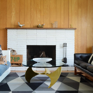
Living room - 1960s living room idea in Vancouver with a standard fireplace and a brick fireplace
Living room - 1960s living room idea in Vancouver with a standard fireplace and a brick fireplace
Find the right local pro for your project
 K.A. Atwood, Inc
PROJECT OVERVIEW: This 1929 Tudor style home was perfect for a couple that loves to collect antiques, but the original kitchen that came with it didn’t work for their family lifestyle. The original floor plan included a small, irregular shaped kitchen with a very large brick fireplace, small nook area, and rear porch entryway, all compartmentalized by load bearing walls. The new design boasts a large kitchen defined by a 24’ fridge and freezer tower wall paneled to match perimeter cabinetry and flanked by double arched entries to both the new butler’s pantry and dining room.
WHAT MAKES THIS PROJECT UNIQUE: Besides eliminating all the large, load bearing walls that divided the overall space, both floors and ceilings had to be aligned to bring the space together. On either end of the long, paneled tower elevation, arched doorways lead to a new butler’s pantry on the left (which then leads into the dining room) and a newly created hall with floor to ceiling bookshelves on the right (which also leads into the dining room). Archways, butler’s pantry, and hall all match kitchen cabinetry. Even retro light switches and receptacles were designed into matching paneling.
DESIGN CHALLENGES: The homeowners wanted a large, family friendly kitchen and better flow between the kitchen and dining room. To achieve this 18’ X 19’ family sized kitchen with a clean ceiling, 31 lineal feet of load bearing wall had to be suspended at 9’. Back-to-back steel C- channels bolted together and a steel I Beam were installed to carry the load of 11” thick brick, 2 ½ story walls.
 Julia Contacessi Fine Art
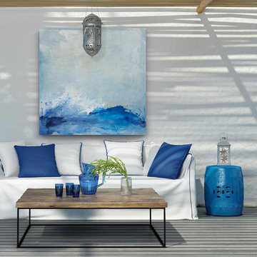
Hanging on the wall, 48 x 48 original painting "Fleeting Light" by artist Julia Contacessi.
Example of a large beach style patio design in New York with decking and a pergola
Example of a large beach style patio design in New York with decking and a pergola
 Kon-strux Developments
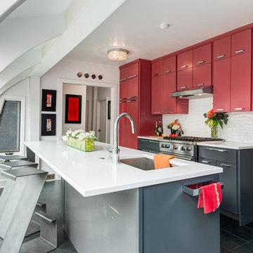
We harnessed the original lines and contours of the space when designing this kitchen reno. The original custom-built supports of the window wall have sensuous curves that contrast beautifully with the client's modern kitchen vision.
(Rob Moroto, Calgary Photos)


Sponsored
Columbus, OH

Wannemacher Interiors
Customized Award-Winning Interior Design Solutions in Franklin Cnty OH
 TVL Creative Ltd.
[Our Clients]
We were so excited to help these new homeowners re-envision their split-level diamond in the rough. There was so much potential in those walls, and we couldn’t wait to delve in and start transforming spaces. Our primary goal was to re-imagine the main level of the home and create an open flow between the space. So, we started by converting the existing single car garage into their living room (complete with a new fireplace) and opening up the kitchen to the rest of the level.
[Kitchen]
The original kitchen had been on the small side and cut-off from the rest of the home, but after we removed the coat closet, this kitchen opened up beautifully. Our plan was to create an open and light filled kitchen with a design that translated well to the other spaces in this home, and a layout that offered plenty of space for multiple cooks. We utilized clean white cabinets around the perimeter of the kitchen and popped the island with a spunky shade of blue. To add a real element of fun, we jazzed it up with the colorful escher tile at the backsplash and brought in accents of brass in the hardware and light fixtures to tie it all together. Through out this home we brought in warm wood accents and the kitchen was no exception, with its custom floating shelves and graceful waterfall butcher block counter at the island.
[Dining Room]
The dining room had once been the home’s living room, but we had other plans in mind. With its dramatic vaulted ceiling and new custom steel railing, this room was just screaming for a dramatic light fixture and a large table to welcome one-and-all.
[Living Room]
We converted the original garage into a lovely little living room with a cozy fireplace. There is plenty of new storage in this space (that ties in with the kitchen finishes), but the real gem is the reading nook with two of the most comfortable armchairs you’ve ever sat in.
[Master Suite]
This home didn’t originally have a master suite, so we decided to convert one of the bedrooms and create a charming suite that you’d never want to leave. The master bathroom aesthetic quickly became all about the textures. With a sultry black hex on the floor and a dimensional geometric tile on the walls we set the stage for a calm space. The warm walnut vanity and touches of brass cozy up the space and relate with the feel of the rest of the home. We continued the warm wood touches into the master bedroom, but went for a rich accent wall that elevated the sophistication level and sets this space apart.
[Hall Bathroom]
The floor tile in this bathroom still makes our hearts skip a beat. We designed the rest of the space to be a clean and bright white, and really let the lovely blue of the floor tile pop. The walnut vanity cabinet (complete with hairpin legs) adds a lovely level of warmth to this bathroom, and the black and brass accents add the sophisticated touch we were looking for.
[Office]
We loved the original built-ins in this space, and knew they needed to always be a part of this house, but these 60-year-old beauties definitely needed a little help. We cleaned up the cabinets and brass hardware, switched out the formica counter for a new quartz top, and painted wall a cheery accent color to liven it up a bit. And voila! We have an office that is the envy of the neighborhood.
 Klopf Architecture
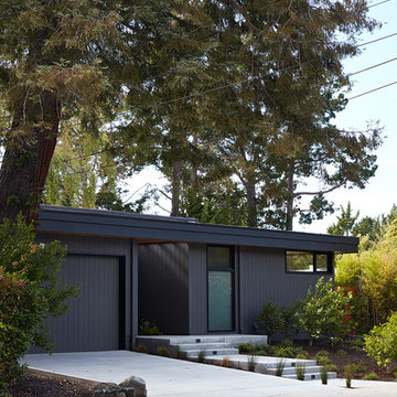
Klopf Architecture, Arterra Landscape Architects and Henry Calvert of Calvert Ventures Designed and built a new warm, modern, Eichler-inspired, open, indoor-outdoor home on a deeper-than-usual San Mateo Highlands property where an original Eichler house had burned to the ground.
The owners wanted multi-generational living and larger spaces than the original home offered, but all parties agreed that the house should respect the neighborhood and blend in stylistically with the other Eichlers. At first the Klopf team considered re-using what little was left of the original home and expanding on it. But after discussions with the owner and builder, all parties agreed that the last few remaining elements of the house were not practical to re-use, so Klopf Architecture designed a new home that pushes the Eichler approach in new directions.
One disadvantage of Eichler production homes is that the house designs were not optimized for each specific lot. A new custom home offered the team a chance to start over. In this case, a longer house that opens up sideways to the south fit the lot better than the original square-ish house that used to open to the rear (west). Accordingly, the Klopf team designed an L-shaped “bar” house with a large glass wall with large sliding glass doors that faces sideways instead of to the rear like a typical Eichler. This glass wall opens to a pool and landscaped yard designed by Arterra Landscape Architects.
Driving by the house, one might assume at first glance it is an Eichler because of the horizontality, the overhanging flat roof eaves, the dark gray vertical siding, and orange solid panel front door, but the house is designed for the 21st Century and is not meant to be a “Likeler.” You won't see any posts and beams in this home. Instead, the ceiling decking is a western red cedar that covers over all the beams. Like Eichlers, this cedar runs continuously from inside to out, enhancing the indoor / outdoor feeling of the house, but unlike Eichlers it conceals a cavity for lighting, wiring, and insulation. Ceilings are higher, rooms are larger and more open, the master bathroom is light-filled and more generous, with a separate tub and shower and a separate toilet compartment, and there is plenty of storage. The garage even easily fits two of today's vehicles with room to spare.
A massive 49-foot by 12-foot wall of glass and the continuity of materials from inside to outside enhance the inside-outside living concept, so the owners and their guests can flow freely from house to pool deck to BBQ to pool and back.
During construction in the rough framing stage, Klopf thought the front of the house appeared too tall even though the house had looked right in the design renderings (probably because the house is uphill from the street). So Klopf Architecture paid the framer to change the roofline from how we had designed it to be lower along the front, allowing the home to blend in better with the neighborhood. One project goal was for people driving up the street to pass the home without immediately noticing there is an "imposter" on this lot, and making that change was essential to achieve that goal.
This 2,606 square foot, 3 bedroom, 3 bathroom Eichler-inspired new house is located in San Mateo in the heart of the Silicon Valley.
Klopf Architecture Project Team: John Klopf, AIA, Klara Kevane
Landscape Architect: Arterra Landscape Architects
Contractor: Henry Calvert of Calvert Ventures
Photography ©2016 Mariko Reed
Location: San Mateo, CA
Year completed: 2016
 Arciform
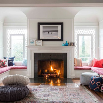
The layout of the original living room remained the same, with its lovely built in benches at the windows surrounding the fireplace. Decoration by Jenna Sheingold. - Dibble Photography
 Atelier Interior Design
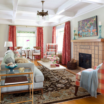
Example of a classic medium tone wood floor living room design in Denver with a standard fireplace, a tile fireplace and gray walls
 Klopf Architecture
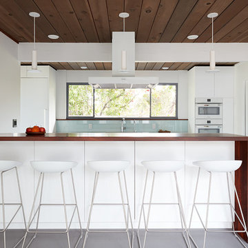
Klopf Architecture and Jesse Ososki Art remodeled an existing Eichler atrium home into a brighter, more open, and more functional version of its original self.
The goals were to preserve the Eichler look and feel without the need to strictly adhere to it. The scope of work included re-configuring the master bedroom/bath, the kitchen, and the hall bath/laundry area, as well as updating interior finishes throughout to be more sophisticated.
The owners are detail-oriented and were very involved in the design process, down to the selection of lighting controls and stainless steel faceplates.Their design aesthetic leans toward the Scandinavian — light and bright, with simple straight lines and pure geometric shapes.
The finish flooring is large porcelain tile (24” x 24”) in a neutral grey tone, providing a uniform backdrop against which other materials can stand out. The same tile continues into the shower floor (with a different finish texture for slip-resistance) and up the shower/tub walls (in a smaller size). Heath Classic Field ceramic tile in Modern Blue was used sparingly, to add color at the hall bath vanity backsplash and at the shampoo niches in both bathrooms. Back-painted soda glass in pale blue to match the Heath tile was used at the kitchen backsplash. This same accent color was also used at the front entry atrium door. Kitchen cabinetry, countertops, appliances, and light fixtures are all white, making the kitchen feel more airy and light. Countertops are Caesarstone Blizzard.
The owners chose to keep some of the original Eichler elements: the concrete masonry fireplace; the stained tongue-and-groove redwood ceiling decking; and the luan wall paneling. The luan paneling was lightly sanded, cleaned, and re-stained. The owners also kept an added element that was installed by a previous owner: sliding shoji panels at all bedroom windows and sliding glass doors, for both privacy and sun control. Grooves were cut into the new tile flooring for the shoji panels to slide in, creating a more integrated look. Walnut was used to add warmth and contrast at the kitchen bar top and niche, the bathroom vanities, and the window sill/ledge under the kitchen window.
This Burlingame Eichler Remodel is a 2,121 sf, 4 bedroom/2 bath home located in the heart of Silicon Valley.
Klopf Architecture Project Team: John Klopf, Klara Kevane and Yegvenia Torres Zavala
Contractor: Jesse Ososki Art
Structural Engineer: Emmanuel Pun
Photography ©2018 Mariko Reed
Location: Burlingame, CA
Year completed: 2017
 Bailey Design + Build
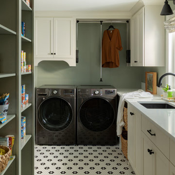
Inspiration for a transitional l-shaped multicolored floor laundry room remodel in Louisville with an undermount sink, shaker cabinets, white cabinets, green walls, a side-by-side washer/dryer and white countertops

Sponsored
Columbus, OH
Wannemacher Interiors
Customized Award-Winning Interior Design Solutions in Franklin Cnty OH
 GuiDenby, Inc.
Jeff Dow Photography
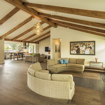
This space originally had a wall dividing it down the center and a flat ceiling. The ceiling was removed and wood rafters added to open up the space. The original sunken living space and custom couches were retained.
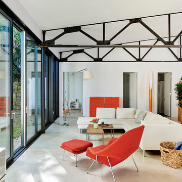
Living room - mid-century modern open concept concrete floor living room idea in Boston with white walls
 Kim Ronemus Interiors
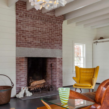
Inspiration for a cottage concrete floor and gray floor living room remodel in New York with white walls, a standard fireplace and a brick fireplace
 Mel McDaniel Design
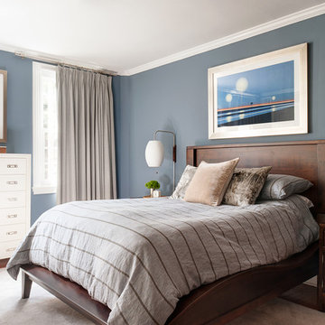
Bedroom - mid-sized transitional master dark wood floor and gray floor bedroom idea in Philadelphia with blue walls and no fireplace

Sponsored
Columbus, OH
Wannemacher Interiors
Customized Award-Winning Interior Design Solutions in Franklin Cnty OH
 Nathan Taylor for Obelisk Home
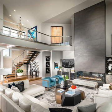
Inspiration for a huge modern loft-style light wood floor, brown floor and vaulted ceiling living room remodel in Other with gray walls, a ribbon fireplace, a wall-mounted tv and a tile fireplace
 Cindy McCarley Designs
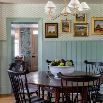
Historic 1880s farmhouse renovation in Spring City, Utah by certified kitchen & bath designer Cindy McCarley. Traditional meets farmhouse chic with sage green cabinetry, marble backsplash, floral wallpaper & copper details. Award-winning interior design preserving vintage charm with modern luxury.
 Sellars Lathrop Architects, llc
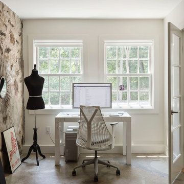
Renovation and addition of a 1940's Colonial into a family home that's modern, cool and classic. White interiors, dark floors, open plan, loads of natural light and easy access to outdoors makes this perfect for family and entertaining. Traditional meets modern. Award winning project . Judges say : "This renovation balances traditional attributes with modern clarity.
Photo: Matthew Williams
64